Visual Identity System for Rezonanz
Pilar Torcal
Visual identity system for rezonanz, a new Swiss startup in the sustainable investments sector.
rezonanz's mission is to amplify responsible investors' influence and voices. By quantifying stewardship's impact, the startup enables values alignment and impactful investing to grow.
To honor the naming, the biggest inspiration came from the idea of resonance and the powerful effects such platform can have, ultimately, in the environment.
Desktop Website Layout
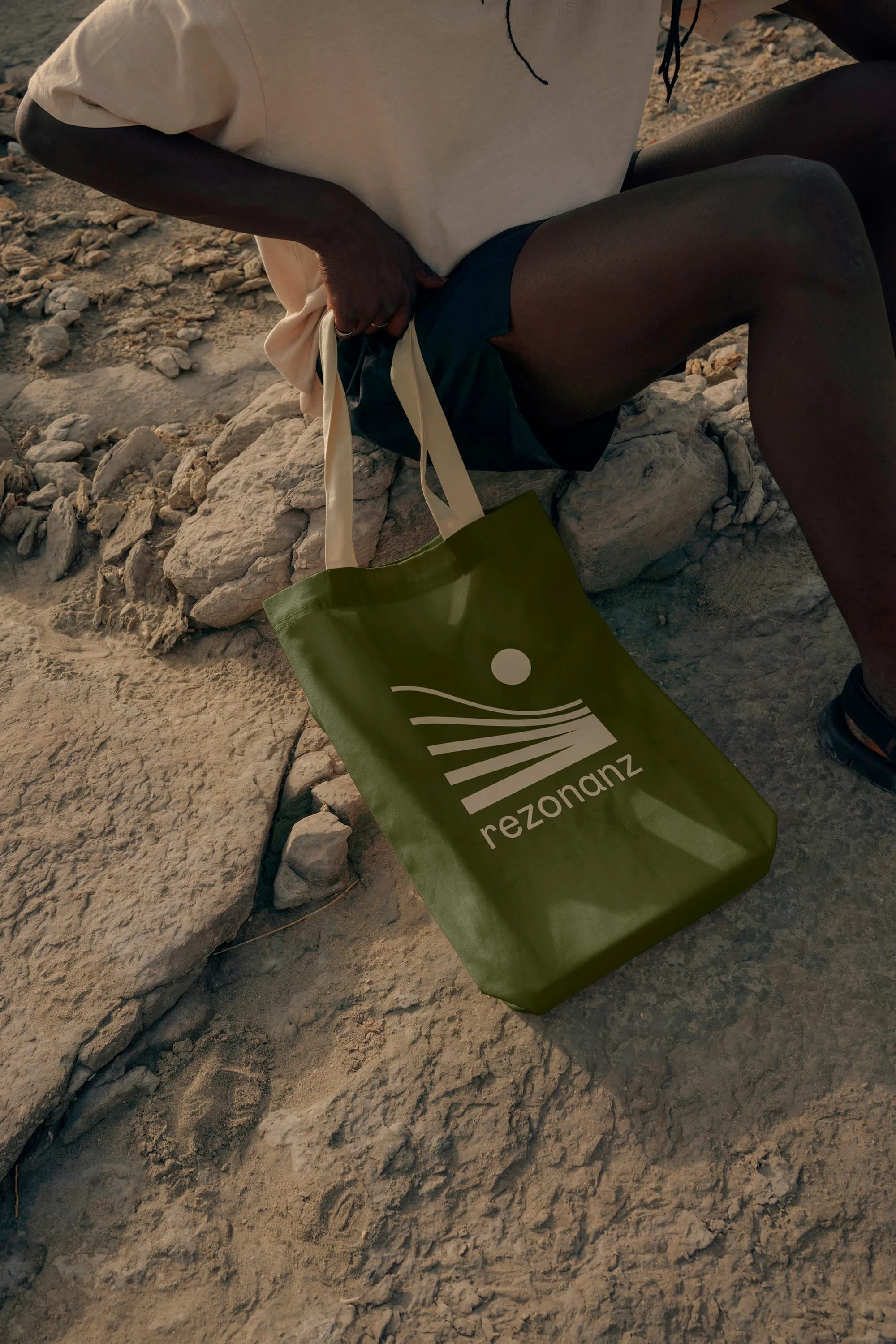
The symbol developed is highly influenced by the idea of "the butterfly effect" and how it teaches us is that small things matter, and we are all connected to a bigger system.
A series of visuals, using the full color palette, were developed to be used as graphic elements throughout the different brand applications. Of course, the idea of refraction and resonance was also brought into these.
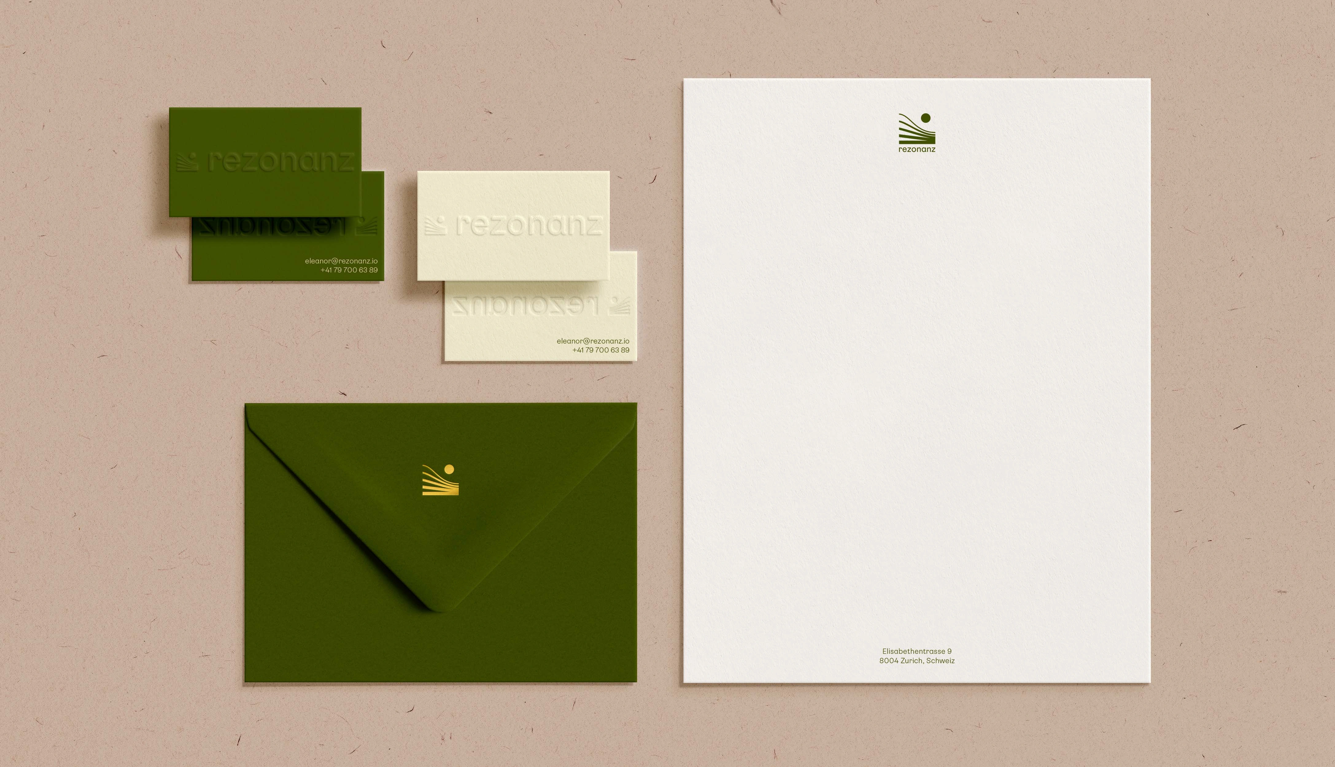
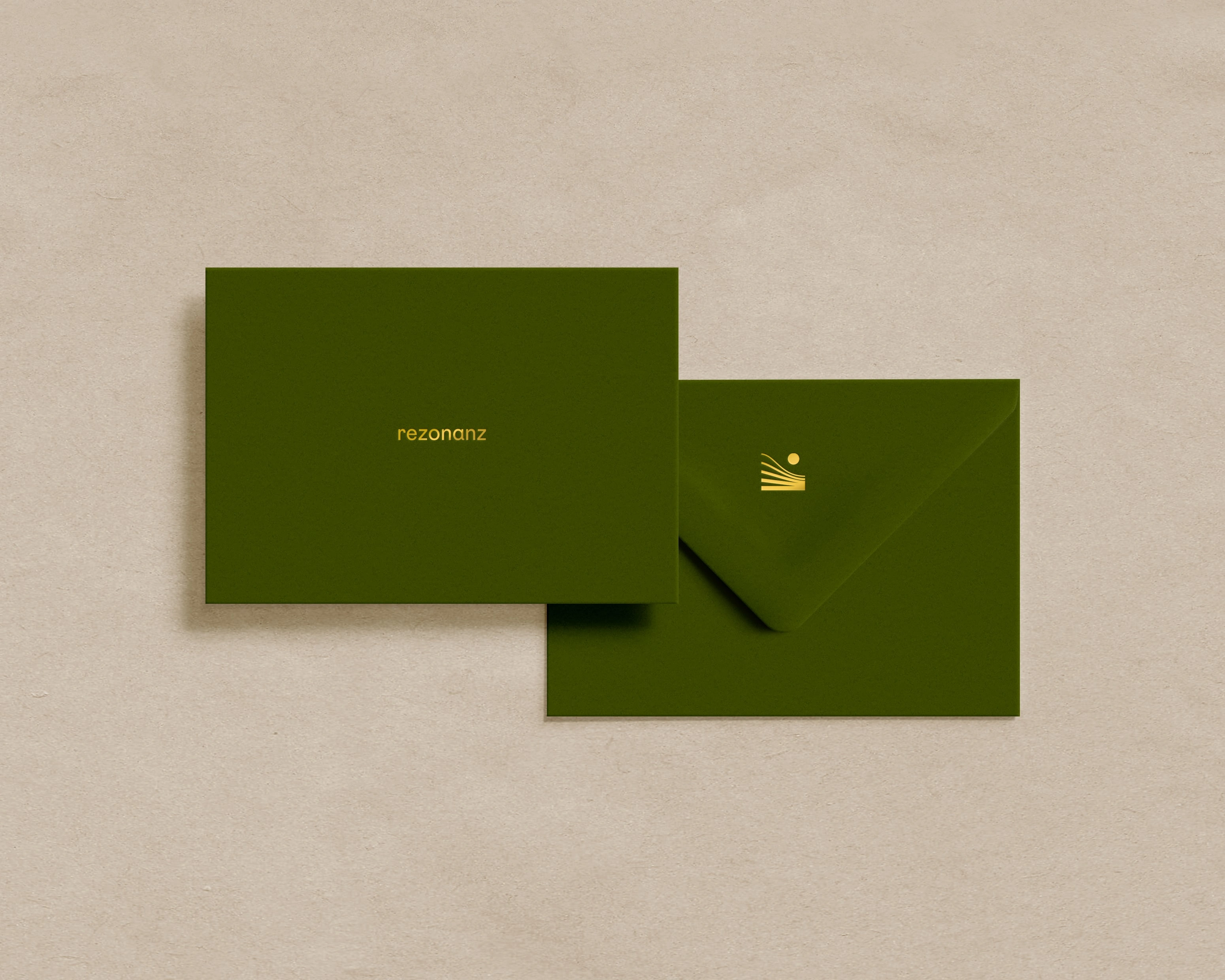
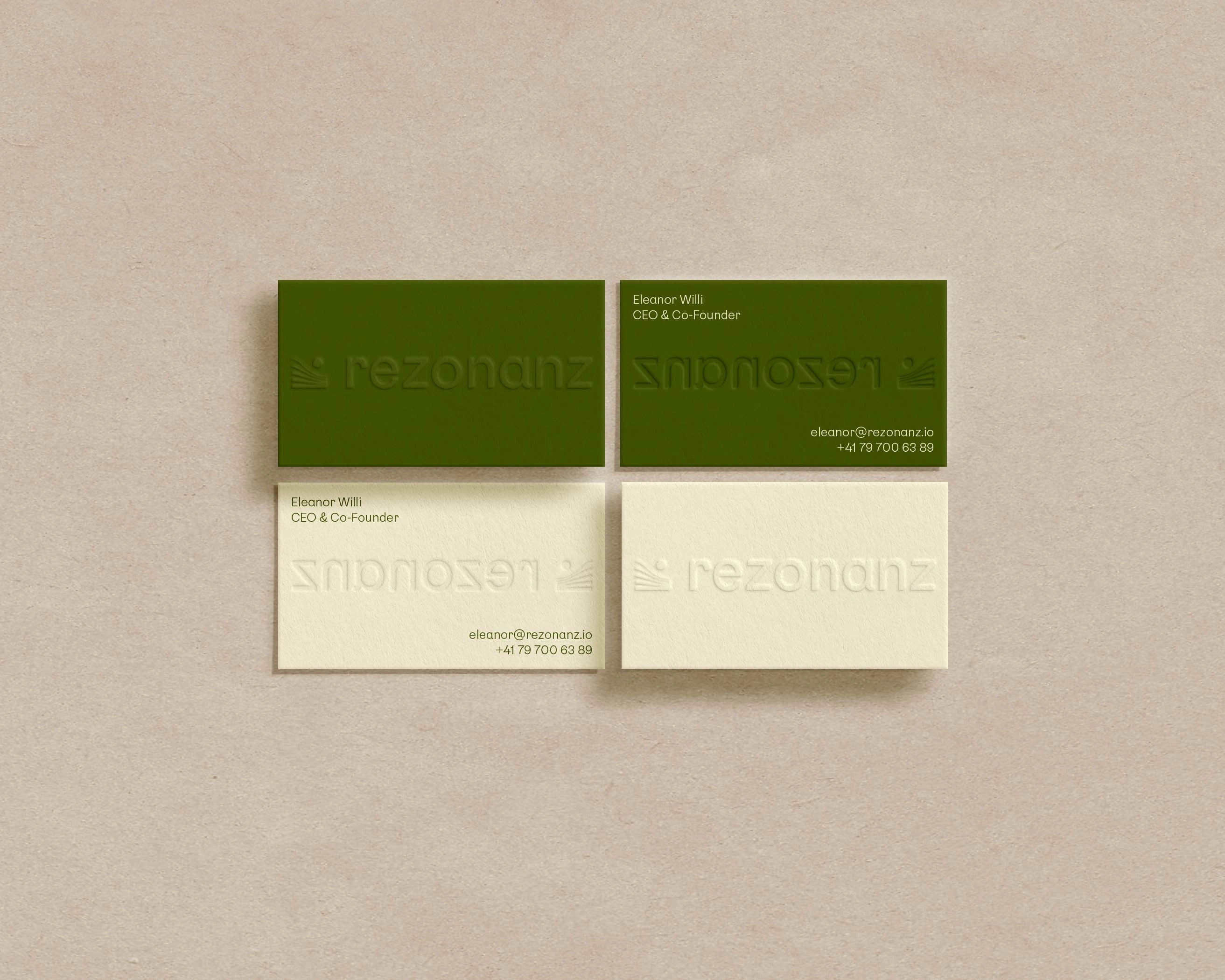
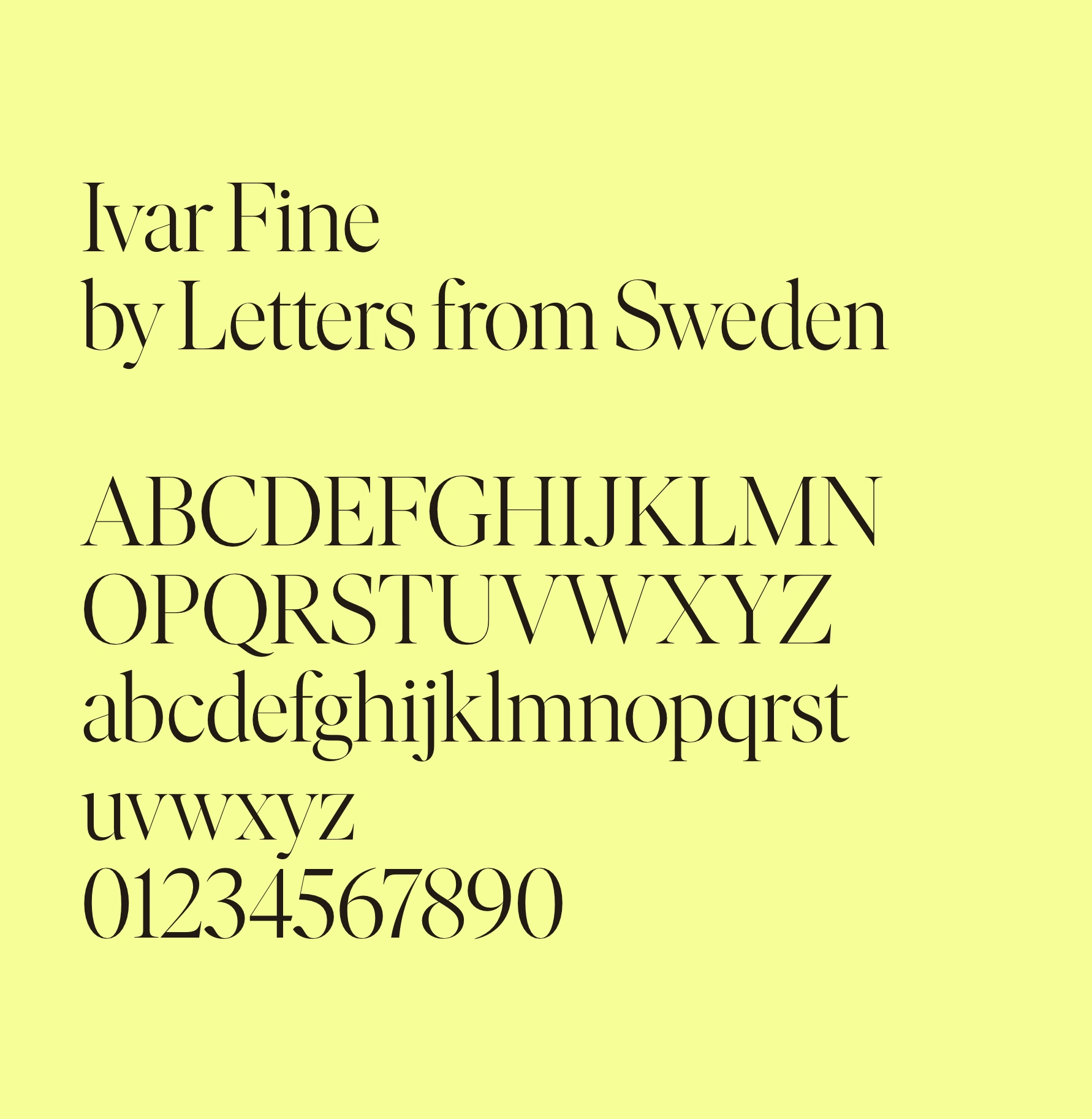
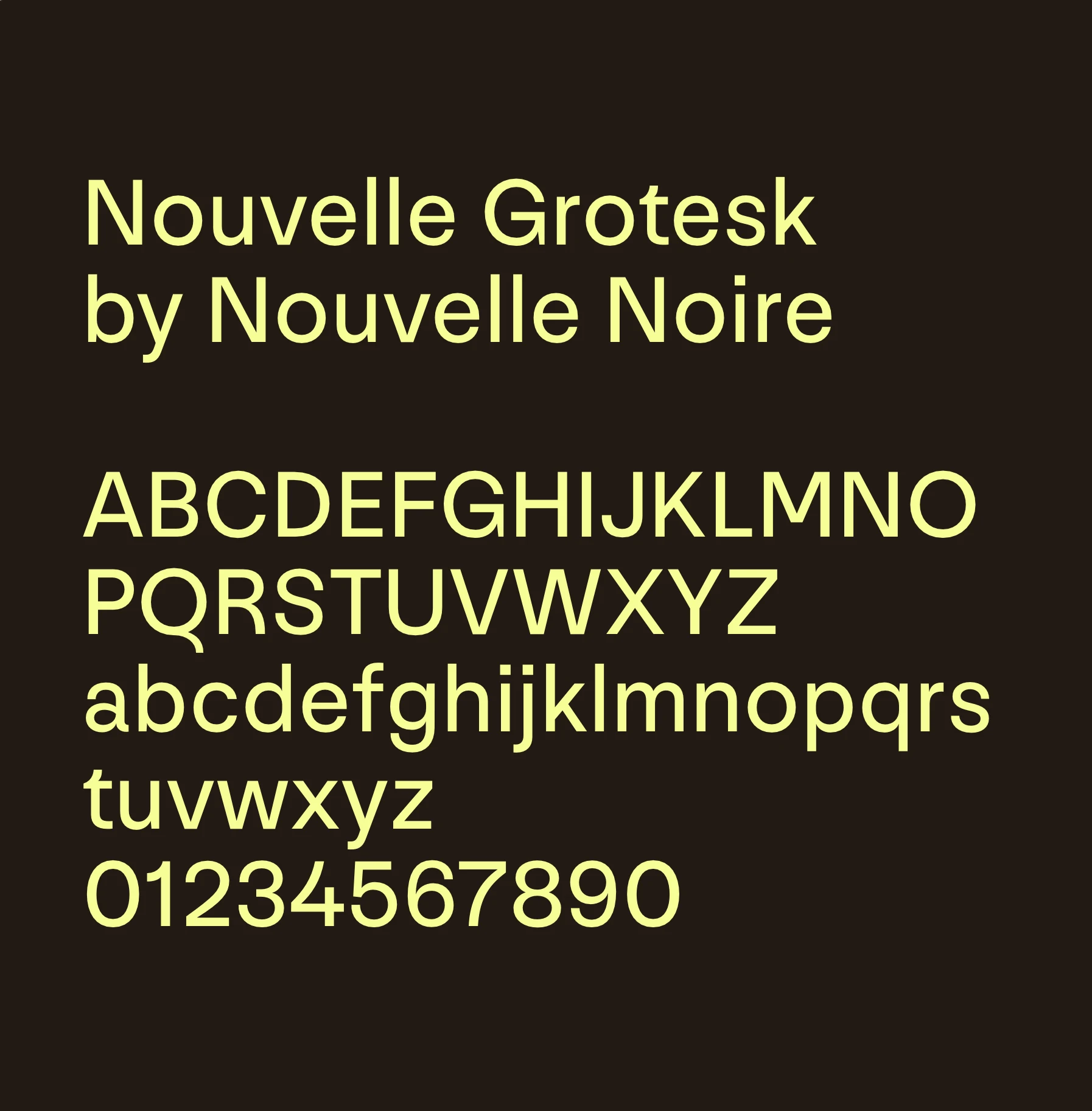
While the logotype is set up using Nouvelle Grotesk to honor the Swiss origin of the startup, the primary typeface for Rezonanz’s visual language is Ivar Fine, mostly used in the Regular Weight. Ivar is strongly influenced by the grace and sturdy construction of Times. The combination of both typefaces creates a balance in between the organic, feminine, and curvy shapes in the serif together with the more geometric accuracy of Nouvelle Grotesk.
Like this project
Posted Nov 14, 2025
Visual identity for Rezonanz, a Swiss sustainable-finance startup. The system draws from the idea of resonance and the ripple effects of responsible investing.
Likes
0
Views
3
Timeline
Dec 14, 2024 - Ongoing