OKO Children's Apparel Branding System
Jaxanna Martinez
🐥 OKO – Children's Apparel Branding System
* OKO is a conceptual project focused on creating a children’s clothing brand designed for imaginative play.
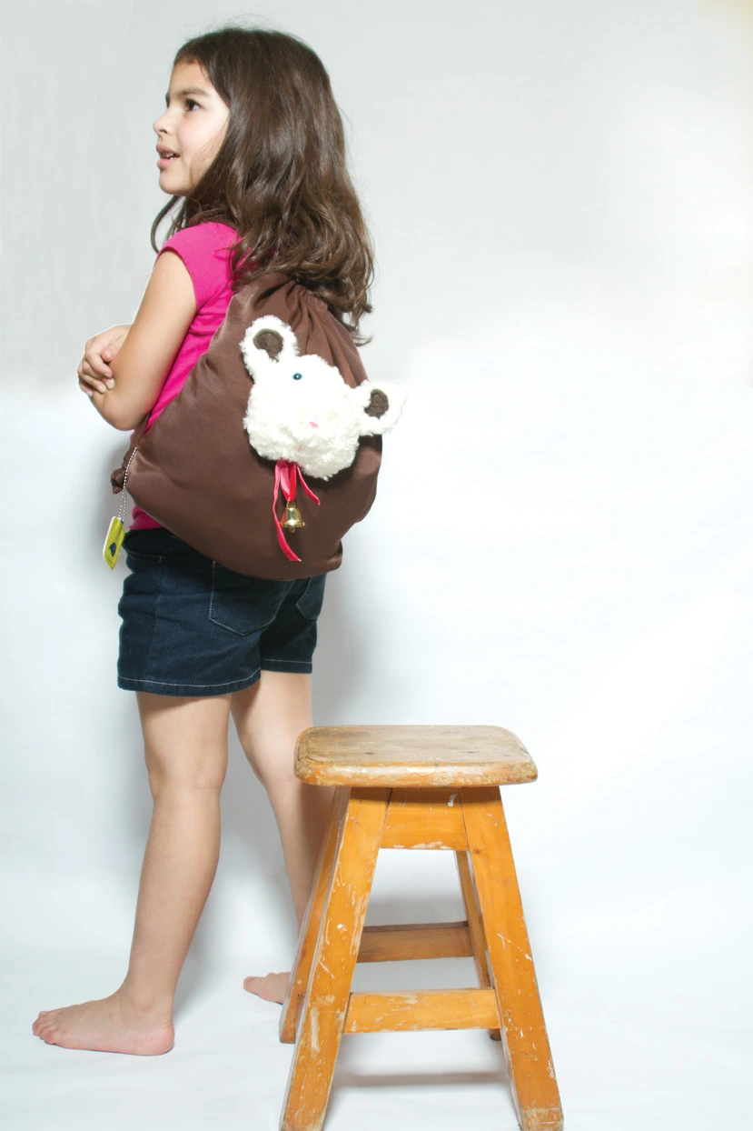
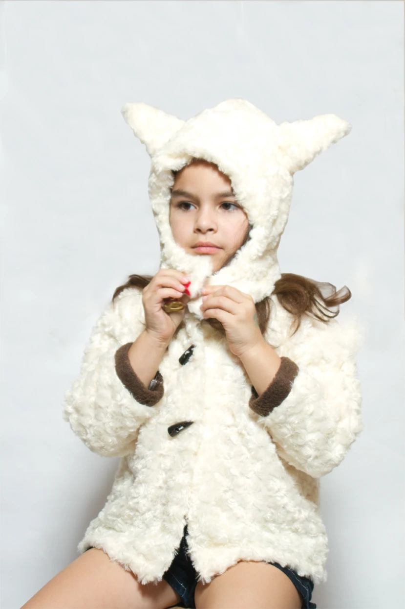
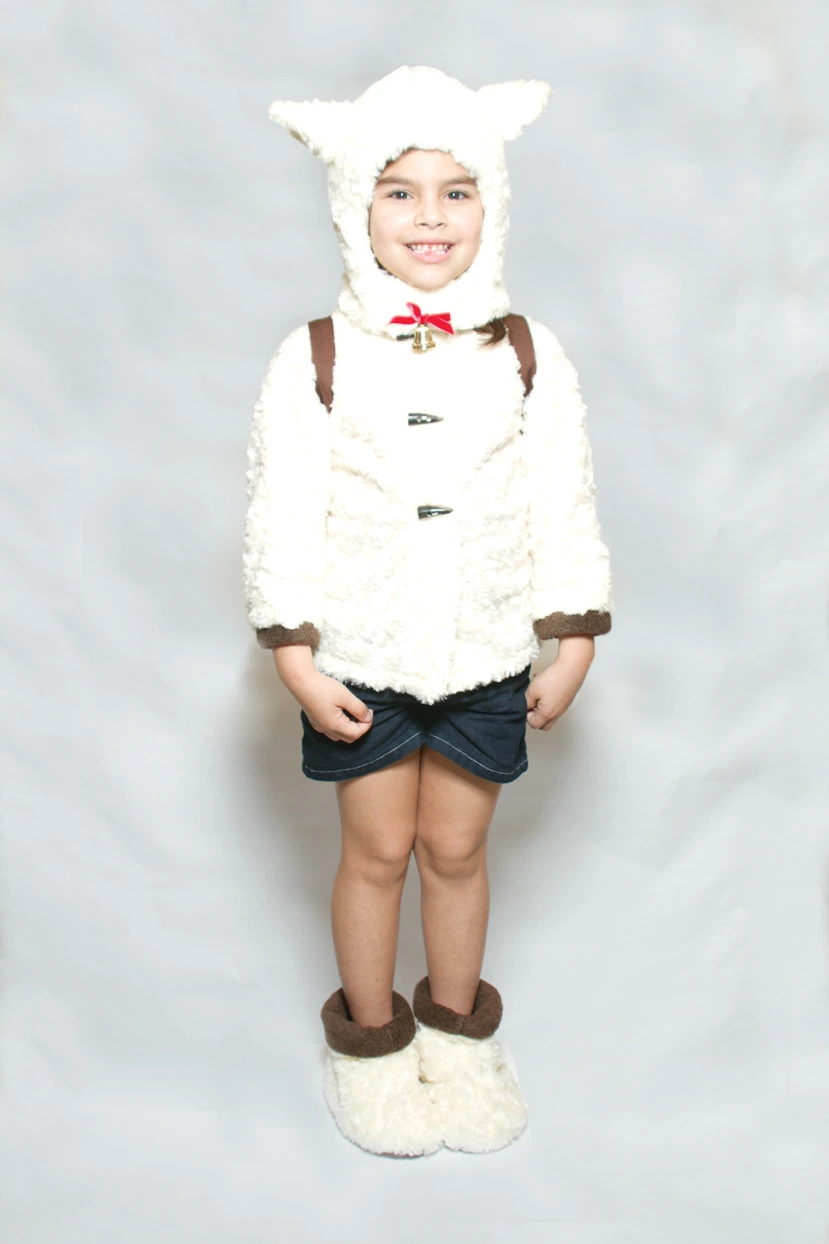
OKO is a playful children’s clothing brand created for little ones who love to dress up, imagine, and explore through costume. Designed with both imagination and sustainability in mind, OKO garments transform children into animals and characters—encouraging creativity and make-believe in everyday life.
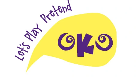
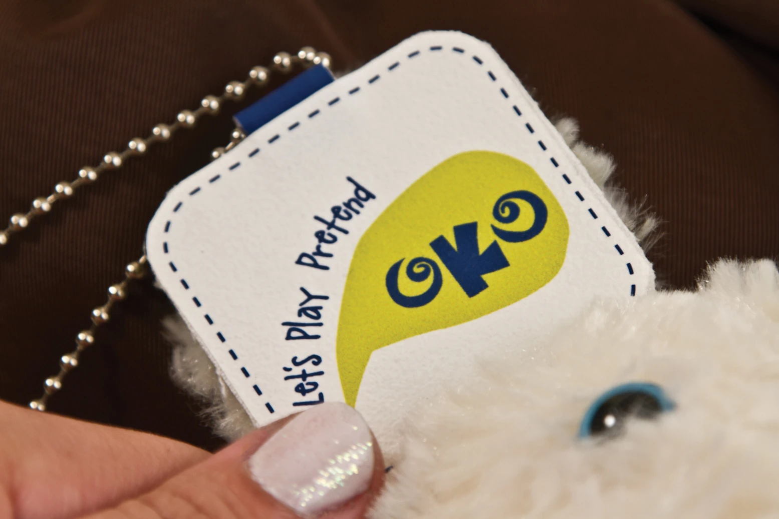
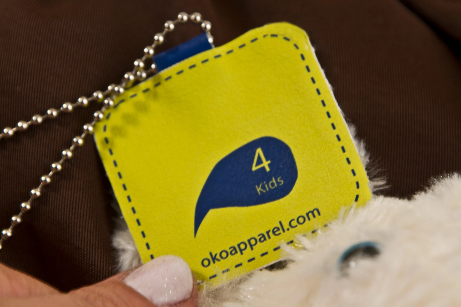
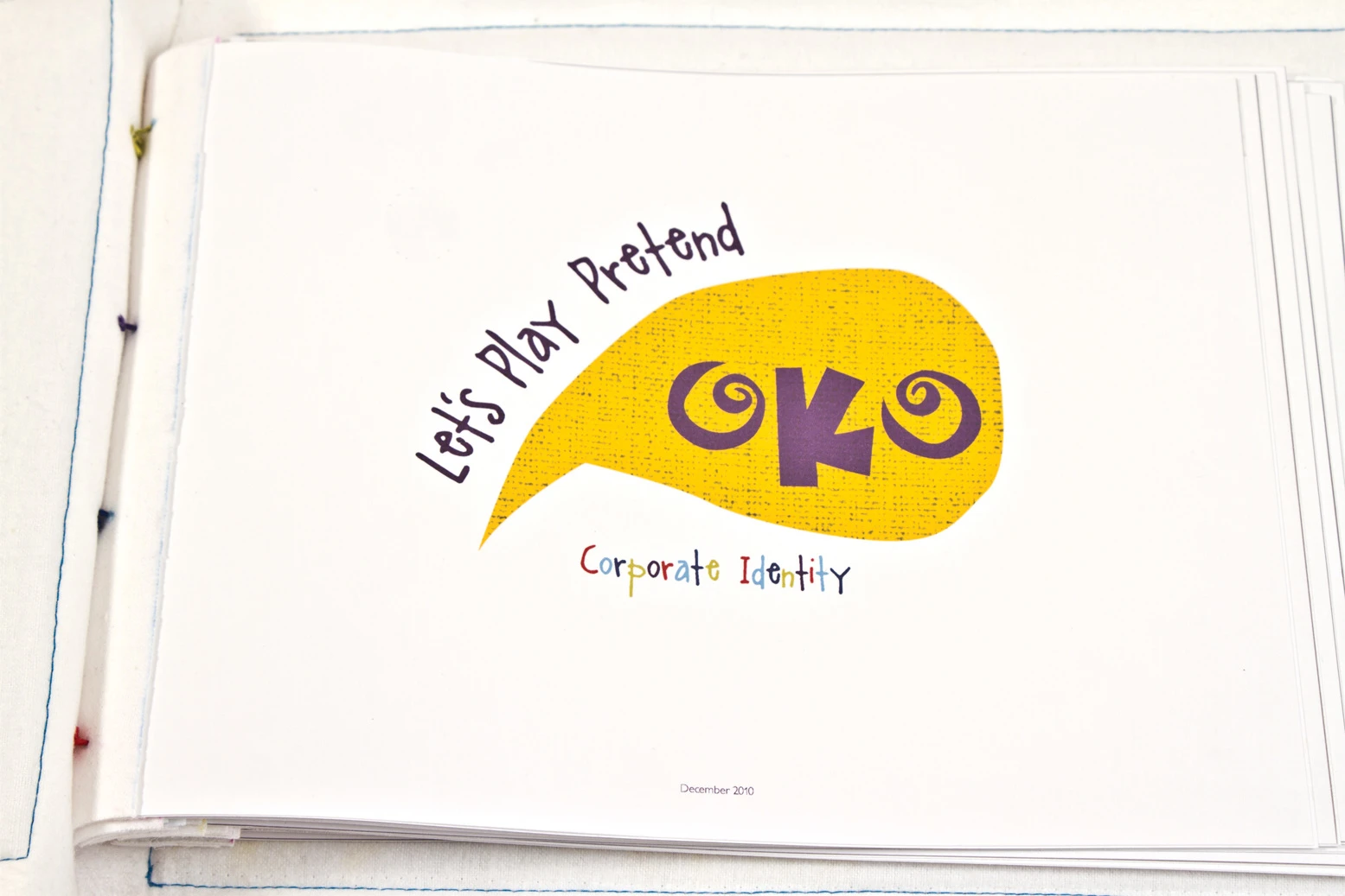
Children can be compared to baby chicks, so the OKO logo is built around an abstract chick head shape. The bold, spiraled “O” letters resemble wide-eyed curiosity, and the "K" represents the mouth of the chick, while the playful tagline “Let’s Play Pretend” arches around the mark like a bouncing giggle. The typography feels hand-drawn and expressive, echoing the joyful imperfection of childhood.
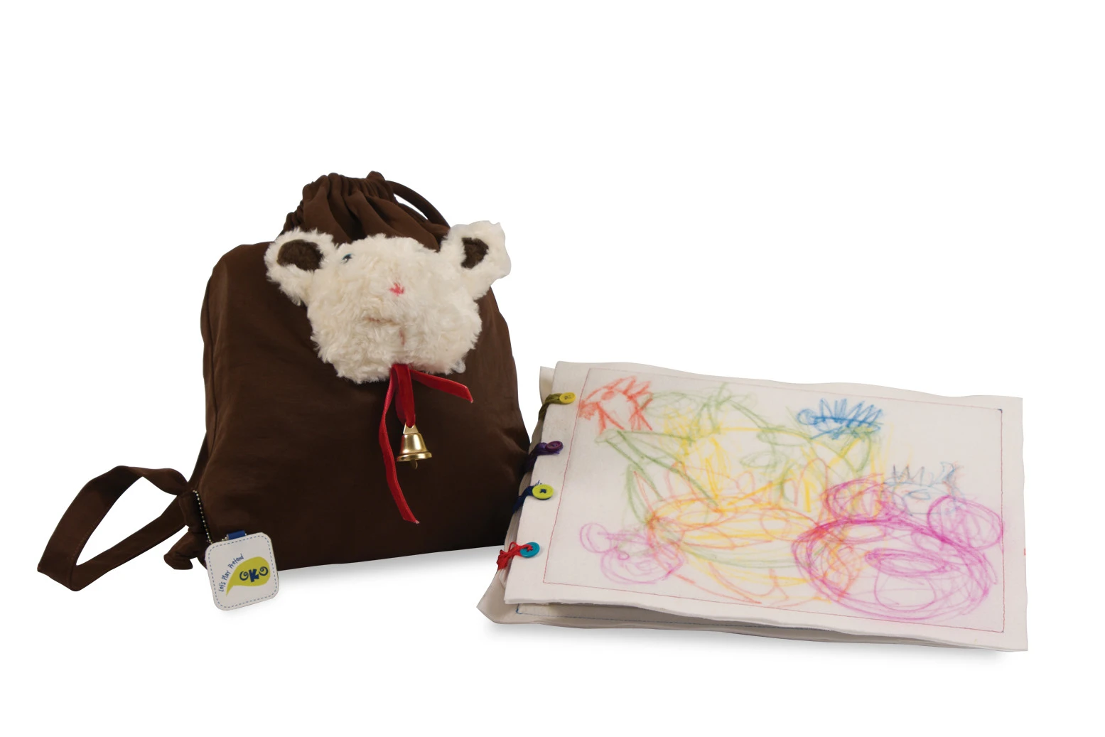
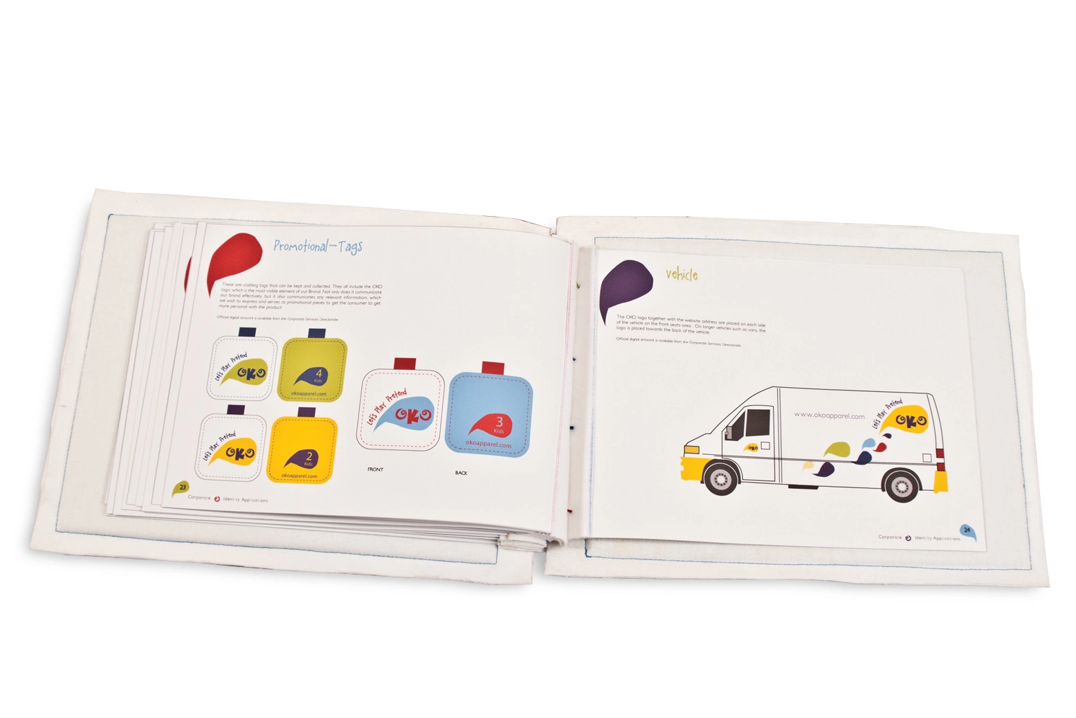
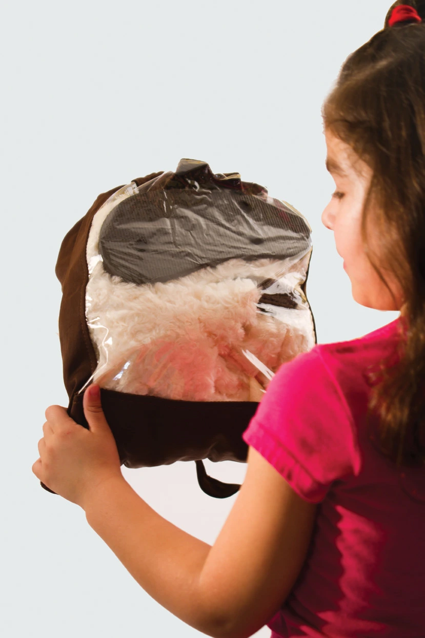
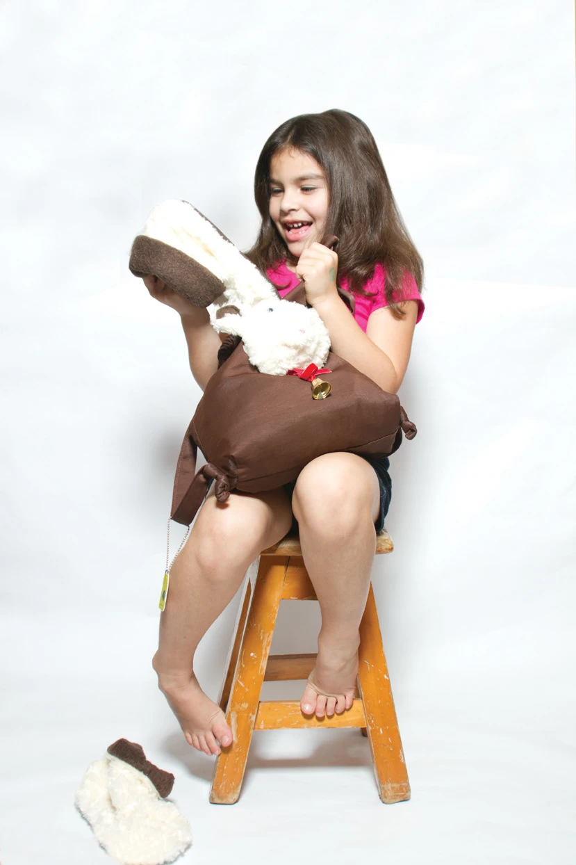
Each garment is designed with playful features—like ears, tails, or soft textures—that allow toddlers to "transform" into the characters they wear. The clothing tags serve as collectible accessories, printed on stitched fabric with rounded corners and bold color coding to indicate different age groups.
The packaging is both multi-functional and sustainable; it acts not only as a retail display system but also as a reusable drawstring bag or play pouch for children to carry their treasures.
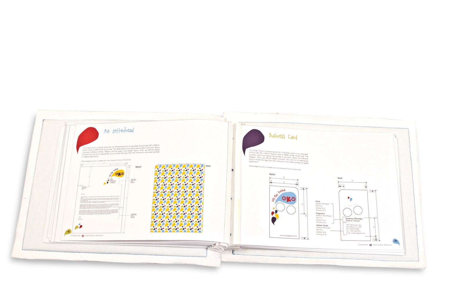
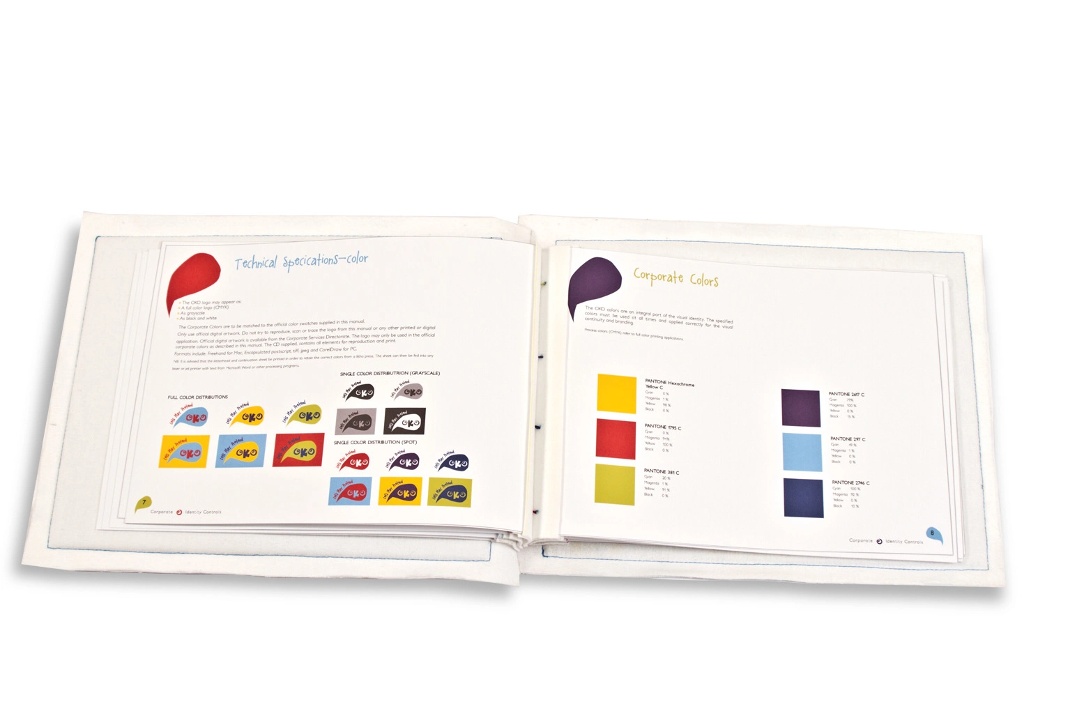
The OKO brand manual includes everything from corporate stationery and promotional items to delivery vehicle graphics. The visual system is driven by vibrant color palettes, modular design elements, and joyful typography—reflecting the spontaneity and boundless imagination of childhood.

Like this project
Posted Mar 30, 2026
Developed playful branding for OKO children's clothing to inspire imagination.
Likes
0
Views
2
Clients
OKO