Day 021 — Monitoring Dashboard | 100 days UI challenge
Hunter Buskirk
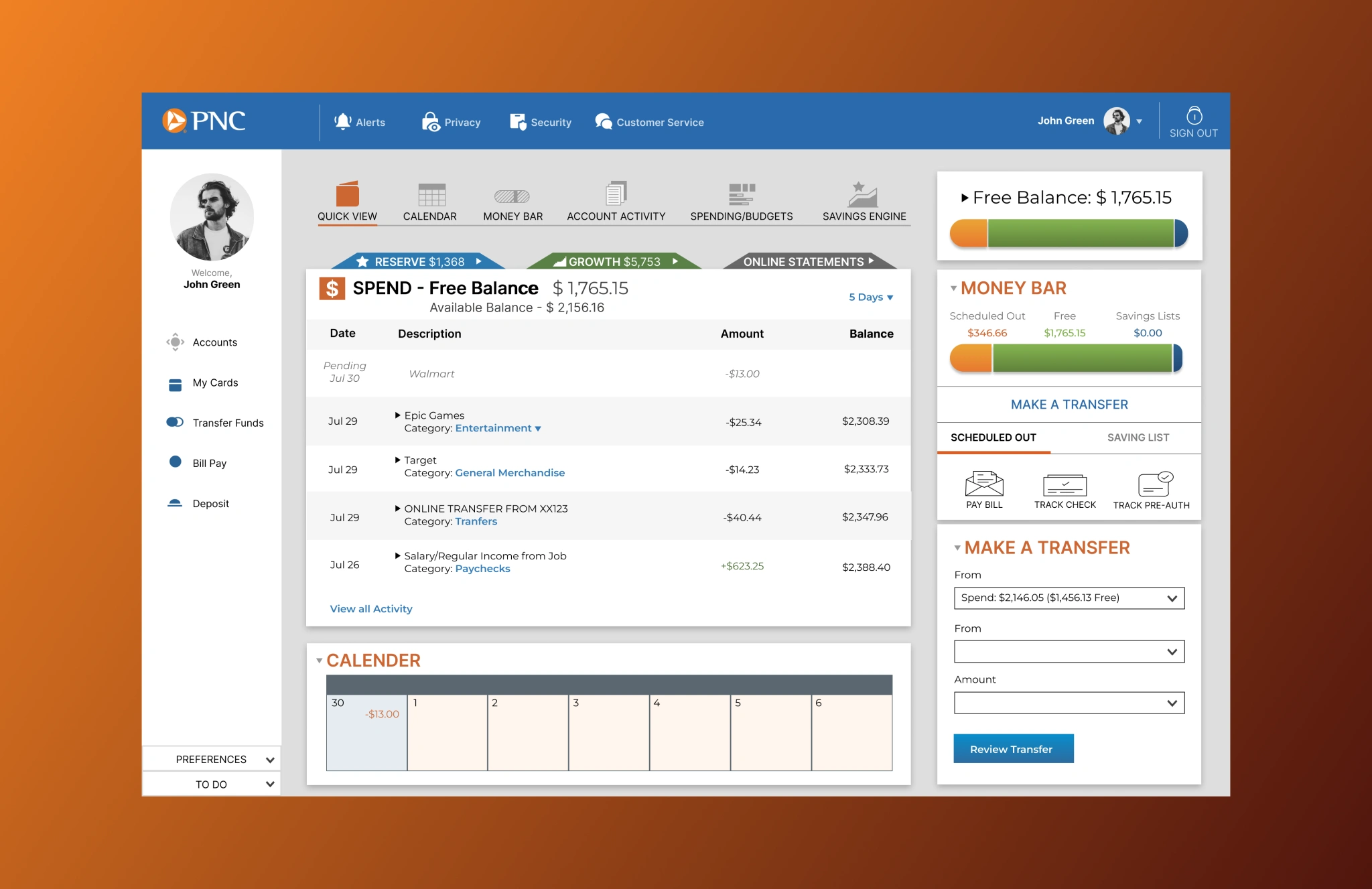
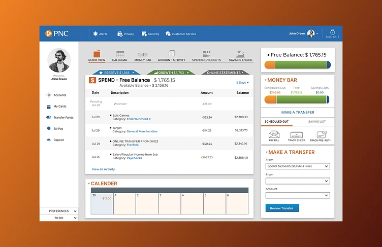
PNC Desktop Redesign.
I wanted to tackle an area I wasn't familiar with for this one, so I decided to do something with a financial structure behind it. The goal was to make simple edits to align more with the mobile version of the PNC dashboard as I felt the desktop version looked a bit dated. I changed a lot of navigation to different locations to help users move around the page more seamlessly. Overall, I am happy with the result, however, I am always open to any feedback. Thanks for reading!
Like this project
Posted Nov 21, 2025
PNC Desktop Redesign. The goal was to make edits to align more with the mobile version of the PNC dashboard, as I felt the desktop version looked a bit dated.
Likes
0
Views
2
Tags