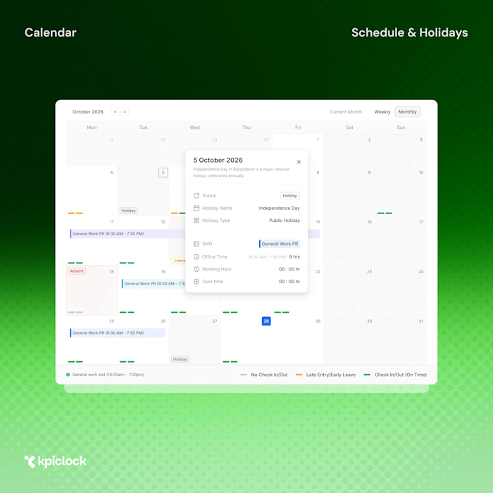
Designing & Building KpiClock SaaS Marketing Website

MD Robin Islam


Designing & Building a SaaS Website in Framer That Sells Against Hubstaff, BambooHR & DocuSign
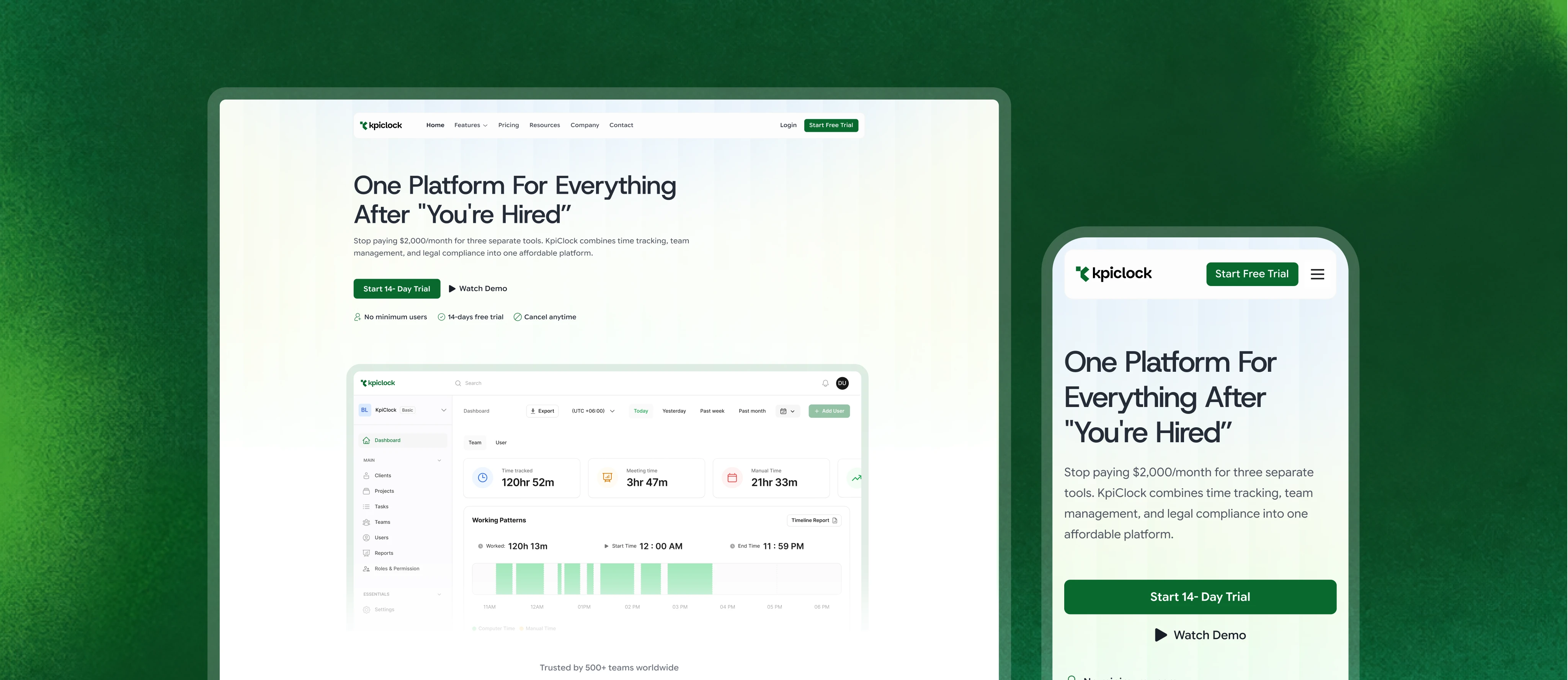
KpiClock had a hard sell: convince teams to drop three tools they already pay for — Hubstaff, BambooHR, and DocuSign — for one platform they've never heard of. That's not a design problem you solve with a nice hero. It's a positioning problem you solve with structure.
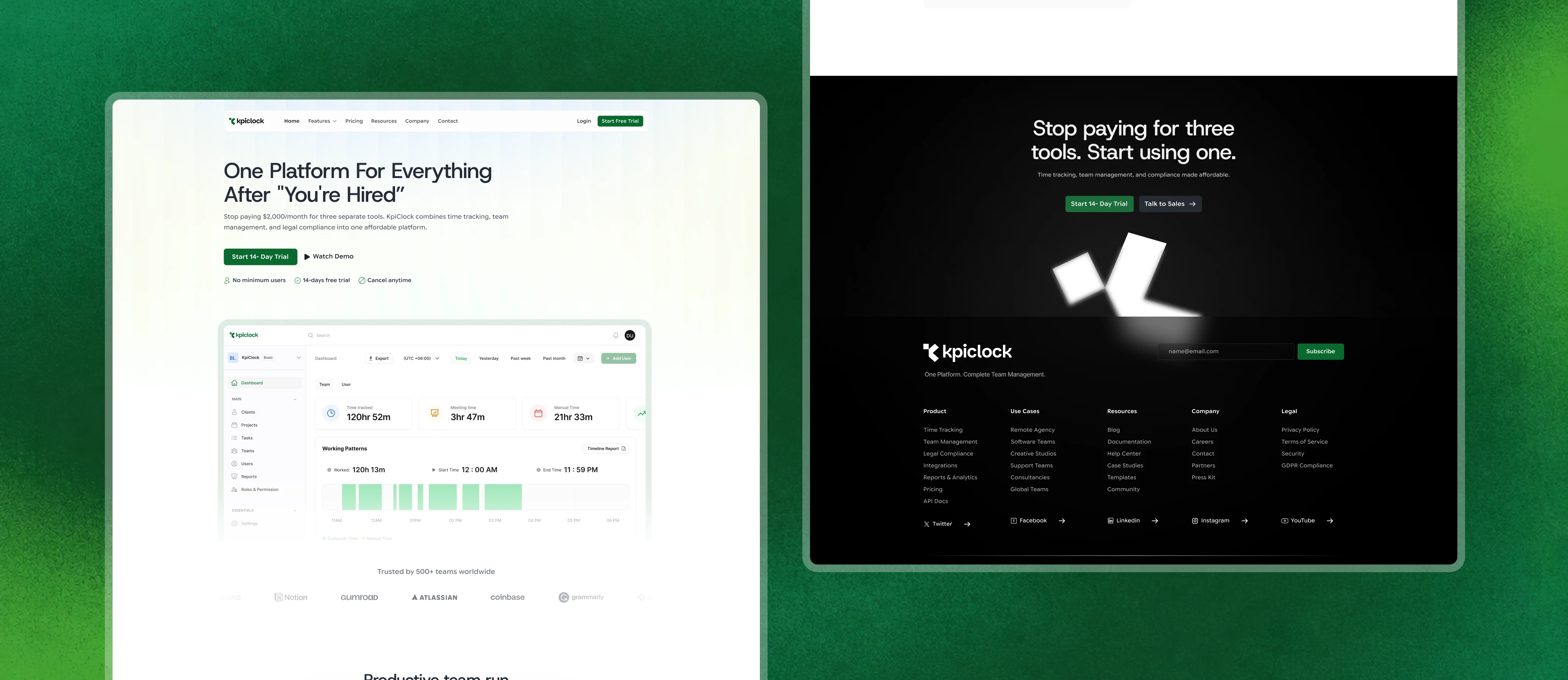
I led the design and build of KpiClock's marketing website in Framer — 11 pages, 3 weeks, launch-ready. My product design team shaped the experience; my Framer development team built it. Here's how we turned a crowded, skeptical category into a clear, confident pitch.
11 Unique pages
3 weeks Design + build
Framer Platform
SaaS / HR-Tech Industry
Scope:
Full marketing website — design + Framer build
My role:
Lead (design + development direction)
Delivered by:
Product design team + Framer development team
The team took our complicated all-in-one pitch and made it feel simple and credible. They designed and shipped our entire Framer site in three weeks, and it looks like the work of a company far bigger than us. Exactly the launch presence we needed.
— KpiClock
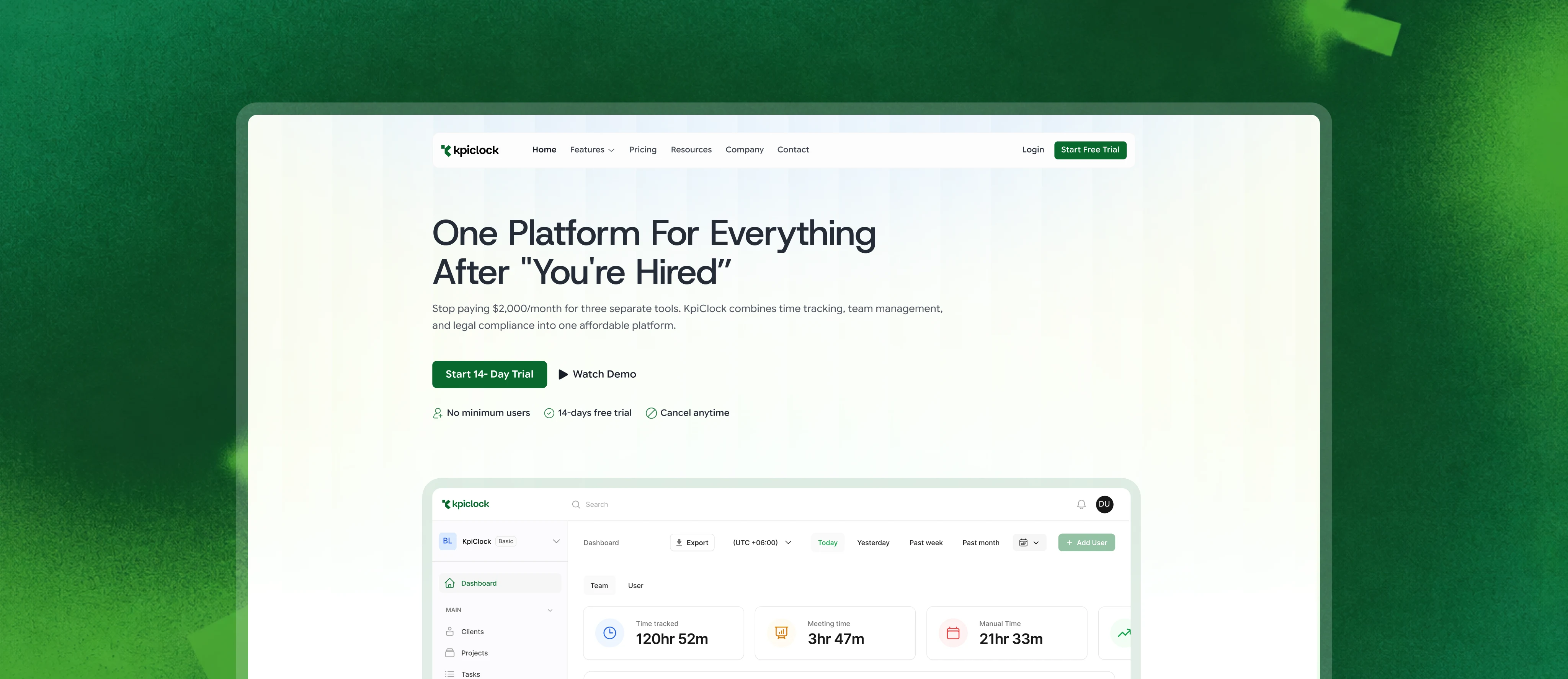
The challenge: sell simplicity in a complicated category
Time tracking, HRMS, and eSign are three mature software categories, each owned by a giant. KpiClock's entire pitch is "replace all three with one, for a fraction of the price." That's a strong offer — but only if the website makes it feel obvious, not too-good-to-be-true.
The design challenge broke into three real problems:
→ Trust. A brand-new SaaS competing with billion-dollar incumbents has to look more credible than its size, not less.
→ Density. The product does a lot — time tracking, attendance, leave, productivity monitoring, document signing, reports, integrations. Show all of it and you overwhelm; hide it and you undersell.
→ Proof of value. The whole promise is cost savings. The site had to prove the math, not just claim it.
How I approached it
I anchored the site on one idea from the homepage down: one platform for everything after "you're hired." Every section had to reinforce that the all-in-one story is real and the savings are concrete.
A few of the deliberate design decisions:
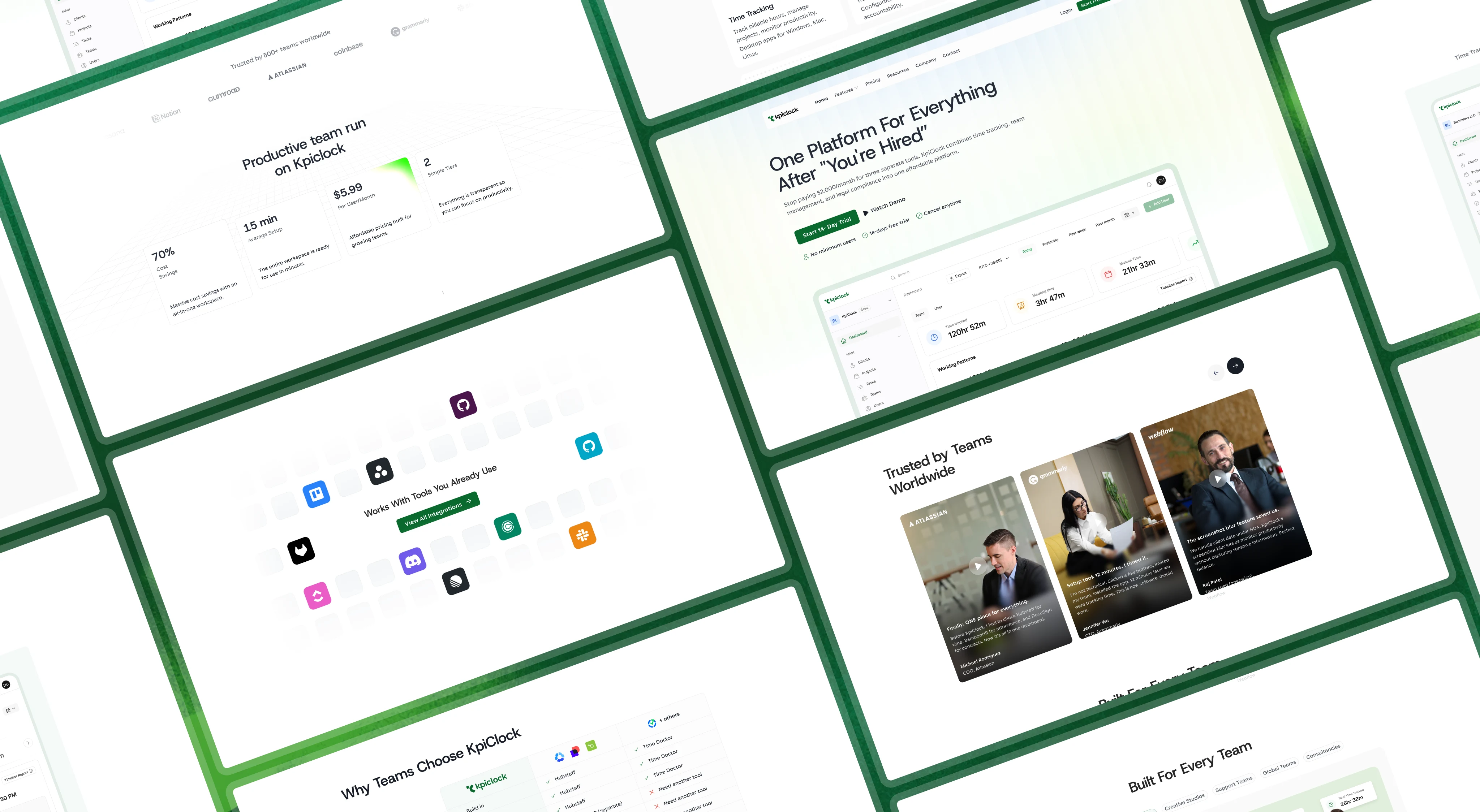
→ A problem/solution spine. Rather than open with features, the site opens with the pain (paying $45+/user across three tools, scattered data, complex setup) and answers each with KpiClock's counter. The visitor sees themselves before they see the product.
→ An interactive comparison table. The strongest sales asset on the site — a direct, honest cost comparison against Hubstaff, Time Doctor, and the BambooHR + DocuSign stack, showing real monthly cost and annual savings. This turns "trust us, it's cheaper" into a number the visitor can check.
→ A tabbed "See KpiClock in Action" module — letting visitors explore the product (time tracking, teams, clients, projects, tasks, leave) without leaving the page or drowning in screenshots.
→ A "Built For Every Team" switcher — one section that speaks to agencies, software teams, creative studios, and support teams individually, so each visitor feels the product was made for them.
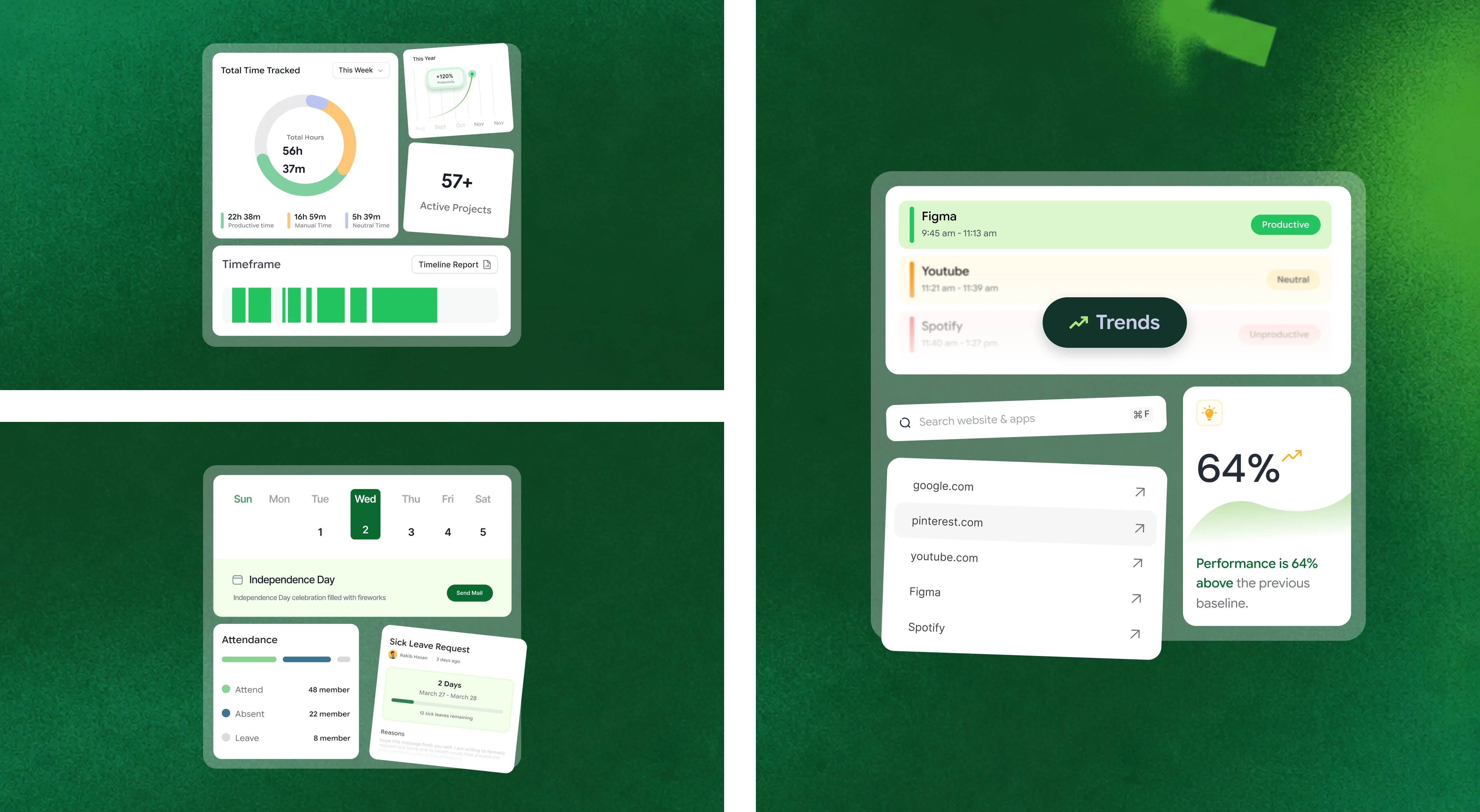
→ Density handled through progressive disclosure — feature grid up top for scanners, a deep-dive section below for evaluators. Fast readers and thorough readers both get served.
Building it in Framer
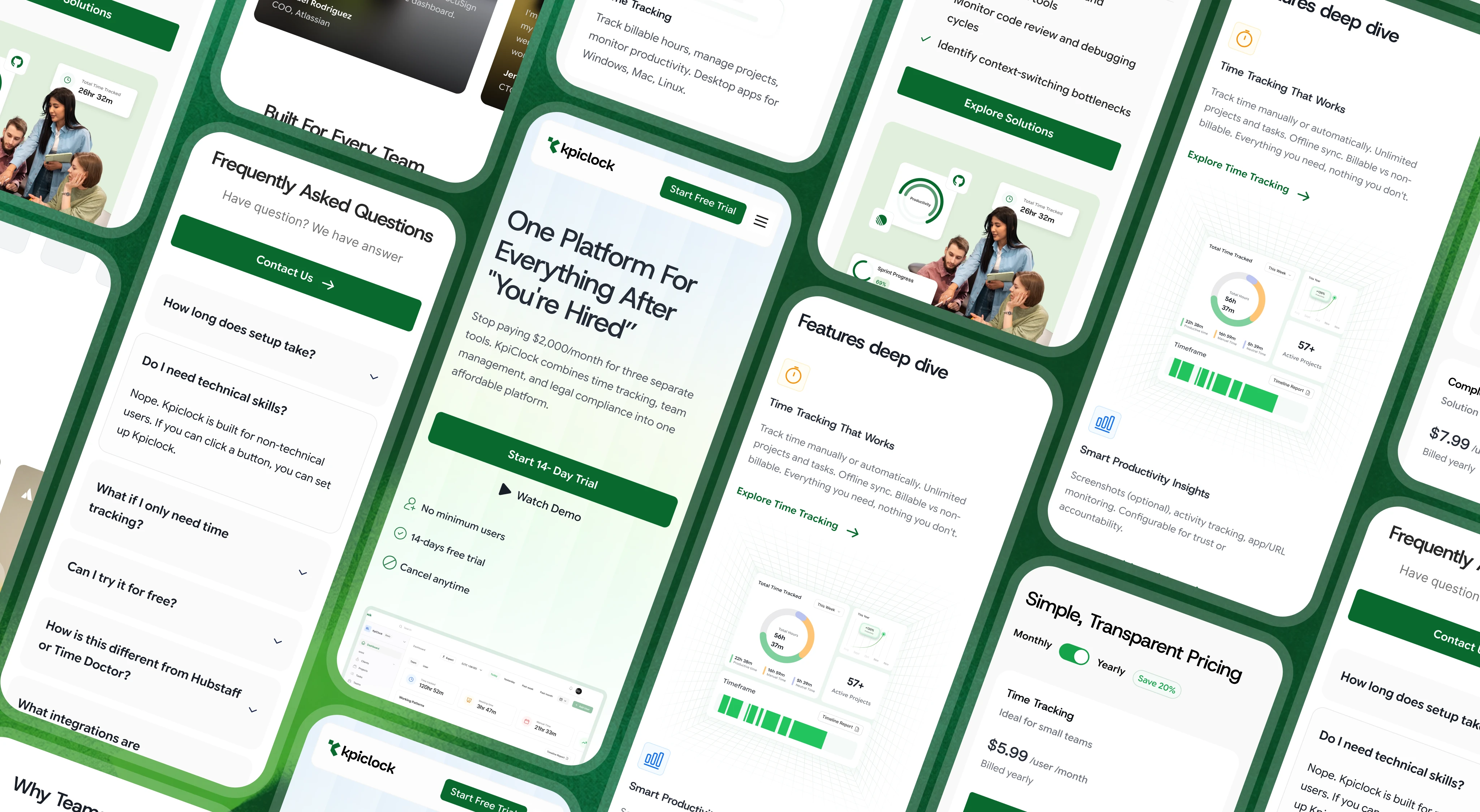
The build had to do three things at once: look premium, load fast despite heavy product imagery, and stay fully responsive across a lot of complex, interaction-heavy sections.
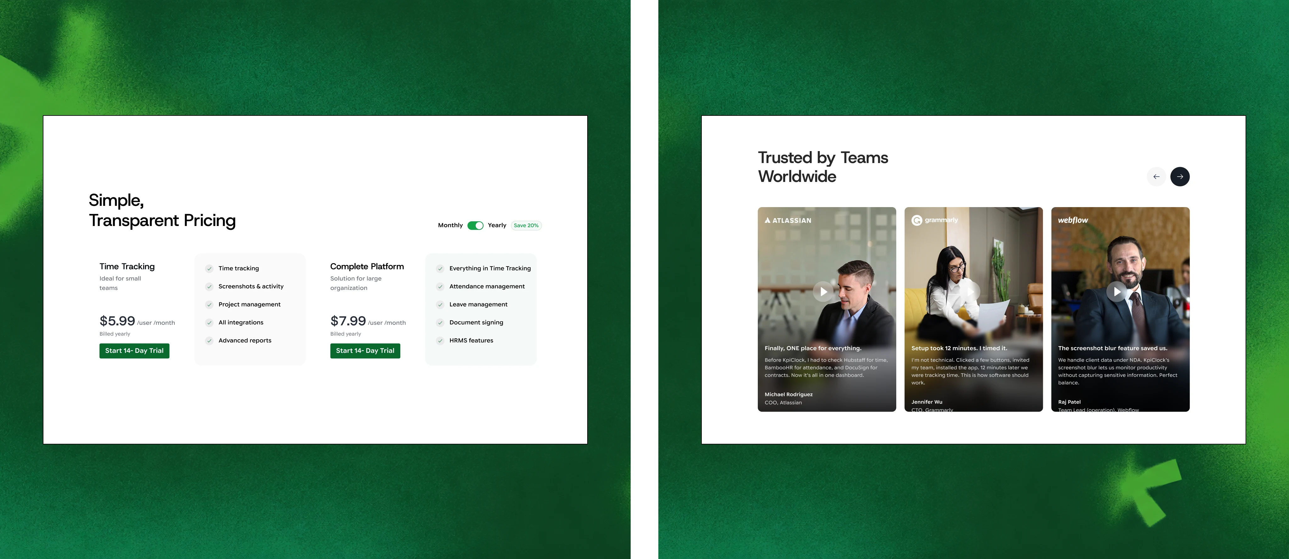
Working in Framer let us move from design to a live, polished, interactive site in three weeks — with motion, tabbed components, a pricing toggle, and the interactive comparison table all built natively, and a CMS structure the KpiClock team can manage themselves after launch. The result is a site that behaves like a custom-coded product page but stays fully editable by a non-technical team.
Where it got hard
The comparison table was the quiet monster of this build. It's the most persuasive element on the site — and the hardest to make feel clean. Cramming time tracking, screenshots, attendance, leave, eSign, setup time, and cost-per-50-users into a table that's honest, scannable, and doesn't look like a spreadsheet took real iteration. Getting it to stay legible and premium on mobile was harder still. But it's the section that turns a browser into a believer, so it earned the effort.
The outcome
An 11-page marketing site, designed and built in Framer in 3 weeks, launch-ready:
A clear, confident positioning against three entrenched competitors
An interactive cost-comparison tool that makes the savings undeniable
A dense product made to feel simple through progressive disclosure
A fully responsive, fast, motion-rich site the client's team can edit themselves
The best SaaS sites don't just list what a product does — they make the decision feel easy. That was the whole job here.
Like this project
Posted Aug 21, 2026
Full 11-page SaaS marketing website designed & built in Framer in 3 weeks — interactive cost-comparison tool, tabbed product demos, fully responsive. I led it.
Likes
0
Views
13