Sismo App v2 Interactive Prototype Design

Göksu Dayan

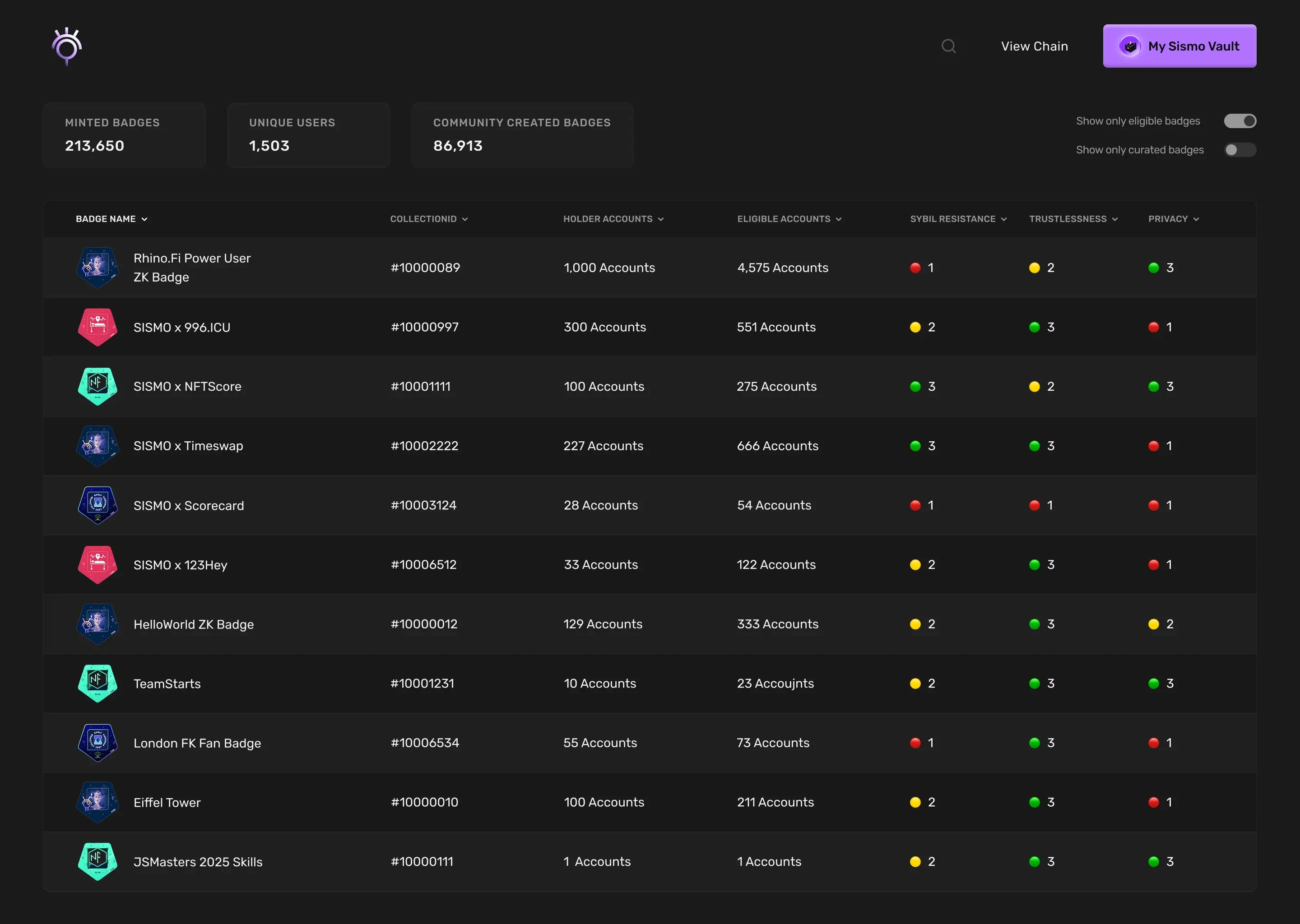
A design exercise completed partly in collaboration with the Sismo team, focused on a more interactive badge experience and a unified dashboard for Sismo App v2.
Sismo - Design exercise - Web prototype
01 / The brief
The next version of a privacy-focused product.
Sismo worked on Web3 digital identity and privacy-preserving experiences. The assignment was to produce an interactive prototype of a possible next version, Sismo App v2. This was a design exercise completed partly in collaboration with the team; I do not present the interface as a shipped product.
The team asked for four changes: bring the separate Playground and Curated environments into one flow, make the app more interactive, show which badges a person was eligible for, and make badge data easier to understand.
02 / Design principles
Keep people oriented as the app expands.
I set three principles at the start of the assignment:
Continuity: both interactions and visuals should make the user flow feel connected.
Freedom to move: the experience should allow people to return to and interact with elements as often as they need, rather than forcing a one-way path.
Scalability: each design decision should leave room for the product to grow.
Build only the system this prototype needed.
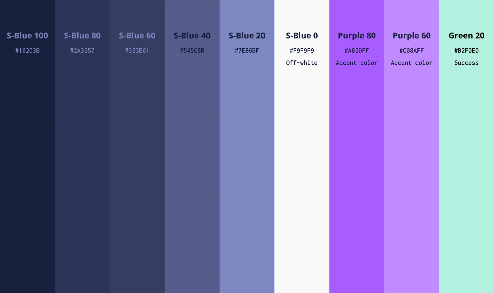
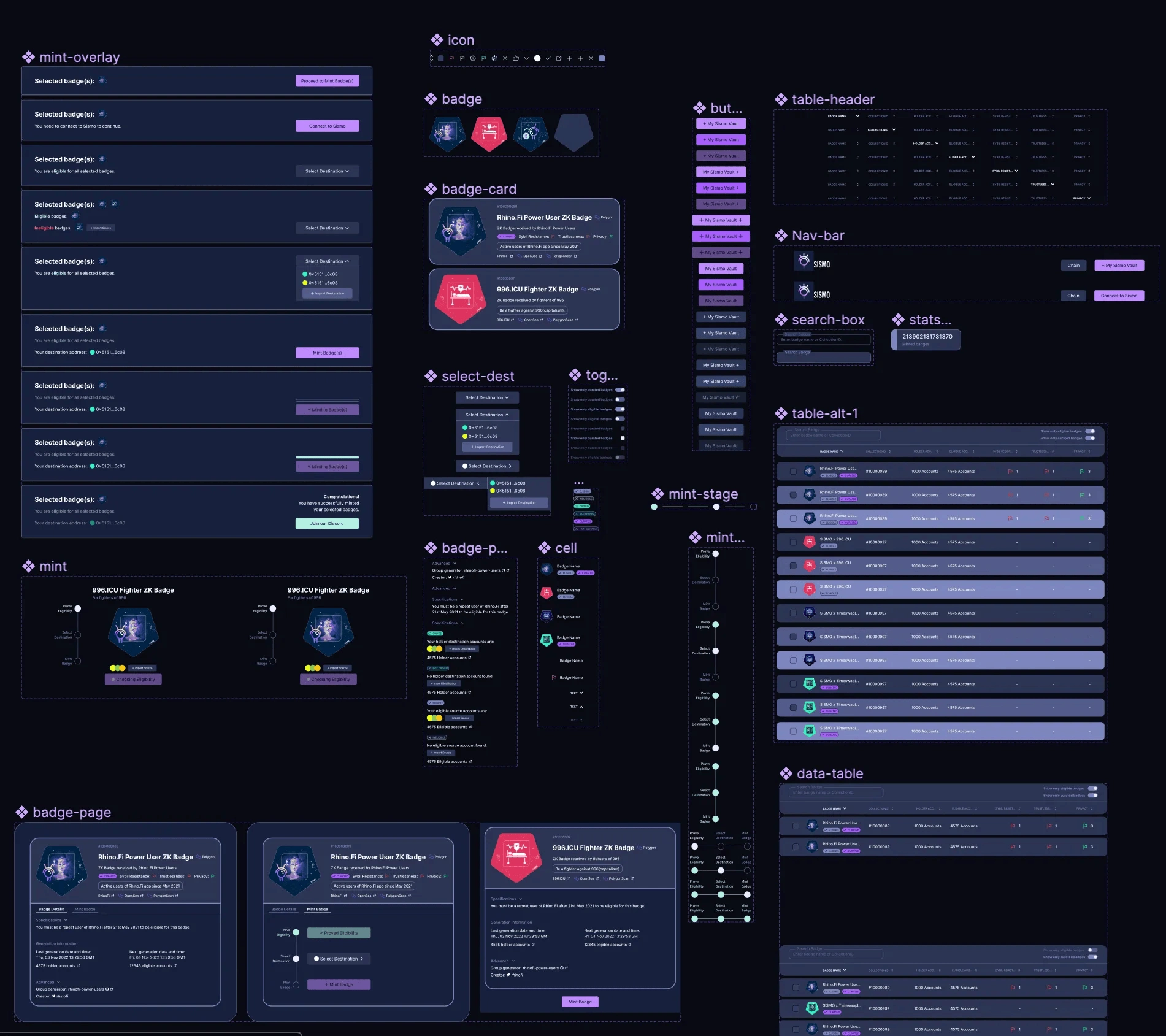
The starting design system had only a few components. The assignment was broad, and I had one week to complete it, so I built a leaner system around the pieces the prototype would actually use. The intent was to speed design work and make a future handoff clearer without creating unused components.
Show badge details without breaking the flow.
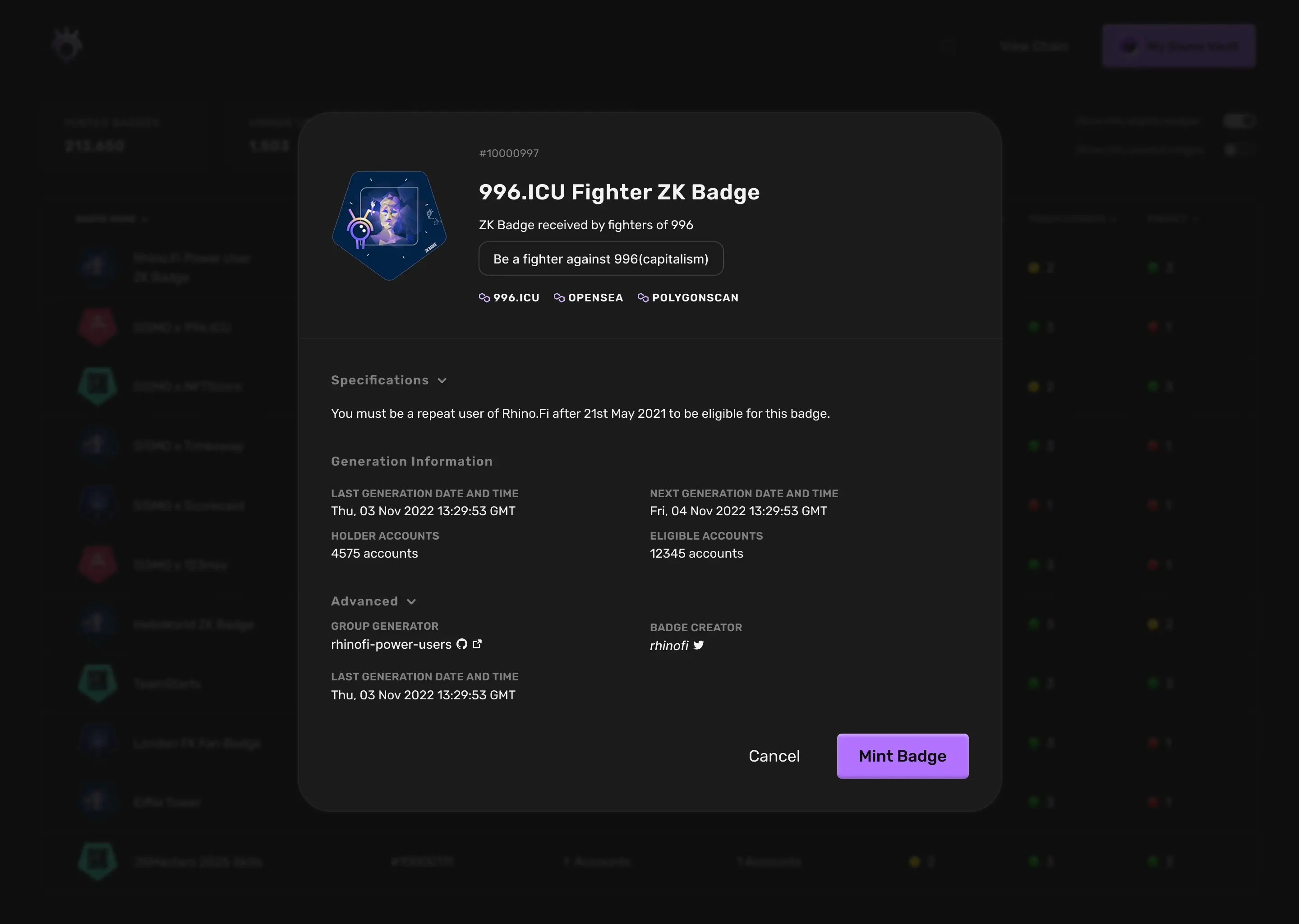
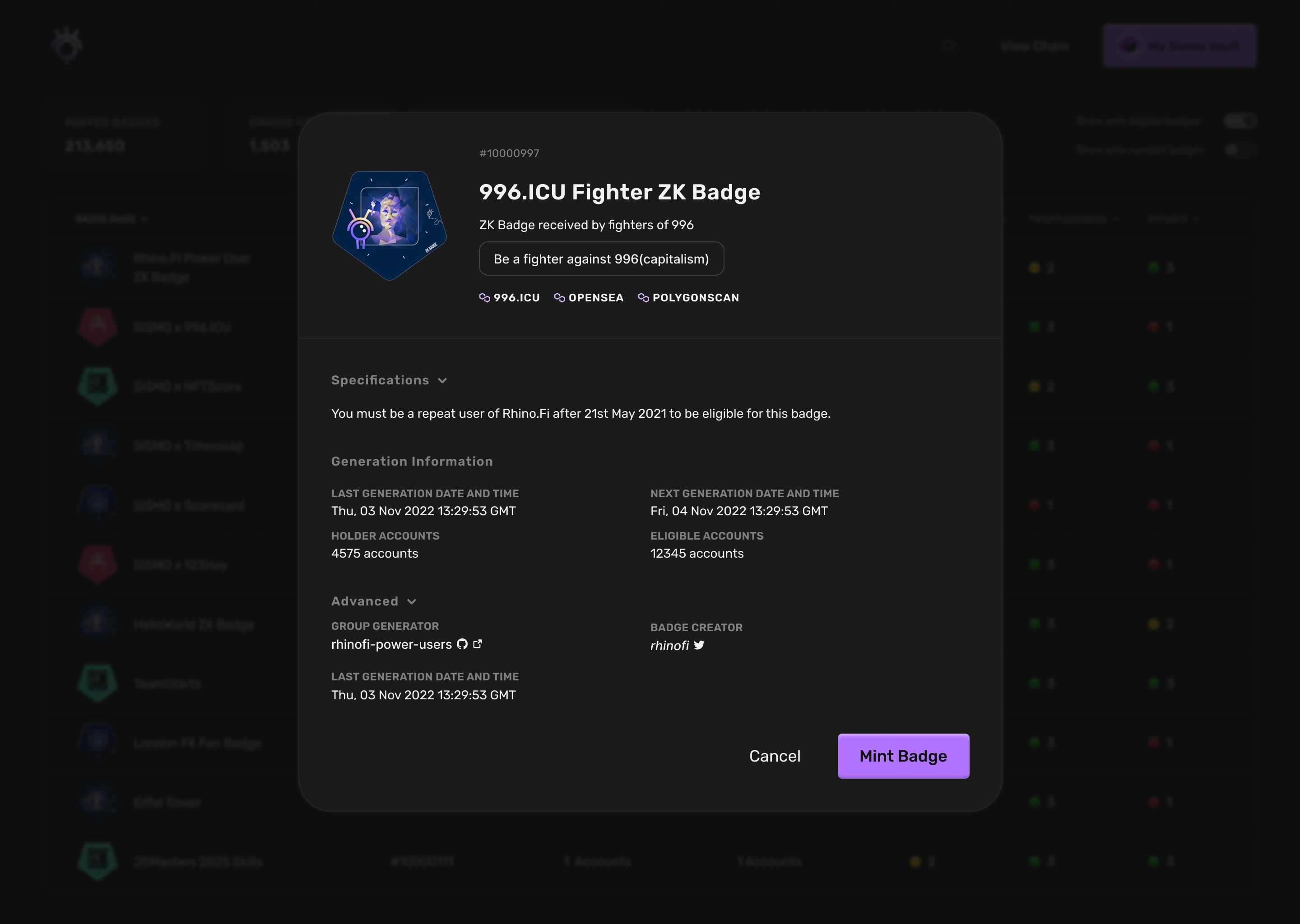
Badges are the basic units of Sismo's product, so their information has to be easy to inspect. In the existing app, opening a badge took the user to a separate page. I used an overlay in the prototype to keep the surrounding context visible and make the experience feel more continuous.
I also explored a tab view to strengthen that continuity and give the interface more room to scale. The Sismo team preferred not to take that idea forward. I still considered it worth exploring, but it was not part of the chosen direction.
Bring badge discovery into one place.
The new main page brought Curated and Non-Curated badges, previously separated into different environments and flows, into one table. It added badge statistics, filters for eligibility and curation, hover states, and clearer badge data.
The existing app gave people little room to act on multiple elements. Multiple selection was therefore a priority: users should be able to select several badges and reach minting in only a few clicks. This was a prototype direction within the design exercise.
Like this project
Posted Sep 28, 2026
Designed an interactive prototype for Sismo App v2, focusing on unified dashboard and badge experience.
Likes
0
Views
1