
Concept & Brand Naming
The brand name ÇEKO is derived from a portmanteau of two core ingredients: "Çerez" (nuts/hazelnut) and "Kakao" (cocoa). The visual identity is built around warmth, approachable nostalgia, and high ingredient honesty, merging a rich hazelnut spread formula with vintage-inspired packaging.
Visual Identity & Mascot System
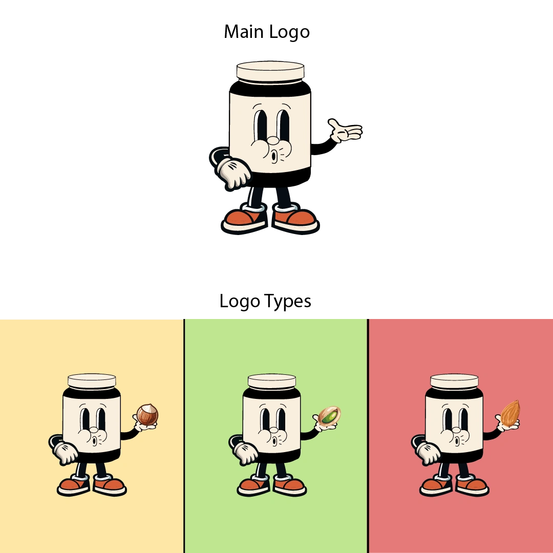
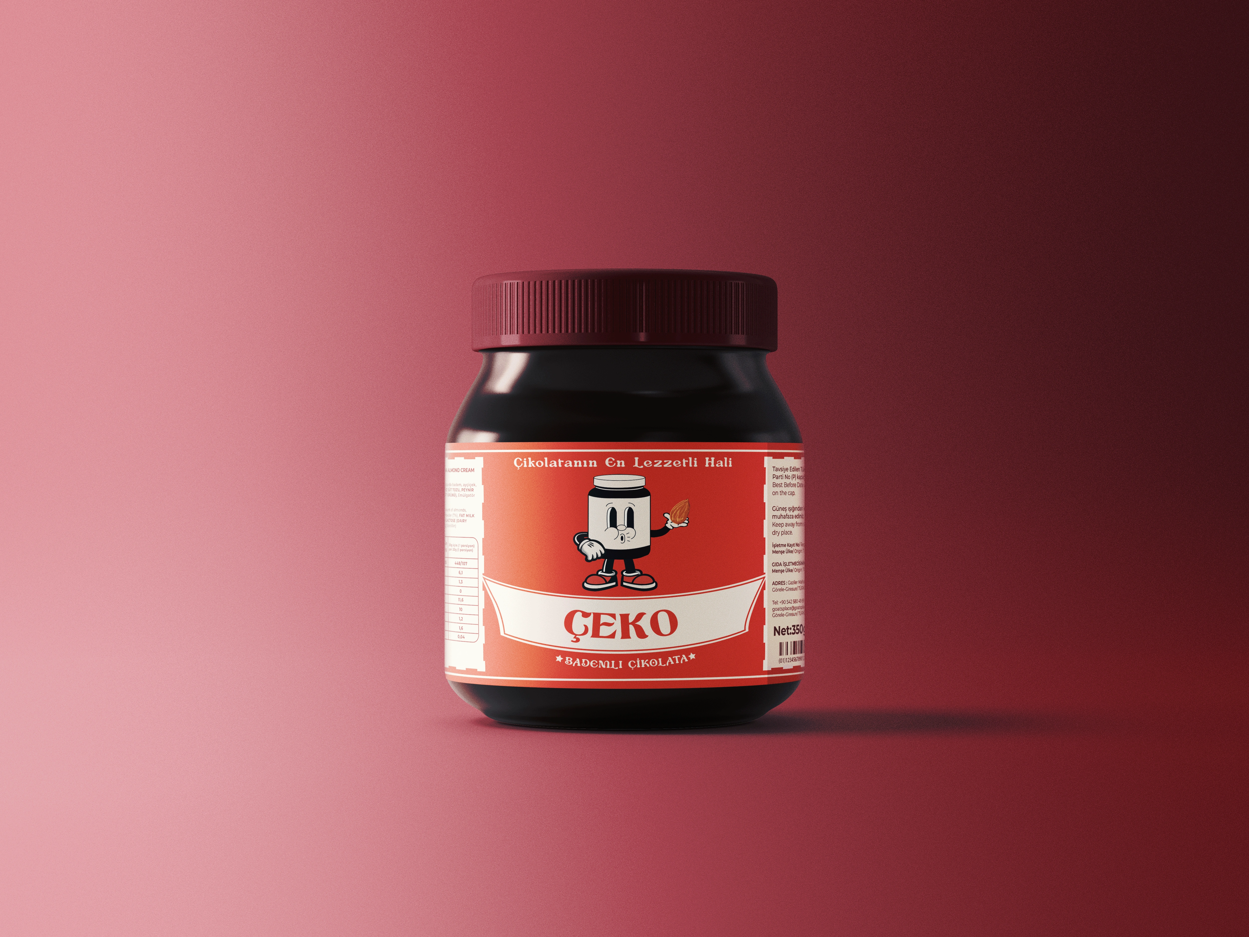
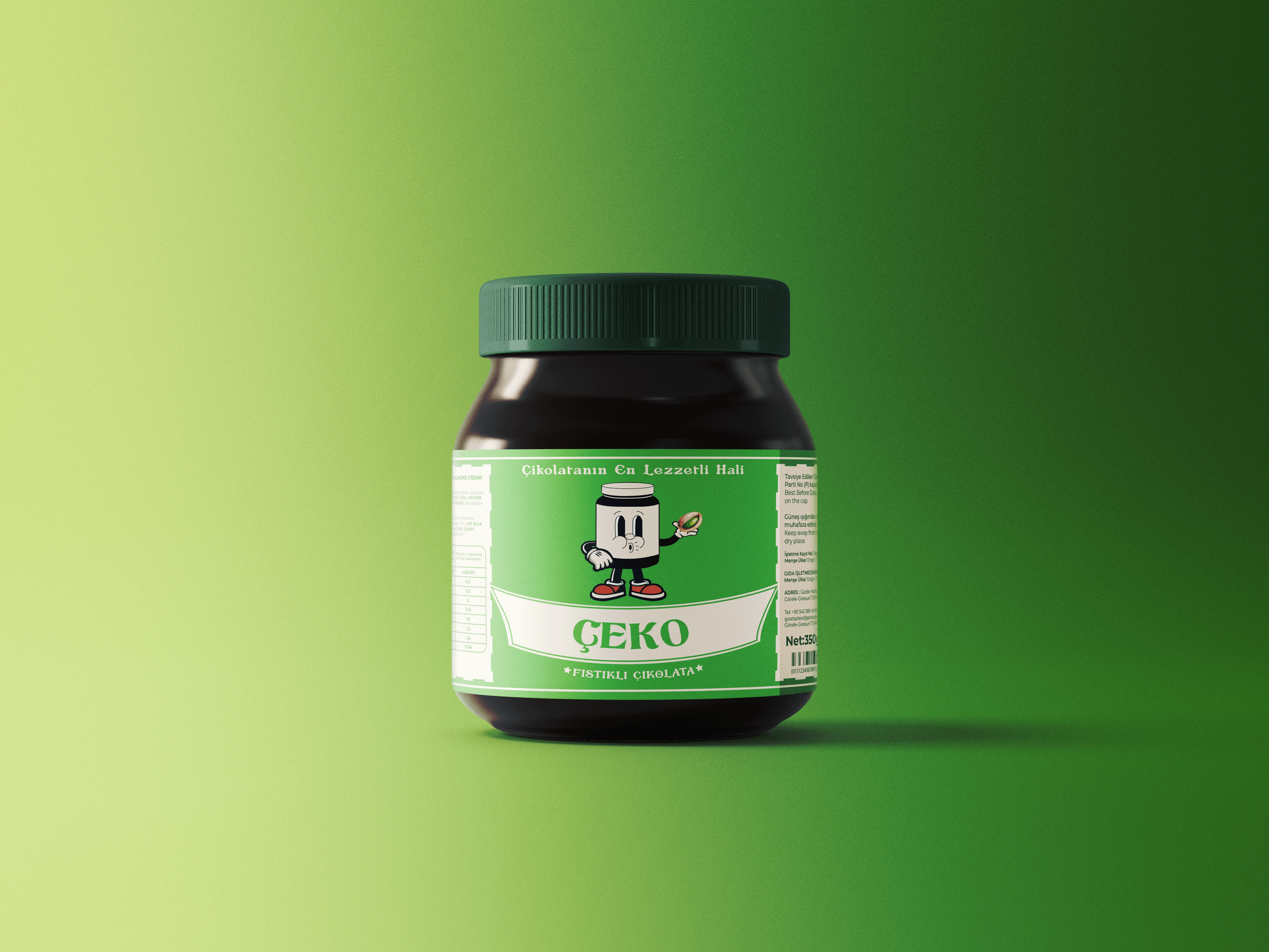
The central brand asset is a custom mascot illustrated in a 1930s rubber-hose animation aesthetic, designed to inject playful personality and instant shelf recognition:
Form & Silhouette: The character body is modeled directly on the product's glass jar silhouette, featuring expressive pie-cut eyes and an inviting retro grin.
Hero Element: The mascot holds a whole roasted hazelnut, visually anchoring the high nut-ratio formula and ingredient transparency.
Accents & Attire: Styled with classic cartoon gloves and dynamic retro sneakers to emphasize movement, warmth, and friendly morning energy.
Packaging & Color Palette
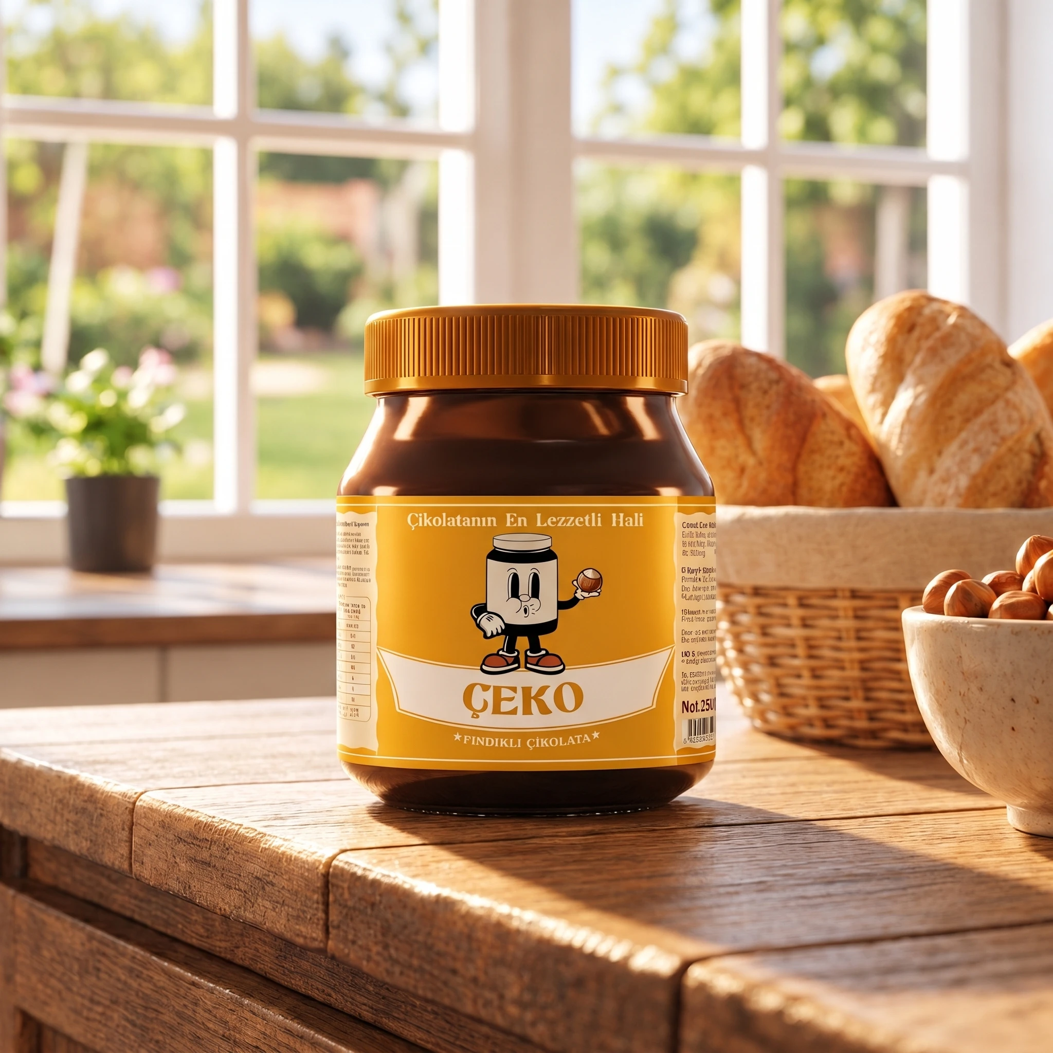
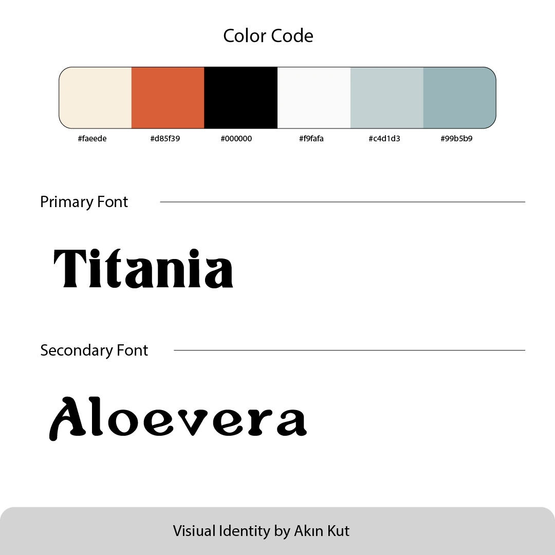
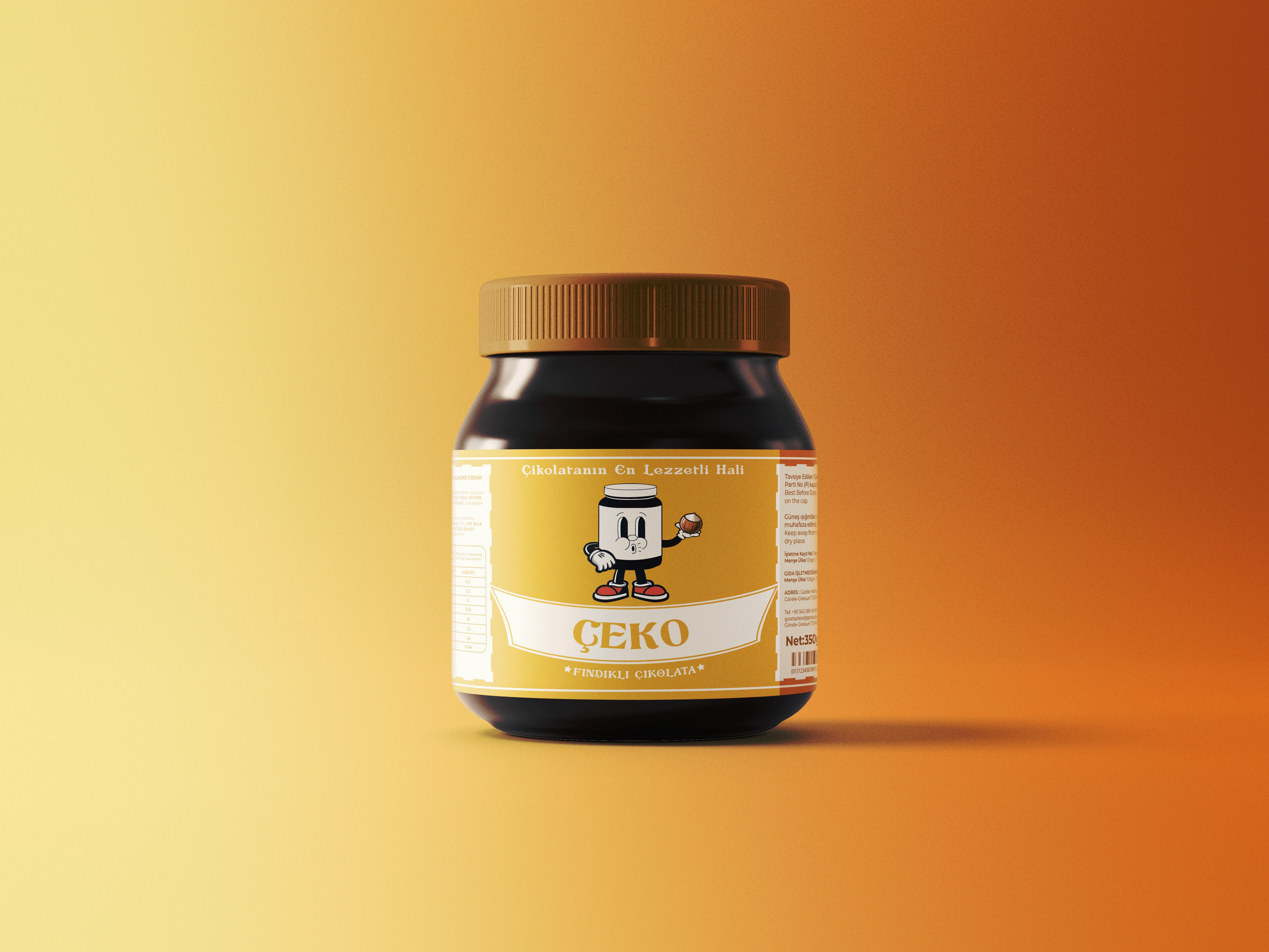
Primary Label Tone: Warm mustard/golden yellow base delivering high shelf contrast against dark cocoa spread tones.
Secondary Accents: Deep chocolate brown and cream ribbon banner housing the bold serif logotype ÇEKO.
Sub-branding & Typography: Balanced hierarchy with secondary flavor callout (Fındıklı Çikolata) centered beneath the main brand badge.
0 likes · 0 views · Nov 10, 2026
ÇEKO — Brand Identity & Packaging Design ÇEKO is an artisan hazelnut chocolate spread concept centered on ingredient honesty and playful nostalgia. The brand n

