AR in the classroom UX
Halo AR is an app from a STEM education startup called Lightup. The app allows teachers and students to create augmented reality (AR) for the classroom
“We build educational labs that harness augmented reality to engage learners like never before.” - Light Up
Project Timeline
I worked on Halo AR with Two designers, Two Unity developers, and one of their co-founders. In This presentation, I will be going over the first research and design and then I will be showing the changes I made after I received feedback from usability testing.
Project Timeline
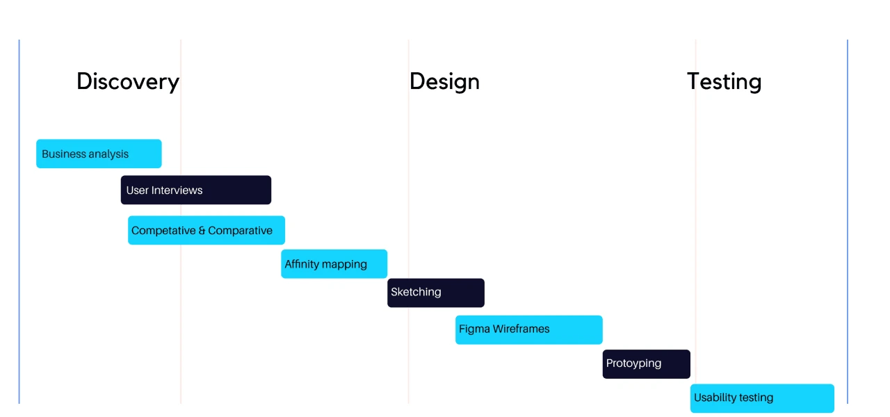
Research
To obtain a better understanding of our users and the market of AR apps We interviewed three science teachers and discussed how they used the app and how teachers shared content, We overlooked of current analytics of the app that details errors and user data.
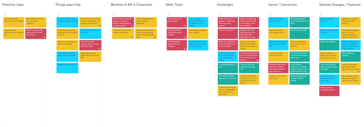
What We Learned About Our Audience
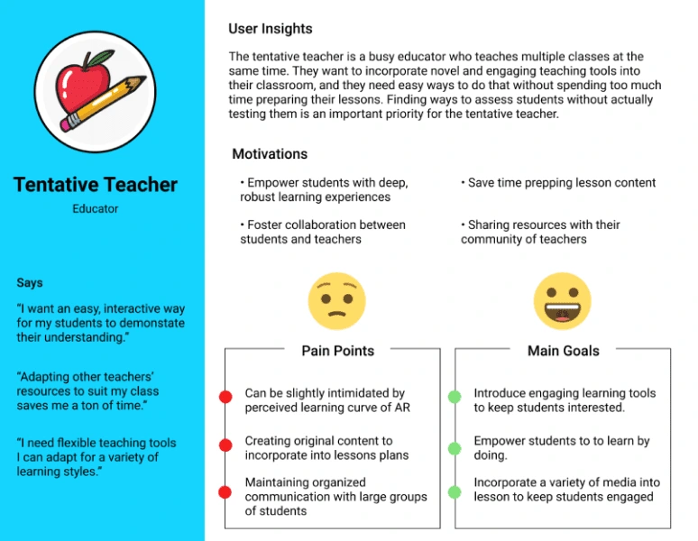
After finding the commonalities between users and potential users we came up with the user persona of the Tentative Teacher. Our Tentative teacher likes to make the classroom more fun and interactive but is often not tech-savvy.
Research Breakdown
Users want to easily edit their halos.
Users want more opportunities to connect with each other and share content.
Users love Halo AR over other apps because they have the ability to bring in content and tailor it to their needs.
Users want to be able to easily find the specific type of content they are looking for.
Problem Statment
The Halo AR app is currently a highly individualized environment without obvious ways to connect and share content with others and users don't create content because they are intimidated by technology.
Hypotheses
We believe integrating functions from familiar social media apps (profile, feed, connections) into Halo AR will increase engagement, expose more people to the app, and gives users familiarity with how the Halo creation process works.
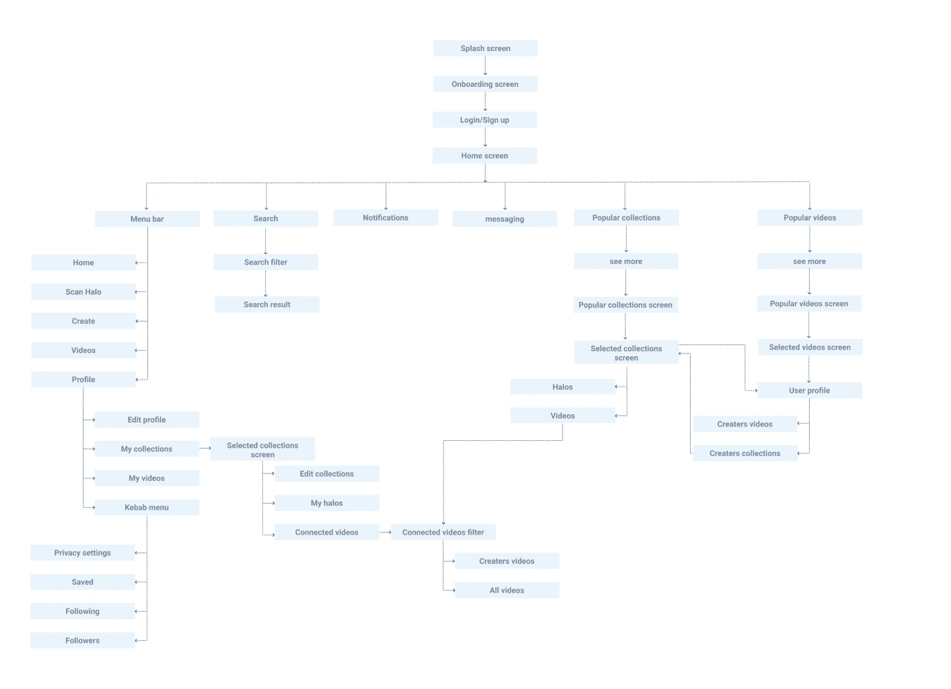
App Layout
Starting Out
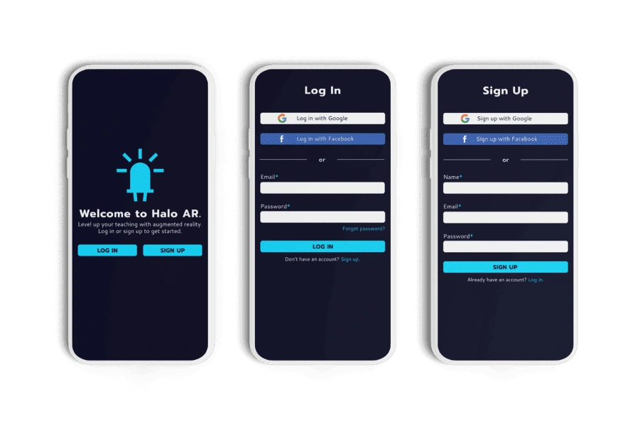
To increase the number of successful sign-ups I took away choosing a username and career role at the beginning. Users will be able to play with the app before they commit. From the analytics of the app, we found users would quit their sign-up process because these choices kept them from finishing the sign-up process.
Creating A Halo
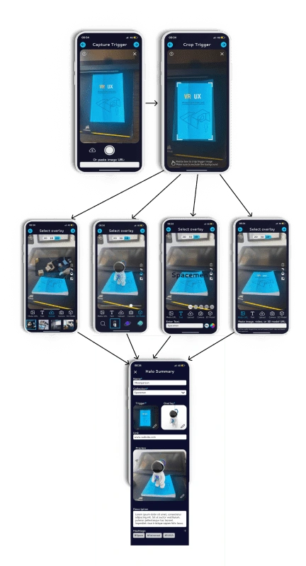
the process to how you would post a story on Instagram so the user is familiar with it. The bottom navigation we took inspiration from other AR apps on how they gave multiple options in small screen space.
User Profiles
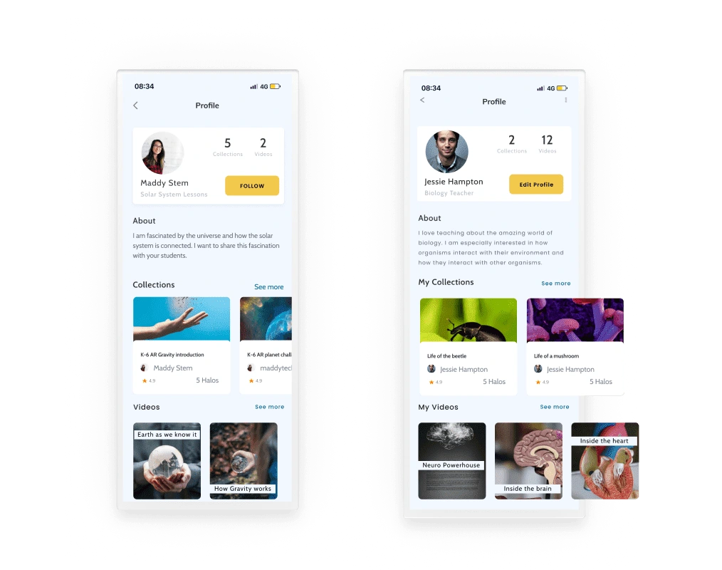
Having Profiles was a way where teachers can view each other's content by creators. A collection was also given its own profile so the creator was able to give relevant links for the lesson and view all halos in the collection in one place.
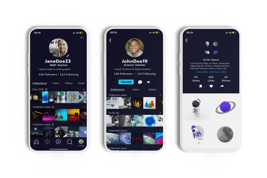
Usability Testing Finds
We emphasized social media too much to where existing users didn't recognize the app
Although we used the same branding of the app the new design seemed too dark and not like an education app
Final Design
Colors and Fonts
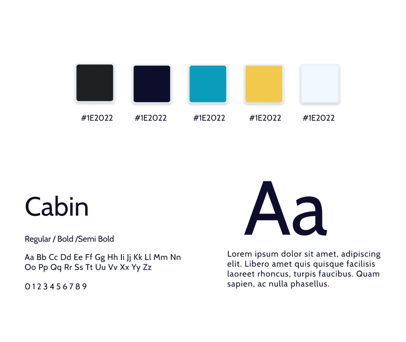
To push the education app feel I gave the colors a brighter feel and chose a sans-serif font that allowed full readability of mixed-case and lower-case text. . The font also gave a more futuristic aspect to the app.
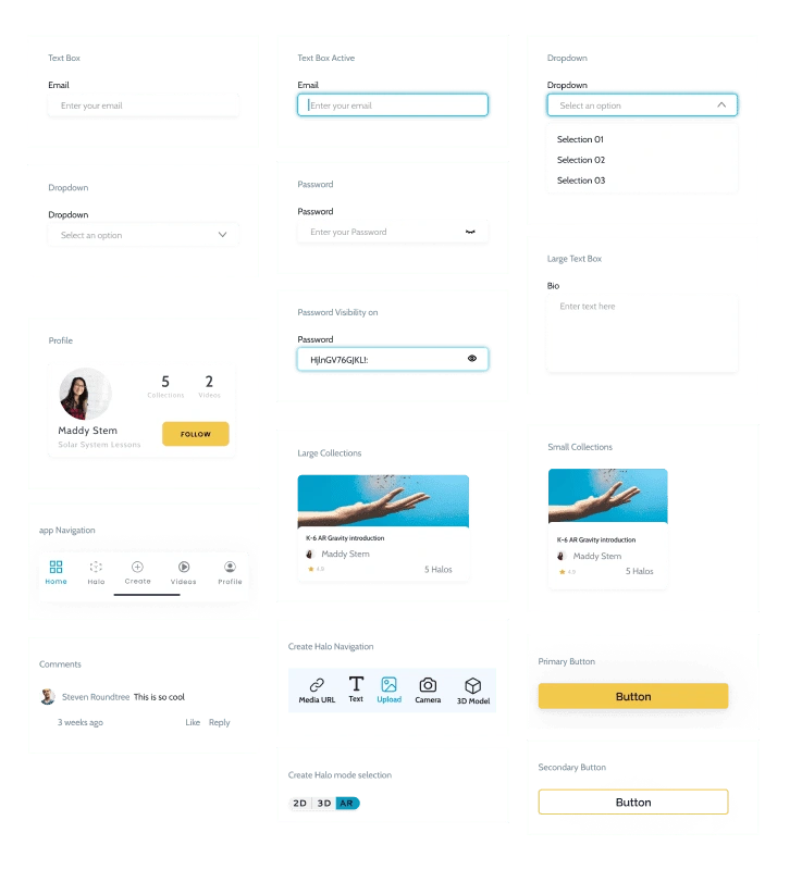
Design Library
Screens
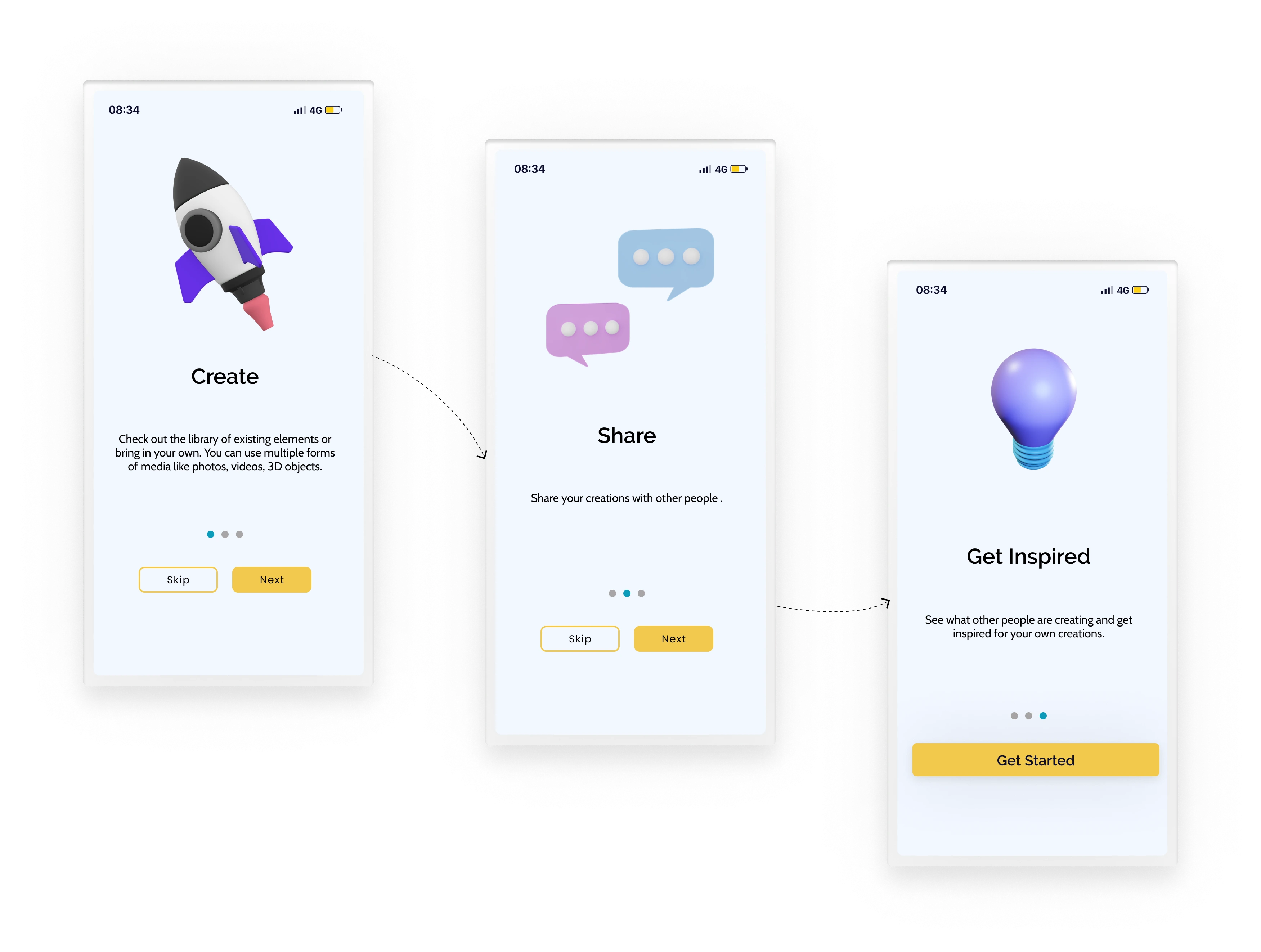
A whole New Beginning
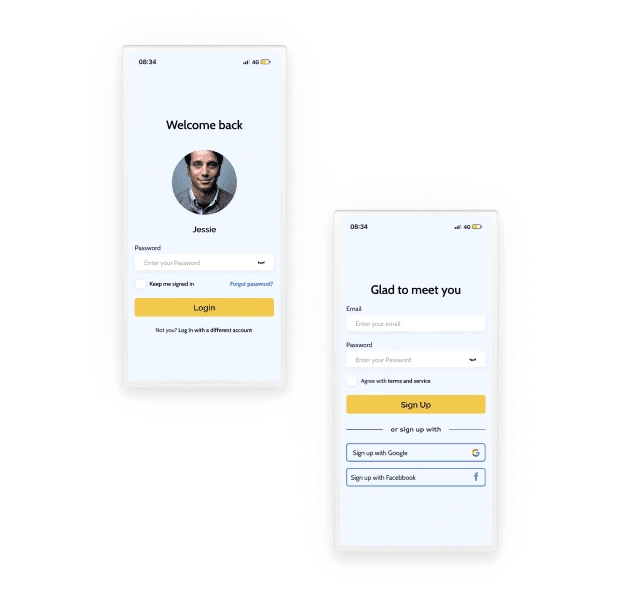
One aspect of the app we did not touch in the first round was the onboarding process. I wanted People to know The key aspect that the app offers.
Sign Up or Login
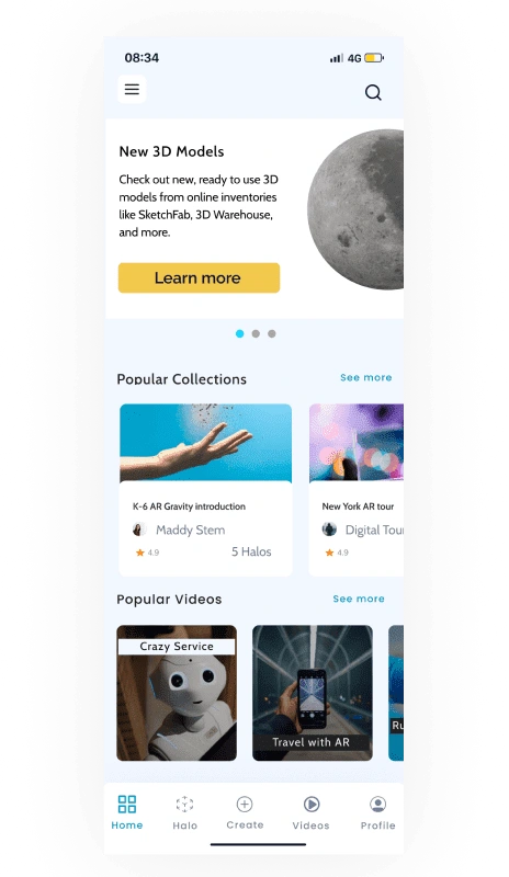
Home
Profiles
One main part of the redesign was to bring the app away from social media and I spent most of that effort on the profile page. For the profile, I took more inspiration from Portfolio apps like Artstation.
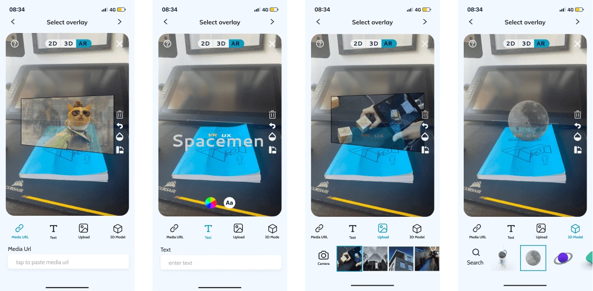
New Halo Creation
Here I was able to remove more clutter while keeping all the same function
Thank You For Checking Out My Portfolio!
Like this project
Posted Feb 2, 2022
Halo AR is an app from a STEM education startup called Lightup. The app allows teachers and students to create augmented reality (AR) for the classroom

