Modern Logos and Brand Marks Vol 2

Asif Aleem


Modern Logos and Brand Marks Volume 2
A new collection of logo designs and brand marks created for businesses across diverse industries. Each concept is shaped by strategy, simplicity, and purposeful visual storytelling, combining meaningful ideas with carefully considered forms and typography.
This second volume highlights our continued exploration of distinctive, versatile, and memorable identities designed to communicate each brand’s character with clarity, relevance, and lasting impact.
EchoLift
MEDIA
We wanted to create an identity that visually expresses the idea of voices, messages, and ideas gaining strength as they move outward.
The symbol was developed using a sequence of curved forms inspired by sound waves and echoes. Their repetition creates rhythm and movement, while the increasing visual presence reflects the idea of amplification, growth, and elevation. Together, the forms communicate how a single message can expand its reach and create a stronger impact.
We paired the symbol with a clean, modern wordmark to keep the identity confident and accessible. The simplicity of the design makes it easy to recognize and highly adaptable across digital platforms, communications, and branded applications.
WaveMaker X Media
BUSINESS & CONSULTING
We set out to create an identity that reflects the energy of a brand built around advertising, marketing, and social media content. The idea began with the name itself and the influence a single creative thought can generate when it moves through the market.
We translated that idea into a flowing wave that travels through a structured frame. The wave represents creativity, momentum, and the ability to spark attention, while the frame gives the identity a sense of strategy, stability, and professionalism. The open edge suggests ideas moving beyond boundaries and creating a wider impact.
To complete the identity, we paired the symbol with a bold, modern wordmark that gives WaveMaker a confident presence, while the spaced typography of X Media adds balance and clarity. The result is a dynamic and versatile logo designed to help the brand stand out across digital platforms, campaigns, and social media.
RÖWE
FITNESS
RÖWE was shaped as a wellness brand that feels as considered as the experience it offers. The identity brings together the discipline of Pilates, the calm of yoga, and the elevated character of a modern lifestyle destination.
The custom wordmark uses elegant, high contrast letterforms to create a sense of confidence and refinement. At its centre, the spiral within the “Ö” introduces movement and flow, reflecting controlled exercise, breath, balance, and the continuous journey toward wellbeing.
The result is a distinctive and fashion forward identity that can move naturally across heated Pilates, yoga, activewear, wellness cafés, and premium lifestyle spaces.
Infradossier
TECHNOLOGY
We set out to create an identity that communicates structure, coordination, and the safe flow of information across underground infrastructure projects.
The symbol is built from a series of rounded parallel lines inspired by underground pipes, cables, GIS routes, and layered infrastructure networks. These lines move toward a shared direction, reflecting how Infradossier brings information from municipalities, network operators, engineers, and construction teams into one coordinated project dossier.
The overall form creates a distinctive letter “D,” representing the central dossier that follows each excavation project from planning through execution and handover. The shorter line segments introduce a sense of movement and data transfer, while the rounded geometry keeps the identity clear, practical, and approachable.
We paired the symbol with a bold, highly legible wordmark to reinforce reliability and confidence. The result is a modern, serious, and future ready identity designed for a platform that helps professionals work together, reduce risk, and protect essential underground infrastructure.
Adara
FASHION AND LIFESTYLE
ADARA’s identity was created for a women’s fashion brand inspired by travel, freedom, and effortless self expression. The visual direction reflects the confidence of women who explore new places while carrying their own sense of style wherever they go.
We developed a refined serif wordmark with elegant proportions and delicate contrasts to give the brand a timeless and premium presence. The letterforms feel graceful yet confident, balancing femininity with the independence and strength associated with modern women travellers.
A bird in flight was introduced as the defining symbol of the identity. It represents movement, discovery, freedom, and the courage to explore beyond familiar boundaries. Positioned above the final letter, it becomes a natural extension of the wordmark and gives the logo a sense of direction and possibility.
The result is a sophisticated and expressive identity designed to connect with women who value fashion, comfort, individuality, and the freedom to experience the world on their own terms.
Harbor Café
FOOD & DRINK
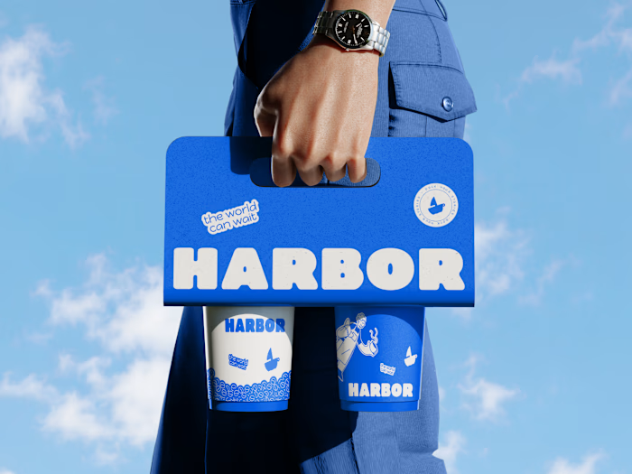
Harbor Café’s identity was created to capture the relaxed charm of a waterfront destination where people can pause, connect, and enjoy the moment.
The symbol combines a sailing boat with a coffee cup, bringing the two sides of the brand together in one simple and memorable mark. The sail reflects the harbor setting, movement, and a sense of escape, while the cup represents warmth, comfort, and the everyday café experience. The circular handle adds a playful detail and helps the symbol feel friendly and recognizable.
We paired the icon with a bold, rounded wordmark that gives the brand a welcoming and approachable personality. The soft forms and subtle irregularities create a handcrafted feel, making the identity suitable for a casual café environment rather than something overly formal.
The result is a playful and distinctive identity designed to work across storefront signage, menus, packaging, merchandise, and social media.
Derf Electronics
INDUSTRIAL
Identity was created to reflect precision, reliability, and global connectivity.The custom geometric wordmark draws inspiration from electronic pathways, engineered components, and technology networks. Its continuous lines represent the efficient movement of critical components, while the sharp angles and controlled curves communicate speed and technical expertise.
The result is a bold, dependable identity for a company serving aerospace, defense, telecommunications, industrial technology, and advanced computing.
Juralis
ATTORNEY & LAW
Built around the values of trust, structure, and professional authority, the Juralis identity brings a modern perspective to the traditional legal sector.
The symbol combines a shield like form with layered lines that subtly create the letter “J.” The shield represents protection, integrity, and legal strength, while the repeated pathways suggest guidance, careful navigation, and the structured process of resolving complex legal matters.
A clean contemporary wordmark balances the strength of the symbol with clarity and approachability. The result is a distinctive and dependable identity for an attorney and law firm focused on credibility, confidence, and client protection.
Koce
TECHNOLOGY
Built around the need to bring clarity to complex legal information, the Koce identity reflects a platform designed for focused analysis, confident decisions, and precise professional work.
The symbol is formed from sharp geometric shapes that create an abstract owl like presence, suggesting insight, attention, and careful observation without becoming literal. Its layered structure also hints at wings, a lens, and the letter K, representing the platform’s ability to review legal content from multiple perspectives.
Strong symmetry and controlled angles give the mark an authoritative enterprise character, while its simplified form keeps it clear and recognizable at any size. Paired with a clean, confident wordmark, the identity feels intelligent, trustworthy, and purpose built for legal professionals and government teams.
Prosymbols
DESIGN
Built around the way visual ideas evolve from simple shapes into expressive systems, the Prosymbols identity reflects a studio where design, motion, and storytelling come together.
The symbol combines bold geometric forms that subtly reference the initials “P” and “S.” Its angled cuts create a sense of movement and transformation, while the modular construction mirrors the studio’s work across Lottie animations, illustrations, icons, and logo design.
A rounded contemporary wordmark adds warmth and clarity, balancing creativity with technical precision. The result is a flexible and recognizable identity for a studio focused on turning ideas into engaging visual experiences.
EmployeeAI
TECHNOLOGY
Built around the idea of giving businesses more time for meaningful human work, the EmployeeAI identity reflects a future where intelligent digital employees support faster decisions, smoother operations, and stronger collaboration.
The symbol brings together a stylized lowercase “e” and a spark, representing employment, intelligence, and new possibilities. Its open circular form suggests continuous support and the seamless flow of information, while the spark introduces a sense of innovation and forward momentum.
A clean contemporary wordmark completes the identity, creating a brand that feels modern, capable, and approachable. The result is a distinctive visual system that balances artificial intelligence with human potential.
Wildborne
RETAIL
Inspired by people who seek adventure without compromising on style, the Wildborne identity brings together rugged outdoor character and considered modern design.
We developed a custom wordmark with strong, condensed letterforms that feel durable, practical, and confident. The central tree symbol is integrated directly into the name, connecting the brand to nature, exploration, and the outdoors without relying on a separate illustrative icon.
The compact structure gives the logo a rugged presence, while the clean geometry keeps it modern and suitable for a curated lifestyle brand. The result is a distinctive identity designed for outdoor equipment, adventure bags, camping products, homeware, packaging, apparel, and retail applications.
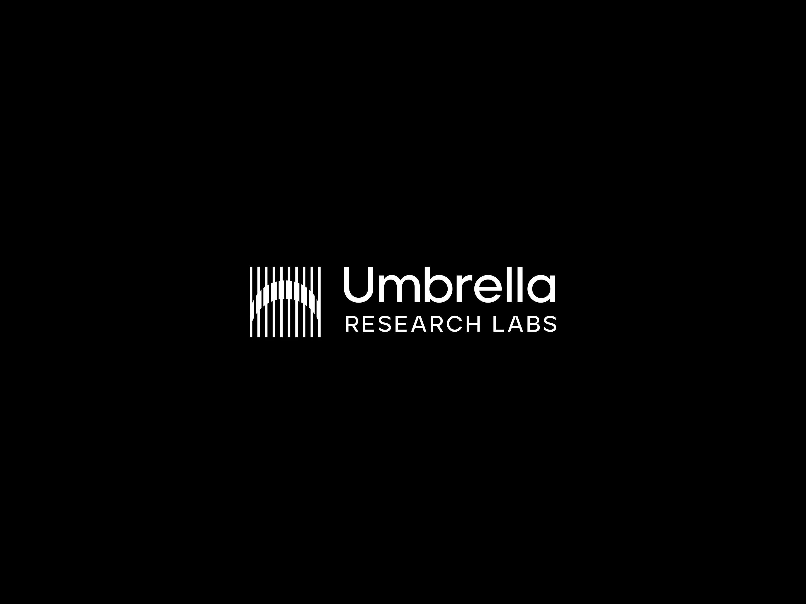
Umbrella Research Labs
TECHNOLOGY
Built around the idea of bringing multiple areas of exploration under one shared vision, the Umbrella Research Labs identity reflects a company focused on experimentation, discovery, and technological progress.
The symbol uses a series of vertical lines that form a subtle umbrella shape through negative space. The umbrella represents protection, support, and a broad framework under which research, experimentation, and emerging technologies can develop. The repeated lines also suggest data, systems, and multiple fields of study working together.
Paired with a clean modern wordmark, the identity feels intelligent, precise, and future focused. The result is a distinctive visual system for a technology research and development company built around exploration and progress.
Like this project
Posted Aug 5, 2026
Modern logo and brand mark collection featuring strategic, timeless identities crafted with purposeful symbolism, clean typography, and clarity.