Relav — Design & Conversion Breakdown

Oussama Bouhouch


Relav — Design & Conversion Breakdown
Relav is a self-initiated landing page project for an AI CRM product, designed and built in Framer. it's a demonstration of how one consistent system (spacing, type, and brand logic) compounds across a page to reduce friction and move a visitor toward a single action.

The Hero
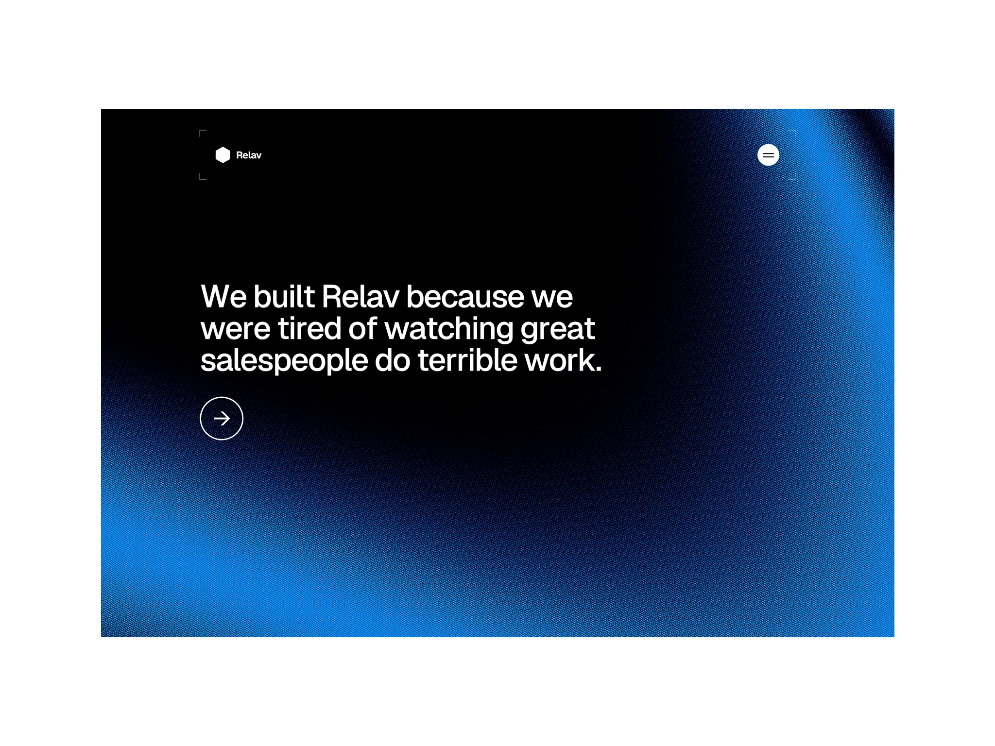
The hero has one job — make the value proposition legible in under three seconds and give the visitor exactly one thing to do next. Its headline sits at the top of the type scale used across the whole page; every other size on Relav — subheads, body copy, button labels — is a fraction of that number, not a fresh size invented per section. That's what makes the page read as considered instead of assembled section by section.
The accent color appears exactly once above the fold, on the primary CTA. Nothing else in the hero competes with it. The moment an accent color gets reused for a secondary link or a decorative detail, it stops meaning "click here" and starts meaning nothing in particular.
Feature Highlights
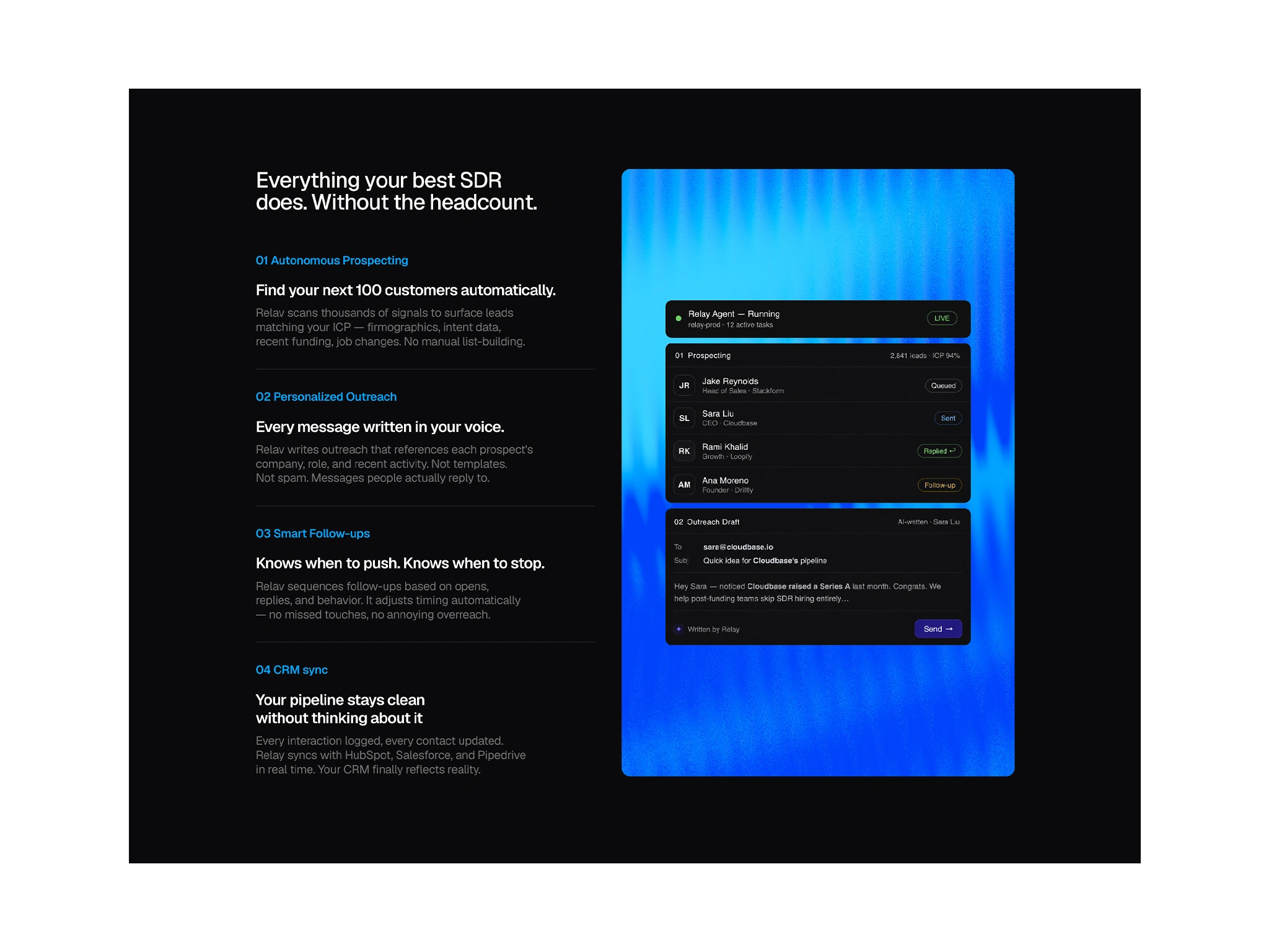
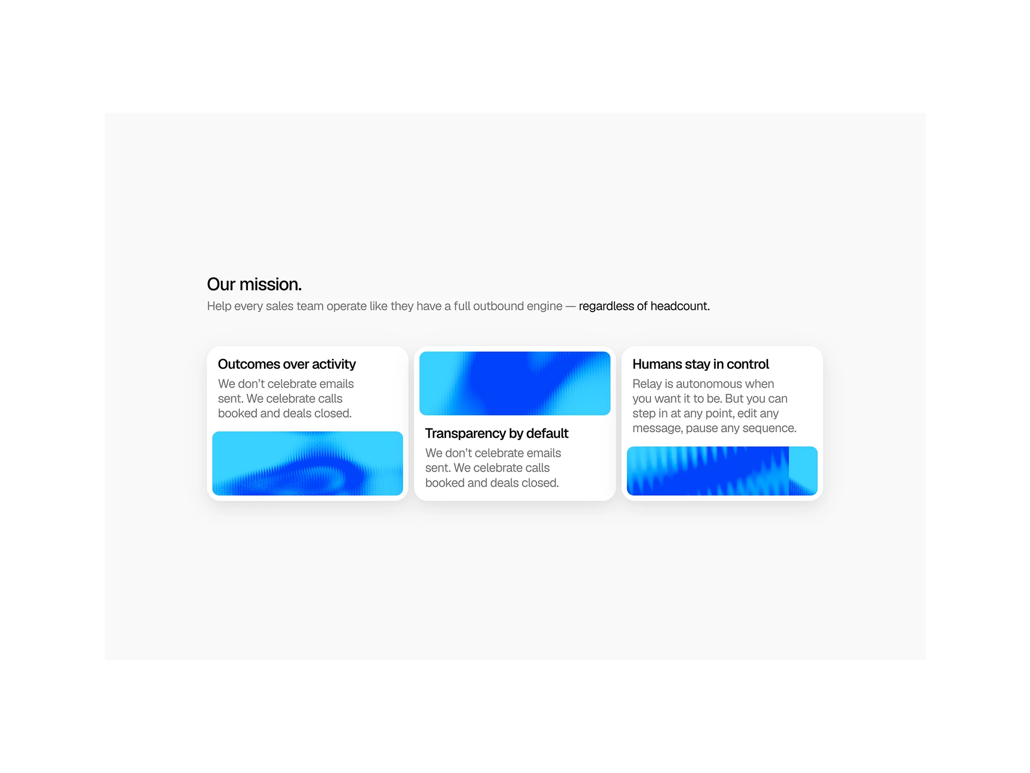
Every value prop in this row shares the same icon size, spacing, and heading-to-body ratio. When each block matches the last, a visitor scans the row without re-parsing a new layout each time, which keeps them moving down the page instead of stalling to work out what changed.
The gaps between blocks inherit the same spacing unit used in the hero, not a new value picked because it looked fine in isolation. That kind of consistency is invisible when it's right, which is the point — it removes friction a visitor never consciously notices, but would notice if it were gone.
Product Visual
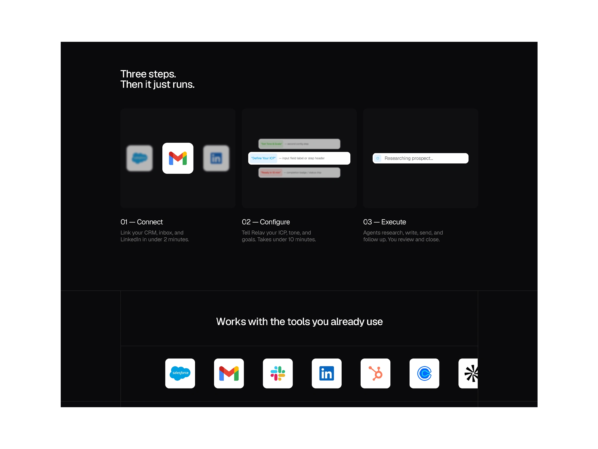
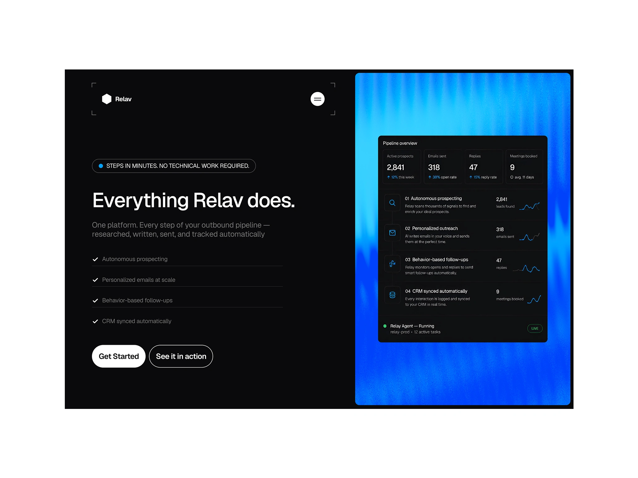
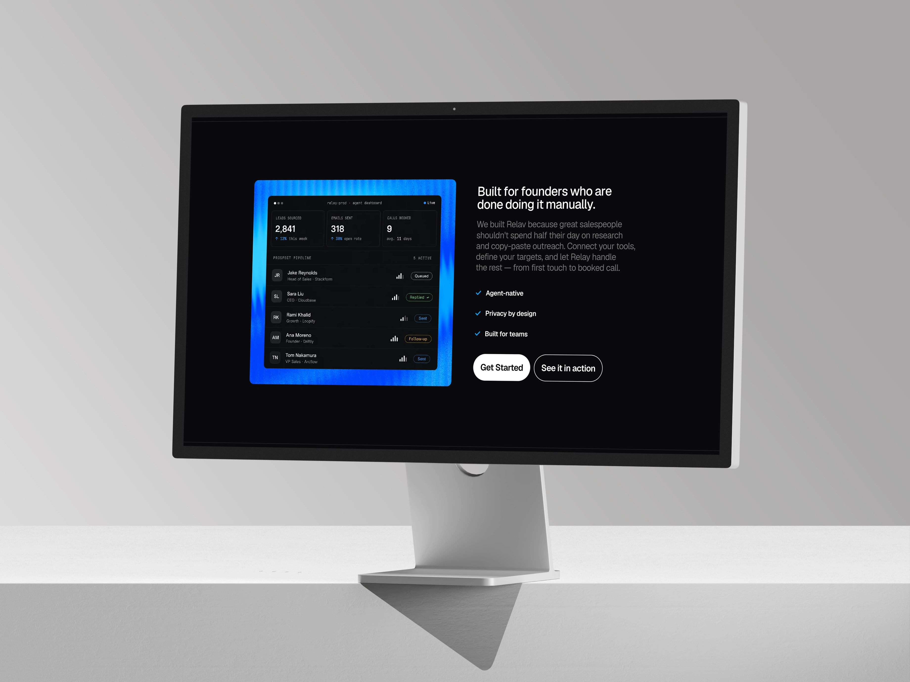
For a tool with no existing brand recognition to borrow trust from, this section carries the most weight. It has to look like a real, functioning product, not a mockup bolted onto a marketing page. The interface reuses Relav's own accent color and typography inside the product itself, so the page selling the tool and the tool it's selling feel like one continuous brand. That continuity reads as credibility before a single line of copy does any work.
Why It Holds Together
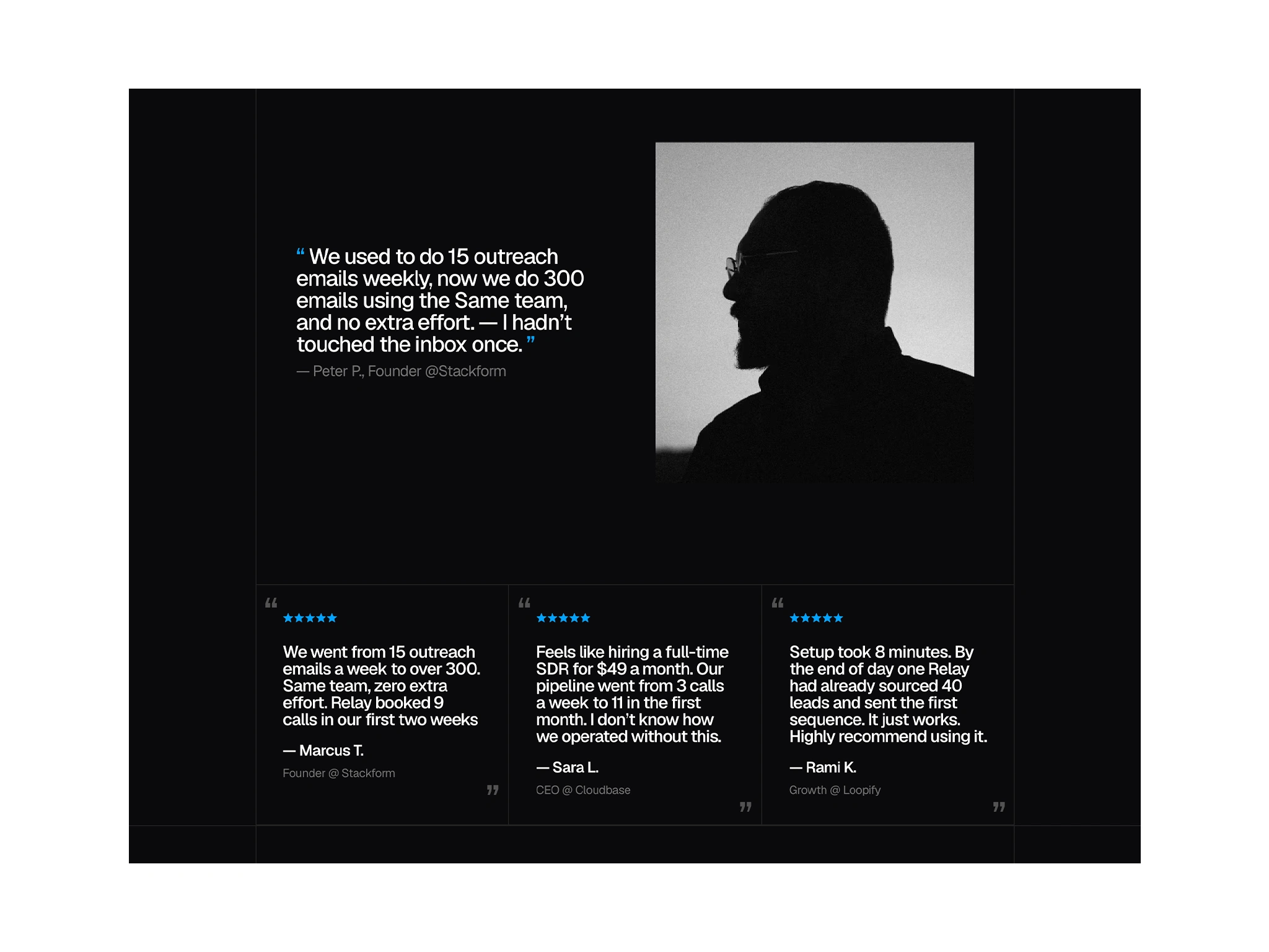
No individual section here is complicated. What they demonstrate together is a system — one spacing scale, one type scale, one color logic, carried without exception from the hero to the footer. That consistency is what makes a page feel trustworthy before a visitor reads a single word of copy, and it's the same system-first approach behind every build.
Like this project
Posted Jul 5, 2026
Relav is a website project for an AI CRM product, it's a demonstration of how a consistent system compounds across a page to move a visitor toward one action.
Likes
1
Views
33