Photography Studio Website Design
Overview
This project is a website design for a photography studio focused on creating a premium, timeless, and emotionally driven digital presence. The goal was to let the photography speak first, while the interface quietly supports the work without distraction.
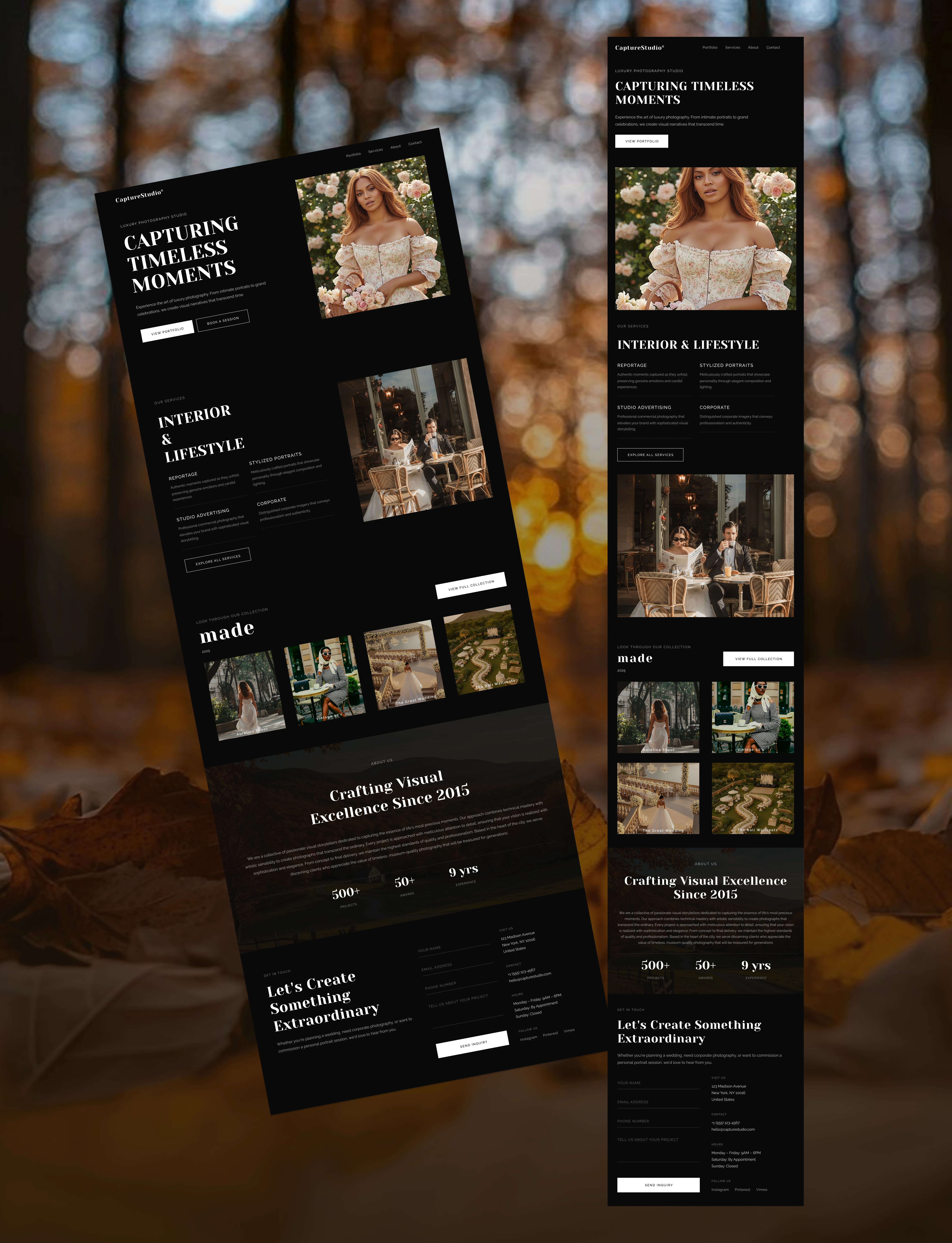
The primary goal was to design a website that: • Feels premium and professional • Positions the studio as high-end and trustworthy • Prioritizes visual storytelling over heavy text • Makes it easy for potential clients to explore work and get in touch
Photography is visual by nature, so every design decision was made to keep attention on the images.
⸻
Typography
Primary Typeface: DM Serif Display
DM Serif Display was chosen to introduce elegance, confidence, and a timeless editorial feel. Serif fonts are often associated with heritage, craftsmanship, and trust—qualities that align well with professional photography.
The font adds character and emotional weight to headings without overpowering the visuals.
Secondary Typeface: Raleway
Raleway was used for body text and supporting content.
Why Raleway: • Clean and modern • Highly readable across devices • Balances the expressive nature of the serif headings
The contrast between DM Serif Display and Raleway creates a refined hierarchy: expressive headlines paired with calm, readable content.
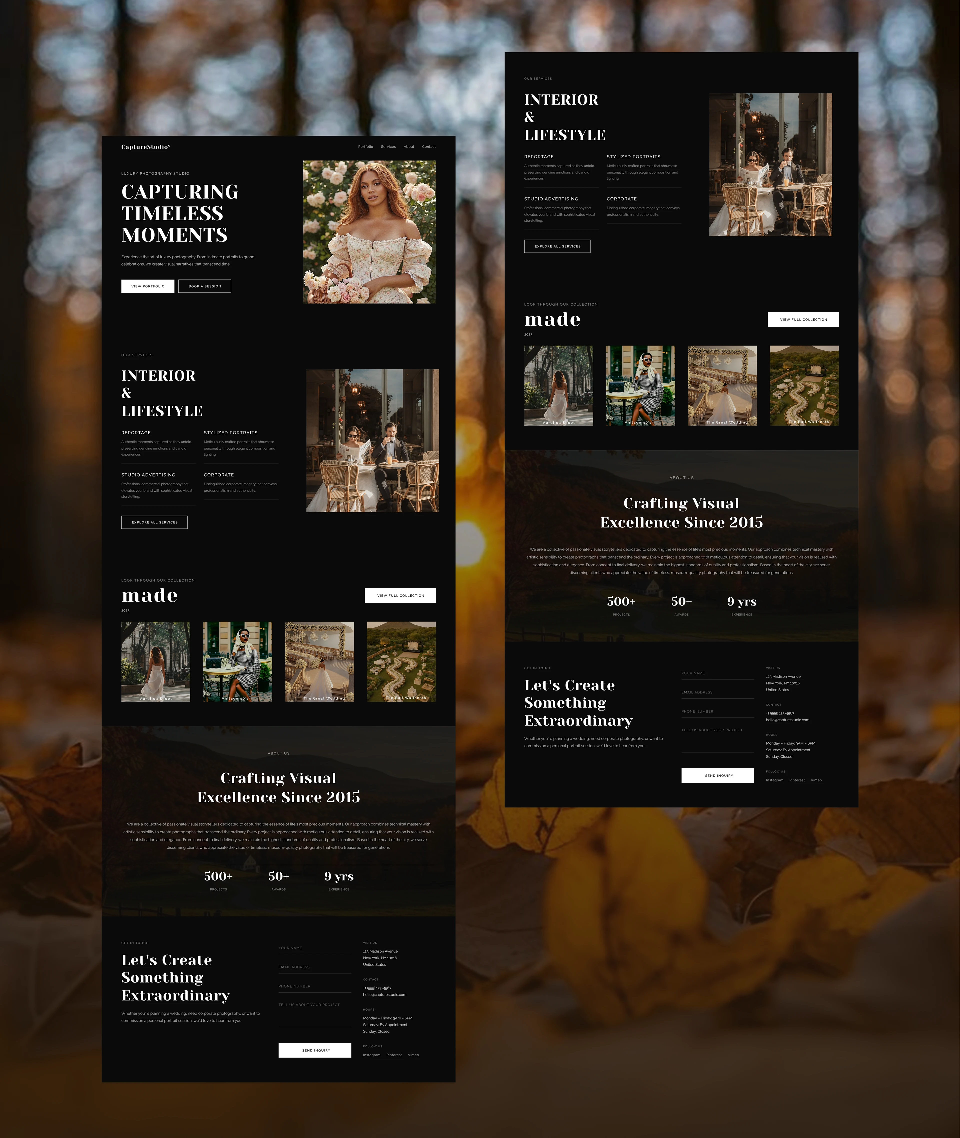
Page Structure & Sections
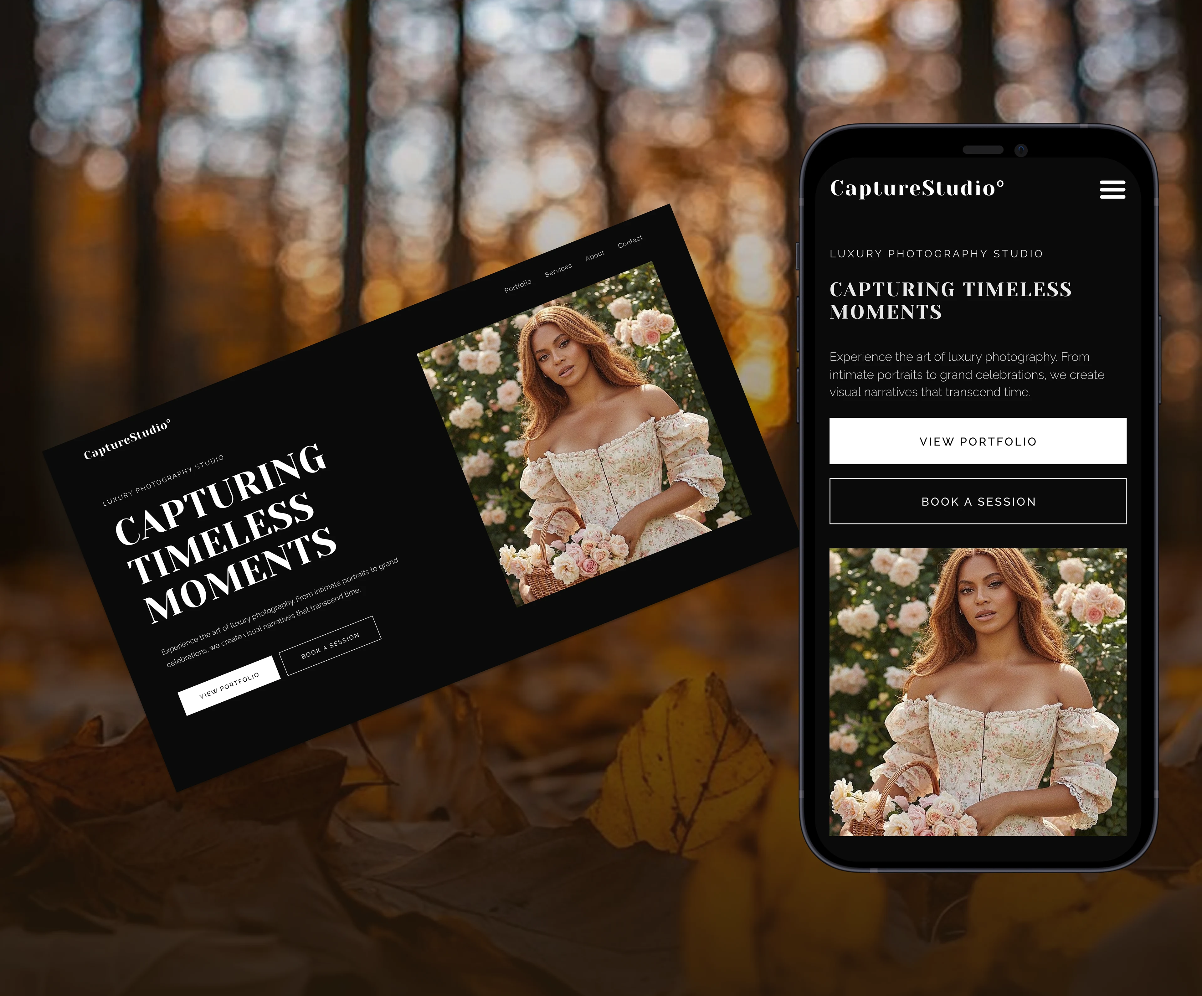
Hero Section
The hero section immediately sets the tone. • Strong headline to communicate the brand promise • Clear call-to-action (View Portfolio / Book a Session) • Calm, confident first impression
This section answers one question instantly: What kind of studio is this?
⸻
Our Services
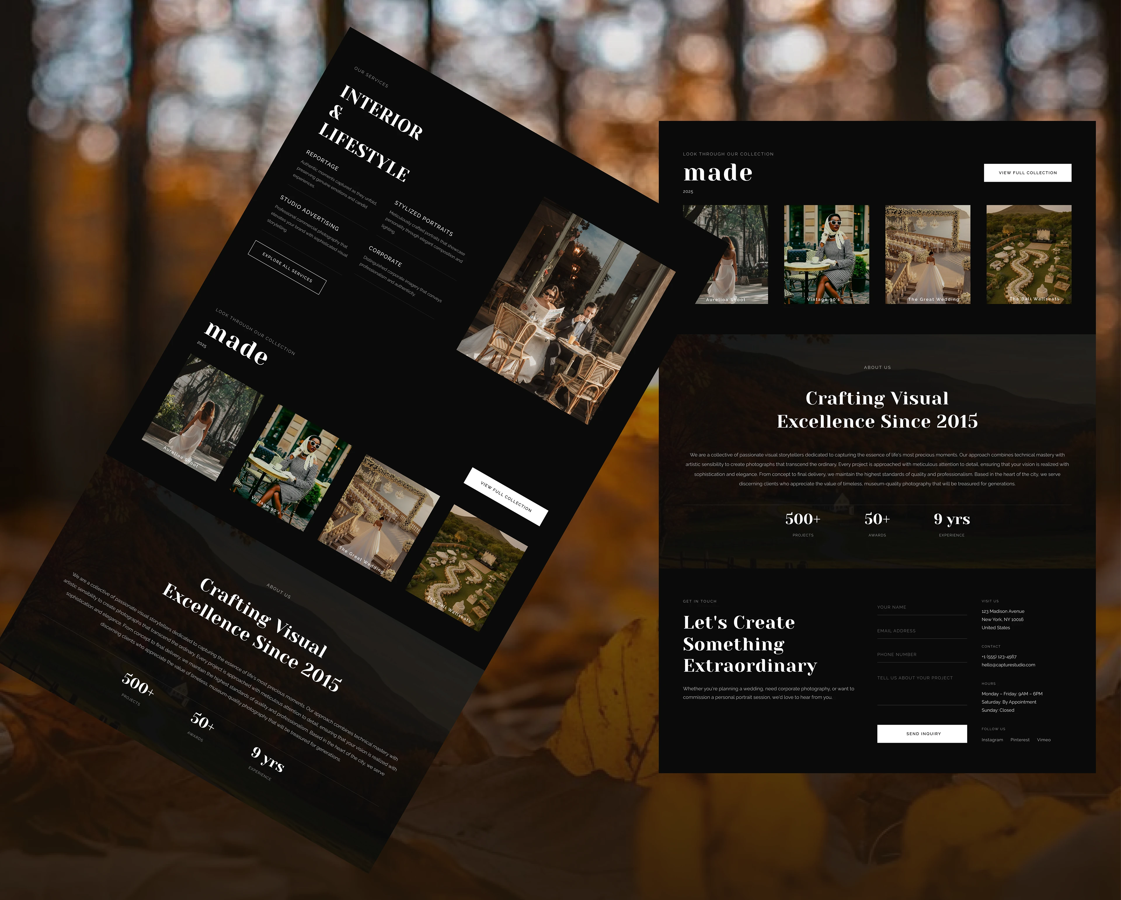
This section provides clarity without overwhelming the user. • Clearly defined photography services • Simple layout for quick scanning • Focus on value, not long descriptions
Users can quickly understand what the studio offers.
⸻
Collection / Portfolio
The collection section is designed like a curated gallery. • Clean grid layout • Emphasis on consistency and quality • No unnecessary UI elements
This section builds trust and showcases the studio’s range and style.
⸻
About Us
The About section humanizes the brand. • Short, intentional copy • Focus on experience, passion, and credibility
It reassures potential clients that they are working with professionals who care about their craft.
⸻
Get in Touch
The contact section is simple and inviting. • Clear call-to-action • Minimal fields • Low friction
The goal is to make reaching out feel easy and natural.
Color Choice
A dark, near-black background was intentionally used to: • Create a gallery-like experience • Increase contrast and make images stand out • Communicate luxury and professionalism
Neutral tones were used throughout the interface to avoid competing with the photography. The color system supports the visuals rather than becoming the focus.
⸻
Imagery
Imagery is the hero of this website.
The design uses: • Large image blocks • Full-width visuals • Minimal overlays
This approach allows users to emotionally connect with the work before reading any text. The imagery does the storytelling, while the UI stays subtle and respectful.
⸻
Content Strategy
The website intentionally uses few words and plenty of visuals.
Photography clients often decide based on feeling and style, not long explanations. Short, intentional copy guides users while keeping the experience immersive and uncluttered.
Final Thoughts
This project is a photography-first design where visuals lead and the interface supports. Every decision—from typography to layout—was made to enhance trust, emotion, and clarity.
The result is a clean, premium website that allows the photography studio’s work to speak for itself.
Like this project
Posted Jan 10, 2026
Capture Studio is a photography website designed to let images speak before words do. The goal was simple: create a site where visual storytelling takes stage
Likes
5
Views
211


