ZenEye: Product Analysis and Redesign
Harut Arzumanyan
Project Overview:
About the product
ZenEye is a mindfulness and meditation app. While there are tons of similar apps, ZenEye is unique due to several reasons:
The users can benefit from stress, anxiety, and emotion management, as well as finding balance.
You can communicate directly with other users and coaches to connect with them.
It targets the younger generation with electronic music and vibes to connect better with the end-users.
The service is available for free. It generates revenue through organizing seminars and offering practical applications.
Problems
The initial version of the application was rather rudimentary in nature. It had no clear navigation system and only featured a lone page with lessons that repeated themselves. Despite having a premium subscription option, it provided no additional perks and was completely free. The sole stipulation for users was to refer the app to three acquaintances, which, while potentially effective for initial business expansion, is insufficient for sustained success. This factor also undermines the user's confidence in the app.
The interface design appears to be quite disorganized, with little attention paid to spacing or accessibility. The combination of bright, electric colors, small font sizes, dark backgrounds, and blurred shapes undoubtedly affects the readability and accessibility of the content. Additionally, the interface seems to be quite crowded, which could cause confusion for users.
Additionally, the social presence wasn't branded, so the app and the company's presence were totally different.
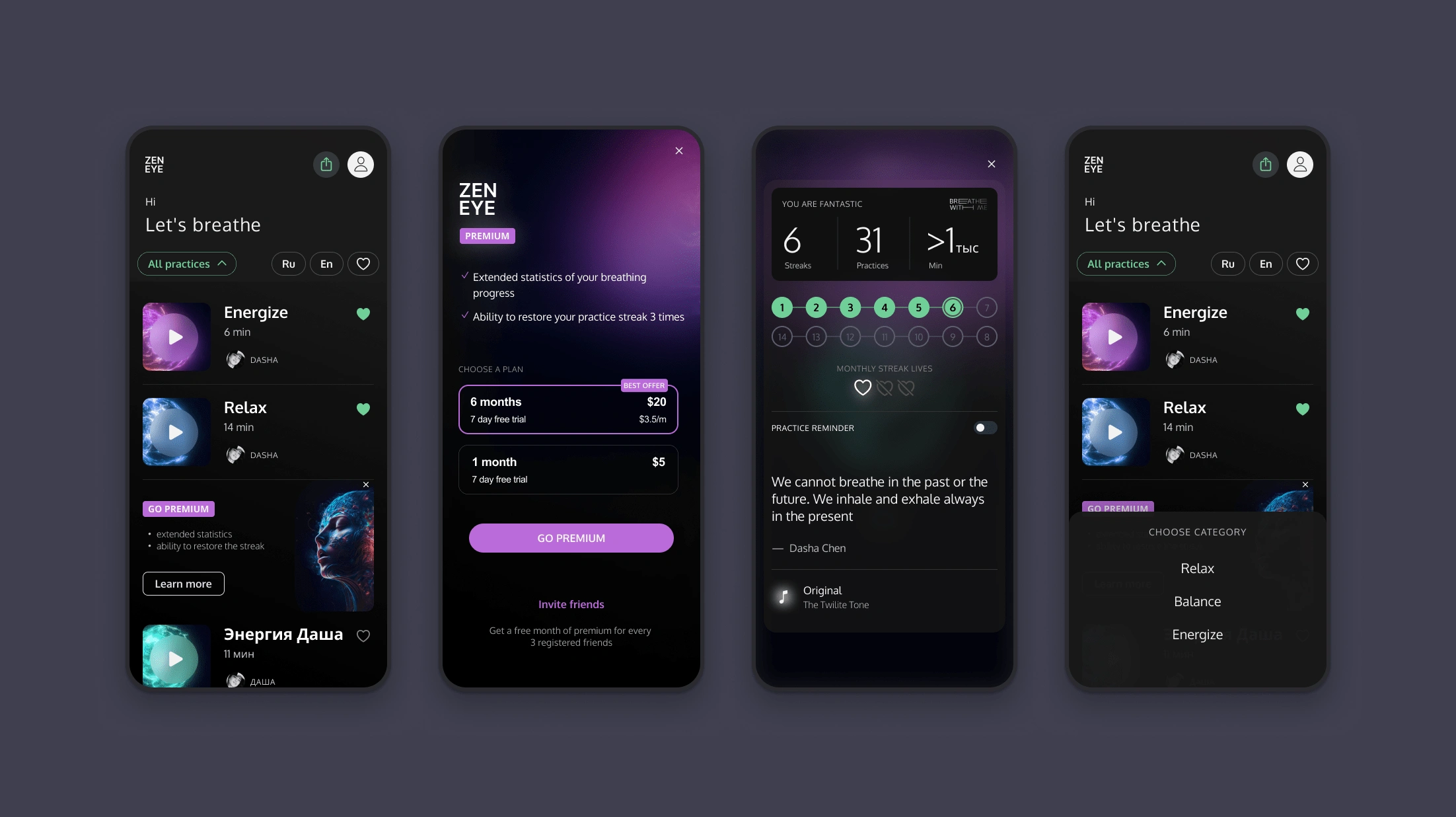
The initial version of the app.
RE-Design: Phase 1
As the app was released, we decided to split the redesign process into two phases.
To begin with, we redesigned the app and improved the user interface to make it more consistent, user-friendly, and readable.
Moreover, we had to incorporate a new section in the app, but the current information architecture of the developed version didn't permit us to include a navbar due to time and cost constraints. So we made a decision to upgrade the existing one, to be able to add the needed section on the screen.
Additionally:
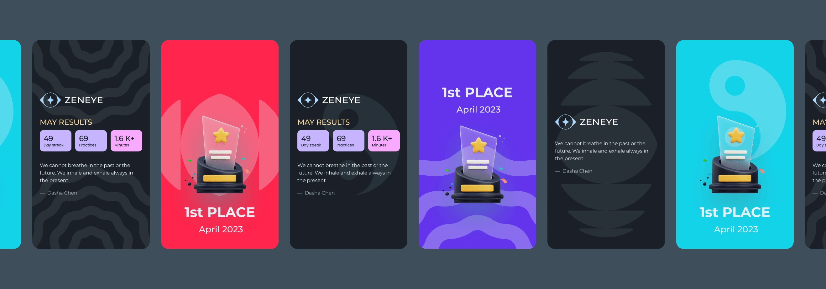
We worked on the logotype - and redesigned it.
Fixed UX issues in the app onboarding, login and registration flows, and user profile pages.
Changed typography - instead of 2 different font families, just 1 - Oxygen.
Redesigned the player of the app. Now there is a .json animation, instead of 800mb+ sized animated 3d video, which users just turn off.
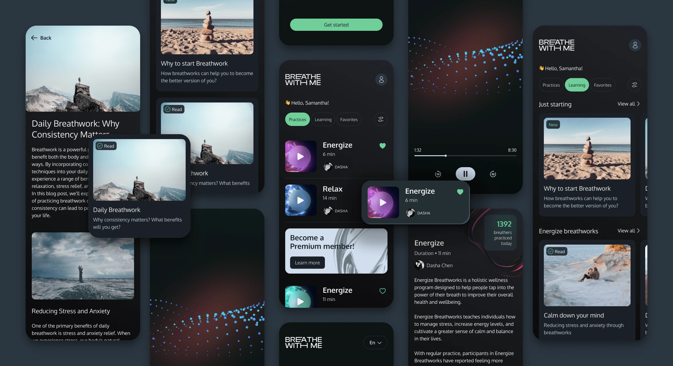
Redesign: Phase 1
Now the application looks much fresher, and at the same time, it's not a huge change in terms of the UX. So, here we decided to start the phase 2.
RE-Design: Phase 2
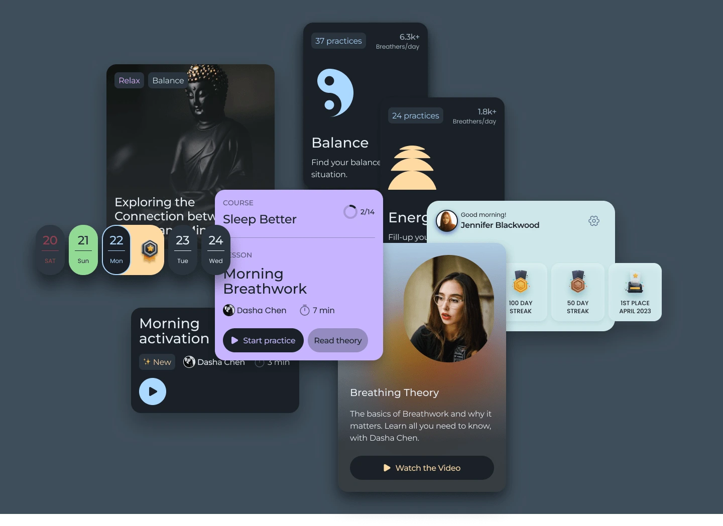
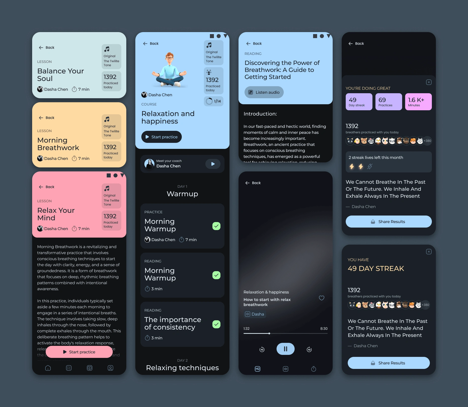
During this phase, the aim is to create a brand-new application from the ground up. The objective is to maintain the simplicity of the previous version while also ensuring that it is user-friendly and easy to navigate. Additionally, it should be scalable to accommodate the growth of the business.
In the new version, we used 2 fonts:
Montserrat - as a Display font.
Poppins - as a Paragraph font.
This allows to creation of the hierarchy, and stylizes the app, making it "pop"!
We chose Arctic Blue as an accent color to maintain the tone of the previous version and ensure a user-friendly UI.
Additionally, we added 5 additional colors to make the interface more visually engaging and less monotonous.
The layout is based on the 4px grid, which is a perfect solution, when we talk about spacing, hierarchy, usage of the white space, etc.
Pages
The app now has a bottom navigation bar, with 4 main pages there:
Home - Personal digest and news feed.
Practices - Short practices and mini-courses, with different targets.
Blog - articles and lectures (typed and audio) about breathwork and mindfulness meditations, separated by the level of the user, from starter to professional.
Profile - Here you'll find your personal analytics, challenges you're in, referral system, settings, etc.
The first 2 pages have personalized sections for the users, to make the experience of using the app more easy, reducing unnecessary steps.
Each page has its own accent color, which affects the entire page.
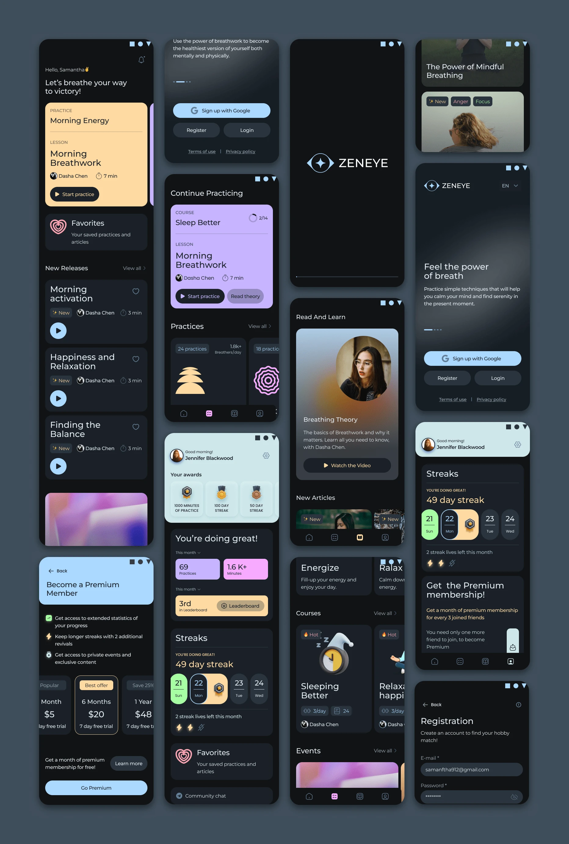
Finally, the social media presence was restyled and aligned with the app branding.
Like this project
Posted Sep 10, 2023
Conducted business and design analysis for mindfulness and meditation application. Rebranded the product, and redesigned the application.