
Astergrid is an engineering firm that takes solar, wind and storage projects through studies, grid connection and construction, and stays on site until the plant is exporting. The brand had to look as calm and exact as the work — and run the same on a feasibility report, a site sign and the website.
The symbol is a sun drawn the way an engineer would draw it on a site plan: four bars crossed at 45° make eight rays, and the yellow core is the plant's first power. Figtree for everything, Instrument Serif Italic for one accent word, ink and paper as the base, sun yellow only for the core and the main action.
Scope: Logo · Colour · Type · Print · Signage
Brand case: webraw.studio/work/astergrid-brand · Website: webraw.studio/work/astergrid
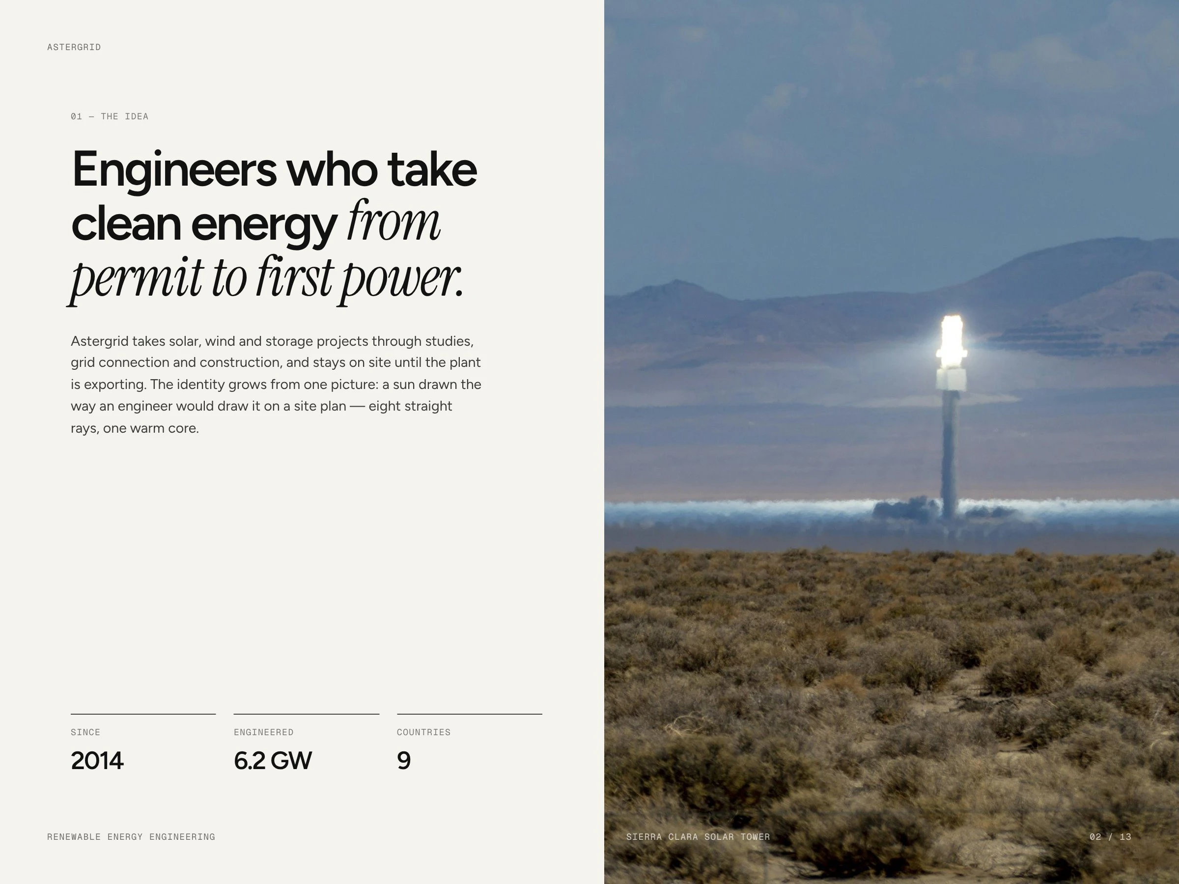
Engineers who take clean energy from permit to first power
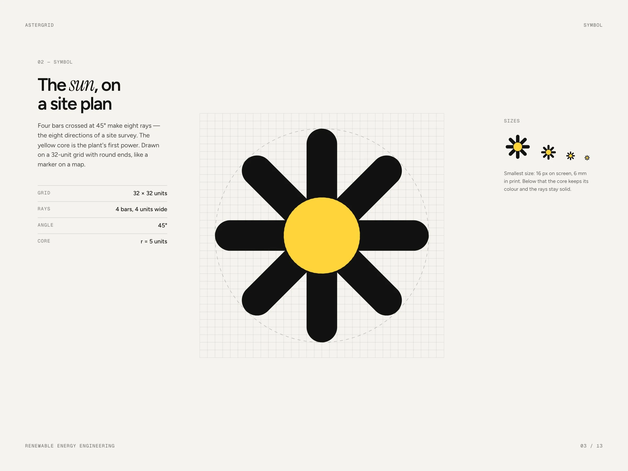
The symbol — the sun on a site plan
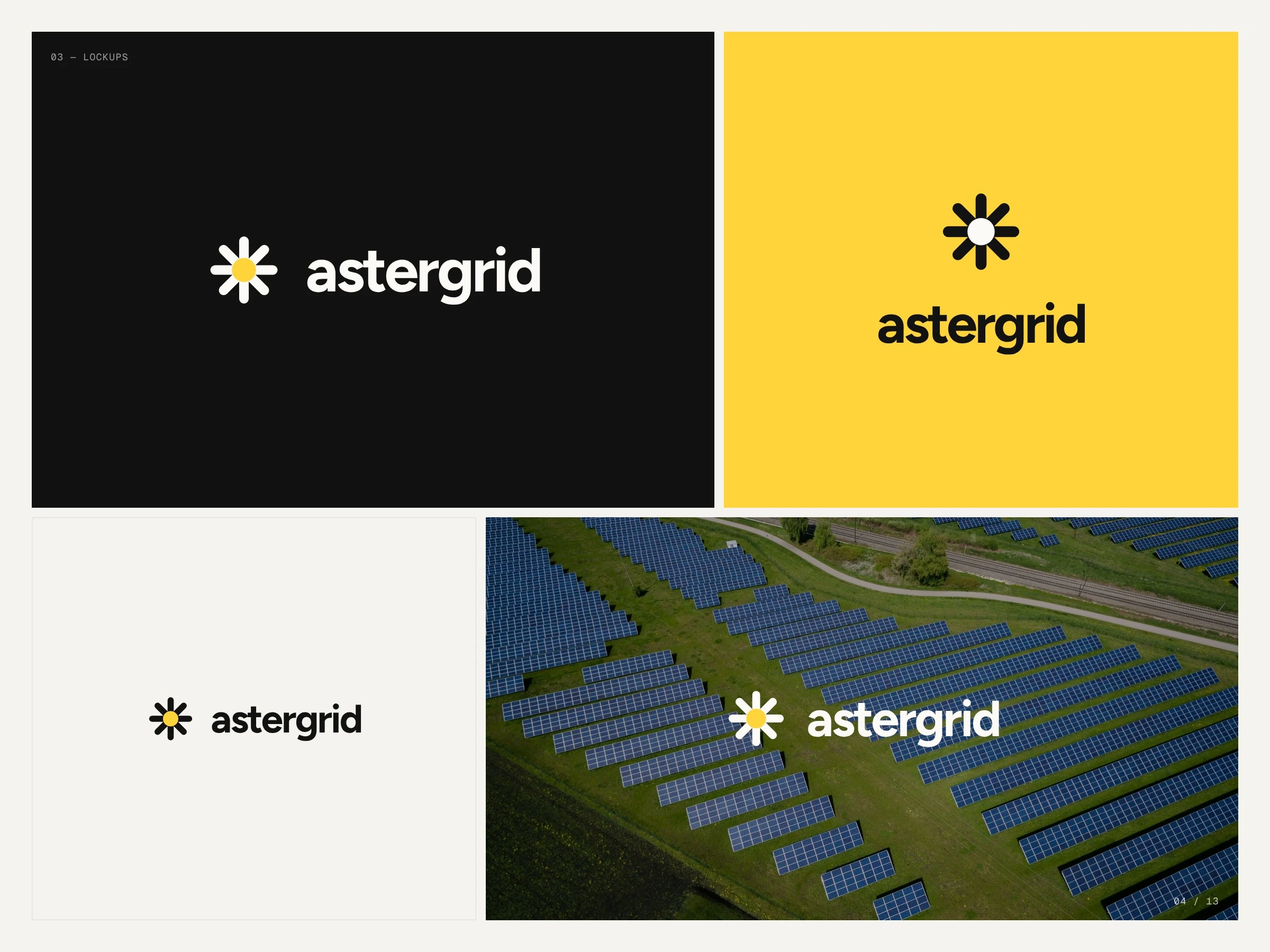
Lockups
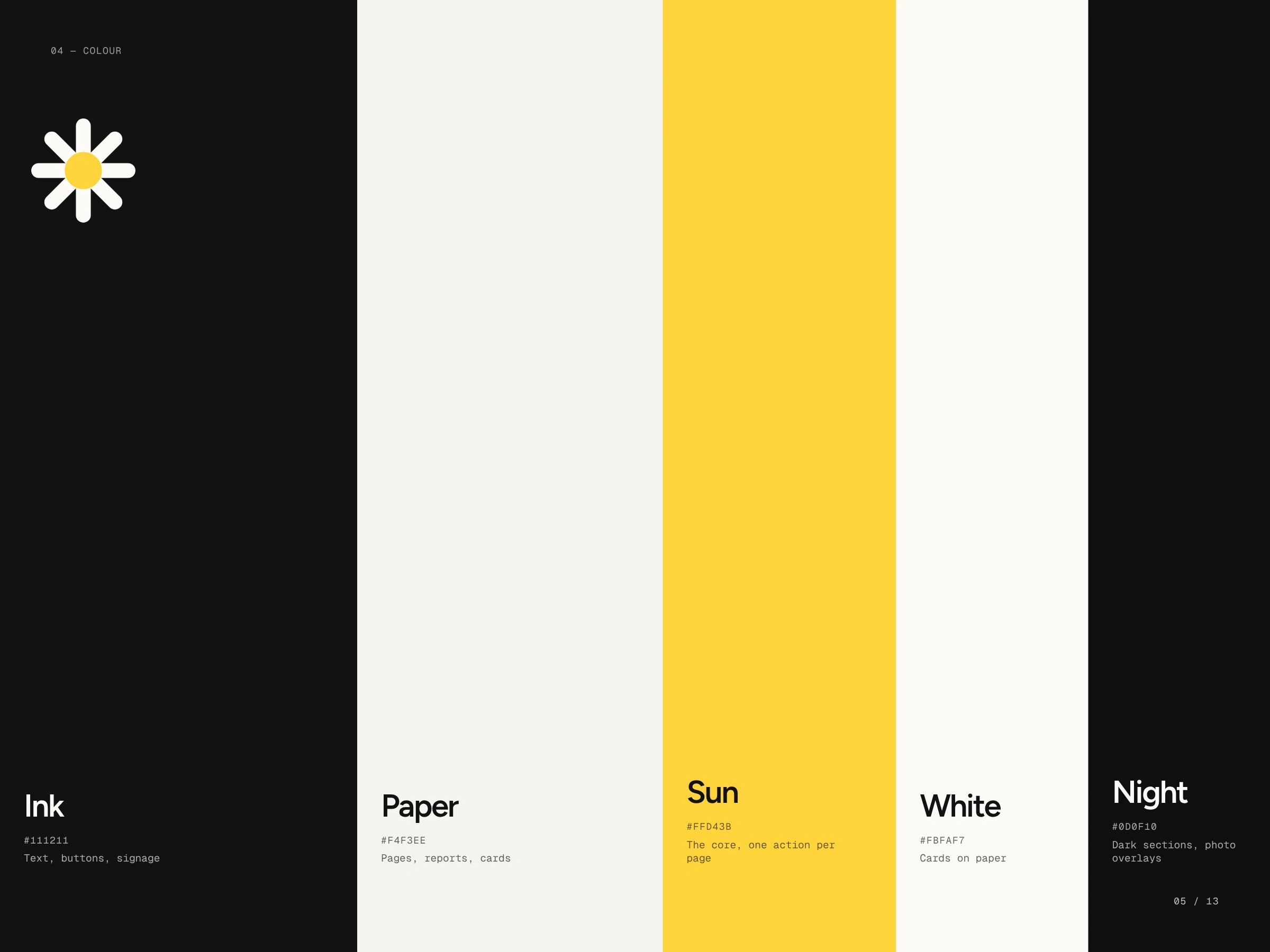
Colour: ink, paper, sun, white, night
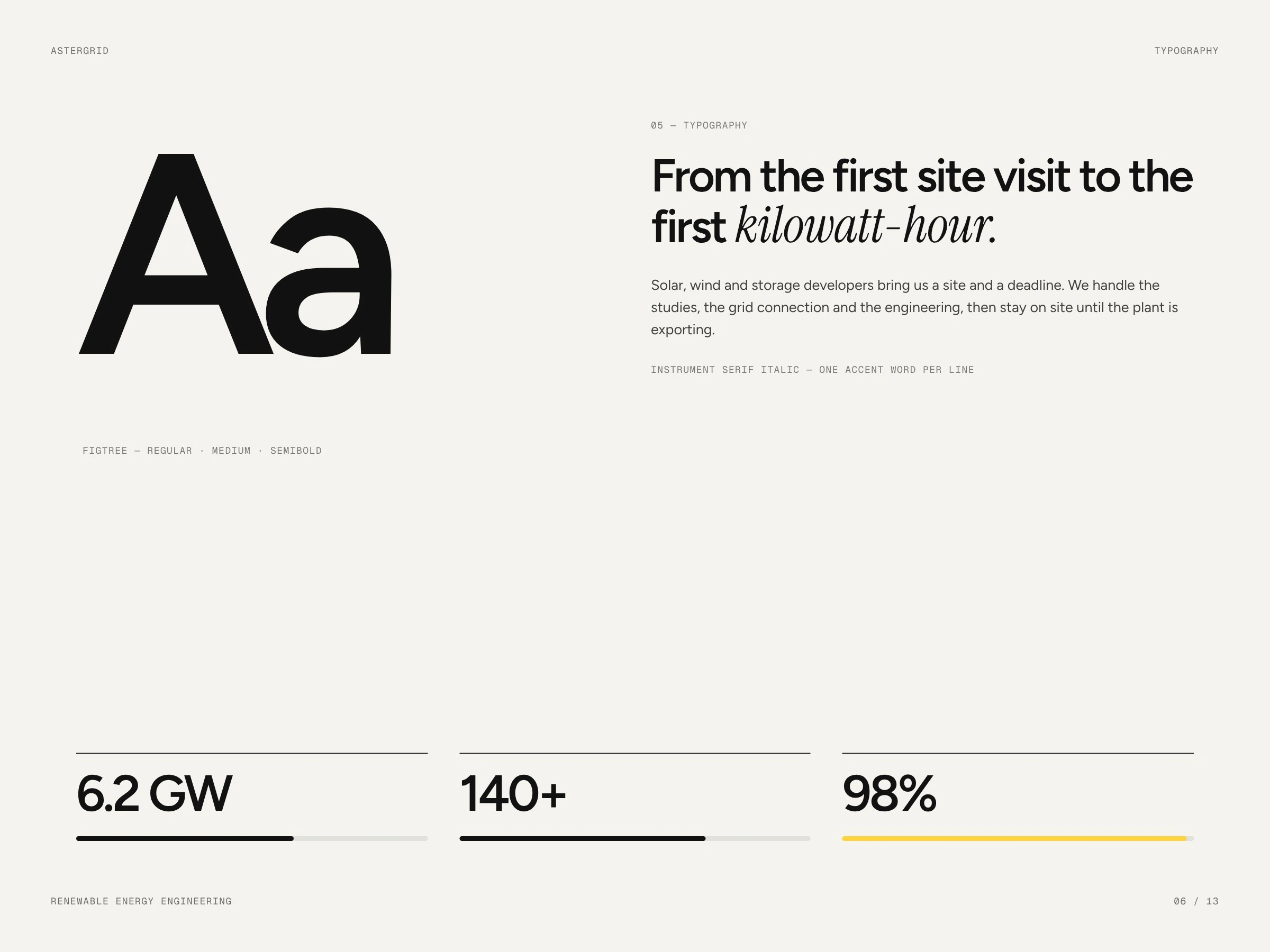
Typography: Figtree and Instrument Serif Italic
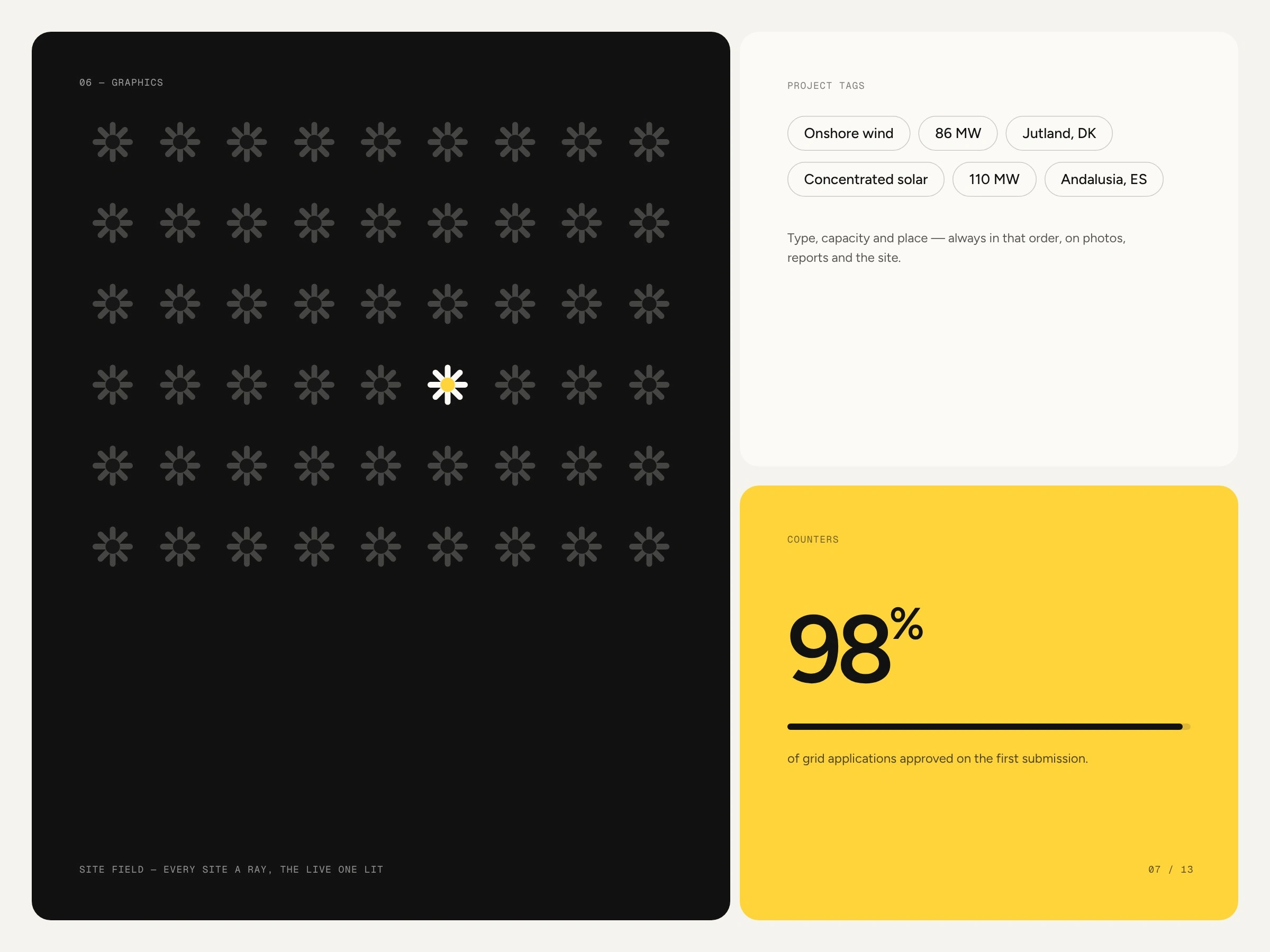
Graphics: site field, project tags, counters
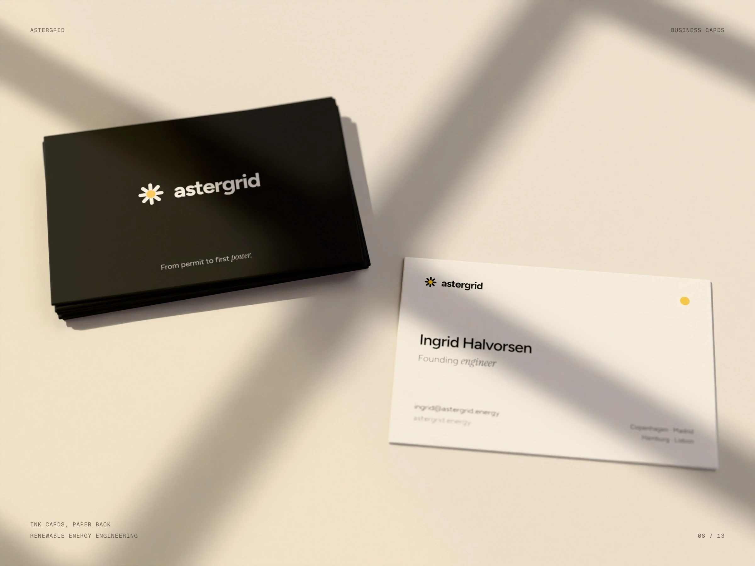
Business cards
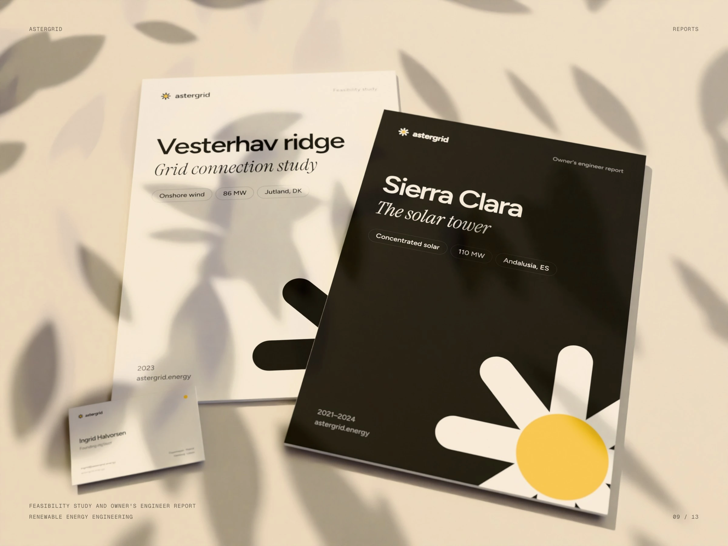
Feasibility study and owner's engineer report
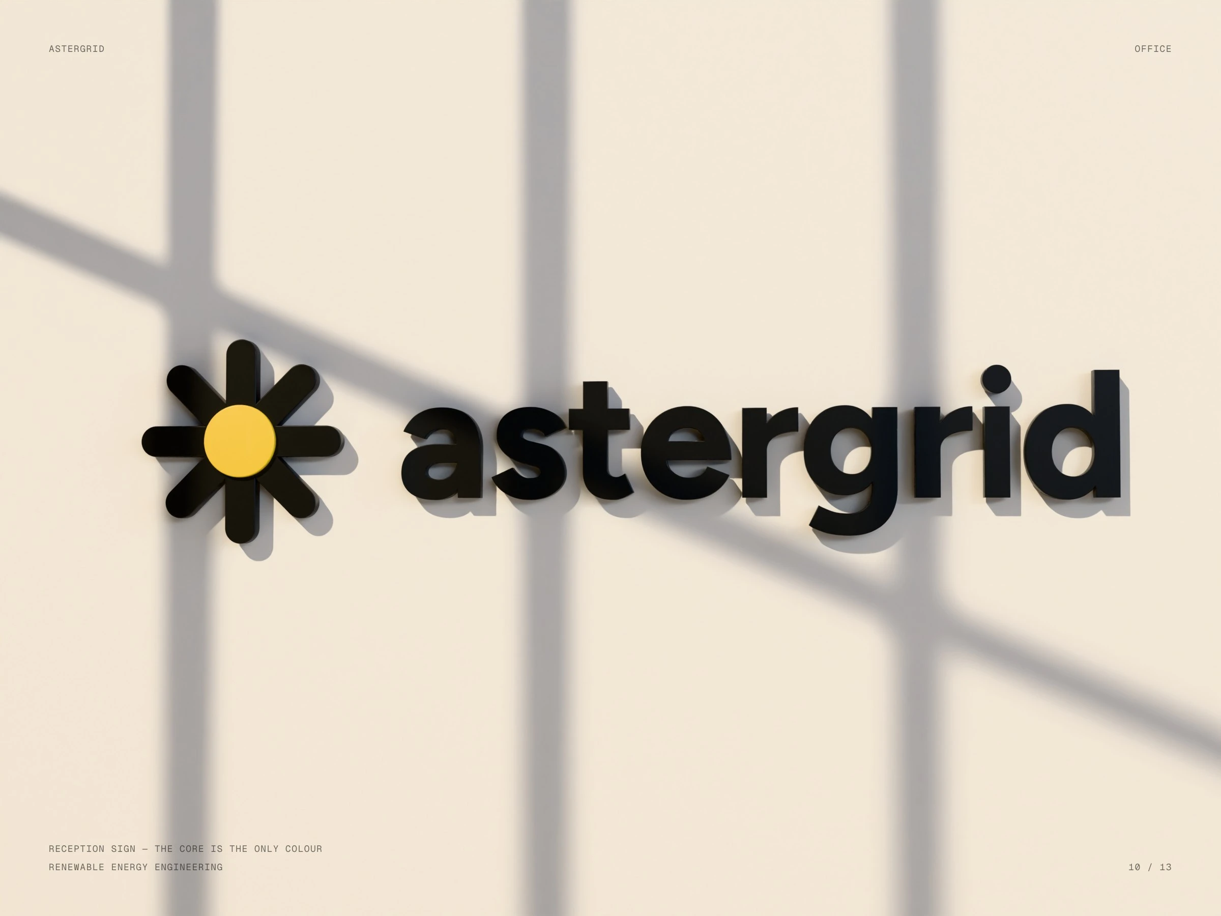
Reception sign
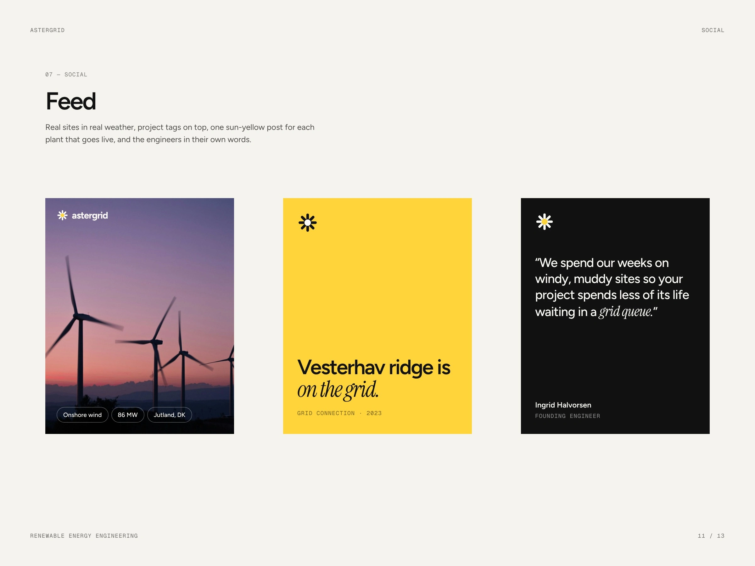
Social
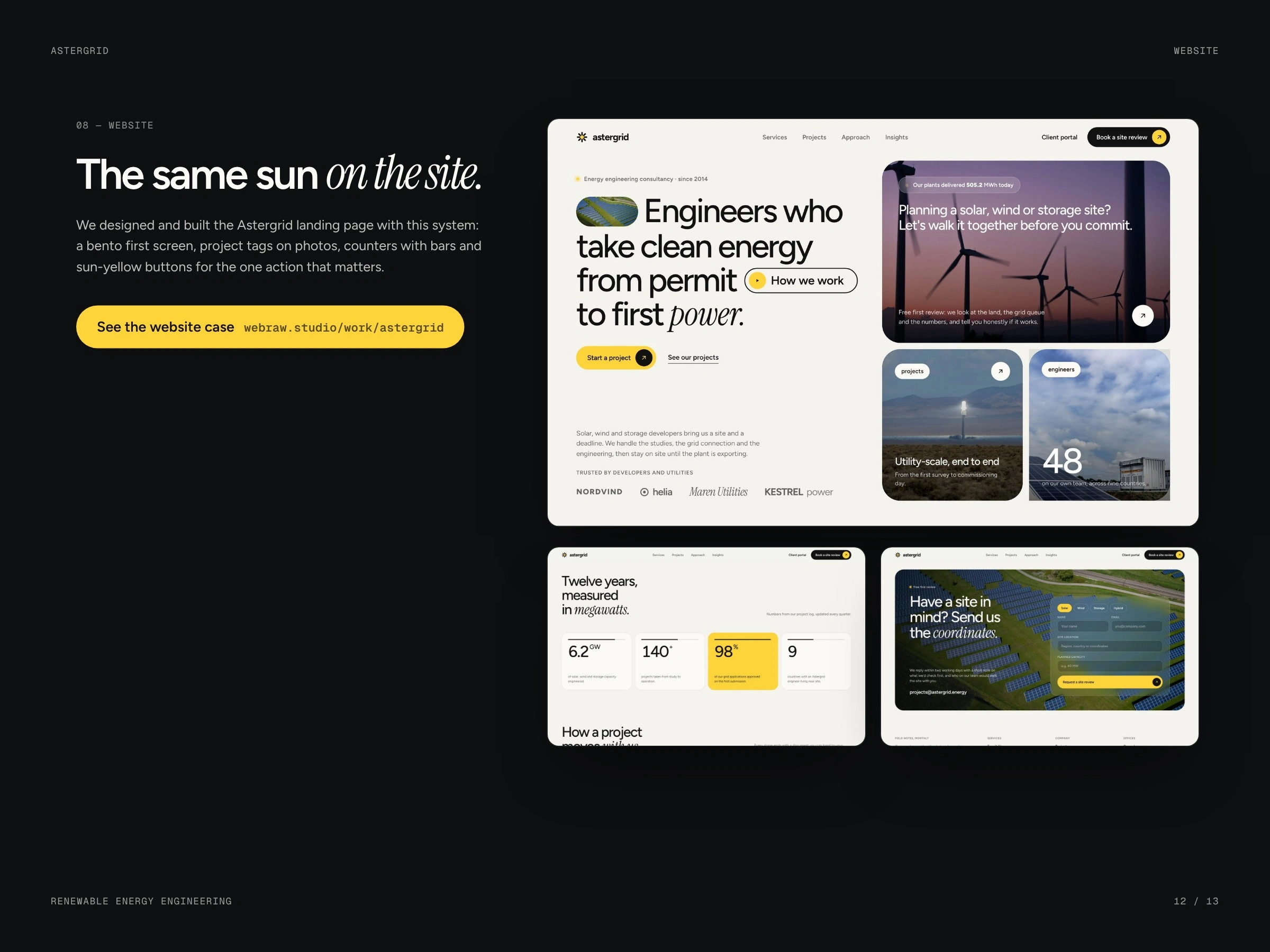
The same system on the website
Closing
1 like · 7 views · Oct 14, 2026
A sun drawn like a marker on a site plan: eight rays, one warm core, ink and paper — on reports, signage and the website.

