Kamilla


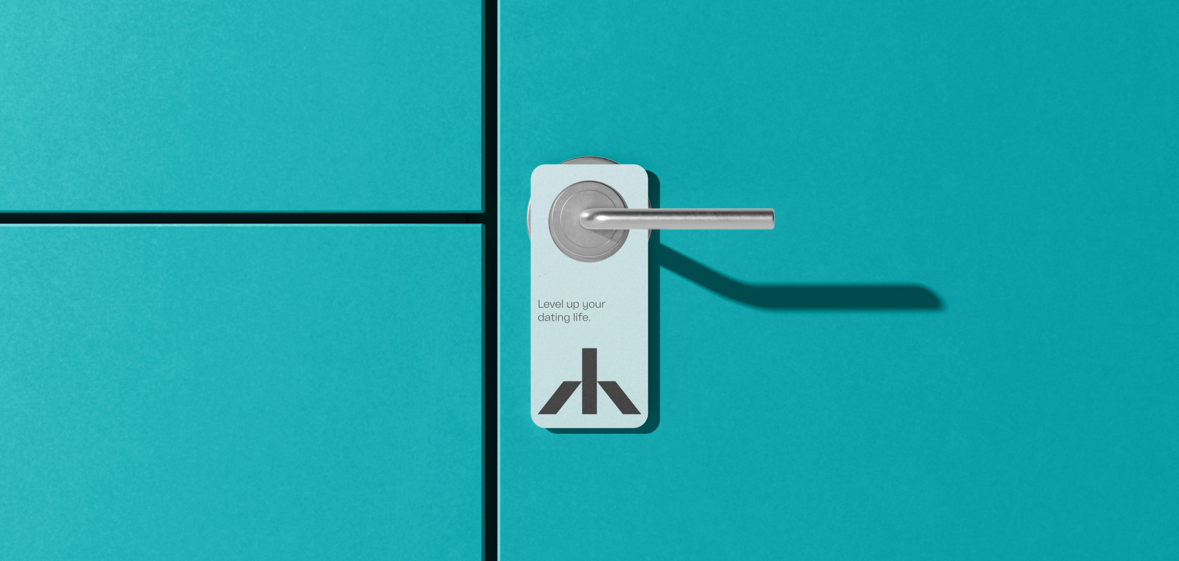


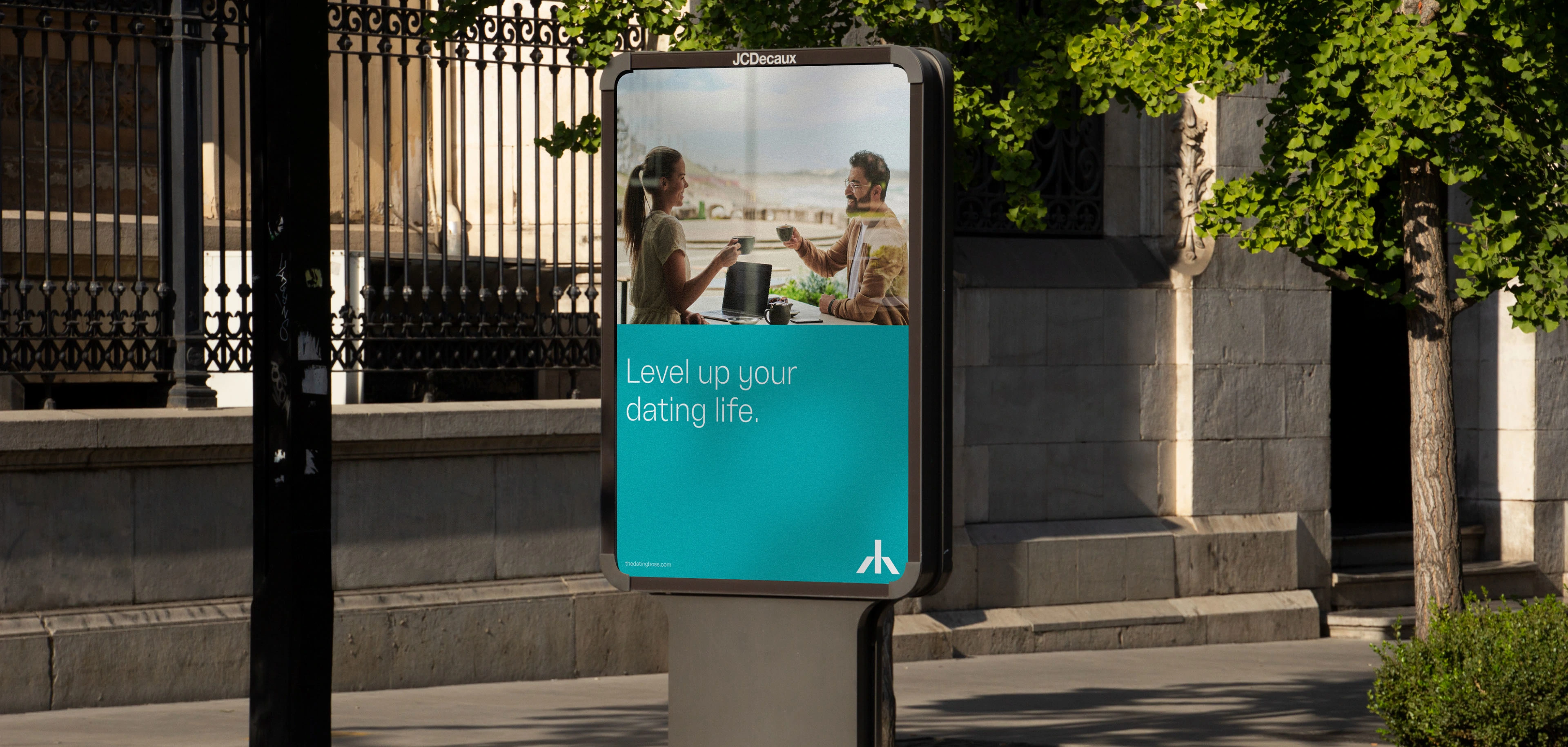
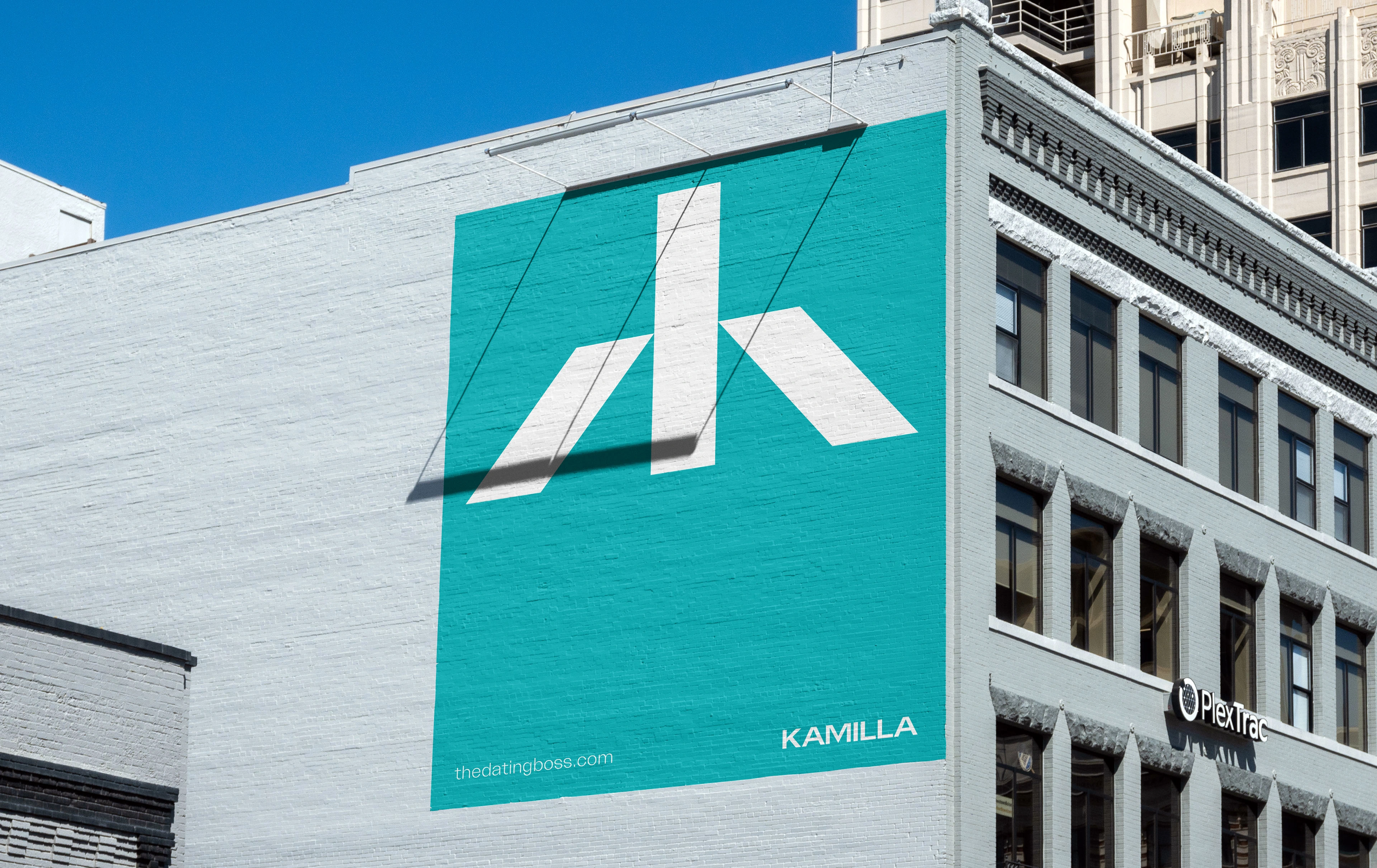
Kamilla is a coach charged with helping men level up their dating lives with uncensored advice, improving their confidence and leveling up their lifestyles.
For the development of Kamilla's identity we opted for colors that are different from the area where the brand operates, but at the same time are able to convey the feeling of what it is to talk to a professional like Kamilla.
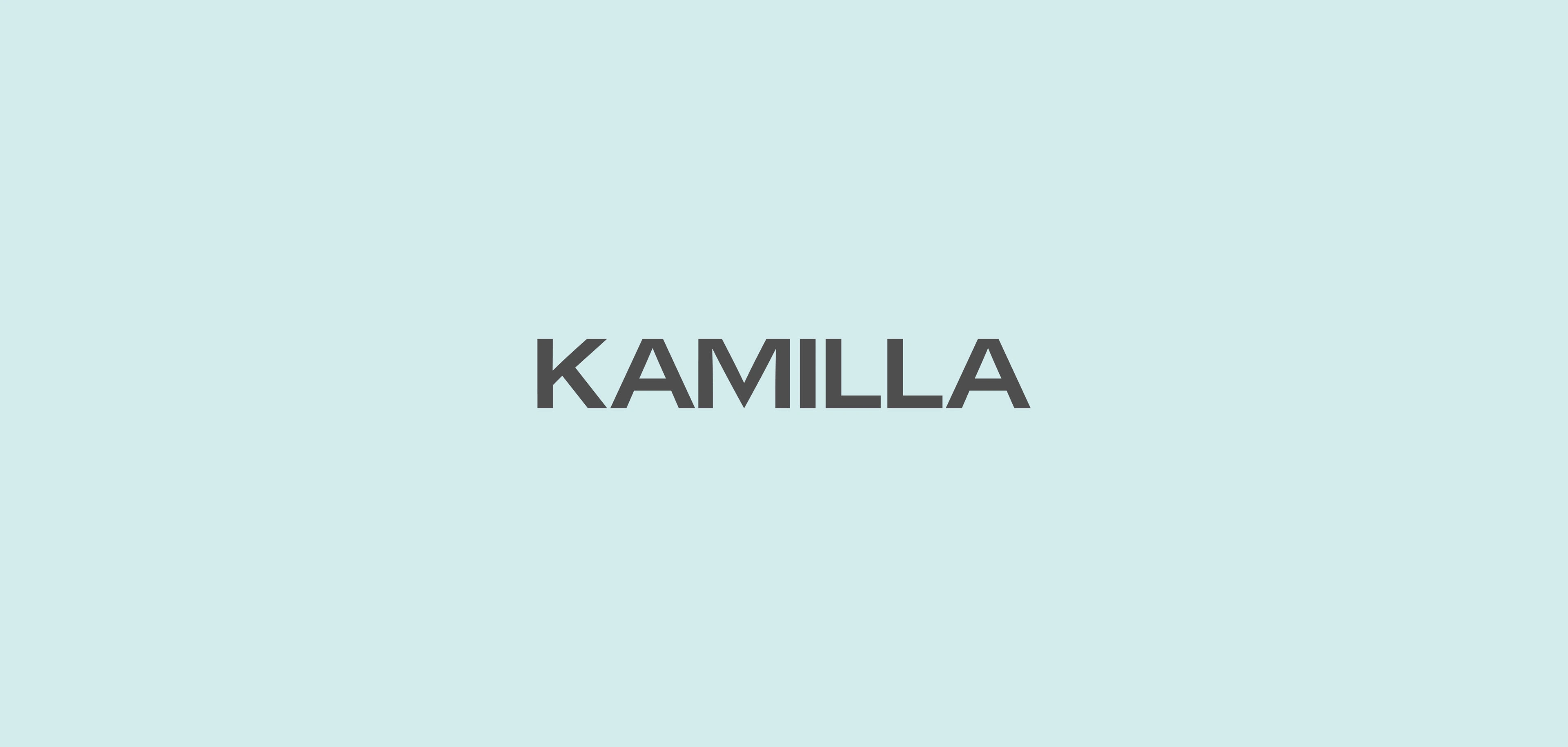
The logotype of the brand formed from strictly horizontal or vertical terminals, modern proportions, closed openings and custom settings make it remain neutral but firm to what the brand wants to convey.
The rational behind the identity as well as the symbol of the brand is balance, that's why the colors are combined equally and for the same reason the symbol that was originally going to represent the letter K, was modified to give that sense of balance.
The same balance that Kamilla transmits through her conversations, the same balance that every man who wants to have a successful love life should apply.
Like this project
Posted Jun 23, 2024
Visual Identity for a coach charged with helping men level up their dating lives.


