Visual Identity Design for Keep Up Agency
Rahat Chy
VISUAL IDENTITY
KEEP UP AGENCY
SWEDEN
About
Keep Up Agency is a marketing agency based in Nyköping, Sweden, specializing in social media, marketing strategy, content production, web development, media buying and advertising.
Concept
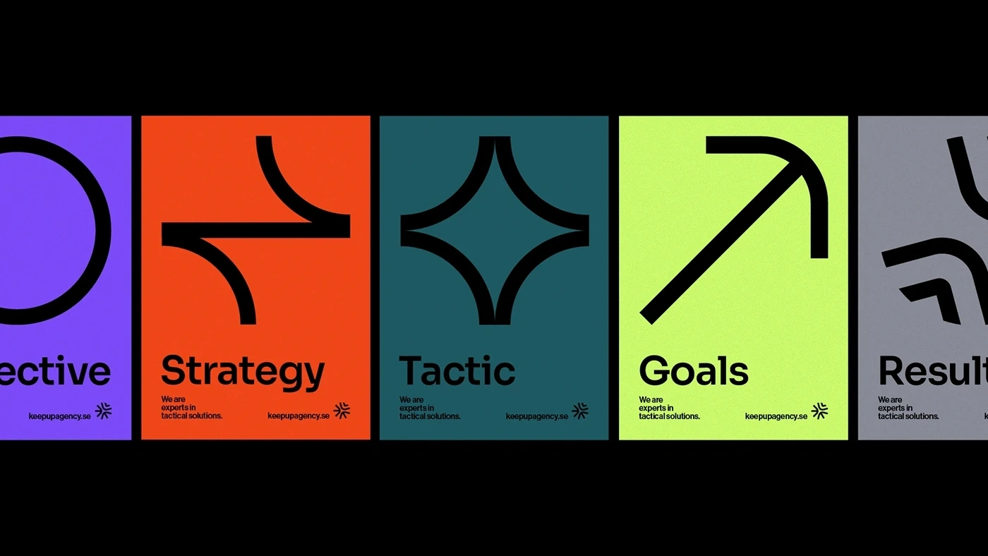
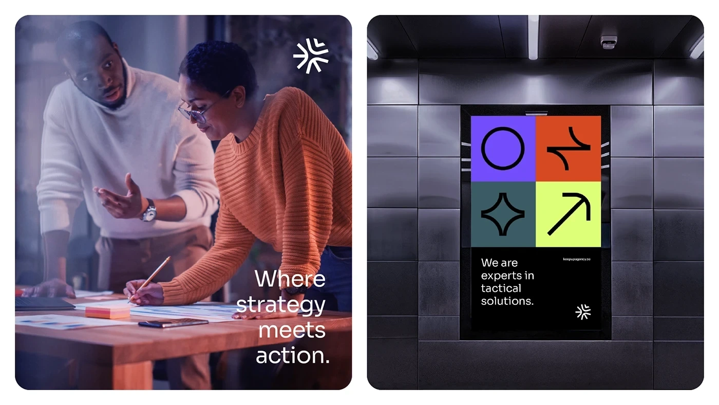
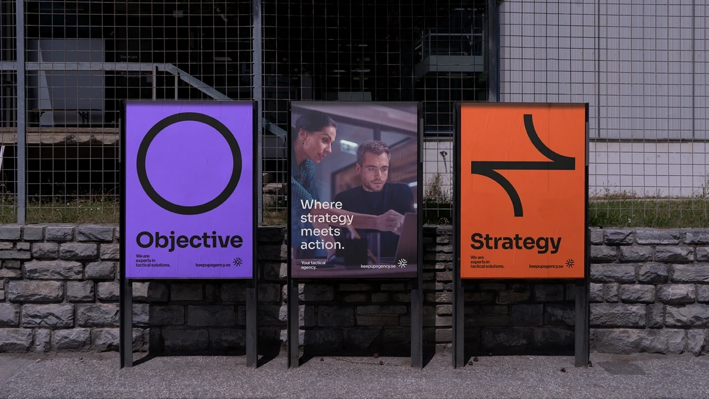
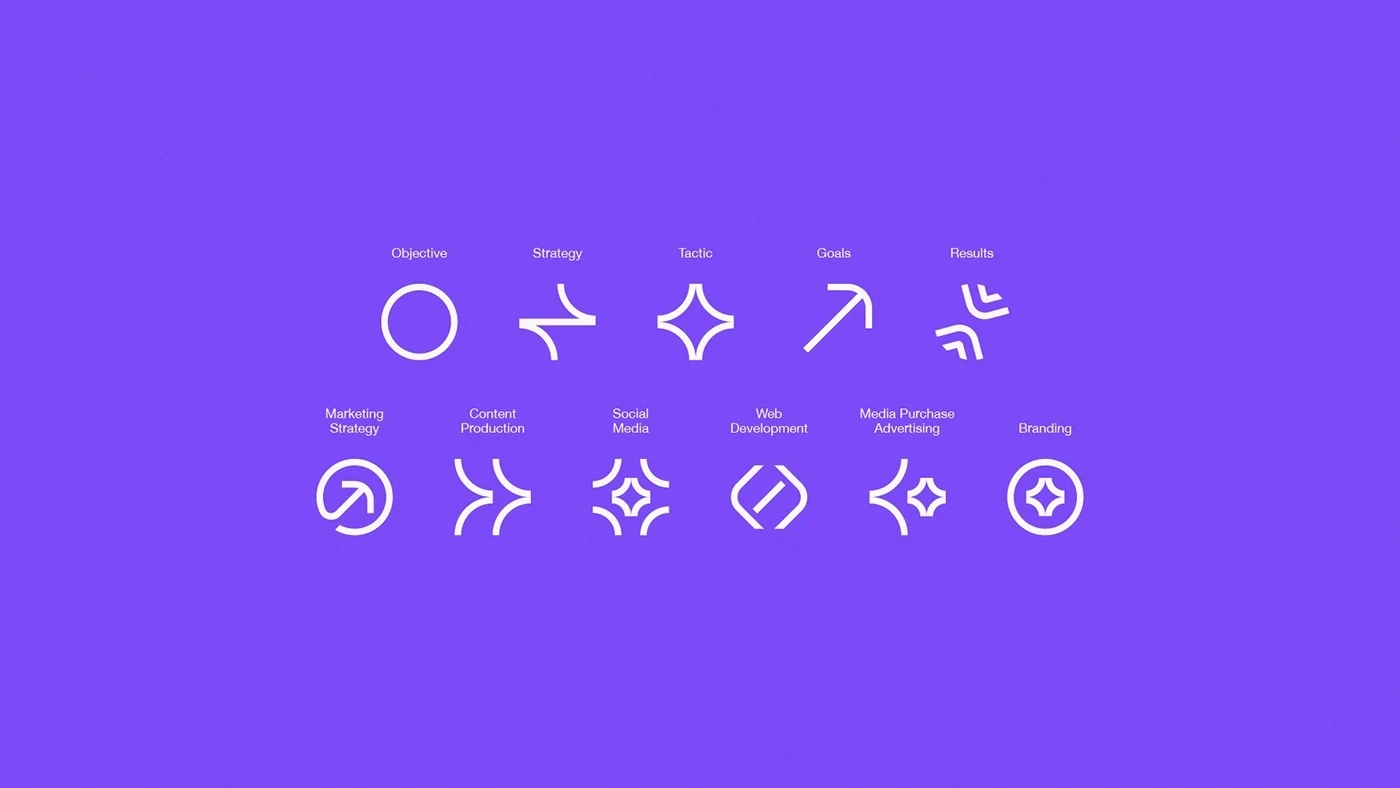
The visual concept of Keep Up Agency is based on fundamental pillars that guide any project developed by the agency: definition of objectives, strategies, tactics and results metrics. This methodical approach is essential to communicating Keep Up's seriousness and professionalism, while the minimalist and modern design aims to ensure a timeless and impactful appearance.

Logo
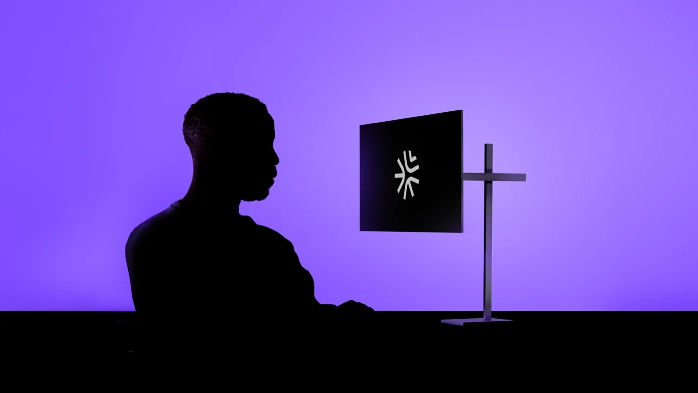
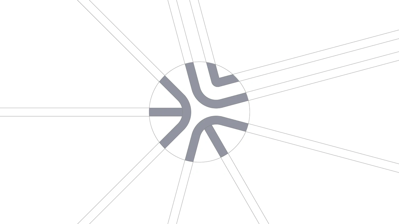
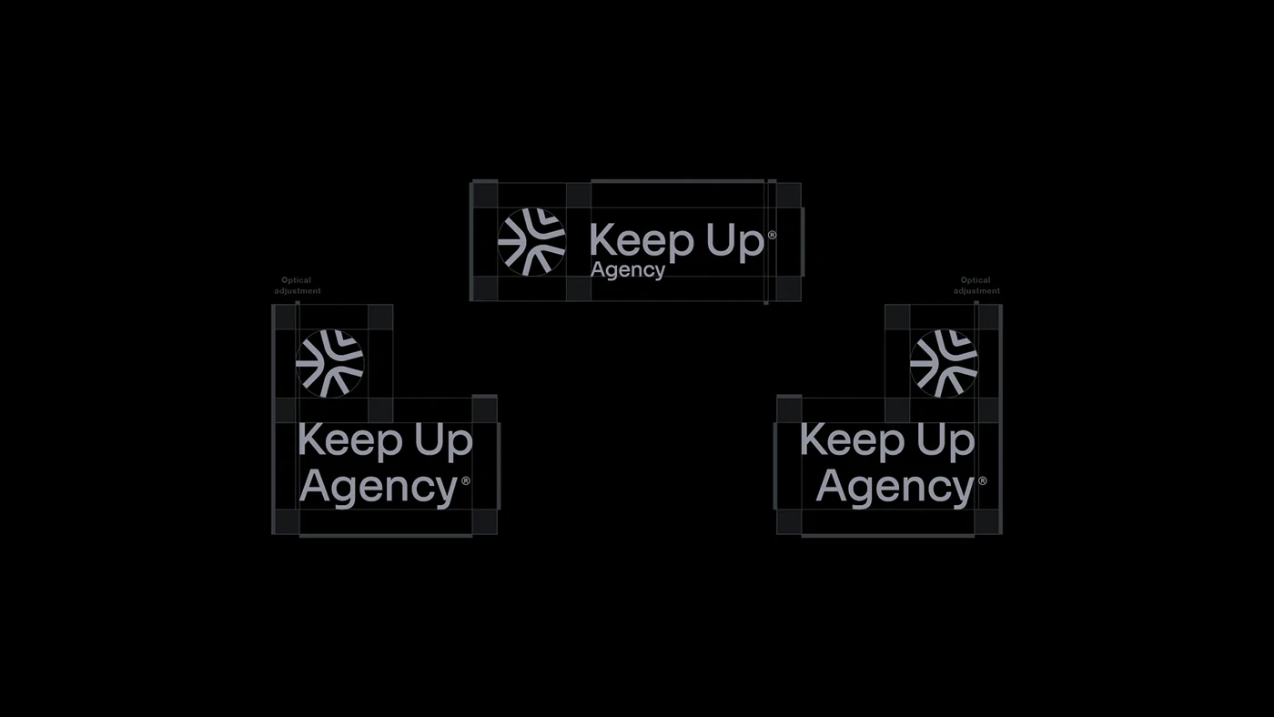
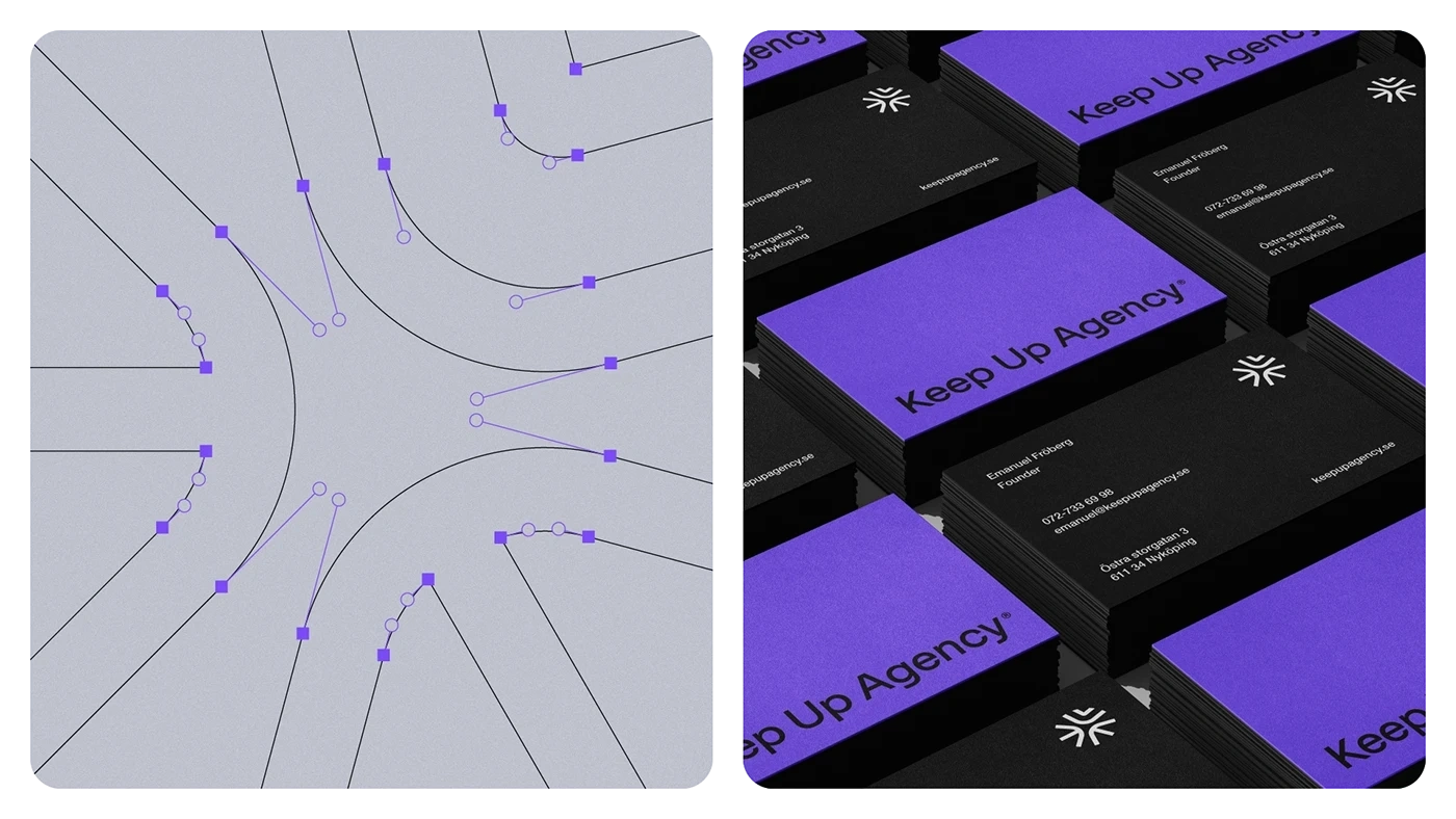
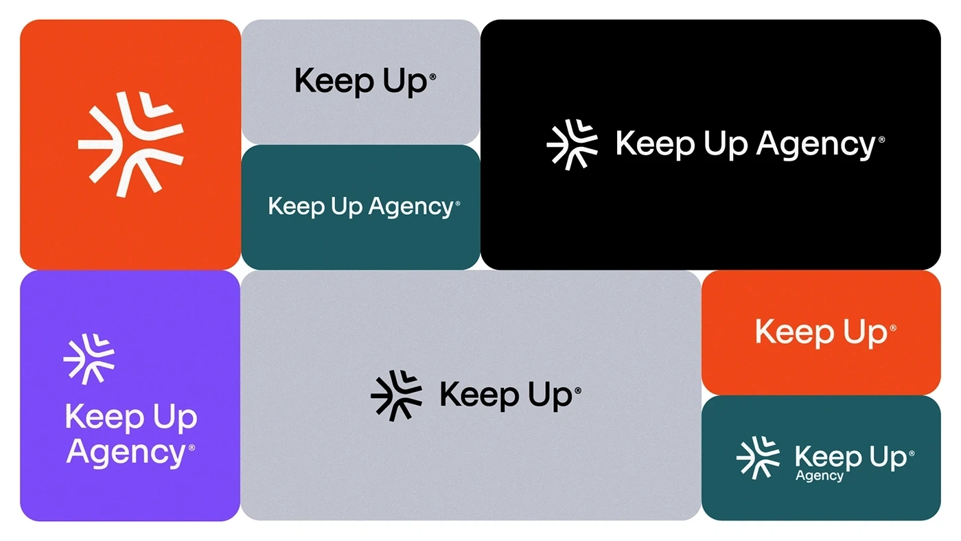
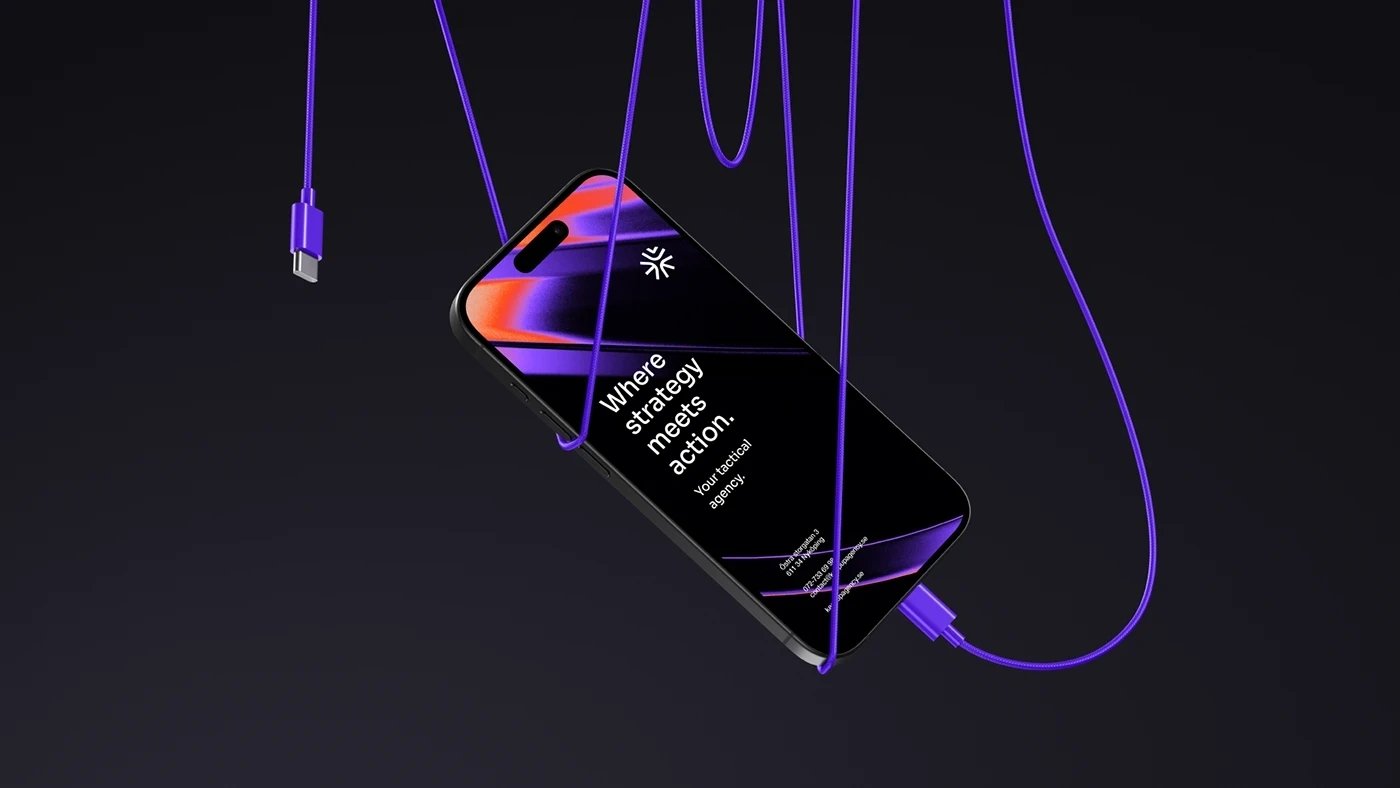
The Keep Up Agency logo was developed with the aim of representing the strategic stages of the agency's services. The symbol is made up of three arrows that form a figure similar to a target, symbolizing the setting of goals and obtaining results. Each arrow represents a key element: strategies, tactics and objectives, culminating in a central target that illustrates the focus on results and success. The sans-serif typography chosen for the logo complements the symbol, ensuring a timeless and balanced appearance.
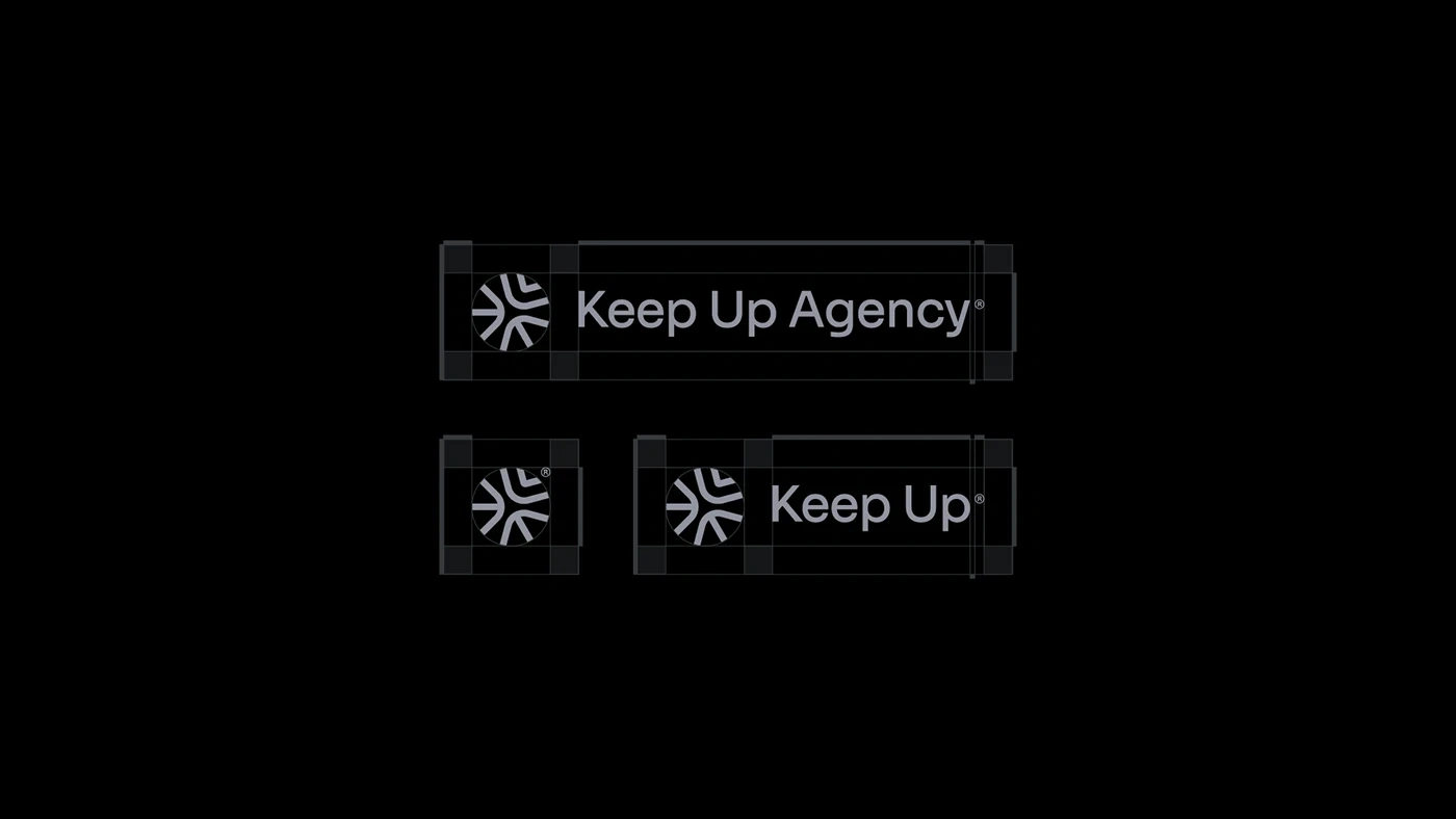
The construction of the logo follows a consistent grid of diagonal lines, providing movement and visual agility. The arrangement of these lines and their spacing establish a visual balance that conveys the agency’s precision and efficiency. Furthermore, versions of the logo were created that include a safety margin and clear space between the symbol and the typography, ensuring good readability and easy identification in different sizes and arrangements of the elements, also guaranteeing dynamicity to the logo.
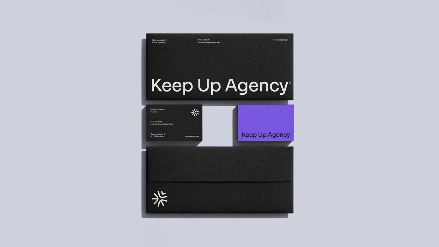
Visual Identity
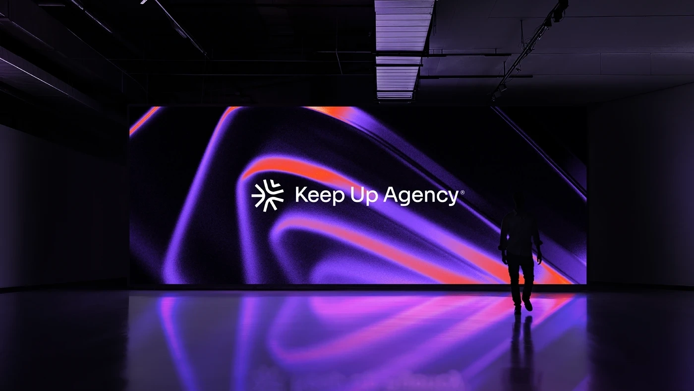
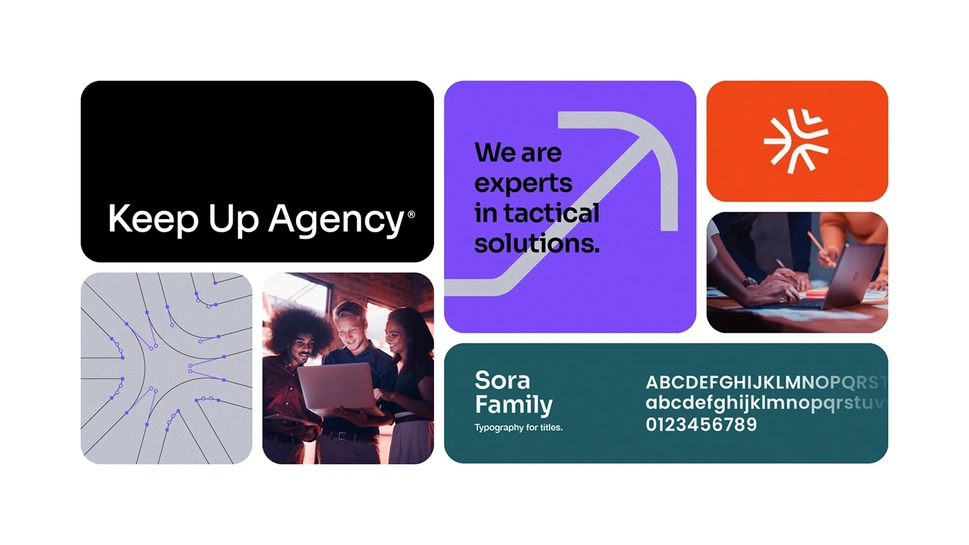
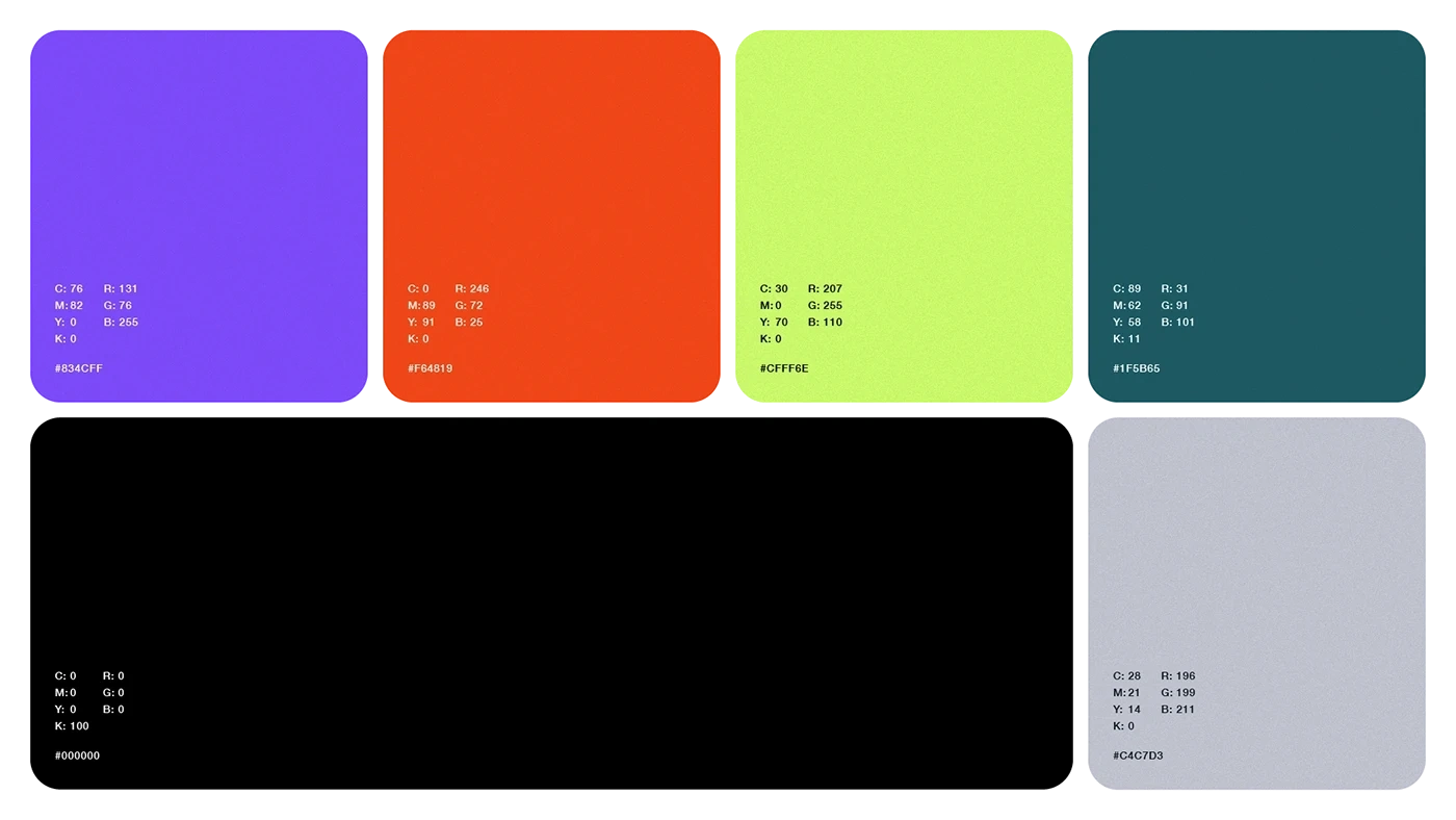
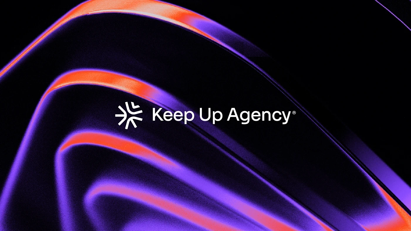
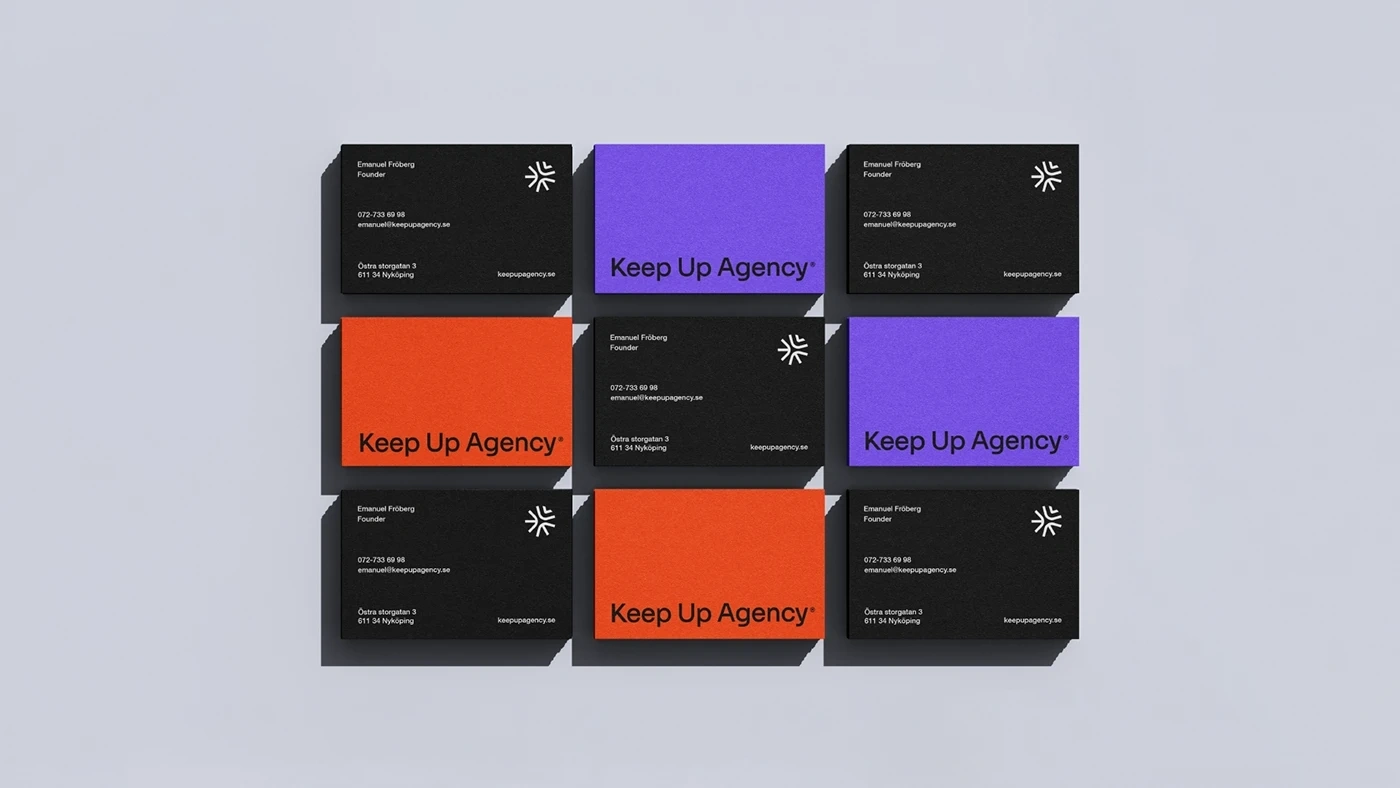
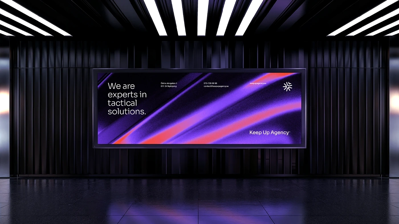
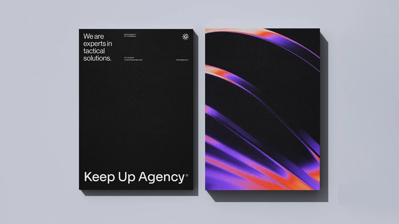
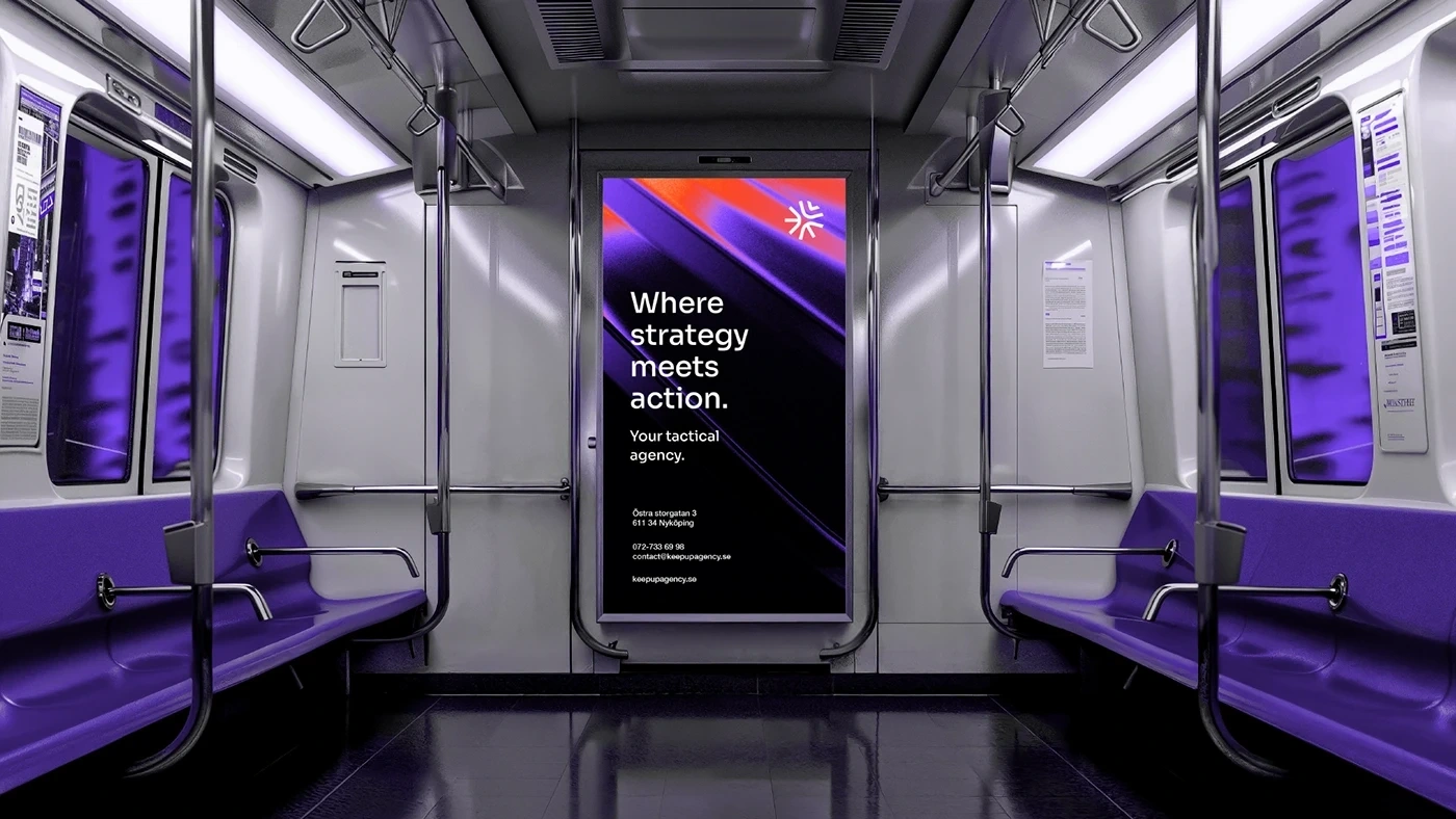
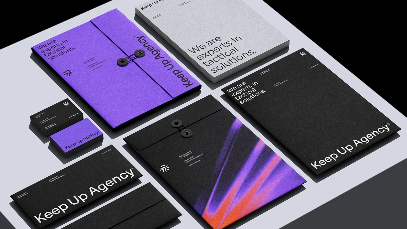
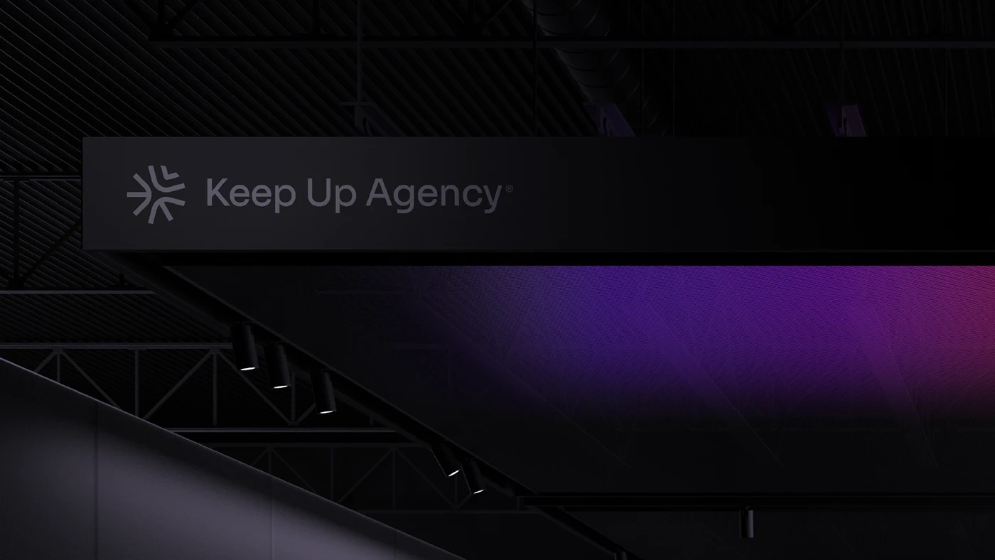
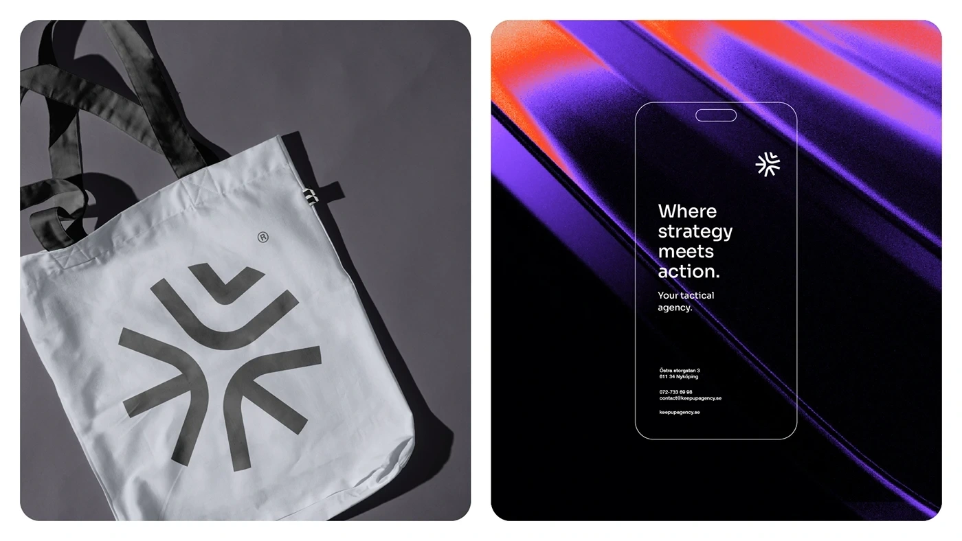
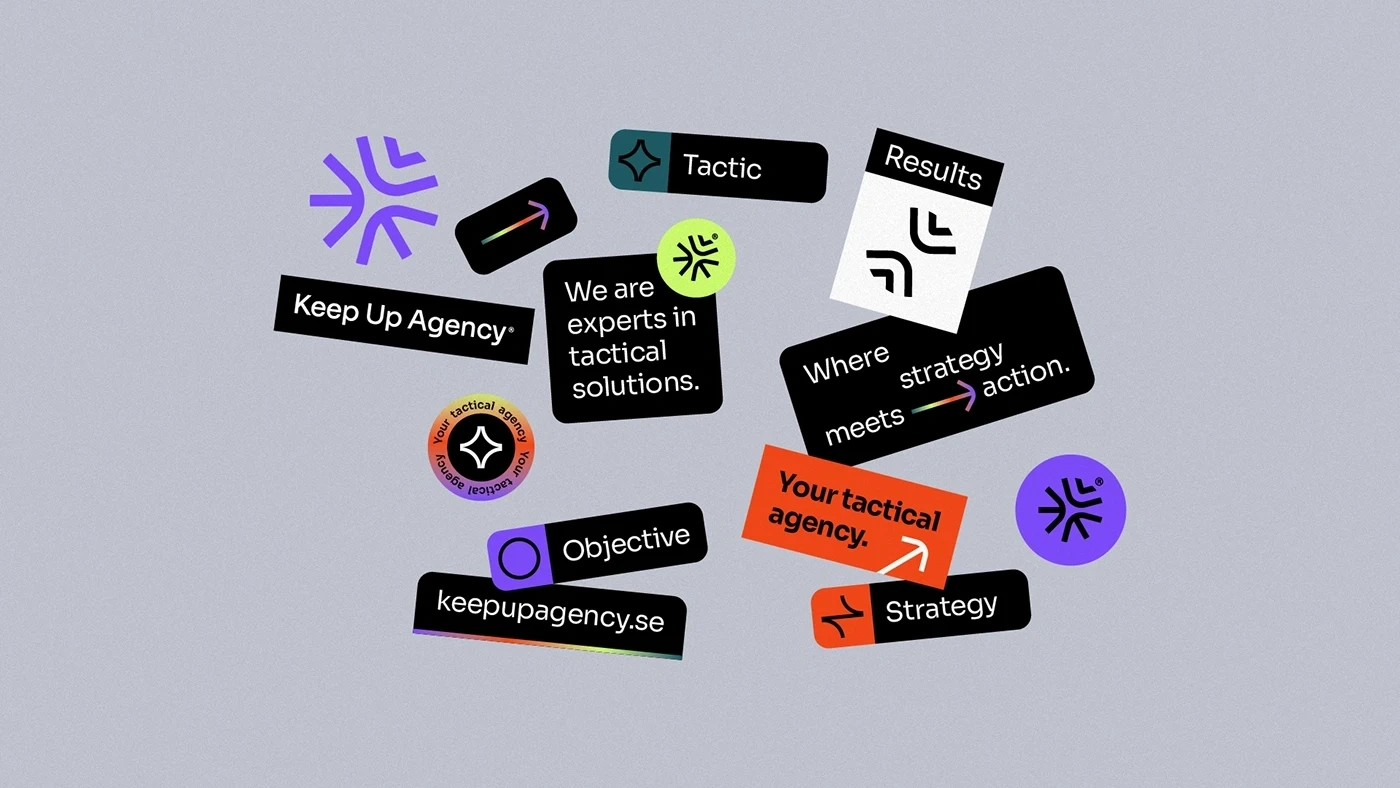
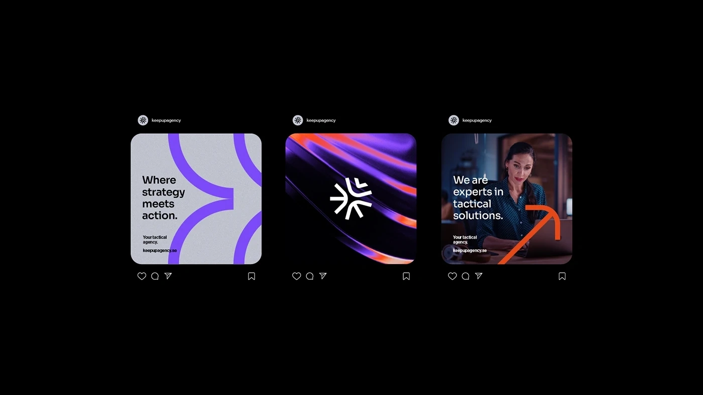
The color palette of Keep Up Agency was created to convey seriousness, energy and confidence. Black symbolizes the agency's seriousness and professionality, while orange and purple exude energy and dynamism. Green, in turn, represents confidence and growth, creating a vibrant and differentiated visual identity in the market.
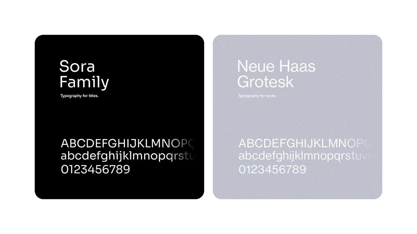
The choice of sans-serif typography, Sora for titles and Haas Neue Grotesk for texts, guarantees clear and pleasant reading, in addition to adding a touch of modernity and timelessness to the visual identity of Keep Up Agency. These fonts perfectly balance elegance and functionality, reflecting the agency's strategic and creative approach.
Like this project
Posted Sep 1, 2025
Created a modern visual identity for Keep Up Agency, including logo, brand assets with color palette.
Likes
1
Views
3
Timeline
Jan 3, 2025 - Jan 9, 2025