[Brand Magic 🔮] Curio & Muse

Darya Batyr ✦
Verified


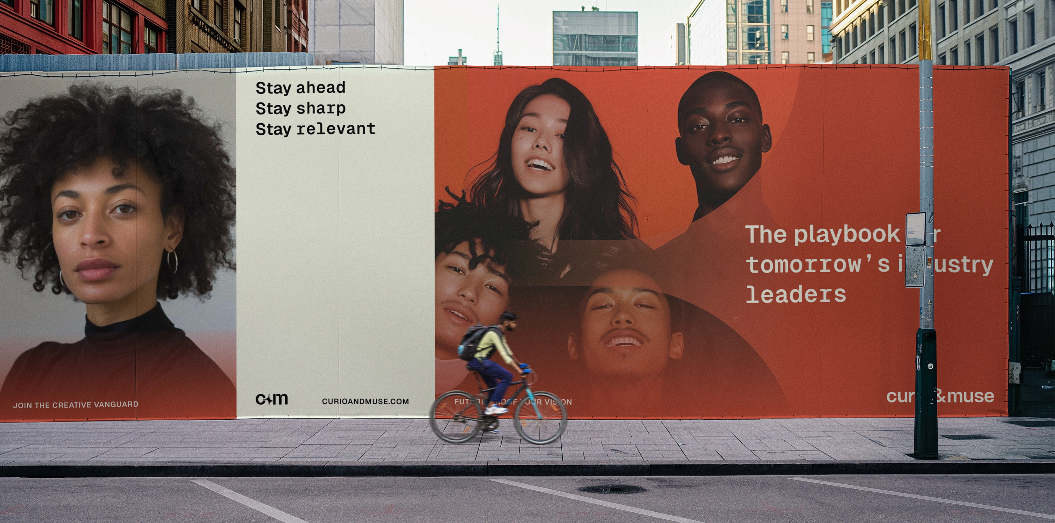
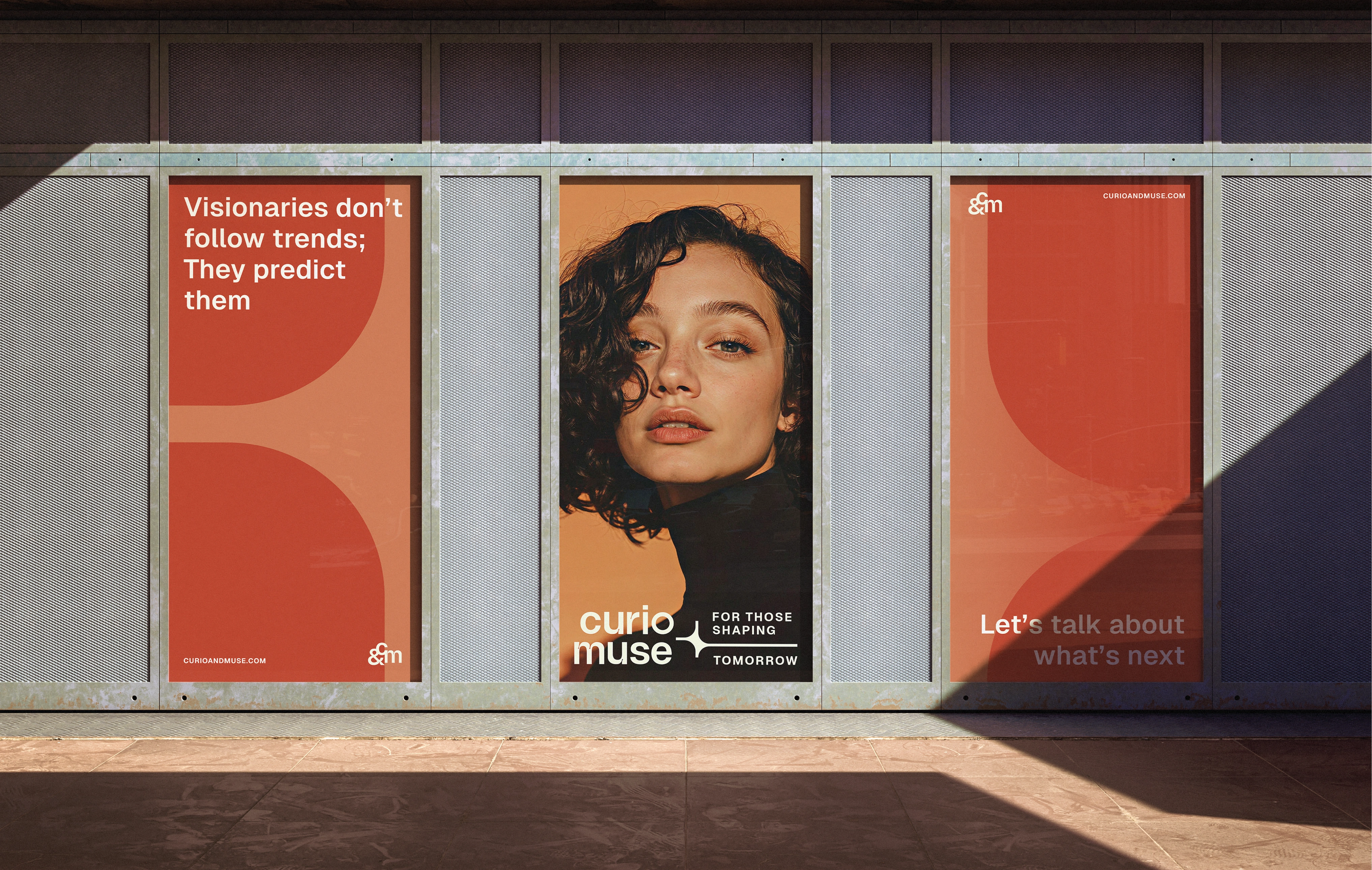
C&M billboard design
Refined, strategic identity packed with meaning and symbolism
Curio & Muse exists at the intersection of thought leadership and creative exploration, offering sharp, forward-thinking insights for those shaping the future of brand, business, and culture. My role was to craft a visual identity that reflected this balance - one that felt authoritative yet inviting, analytical yet deeply human.
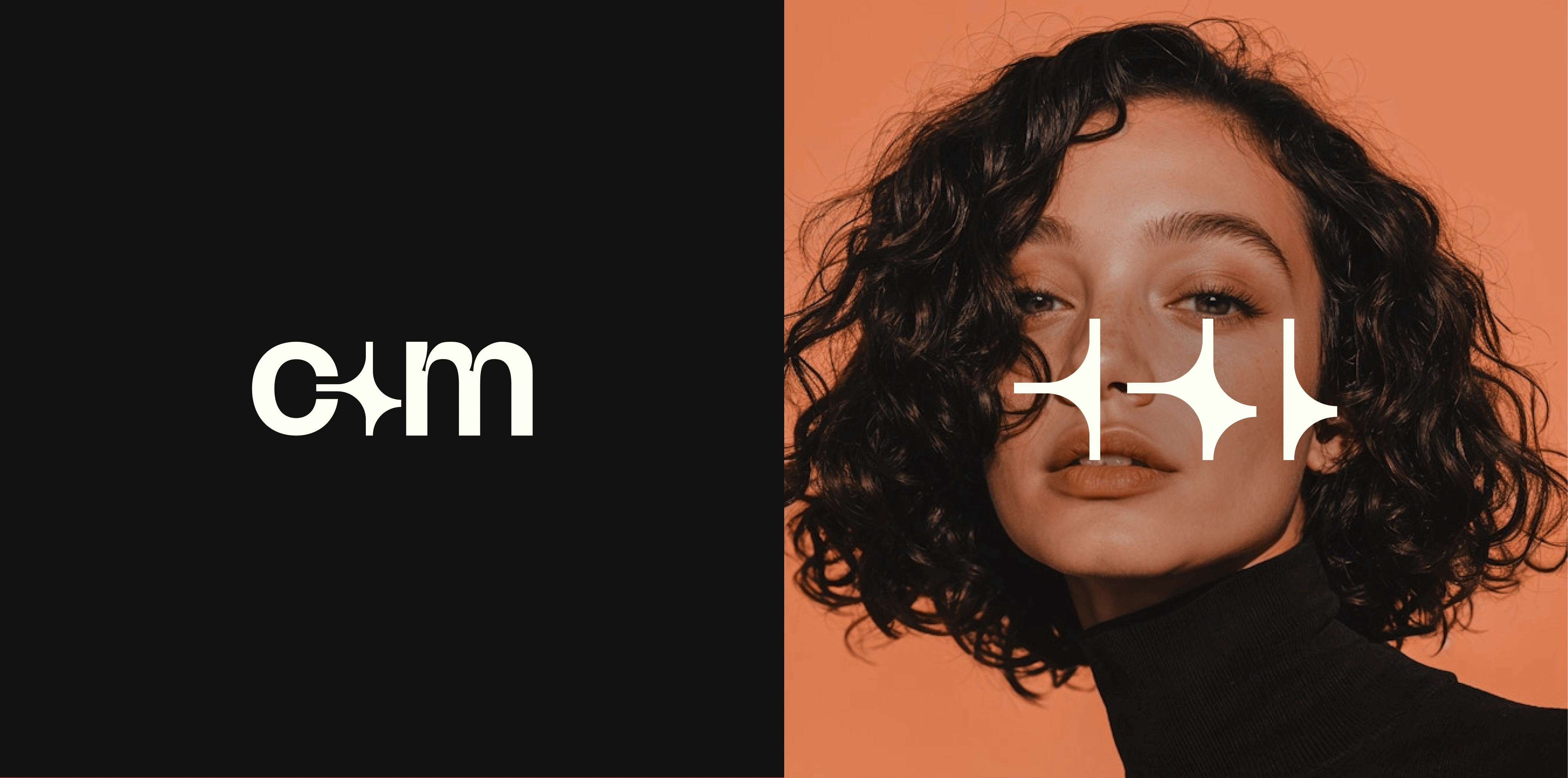
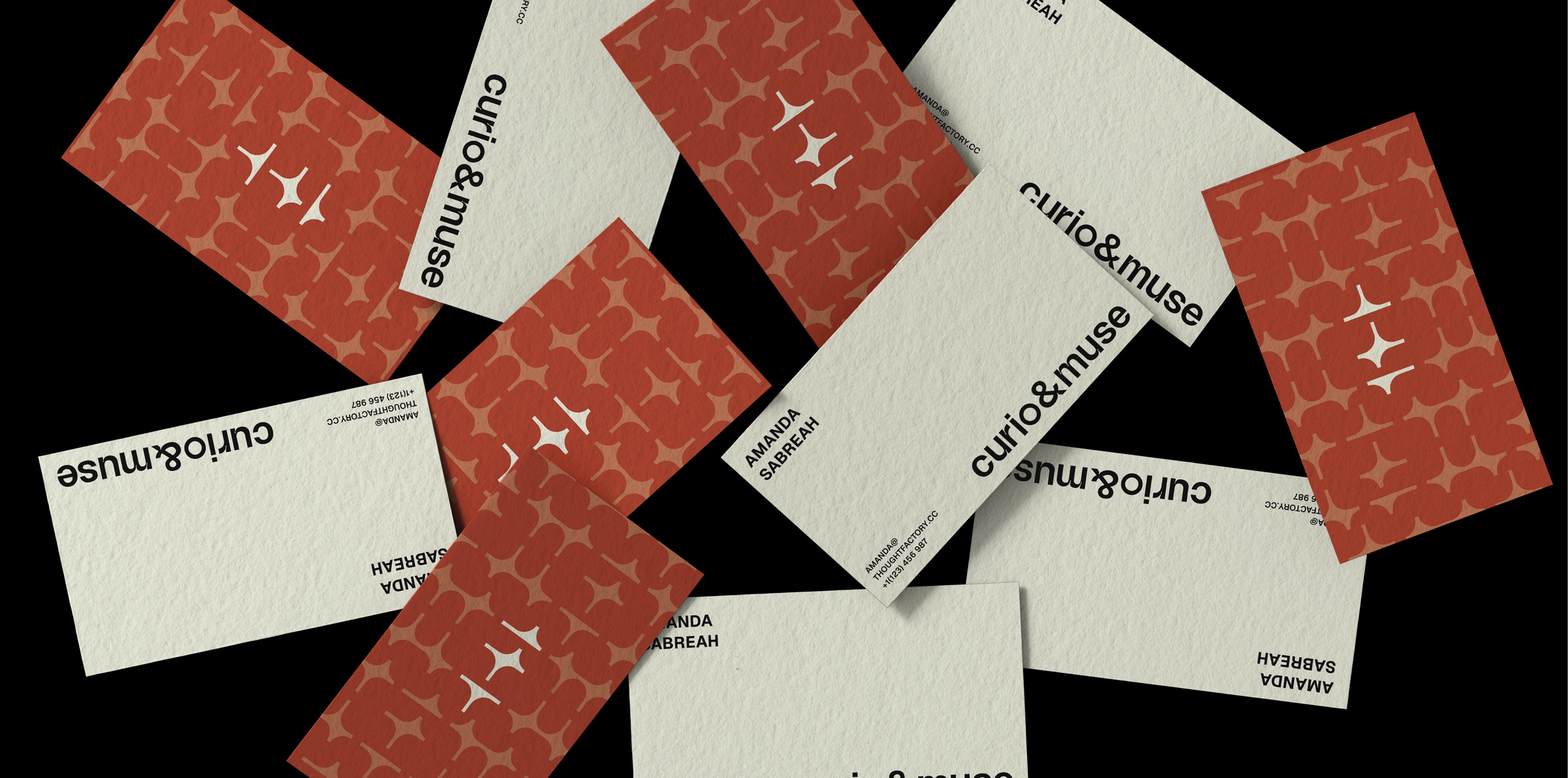
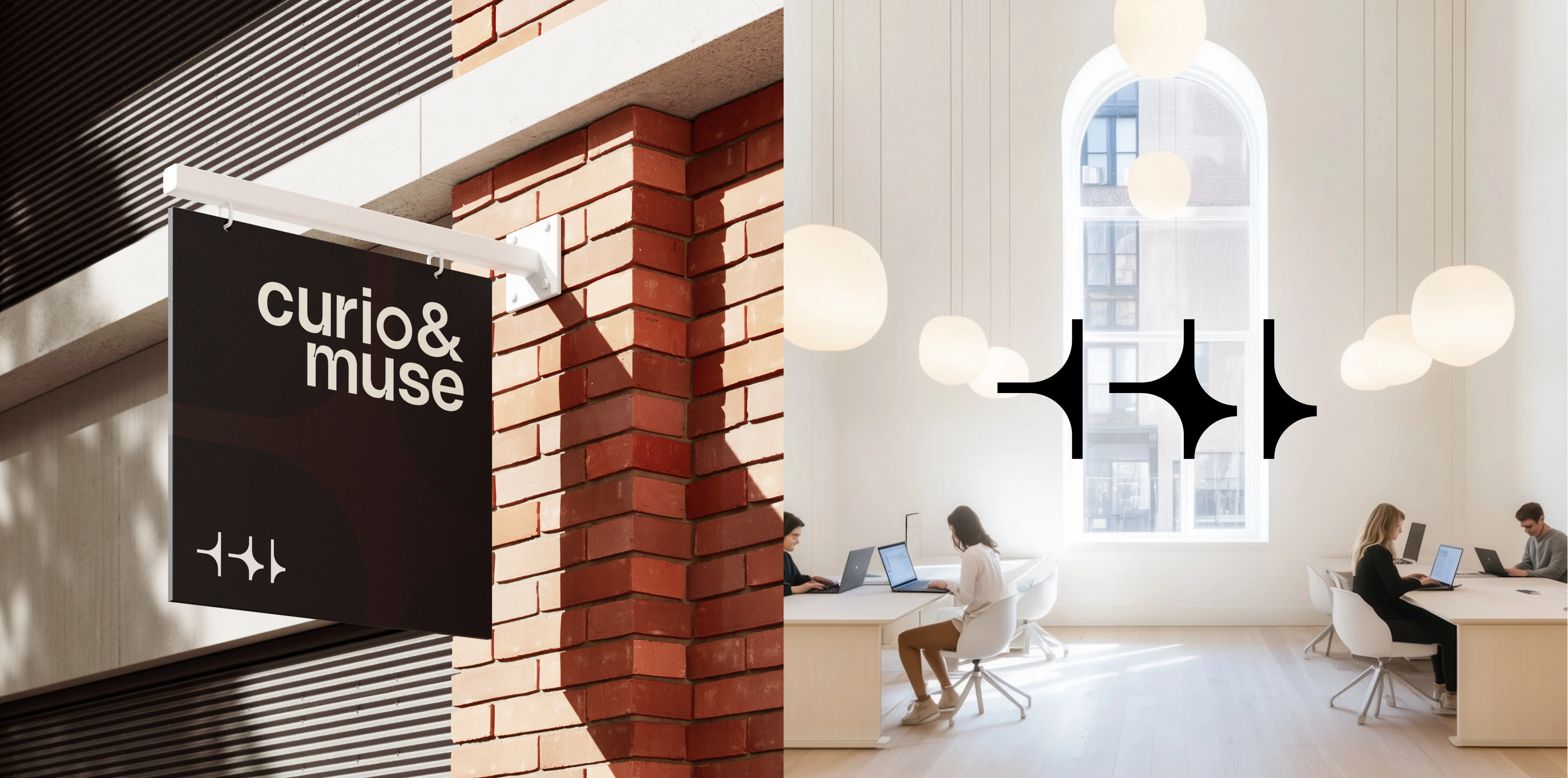
C&M logo suite | Business card design
Designing a Symbol of Leadership, Growth & Possibility
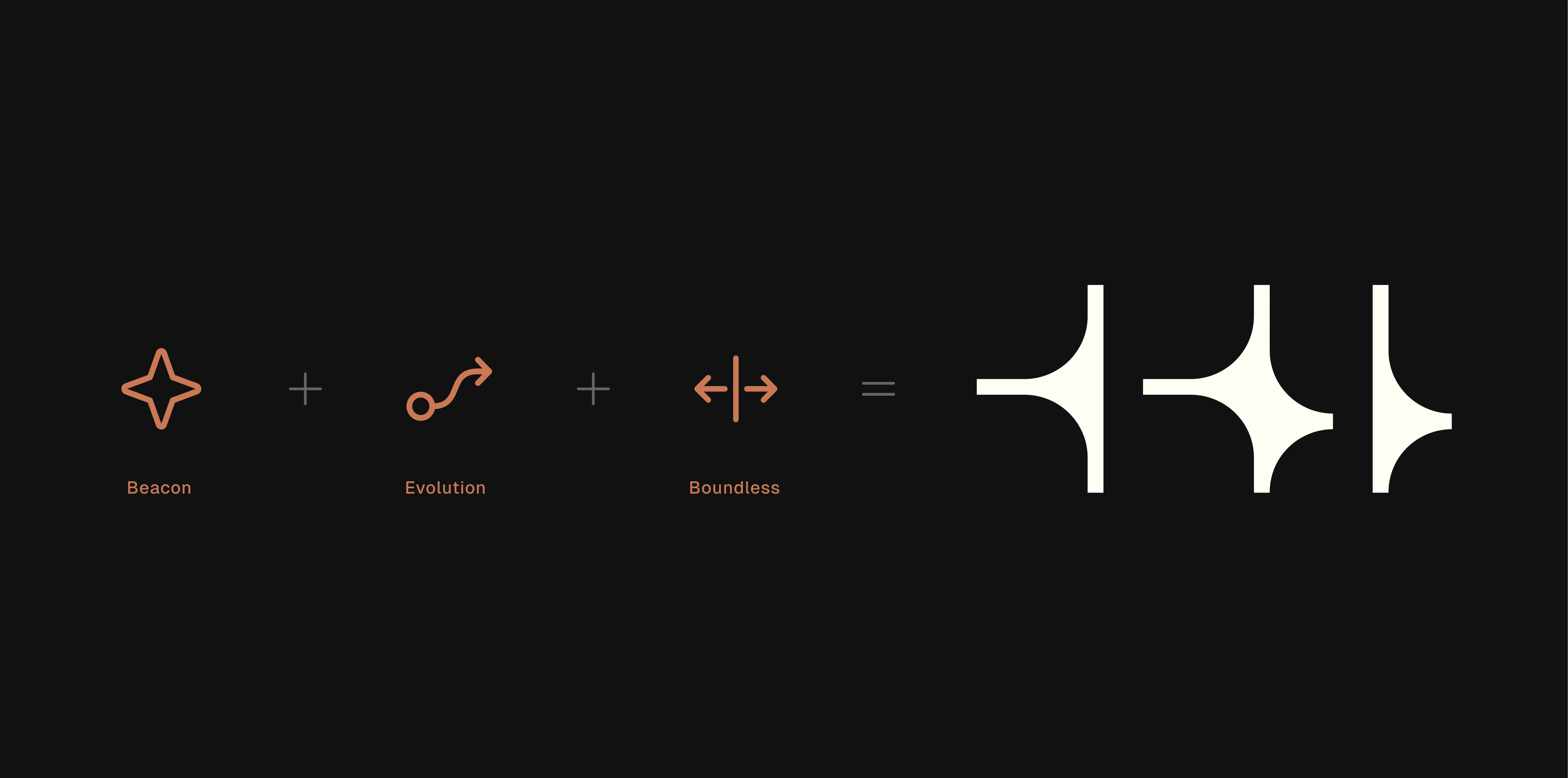
At the heart of the brand identity is the Curio & Muse submark - a symbol that embodies the brand’s role as a beacon of insight, a force for progress, and a gateway to knowledge.
A beacon, representing leadership and vision. The reimagined lighthouse beacon serves as a metaphor for the brand’s role as an industry guide - one that illuminates trends, provides clarity, and leads the way for creative decision-makers. The geometric yet uniquely fluid form ensures that the symbol feels distinct and contemporary.
Asymmetry, as symbol of evolution and progress. The three-piece composition is carefully balanced with intentional asymmetry, reflecting the brand’s forward-thinking and dynamic nature. It signals growth, evolution, and the willingness to embrace change - key qualities in a rapidly shifting business and creative landscape.
An open doorway, for boundless possibilities. Emphasizing industry-wide empowerment, Curio & Muse isn’t about gatekeeping knowledge but rather about making high-level insights accessible, empowering its audience with the tools and perspectives needed to make bold, informed decisions.

C&M Submark | Digital use
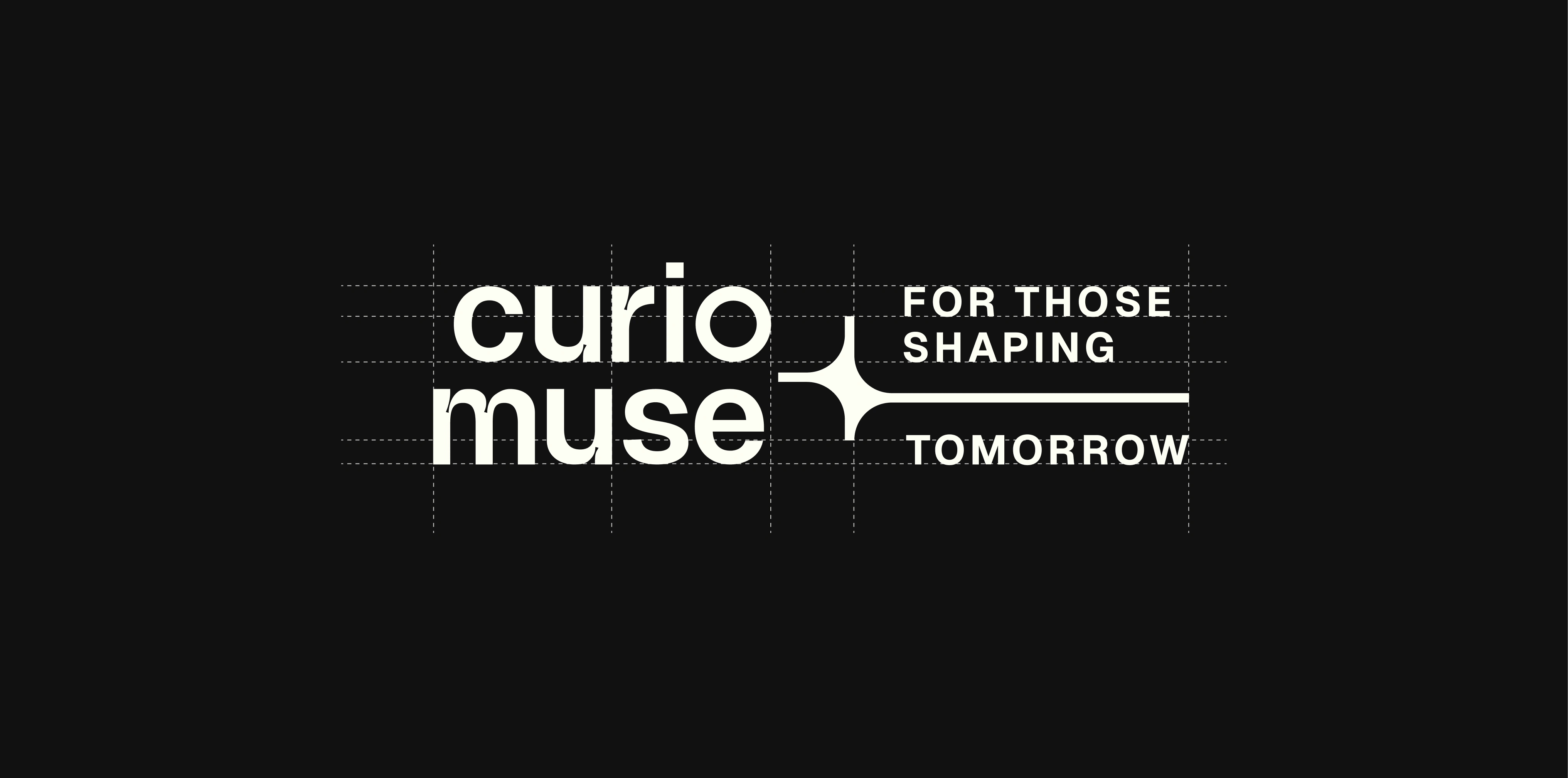
A cohesive, scalable identity
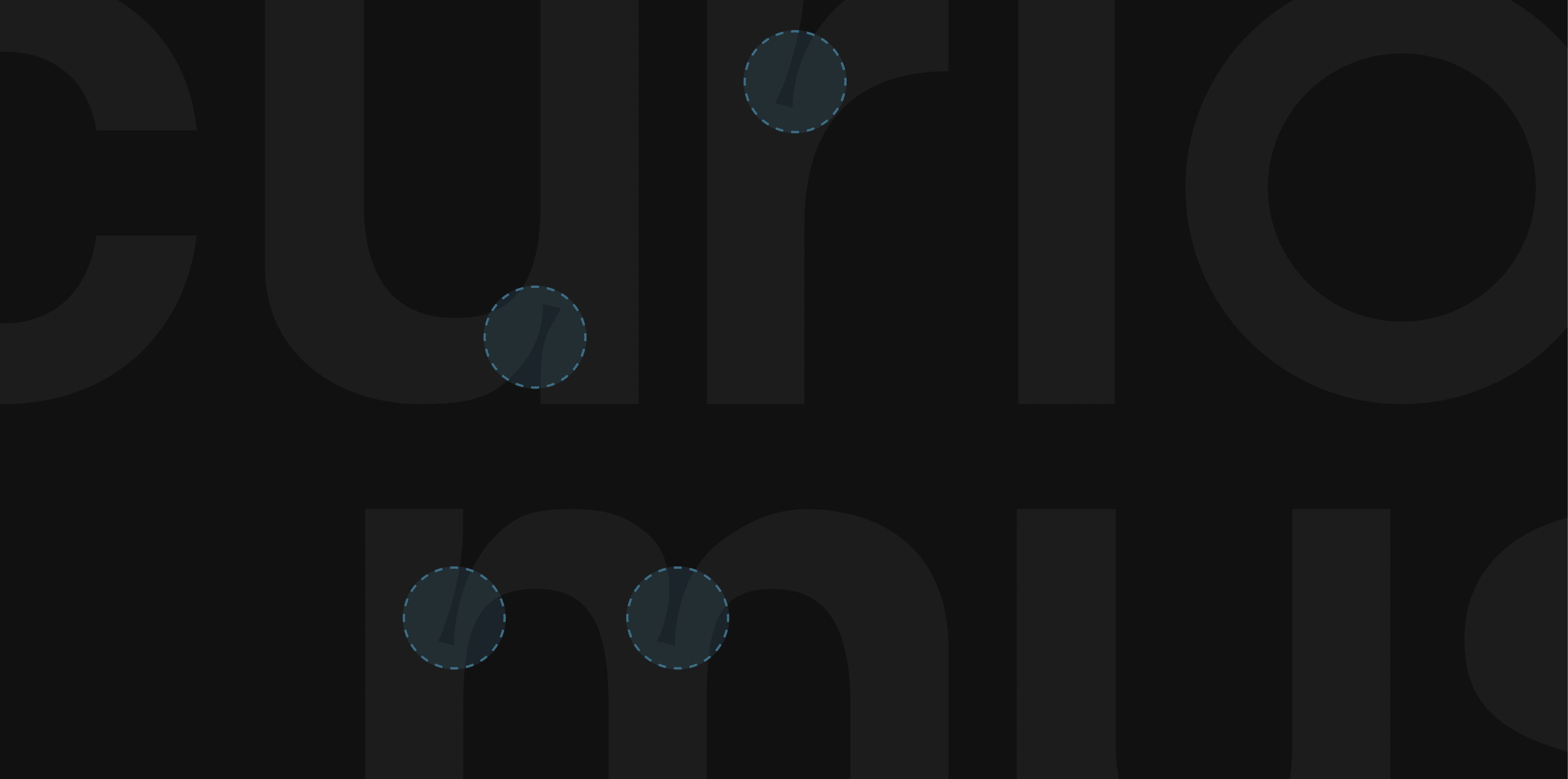
The wordmark was meticulously refined to balance strength with individuality. Subtle ink traps were introduced to add depth and ensure clarity across different scales, making the brand’s presence strong yet nuanced.
Design rationale & details
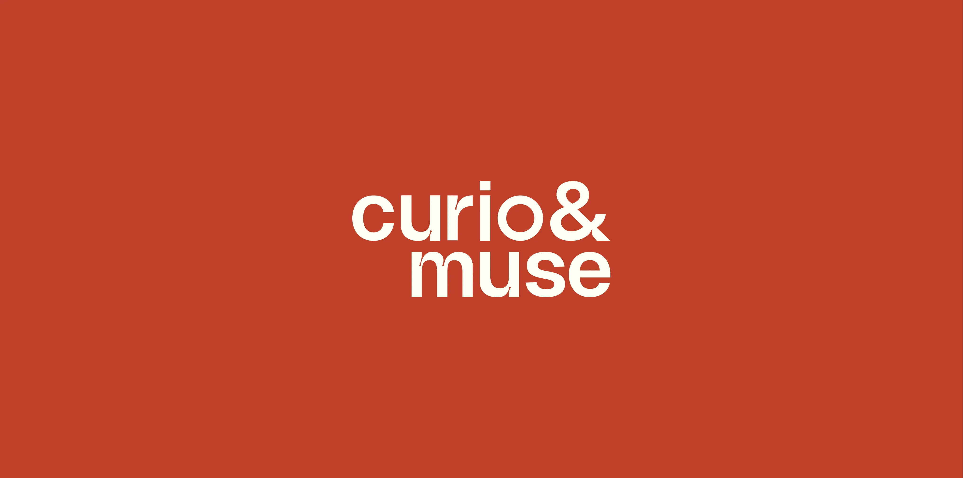
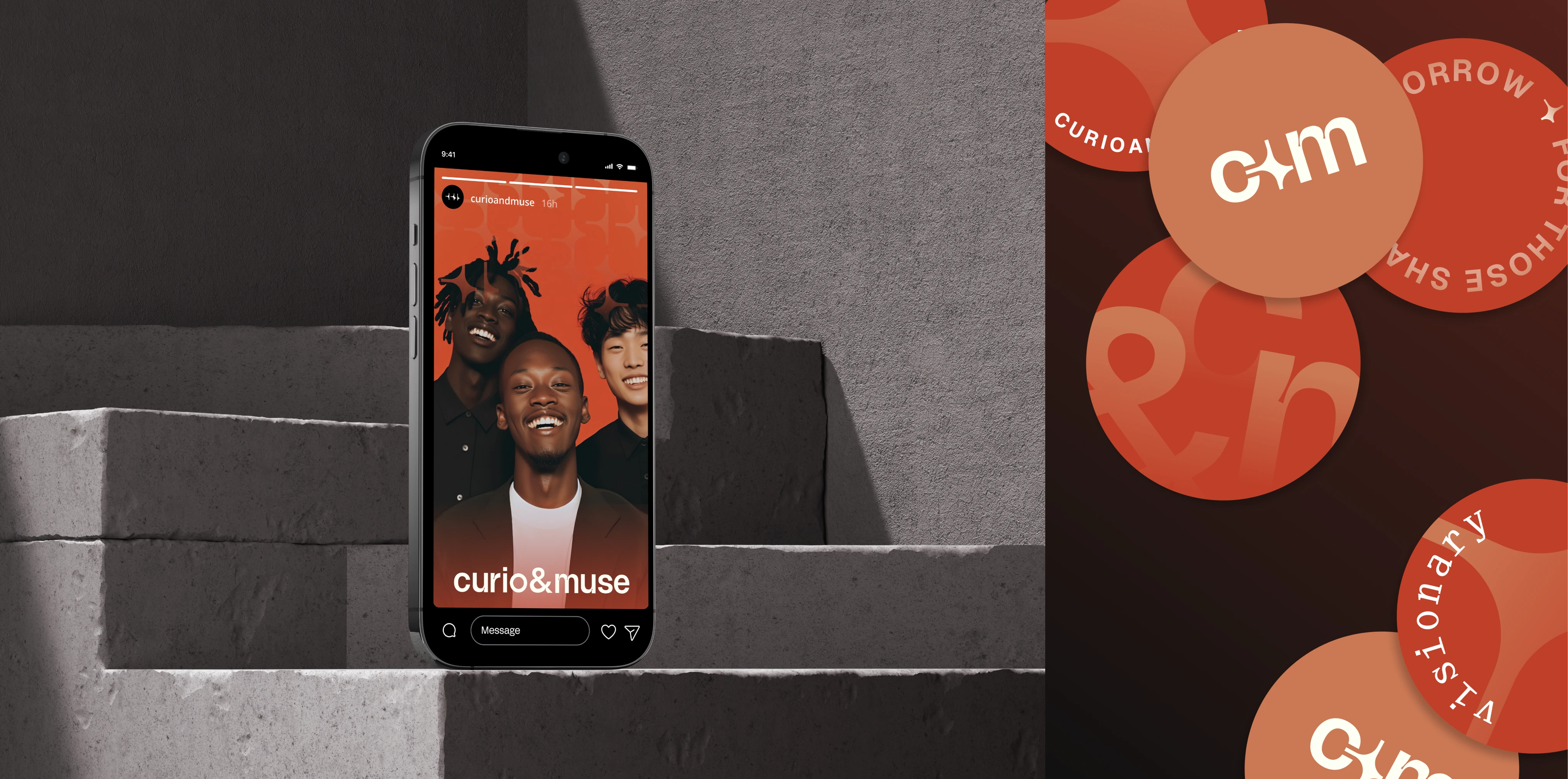
Color was an essential tool in shaping Curio & Muse’s personality. A black-and-white foundation reinforces the brand’s clarity and timeless appeal, allowing content to take center stage. Terracotta hues serve as primary accents, bringing warmth and vibrancy, while muted blues are reserved for subtle, selective highlights - never competing, only enhancing the overall composition.
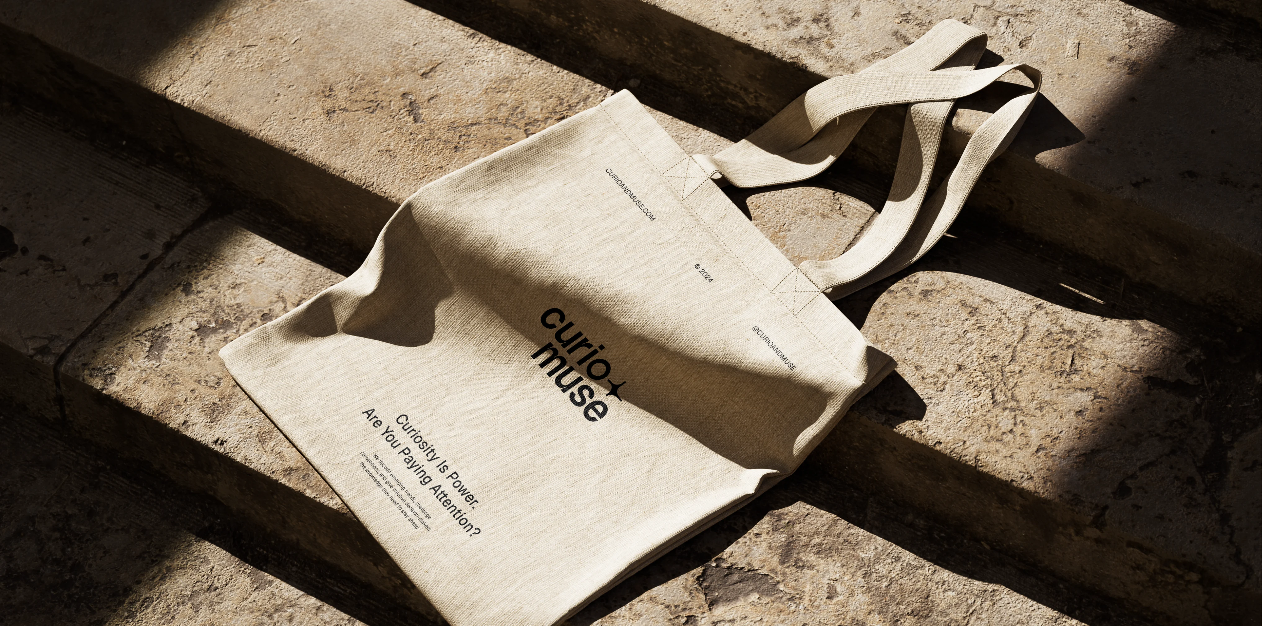
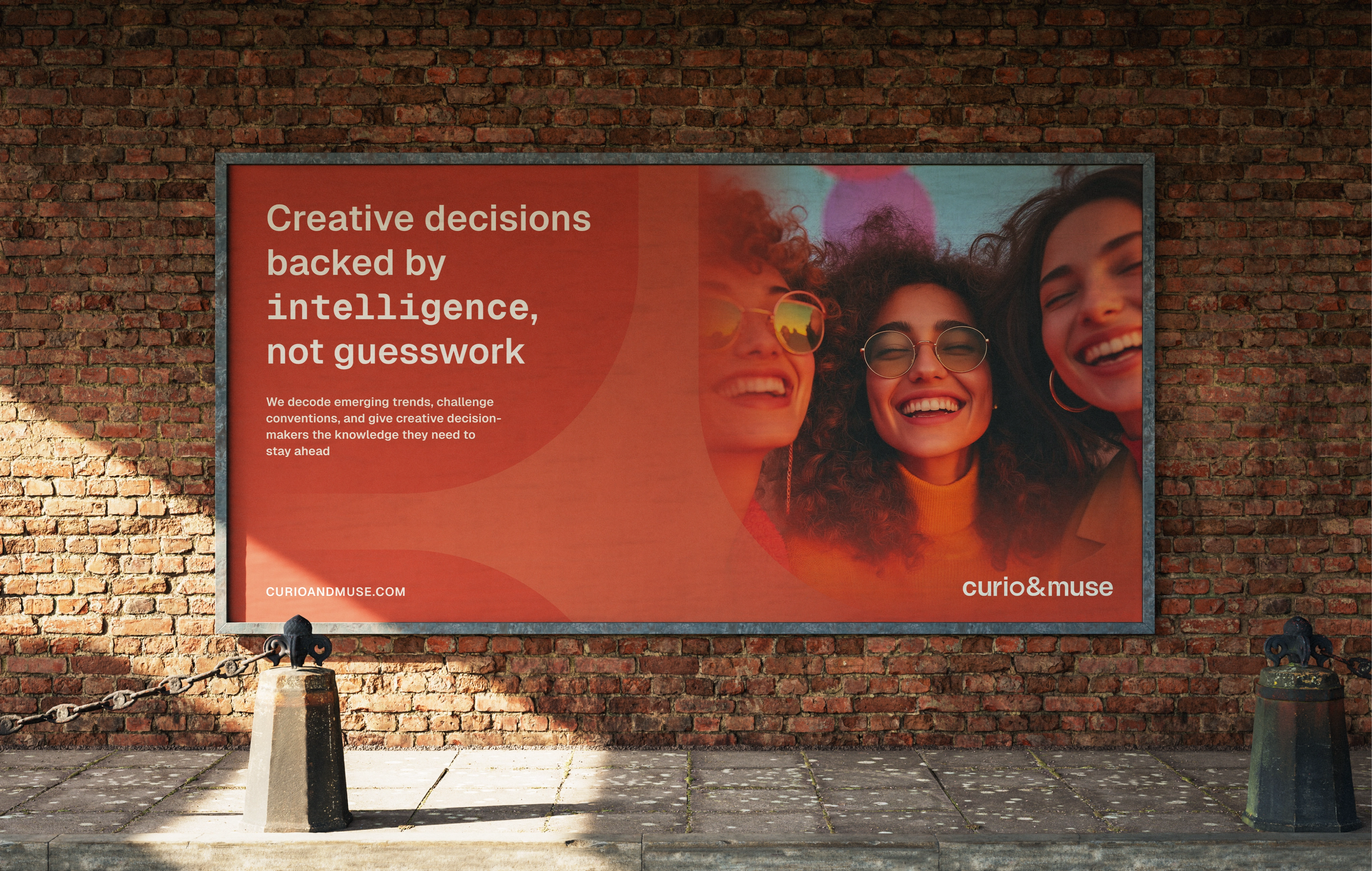
Brand in use: Print & Digital samples
From digital to print, every brand element was designed to be adaptable and cohesive. The brand manual was created, outlining clear principles for application, ensuring consistency across all touchpoints, while real-world mockups showcase how the identity thrives in both editorial and social media contexts.

Brand in use: Print & Digital samples
Curio & Muse now stands as a refined, strategic identity that feels as insightful as the content it delivers

Brand in use: Print & Digital samples
Like this project
Posted Feb 17, 2025
Modern, confident, unapologetic brand identity for C&M, rooted in geometric principles and packed with meaning and symbolism
Likes
12
Views
191
Timeline
Jan 6, 2025 - Mar 12, 2025
Clients
Thought Factory


![[Brand Alchemy 🧙♀️] Hydrä](https://media.contra.com/image/upload/w_400,q_auto:good,c_fill/uimixbkubugcfuiyukkn.avif)
[Brand Alchemy 🧙♀️] Hydrä
![[Brand Magic 🔮] Kokone](https://media.contra.com/image/upload/w_400,q_auto:good,c_fill/yluqxf72vmfx393ubual.avif)
[Brand Magic 🔮] Kokone
![[Brand Forge 🔥] PerfectFor](https://media.contra.com/image/upload/w_400,q_auto:good,c_fill/zq0rutcxc2v3gyv5f5sq.avif)
[Brand Forge 🔥] PerfectFor
![[Brand Alchemy 🧙♀️] Wild & Organic](https://media.contra.com/image/upload/w_400,q_auto:good,c_fill/pwgbcaihv0docf0wnsqv.avif)
[Brand Alchemy 🧙♀️] Wild & Organic