Energizing Timelessness: Stora Energy's Visual Identity
Patryk Rachwalak
Introduction
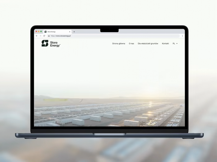
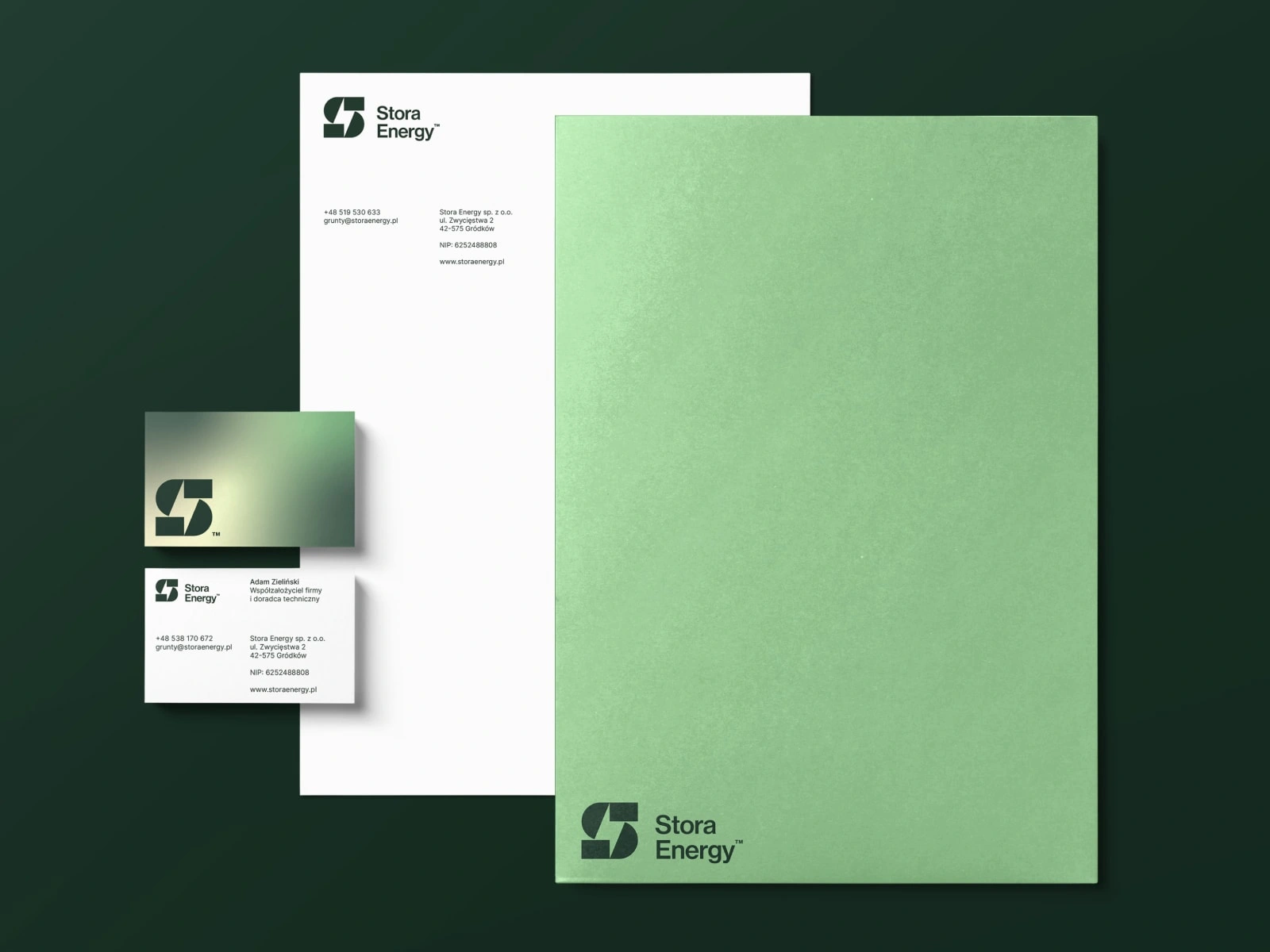
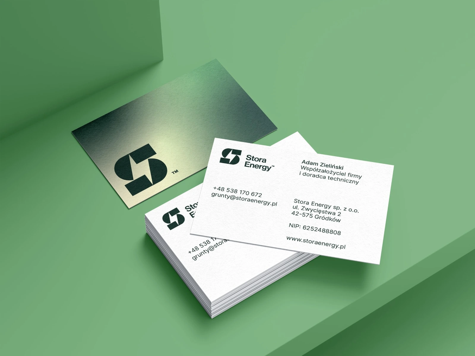
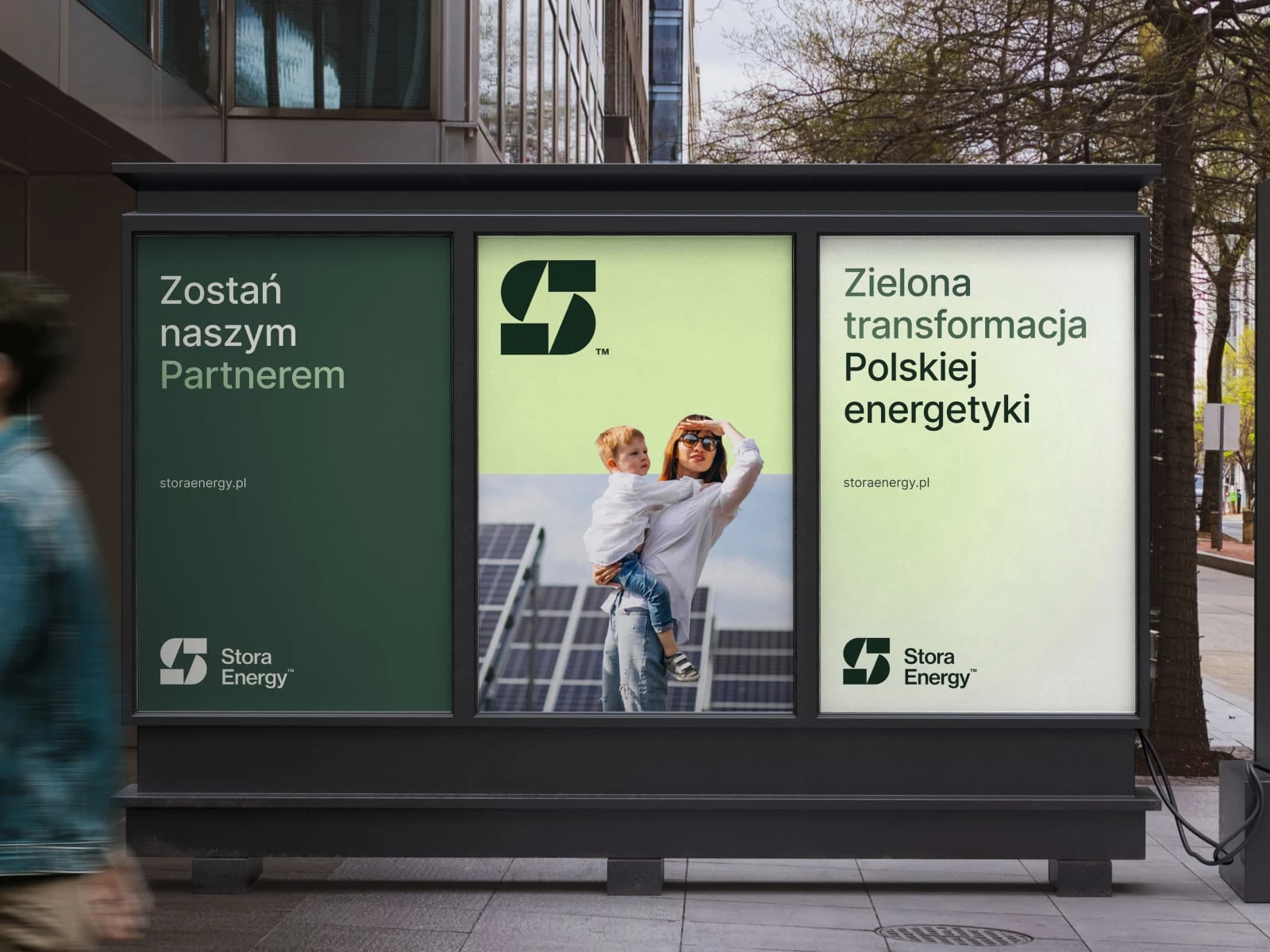
Stora Energy's visual identity project, covering logo, stationery, digital templates, and a website, reshapes the brand narrative.
Design Inspiration
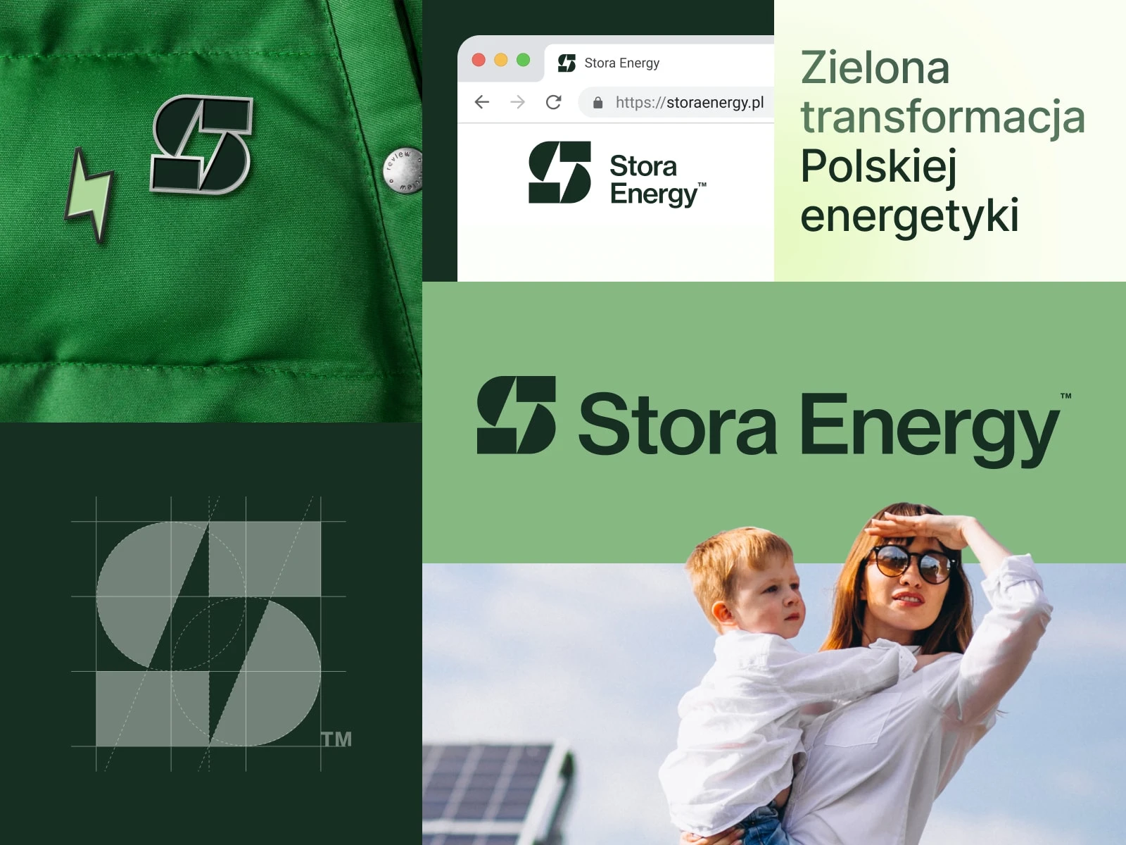
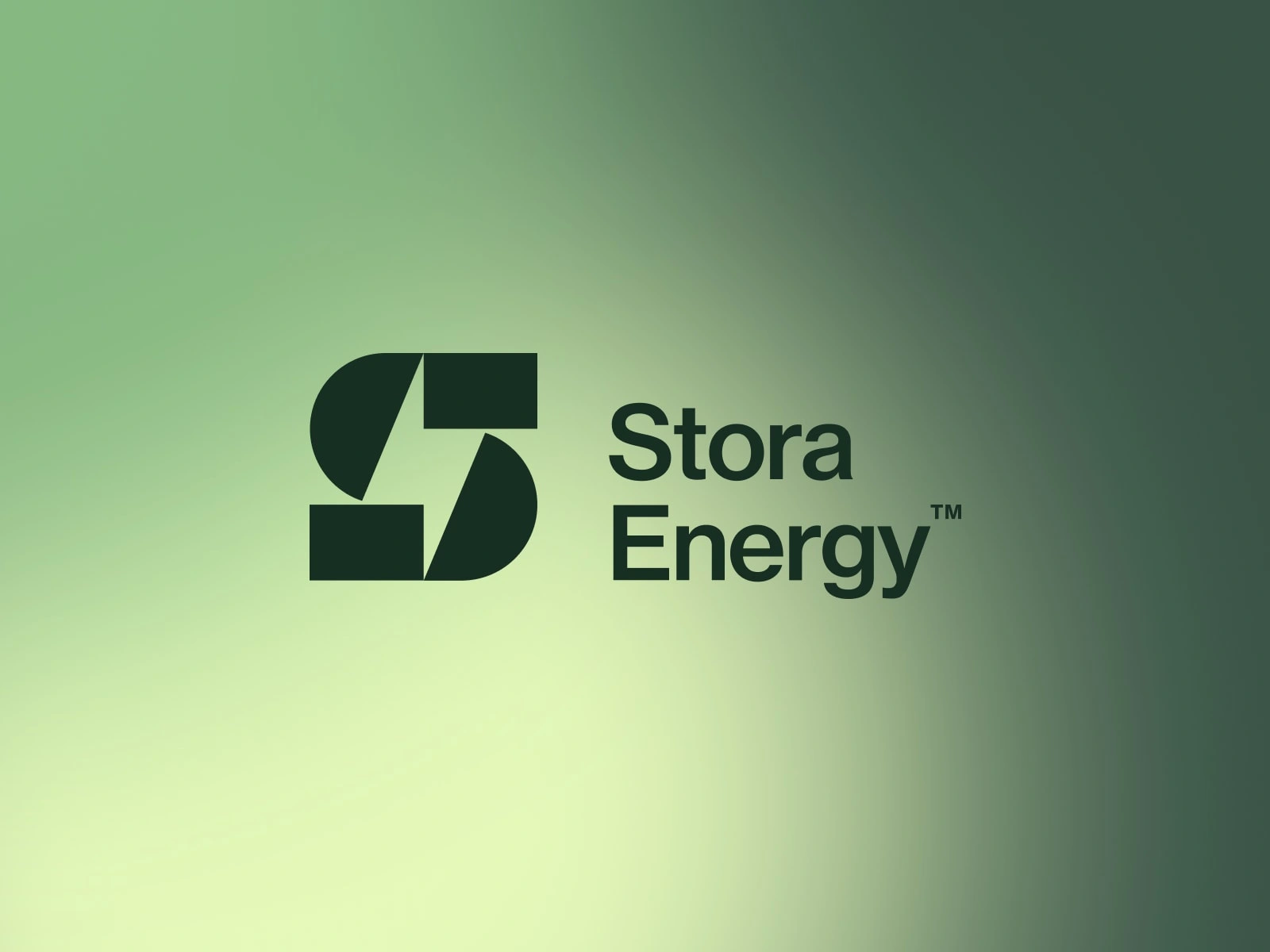
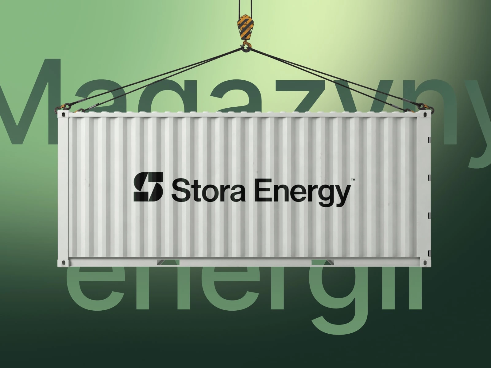
Inspired by the modernist era, the logo merges 'S' and a lightning bolt, epitomizing Stora Energy's dynamic role.
Palette and Typography
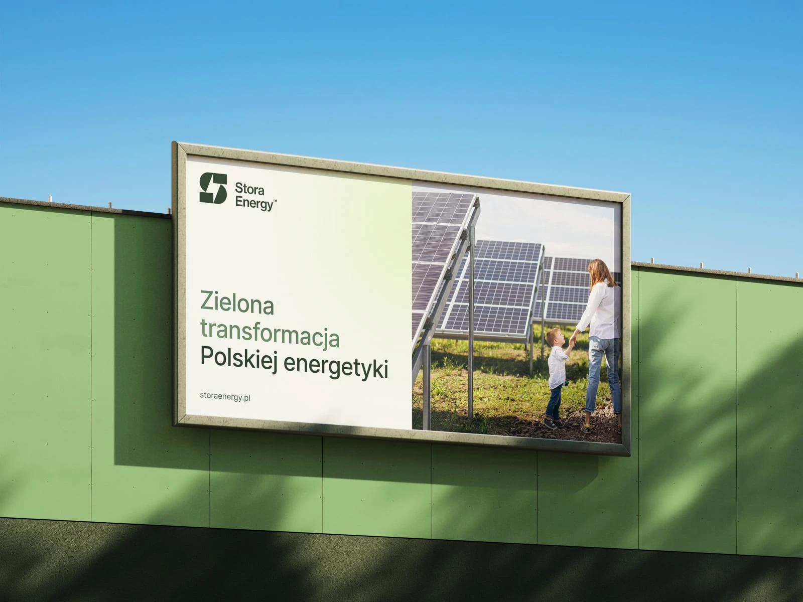
A greenish gradient palette and sans-serif typography embody stability, sustainability, and innovation, ensuring a timeless visual language.
Timeless Execution
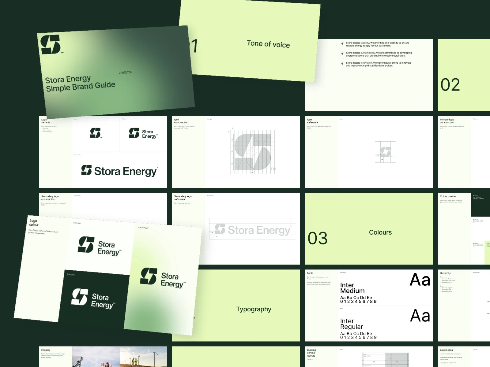
The project's execution adheres to modernist principles, creating a cohesive, timeless narrative for the brand's past, present, and future.
Everlasting Energy
Stora Energy's visual identity stands as a masterpiece, a timeless source of energy that sparks connections and leaves an indelible mark on grid stabilization.
Like this project
Posted Jan 23, 2024
Energizing identity for Stora Energy, a grid stabilization leader in Poland. Timeless S letter + lightning bolt. Stability, sustainability, innovation.