Welie Spa & Welliness

Adeal .


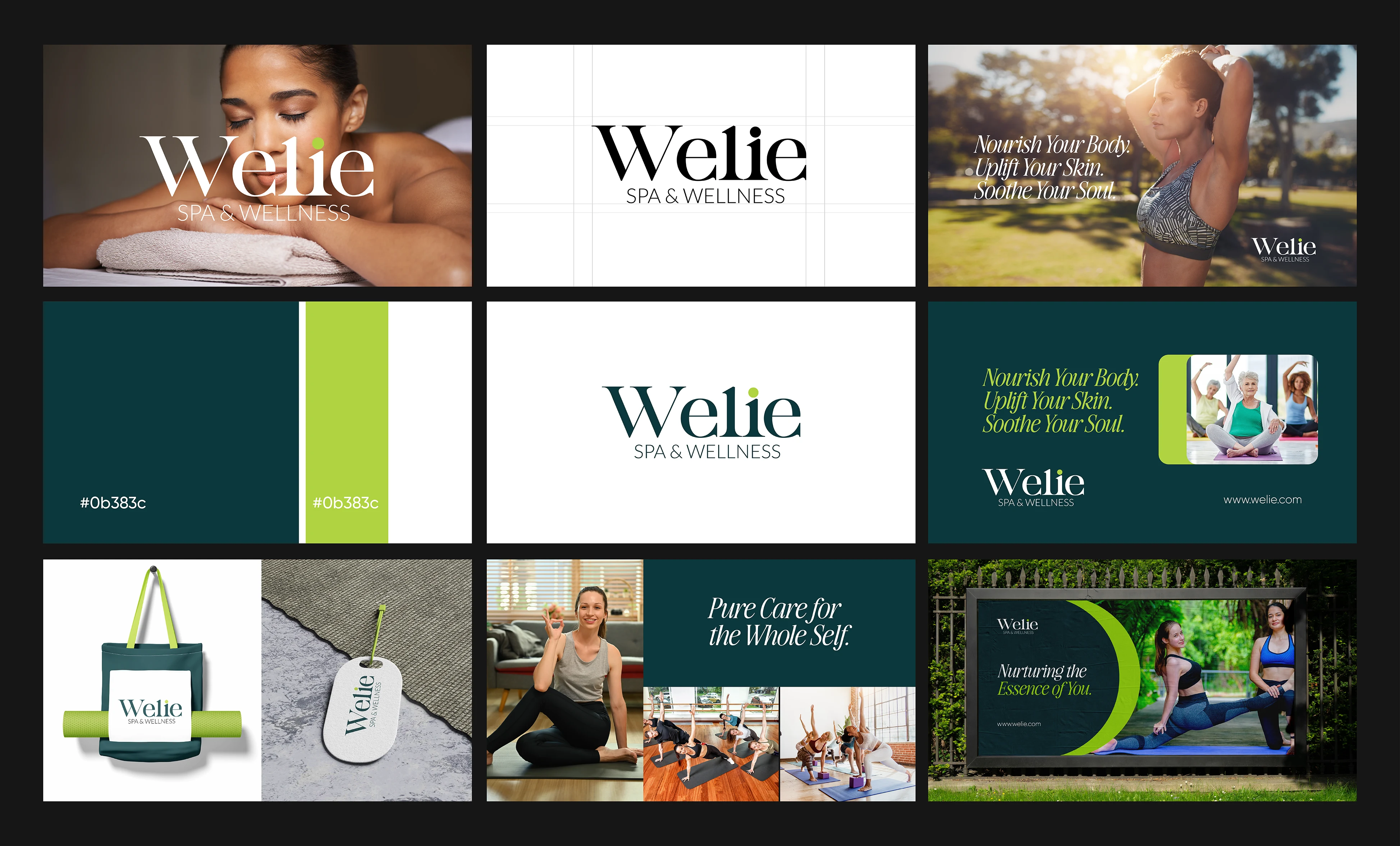
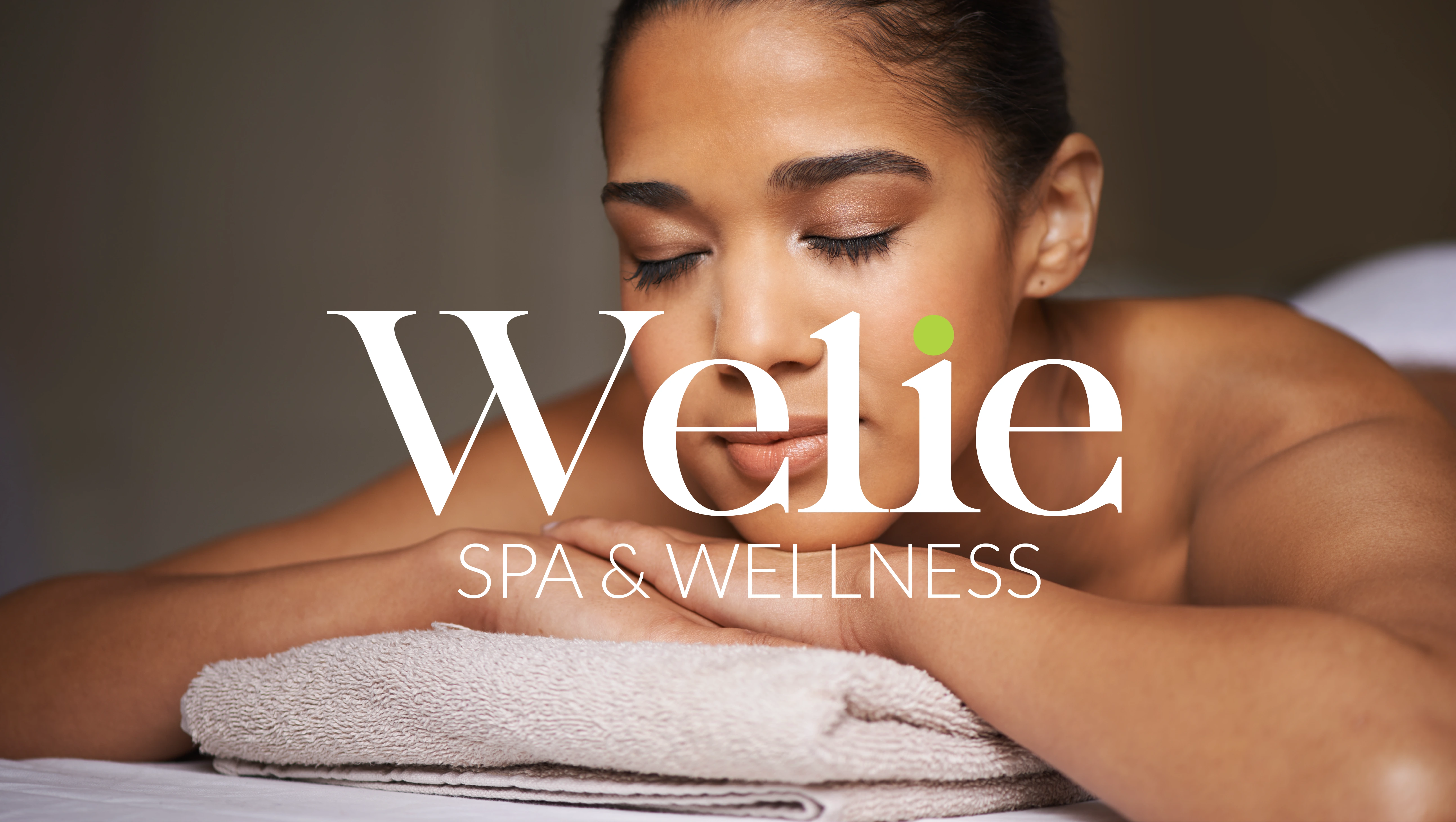
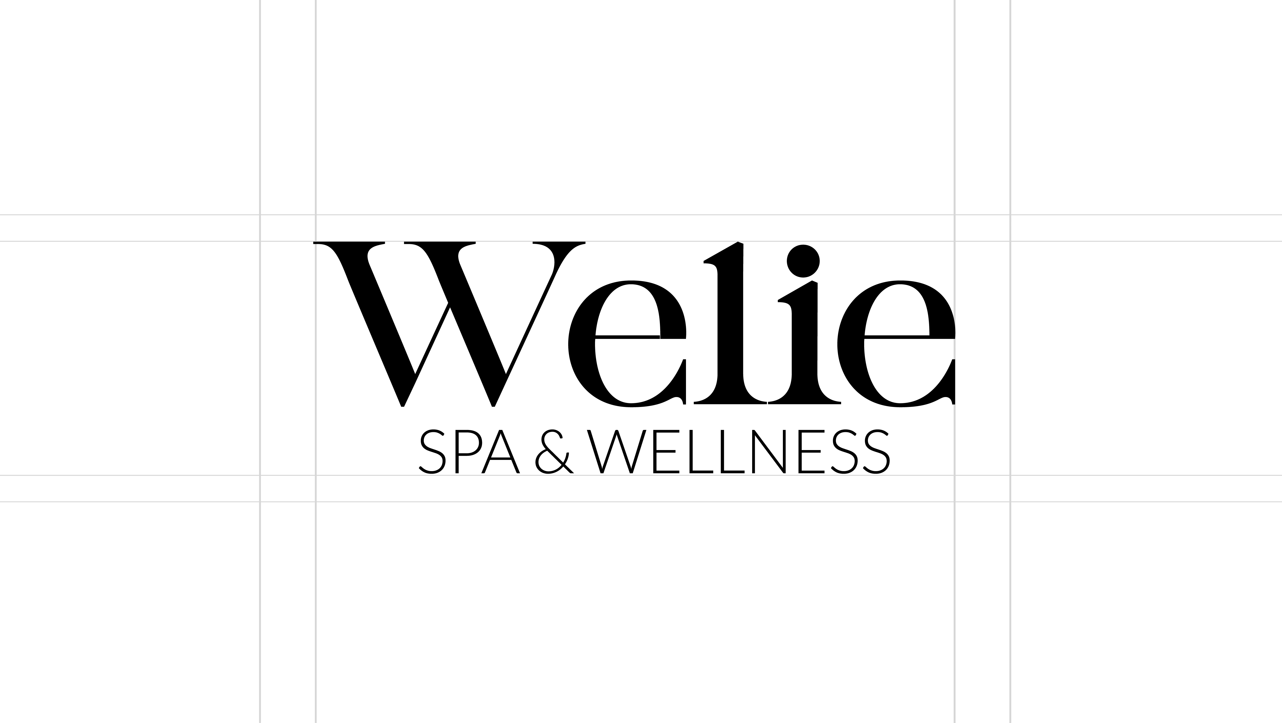
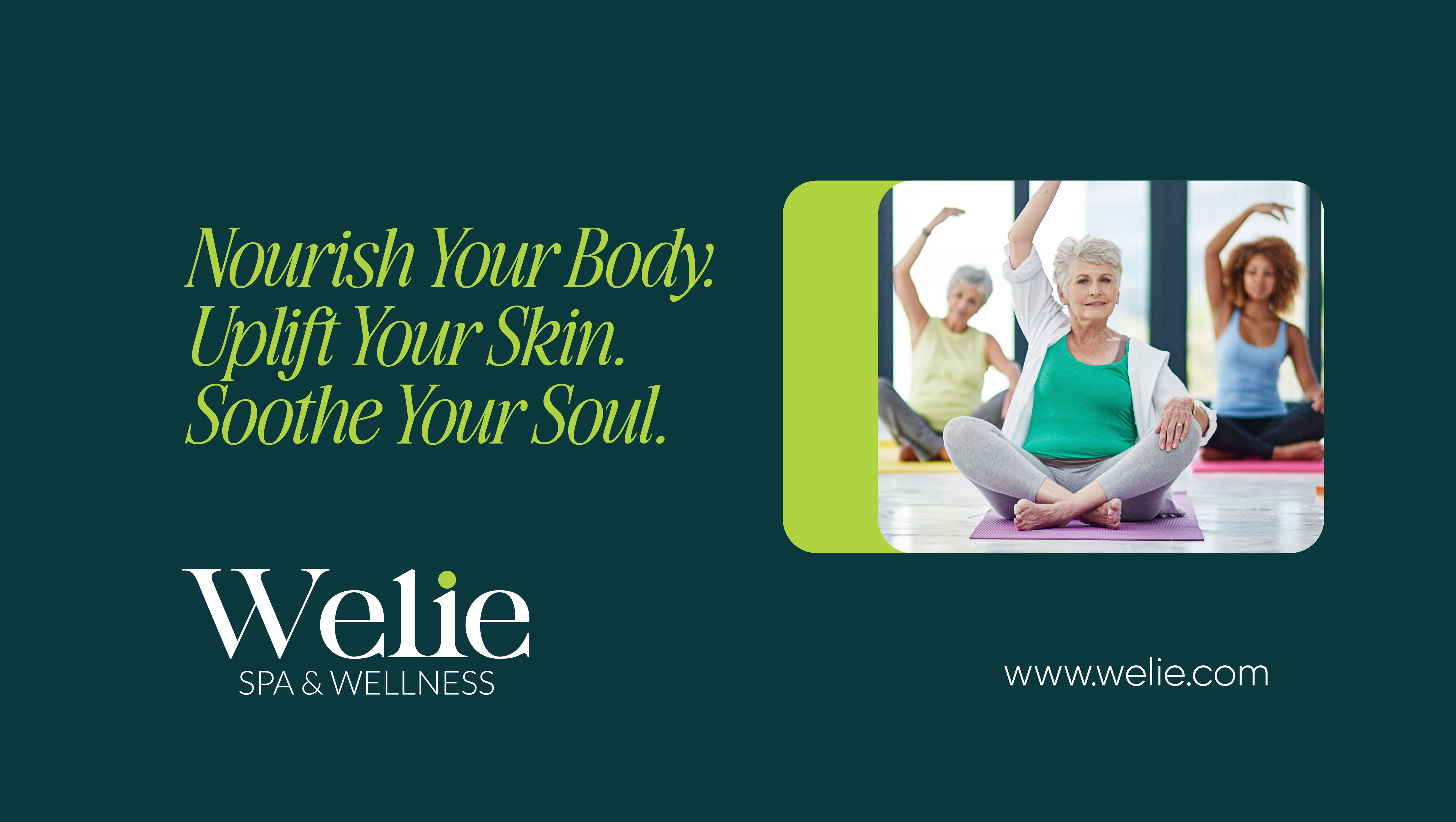
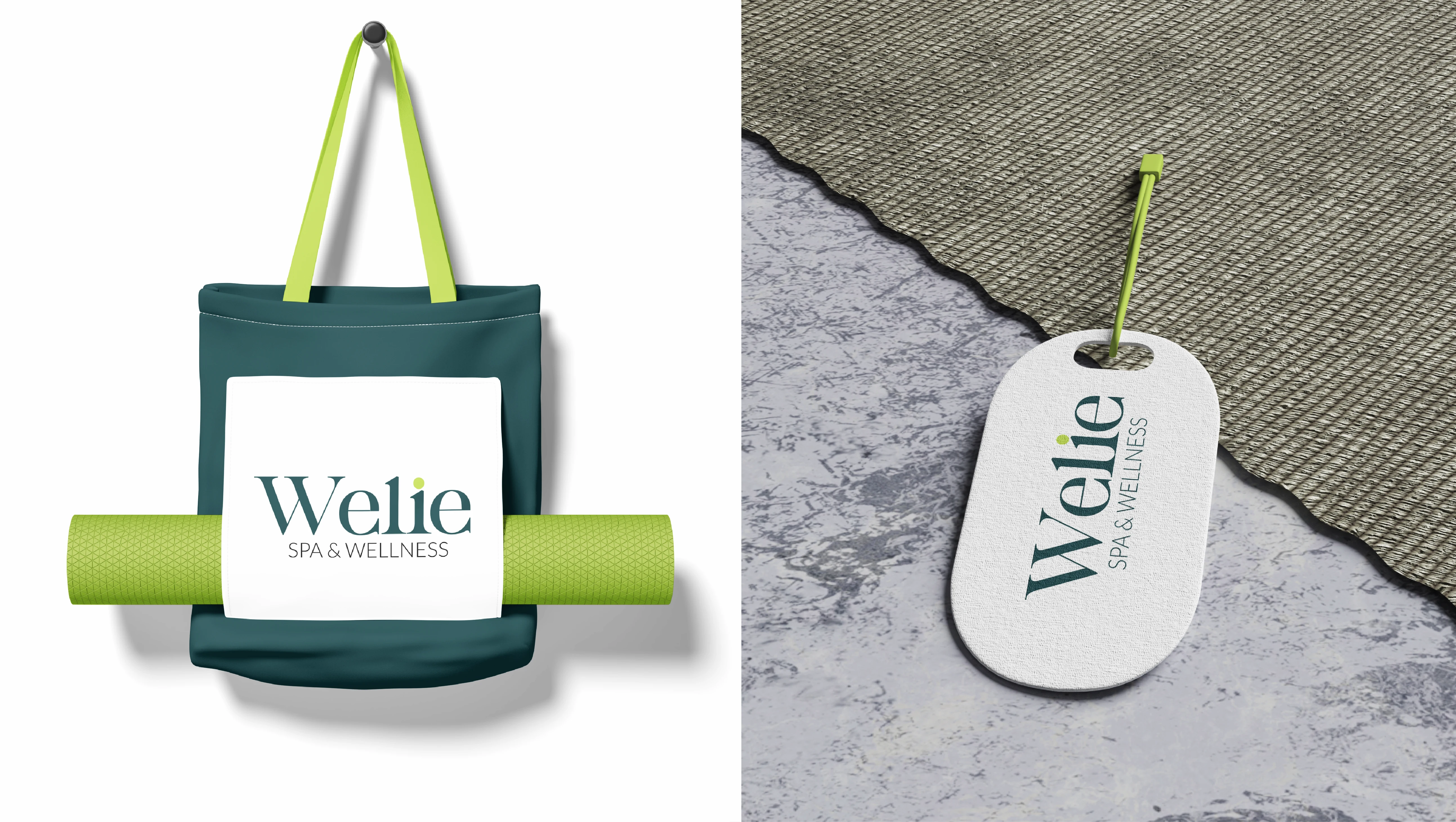
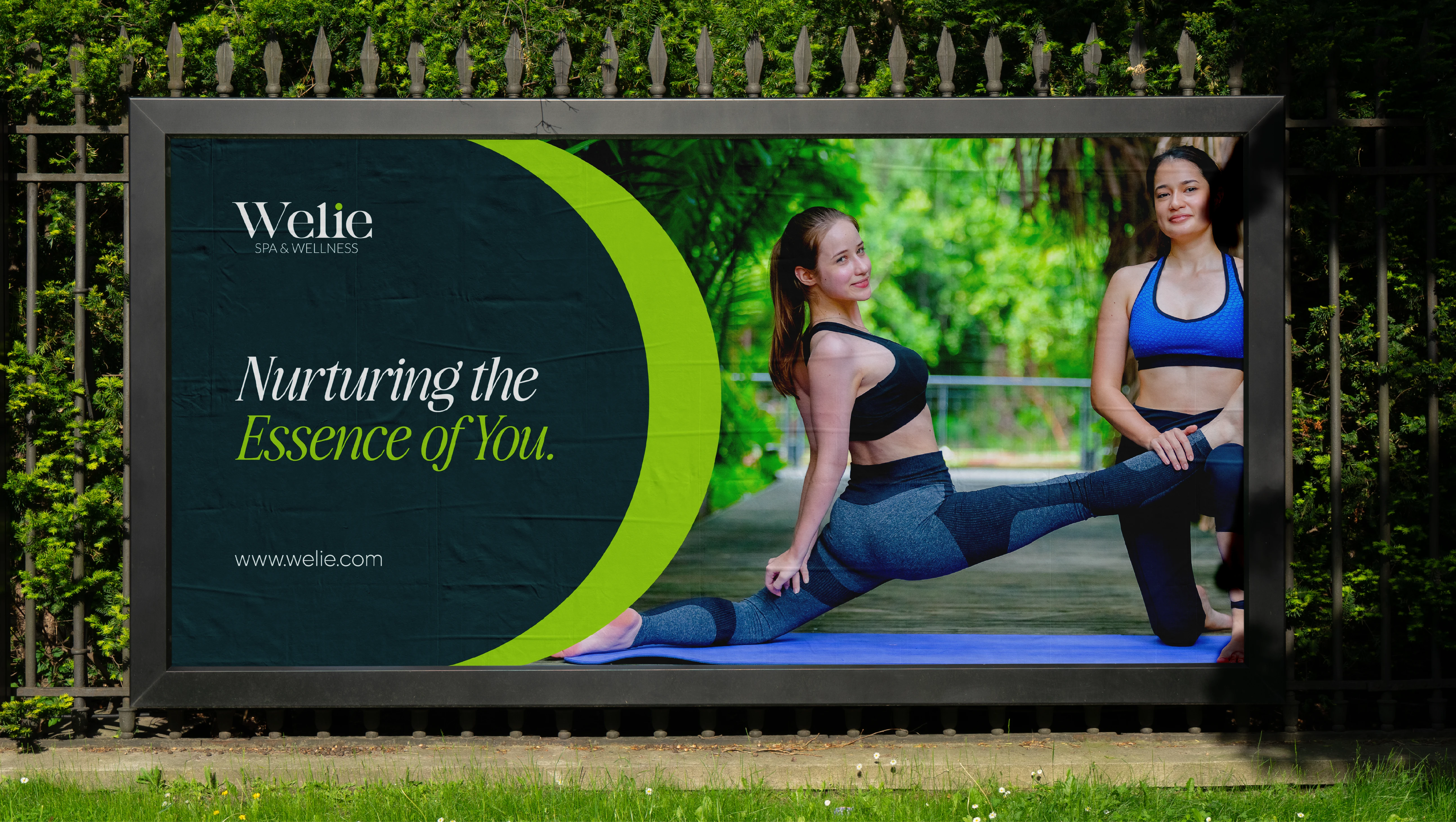
The Welie visual system is built on the balance of strength and fluidity. By pairing a sharp, sophisticated serif with soft, organic italics, the identity captures the dual nature of wellness: the science of skincare and the art of relaxation. Every element from the staggered layout to the muted, natural tones is designed to evoke a sense of "quiet luxury," positioning Welie as a premier destination for holistic
The Noise of Modern Life
Most people feel overwhelmed and tired. In the wellness industry, many brands look "clinical" (like a doctor's office) or "cluttered" (too many flowers and colors). This makes it hard for a client to feel truly relaxed or to trust that the spa is a high-end, professional space.
I noticed a gap for a brand that feels like a quiet, luxury escape, a place that values "less" in a world that is doing "too much."
Like this project
Posted Mar 3, 2026
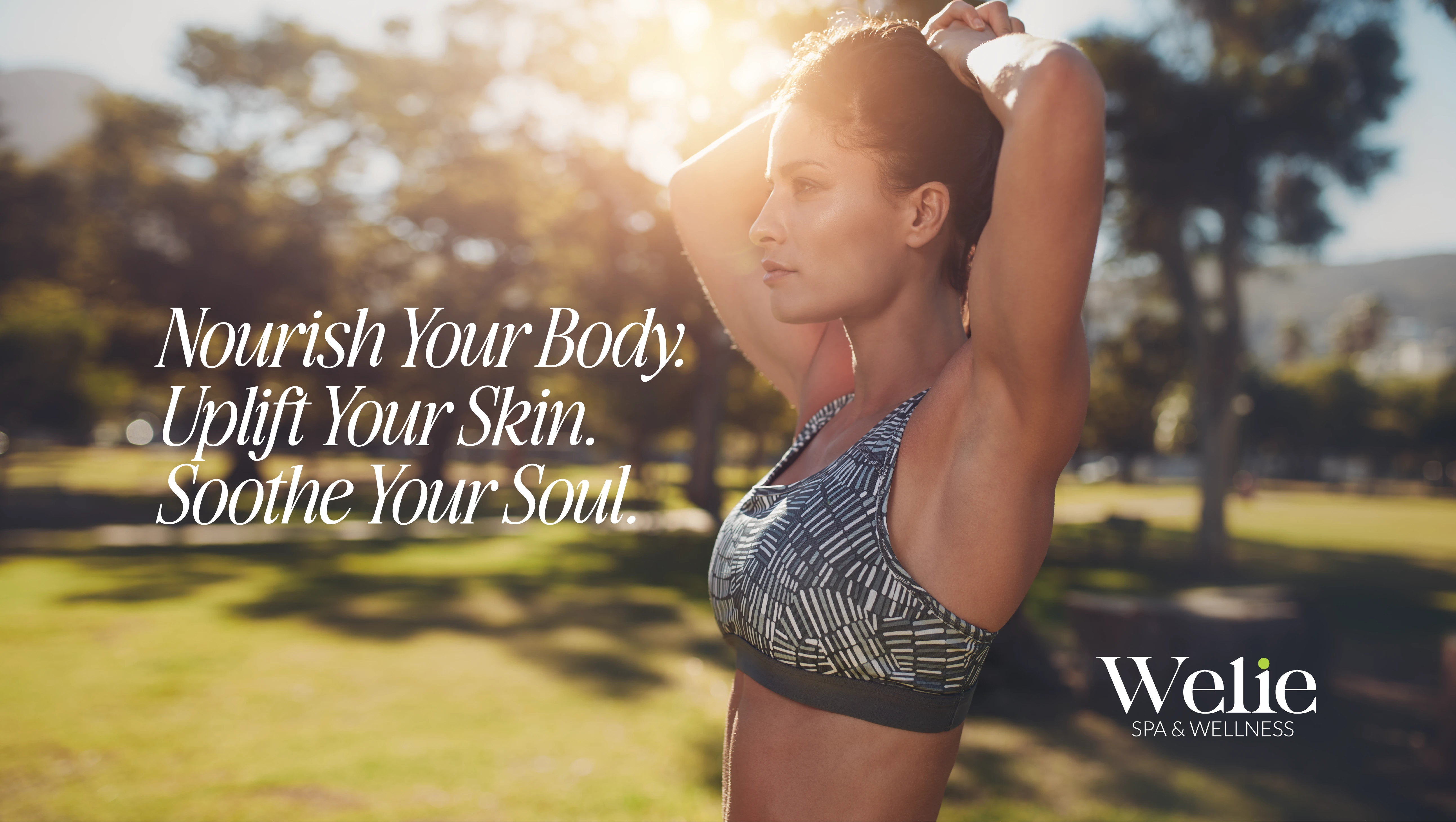
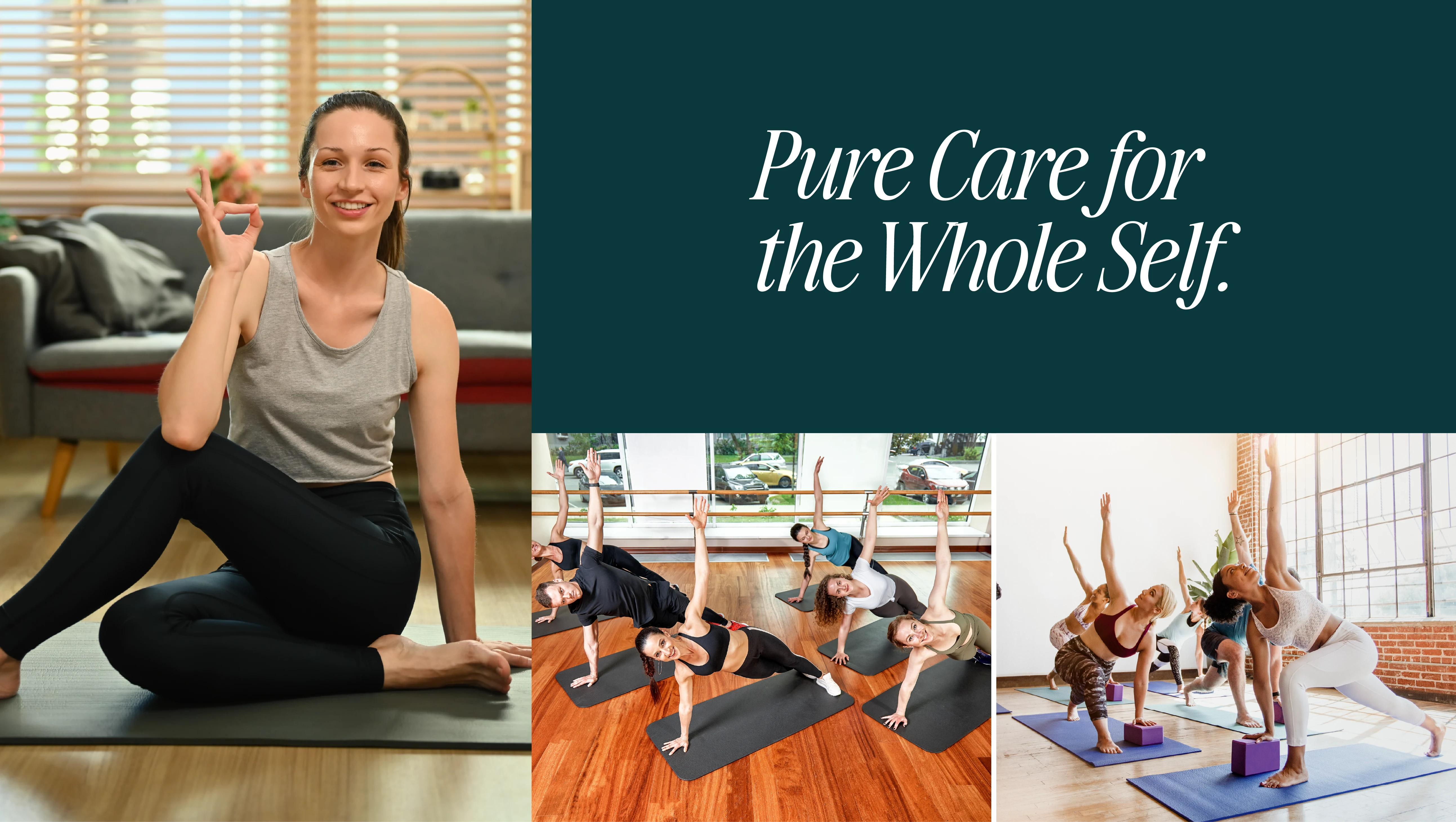
By focusing on three simple pillars, Nourish, Uplift, and Soothe, I built a brand identity that feels premium but welcoming. It’s a visual promise for wellness
Likes
0
Views
1