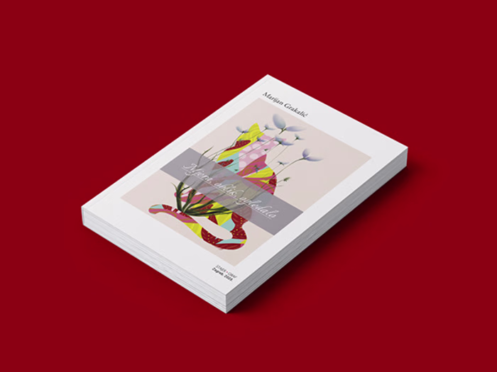
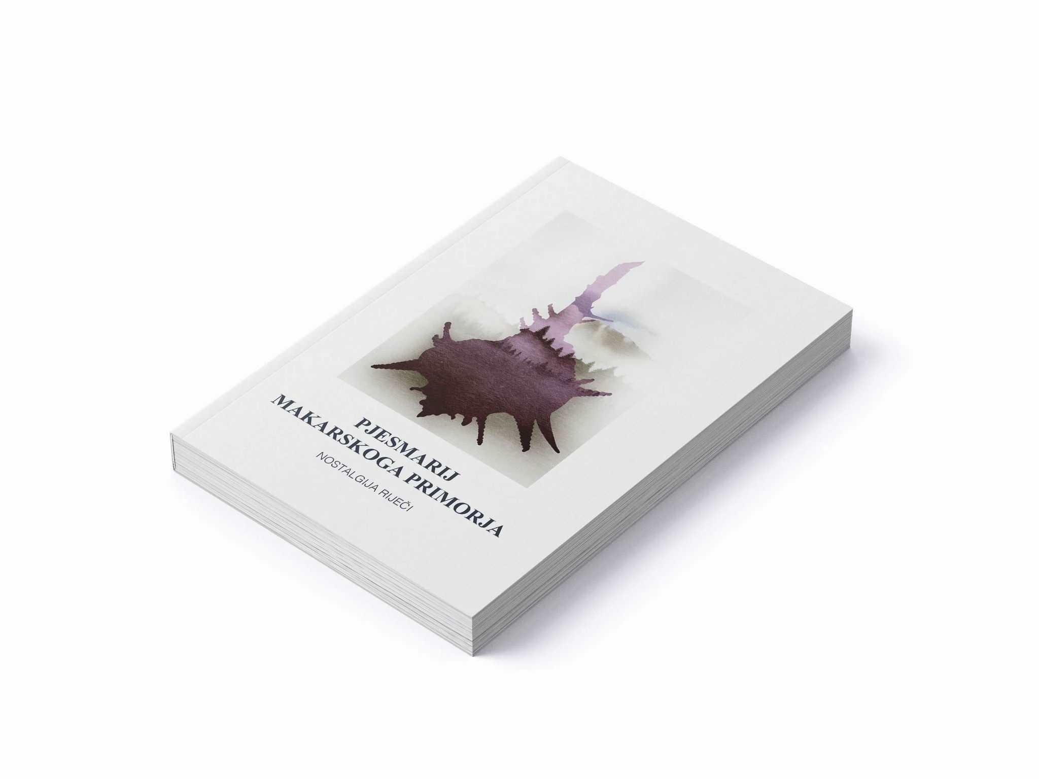
ANTHOLOGY OF THE MAKARSKA / Illustration, Cover Design
Dubravka Periša Stepić
THE ANTHOLOGY OF THE MAKARSKA RIVIERA
Illustration, Cover Design, and Interior Graphic Architecture of the Book
Design System
The interior of the book is graphically and thematically organized into several sections, each layout specially adapted to the theme, time period, and atmosphere it represents.
1. Impressum (Imprint) — Technical Section:
The book begins with the imprint containing technical details. Helvetica font was chosen for its clarity and neutrality, emphasizing the documentary nature of this part.
2. Introductory, Historical Section:
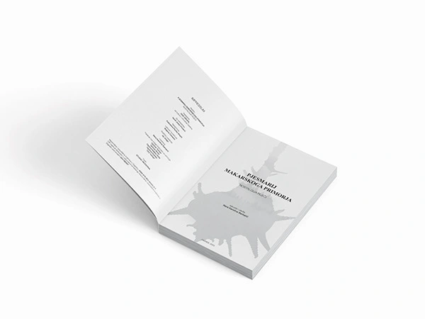
This is followed by a repetition of part of the cover with a black-and-white image of the purple sea snail (volk) and the book’s title along with the editor’s name.
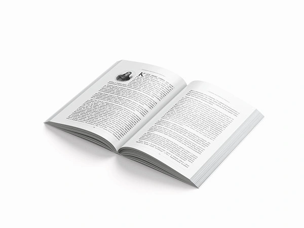
The layout of this section is designed so that the text (in Times New Roman font) and images mimic the appearance of old manuscripts. Margins, text hierarchy, and placement of poets’ portraits are arranged to evoke historical authenticity. Certain poems are supplemented with footnotes for historical context. Authors are listed alphabetically, with brief biographies.
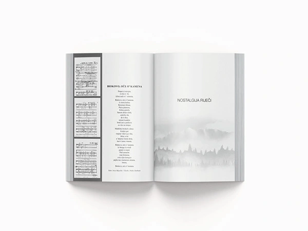
3. NOSTALGIC WORDS — Contemporary Poets:
This part visually separates itself with the second part of the title and a motif of Biokovo, the mountain symbolically connecting the region’s poets.
The layout gives more space to the poems and creates an airy impression.
Authors are arranged alphabetically; names and years are bolded, biographies set in light Helvetica, while poem titles are centered. The verses are harmoniously formatted, with the collection and year noted below in a smaller italic font. Authors are graphically separated by spaces and lines.
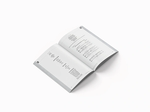
A special element consists of old musical notes accompanying some poems, linking musical tradition with poetry.
Headers contain the initial letter of the author’s last name for easier navigation.
List of Published Books:
An alphabetical list of works by the authors featured in the Nostalgic Words section.
5. Short Dictionary of Localisms:
The dictionary layout features bolded word entries with explanations in light Helvetica, and abbreviations’ meanings placed in a box at the bottom of the page.
6. Index (Table of Contents):
The index includes author names, years, and poem titles. Authors and years are bolded; poem titles are set in a different Helvetica weight with indented spacing for better readability.
Graphic Consistency:
The main divisions are clearly marked through headers and footers — the historical section and contemporary poets section differ in visual code, making the layout contribute to easier orientation and reading rhythm.
Like this project
Posted Jun 23, 2025
Complete graphic design and typesetting of a poetry anthology, blending historical and modern visuals to honor Makarska’s rich literary heritage.
Likes
0
Views
6
Timeline
Aug 1, 2023 - Aug 20, 2023