Cover Design, and Interior Graphic Architecture of the Book
Dubravka Periša Stepić
MEASURE, SHAPE, MIRROR
Illustration, Cover Design, and Interior Graphic Architecture of the Book
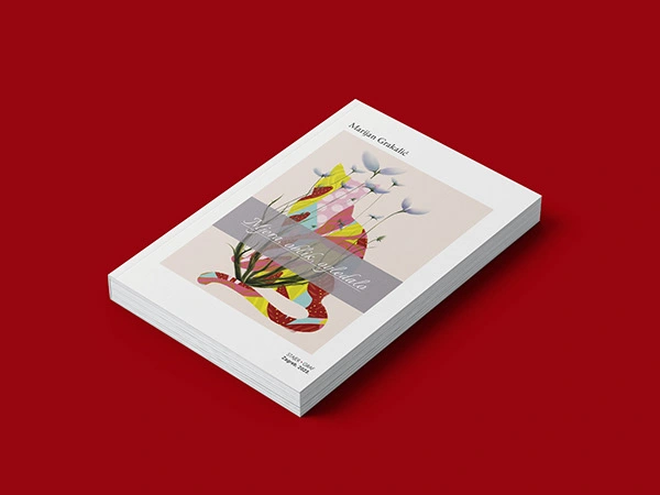
Book Cover
This cover is my original design and illustration, created to reflect the poetic essence of the manuscript. The visual concept was developed in close dialogue with the spirit of the poetry—imaginative, multilayered, and emotionally resonant. The abstract silhouette of a cat, enriched with whimsical patterns and delicate floral elements, serves as a visual metaphor for the fluidity and depth found in the verses. The light, curious, and optimistic palette further supports the book’s emotional tone, inviting readers into its imaginative world.
This poetic sensibility extends throughout the entire book design. From the choice of typefaces to the rhythm of titles, spacing, and layout structure, every element was thoughtfully selected to echo the lyrical, intuitive flow of the poems. The aim was to create a visual landscape that quietly supports the text while enhancing the reader’s experience on both a visual and emotional level.
This poetry collection, written by one of Croatia’s most prolific authors, Marijan Grakalić, was one of six books he published in 2023. It was an honor to contribute to this creative momentum by designing both the cover and the interior layout.
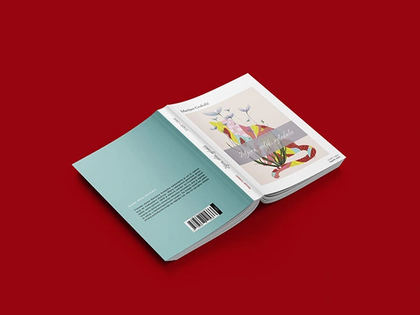
Covers with ISBN number
Impressum (Imprint) — Technical Section; left: Section Beginning
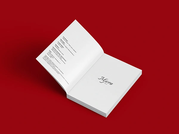
Book Interior
Design System
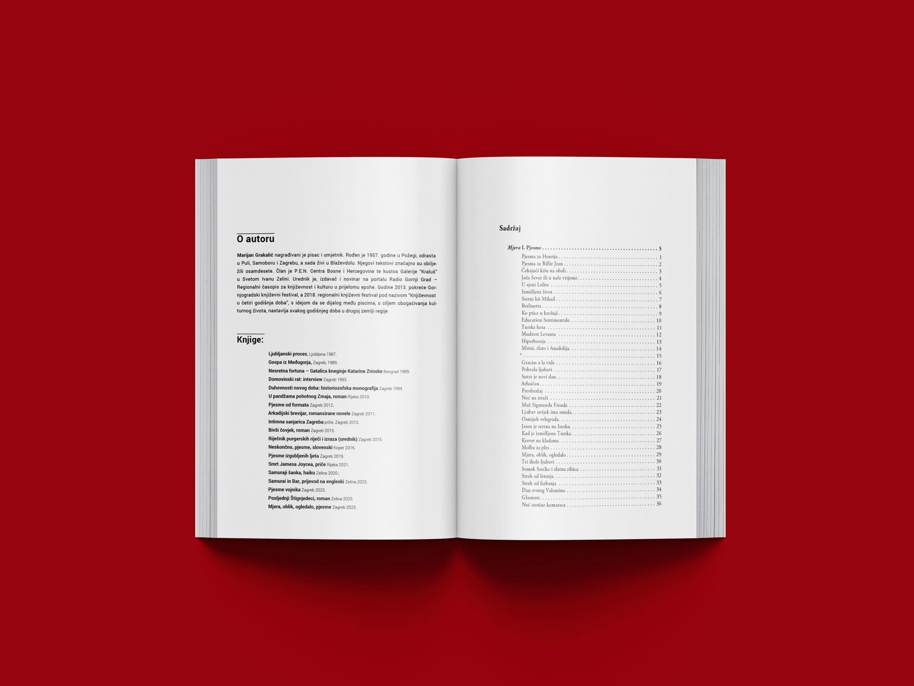
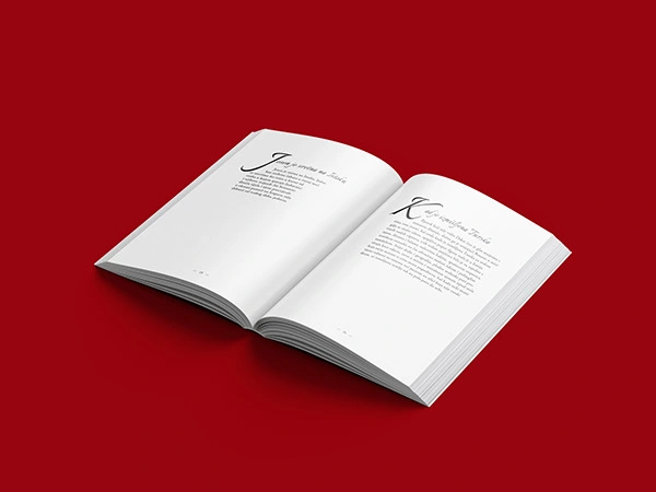
Typography: The typographic system combines clarity, contrast, and a poetic tone. I used the full Roboto font family for its modern versatility, Italianno for expressive, script-style headings, and Adobe Garamond Pro for a classic serif texture that enhances readability and elegance.
Interior Architecture: The book’s internal structure is guided by a distinct typographic rhythm that balances elegance with personality. Large script fonts like Italianno are used for section openings to emphasize the poetic spirit of the book. The body text is set in a refined serif (Adobe Garamond Pro), while Roboto in its lighter weights provides contrast for technical sections and biographical notes.
Sectioning & Flow: The layout is divided into three thematic parts—Measure, Shape, and Mirror. Each section is introduced with unique visual treatment to aid navigation and enhance the thematic progression. Additional elements such as the imprint, table of contents, and author bio follow a unified visual logic, with consistent use of spacing, alignment, and typography to ensure coherence across the entire book.
Book Summary:
The visual identity of the book—both the cover and interior layout—was designed and illustrated by me to echo the imaginative and emotional tone of the manuscript. A whimsical cat figure, rich in color and floral motifs, acts as a visual metaphor for the spirit of the poetry. This sensibility carries through the entire book: from typography to spacing, titles, and rhythm of the layout, every element was crafted to support and deepen the reader’s experience of the text.
Published in 2023, this volume is one of six titles Grakalić released in a single year, a testament to his creative drive. It was an honor to contribute to that momentum.
Like this project
Posted Jun 23, 2025
Book designed, printed, and published; successfully reached its audience, receiving positive recognition for thoughtful design and accessibility.
Likes
0
Views
7
Timeline
Jul 25, 2023 - Aug 11, 2023