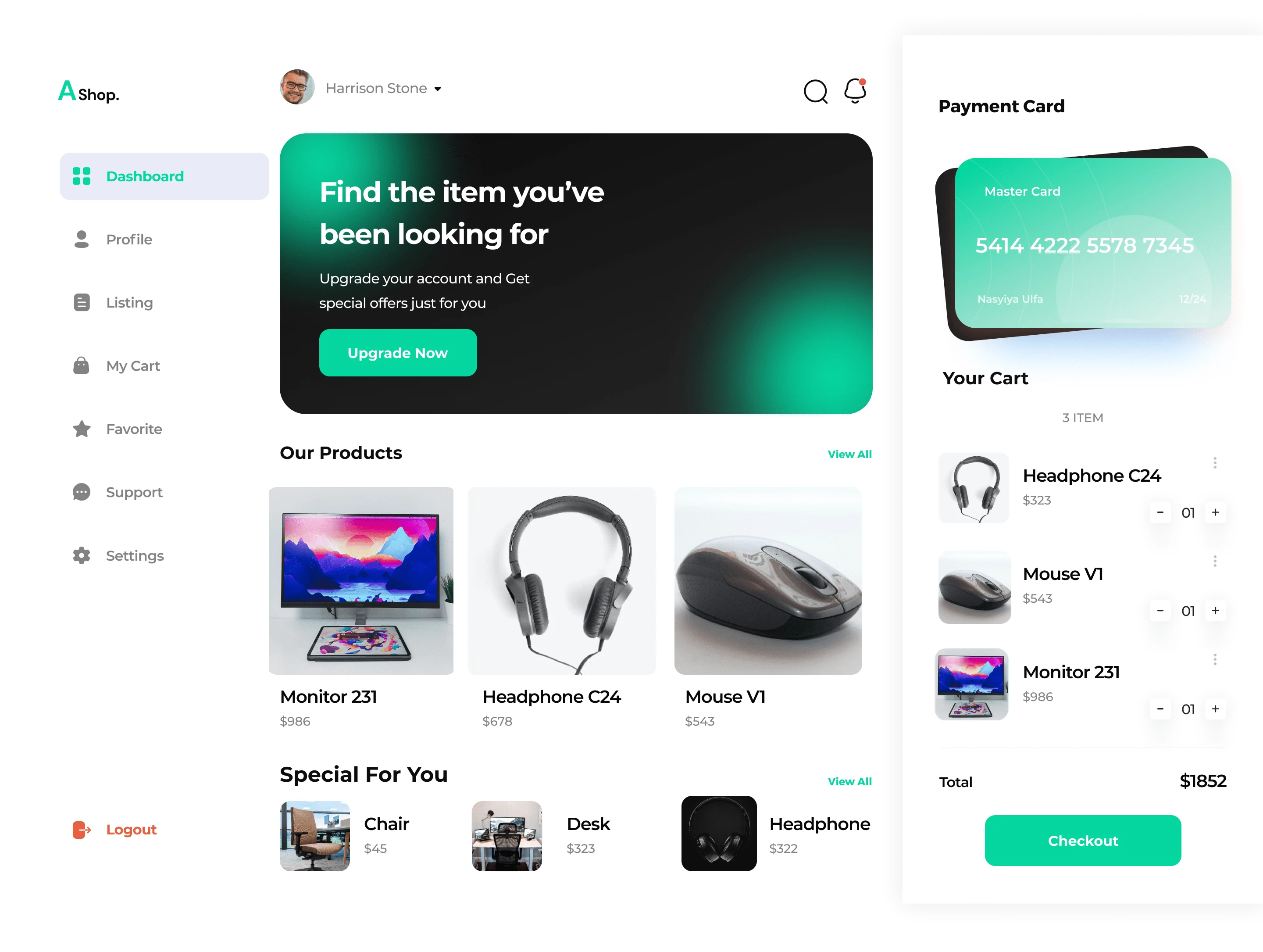
Designing an Impressive Web E-commerce Dashboard
Final Design!

As e-commerce businesses grow, they generate vast amounts of data that, when analyzed effectively, can provide valuable insights into business health, customer behavior, and operational efficiency. An e-commerce dashboard serves as a central hub, visualizing key data points that help business owners, managers, and analysts track and analyze performance. A well-designed dashboard not only simplifies data interpretation but also empowers teams to make quick, informed decisions. This project focuses on creating a visually appealing, data-rich, and user-centric e-commerce dashboard that delivers actionable insights in real time.
Project Goals
Develop an engaging, data-focused dashboard design that balances aesthetic appeal with functionality.
Enhance data accessibility and usability by designing clear visual hierarchies, enabling users to navigate metrics easily and intuitively.
Facilitate faster decision-making by presenting critical KPIs at a glance, allowing users to identify trends and anomalies immediately.
Support diverse business needs through customizable views and modular widgets, catering to departments such as sales, marketing, inventory, and customer service.
Key Performance Metrics
User Engagement: Measure time spent on the dashboard and frequency of visits to gauge engagement levels.
Data Accuracy: Track how often the data is updated and ensure it aligns with back-end data sources to maintain accuracy.
Task Completion Rate: Monitor users' ability to complete key tasks, such as checking sales data, tracking customer trends, or generating reports.
System Load Speed: Ensure that the dashboard loads quickly, with minimal lag for all data visualizations.
User Satisfaction: Collect qualitative feedback through user surveys to assess overall satisfaction and ease of use.
Target Audience
Primary: E-commerce business owners, managers, and data analysts.
Secondary: Marketing and sales teams, inventory managers, and customer support teams.
Audience Profile: Professionals aged 25-50, often busy and data-driven, with a need to quickly interpret and act on data insights.
Device Choice Options
The dashboard should be optimized for:
Desktop screens (primary focus for maximum data visibility)
Tablets (for portability and quick access in meetings)
Mobile devices (secondary, with simplified data for on-the-go viewing)
Suggested Tasks
Identify Core KPIs:
Define and prioritize metrics like total revenue, average order value, conversion rate, customer acquisition costs, cart abandonment rate, and more.
Enable customizable KPI selection to allow users to focus on metrics most relevant to their roles.
Design Visual Representations:
Utilize graphs, charts, and tables to represent data such as sales trends, customer demographics, top products, inventory levels, and marketing campaign effectiveness.
Implement interactive elements like drill-down options, time filters, and comparison views to allow deeper exploration of data.
Ensure a User-Centric Layout:
Structure the dashboard with clear visual hierarchy to ensure key metrics are prominent.
Use modular widgets so users can arrange the dashboard layout according to their preferences.
Data Refresh and Real-Time Insights:
Integrate real-time or periodic data syncing, depending on the business needs, to provide the most up-to-date information.
Include alert features to notify users of significant changes or anomalies in data (e.g., sudden drops in sales).
User Testing and Feedback Integration:
Conduct usability testing sessions to validate the effectiveness of the dashboard layout, data clarity, and interactive features.
Use feedback to iterate on and improve the design, ensuring it remains user-friendly and valuable for daily use.
Guiding Questions
Data Prioritization: Are the most critical KPIs and metrics displayed prominently and in a way that’s easy to interpret?
Visual Design: Does the design balance aesthetic appeal with functional clarity? Are colors, typography, and spacing used effectively to avoid overwhelming users?
Customizability: Can users easily tailor the dashboard to their specific needs, such as adding/removing widgets or filtering data?
Scalability: Is the design flexible enough to accommodate future growth in data or additional features as the business expands?
Cross-Device Usability: Is the dashboard responsive and accessible across devices, ensuring a consistent experience for desktop, tablet, and mobile users?
What This Challenge is Designed to Teach and Improve On
Data Visualization and Interpretation: Learn how to design visually compelling data representations that users can easily interpret.
User-Centric Interface Design: Focus on creating layouts that accommodate users’ needs and preferences, reducing cognitive load and enhancing efficiency.
Performance and Real-Time Data Integration: Understand the technical requirements for real-time data handling, load optimization, and syncing across devices.
Customizable and Modular Design: Gain experience in designing dashboards with modular elements that users can configure to suit their specific needs.
Usability Testing and Iteration: Practice gathering and applying user feedback to refine the dashboard, enhancing both functionality and user satisfaction.
Additional Research and Resources
To further explore best practices and industry standards in e-commerce dashboard design, you may refer to the following resources:
Baymard Institute's UX Research on E-commerce: Offers insights and data on e-commerce usability, including dashboards and data presentation.
Nielsen Norman Group Articles: Covers usability principles and best practices, which are invaluable for designing user-friendly dashboards.
Hotjar UX Design Trends: Discusses UX trends that impact how data should be presented to maximize engagement.
Usability.gov's Data Visualization Guide: Provides insights into creating effective data visualizations and interfaces that enhance comprehension and decision-making.
UX Design for Dashboards: A platform for articles and case studies on UX design specifically for dashboards, offering practical insights into user-centered design practices.
These resources can help you understand best practices for creating an effective and visually appealing e-commerce dashboard.
Like this project
Posted Jun 29, 2023
This case study explores the steps involved in designing a visually appealing and exceptionally efficient web e-commerce dashboard, that converts very well.


