A new visual identity for a French self-stockage provider
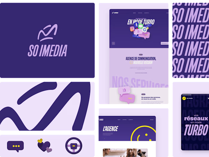
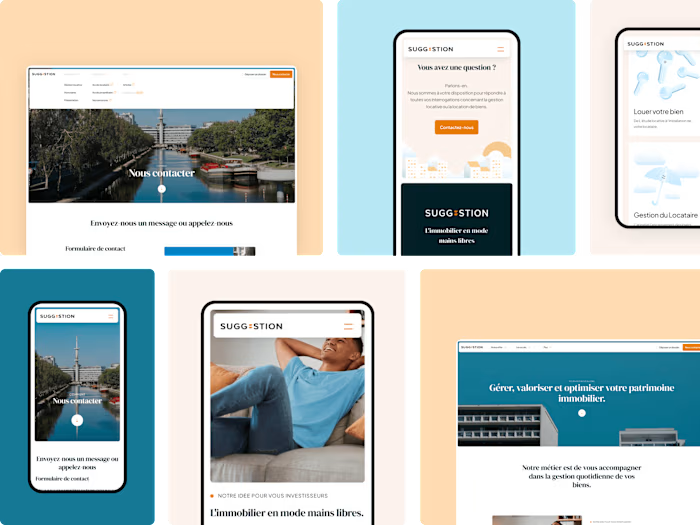
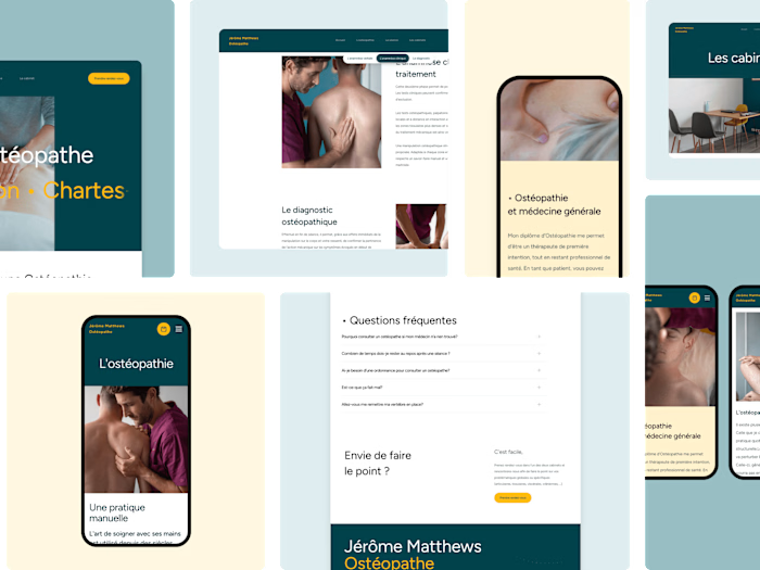
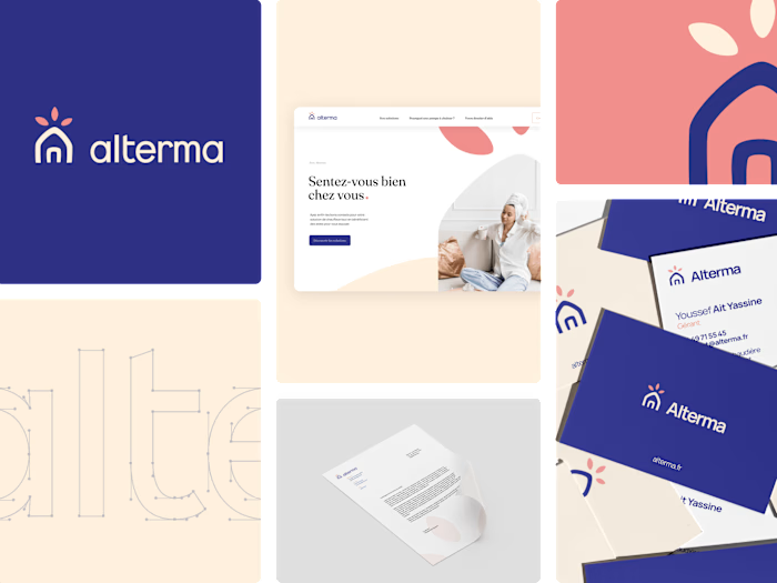
Since 2020, with the Arnal-Resotainer group, we teamed up to create a new visual language on the different brands of the group. For Resotainer, a self-storage company based on container sets, the goal was to modernize and simplify the perception of the company by its clients and prospects. Therefore, we worked on a simple and universal identification symbol and a custome typographic bloc that incorporates the design codes of container sites while making them accessible and attractive. This set is applied across a range of media with key, punchy, and colorful phrases.
Like this project
Posted Feb 20, 2024
A stong and happy visual system for a challenger in the sector.
Likes
0
Views
4
Clients
RESOTAINER

