Coral Care - Visual Identity Project

Stacey Troutman
Brand Designer
Graphic Designer
Logo Designer
Adobe Illustrator


Canva

Coral Care - Phase - 01
⭐️ The Brief
Alice and Jen had approached me in a logo design project for Coral Care, a place to connect families with local, vetted childhood developmental specialists who are available to start right away and take your insurance.
Coral Care exist to create an ecosystem where children can thrive and where specialists can grow their practice and serve more families.
The goal for this project is to create a logo for the first phase of Coral Care that will be used on their website, social assets, and pitch decks.
Target audience for Coral Care would ideally be families with young children (ages 0 months to 8 years old) and Speciality Providers (SLPs, OTs, PTs, etc.).
👉🏽 Logo Requirements
Design tone:
Playful (without being childish)
Modern
Trustworthy
Legible
Ability to be in one color
Why coral? It's a living and thriving ecosystem that is colorful
☝🏽First Step
The action item we initially took to begin our project is creating a mood board for visual inspiration and to make sure we're aligned with the brief.
Below, are the initial two mood boards sent to the client.
First mood board sent to Coral Care for their logo design inspiration
Second mood board sent to Coral Care for mood board inspiration
From these two mood boards, Alice and Jen have picked a few from both mood boards that they liked alongside an ask to add additional visuals that are aligned a little closer. The third mood board is the final mood board - I had put it in grayscale so none of us would be influenced by colors.
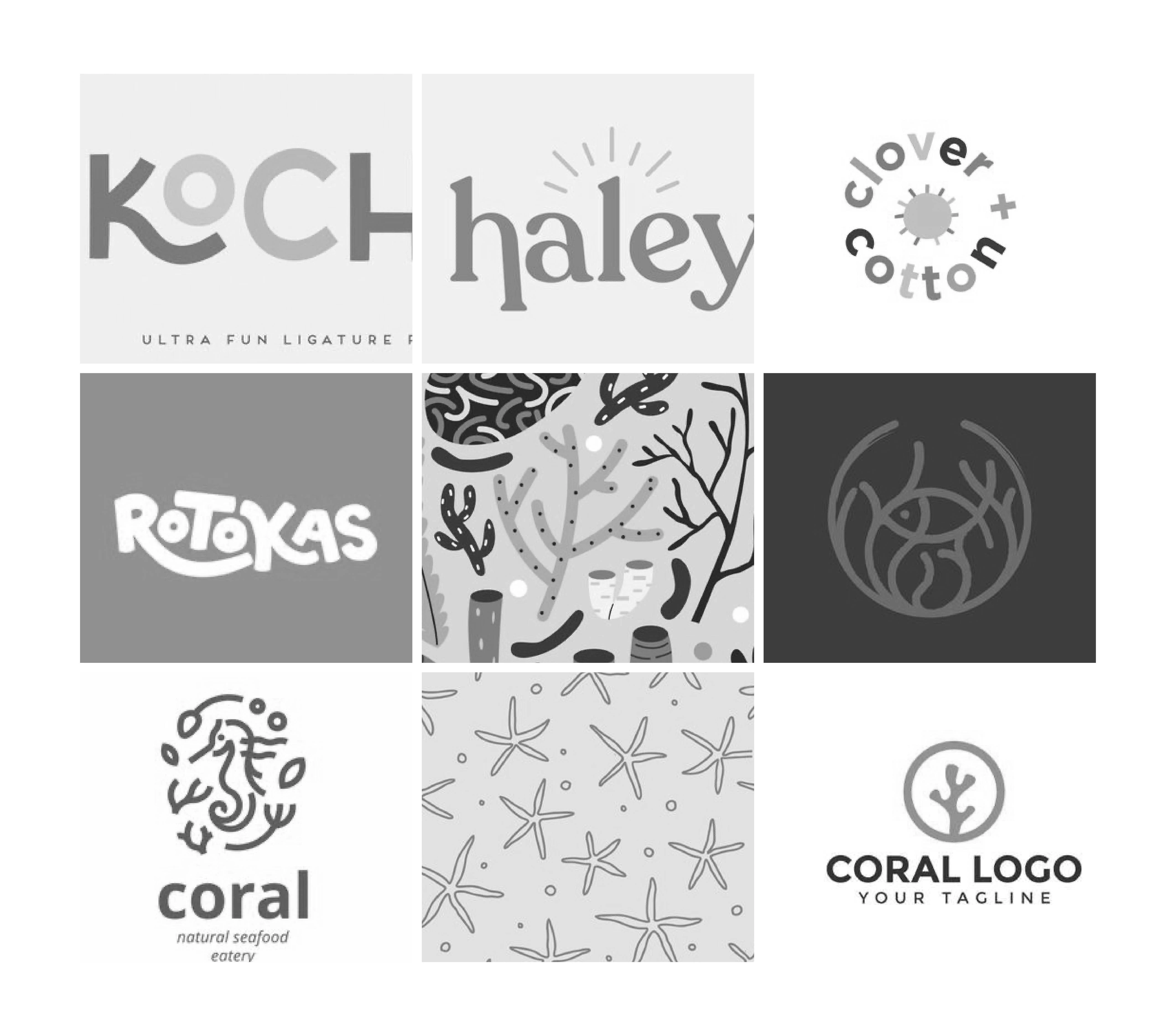
The third and final moodboard created in grayscale to avoid being biased by colors
✍🏽 Iterations
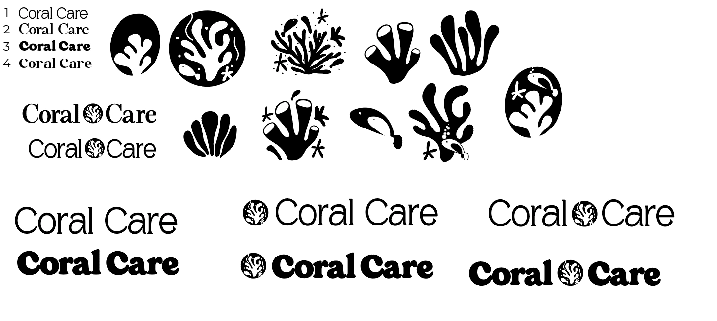
The fun begins! With the mood board shown, I approached the designs with a playful and bright colors mindset. My Illustrator artboards were filled with different fonts to choose from and how I would customize the type.
All of my designs begin with in only black. I never begin with color as I can easily be biased and lean towards one font over another due just the color alone.
Screenshot of an artboard filled with the different fonts chosen for Coral Care's logo
I was able to narrow it down to my top three, then to one I felt matched with their "playful without being childish" theme.
Coral Care in one font, varying customizations
I played around with different ways to make the logo playful. I thought maybe the R could curl under and the letters could be uneven to represent playful. I feared this was going to be approached as too playful for Alice and Jen. I added a couple of illustrations with a starfish and a fish for the A in "Care".
As I played more and more with customization, I moved on to the icon part of the logo.
Varying illustrations and compositions
I wasn't sure if they were more interested in a busy icon or a simple one for Coral Care. I also played around with different compositions with the icon being either on top or to the side.
After this first draft, I had narrowed it down to two different logos for them to review.
Draft 01 of Coral Care's logo with explanation of each component
Draft 01 was maybe about 50% of the way of what Alice and Jen had in mind, visually, for their logo. They liked the simple icon of the left, but were drawn more to the type on the right. However, overall, it wasn't quite there yet. A second draft was sent to them shortly after.
Second draft of Coral Care
When creating the second draft, they had asked to take out the line under the O and to not have the R curl the way that it did. I reverted back to the regular type and added a more simpler icon. While they felt like this is playful, Jen felt this may a little too playful for the direction she was wanting.
We met on Zoom for a quick huddle and a game plan for a different approach.
This last part is where Coral Care's design really began to take off!
Second approach to Coral Care's logo designs
Back to the drawing board, I went! I went back and found four new fonts and doodled more oceanic illustrations. Once this was sent, Alice and Jen felt like it was definitely going in the right direction - I'd say maybe 80%! They actually really loved the bottom font with the icon that's with it. They liked it so much, they were ready to add color in already!
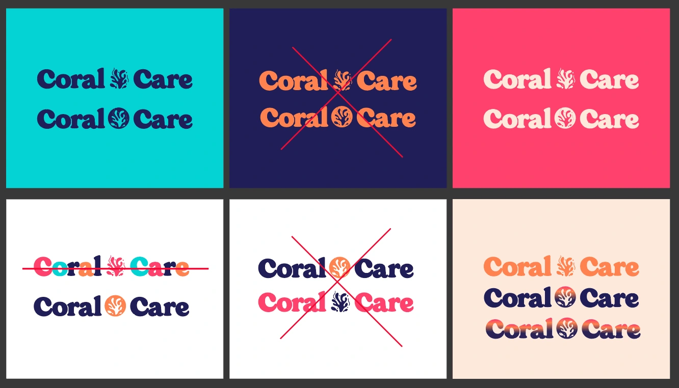
More play came into action with different ways of adding color. Personally, I enjoy the one color logos, but I knew they were wanting something unique. Jen had asked for a gradient, so I used their three colors to create that gradient. We all felt the dark blue was a little too much for the logo. So, we simplified it to a two-color gradient.
The beginnings of Coral Care's logo has finally begun! We all agreed that this is much closer to what they had in mind. It's playful, while still being modern and professional. We had to remind ourselves that both parents and medical professionals are involved with Coral Care. We had to make sure the logo conveys and speaks to both of these audience.
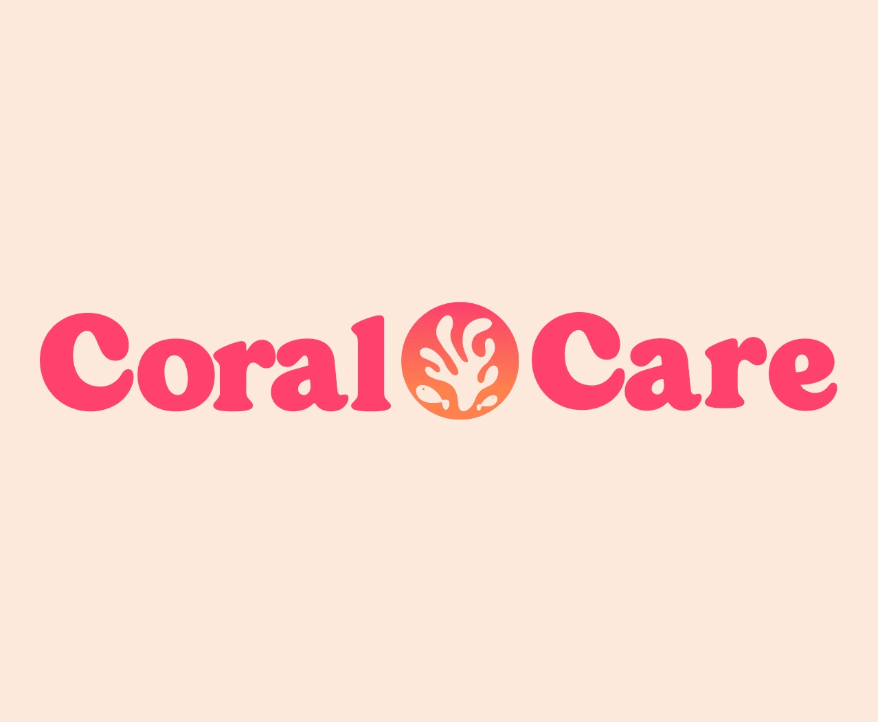
✨ The Final Logo
Almost exactly two weeks later, we've landed promptly on our deadline with a day to spare with the final and completed logo for Coral Care!
Alice and Jen were both very pleased with the way it turned out. I, personally, love the logo as well. I'm a bit impartial, because I still enjoyed the first more "playful" designs, but I understand that their audience is more adults and needs to be a little less playful than initially planned.
Here's the final logo!
While this project was very much within the style and line or work I love, it was still a bit challenging trying to nail the visual that the client wanted. I'm glad I went the way my mind initially told me to do with the more playful version, though!
Coral Care - Phase 02
⭐️ The Brief
After working with Alice and Jen on their logo design, they reached back out to me asking for hand drawn and custom illustrated icons for their brand! This one was more simple and straight-forward - especially after working with them and designing their logo, I feel like I had a good grasp on what they'd like for their illustrated icons.
Here were their requirements:
2D illustrations
Something that would show a relationship between a specialist and a child
A balanced mixture of oceanic plants and animals
Similar to the icon mark I've created for their full logo
✍🏽 Draft Illustrations
I used my iPad Pro and Apple Pencil to open Procreate and start designing Coral Care's icons. I presented two artboards to Alice and Jen.
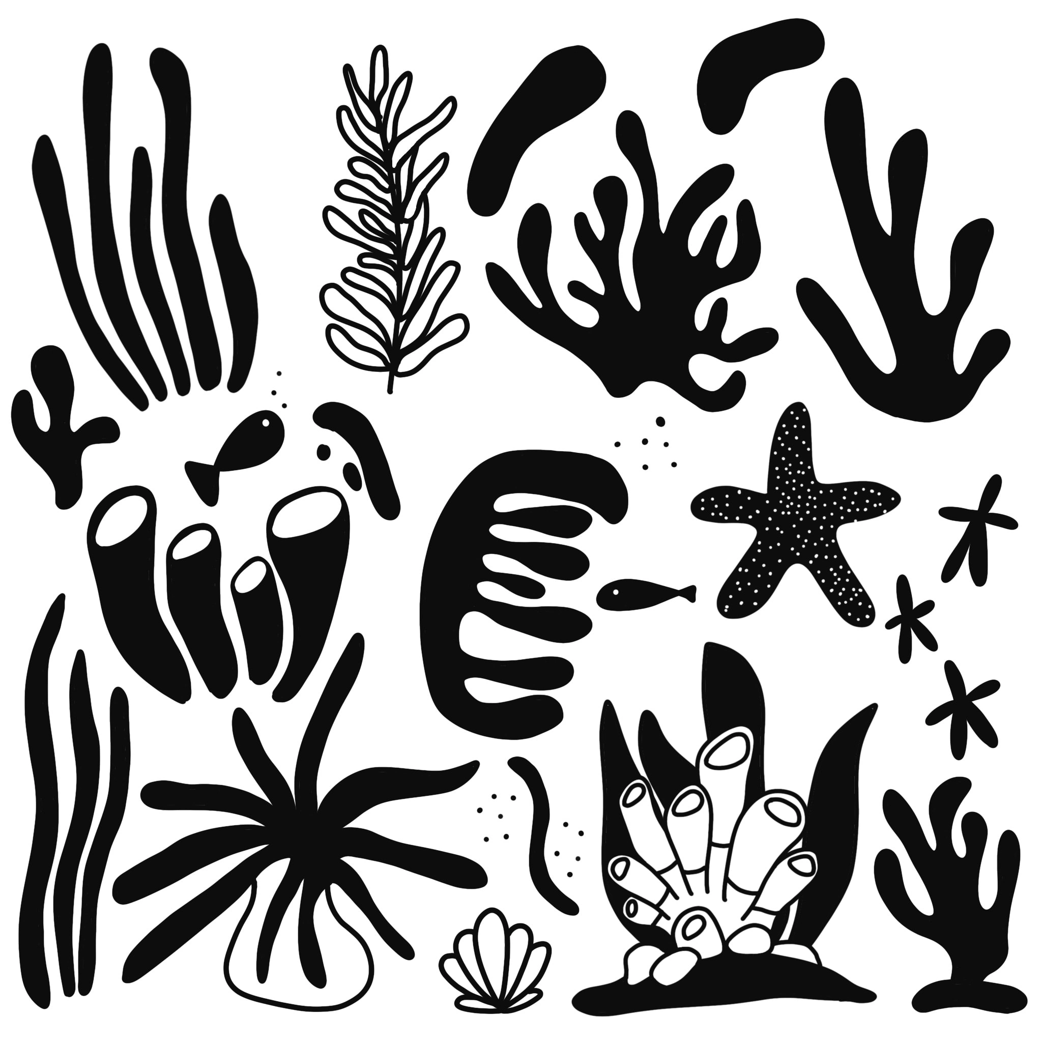
Artboard 01 for Coral Care
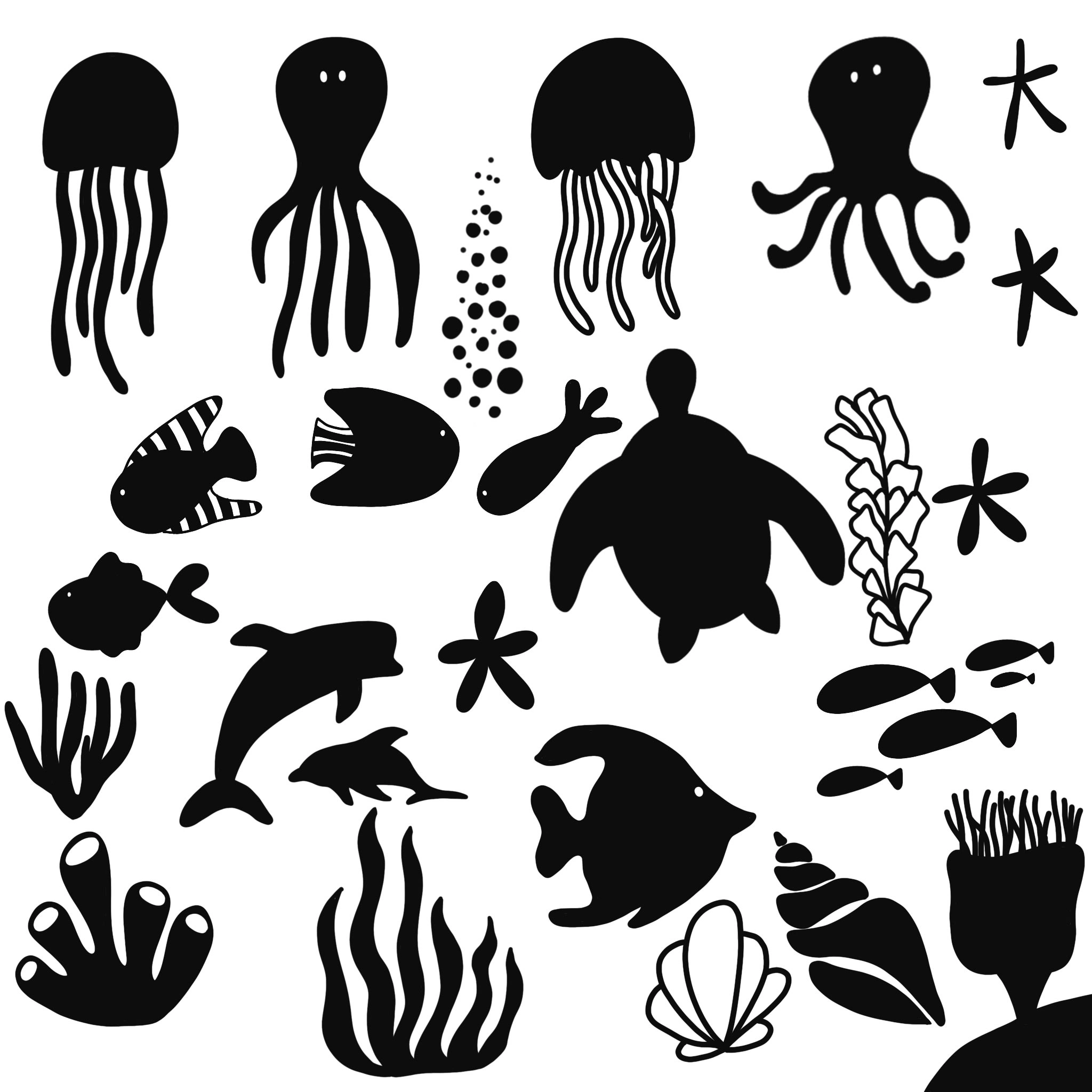
Artboard 02 for Coral Care
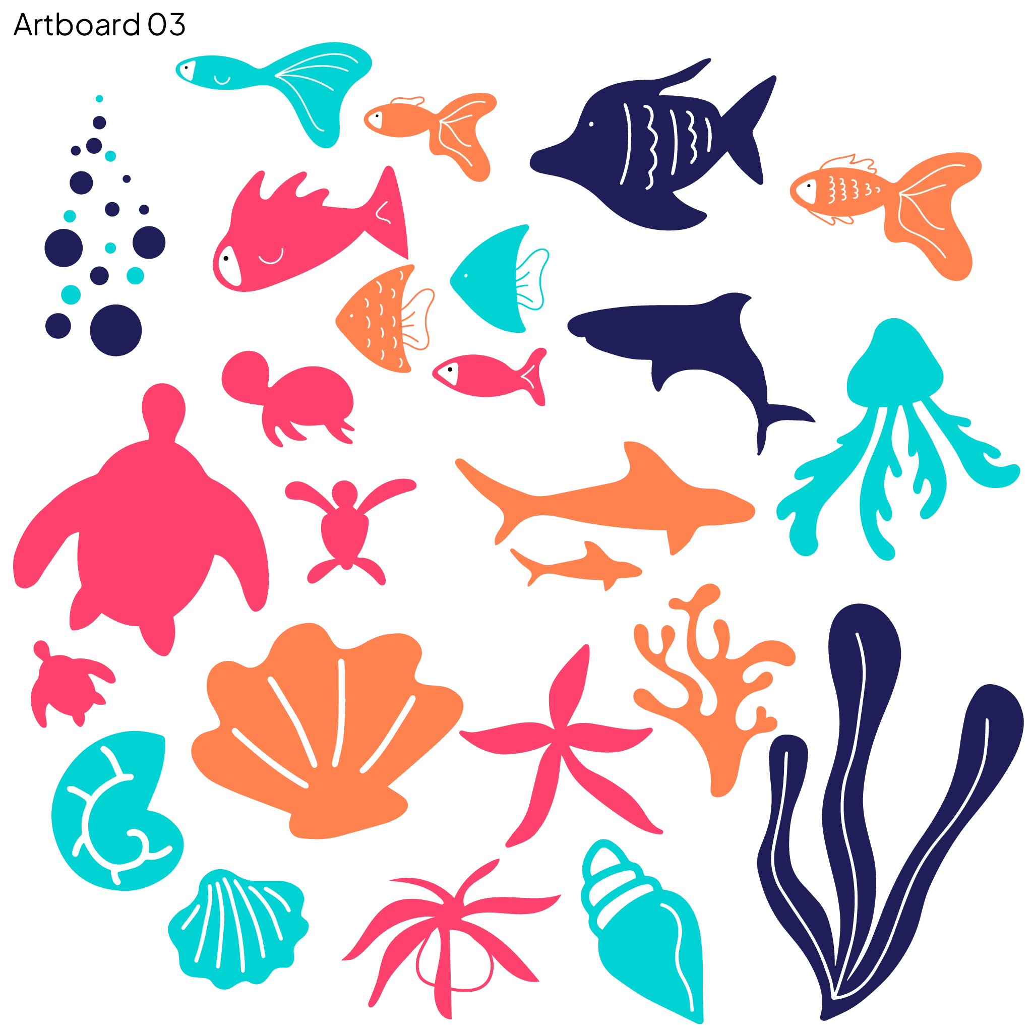
Jen identified several illustrations she liked from these two artboards. She requested I create a third artboard with the selected ones and some additional varieties.

Artboard 03 for Coral Care
I have a method for my logo designs where I start with black to avoid being influenced by colors. Jen expressed satisfaction with the initial designs and requested to view them in color. To accomplish this, I imported the illustrations to Adobe Illustrator and transformed them into vectors. This allowed me to easily add color to each icon.
🎨 Add Color!
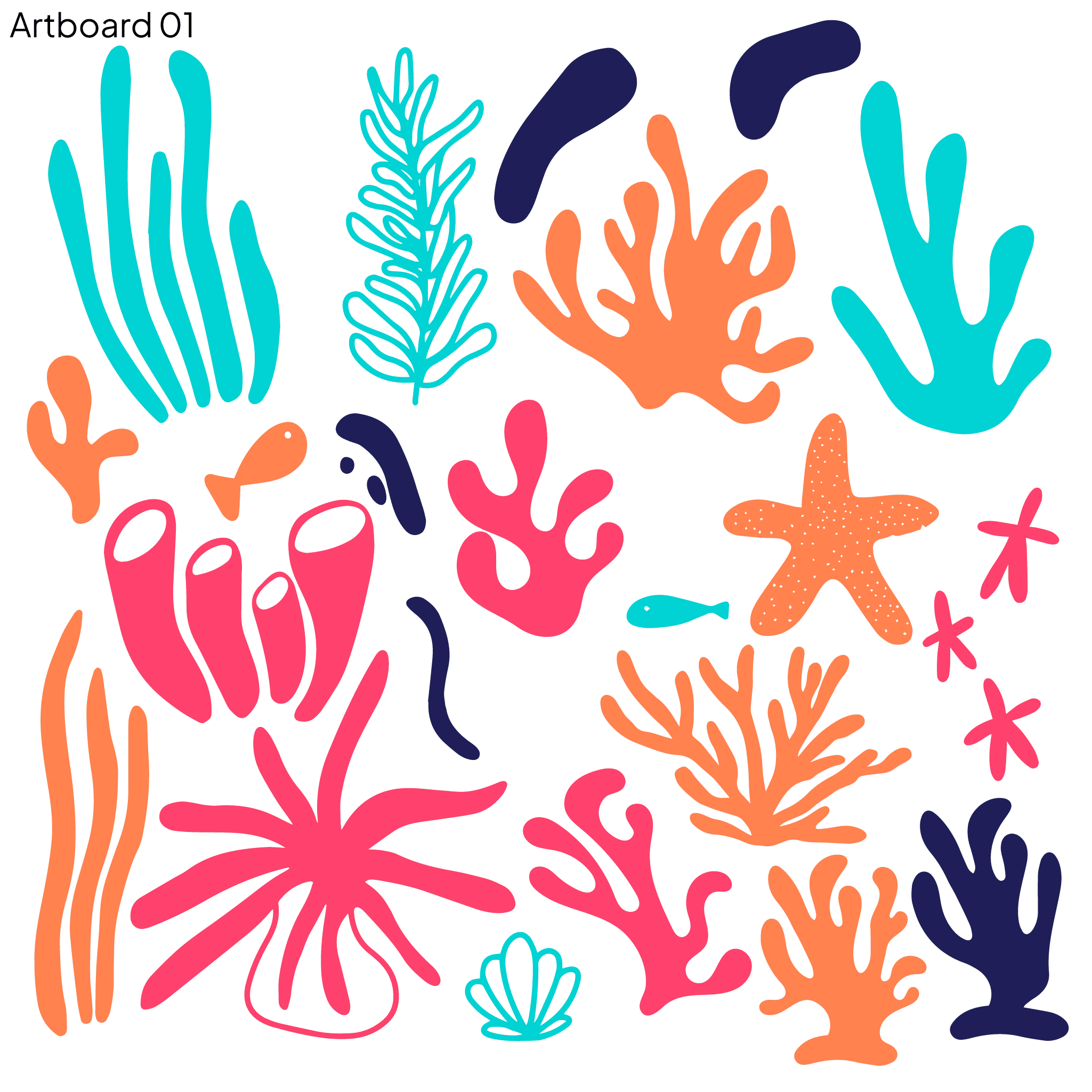
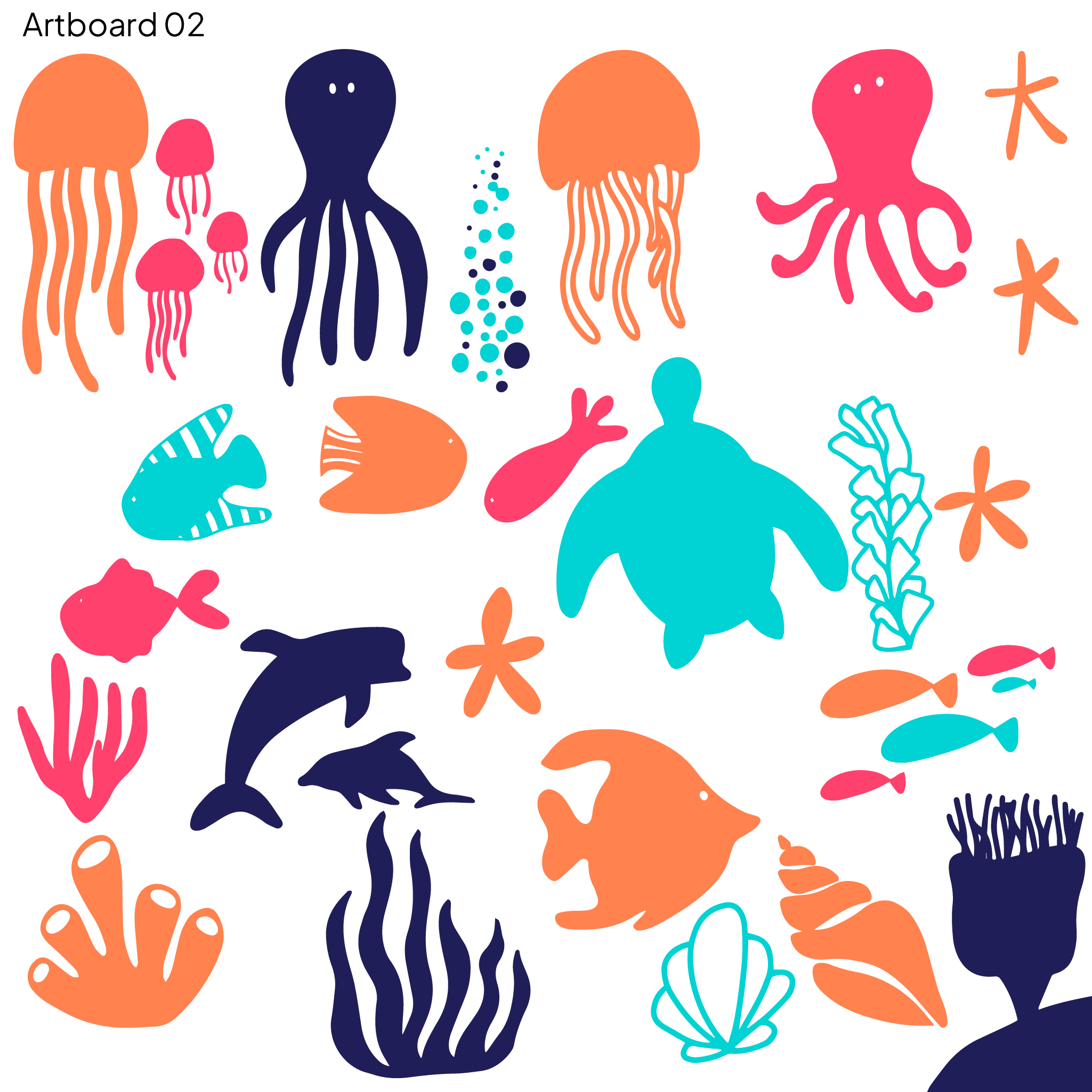
These were the final icons in color! They also wanted me to create them all in the same gradient as their logo as an additional color request.
💬 Final Thoughts
I had a great experience working with Alice and Jen previously, and was excited when they asked me to collaborate with them again on phase 2 of their designs. It's rewarding to know that they appreciate my work and enjoy the same creative pursuits as I do.
🐠 Coral Care's Website
Check out Coral Care's website with many of my designs I've mentioned in this case study!