Earlybean Mobile Banking App Design by Tomiwa NeustackEarlybean Mobile Banking App Design by Tomiwa Neustack

Earlybean Mobile Banking App Design

Tomiwa Neustack

Tomiwa Neustack

Earlybean is a youth financial literacy and family banking product built around a simple question: how do you help Nigerian children understand money before adulthood makes the lessons expensive?
The product was designed for the realities of Nigerian families — where children often encounter money through school fees, pocket money, food purchases, savings goals, and parent-controlled decisions. That context shaped the UX: parent-linked accounts, goal-based saving, clear wallet balances, allowance-style funding, child-friendly learning moments, and visual progress patterns that make money feel practical instead of abstract.
A major design challenge was trust. Parents were not just trusting a fintech product with money; they were trusting it with their children. So the experience had to feel credible for adults, simple for children, and structured enough to support schools and families as intermediaries.
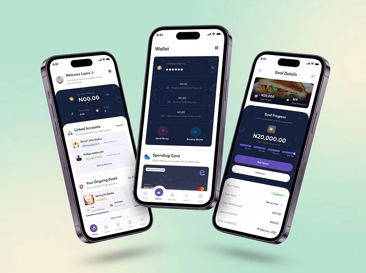
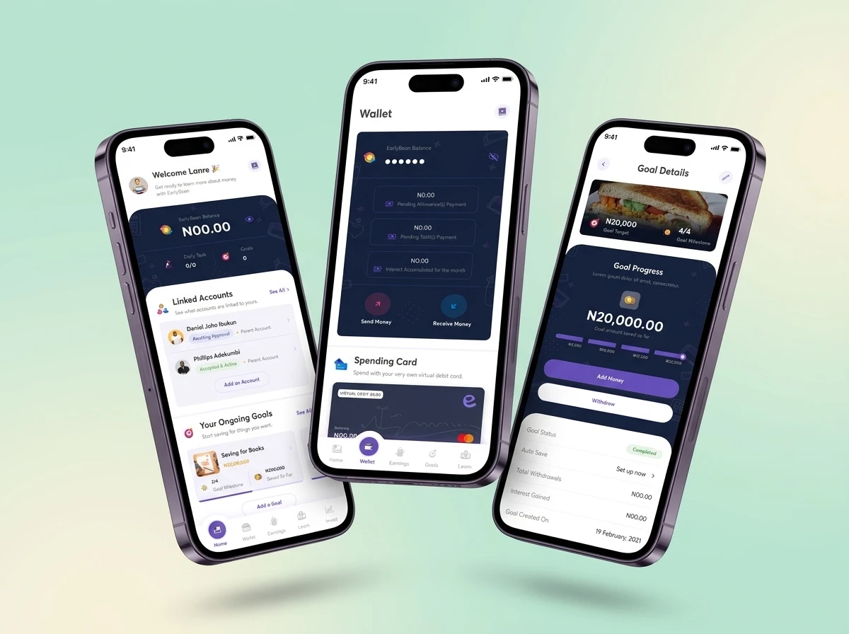
The interface combines playful visual language with fintech clarity: soft colour, rounded cards, readable balances, visible goal progress, and quick actions for sending, receiving, saving, and withdrawing. The aim was not to make finance look cute for its own sake, but to make financial behaviour easier to understand, repeat, and build into habit.
If you’re building a fintech, edtech, or behaviour-change product for emerging markets, I’m open to thoughtful collaborations.
Like this project

Posted Oct 17, 2026

Earlybean is a youth financial literacy and family banking product built around a simple question: how do you help Nigerian children understand money before adulthood makes the lessons expensive? The product was designed for the realities of Nigerian families — where children often encounter money through school fees, pocket money, food purchases, savings goals, and parent-controlled decisions. That context shaped the UX: parent-linked accounts, goal-based saving, clear wallet balances, allowance-style funding, child-friendly learning moments, and visual progress patterns that make money feel practical instead of abstract. A major design challenge was trust. Parents were not just trusting a fintech product with money; they were trusting it with their children. So the experience had to feel credible for adults, simple for children, and structured enough to support schools and families as intermediaries. The interface combines playful visual language with fintech clarity: soft colour, rounded cards, readable balances, visible goal progress, and quick actions for sending, receiving, saving, and withdrawing. The aim was not to make finance look cute for its own sake, but to make financial behaviour easier to understand, repeat, and build into habit. If you’re building a fintech, edtech, or behaviour-change product for emerging markets, I’m open to thoughtful collaborations.

Likes

0

Views

0