GRIT Visual Identity
Janja Junež
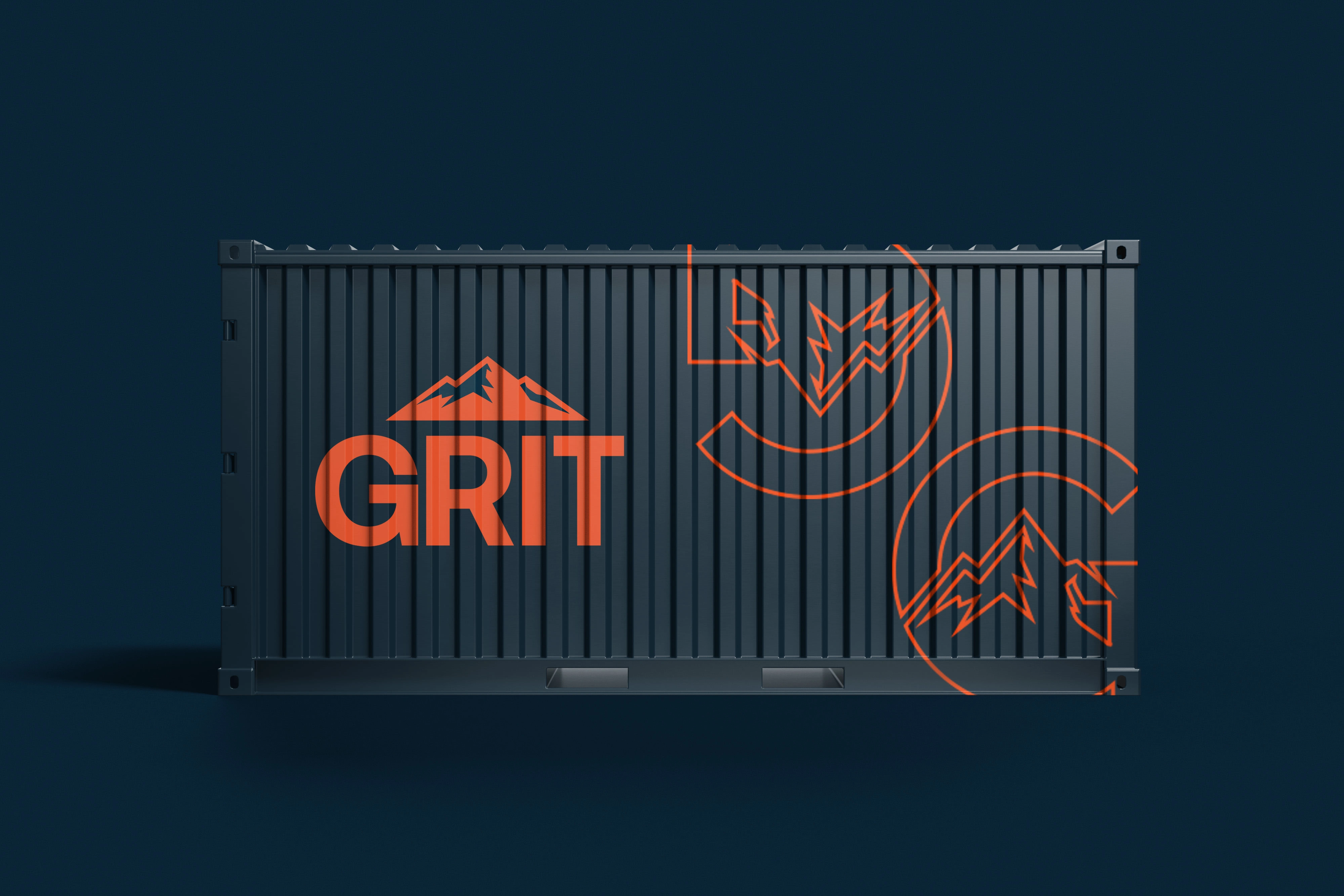
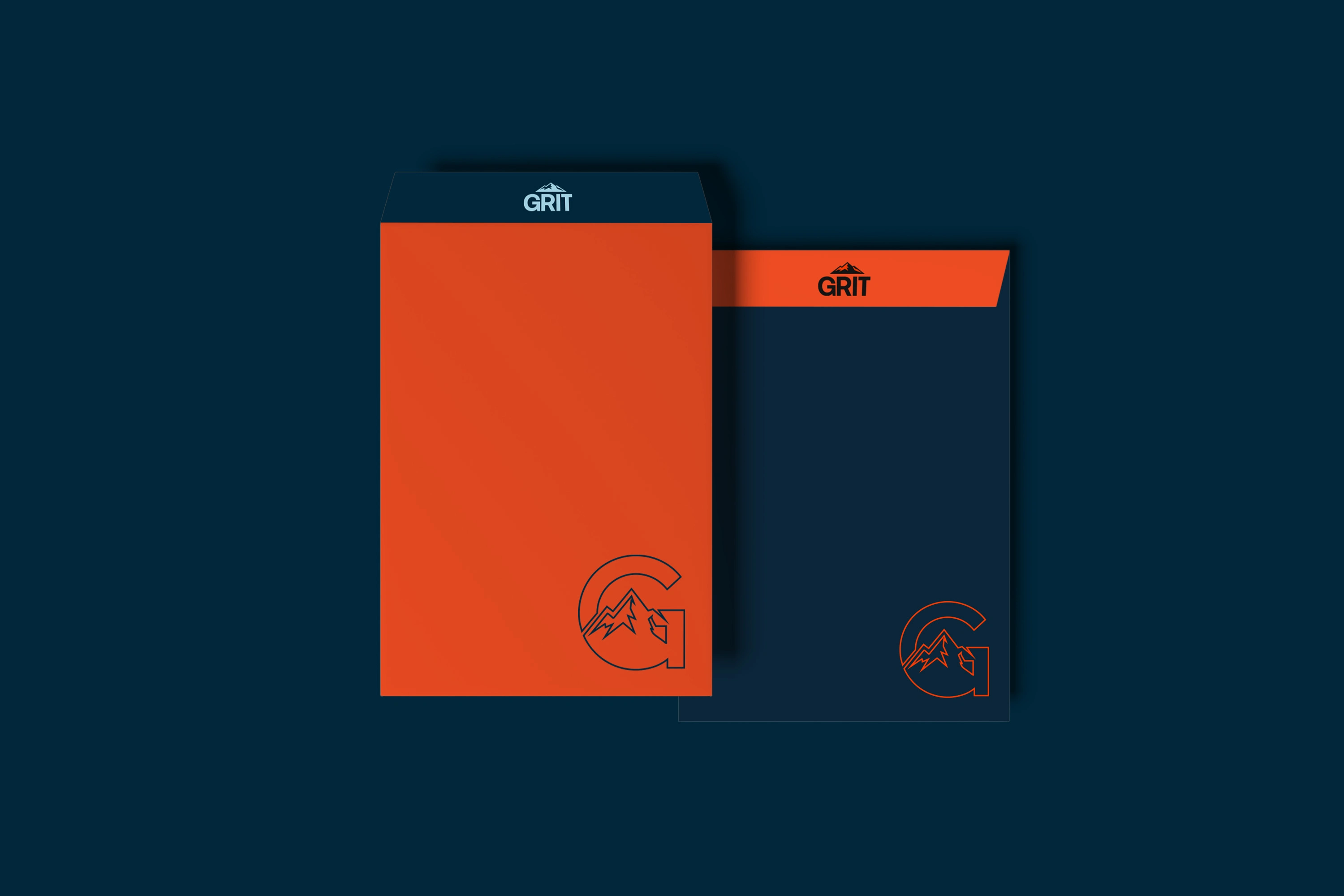
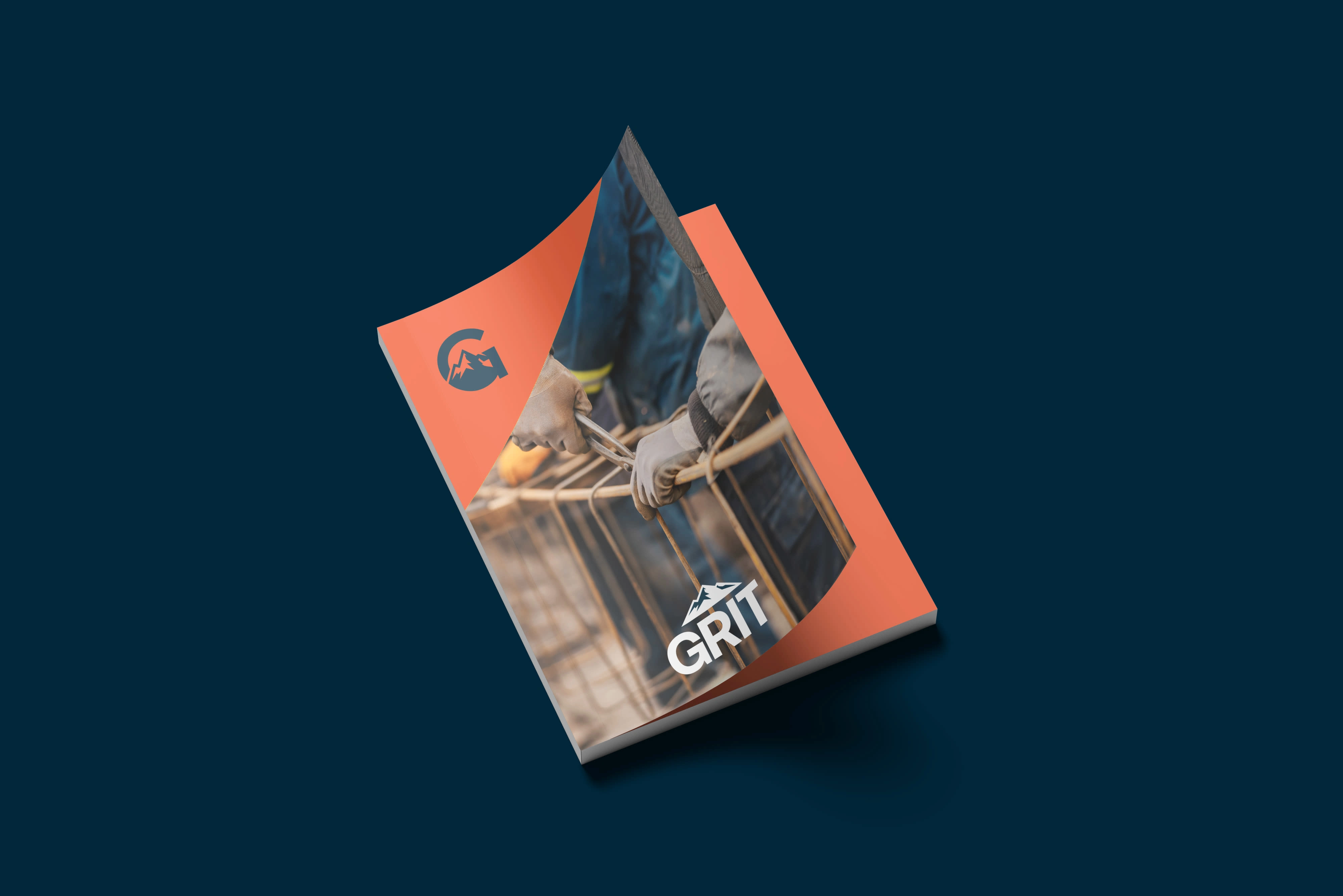
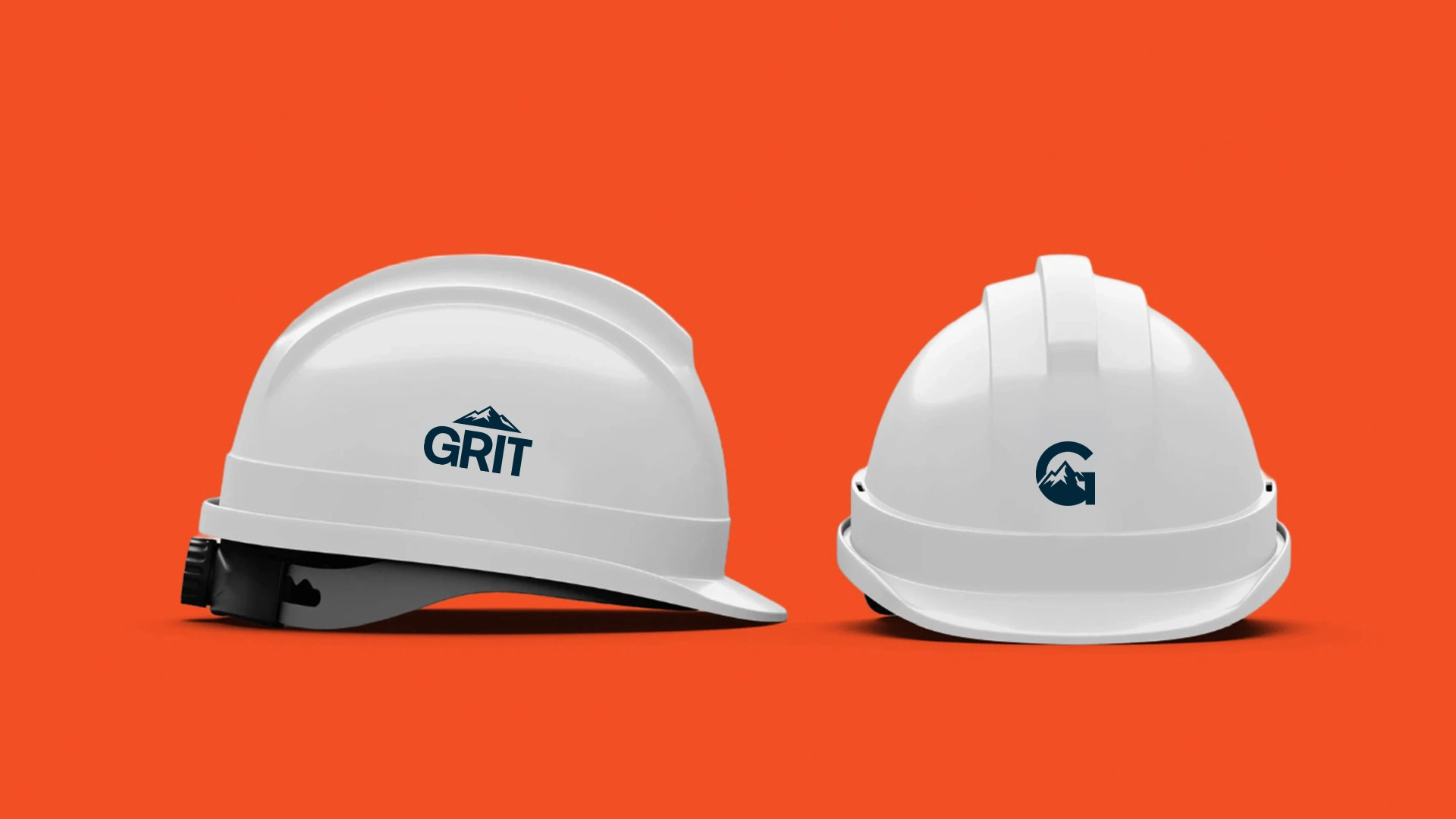
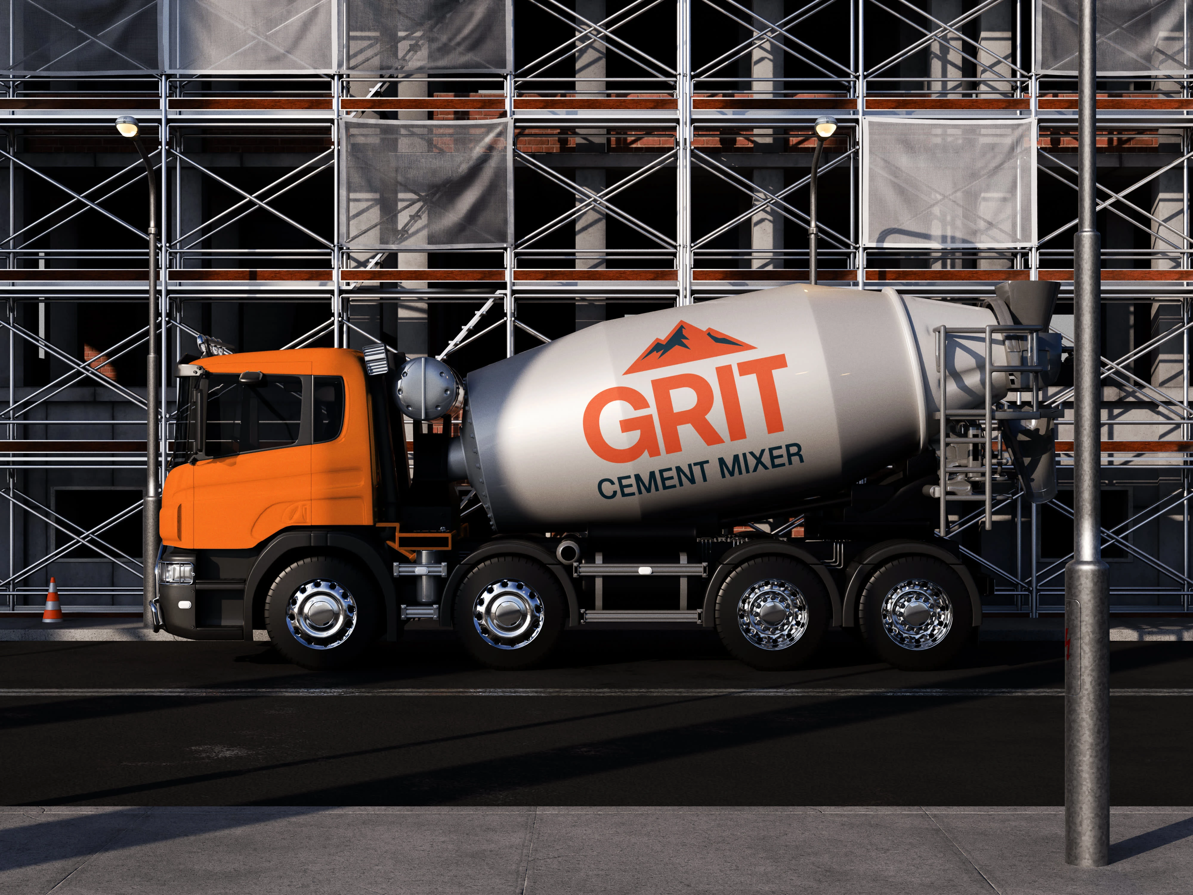
The GRIT visual identity reflects strength, stability, and precision. The logo combines bold typography with a mountain symbol, representing durability and resilience. The mountains are intentionally incorporated as a reference to the company’s headquarters in the Alps, reinforcing its connection to a strong and demanding environment.
The color palette pairs industrial orange with deep steel blue to create strong contrast and high visibility. Clean typography and minimal iconography ensure clarity, consistency, and professional communication across all applications — from print materials to equipment branding and digital platforms.

Like this project
Posted Mar 3, 2026
GRIT’s visual identity reflects strength and precision. Alpine-inspired mountains honor its headquarters, paired with bold type and industrial colors.
Likes
0
Views
2