Sensibo's homepage refresh
Simon Cohen
Sensibo homepage refresh
Their products are solid. The tech works. But their homepage looked like it was designed in 2015 and hadn't been touched since.
Sensibo makes smart climate control devices—think thermostats and air purifiers you control from your phone. Their products are solid. The tech works. But their homepage looked like it was designed in 2015 and hadn't been touched since.
The problem wasn't just aesthetics. The messaging was buried. Product benefits weren't clear. The site felt cluttered and overwhelming instead of simple and smart (which is what their products actually are).
The solution
I rebuilt the homepage from scratch with a focus on clarity and product storytelling.
What I did:
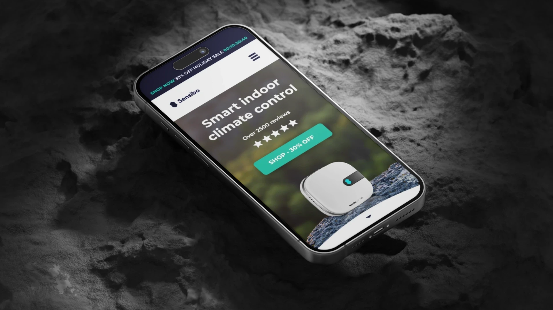
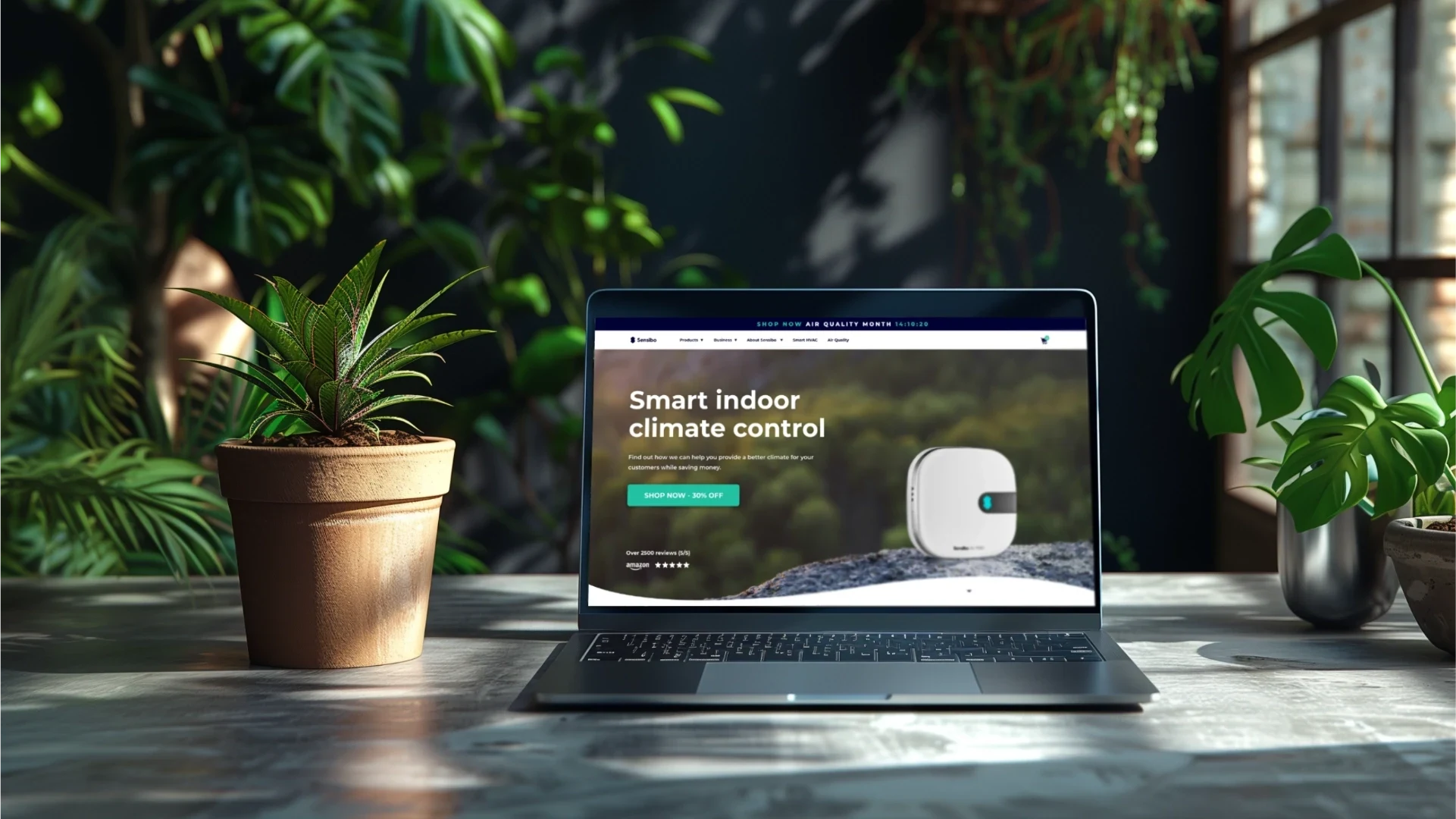
Simplified the hero section to lead with the core benefit: "Smart indoor climate control." No fluff, just what it does.
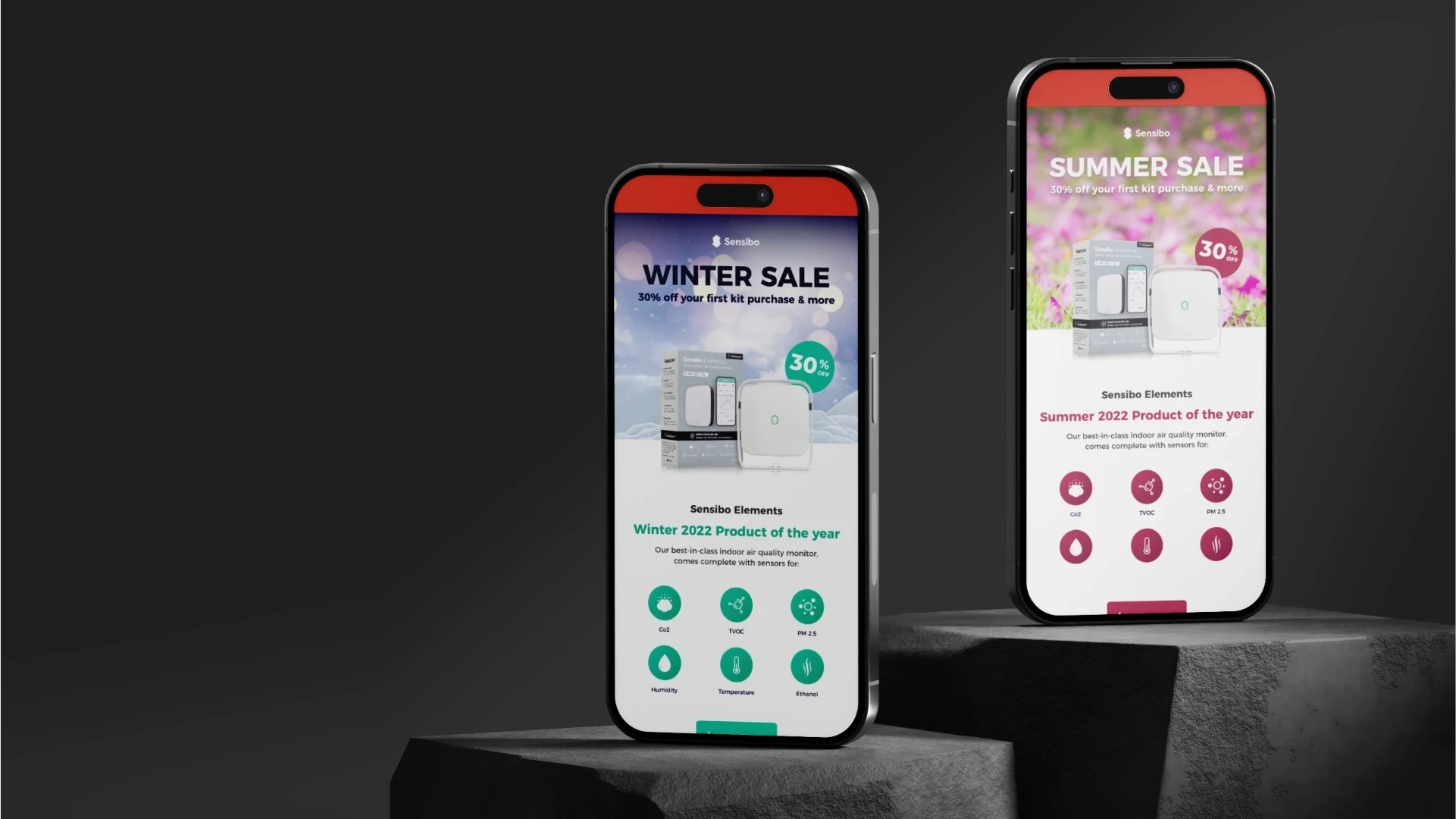
Reorganized the content hierarchy to feature their product lines (Pure, Elements, Sky) with clear, scannable benefits for each
Designed lifestyle-focused product blocks that show the devices in real homes, not just on white backgrounds
Built a mobile-responsive layout that works as well on a phone as it does on desktop
Created a visual system that feels premium without being cold—warm tones, clean typography, breathing room
The design language mirrors what the products are: smart, simple, effective.
The result
Sensibo launched the new homepage and immediately saw better engagement. Product pages got more traffic because the homepage did its job—guiding visitors to the right place.
They are still using the same website 3 years later.
More importantly, the site now reflects the quality of the products. When you're competing against Google and Amazon, looking credible matters.
The internal team can also manage content updates easily without breaking the design—everything's component-based and built to scale as they add new products.
Like this project
Posted Jan 18, 2026
Their products are solid. The tech works. But their homepage looked like it was designed in 2015 and hadn't been touched since.