Skyrise Architects - Identity Design
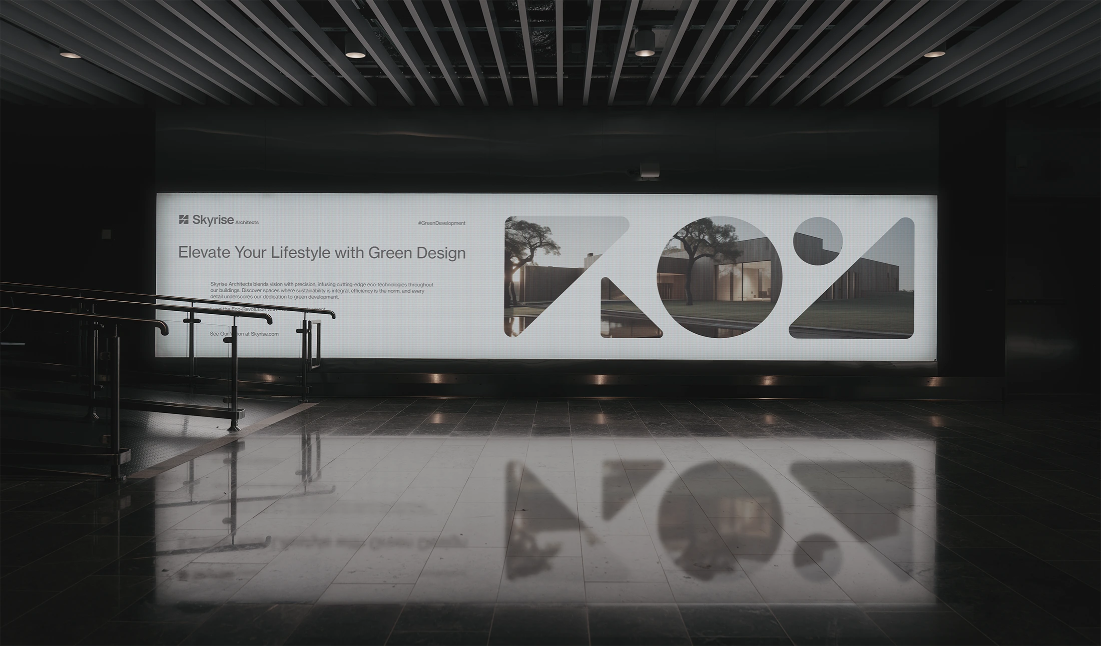

Skyrise Architects
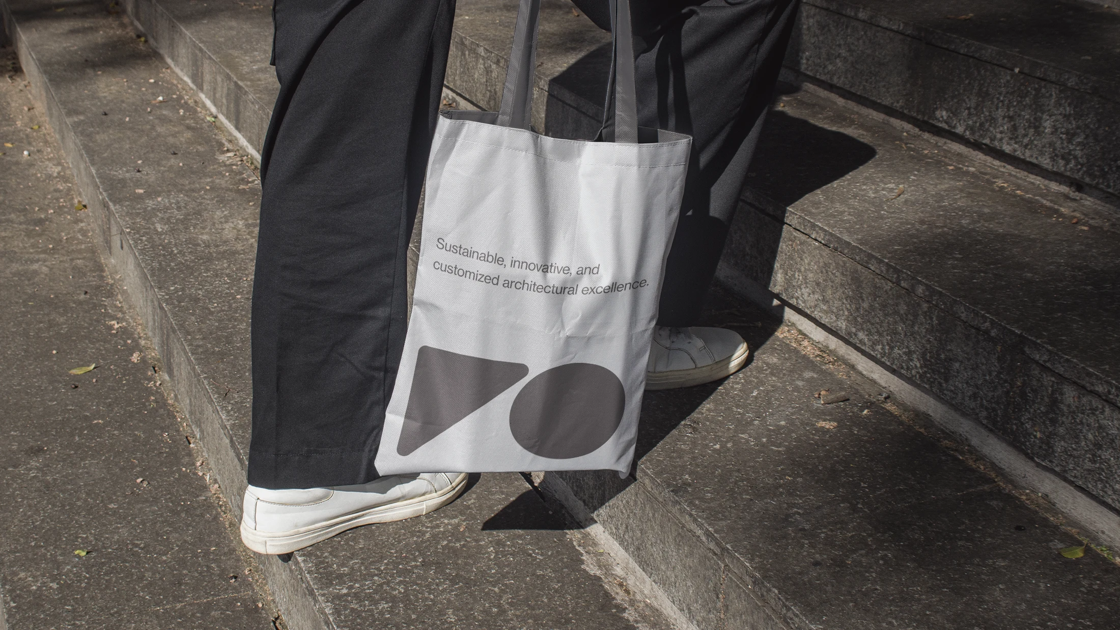
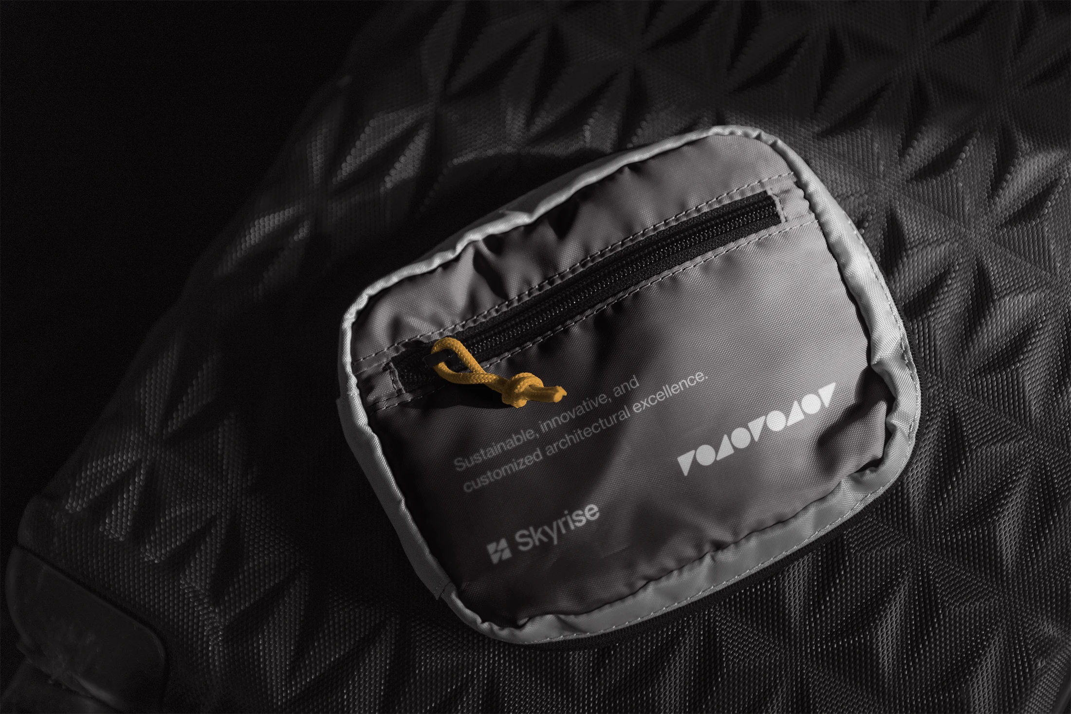
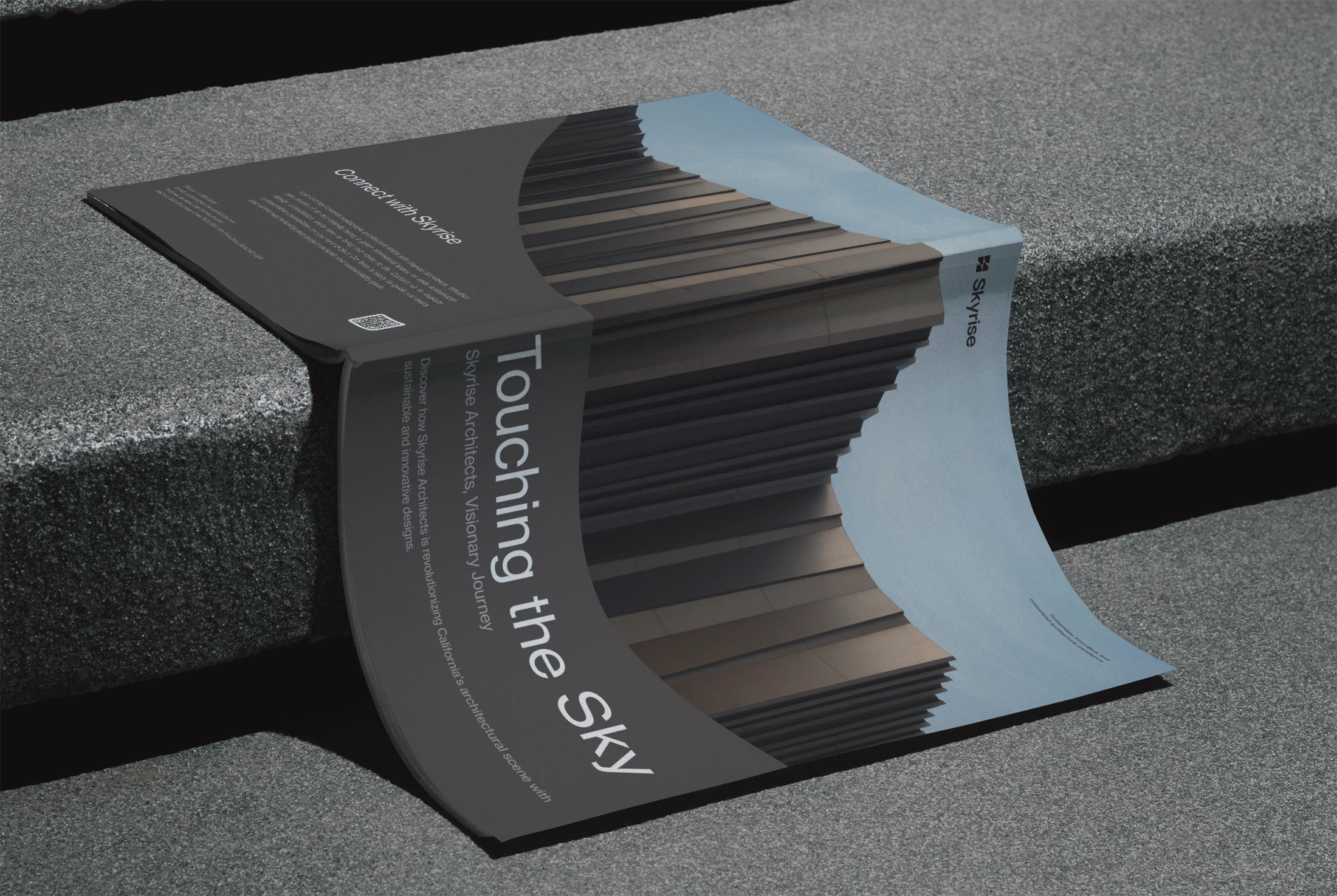
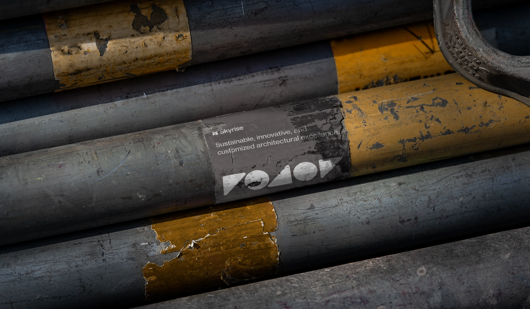
Sustainable, innovative, and customized architectural excellence.
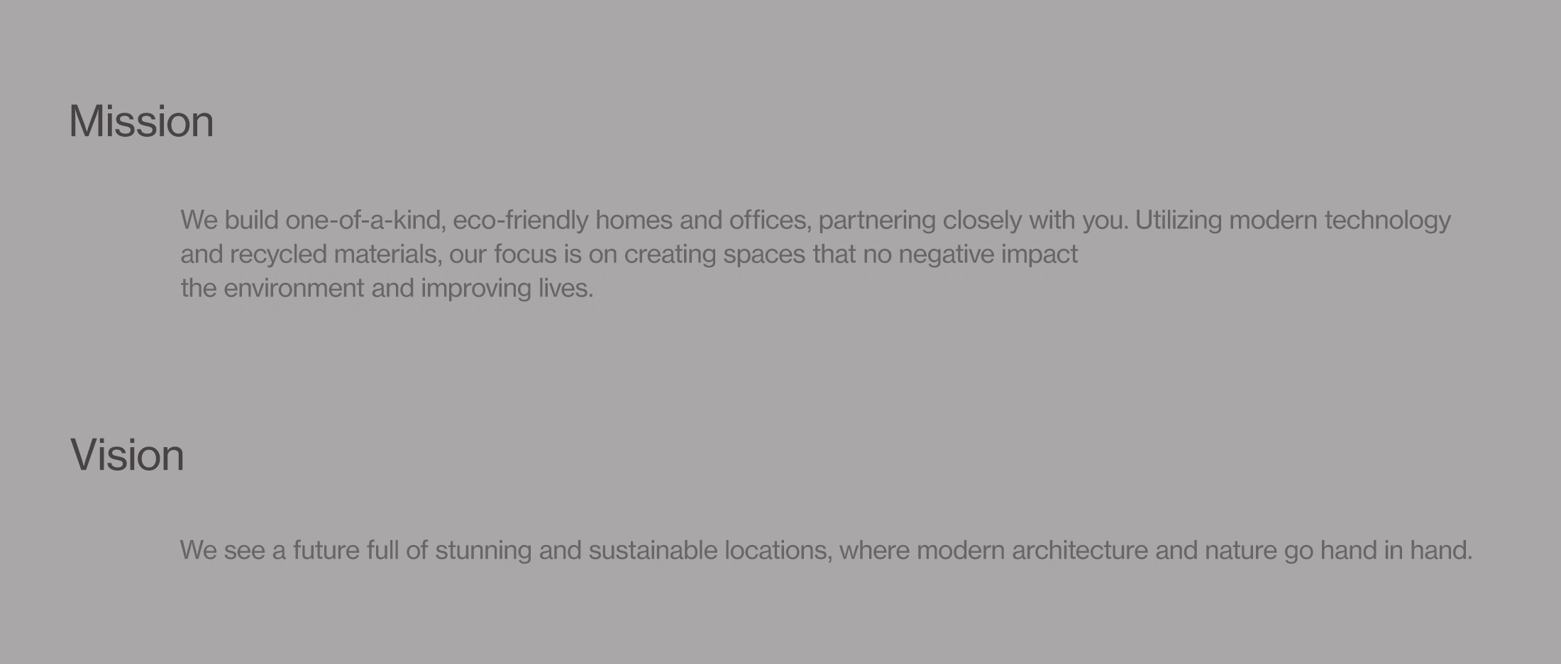
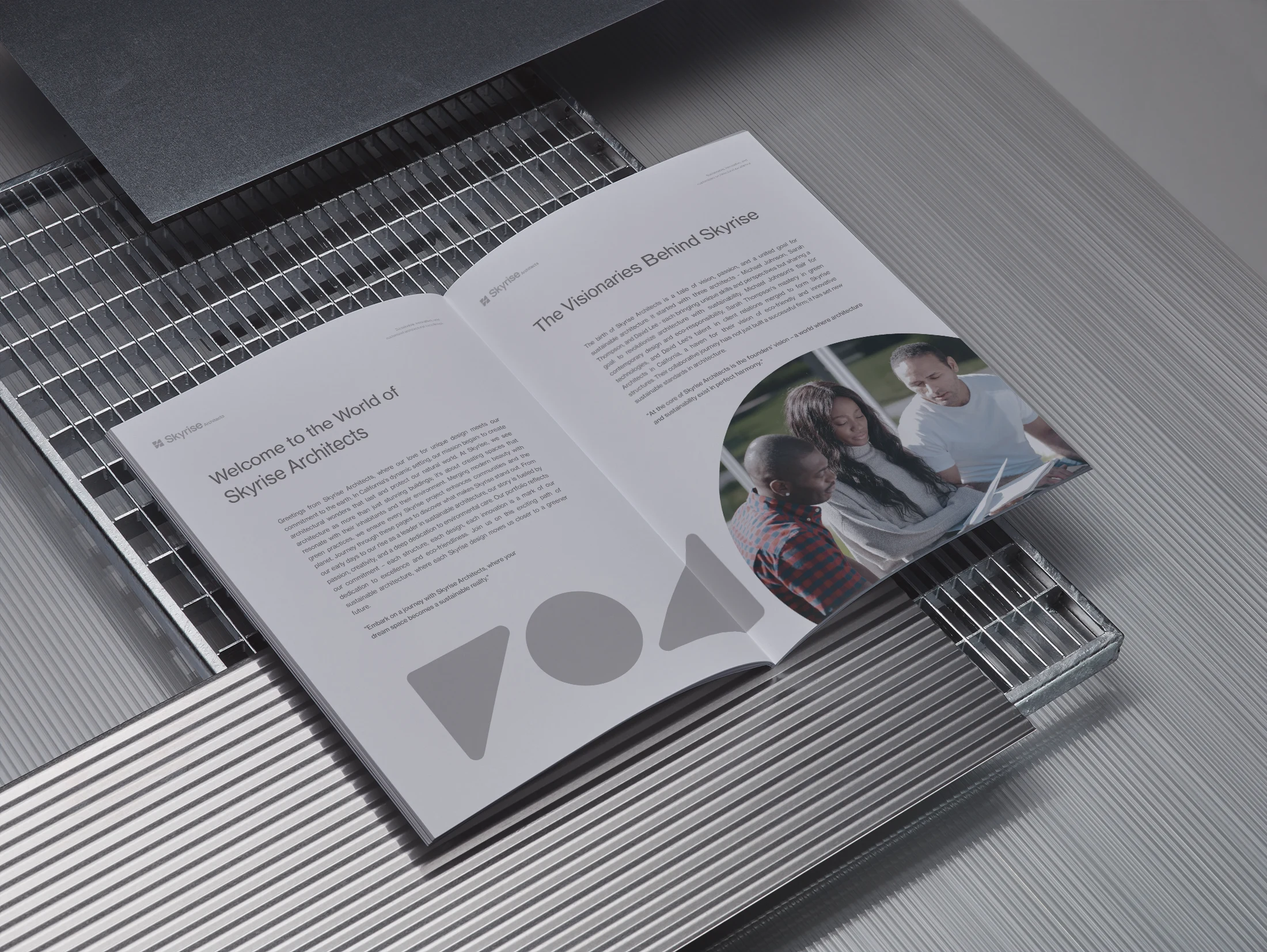
Skyrise Architects is a creative company that creates attractive, earth-friendly constructions. They provide services for planning, designing, and managing the construction of dream places that are as good for the environment as they are for the people who live in them.
Skyrise Architects creates buildings that uniquely reflect our architectural expertise by keeping things simple and traditional while creating attractive and useful designs. We focus on reliable and classic looks, as we are aware that this is what benefits both our customers and the environment.
Project Scope: Visual Identity and Motion Design
Duration: October 2023 – February 2024
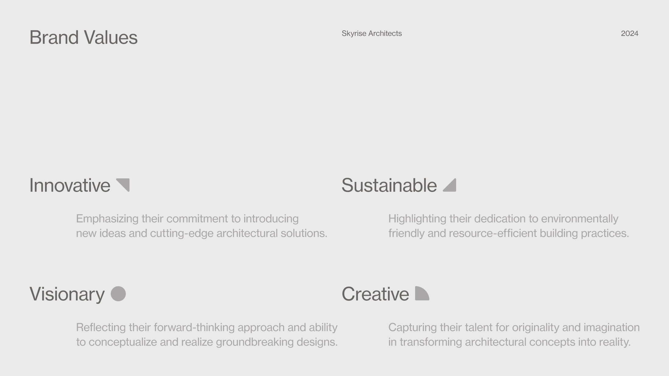
The Logo
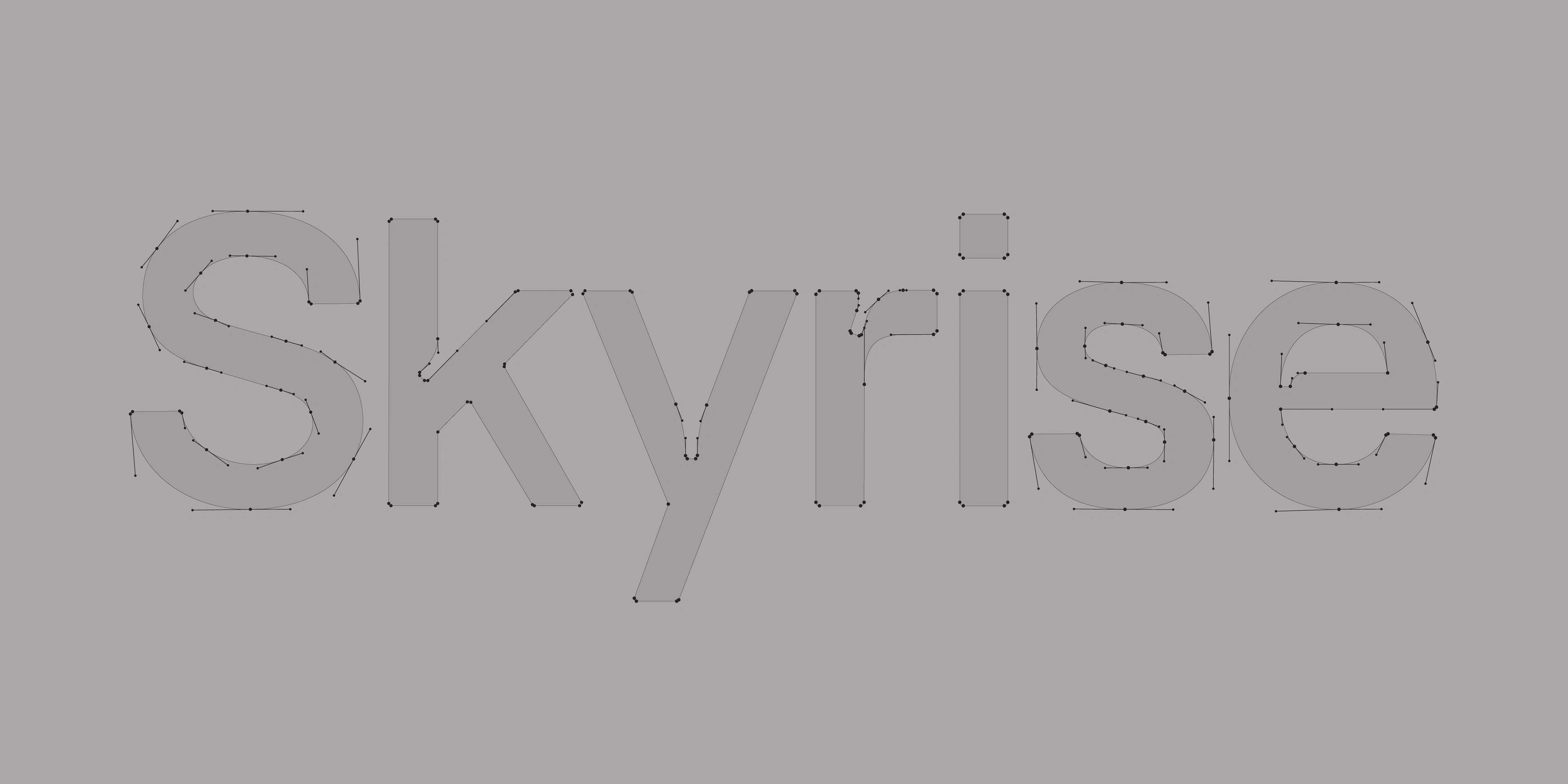
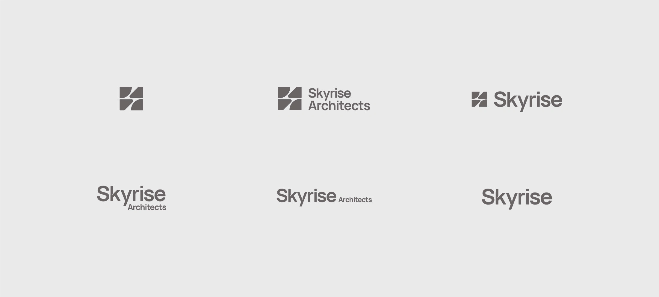
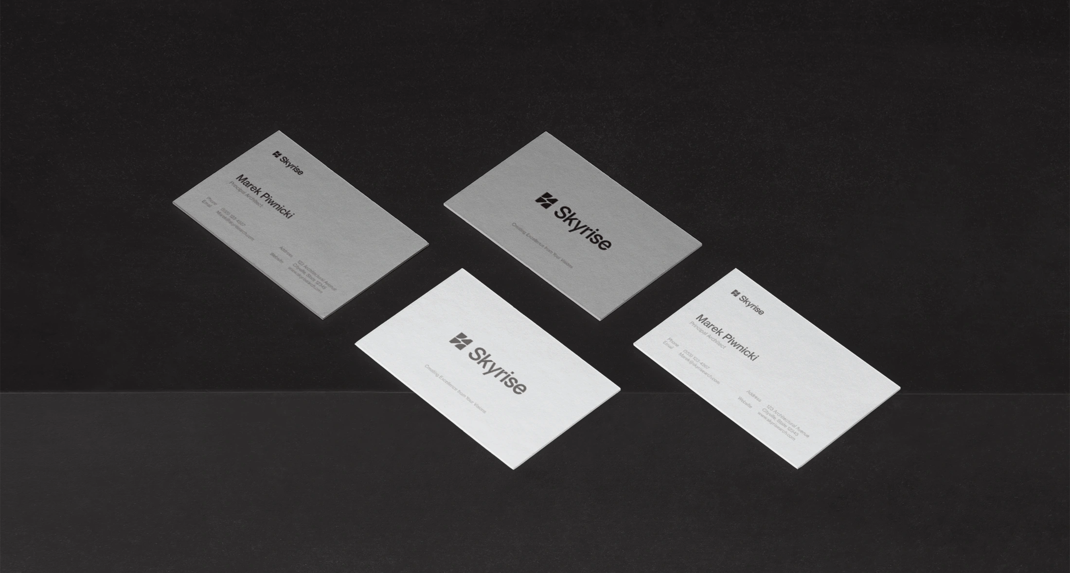
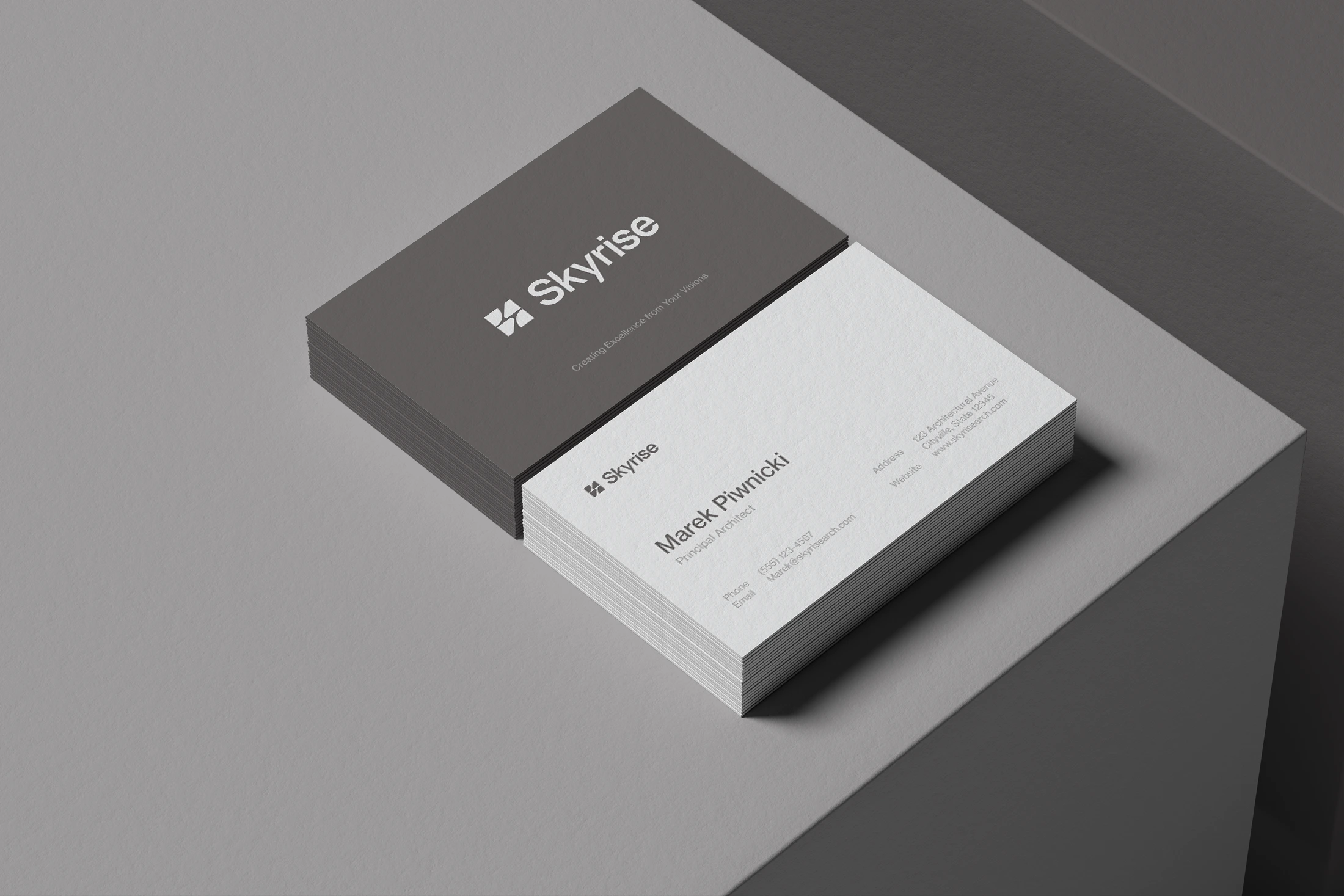
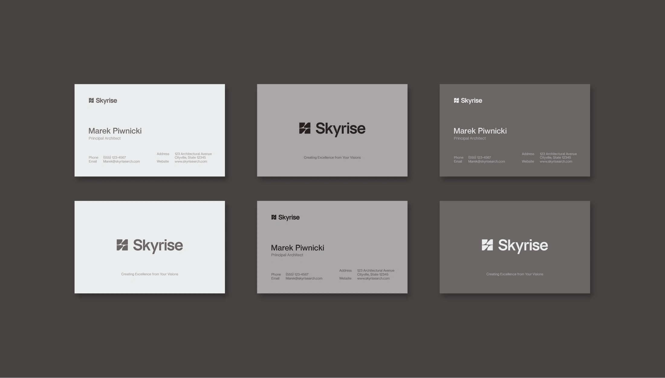
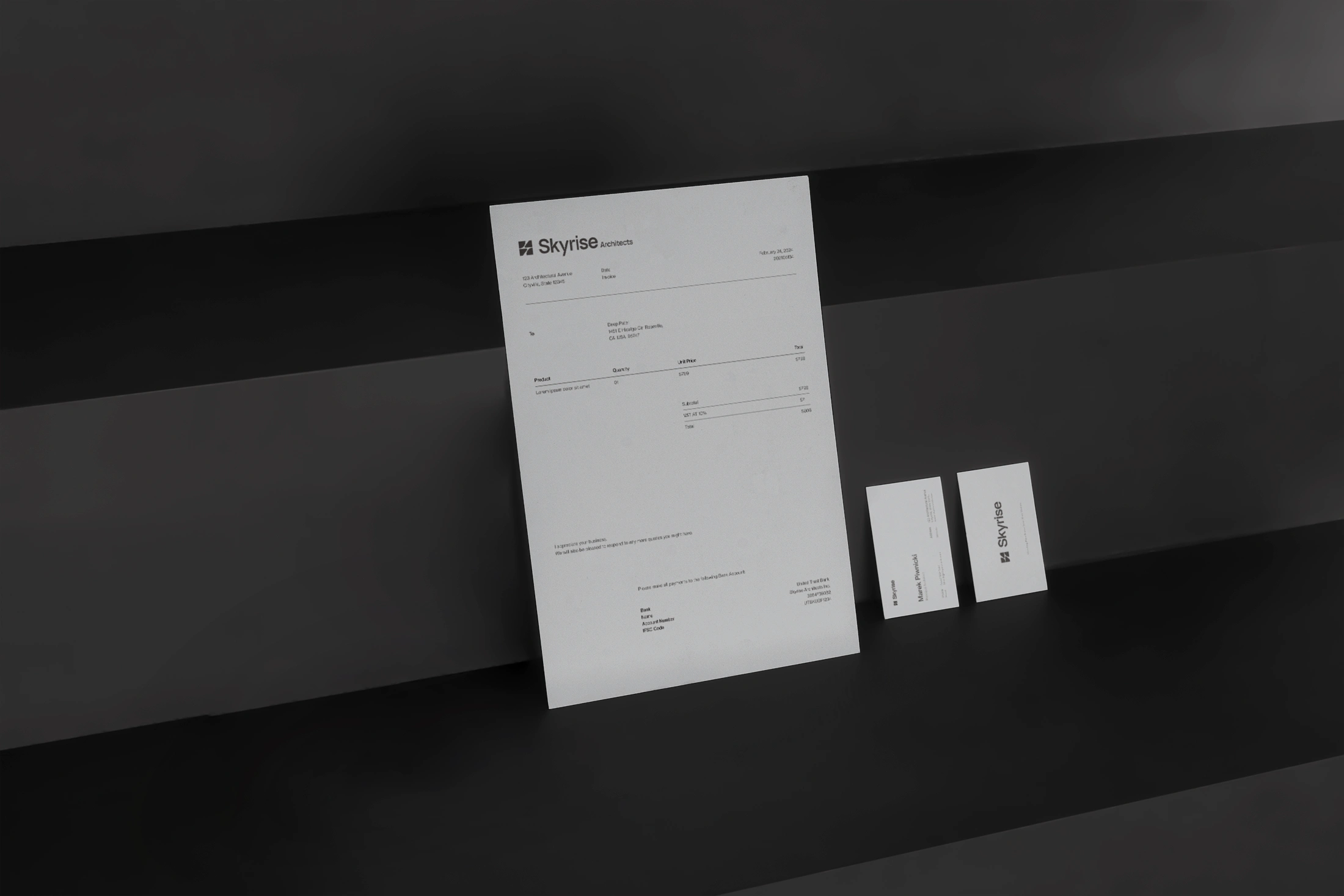
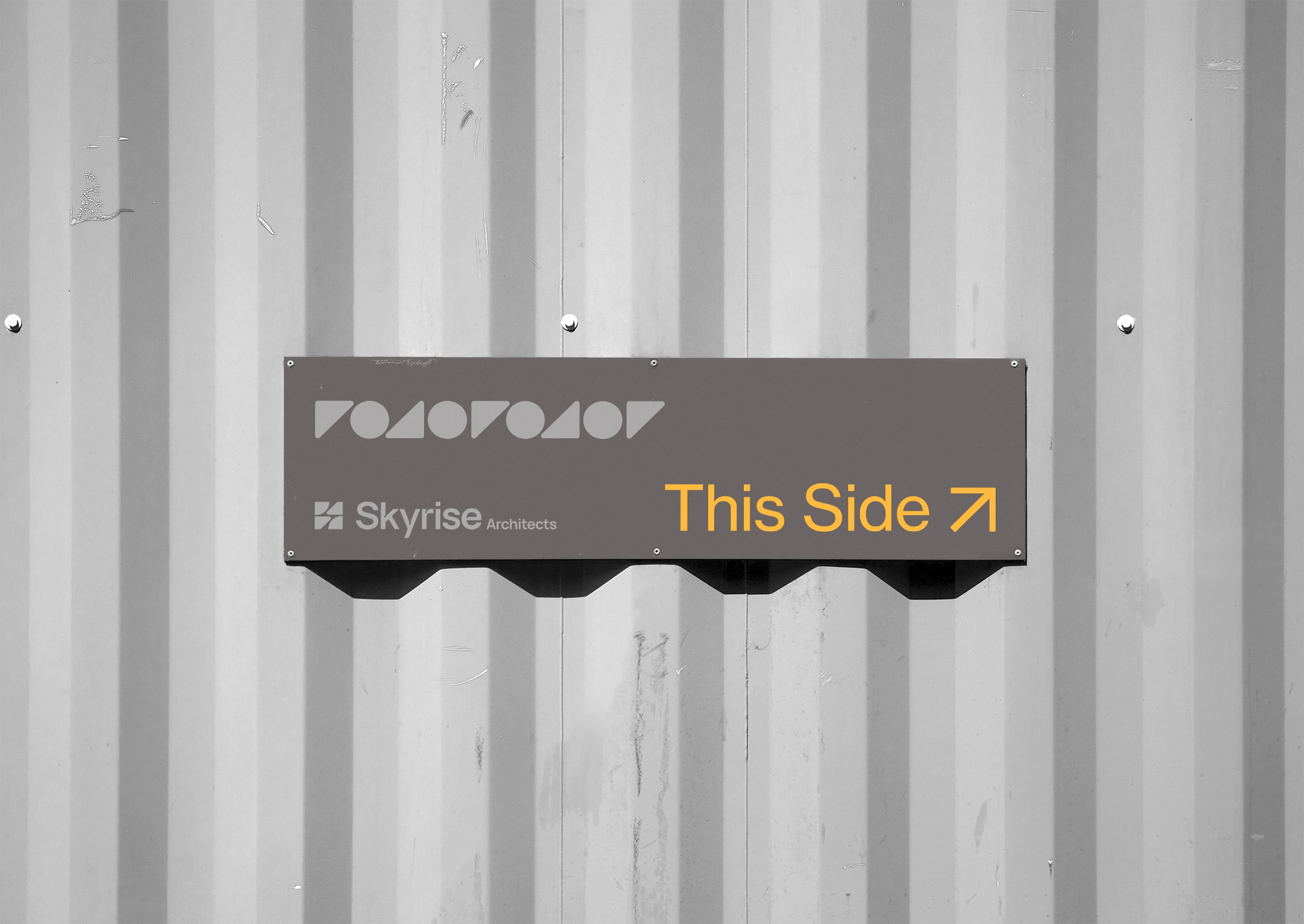
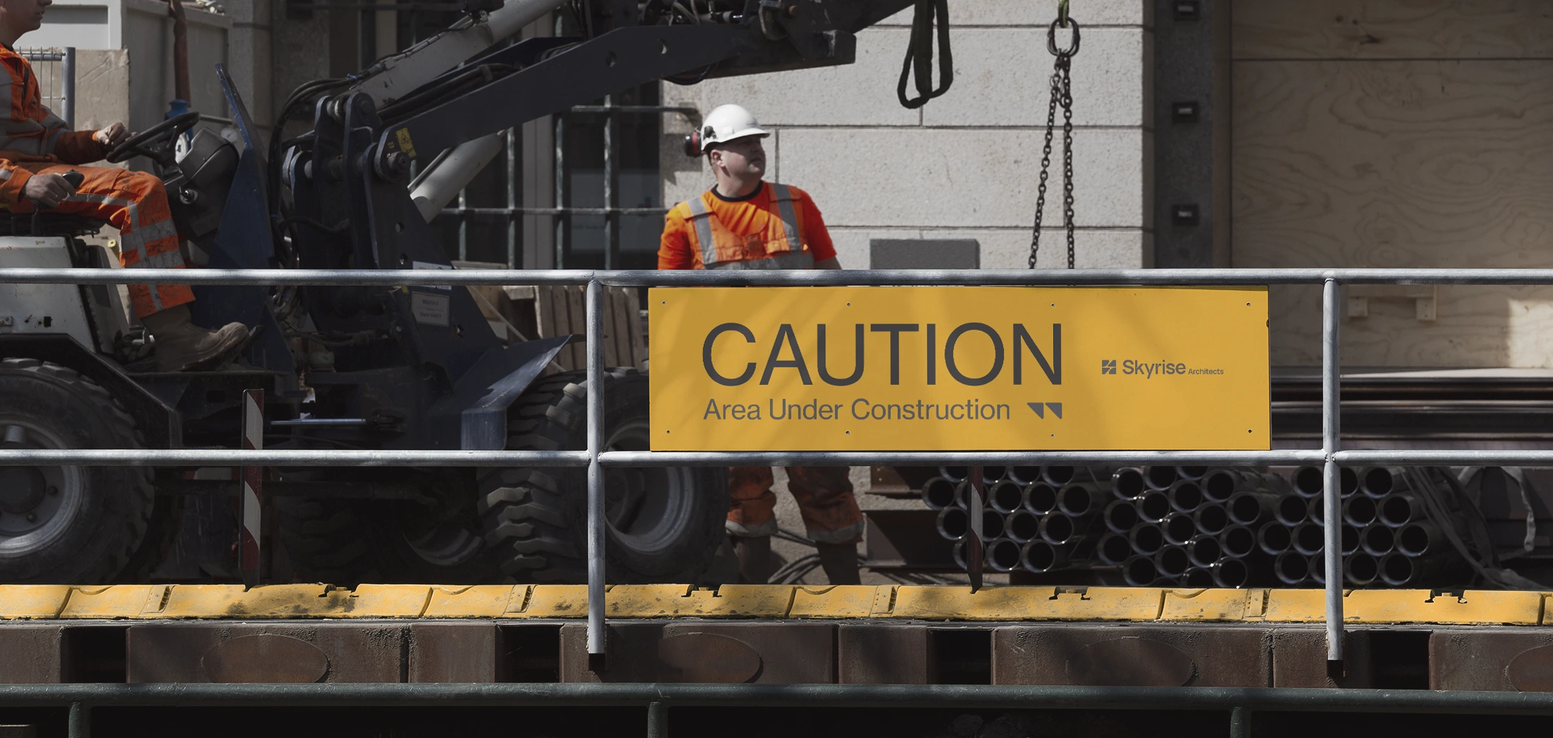
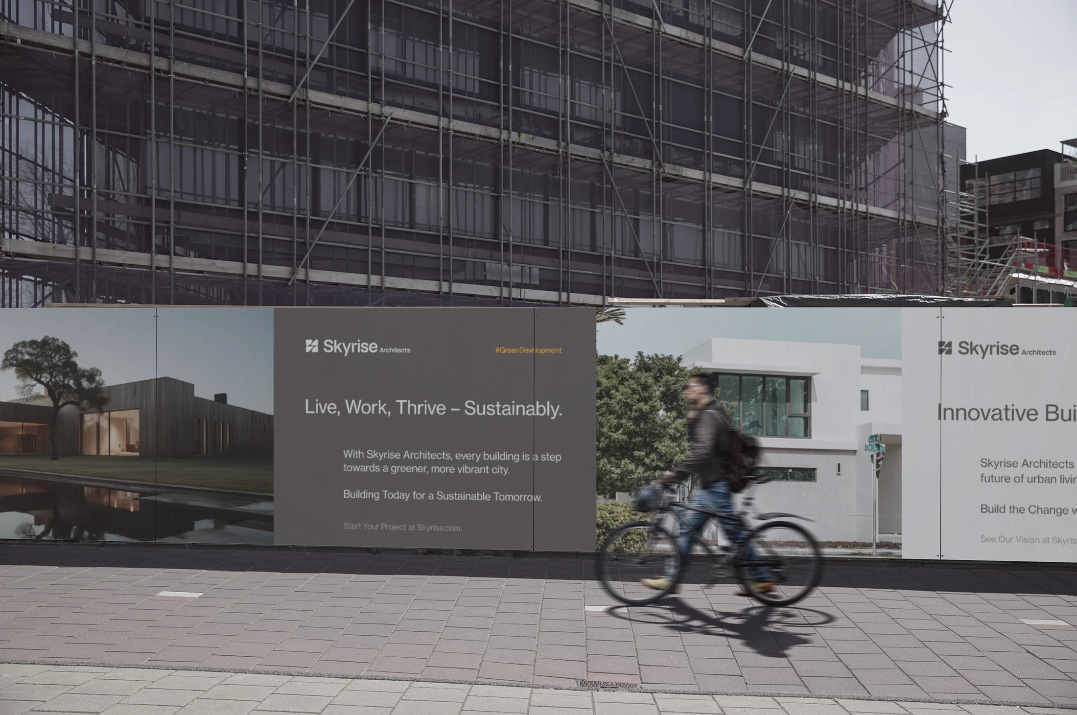
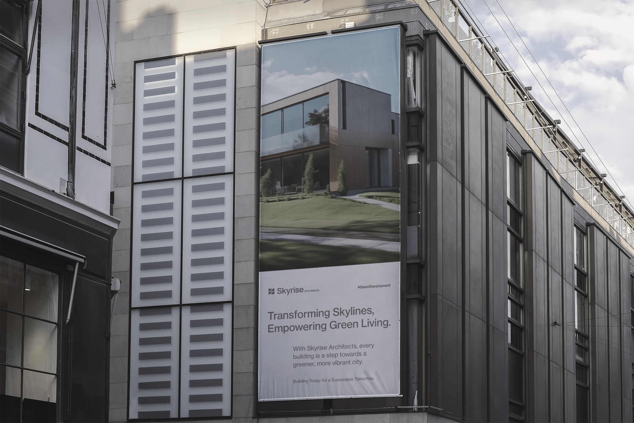
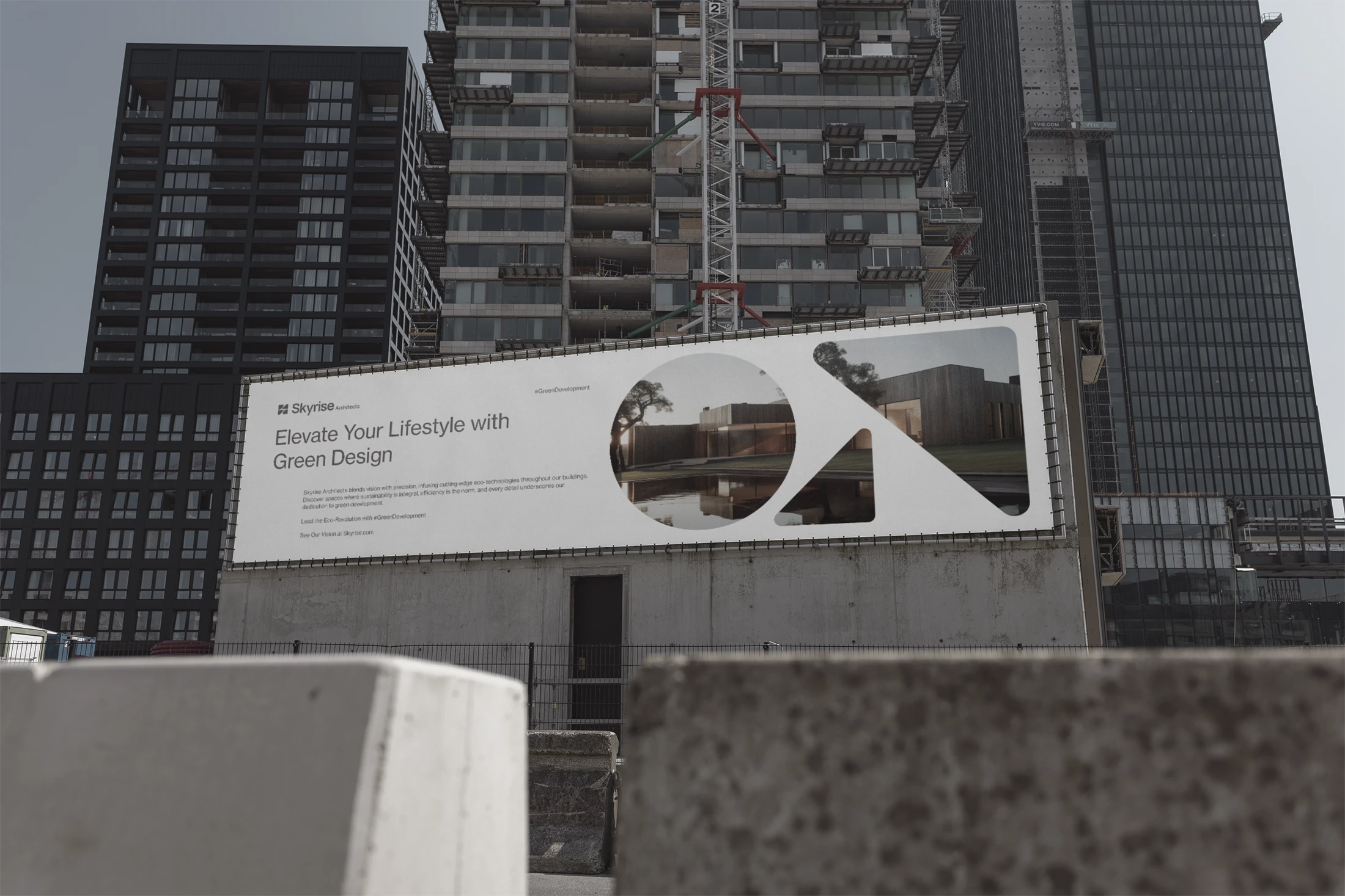
For the logo, we chose a simple triangle and a circle because they're the building blocks of all designs. From these, we creatively crafted the letter "S" in the negative space. The mark was then fitted into a square to complete the logo mark. Alongside, we developed a custom wordmark that seamlessly matches our logo. This wordmark effectively conveys Skyrise Architects' commitment to simplicity, elegance, and innovation in every detail.
Colors & Typography
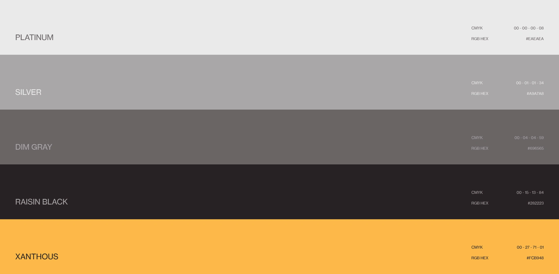
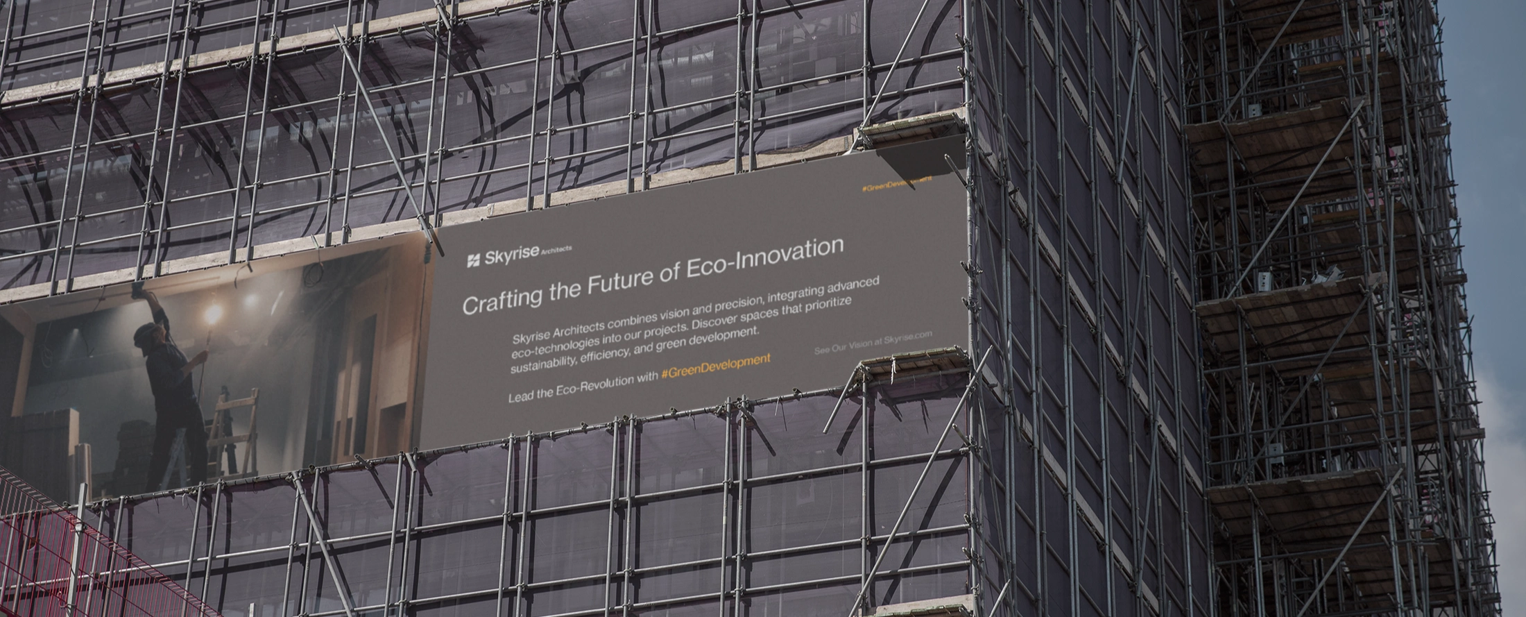
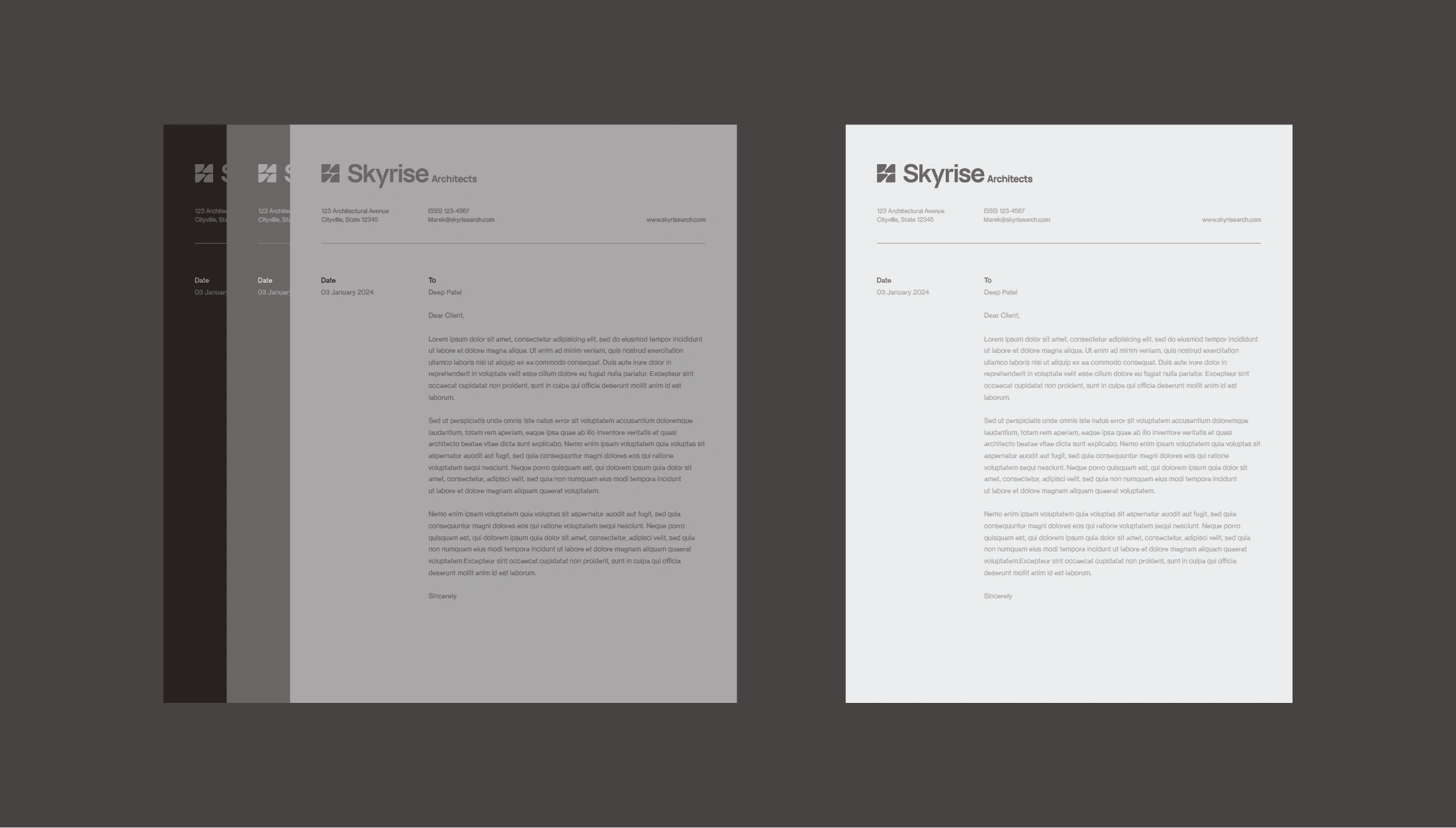
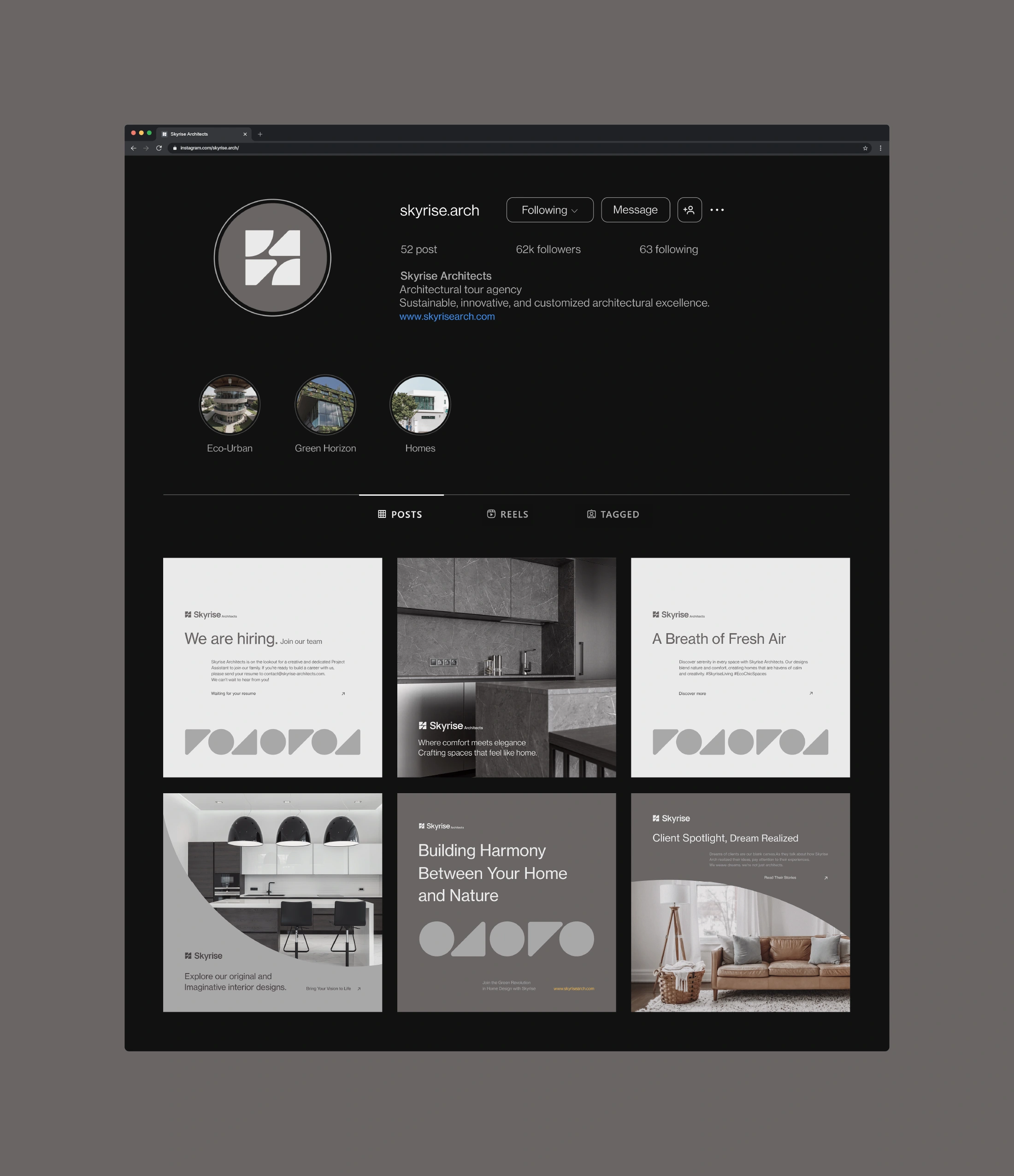
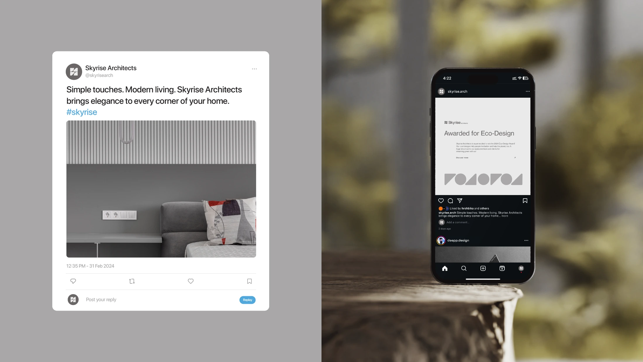
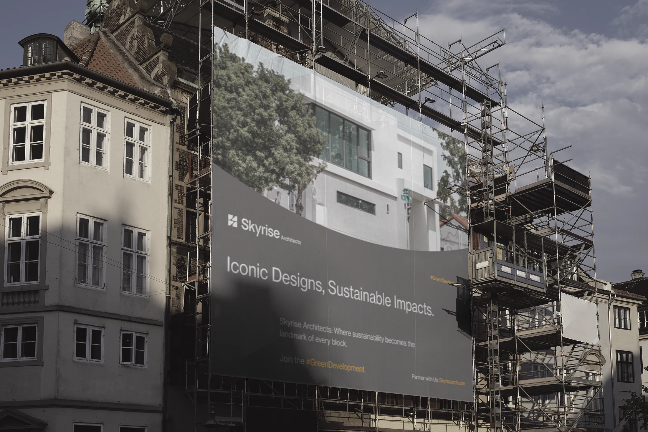
We chose earthy tones to highlight Skyrise Architects' dedication to being eco-friendly. The shades of white and gray (Platinum) mirror the color of concrete, while dark brown (Raisin Black) resonates with the earth itself. We added a pop of yellow (xanthous) as our accent color to create a warm, inviting feel reminiscent of sunlight, a crucial element in any architectural design.
Our chosen font, Neue Haas Grotesk Text Pro, brings a clean, modern vibe to our brand. It's a sans-serif font that speaks to our sleek, contemporary style, ensuring our messages are clear, versatile, and distinctly Skyrise.
Like this project
Posted Aug 20, 2024
For the Skyrise Architects project, we crafted a logo from simple shapes, symbolizing innovation and our eco-friendly ethos. Our earth-inspired colors—concrete…
