Linv: Personal Portfolio Website
This year I embarked on the journey to design and create a portfolio website that merges my passion for nostalgic web design with my career as a graphic designer. The project involves using simple concepts in CSS to create beautiful illustrative designs and effects. I wanted to challenge myself to go back to the simple way of making websites but this time in React, a popular front-end framework.
The reason why I wanted to create this portfolio website is to showcase my skills and highlight my work in a unique and creative way, by using key concepts of visual communication and theory of Art and Color I wanted to create visually appealing assets that appeared to be "popping out" of the screen - Virtually merging the 2D world with the 3D environment in front of it.
I believe that a portfolio website is a crucial component of any creative career, and I wanted mine to stand out from the rest. With my love for pixel art and nostalgic web design, I aimed to create a website that not only showcases my design work but also evokes a sense of nostalgia and excitement for the early days of the internet. While using React allowed me to create a dynamic and responsive website, I wanted to maintain the simplicity and charm of early web design by focusing on borders, colors, and finding creative ways to achieve textures with pure CSS manipulation. I needed to find a way to merge these two styles seamlessly, without compromising on either.
To create the vision, I used a combination of styles and techniques. For the art, I used a low-resolution color palette and created custom css classes for each section of the website. For the web design aspect, I kept the layout clean and simple, with a focus on typography and negative space. I used CSS animations and transitions to add interactivity and movement to the website, which evokes a sense of nostalgia for the early days of the internet. Overall, this project allowed me to push my design and development skills to the next level and create something that reflects my unique artistic vision, but it came in various iterations and style changes.
Case Study 1: Notebookpaper
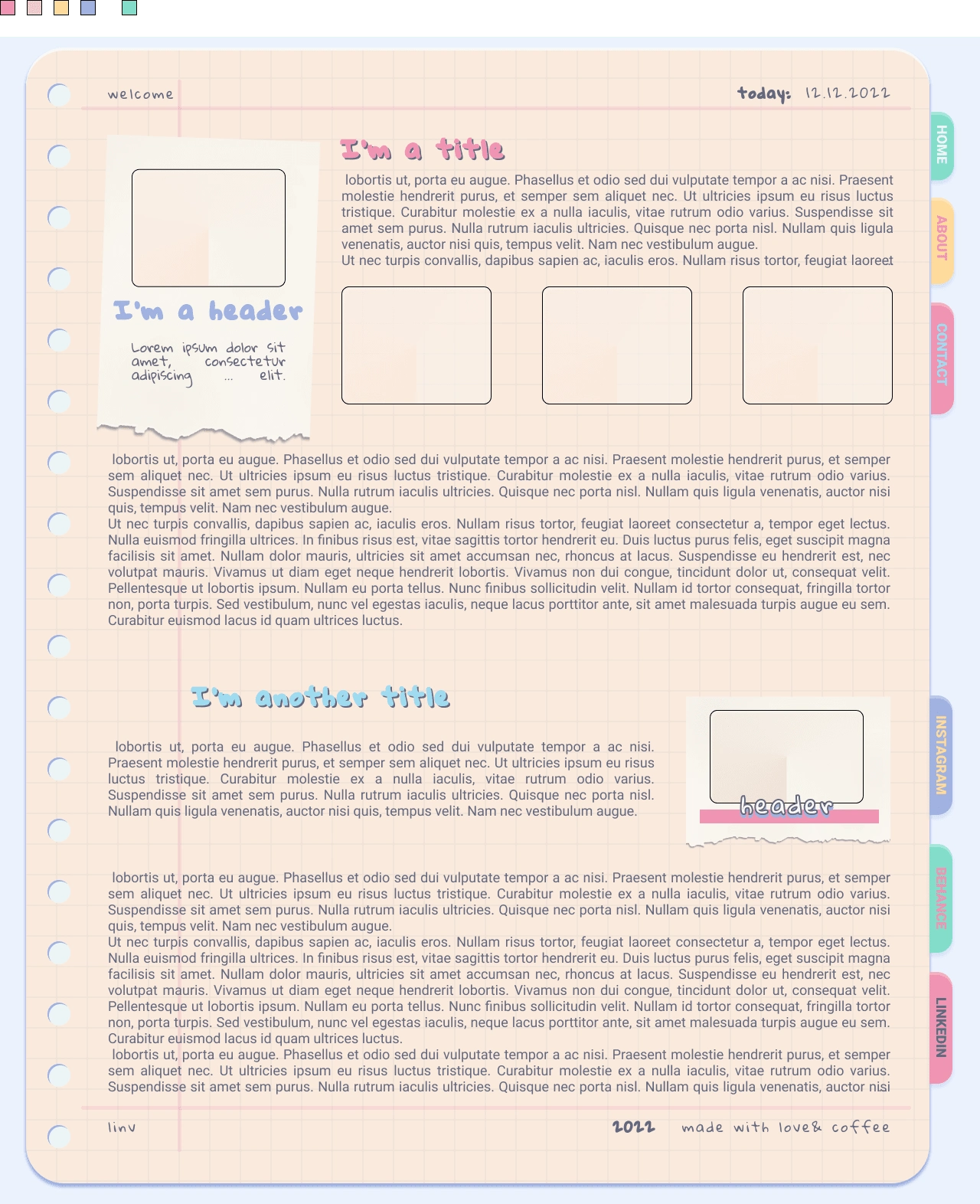
The first case study in my portfolio is a design inspired by an Instagram account I ran during high school. It was a "studygram" profile where I documented my study process, methods, and journal inspiration. Although it didn't generate revenue, it taught me a lot about social media growth, exceeded my expectations for follower count and engagement, and created a small community for myself, making friends along the way. I even received sponsorships for stationary, some of which I still use today.
This chapter of my life was the perfect starting point for the design as journaling and scrapbooking are a free form of expression that didn't limit my creativity. To achieve a notebook paper effect with punch holes, I used an array of drop shadows, background-image textures, and inset borders. I kept the rest of the design quite simple with pastel colors to maintain a cohesive aesthetic. This design allows me to showcase my skills in both web design and illustration, while also reflecting a nostalgic and personal touch.
I scrapped this idea because while extremely fun to code and design, it wasn't giving me the grown-up aesthetic for a web developer portfolio that I was looking for.
Case Study 2: Cloudy

This website design was inspired by the nostalgic game user interface designs from the 90s and early 2000s. The design features pastel colors and cloud shapes that are achieved through clever use of drop shadows, color choices, CSS manipulation, and typography, but use the same exact color palette as before. The overall design is slightly more streamlined and bold compared to the original attempt.
The idea behind this design was to evoke a sense of nostalgia for classic games while still maintaining a modern and stylish look. I wanted to create a design that was playful and fun while still being functional and easy to use. The use of pastel colors and cloud shapes gives the design a whimsical feel, while the bold typography and streamlined layout make it modern and easy to navigate.
The challenge of this project was finding the right balance between nostalgia and modernity. I had to ensure that the design felt familiar and nostalgic while also being fresh and modern. I achieved this by using classic game UI elements, such as the cloud shapes, and combining them with modern design techniques, such as bold typography and clean lines.
To create the final design, I used a combination of drop shadows, color gradients, and typography. The drop shadows were used to create the illusion of depth and to give the design a more tactile feel. The color gradients were used to create a sense of movement and to help guide the user's eye through the design. The typography was kept bold and simple to ensure that the design was easy to read and navigate.
Overall, this design was a fun and nostalgic project that allowed me to push my design skills to the next level. I'm proud of the final result and I believe that it perfectly captures the playful and whimsical nature of the idea.
I scrapped this one mostly because - while I loved the design itself - I felt like it was very different from my personal aesthetic. I remember my childhood days fondly, and with as much magic and whimsy as depicted here, but those days are long gone and I needed something different.
Case Study 3: Minimaljournal
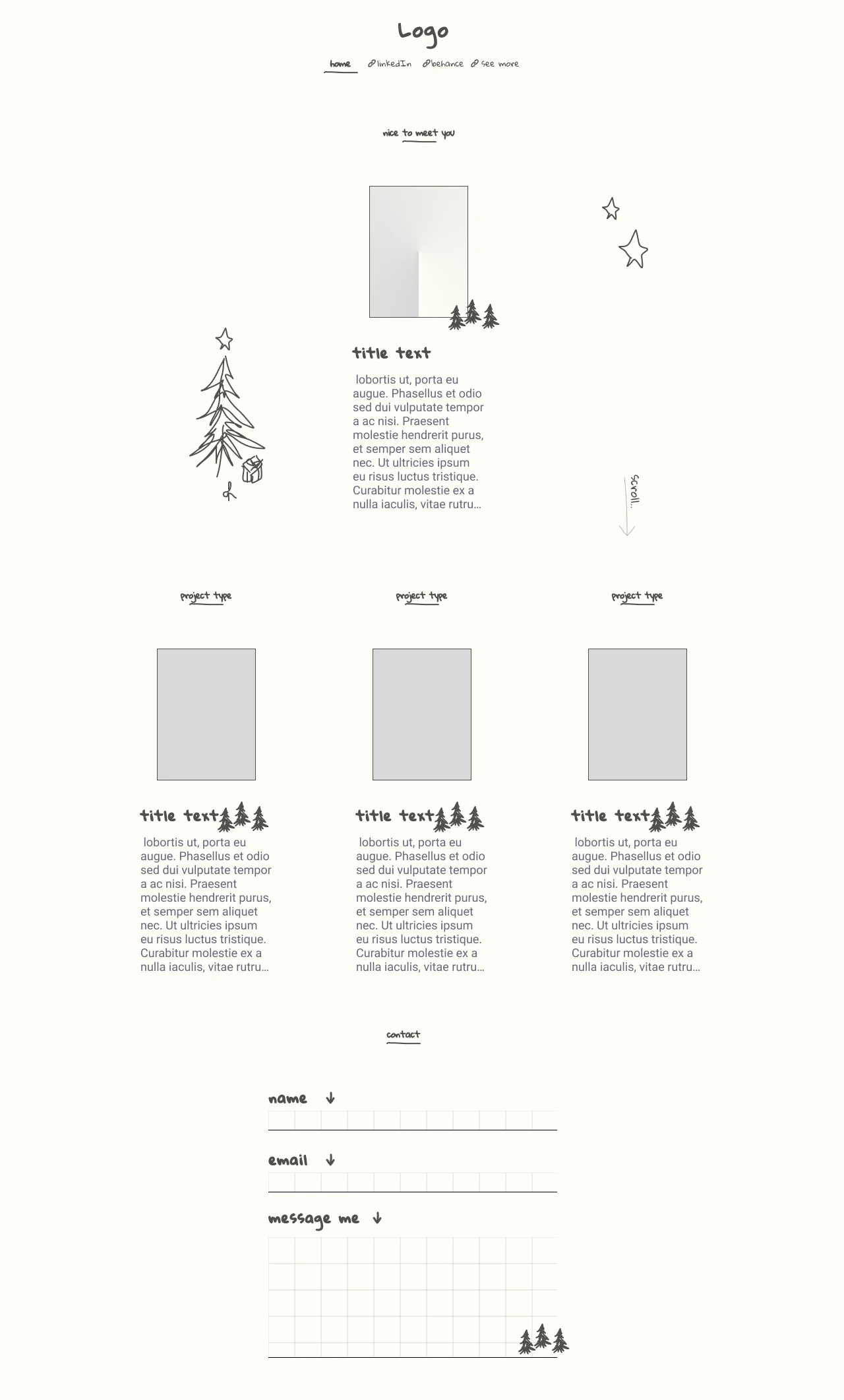
After thoroughly analyzing why the previous designs didn't quite fit with my vision,
I wanted to challenge myself to create a web design using an extremely limited color palette, using only beige and dark-gray. By doing so, I needed to rely on clever manipulation of CSS and typography to achieve the desired aesthetic. The result was a simple and elegant vertical scrolling web page with bold borders around the placeholder images, handwritten font paired with a sans serif font, and charming doodles to maintain a journal-like feel. The minimalist approach allowed the content to shine, with the doodles adding a touch of whimsy to the design.
While I'm proud of this design, I would love to revisit it and add more interactive features. Specifically, I would like to add the option for viewers to leave their own doodles on the pages, creating a collaborative and interactive experience. This feature would not only enhance the design but also create a sense of community and engagement with the website's audience. Overall, this project was a rewarding challenge that forced me to think outside of the box and rely on creative problem-solving skills to achieve the desired outcome.
Final Design
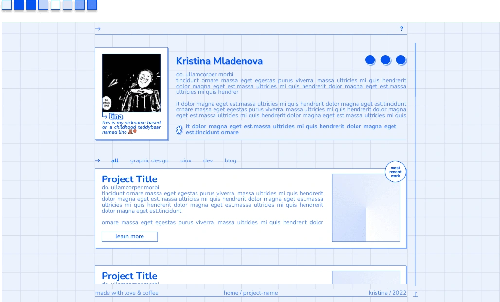
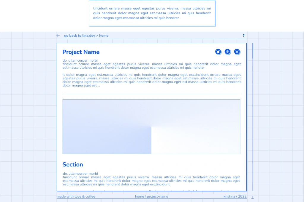
When I first created my "Minimaljournal" website, I was excited to bring to life an aesthetic that felt in line with my high school journal account, but grown up. The crisp, put-together feeling of a new journal was exactly what I wanted to capture. However, as time went on, I couldn't shake the feeling that the design was disingenuous. It just didn't reflect who I truly was.
Behind the scenes, while I was outlining my study routines and time-keeping, I was also studying vocational high school for traditional graphic design. This included courses like lino printing and aquatint, where I'd get elbow-deep in the greasiest, grimiest, hardest-to-wash paints known to mankind. As a 15-year-old girl, I'd wash my hands with the same detergent as my electrician father. That's the real me, and I needed a design aesthetic to reflect that.
I committed to using a specific shade of ink blue for the final rendition and used a table-like structure to achieve a nostalgic look. I finally wanted to create a website that worked, had a database, and clickable things. I was fully committed to this website, and my plan was to host it and eventually alter the design to lean more towards brutalism and a more dominant typography style. For now, though, I was content with my pastel lies. 😉
It's funny how things come full circle. The design that started off as a facade of who I thought I was, ended up leading me back to my true creative self. I can't wait to see how I can "distress" this website in the future.
Like this project
Posted Mar 15, 2023
A web designer's creative journey - from pixel art to studygram-inspired designs, nostalgic game UI to a girly oil-smudged canvas. No limits! 🎨💻
Likes
0
Views
23
