Bonbolat by Paola Romagnoli

Karil Méndez
Brand Designer
Graphic Designer
Adobe Illustrator
Adobe Photoshop
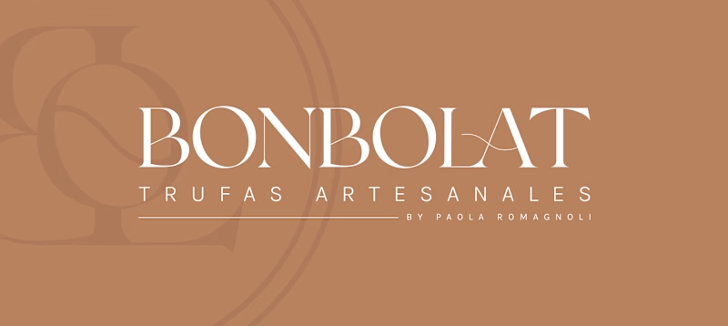
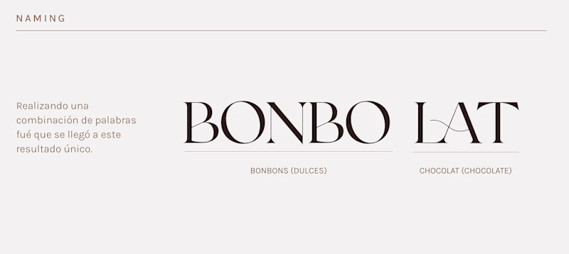
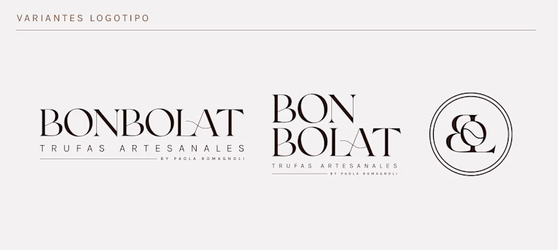
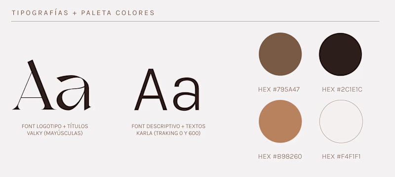
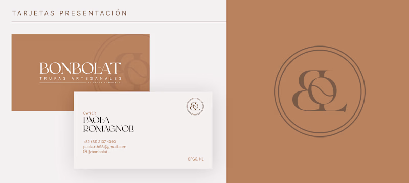
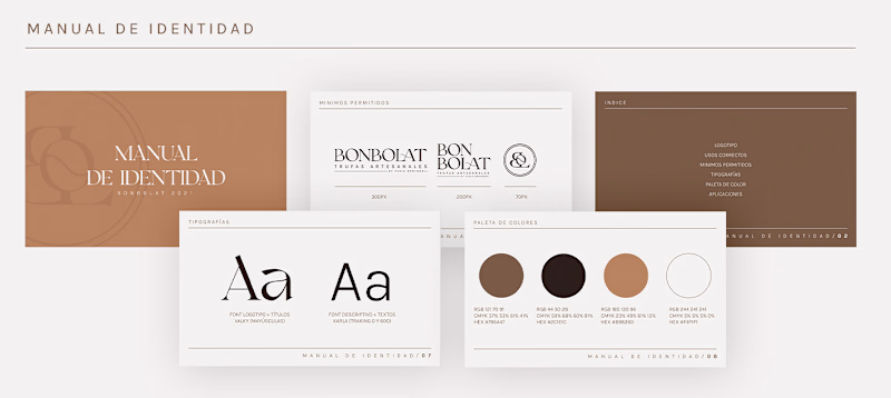
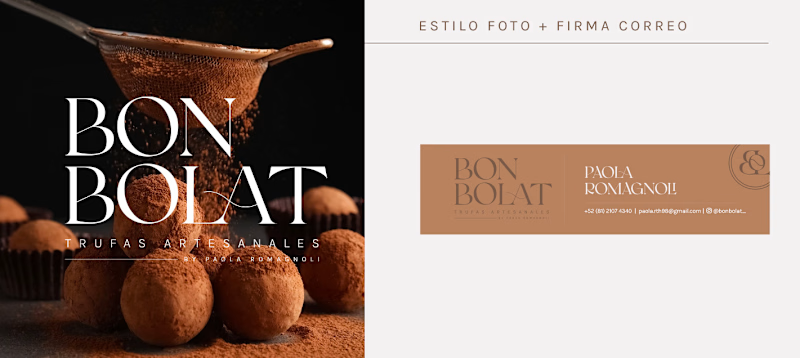
This project aimed to create a short name that audibly captured the essence of the client's products without being overly literal. They sought something unique and easy to pronounce. After exploring a combination of words in different languages that conveyed the idea of "sweets chocolate," a solution was found. One of the main challenges was balancing the arrangement of text in the logo to meet legal requirements while achieving a luxurious and minimalist look. Colors within the palette of browns and nudes were chosen to better represent the chocolatier. Additionally, efforts were made to establish a range of basic applications to address the initial needs of the shop.
