Power BI Dashboards
I had the opportunity of working on two impactful and stunning dashboards for a client, focusing on business sales performance and a survey analysis of mental health among IT employees. Leveraging the capabilities of Power BI, I created engaging and informative dashboards that provided critical insights for the client.
Project Objectives
The client reached out to me on a freelance platform, seeking assistance in visualizing and analyzing data from two primary areas:
Sales Performance Dashboard: To provide a comprehensive overview of the client's sales data, helping them identify trends, track performance, and optimize strategies.
Mental Health Analysis Dashboard: To analyze survey data on the mental health of IT employees, enabling the client to understand stress factors and improve employee wellbeing.
Scope and Requirements
Through detailed discussions with the client, we established specific requirements for each dashboard:
Sales Performance Dashboard:
User Interface Design: Create a visually appealing and intuitive layout.
Key Metrics: Display metrics such as total revenue, growing rates, sales by region, and sales trends.
Interactive Features: Include filters and drill-down capabilities for detailed analysis.
Mental Health Analysis Dashboard:
Survey Data Analysis: Visualize results from the mental health survey.
Departmental Insights: Identify stress levels across different departments and job roles.
etc
Approach and Tools Used
Power BI was the chosen tool for its powerful visualization features and ability to handle diverse data sources. My approach to developing the dashboards involved:
Data Preparation and Cleaning:
The client provided data files in CSV and number extension. My primary focus was on cleaning the data, particularly handling missing values to ensure consistency and reliability.
Applied data transformation rules to prepare the datasets for visualization, ensuring smooth integration across both sales and mental health survey data.
Dashboard Design:
Sales Performance Dashboard: This dashboard included key metrics such as total revenue, sales trends by region, and top-performing products. It featured interactive graphs that allowed the client to analyze sales data over different time periods.
Mental Health Analysis Dashboard: This dashboard visualized the survey data, highlighting stress levels by department and role. Heatmaps were used to indicate departments with high stress, and trend graphs showed changes in employee wellbeing over time.
Visualization and Customization:
Utilized Power BI’s interactive charts and graphs to create an engaging user experience.
Designed a consistent and user-friendly layout for both dashboards, ensuring that each section logically flowed into the next.
Added filters and drill-down functionalities, empowering the client to explore data in greater depth.
Client Feedback
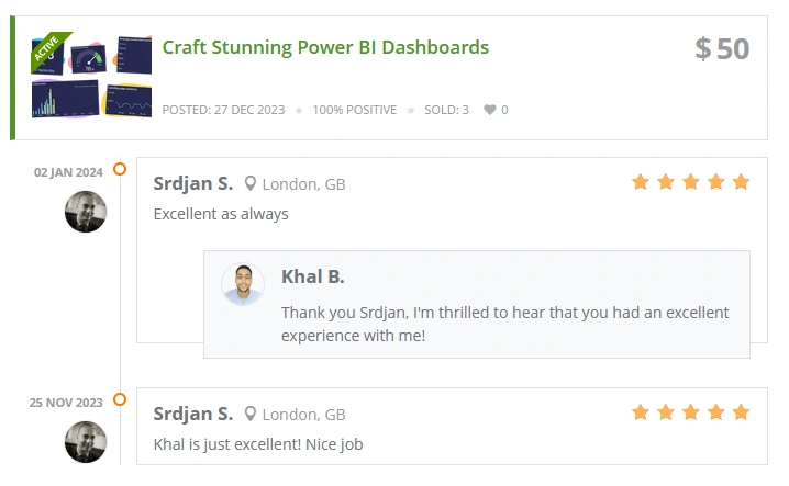
The client expressed great satisfaction with both dashboards, noting:

Client's feedback
Like this project
Posted Oct 30, 2024
Dashboards and data visualization PowerBI
Likes
0
Views
8


