My Craft Beer E-Commerce 🍺
⚡️My first entrepreneurial effort
This is the story of CA·MX, an online store that offered gourmet pairing experiences focused on promoting the Mexican craft beer culture 🍻
💛 It all started with a love triangle
By the end of 2015, a freelance Event Producer and a Music Magazine Editor - that had been dating for a year- were talking about their love towards Mexican craft beer and how it had a lot of untapped potential.
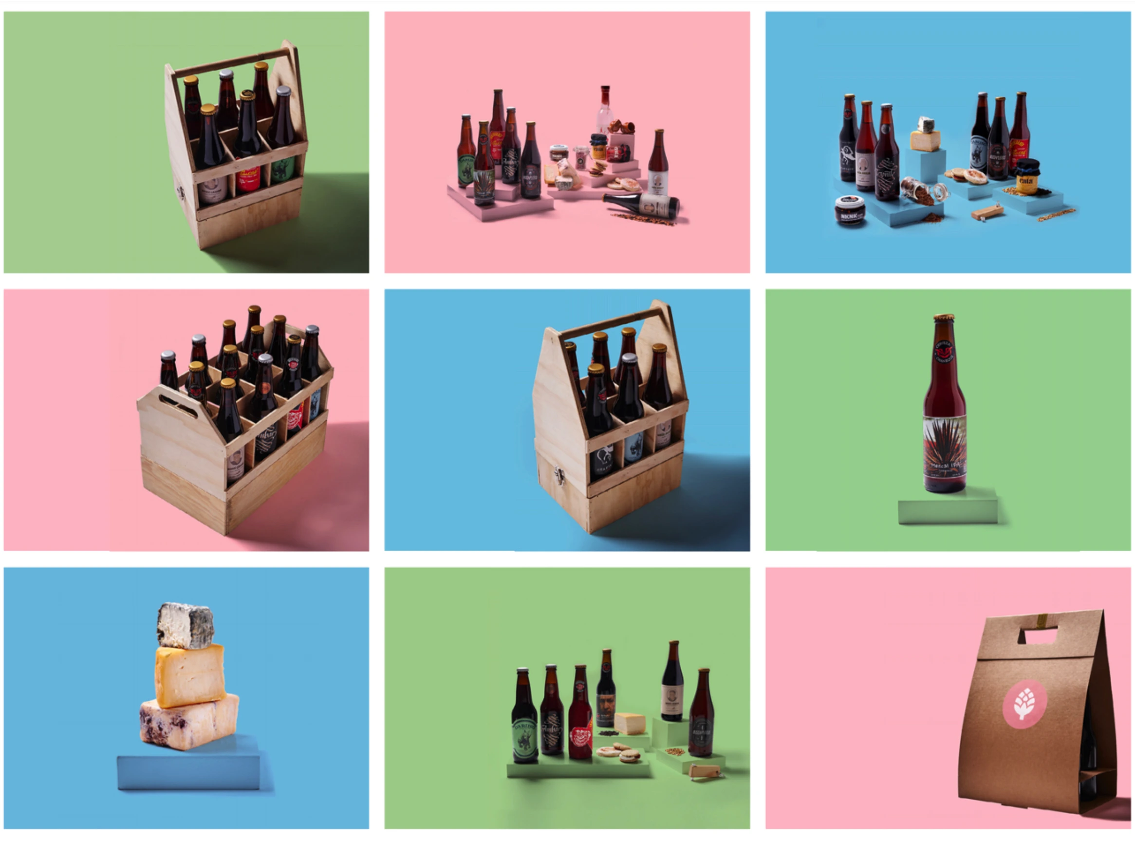
They identified that the aesthetics and visual identity that was being used to promote craft beer were part of the problem. It was too gritty, manly, and rocker, mainly targeting tough men, with some references to the biker, heavy metal, and goth cultures. Instead, they decided to use bright and cute colors to appeal to a new and wider audience that was being overlooked.
Considering that craft beer is way more expensive than commercial beer, they also deemed important to bring out its gourmet qualities, similarly to how wine is marketed. So pairing it with a variety of high quality local gastronomical products became an essential part of the brand experience.
🍻 The main goal was to showcase a selection of what we considered to be the highest quality, best-tasting craft beer brands from all of Mexico. 🍻
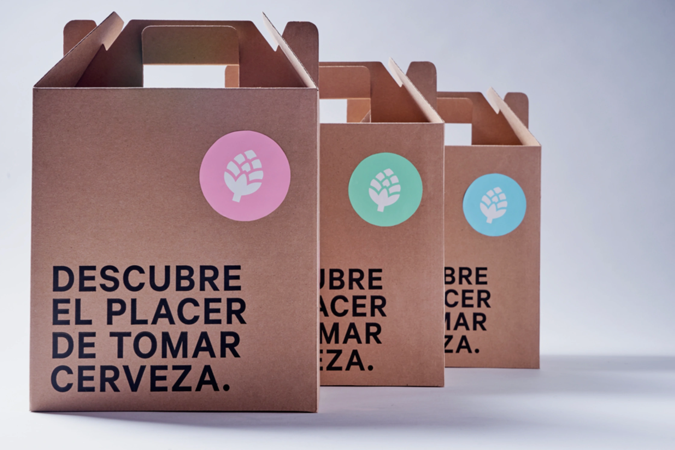
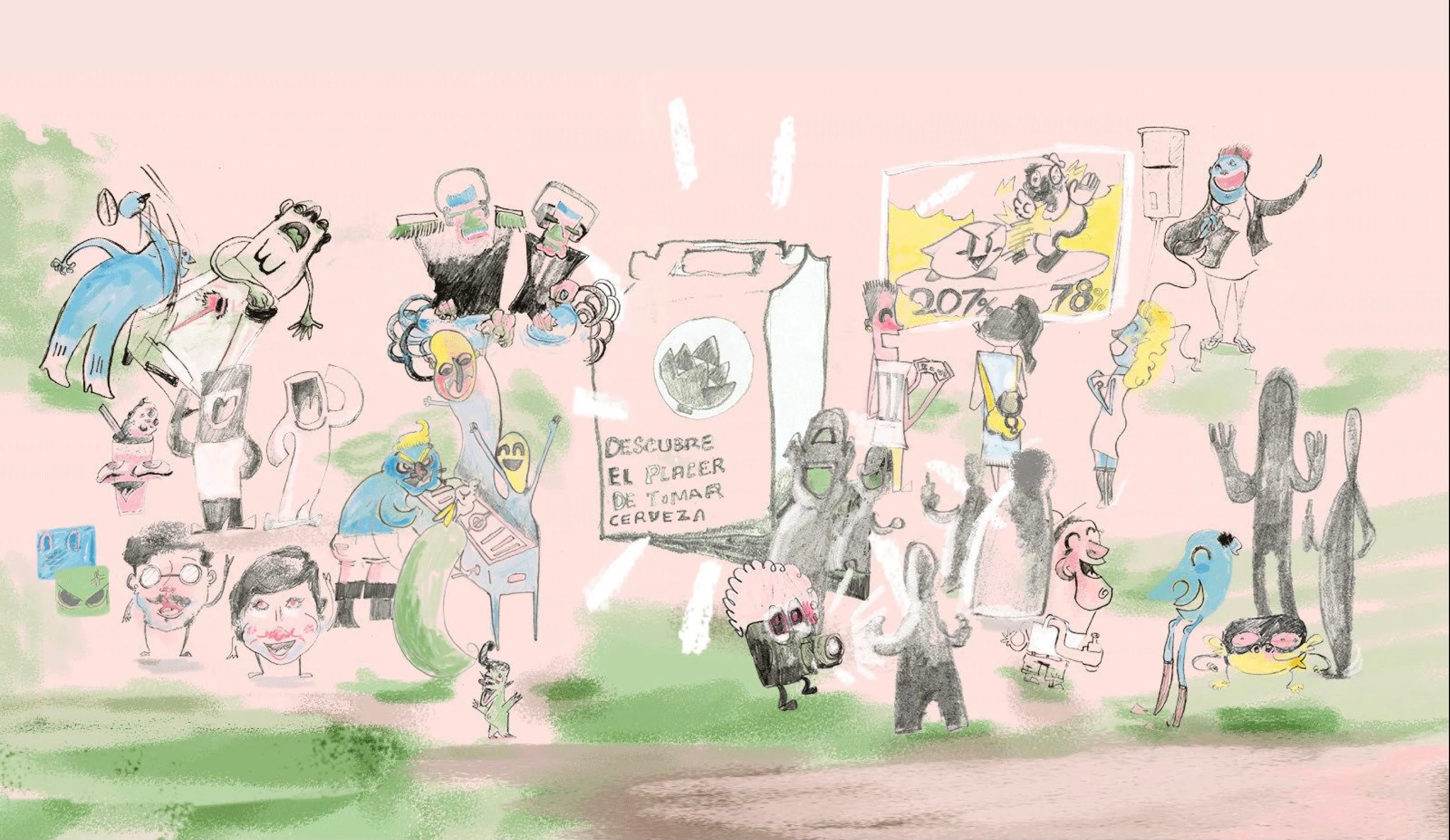
👉 This is how the innovative idea of out-of-the-box craft beer pairing experiences was born, with the slogan: "Discover the pleasure of drinking beer".
🍺 The e-commerce was launched on December 2015
We began offering 3 different packages (see above), each one containing a different range of beers (from lighter to darker). Inside each box, you'd find 6 different styles of beer from 6 different breweries, 2 pairing products, and a postcard illustrated by an independent Mexican designer.
The idea was to be a gateway to introduce people to craft beer culture, having a taste of different styles and getting familiar with brands from across the country, while sharing with friends and enjoying with products that were meant to elevate the tasting experience.
👉 Watch CA·MX commercial 👈
🏓 Crafting experiences beyond the bubbles
Being an online store, we realized that in order to build loyalty we wanted to be in direct contact with our customers. So we needed to design engaging in-person experiences around craft beer.
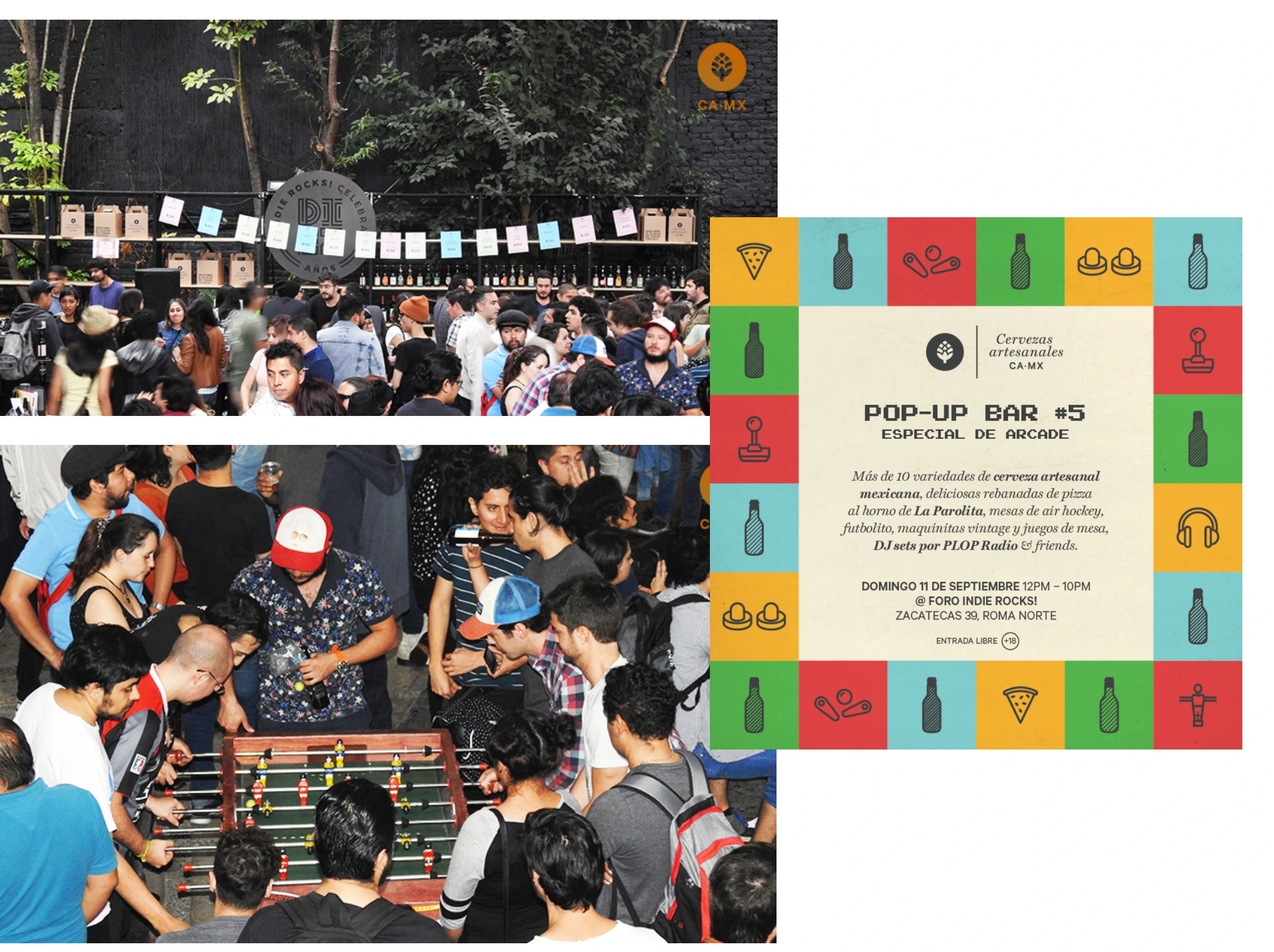
That's how we came up the idea of hosting monthly pop-up bars, which we used to build a community around our brand. The last Sunday of each month we held themed events for 200-400 people, where we would setup a bar, have a lineup with local DJ's, invited food trucks/bikes to sell food, and organized activities such as ping-pong tournaments, Nintendo 64 matches, arcade or stand-up comedy specials.
🏆 Achievements
We were selected as "Success Story" by Facebook For Business and were invited to a meeting with David Fischer (VP of FB Advertising and Global Operations).
We were featured on relevant Mexican media such as: Reforma, El Universal, Chilango, Sopitas, TimeOut, Warp, among others.
We had clients like: Facebook LATAM, Google, Platoon Germany, and more.
We significantly increased sales and awareness of Mexican microbreweries such as La Patrona, 19º Norte, Irreverente, and Insurgente.
We were monthly guests on an online radio show, where we talked about a specific beer and did a live tasting with the host.

Cheers! 🍻
Like this project
Posted Mar 2, 2021
I co-founded my own business for promoting Mexican Craft Beer in Mexico City

