Crafting an Engaging Vibe Coding Course Landing Page Design
Synthia C
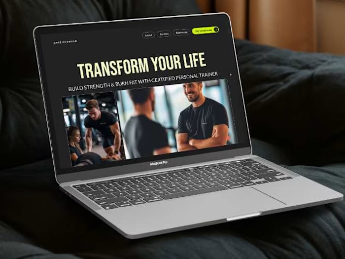
Recently I challenged myself to build a product course landing page using Vibe Coding, and I wanted the design to do the talking before a single word was read.
The pixelated aesthetic was intentional. Product courses are about breaking things down, zooming in, and understanding the grid beneath the surface. The texture reflects that it is clean but tactile, structured without feeling cold.
This design starts with a single image, then unfolds into three hidden cards on interaction. One visual, three reveals. It felt like the right metaphor for what a course actually does; it opens up what you couldn't see before. Technically tricky to get right, but the payoff was worth it.
Like this project
Posted May 19, 2026
Recently I challenged myself to build a product course landing page using Vibe Coding, and I wanted the design to do the talking before a single word was rea...