
pro
Synthia C
Framer Designer for Startups and Modern Brands
- 3x
- Hired
- 5.00
- Rating
- 7
- Followers
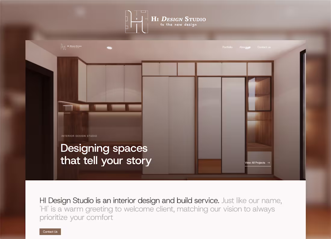
HI Design Studio Portfolio Website Creation
0
4
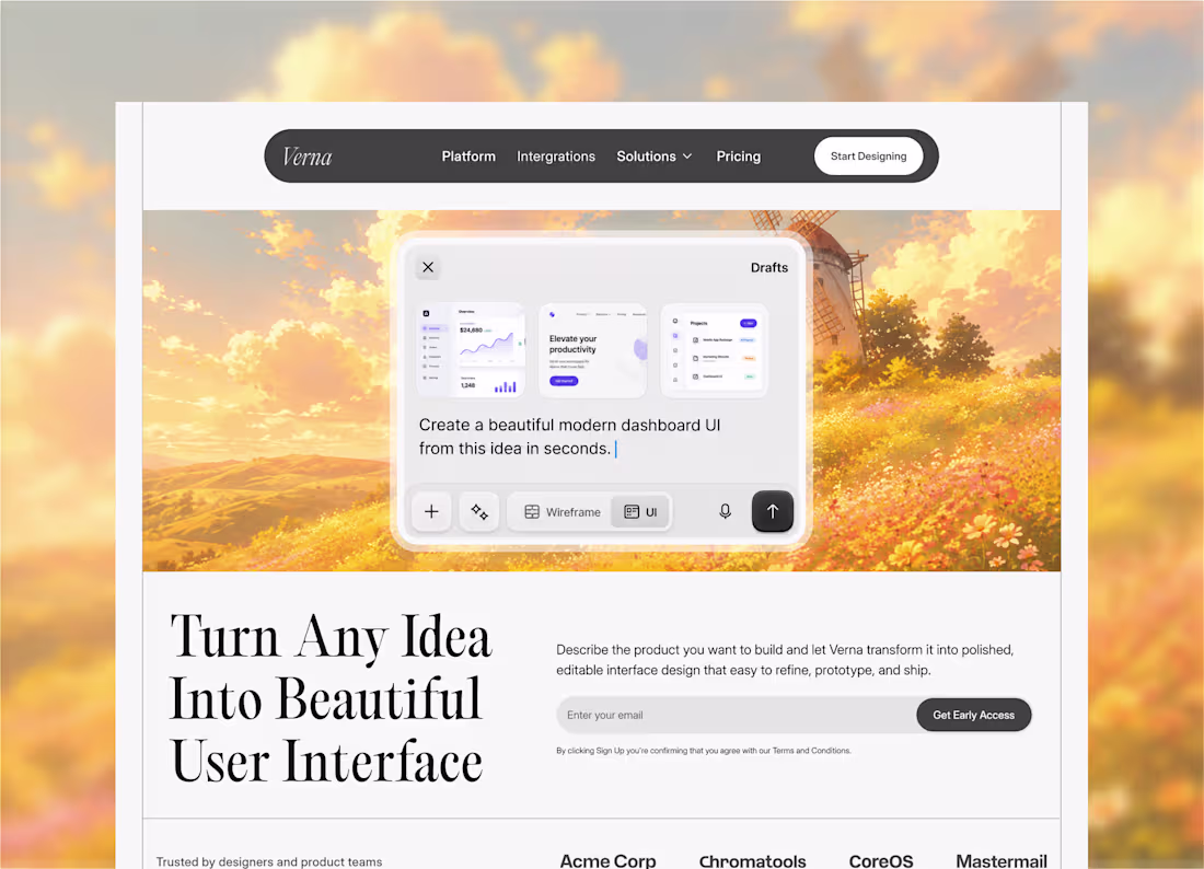
Most AI product websites look futuristic.
I wanted this one to feel creative.
The challenge was balancing three things:
• A strong product demo
• Clear hierarchy
• An emotional visual backdrop
Exploring how AI design tools can feel more inspiring and less technical.
Hero section exploration for "Verna", an AI platform that turns ideas into editable interfaces. More screens coming soon 🙌
#ProductDesign #UIDesign #AIProduct #SaaSDesign #InteractionDesign
2
127
Recently I challenged myself to build a product course landing page using Vibe Coding, and I wanted the design to do the talking before a single word was read.
The pixelated aesthetic was intentional. Product courses are about breaking things down, zooming in, and understanding the grid beneath the surface. The texture reflects that it is clean but tactile, structured without feeling cold.
This design starts with a single image, then unfolds into three hidden cards on interaction. One visual, three reveals. It felt like the right metaphor for what a course actually does; it opens up what you couldn't see before. Technically tricky to get right, but the payoff was worth it.
4
219
Travel web concept Inspired my trip to Thailand 🇹🇭
An interaction tab and card to show how the place just by hover. All design is made in Framer
Build this to turn destination discovery into a soft, cinematic browsing experience combining immersive visuals, clean UI, and simple interaction.
Also I am now open for new project 🙌
2
182
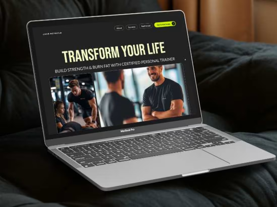
Jake Reynold | Landing Page Design Framrr
0
4
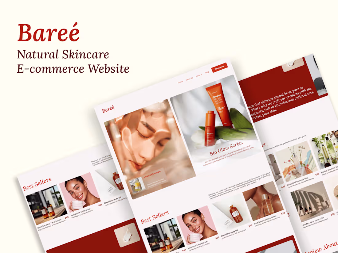
Baree - Skincare E-commerce Website Design
0
9
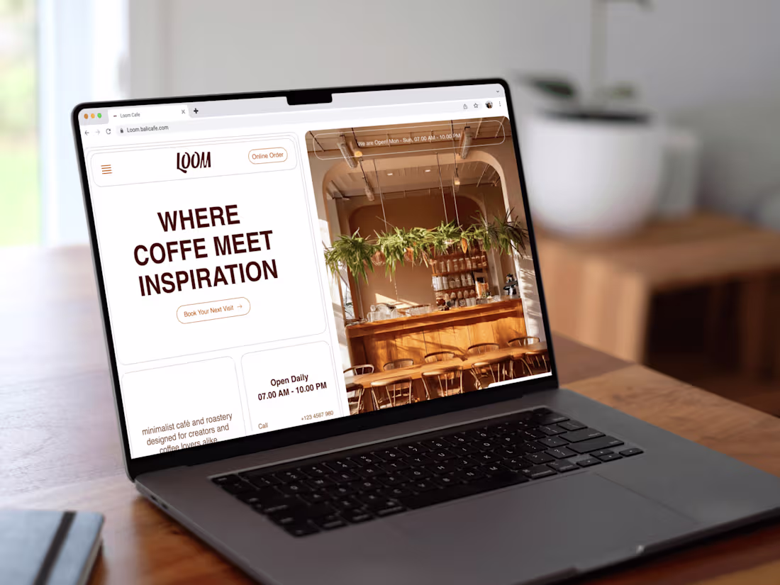
Loom - Unique 1 Page Web Design
0
7