DESIGNING WARNER MUSIC GROUP’S MUSIC LICENSING BUSINESS SOFTWARE
DESIGNING WARNER MUSIC GROUP’S MUSIC LICENSING BUSINESS SOFTWARE
All names and trademarks are intellectual property of Warner Music Group. All information pertaining to this study are my own and do not reflect the views of Warner Music Group.
DESIGNING MUSIC LICENSING SOFTWARE FOR WARNER MUSIC
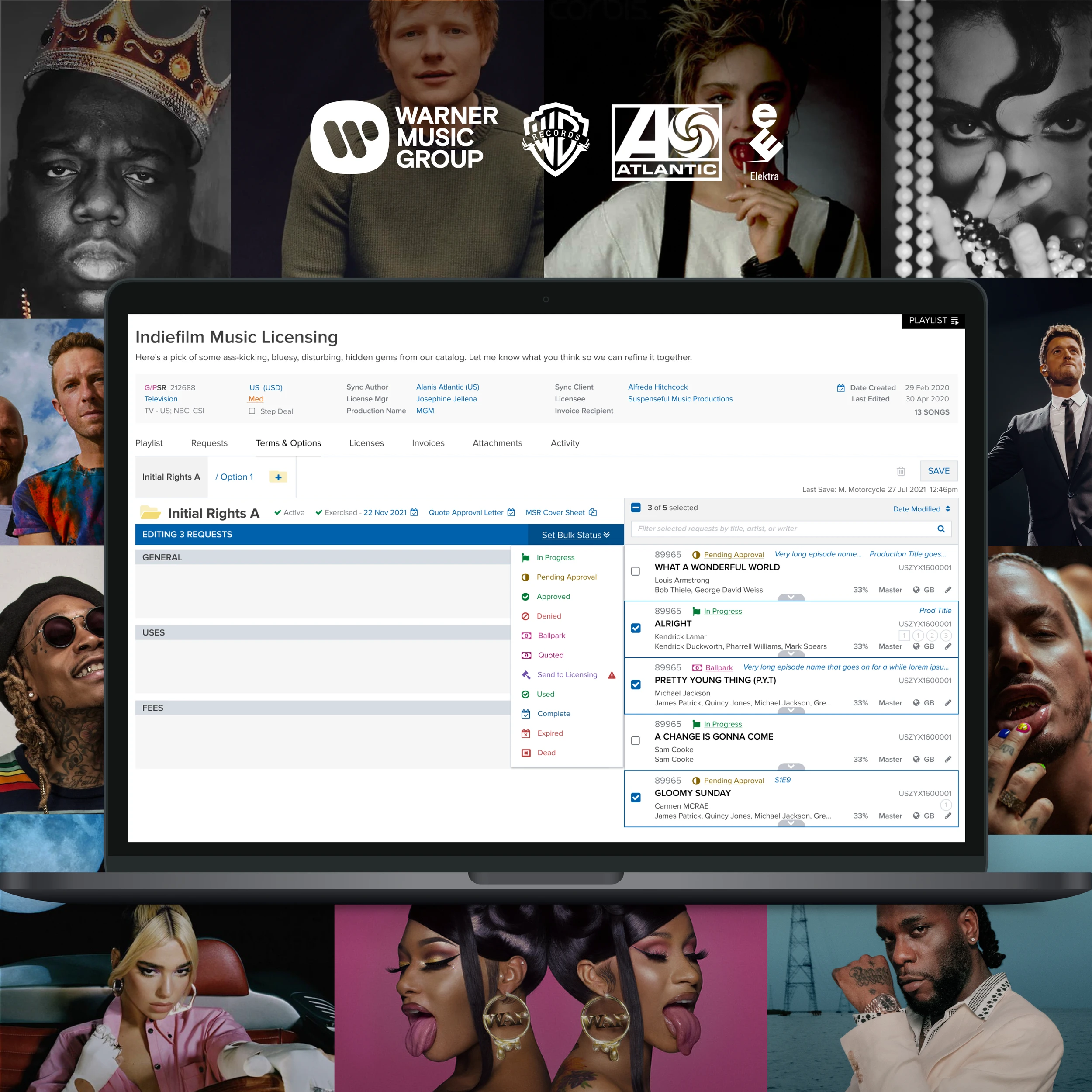
Warner Music Group is one of the "big three" recording companies in the global music industry, consisting of record labels such as Atlantic Records and Elektra Records, with artists such as Ed Sheeran, Beyonce, and The Notorious BIG. I was hired as a Lead Product Designer to lead all design efforts of the business application Warner uses to license its music globally, accounting for a sizeable revenue stream. Global Licensing System (GLS) is used by internal Warner teams to license songs, compositions and works to music supervisors of movies, shows and video games, VR and more across the globe. It includes a variety of complex features that allow users to send creative briefs, quote, approve, develop terms & options, license, and invoice the music supervisors.
This case study will start by outlining my process of how I quickly managed to get up to speed on such a complex product in order to take over as Lead Product Designer, and it will highlight how I designed and optimized one very critical section of the business application. Everything outlined here was not done in a silo and was done in parallel to putting out on-going design-fires 🔥 and completing competing design tickets. I will also show how I championed, introduced and implemented various UX Research methodologies, or Minimal Viable UX Research, throughout the process in a product team that had never previously done UX Research before.
LEARNING ABOUT THE INDUSTRY AND USERS
As with every new contract, understanding the industry and users was my first priority and as a result of having done this with so many wide-ranging industries, I have crafted a process that consists of a combination of UX Research methodologies and tools.
USER PERSONAS AND USER JOURNEYS
Unlike other clients, Warner had existing resources consisting of the user journeys as well as user personas. If Warner didn’t have these assets, then I would have taken the approach I took in Data Visualization Product Design Case Study to create these artifacts myself.
ANALYTICS
GLS did not have any analytics tool tracking user behavior, funnels, or KPI’s. As a result I couldn’t utilize any data, however this presented itself as an opportunity for me to champion the implementation of user analytics tools and strategies by creating an analytics tracking plan, which will be beyond the scope of this case study.
UX AUDIT
I did a UX audit and heuristic evaluation based on first impressions using UX best practices to identify friction points, usability gaps, and inconsistencies. I would refer back to this document at later stages, designing several solutions that pushed for usability improvements.
One example of this was that anywhere where something could be edited there a blue pencil icon. This threw off the visual hierarchy by making the user focus on these big bold blue icons, when their task at hand was elsewhere. As a result I created a design system that was applied all across of the editable UI components of GLS, which only showed these pencil edit icons upon hover.

This was the old design for all editing, which always showed pencil icons which distracted away from the Call to Actions and broke the visual hierarchy of the page it was on.
The new editing functionality that I designed was dynamic, and showed what the user wanted to see when they wanted to see it by not showing any edit icons until the user hovered the UI element.
MINIMUM VIABLE UX RESEARCH
I set out to do a hybrid of contextual inquiry, user shadow sessions and user discovery, with each of the user personas. This allowed me to empathize with the user personas, understand their existing end to end process inside and outside of GLS with a combination of different tools, as well as identify any usability friction points within GLS itself.
When it comes to Global licensing, what is your role and what are your duties within this role?
What does success look like for you?
What’s your biggest barrier to success?
Can you share your full screen and walk through an end to end happy case scenario in GLSS? This would involve any software that you use outside of GLS, from the very beginning of your process.
The key aspect of this was question #4, where I had the user prepare a common “happy path” scenario ahead of time, a very typical deal that they would license without too many outliers or special cases. Typically this consisted of a deal they had recently done so that the details were fresh in their mind. A lot of users wanted to jump straight to GLS, but I would always have them start from the very beginning, which was usually by showing me an incoming email about a licensing deal. A holistic approach with the context in which the software is being used is key to uncovering learnings. Software is used in the real world and understanding that real world matters.
High-level findings
Changing the detail status of each song (i.e. in progress, pending approval, approved) takes a considerable amount of time (upwards of 15 minutes in some cases) due to the user having to do this one-by-one combined with the loading times
Lots of non-GLS activities and work-arounds
Outlook templates are used to speed up tasks
Users constantly switch windows and tabs, sometimes shrink windows down horizontally so they can use GLS and other tools on the same screen (GLS is not responsive)
Users are copy pastings content between tabs, applications and windows
Users are waiting for incoming emails before they continue in GLS
Legacy software is being used in conjunction with GLS for certain data points
Overall process is much more of an art than a science
REDESIGNING A CRITICAL FEATURE
Terms & Options is where a large segment of users spend a lot of time to follow a legal and technical process to define the license for one or more songs. I will show how I went from the design that was in place when I joined, to the delivered designs shown below. For the full before and after design, scroll to the bottom.
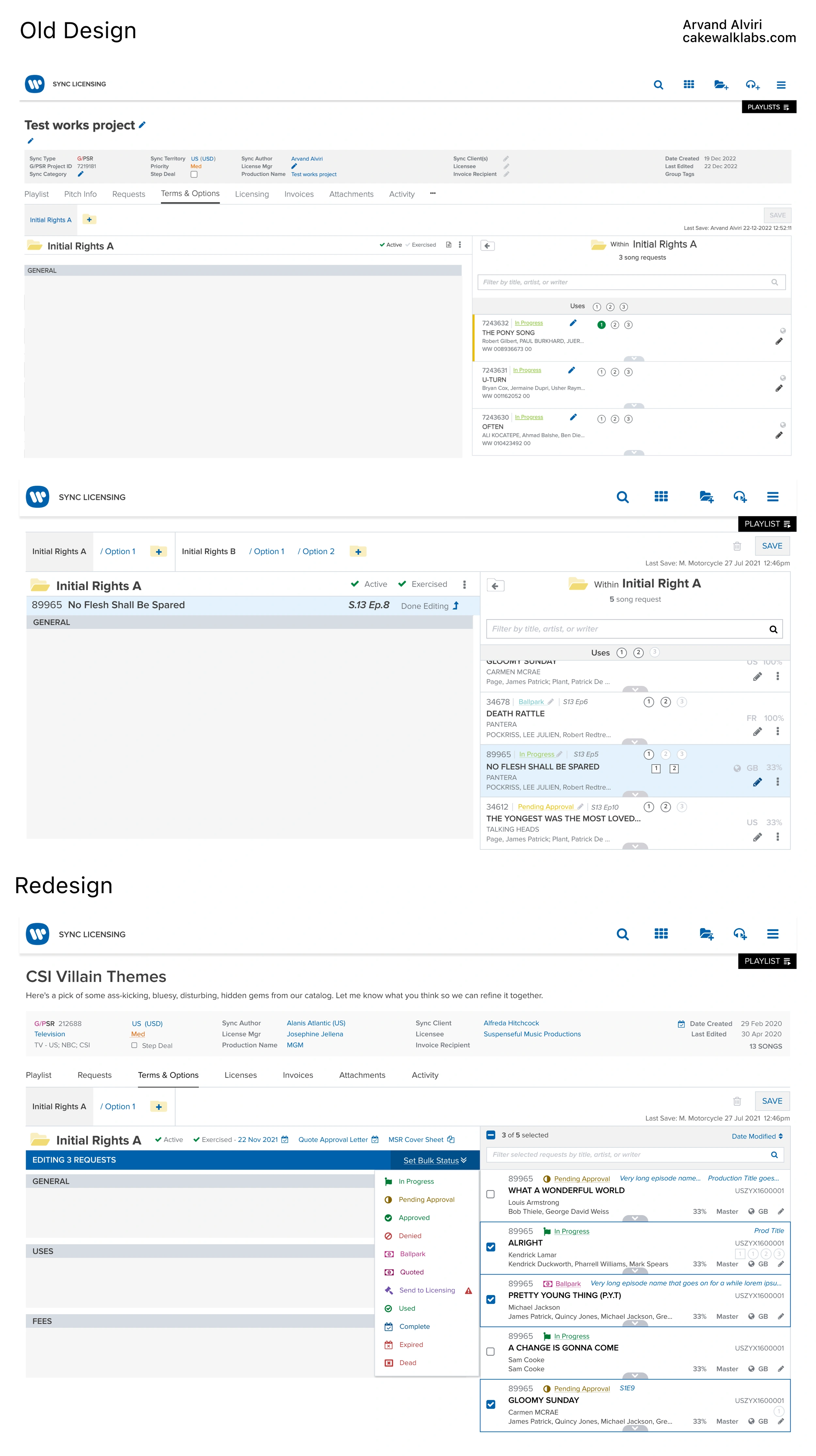
After discussing the findings from my User Shadow Sessions with the Product Owner, we agreed that it would make sense to design a multi-select capability in this section. In the old designs, the users could only edit the Terms & Options of all of the songs in a deal, or only of one song at a time. They could also only edit the deal status (i.e. in progress, pending approval) of one song at a time. As I observed in the user shadow sessions, this design resulted in a lot of redundancies, forcing users to enter information many times, and would make the users take a lot of time (hours per day) to change deal statuses one by one. The User Discovery Interviews had also revealed that there was a segment of users who were doing deals with 15 to 50+ songs at a time, for licensing music to TV shows such as The Voice or America’s Got Talent.
Creating a multi-select would allow users to edit specific information for whichever subset of songs all with one action, and I wanted to also design a way for these users to bulk-change the status of whatever subset of songs to “Ready for licensing”. Some users in the user shadow sessions said that they were spending hours on this by doing this one-by-one, for dozens of songs, multiple times per day.
WHY USER TEST A FIGMA CLICKABLE PROTOTYPE?
I identified the problems to solve for by watching users have the friction points and usability issues with Terms & Options in the user shadow sessions, as well as ones I caught in my UX audit. I also took into consideration the specific business use cases that the current design was neglecting. As a result of these I started designing several alternative designs.
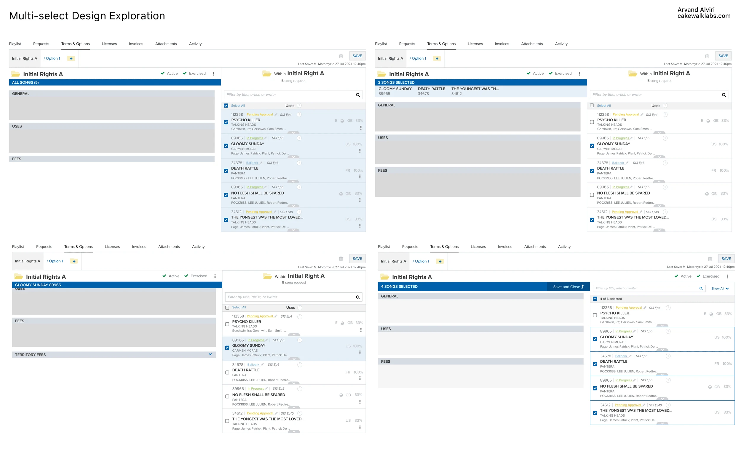
Throughout iterating on the designs and getting feedback from the Product Owner and Lead UX Architect at Warner, I saw an opportunity to do usability tests on a Figma clickable prototype on real users as this feature was brand new, involved a big change to existing processes and would potentially have a huge impact. This was also a perfect introduction of another UX Research methodology, as the GLS product team had previously only received user feedback in the form of showing the users a design and asking them “So, what do you think about this?”. I educated the team about UX best practices which involved observing users struggle or thrive, rather than asking their subjective opinions on designs.
I put the latest iteration into a Figma clickable prototype that captured the key features and on one-on-one Zoom calls had users share their screen and open the prototype. I then asked them a series of segmentation questions, and I gave them tasks to perform on the clickable prototype while they narrated out loud.
Can you describe your role and tasks?
What are the biggest friction points for doing Terms & Options for groups of songs?
How would you edit only the song Gloomy Sunday?
How would you edit all songs again?
How would you edit only Gloomy Sunday + Death Rattle + The Youngest Was The Most Loved?
Do you deal with Exclusivity / Royalty Bearing at all? If so how would you expect Exclusivity / Royalty Bearing here to work for these 3 songs?
How would you edit all songs again?
How would you sort all of these songs by title? Which other sorts do you want?
How would you only edit the songs that are Exercised? Which other quick filters do you want?
Go ahead and edit only Gloomy Sunday + Death Rattle + The Youngest was the most loved
Imagine there is a very long list of songs, on this page how would you show what you’ve selected at the top of the list?
USABILITY TEST FINDINGS AND ITERATIONS
One key finding was muscle memory and resistance to change. Since the new designs were for tasks that a lot of users were already performing in the existing design dozens of times per day, even though the design was following best practices, a substantial portion of the users were trying to perform these tasks through the old method, because of muscle memory. They were looking for a specific edit pencil icon, and ignoring the new multi-select checkbox mechanism. As a result, this was one design element that I iterated on before continuing further rounds of usability testing. The iteration consisted of a hybrid of the new design element as well as the old, by utilizing hover mechanisms to declutter the designs.
MANAGING COMPETING USER FEEDBACK
GLS was in a unique position where some of the end users who are a part of Warner, are at VP levels and therefore have a lot of say in what goes into the product, and essentially have veto votes regardless of all other factors. It was not uncommon to receive suddenly shifting priorities from top-down, as a result the multi-select feature was deprioritized. A lot of competing and contradictory requests would come in from these loud and influential users. This was understandable due to the varied user personas with differing tasks, as unfortunately GLS had not been designed from the ground up with different business roles in mind, as a result the designs had to make all user personas with differing roles happy, yet largely that meant compromising for each.
As a result, I introduced another UX Research methodology to GLS by sending a survey to every user to rank priorities as they saw it, that were specific to certain UI components that had been receiving very strong, yet contradictory, opinions from varying user personas.
Using a survey for product design has to be done from the perspective of “what data do you need” and “what problems do you face”, rather than “please tell us what designs you like”. I asked users to rank what data is most important for them to see in these UI components. I did not use a likert scale (1-10) (i.e. Rank these data points based on how important they are for you at this stage; very unimportant, unimportant, somewhat important etc) because a likert scale allows users to rank multiple data points at the same level of importance, therefore allowing users to say that several elements are equally important. These influential and loud users wanted Everything Everywhere All at Once, whereas I wanted to force the users to really prioritize, and not rank anything equally, therefore the questions were made to be a forced ranking. A forced ranking would give a lot more clarity on the visual hiearchy of these UI elements as well.
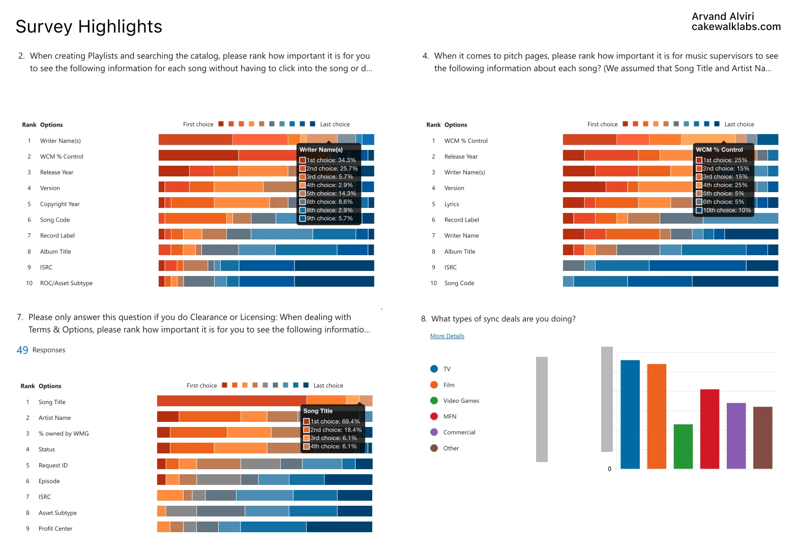
One of the UI components that this survey gathered feedback on was on the Terms & Options page, its an element that shows each song in the deal with all of its corresponding data. Since multi-select had been deprioritized due to the competing interests, I did a redesign of this UI component while keeping in mind that in the eventual release of multi-select this component would also be used. I designed this component as responsive Figma components, that were later added to the design system, since they would be used in many places in Figma as they were going to be in many different sections of the app and would have a varying and customizable amount of data displayed on them, therefore having a large amount of varied states with truncation, empty data points and hover states.
UX ACCESSIBILITY
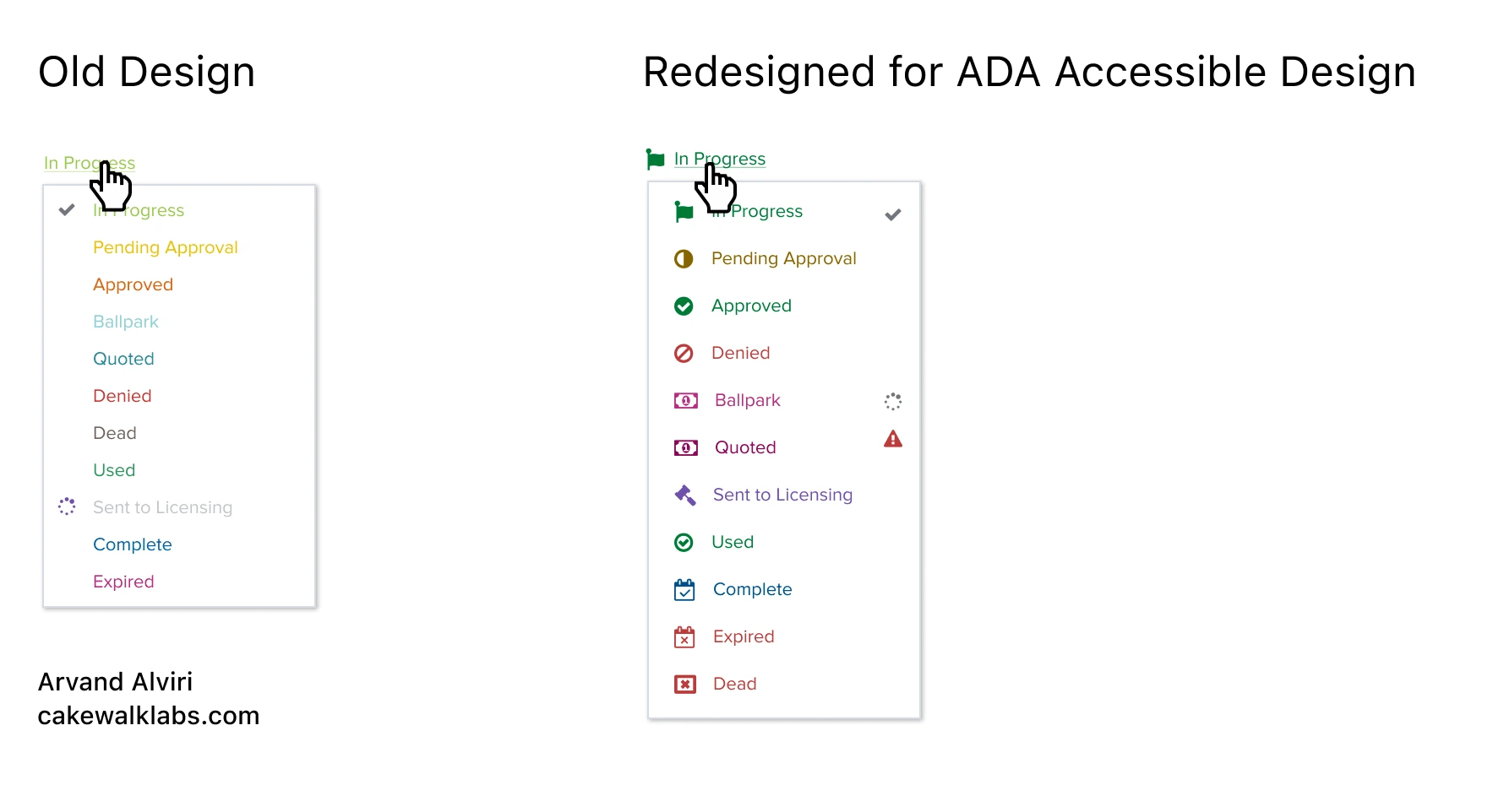
One small aspect of the designs that I caught and changed in the Terms & Options was to make the colors for the statuses follow the Americans with Disability Act (ADA) standards for Accessible Design.
SOLVING THE MOST TIME CONSUMING FRICTION POINT
I designed a new feature that addressed the most time consuming task in the original designs, which was forcing users to change the status of each song one-at-a-time, which would take them hours per day. The tricky part of this design was that not all songs could be changed to Sent to Licensing, because in order to Send to Licensing, a song had to have a preset amount of fields correctly filled out. As a result, if the songs the users selected to Send to Licensing had 1 or more songs that were not ready, I designed a popover with messaging allowing users to move forward with the songs that were ready, but at the same time highlighting the song that wasn’t and allowing the user to click into that song to make proper adjustments to make it ready.
PUTTING EVERYTHING TOGETHER
I combined the responsive UI components which were backed by survey results, multi-select designs that were validated with usability tests, color changes that followed ADA standards, with the new feature addressing the biggest friction point for users (bulk status changes), discovered in user shadow sessions, to put everything together for final designs of multi-select.

CLIENT SATISFACTION
You can see the LinkedIn Recommendations the Product Manager and User Experience Artchitect (who had worked on the product since inception) left for me on my LinkedIn.
“I worked closely with Arvand for a year at WMG where he was extremely easy to work and communicate with and was a fantastic collaborator on product design. He took the initiative to introduce our team to UX research and aspects of Product Design best practices. He was able to work with unknowns and dig into problems to solve for the correct business use cases with user friendly and intuitive designs. He questioned requirements and delved into deeper issues in order to gain a full understanding of the problems presented. He showcased proactive problem-solving when it was needed. I would highly recommend him for any Product Design, UX research or UX/UI work.” -Dan Hewins, Product Manager @ Warner Music Group
“Everybody calm down... we've got this! Arvand is so cool under pressure. He knows what to do, he knows what to ask, he absorbs the current system, he listens, he takes notes, he gets it. And because he gets it, he get you to slow down a second and think through what's been communicated. He turns "asks" into "UX".When Arvand started at WMG he was lined up to tackle a very complicated project involving many user types (internal and external) and many workflows. I was nervous because of the system knowledge he would need to build in order to meet the speed to feature asks. What happened was what I lead this recommendation with. He absorbed, he understood, everybody started calming down. He read, he used the product, he ran targeted research, he asked for history... and THEN he designed, asked questions again... and soon enough there was more design ready than engineers had capacity.Everybody calm down... Arvand's got this. He's a pro.” -Michael Constantino, User Experience Architect & Forward Thinking @ Warner Music Group
Like this project
Posted Mar 18, 2024
I led all design for the application Warner uses to license its music globally, accounting for 19% YoY growth and $170+ million annual revenue.
Likes
0
Views
25
Clients
Warner Music Group
