
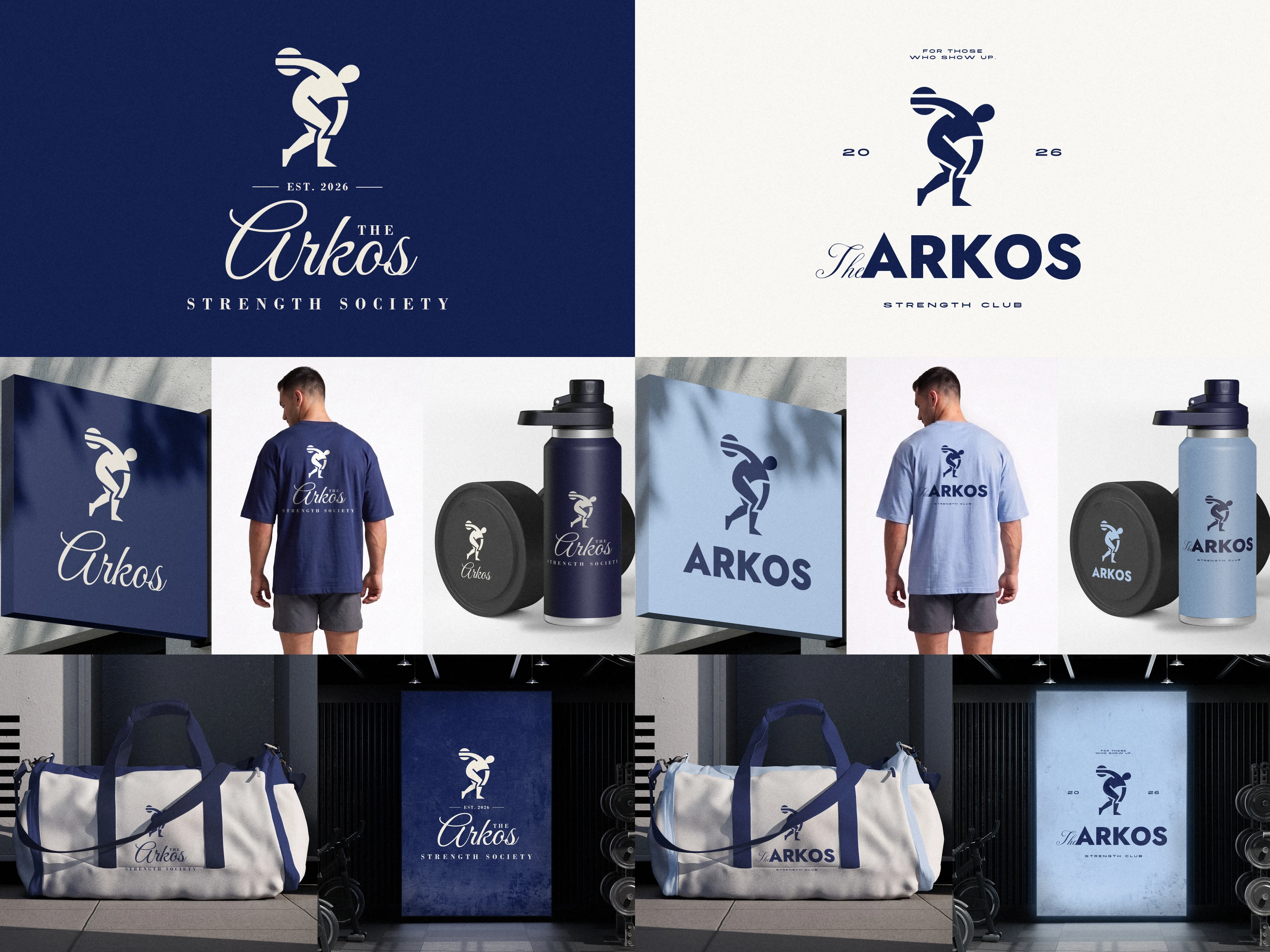
Most gyms follow a pretty similar approach to branding. I wanted to see what one could look like if it took more inspiration from a private members' club instead.
Arkos is a concept project I put together exploring two different branding directions. Both use the same discus thrower mark, just with completely different styles. I carried each one across apparel, merch, signage, and a short brand film.
Brand film
Arkos brand film
The identity in motion: the lockup builds piece by piece, then shows up around the club on the poster, sign, bag, tee and bottle.
Direction A: Refined & Classic
Script name, spaced serif lettering and an EST. line, in dark navy and cream. It reads like a private club.
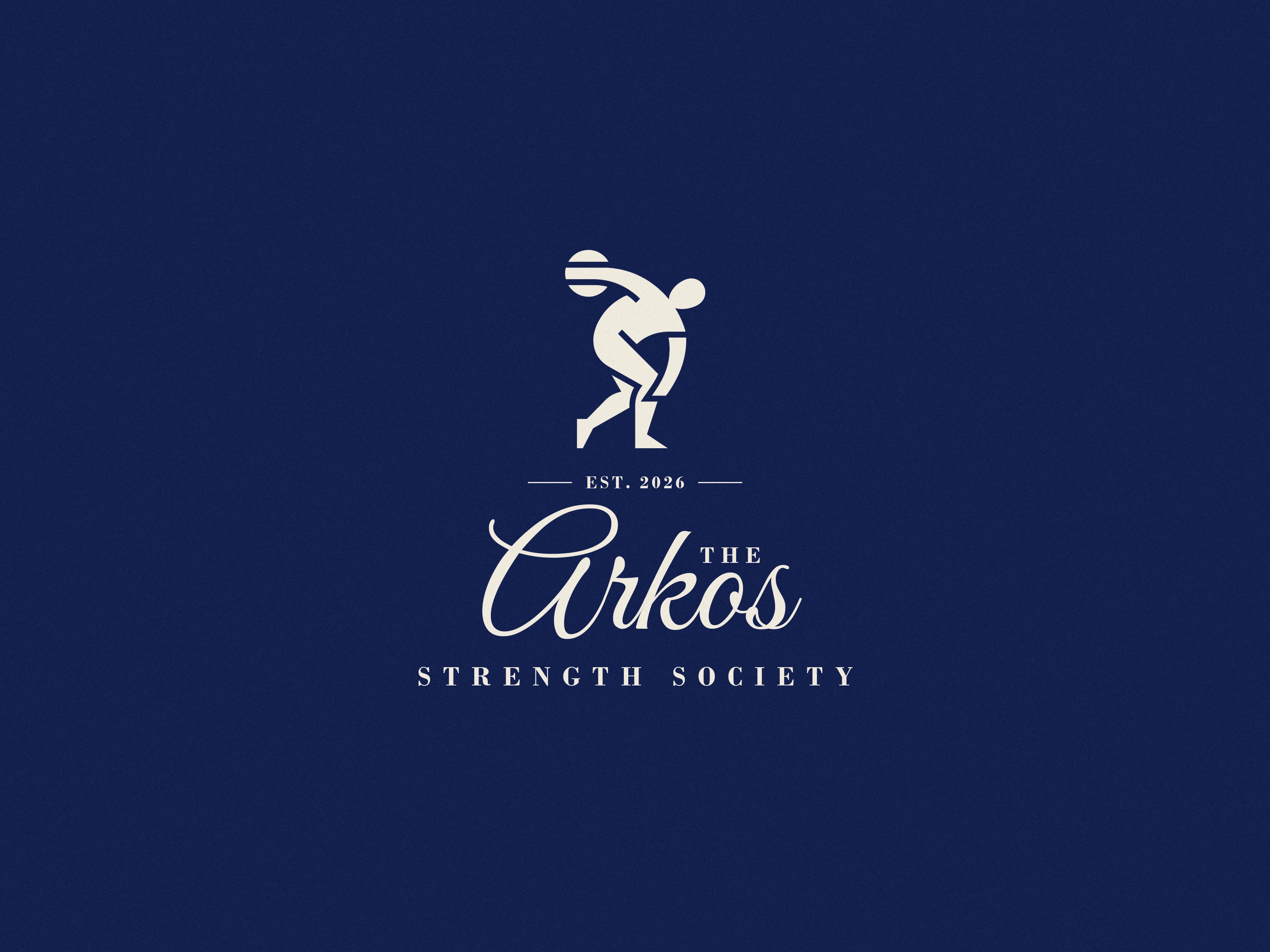
Arkos Direction A logo on navy
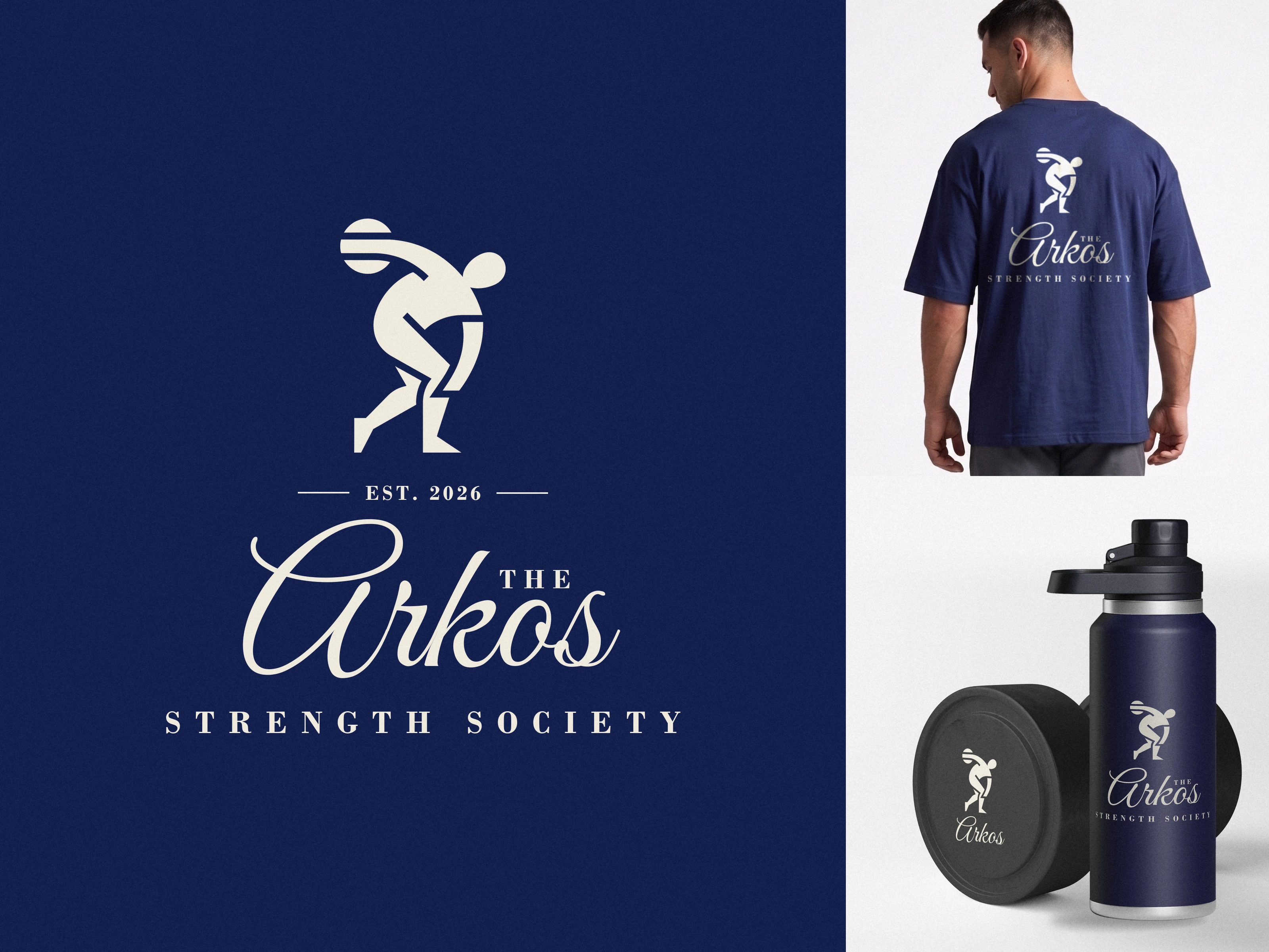
Arkos Direction A logo with the tee and bottle
Direction B: Bold & Modern
Heavy geometric caps, a wide-set tagline and the year split around the mark, in navy on white, with powder blue on the merch. The tougher, blockier gym look.
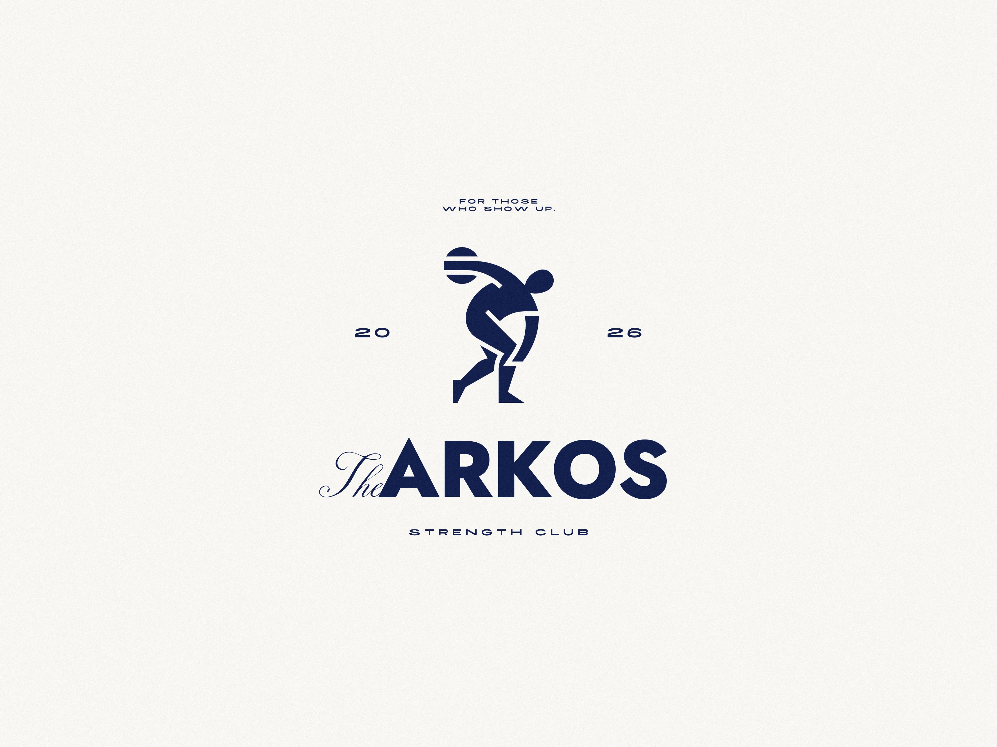
Arkos Direction B logo on white
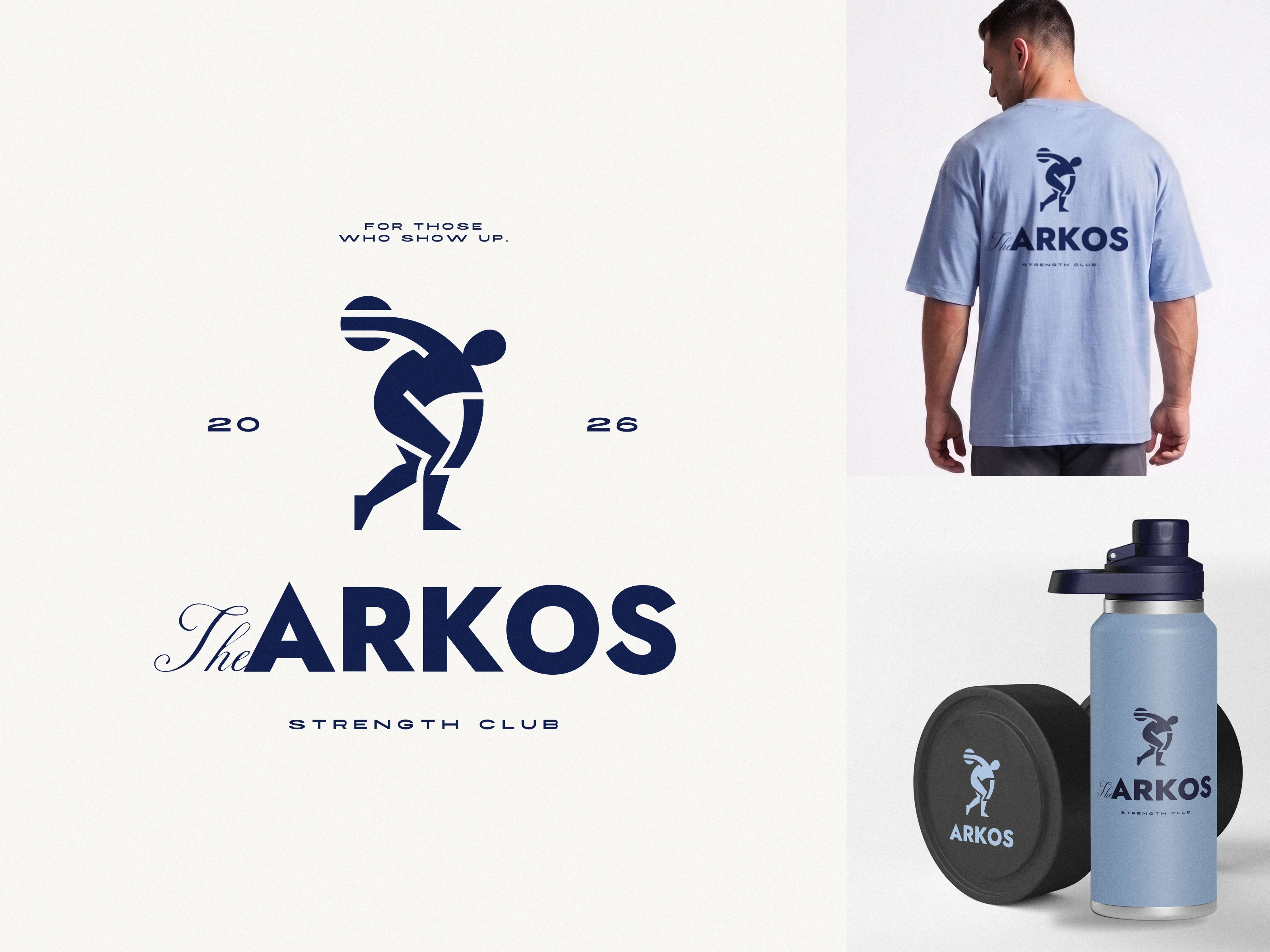
Arkos Direction B logo with the tee and bottle
On merch
Oversized tees with a back print, water bottles, and dumbbells with the mark on the plates, in both directions.
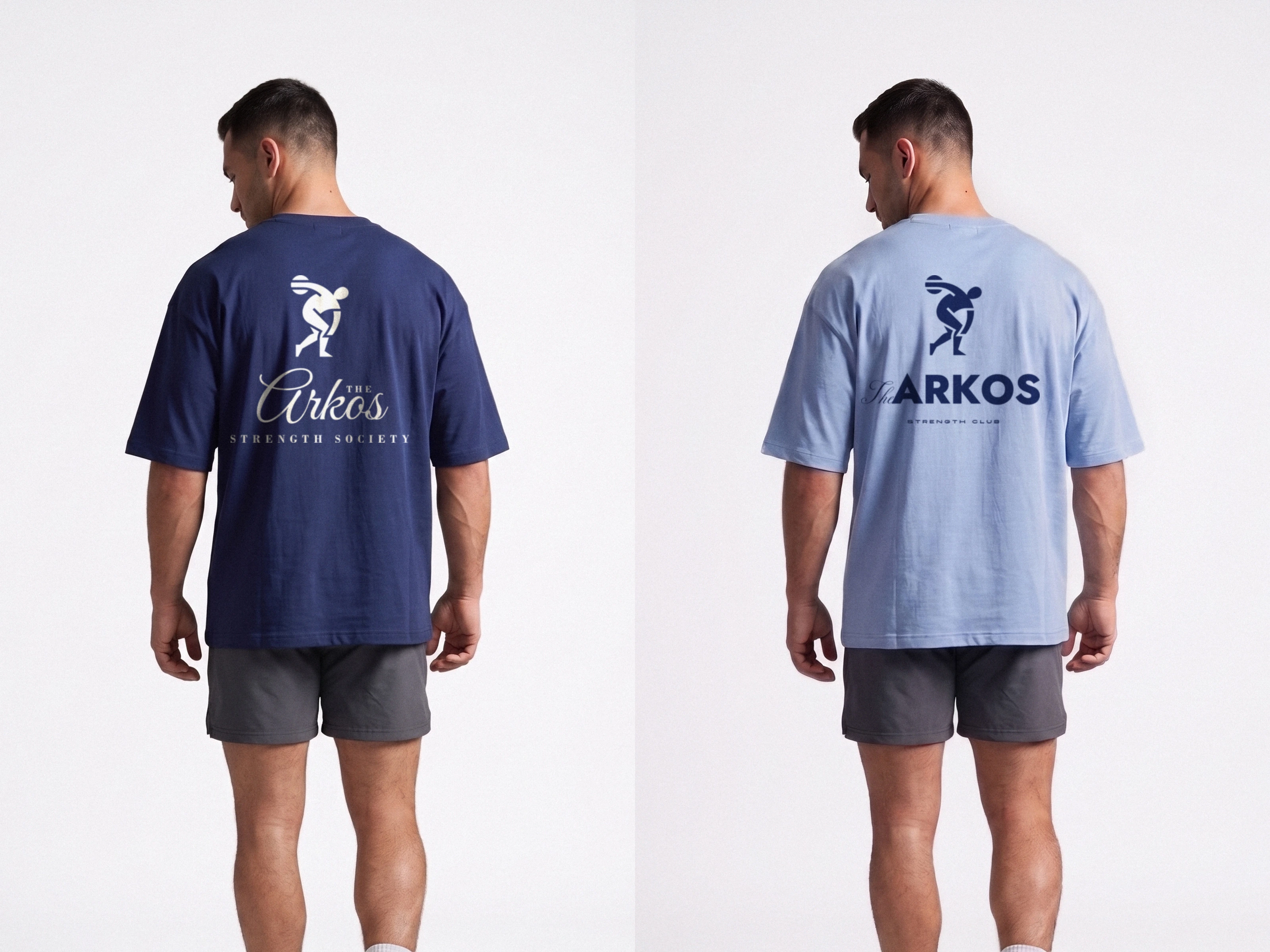
Arkos tees in both directions
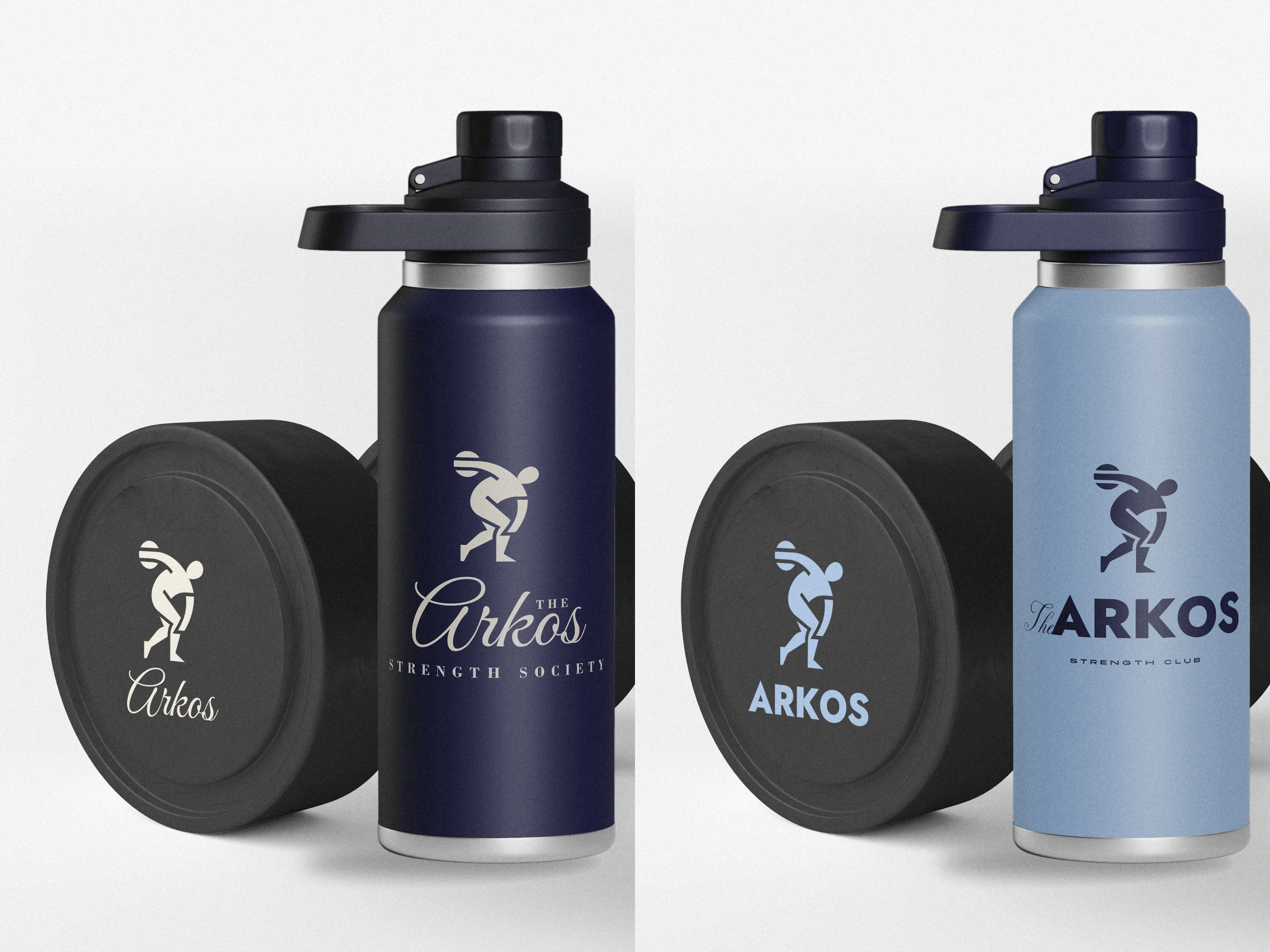
Arkos bottles and branded dumbbells in both directions
Around the club
A sign out front, a duffel bag, and a lit poster for the gym wall, in both directions.
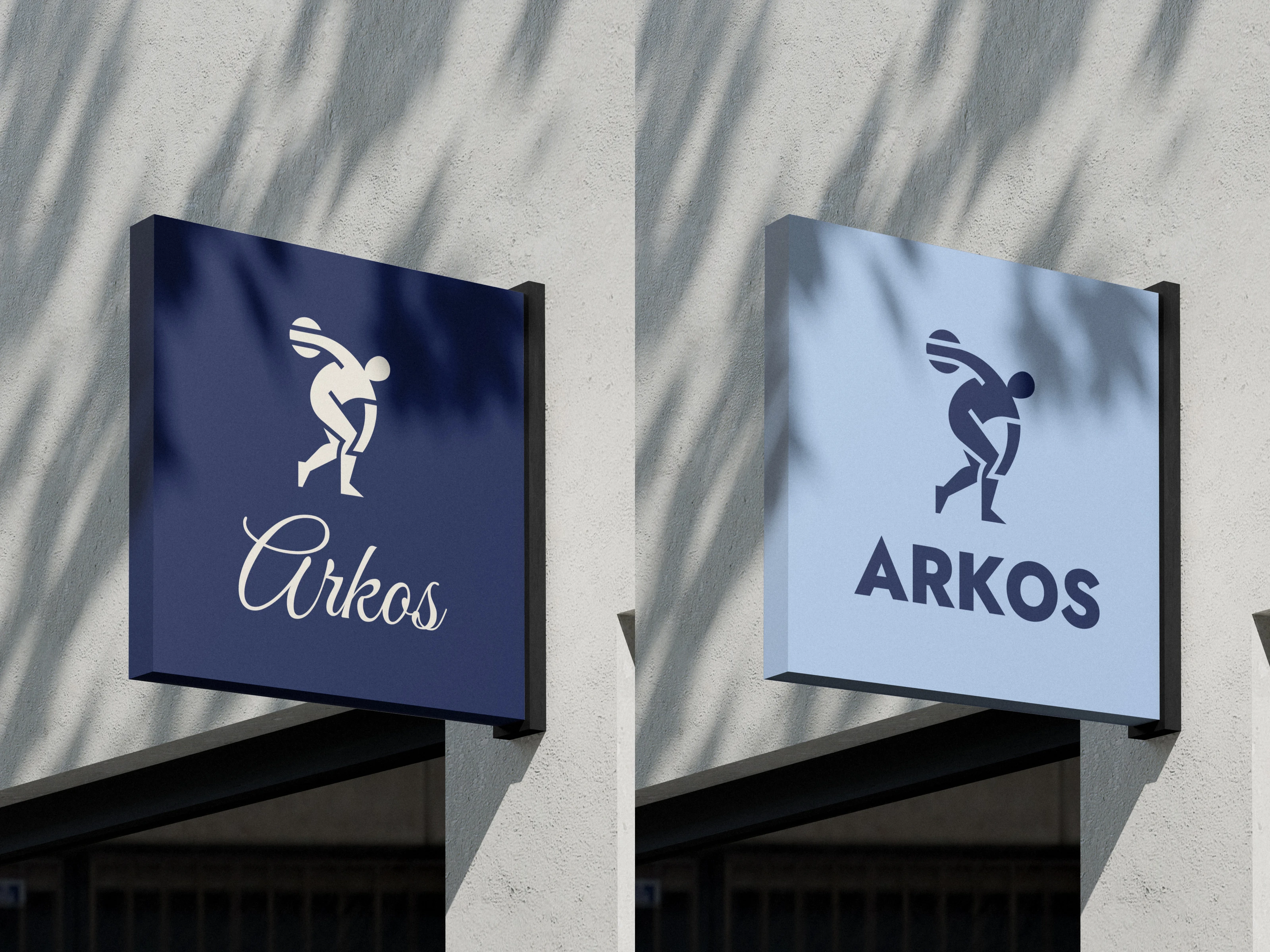
Arkos shop signs in both directions
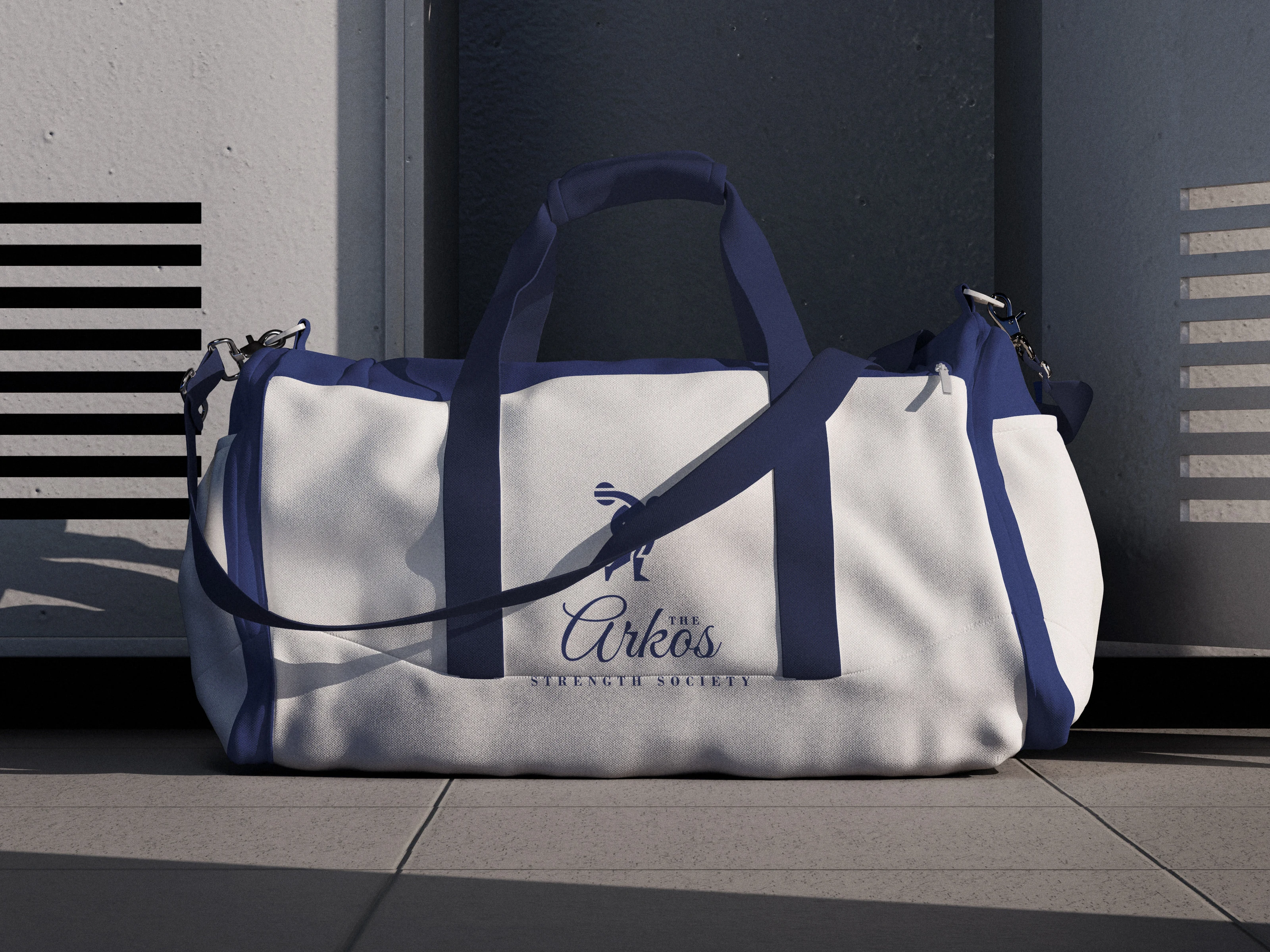
Arkos Direction A duffel bag
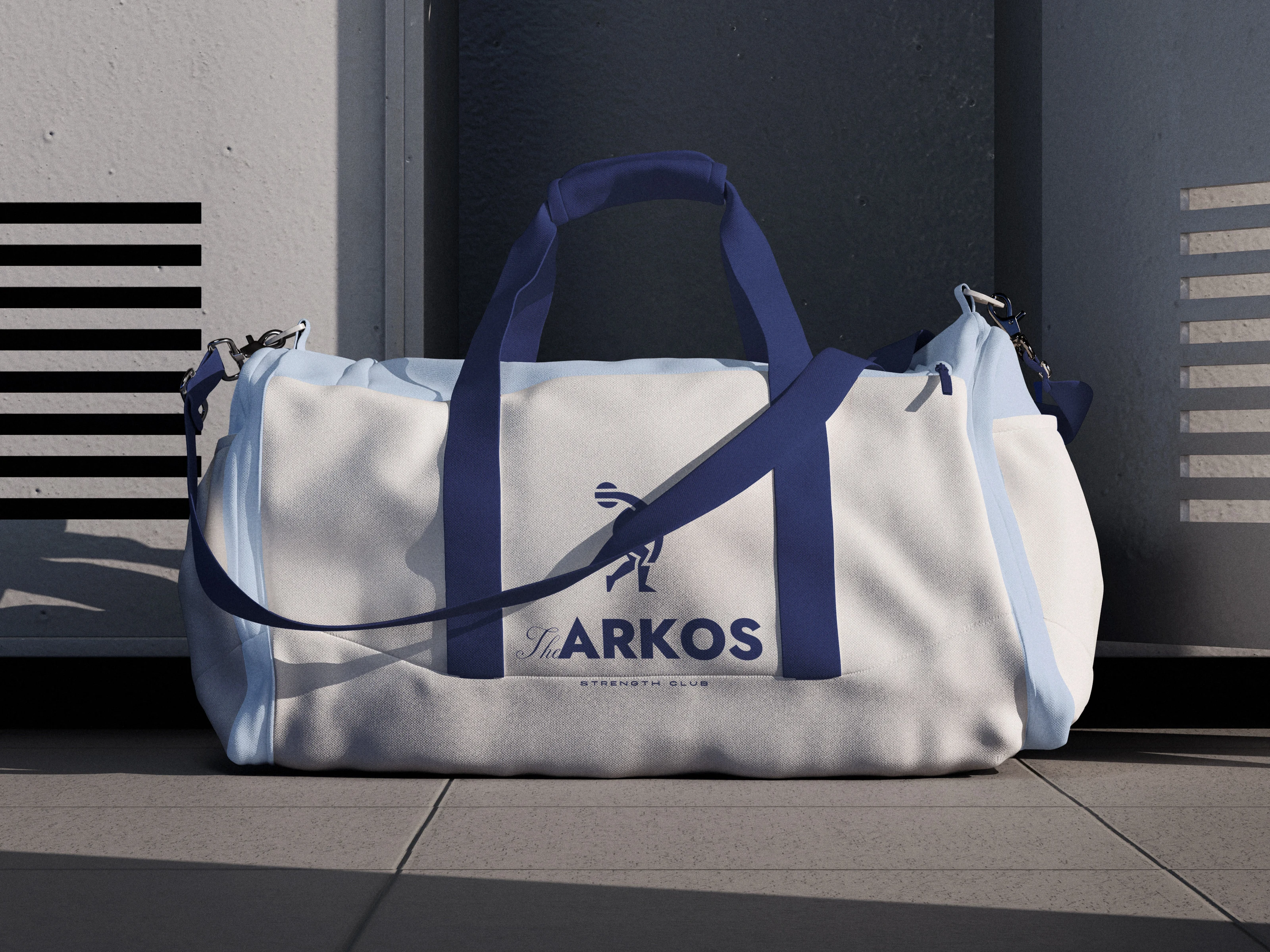
Arkos Direction B duffel bag
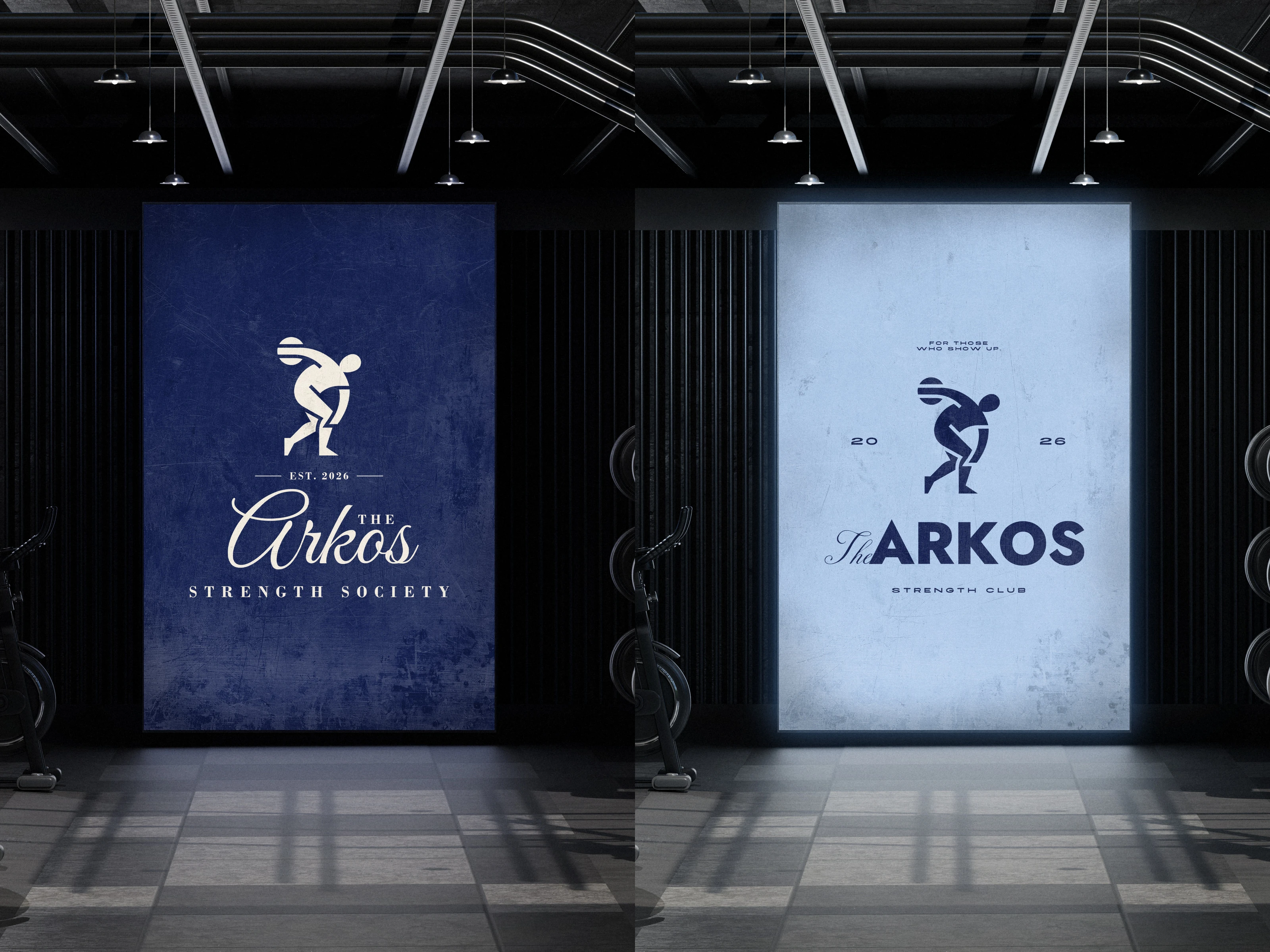
Arkos gym posters in both directions
Same logo mark, two completely different directions. Wanted to show how much the typography, colors, and overall styling can change the way a brand feels.
0 likes · 2 views · Nov 17, 2026
Arkos is a gym concept with more of a private members' club feel. I created two branding directions and applied both to apparel, merch, and signage.


