Everspring Sparkling Water Brand Identity
Kisty Mea
Everspring Sparkling Water
A refreshing visual identity for a health beverage
Everspring celebrates health and joy through a fresh, playful identity. Pastel colors, soft illustrations, and clean type make wellness feel easy and inviting.
Everspring’s essence is Health + Joy—helping people stay healthy while enjoying life. The brand’s message, Find Your Flow, encourages people to live mindfully and joyfully. Through soft colors, hand-drawn details, and a calm yet vibrant tone, Everspring makes wellness feel easy and inviting
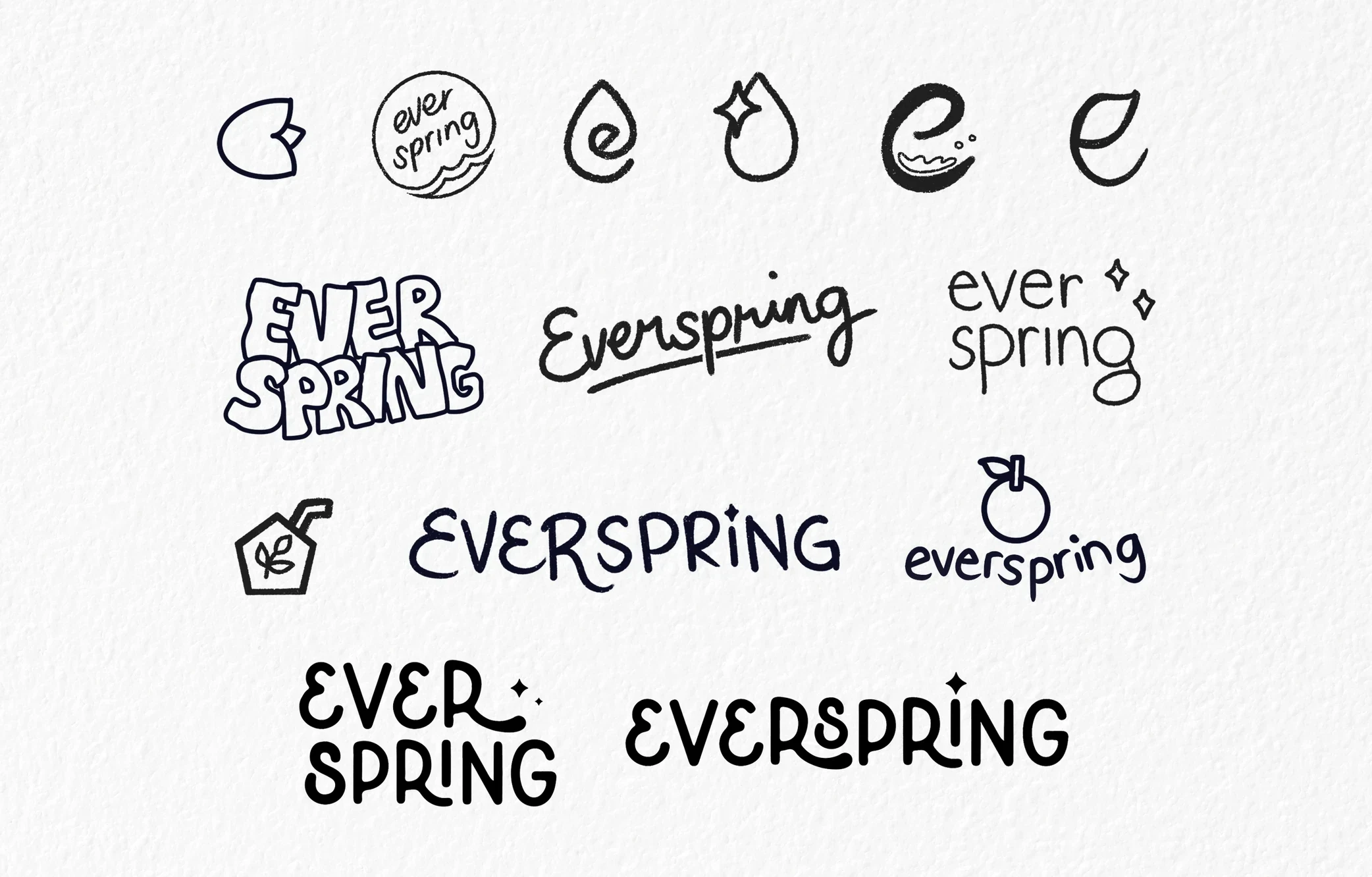
Logo Explorations
Initial sketches explored ideas of water, motion, and renewal. The final wordmark combines soft curves and structured rhythm, creating a logo that feels calm, confident, and full of life.
Logo Explorations
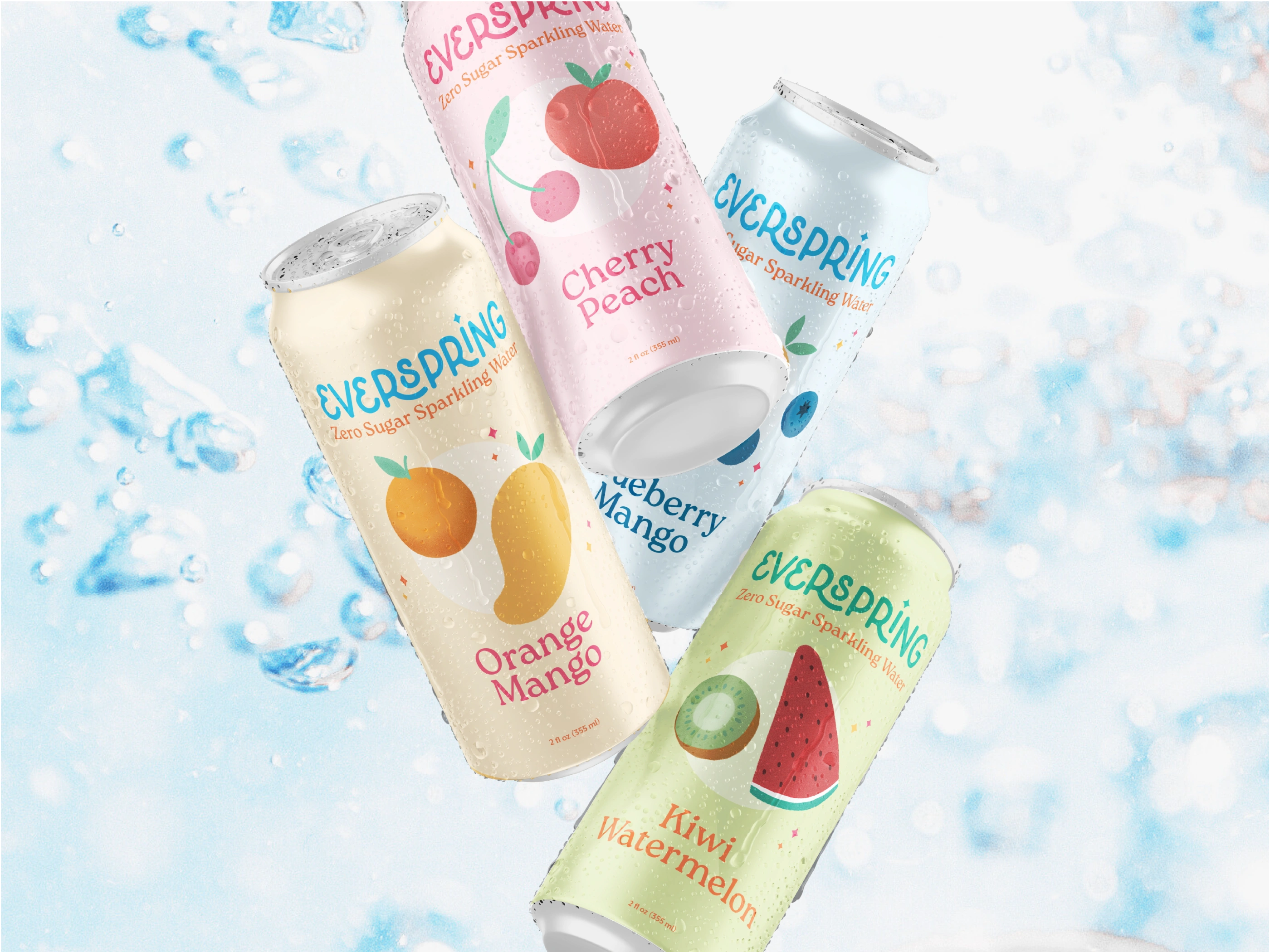
The system builds around a pastel palette and hand-drawn details that feel light and approachable. Each element works consistently across packaging, social media, and print while keeping the brand tone modern and cohesive.
Three brand pillars guide the design and messaging: Health in Every Sip, Joyful Refreshment, and Find Your Flow.
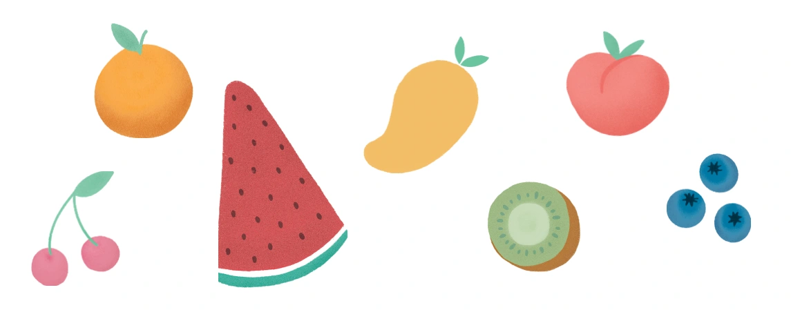
Fruit Illustrations
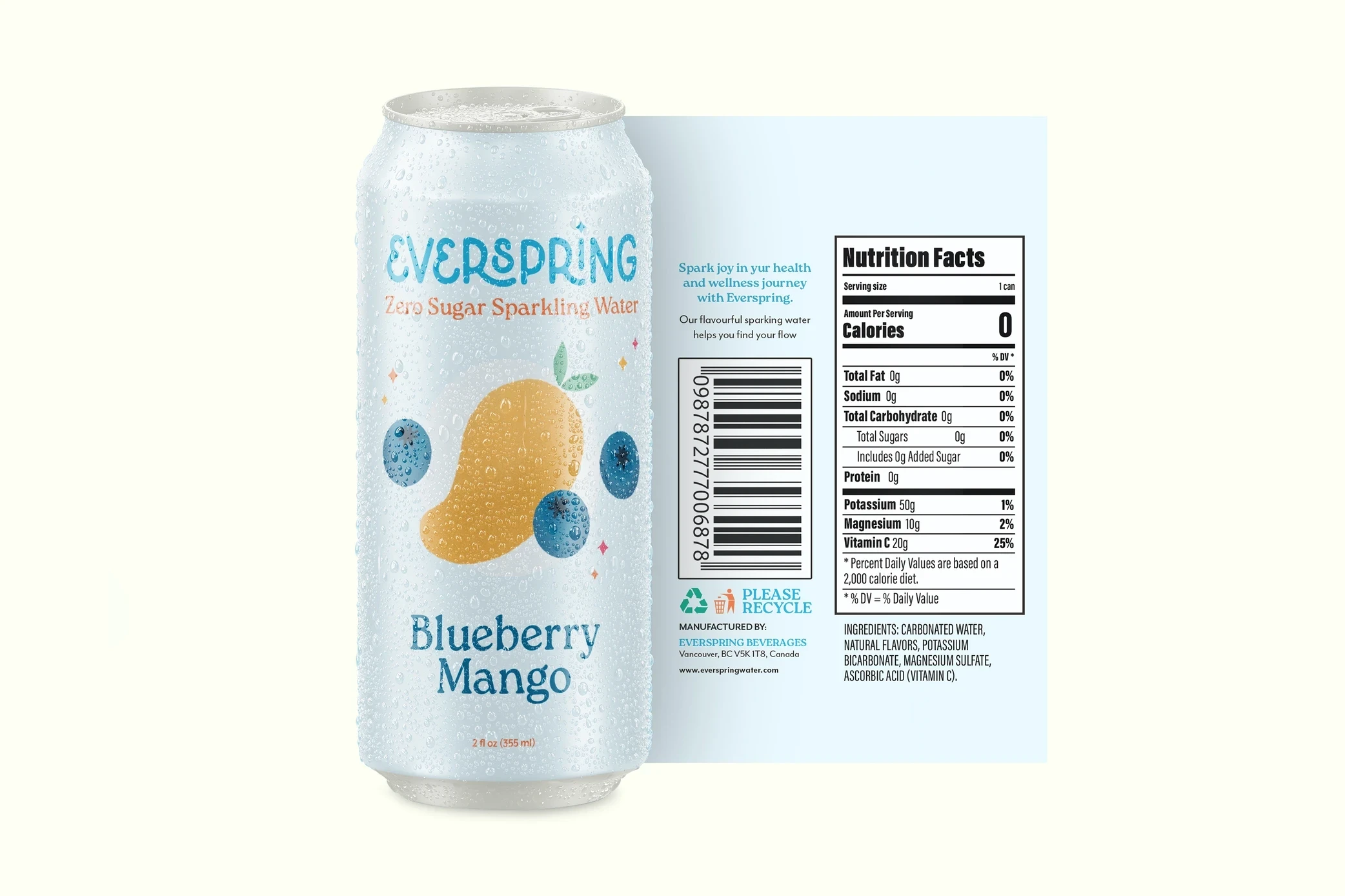
Label Packaging
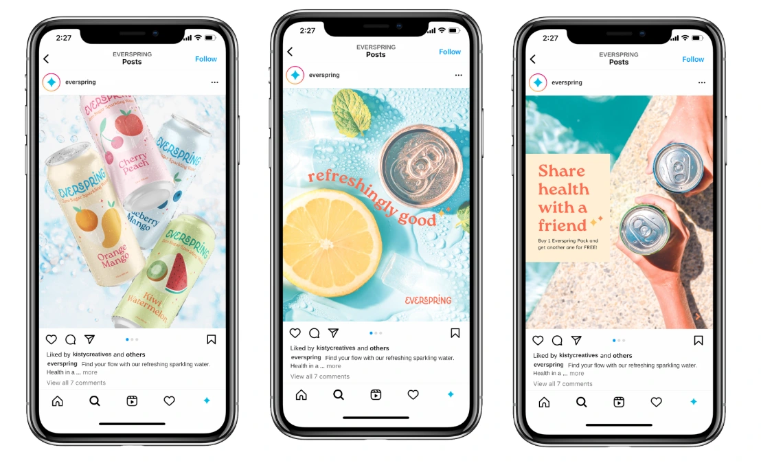
The final identity feels consistent and refreshing across all applications. Clear hierarchy and bright visuals make the product easy to recognize and enjoyable to explore. Everspring turns healthy choices into small moments of joy—simple, honest, and uplifting.
Designing Everspring reminded me how visual identity can make wellness feel more joyful. It’s a project that combines clarity, warmth, and character—the same values I bring to every brand I create.
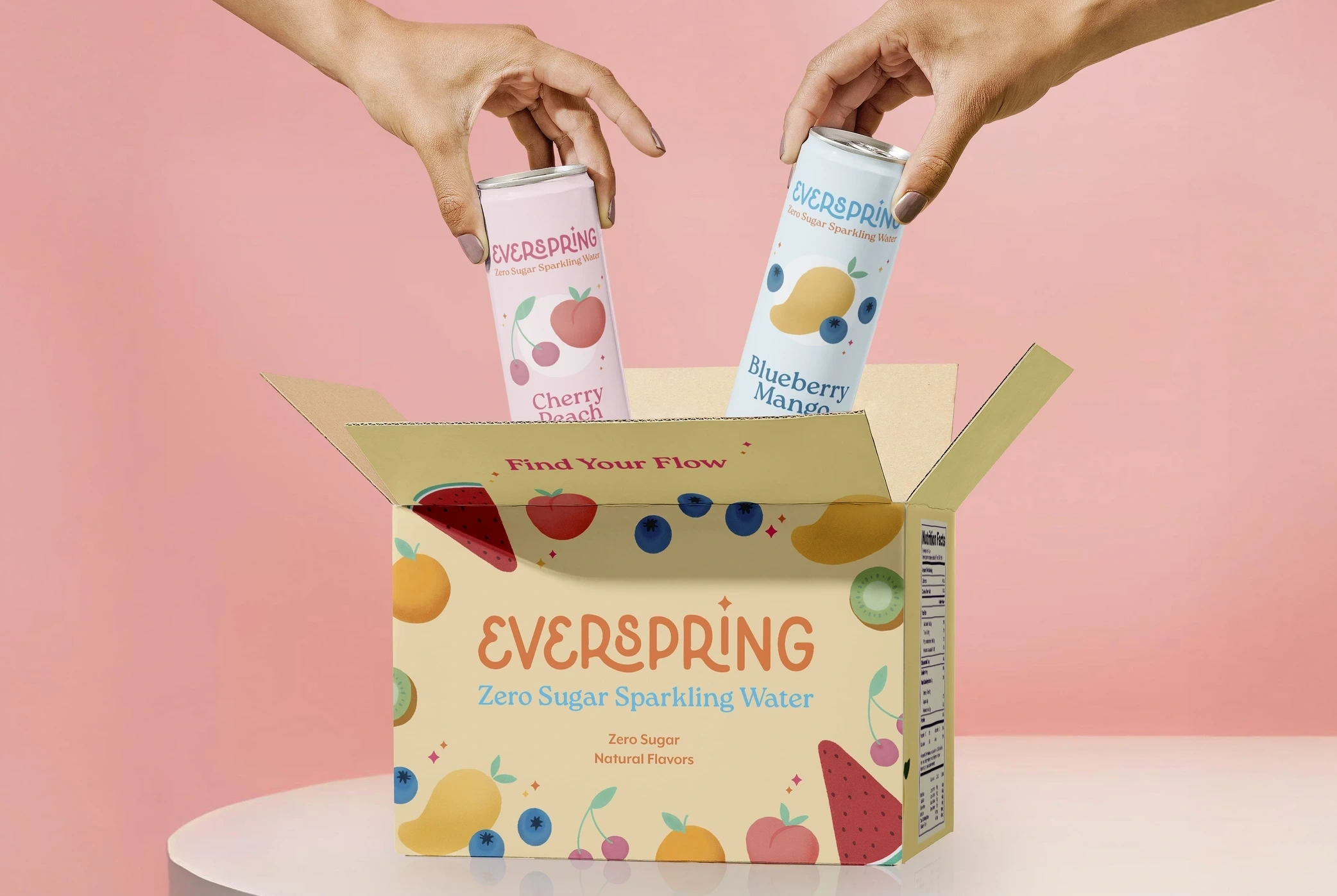
Everspring Packaging Box
Like this project
Posted Dec 17, 2025
Everspring celebrates health and joy through a fresh, playful identity. Pastel colors, soft illustrations, and clean type make wellness feel easy and inviting.