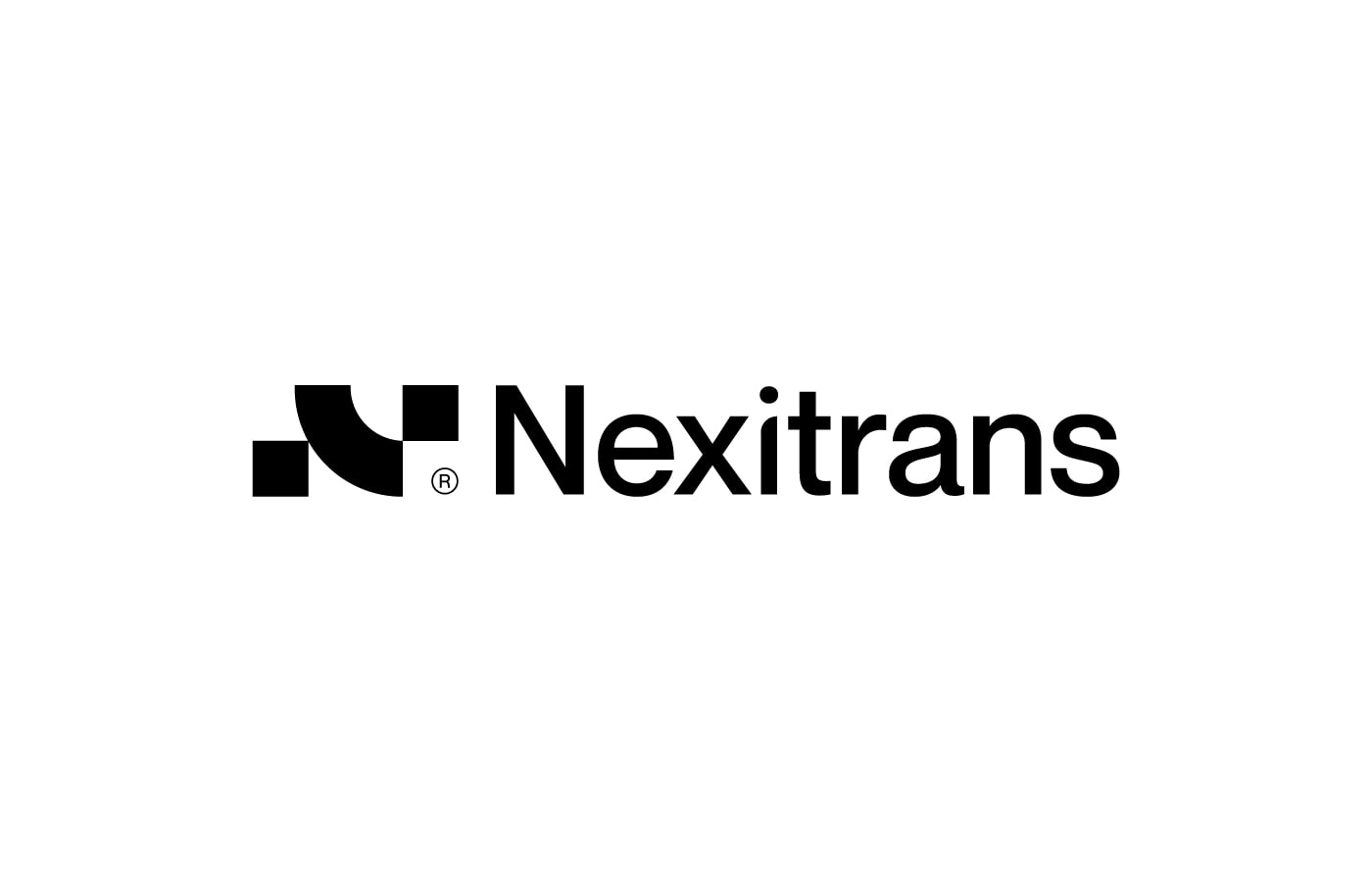
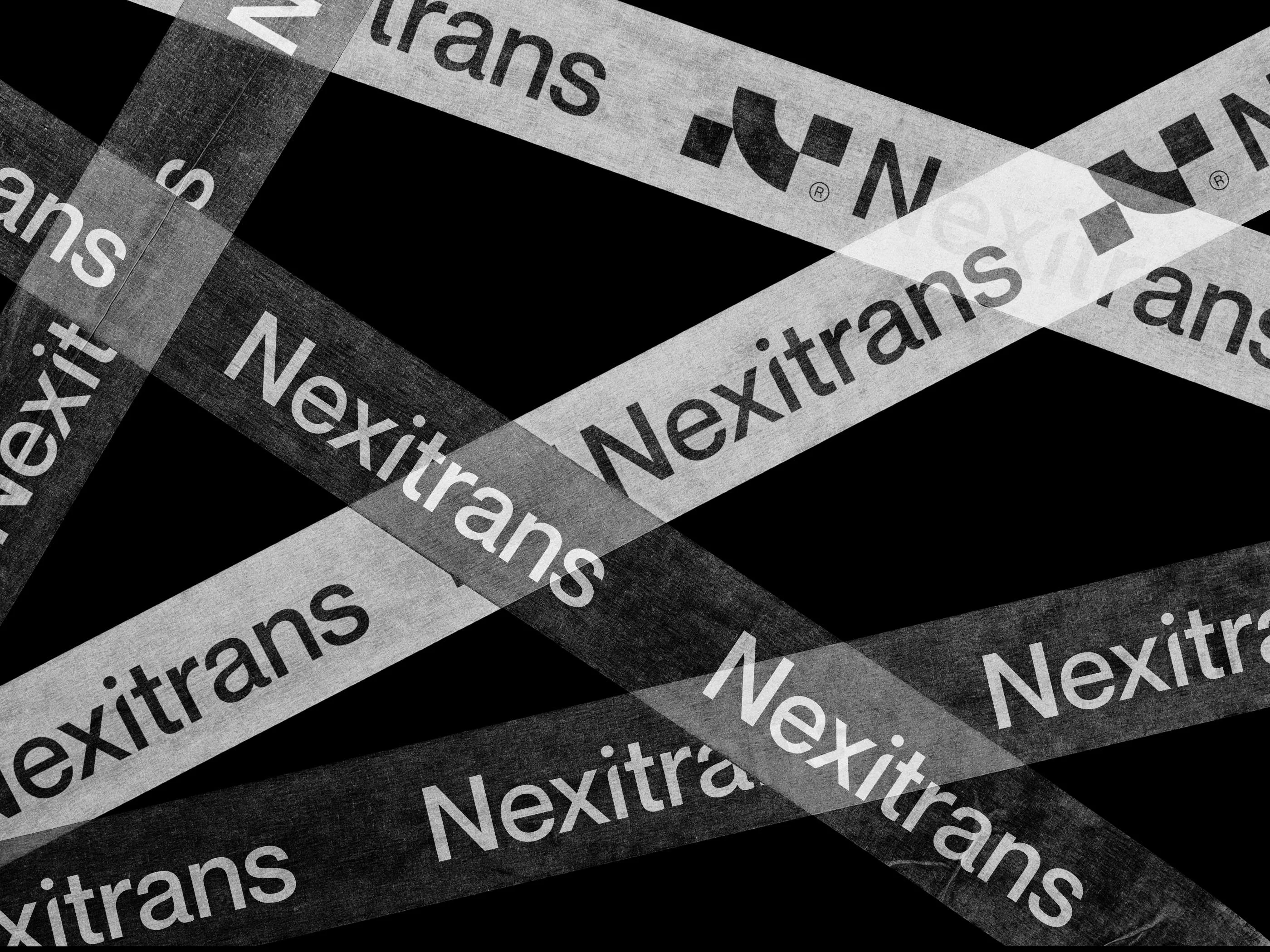
Nexitrans Logo and Visual Identity Design
Alamgir Brands
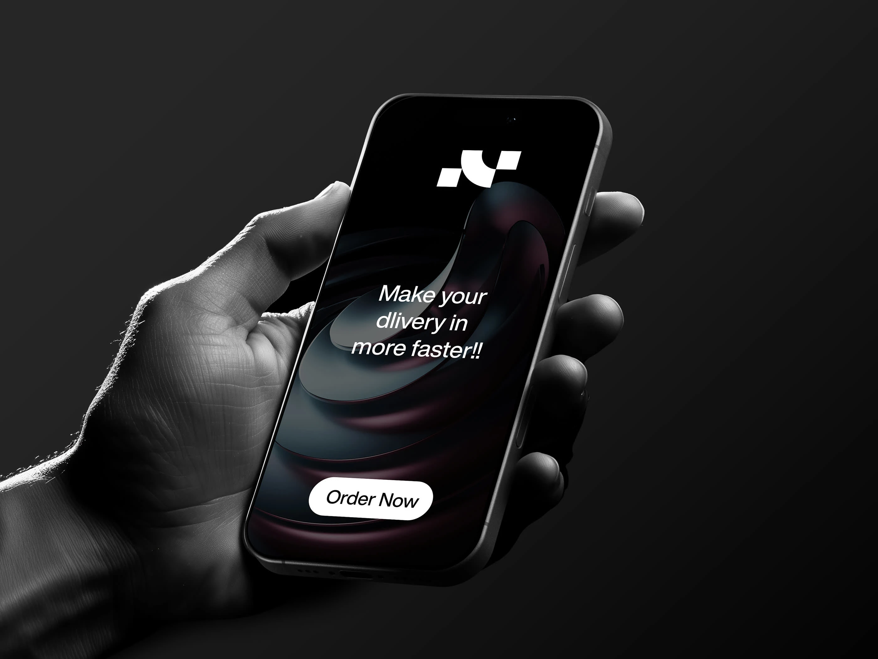
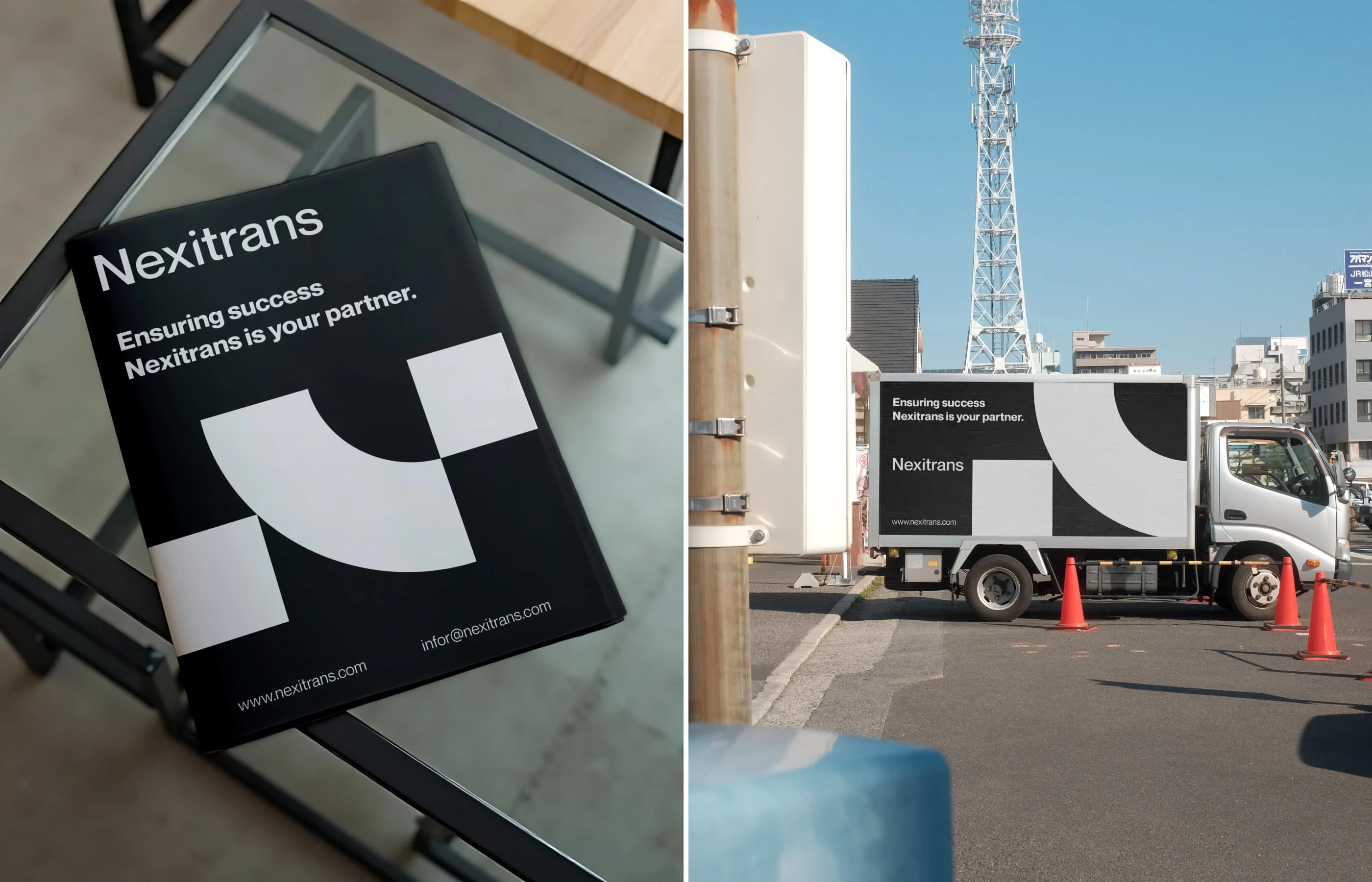
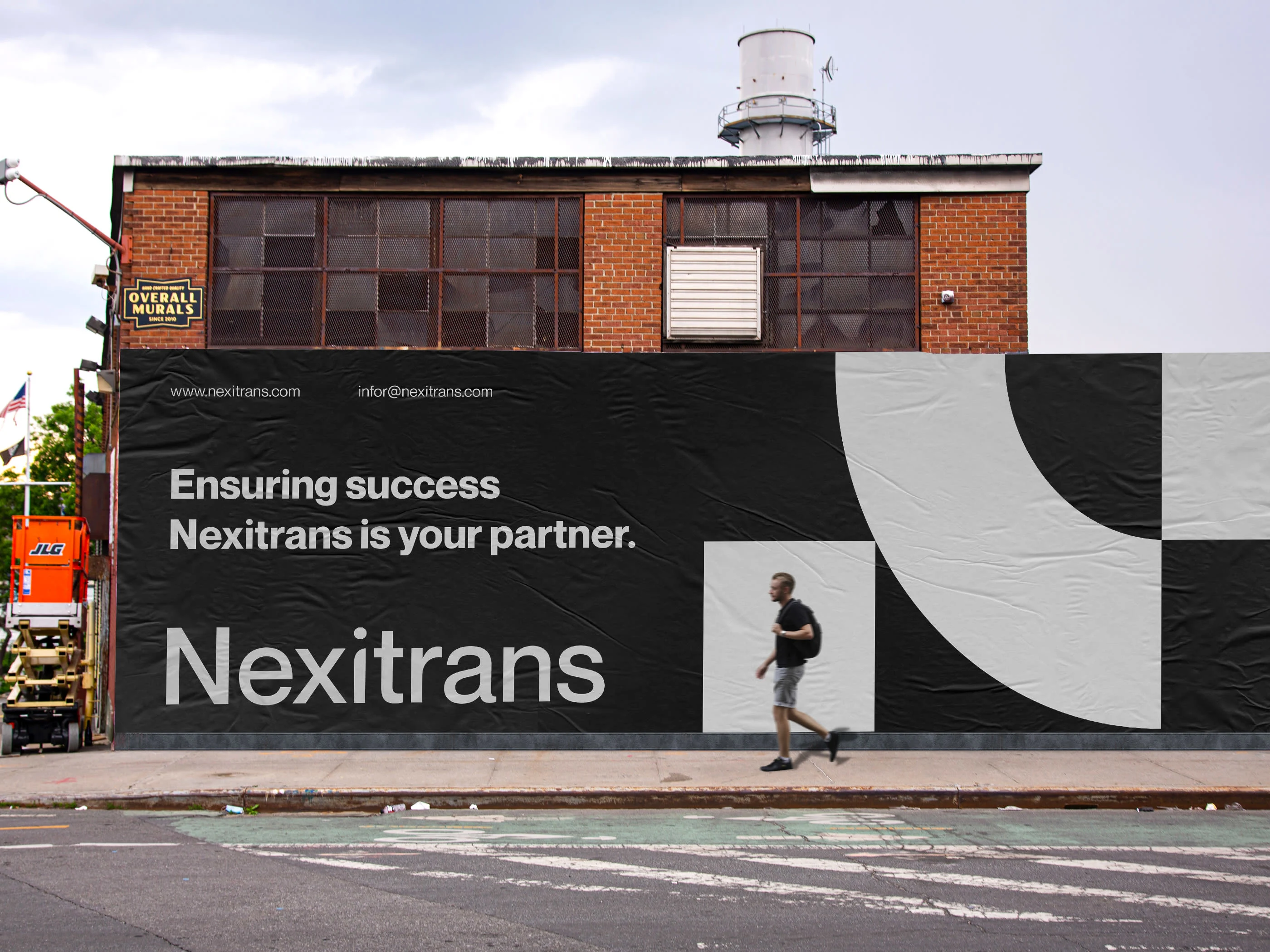
A company specializing in logistics solutions, Nexitrans offers comprehensive transportation and delivery services worldwide.
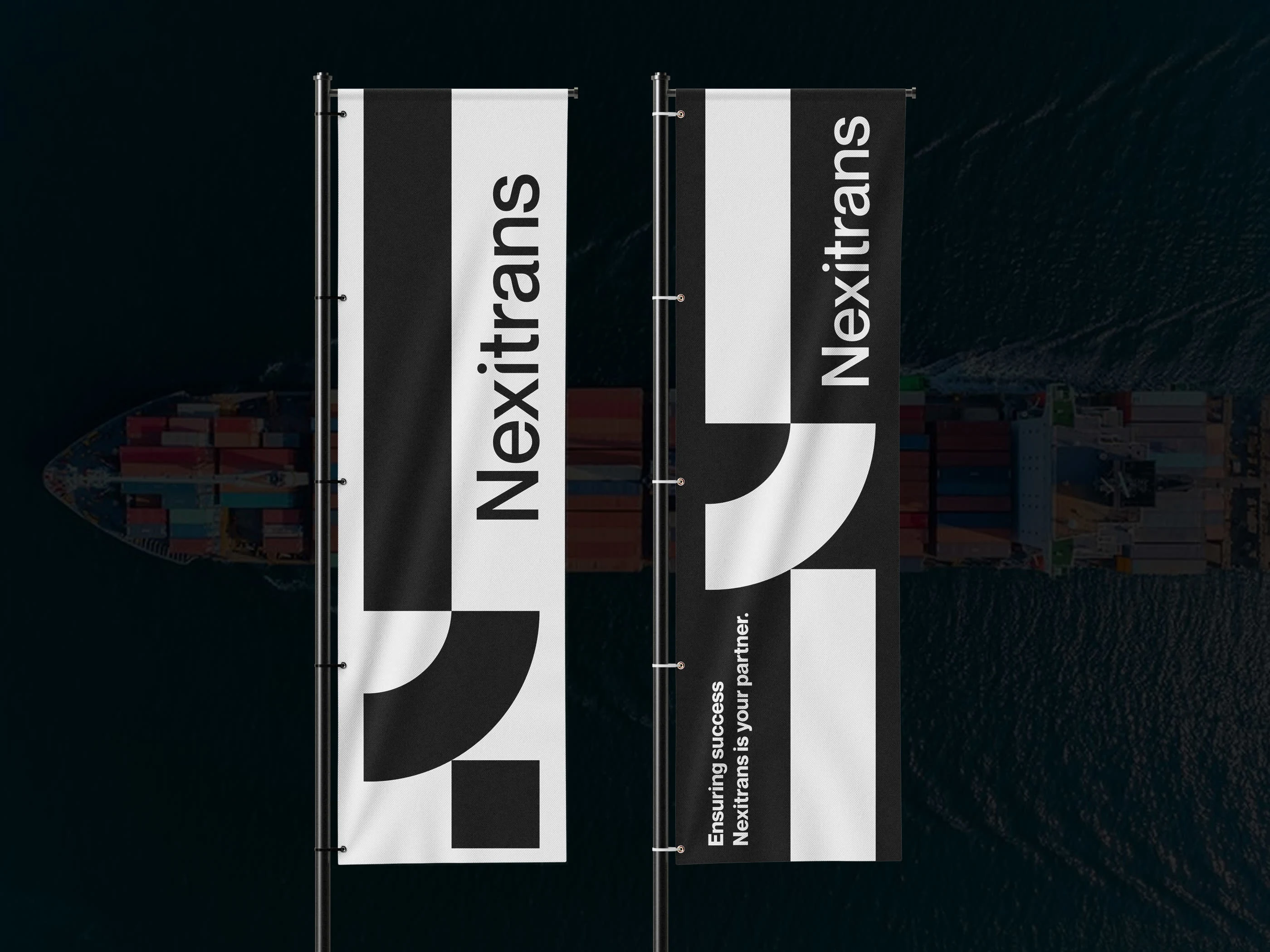
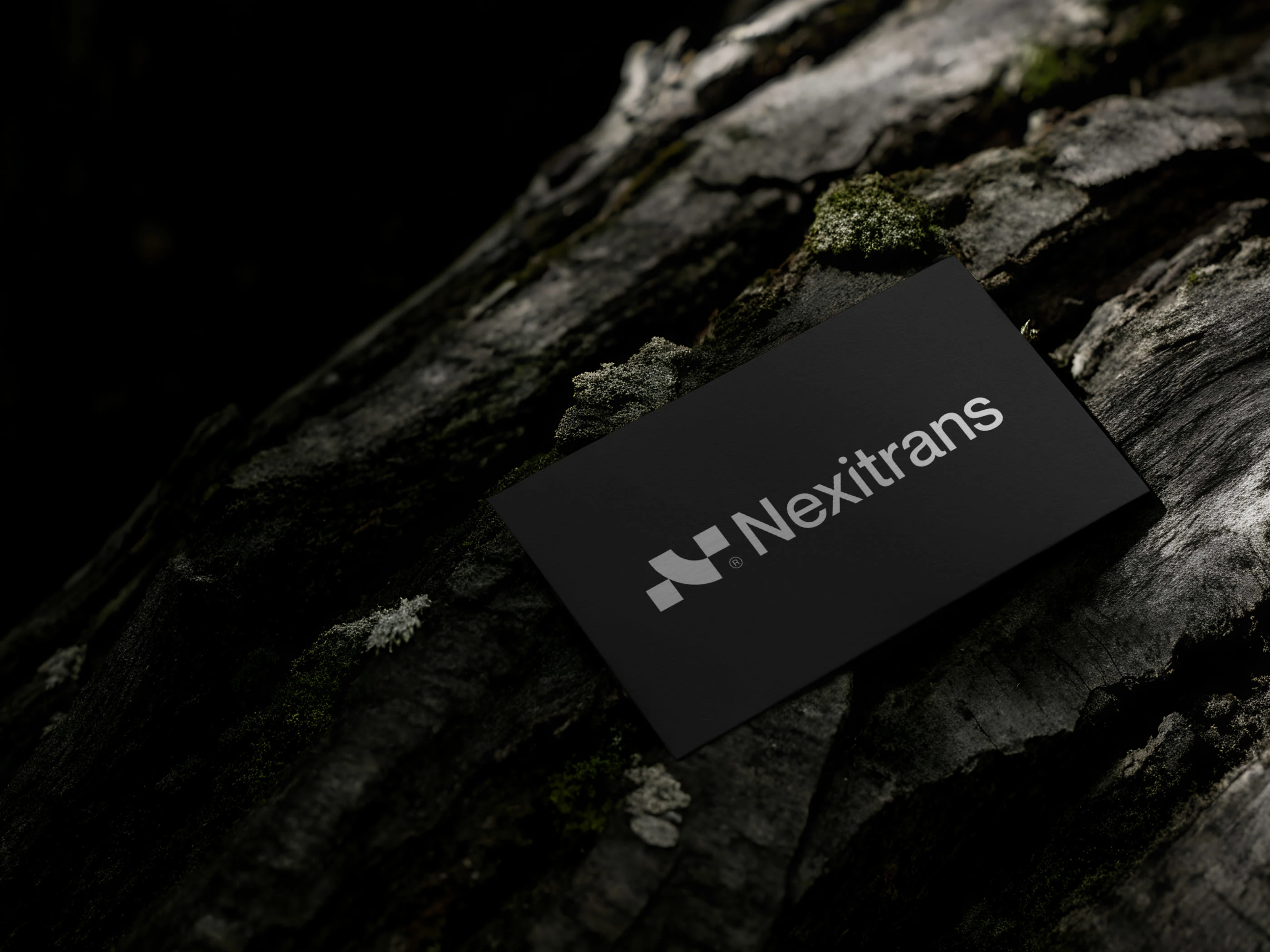
The logo, featuring a dynamic letter “N” (representing the company's initial), illustrates the path of a parcel (the Delivery Box element) as it travels, passing through elements like the Road/Transport curve and the Speed/Wave motif, from the point of departure to the recipient.
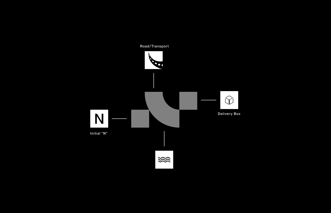
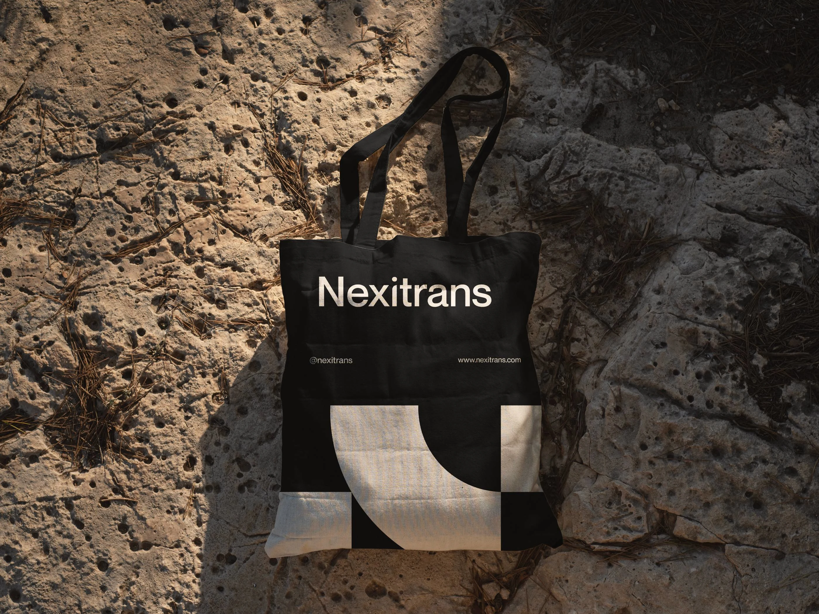
The central abstract shape, which suggests the flowing motion of the road and the initial “N,” is a minimalist yet expressive element of the visual identity, derived from the logo itself. It symbolizes the smooth, efficient movement of goods. When combined with the square elements, it unifies the entire identity system and highlights the core concept of a delivery journey. This is a truly creative transport logo design.
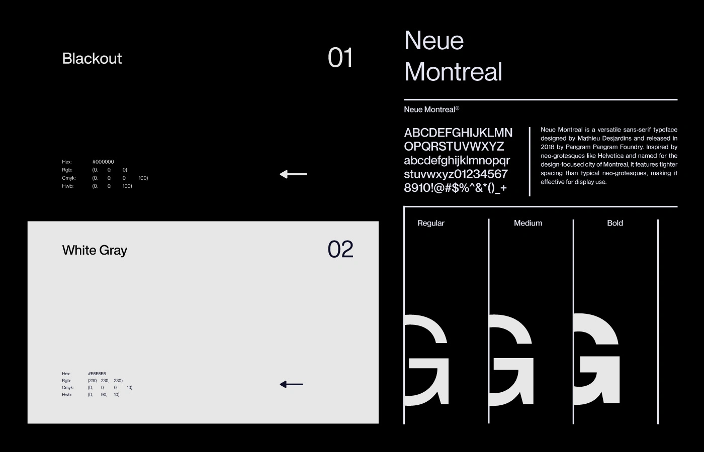

The visual system combines modern clarity with technological precision, taking inspiration from the history of logistics, making it an excellent example of transport company logo design and a strong transport brand Bag.
We have created an identity in which functionality acquires aesthetic value, and every detail is imbued with meaning and the atmosphere of the behind-the-scenes processes of logistics.


Like this project
Posted Apr 21, 2026
A company specializing in logistics solutions, Nexitrans offers comprehensive transportation and delivery services worldwide.