Monitoring Page Data Driven UX/UI Design
This project focused on creating a data-driven, user-centered design for a platform that transforms complex monitoring processes into an engaging, intuitive experience. By addressing the challenge of presenting detailed data in a compelling and interactive way, this design balances functionality and aesthetics, making intricate information digestible and actionable.
Design Approach
1. Data-Driven Design
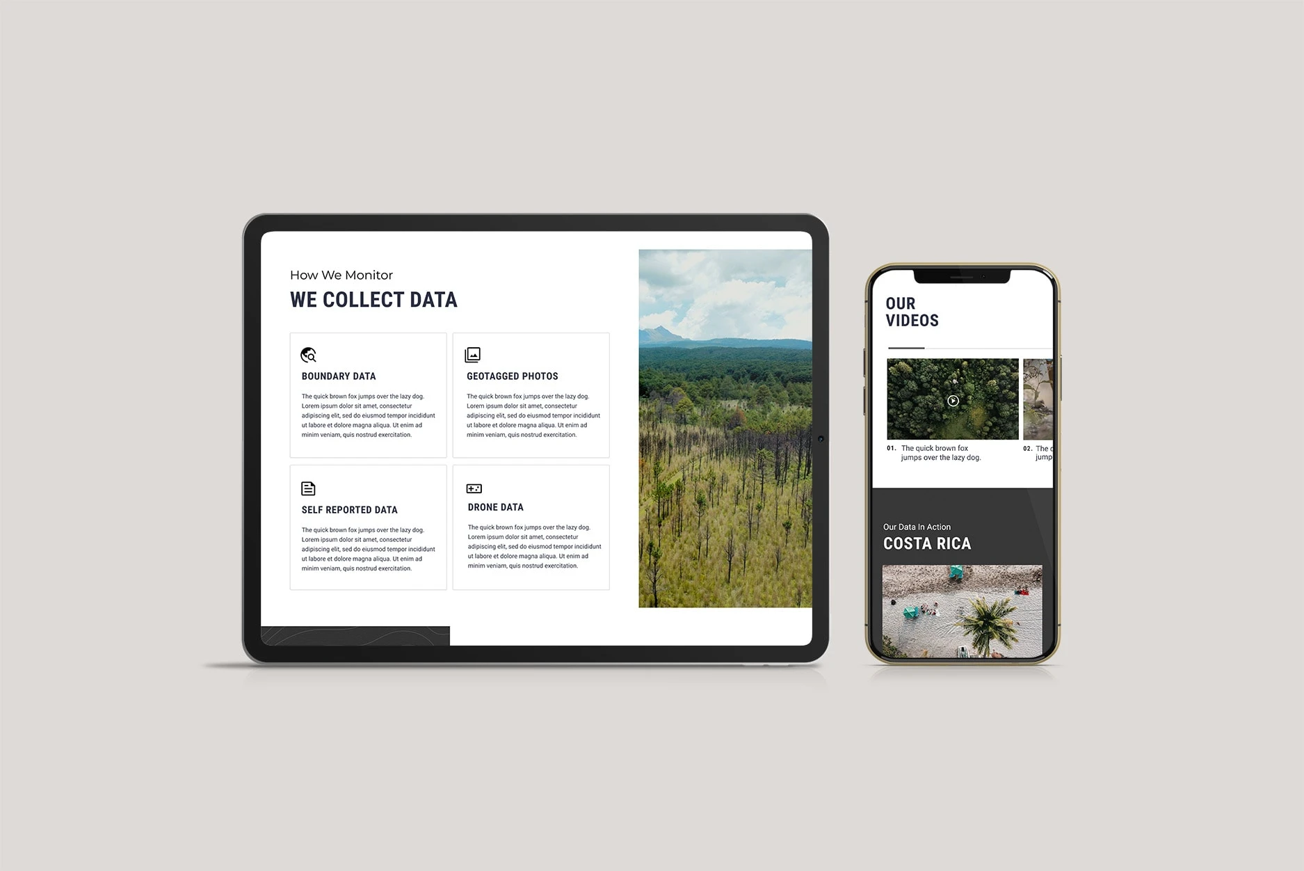
The platform leverages real-time data collection and visualization to provide users with actionable insights. Key data points such as boundary information, geotagged photos, and drone data are presented in a clean, modular layout, ensuring clarity without overwhelming the user. The design highlights the importance of context, seamlessly connecting visual elements like maps and project statistics with supporting text.
2. User-Centered Interaction
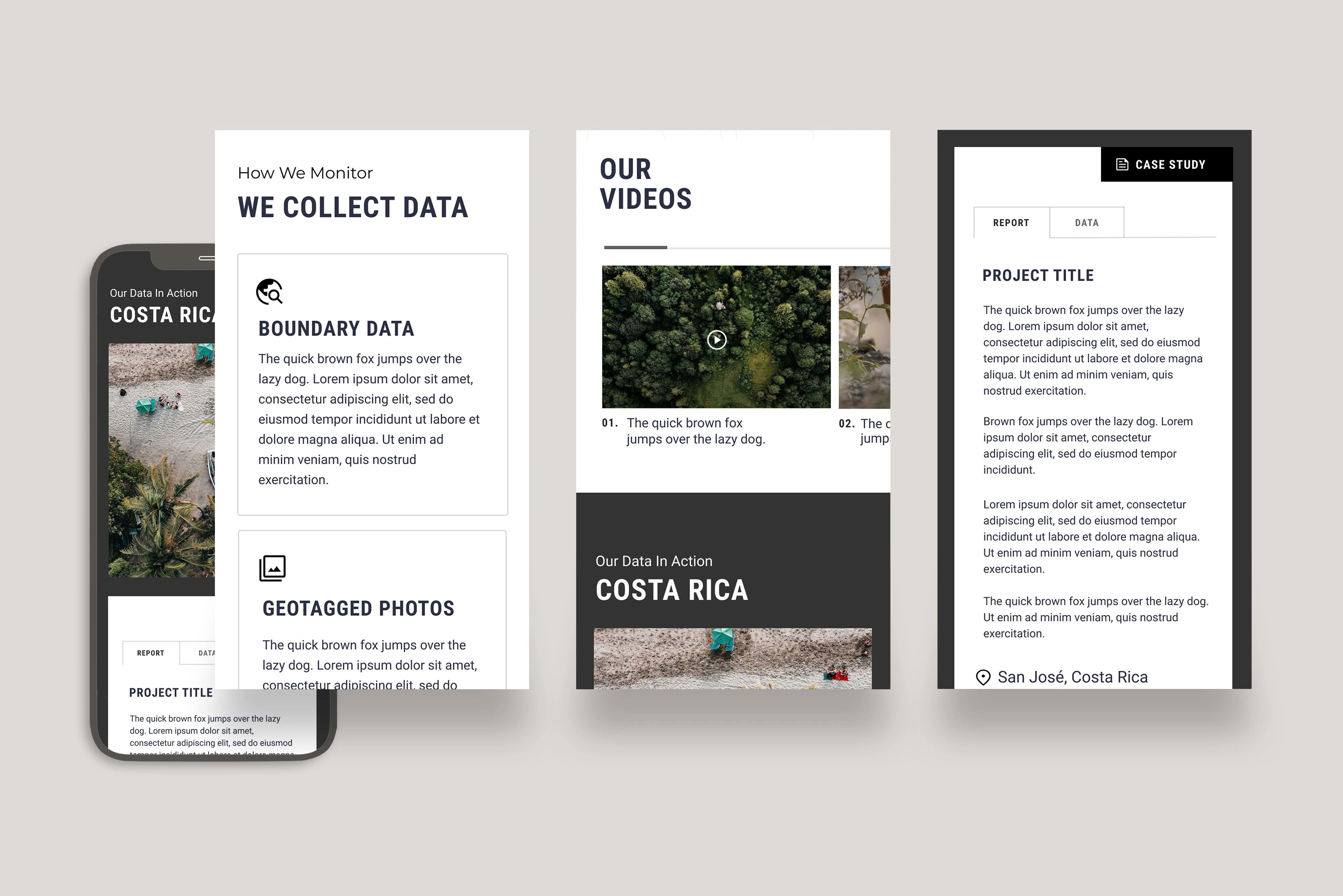
The user interface prioritizes accessibility and usability, accommodating both technical and non-technical users. Interactive components such as dropdown filters, clickable maps, and expandable content panels allow users to explore data at their own pace. By simplifying navigation and emphasizing clarity, the platform ensures users can efficiently access the information they need.
Innovative Solutions to Complex Layouts
Modular Card System
The platform’s layout organizes diverse datasets into modular cards, each presenting a distinct type of data, such as boundary details, drone imagery, and self-reported metrics. This approach creates visual hierarchy and improves the scannability of dense content.
Interactive Maps
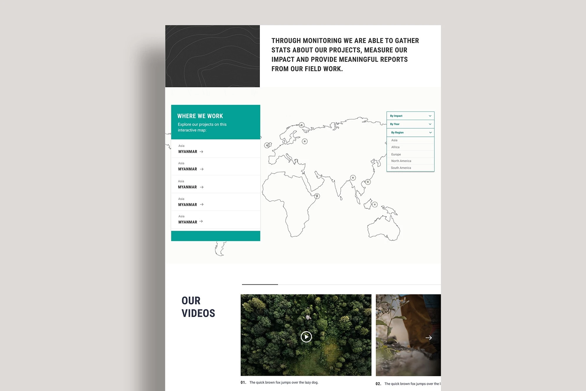
An interactive world map serves as a central feature, allowing users to filter projects by region, impact, and timeline. The map provides an engaging entry point to explore case studies and project data, enhancing user engagement and understanding.
Making Dry Data Compelling and Interactive
Visual Storytelling with Case Studies
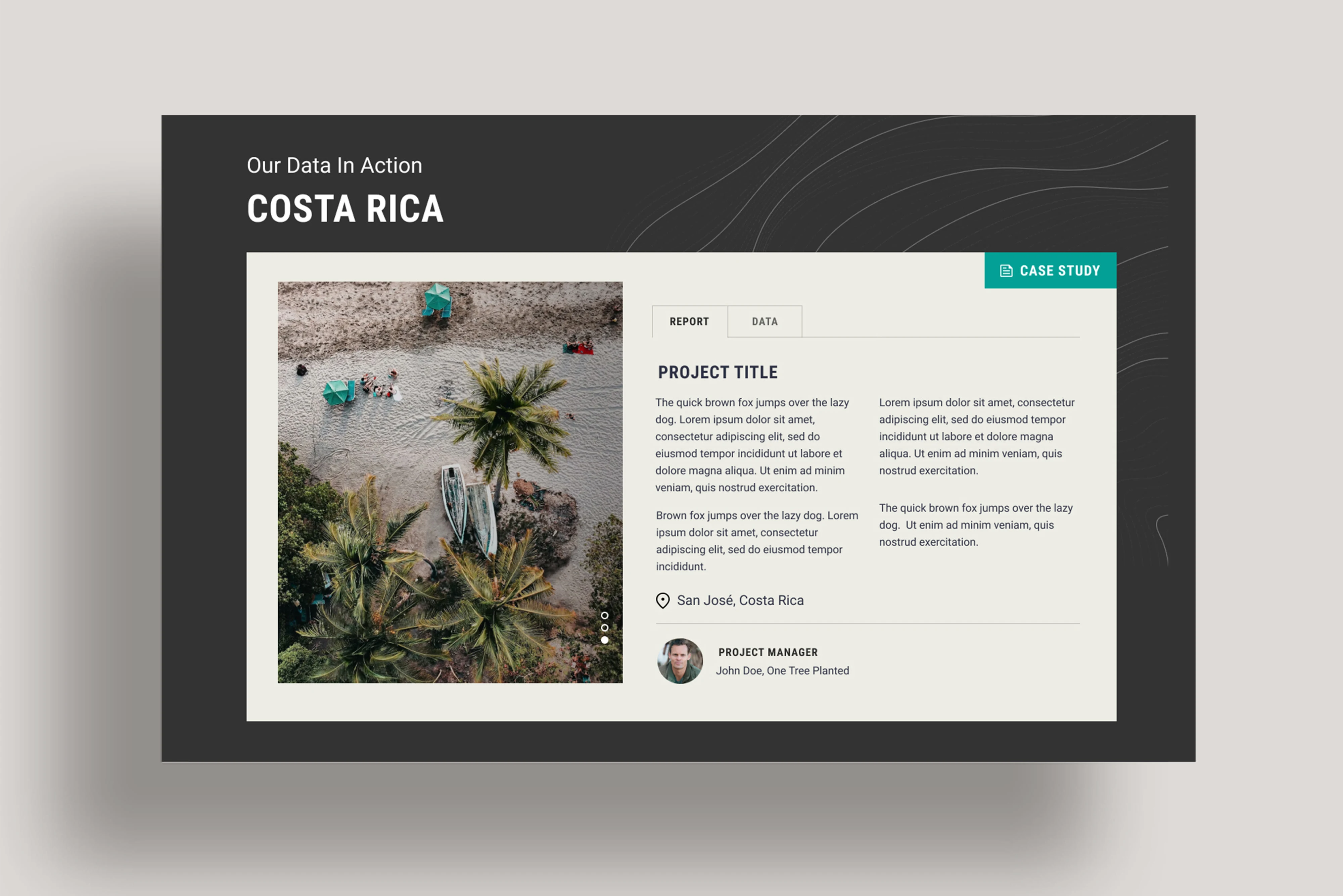
Case studies, such as the Costa Rica project, combine photography, project details, and manager profiles to humanize the data and tell a narrative. The inclusion of toggles for "Report" and "Data" views ensures that both qualitative and quantitative aspects are equally emphasized.
Engaging Video Content
A dedicated video section highlights on-the-ground activities, bringing data to life through dynamic visuals. By integrating multimedia elements, the platform maintains user interest while showcasing the scope and impact of the work.
Key Outcomes
This project exemplifies how thoughtful design can transform complex, data-heavy platforms into intuitive, engaging experiences. By combining interactive solutions, user-centric layouts, and visual storytelling, the design ensures that critical data not only informs but also inspires action.
Like this project
Posted Apr 19, 2024
A UX design meticulously crafted for a Shopify Plus website, aiming to transform extensive customer data into immersive and interactive visualizations.
Likes
0
Views
22

