BE IN THIS - Rebrand
Overview
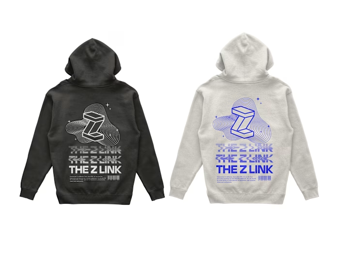
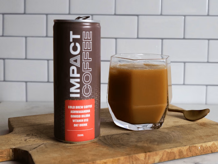
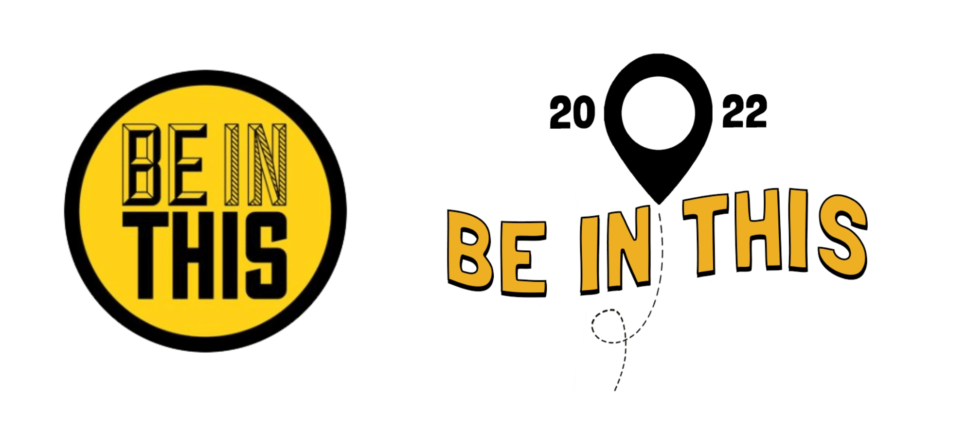
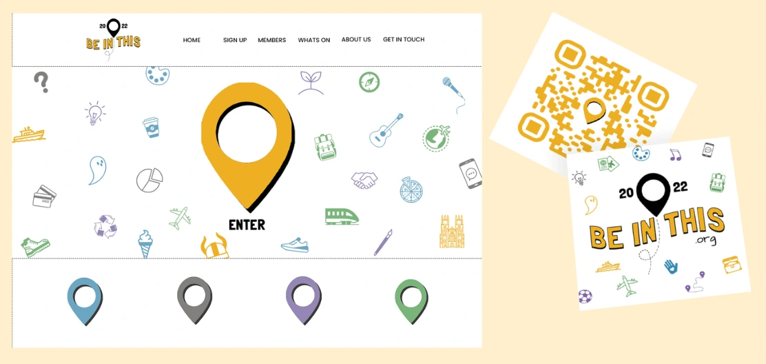
Be In This approached me as a start-up with limited branding, a logo they didn't like and a limited vocabulary for brand strategy and design. We sat down to discuss their vision for the company and what they wanted to capture with their branding. After creating a shared mood board and a few rounds of feedback we settled on a simplistic style with some clear iconography that signposted the community element of what they do and could be easily reused in future designs. We wanted to create a design that would grow with them, not age and resonate with their young audience.
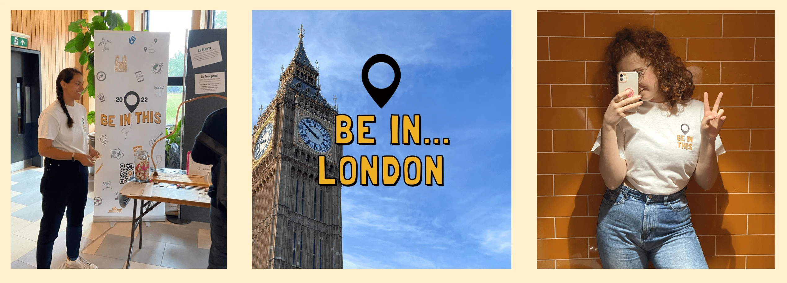
Jon and Natalie were very happy with the final designs and are now in the process or rolling this out across their website and prints.
Before & After
Results
Like this project
Posted Jan 13, 2023
208 Followers, 281 Following, 111 Posts - See Instagram photos and videos from BE IN THIS (@beinthis)
Likes
0
Views
16
