Built with Framer
Skogli digital brand and Framer website
Tom Sommerseth
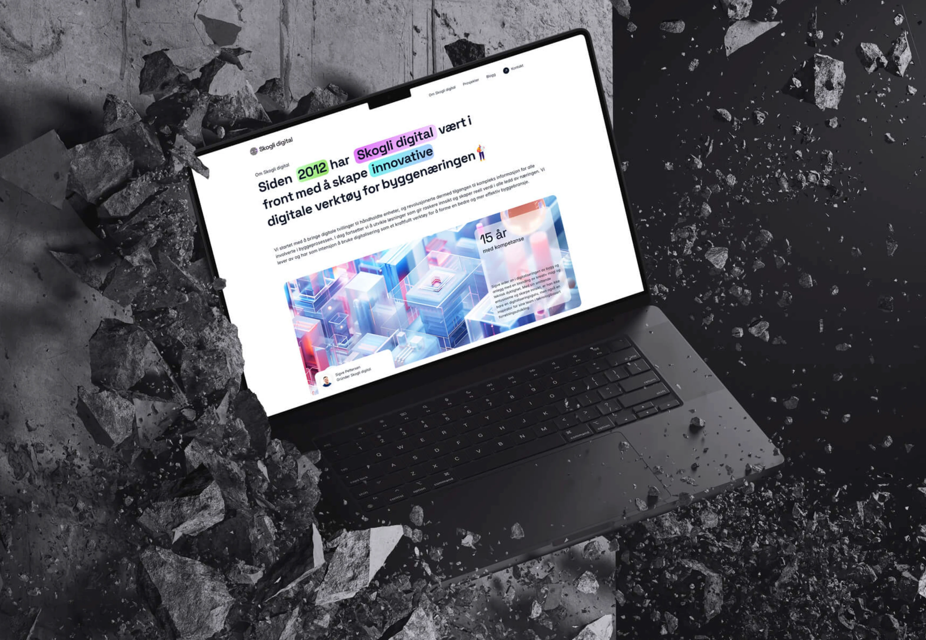
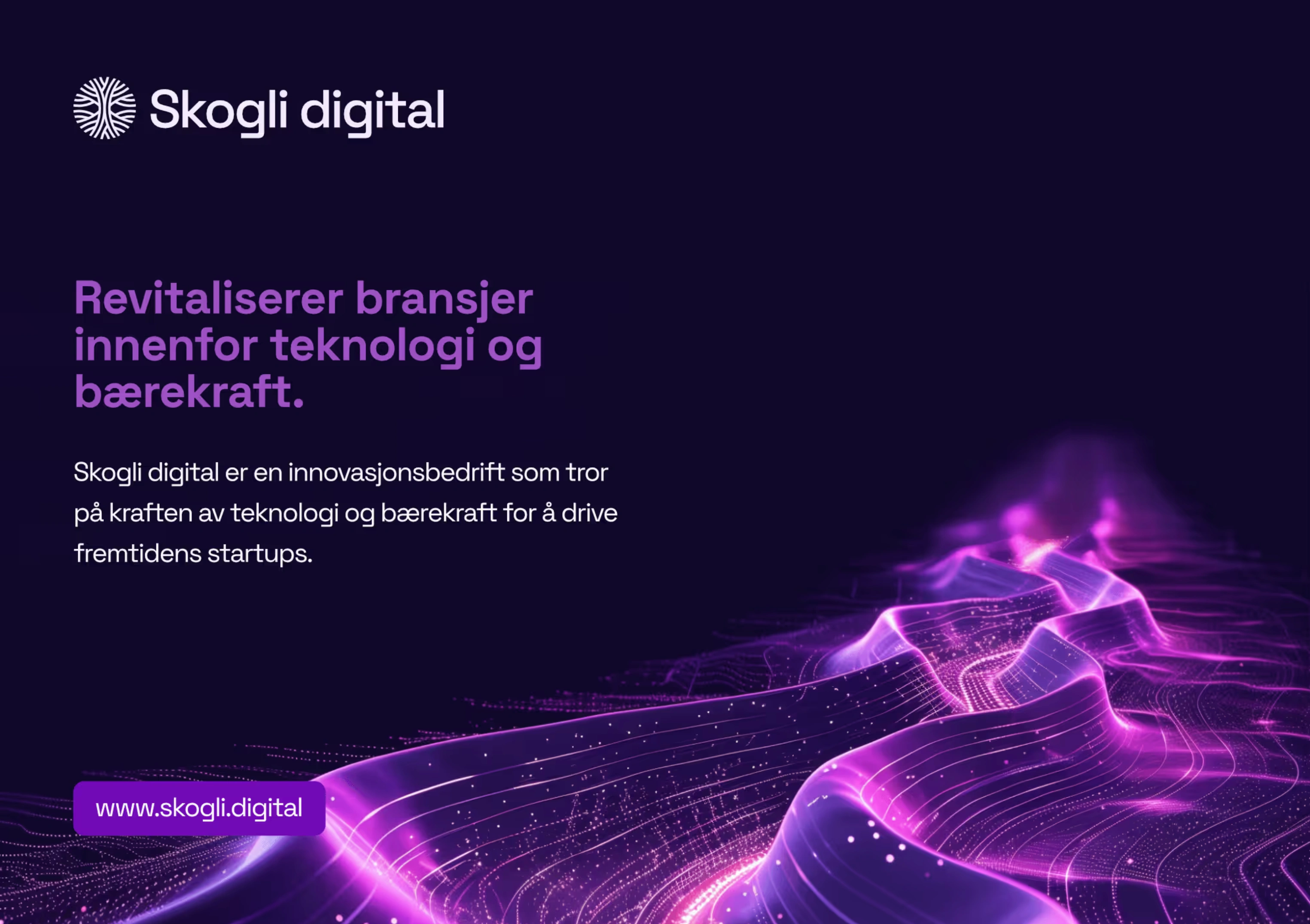
With clients such as NMBU, Helse Sør-Øst, Fremby, and the Directorate for Building Quality, Skogli Digital ensures thorough processes that deliver documented results. The logo design reflects the connection to digital twins, growth, and innovation. This concept is also integrated into the visual language, typography, and modern UI/UX animations.
This project also marks our first delivery on the Framer platform. After extensive experience with Webflow, we wanted to explore this innovative tool. Framer has impressed us with its intuitive approach to website building, offering comprehensive design, functionality, and animation capabilities—almost like an enhanced version of Figma.
We look forward to continued collaboration with Skogli Digital in the years to come.
Graphics from the release and Pitch slides
The visual identity is based on a deep purple primary color. To emphasize the concept of digital twins, the design system allows for the use of high-contrast colors tailored to different communication needs and target audiences.
The complete design manual is compiled in Notion, where the client has easy access to:
• Logo in various formats
• Color palette with codes
• Templates for different uses
• Presentation materials in Pitch
• Visual elements in Figma for social media
The website stands out with innovative micro-animations that break away from traditional design patterns. This creative approach results in a unique and engaging user experience.
Thank you for the trust in exploring new design possibilities and creating something unique for Skogli Digital.
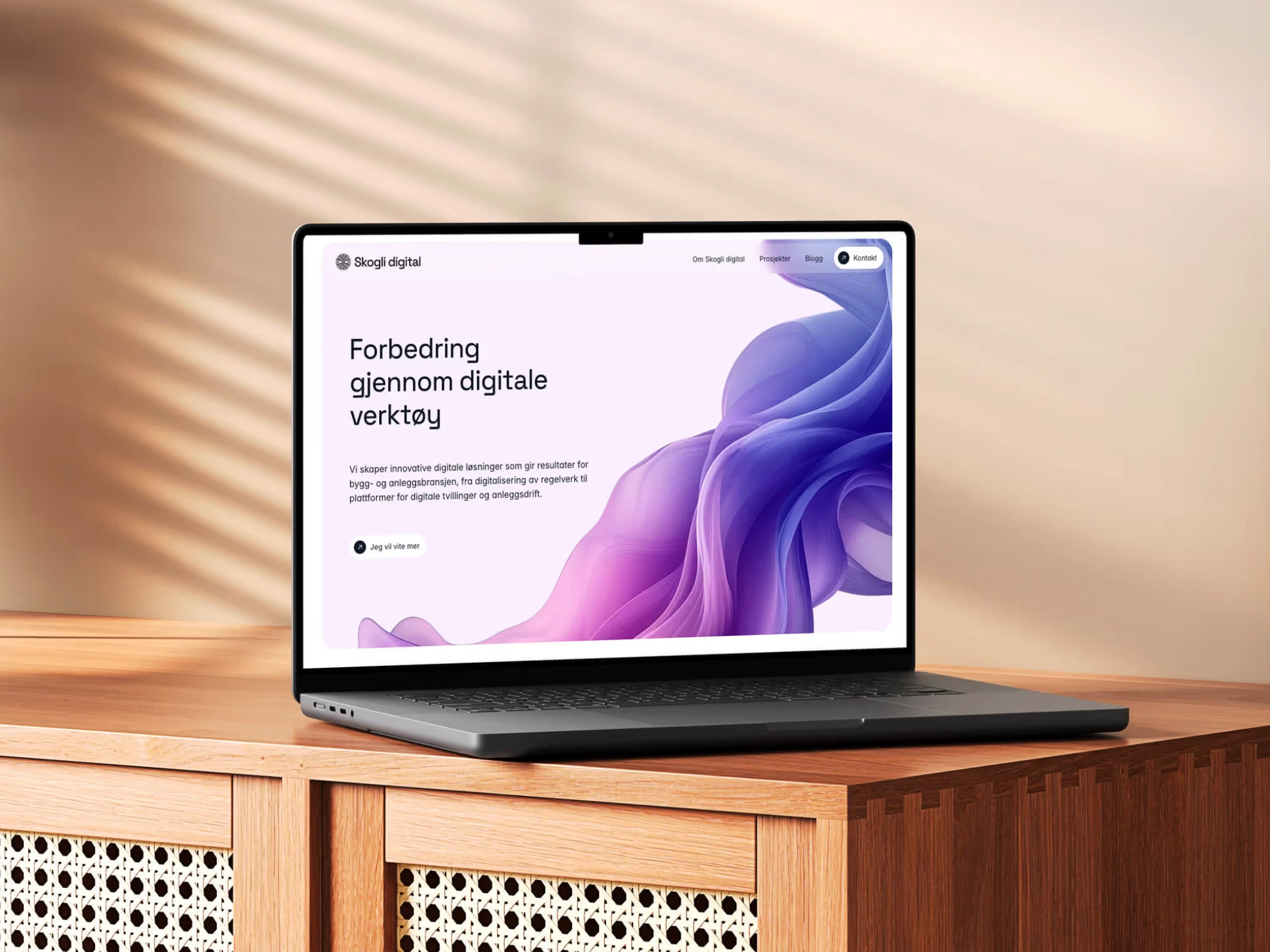
Screenshot of the website
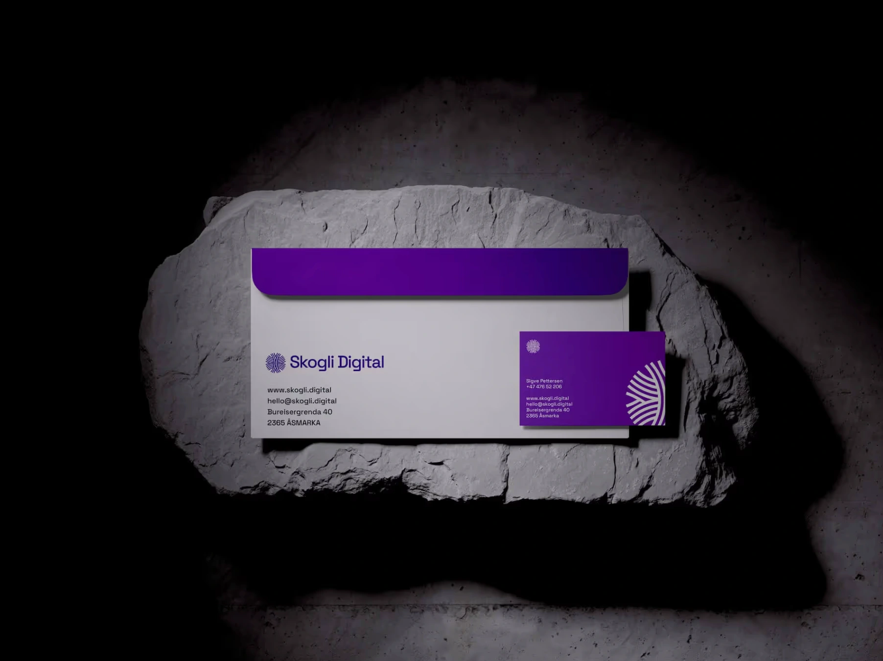
Stationery. Envelope and business card
Like this project
Posted Dec 2, 2025
I developed logos, illustrations, presentation materials, and Framer website for Skogli Digital.