Interior Architecture Portfolio
Bartosz Roszak
Project Overview
This portfolio design was created as part of an Interior Architecture Diploma project, aimed at showcasing the work and conceptual approach to spatial design. The challenge was to produce a portfolio that not only effectively presented the architectural projects but also conveyed the journey through the design process in a cohesive and engaging manner.
The primary challenge for this project was to create a print portfolio that would stand out among other portfolios while maintaining a professional and minimalist aesthetic. The portfolio needed to be functional, user-friendly, and seamlessly organize content that spanned several projects, each with its unique characteristics. Additionally, the design had to accommodate the tactile nature of print, allowing the viewer to easily navigate between projects and understand the relationship between each section.
The issue was also how to incorporate the interior architectural theme into the design without overwhelming the visual identity with too many elements. The goal was to make the design feel spacious and organized, much like an interior space itself, without the design becoming distracting or too complex.
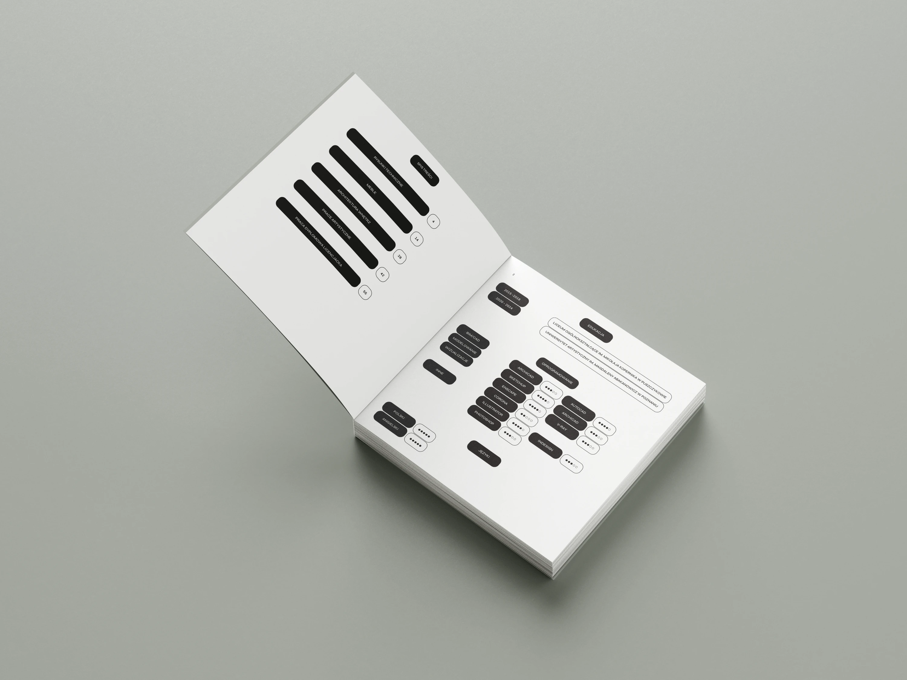
The solution was based on a minimalist approach with muted colors to evoke a sense of calm and focus, reflecting the quiet elegance often found in architectural interiors. The color palette was deliberately neutral, utilizing shades of grey, to ensure that the design did not overshadow the content but rather complemented it.
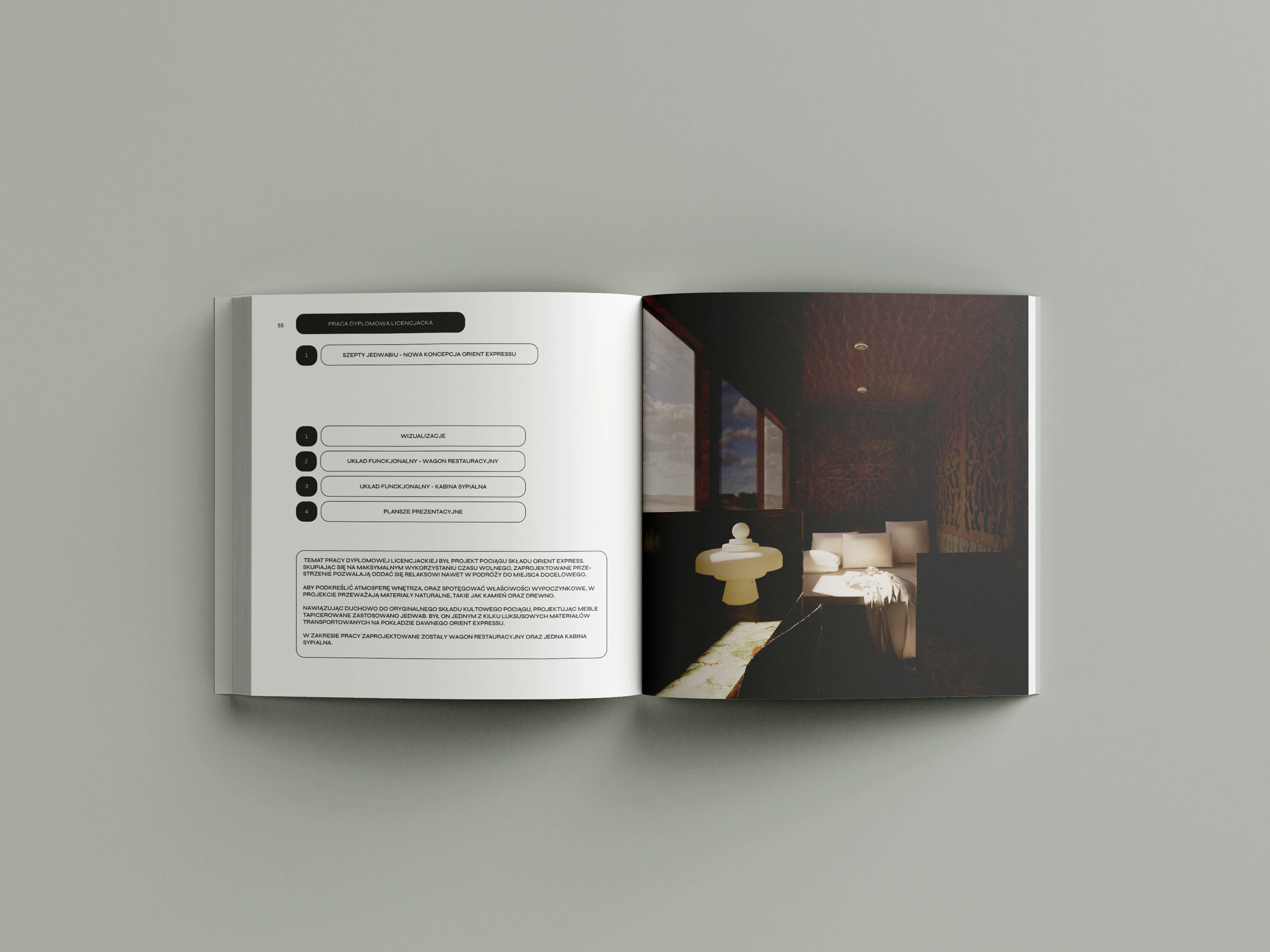
A key aspect of the design was the implementation of an indexing system inspired by "you are here" signage. This navigation system helped guide the viewer through the portfolio in a way that mimicked the experience of walking through an architectural space.
Each section was clearly marked with simple, intuitive symbols or icons that referenced architectural elements such as doorways, paths, and rooms. This not only helped break the content into digestible sections but also provided a cohesive flow through the portfolio, enabling the reader to easily orient themselves and navigate the projects.
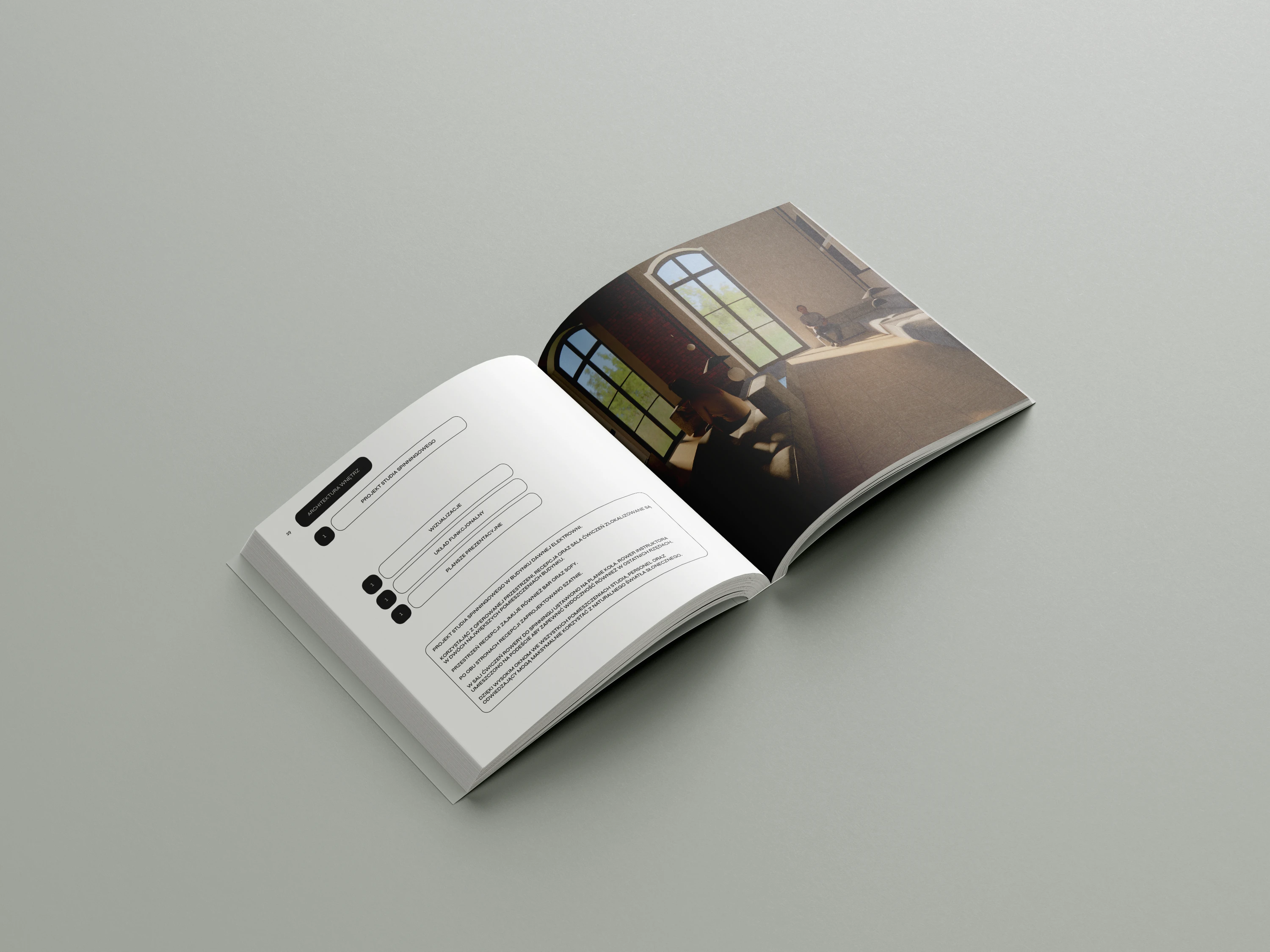
The use of large, full-page photographs of the projects allowed for a visual connection to the spaces while leaving room for concise explanations and conceptual descriptions. The typography was chosen for its readability, with clean, sans-serif fonts that supported the overall minimalist feel of the portfolio.
Outcome
The final portfolio was well-received for its clarity, organization, and effective use of design principles to communicate the architectural journey. The muted color scheme allowed the content to be the focal point, while the indexing system provided a visual roadmap, ensuring the reader could navigate the projects with ease. The print quality was carefully considered, using textured paper to add a tactile element to the experience, reminiscent of the physicality of architecture itself.
Like this project
Posted Apr 24, 2025
Print design for interior architecture portfolio - a university diploma project.