
THREE COLOUR SYSTEM — Cross-Category Visual Direction
A visual identity study exploring how one restricted colour palette can move consistently across fashion, product, interiors and advertising.
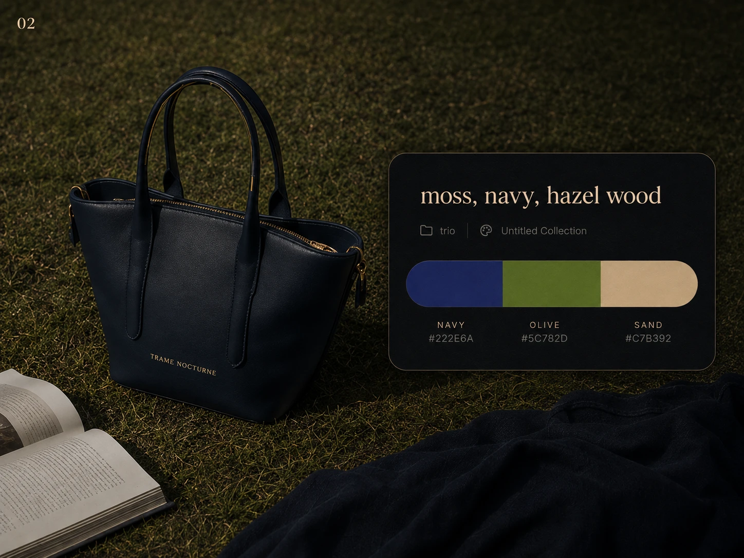
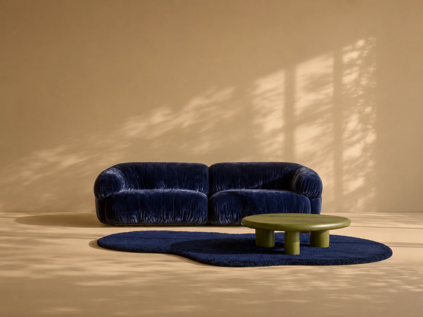
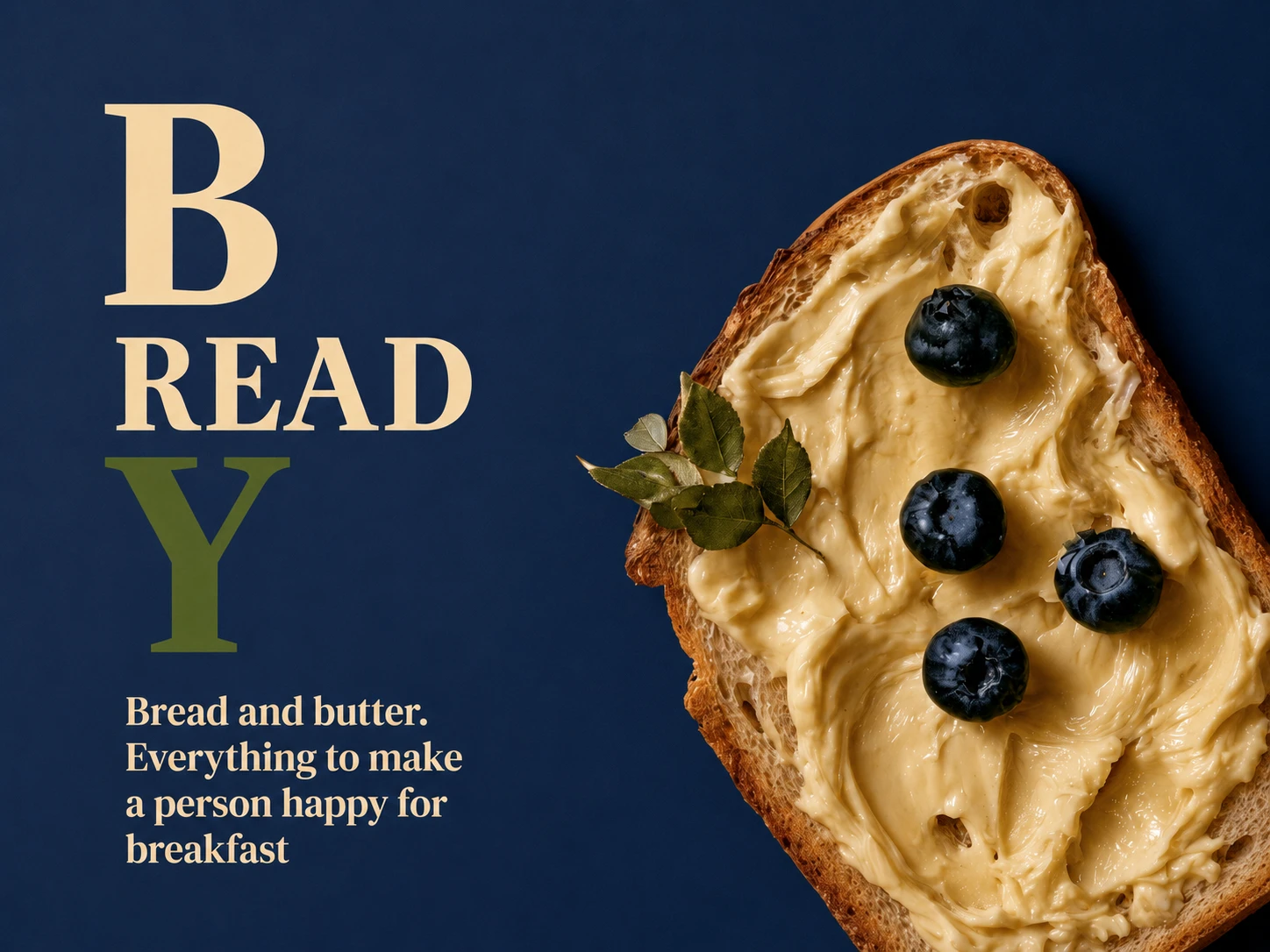
OBJECTIVE: Build a coherent visual universe using only three dominant colour families — navy, olive and sand — across multiple creative categories.
The project demonstrates how colour direction can maintain brand recognition even when subject matter, scale and visual format change.
VISUAL DIRECTION:
NAVY provides depth, structure and visual authority.
OLIVE introduces an organic, slightly unexpected counterpoint.
SAND softens the system through warmth and neutral space.
Rather than repeating the same composition, the palette becomes the connecting element between fashion portraits, accessories, interiors and advertising imagery.
Self-initiated visual direction study created to demonstrate cross-category campaign thinking.

0 likes · 0 views · Aug 18, 2026
THREE COLOUR SYSTEM — Cross-Category Visual Direction A visual identity study exploring how one restricted colour palette can move consistently across fashio...
Timeline
Aug 3, 2026 - Aug 5, 2026


