Offensive Bias - Music Project Logo
Cataldo Cappiello
Offensive Bias is a progressive metal / electronic / math project, taking inspiration from many eclectic artists in the contemporary music scene.
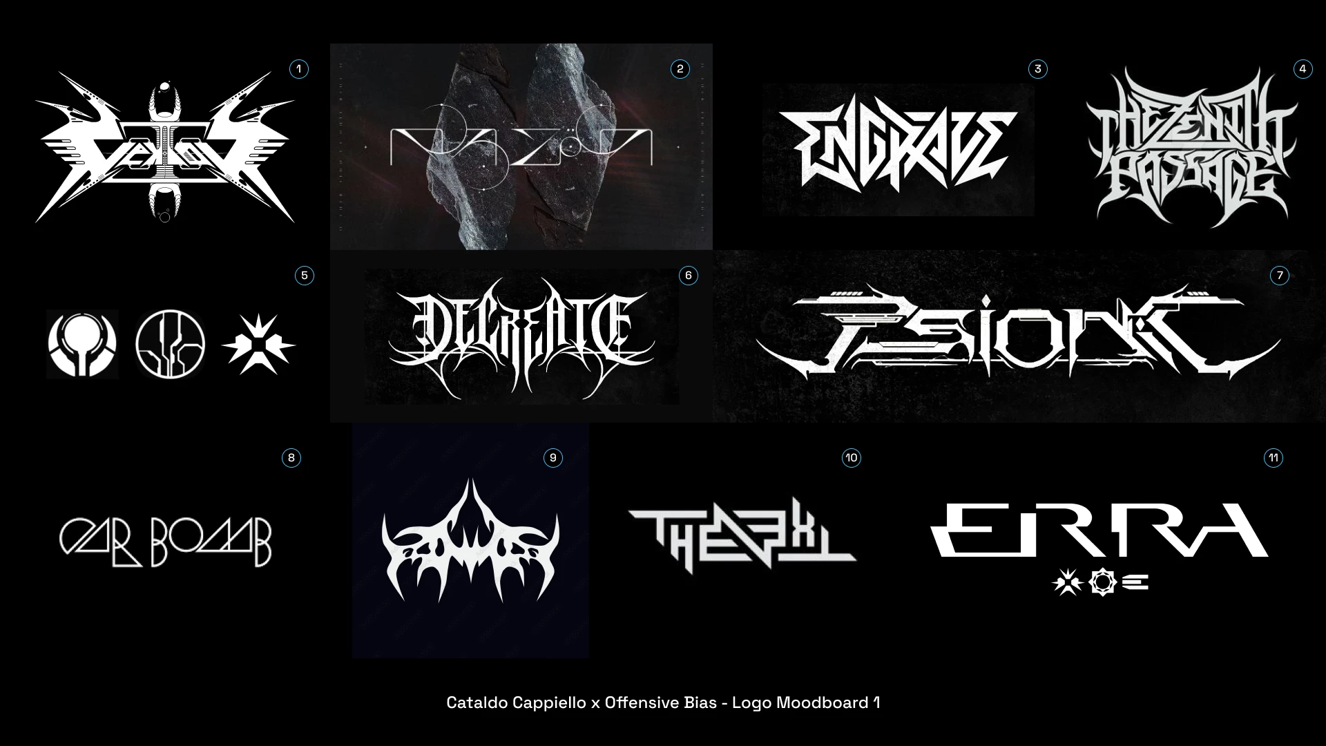
I was briefed to design a logomark for the project. So, as I often do, I started by laying down a moodboard. The client also provided some elements for this first moodboard, which helped me to better understand their idea.
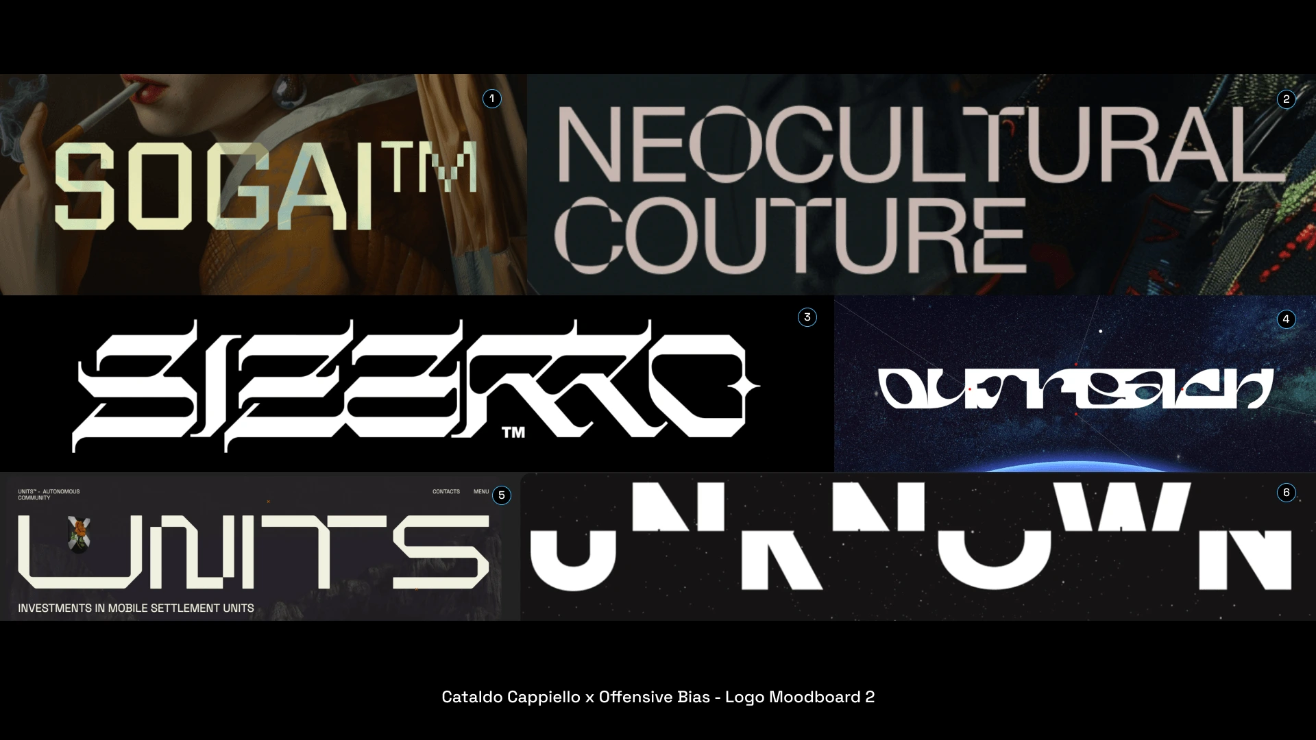
After showing the first moodboard to the client, it became clear that the direction we needed to take had to been cleaner, more geometric, and futuristic. So I came up with a second moodboard.
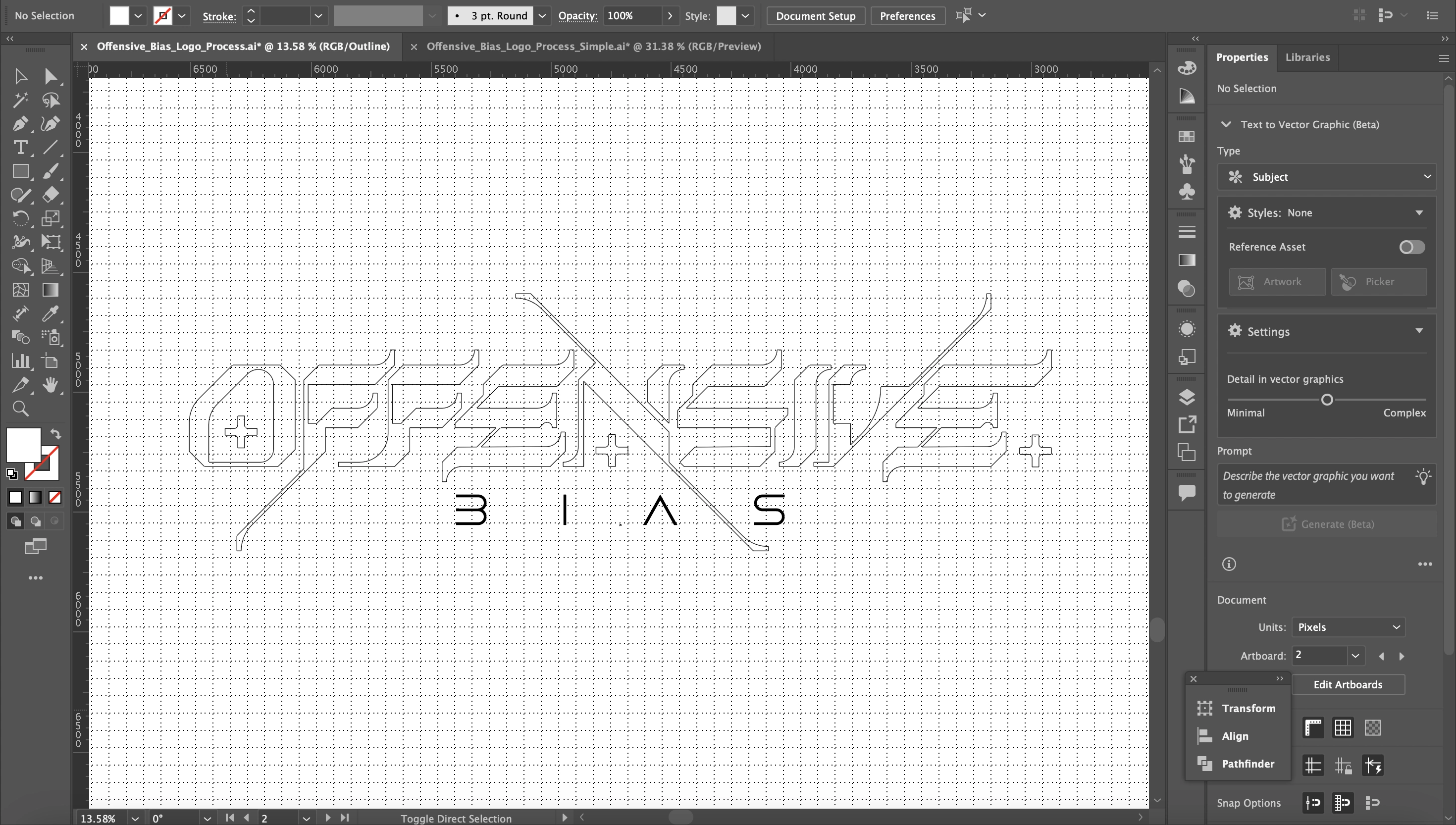
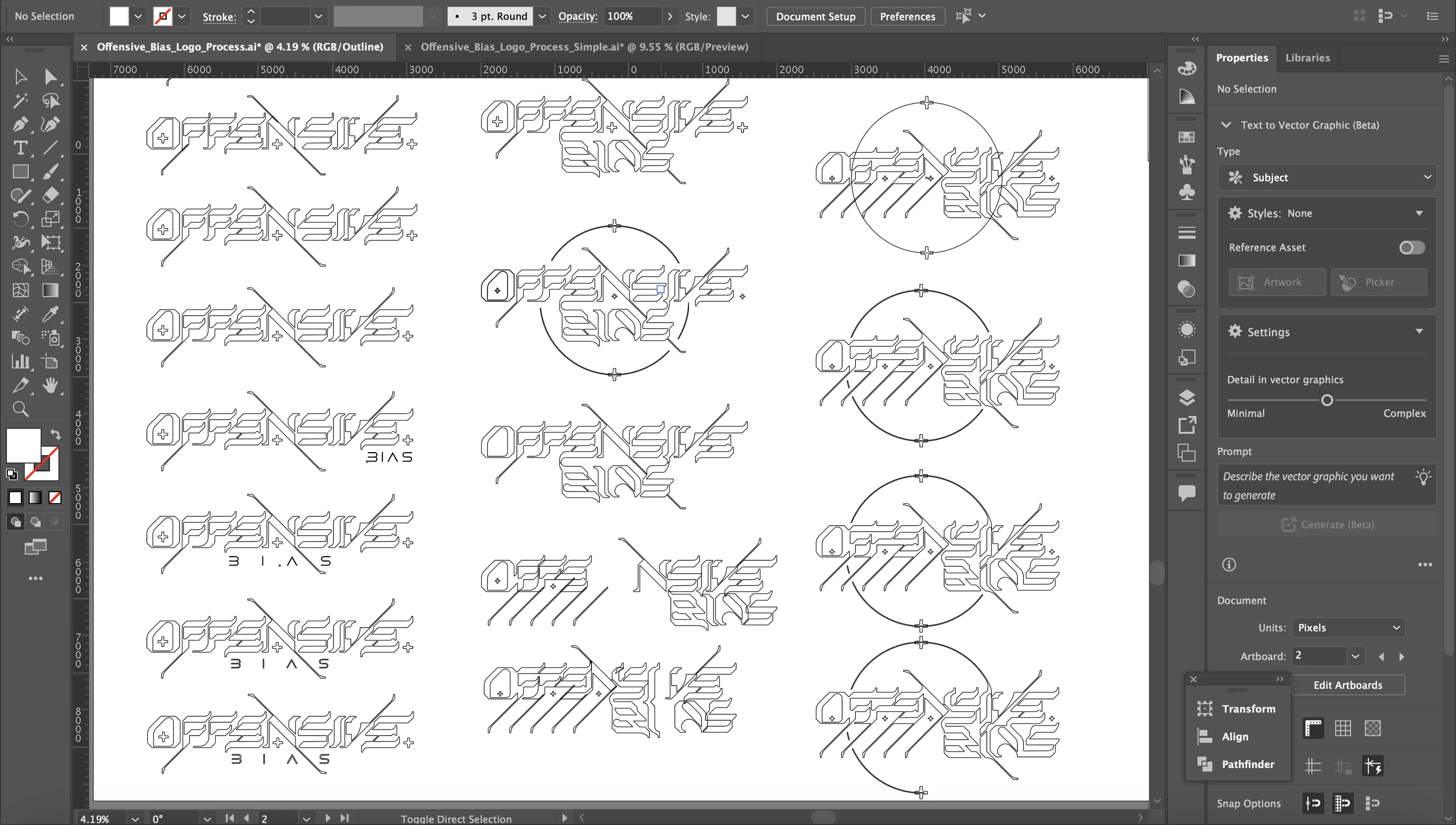
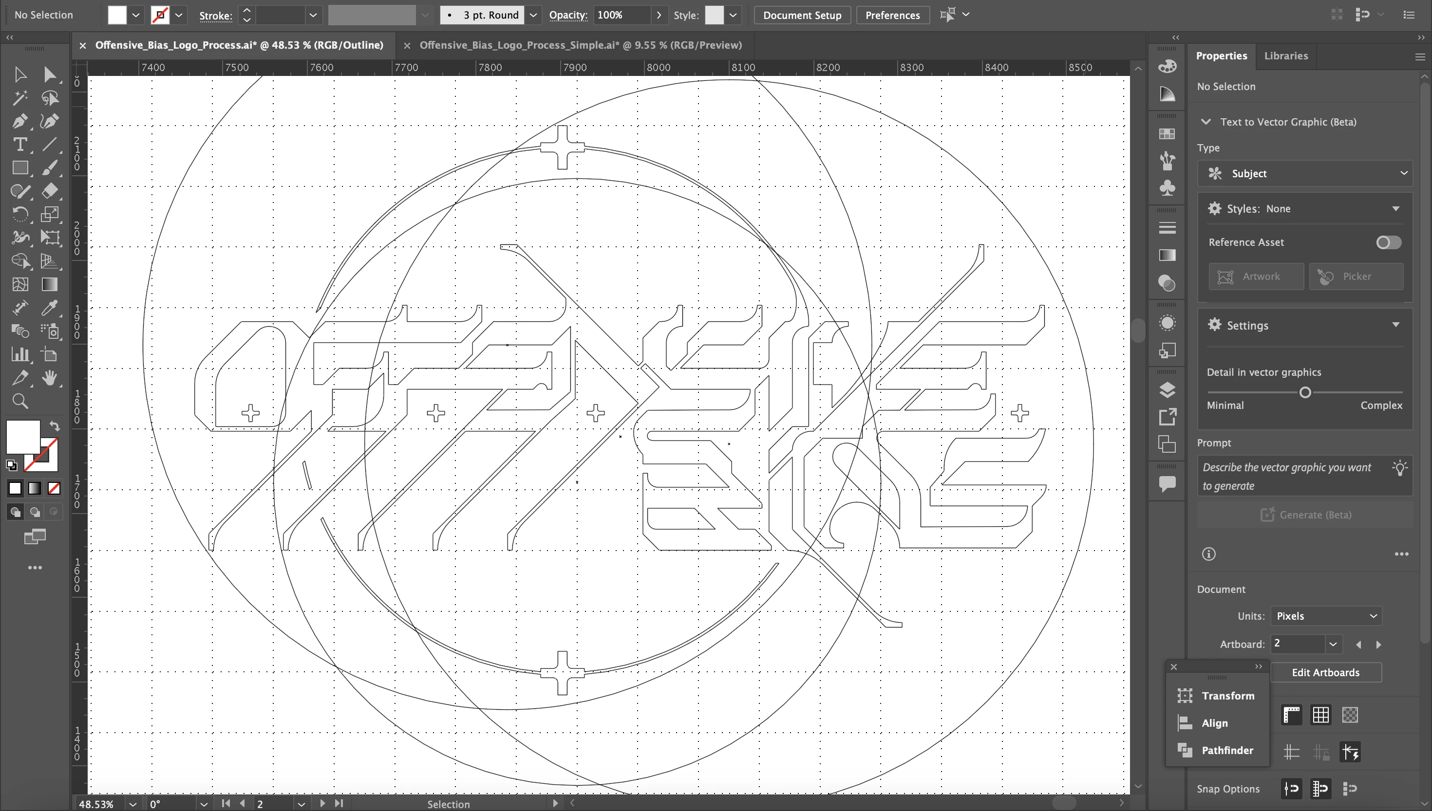
From there, I started working on the logo's structure, which combined the graffiti aesthetic with a more sci-fi look. Each step is fully hand-made, as I didn't start from a pre-existing font.
Eventually, the iteration process yielded the first version of the logo, which was submitted to the client in order to understand how close we were to their taste.
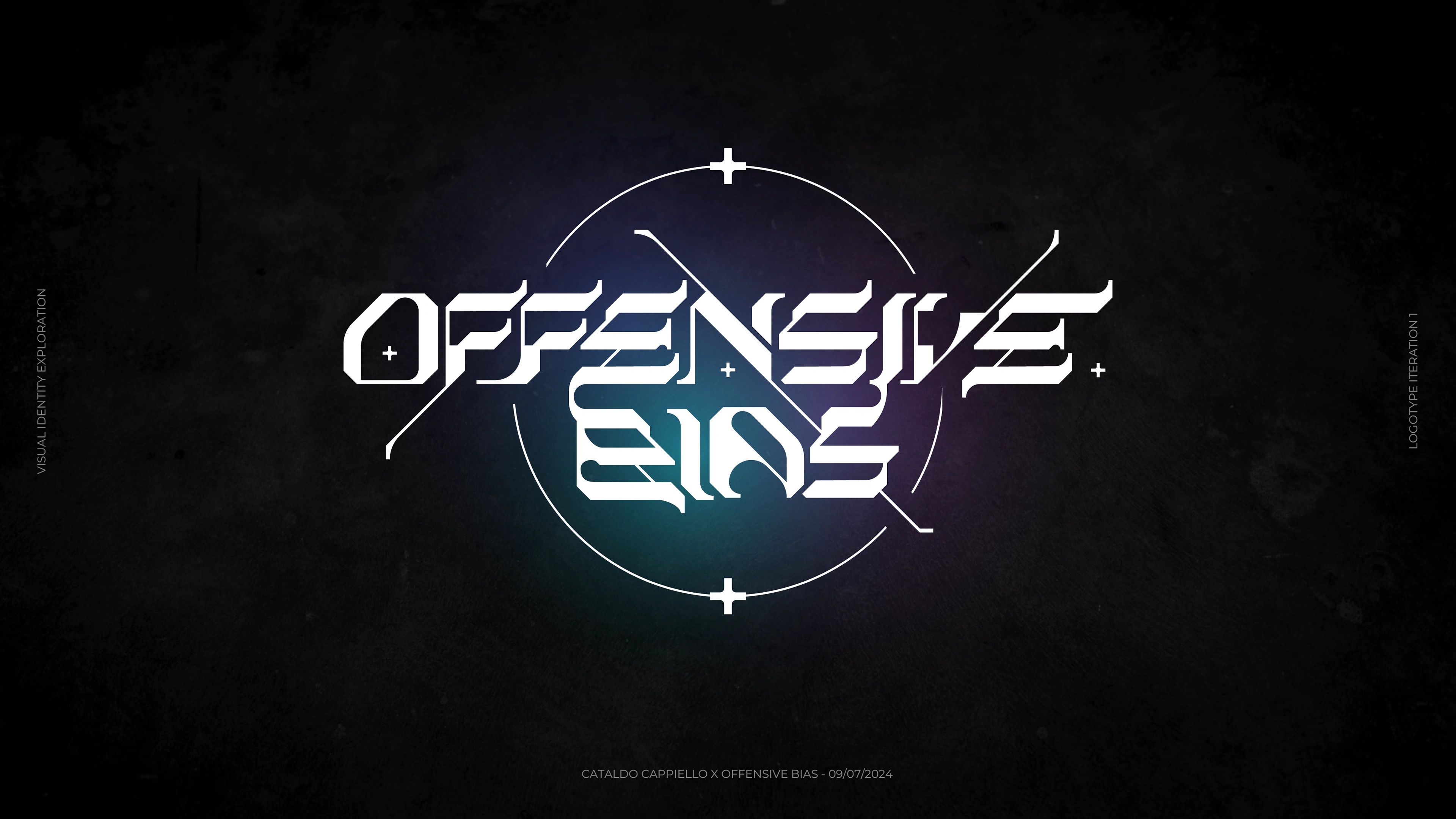
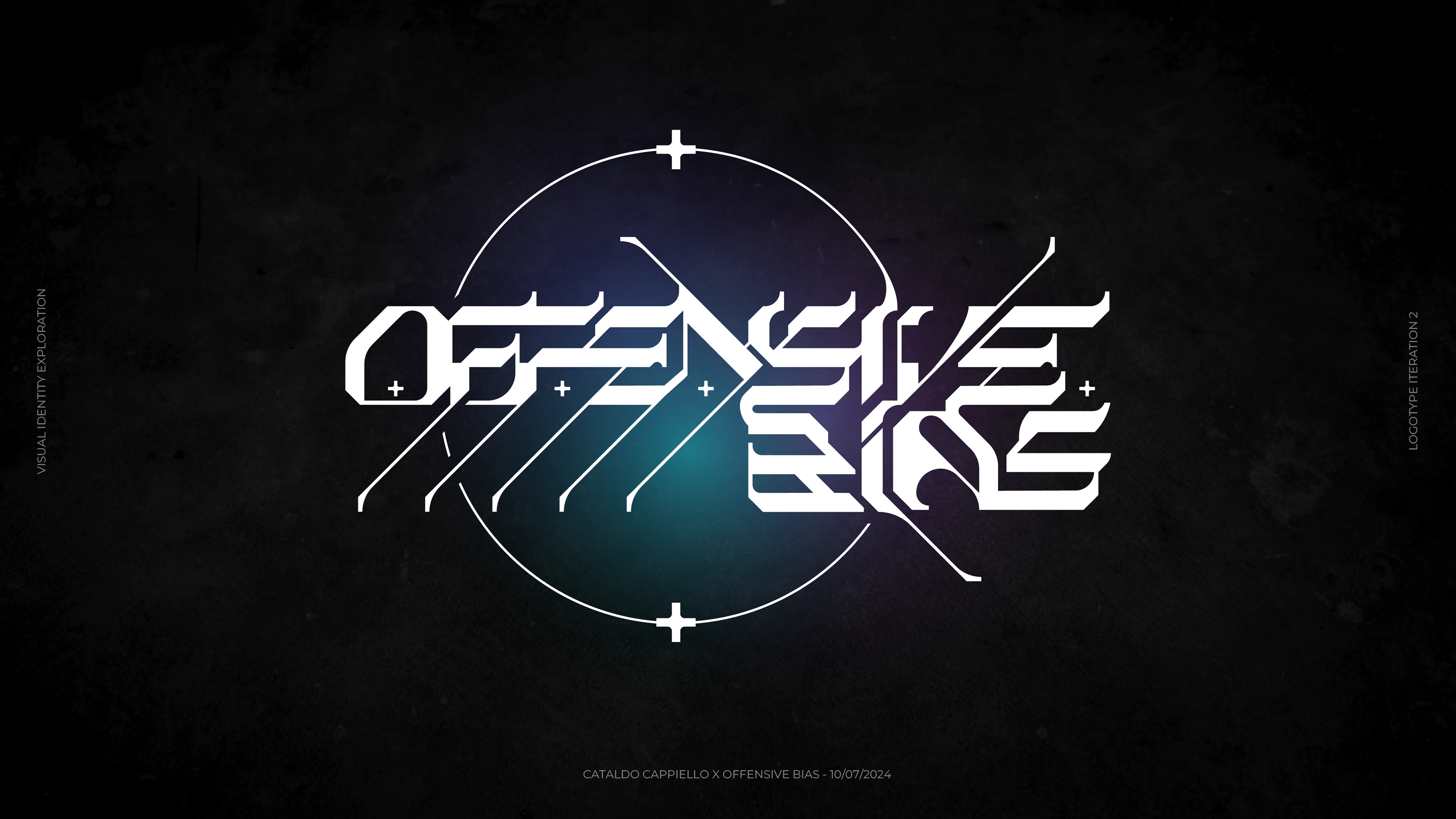
An alternative version was provided, where the + element was used as a crosshair, nodding to the "Offensive" part of the band's name. (Ballistic offensive?)
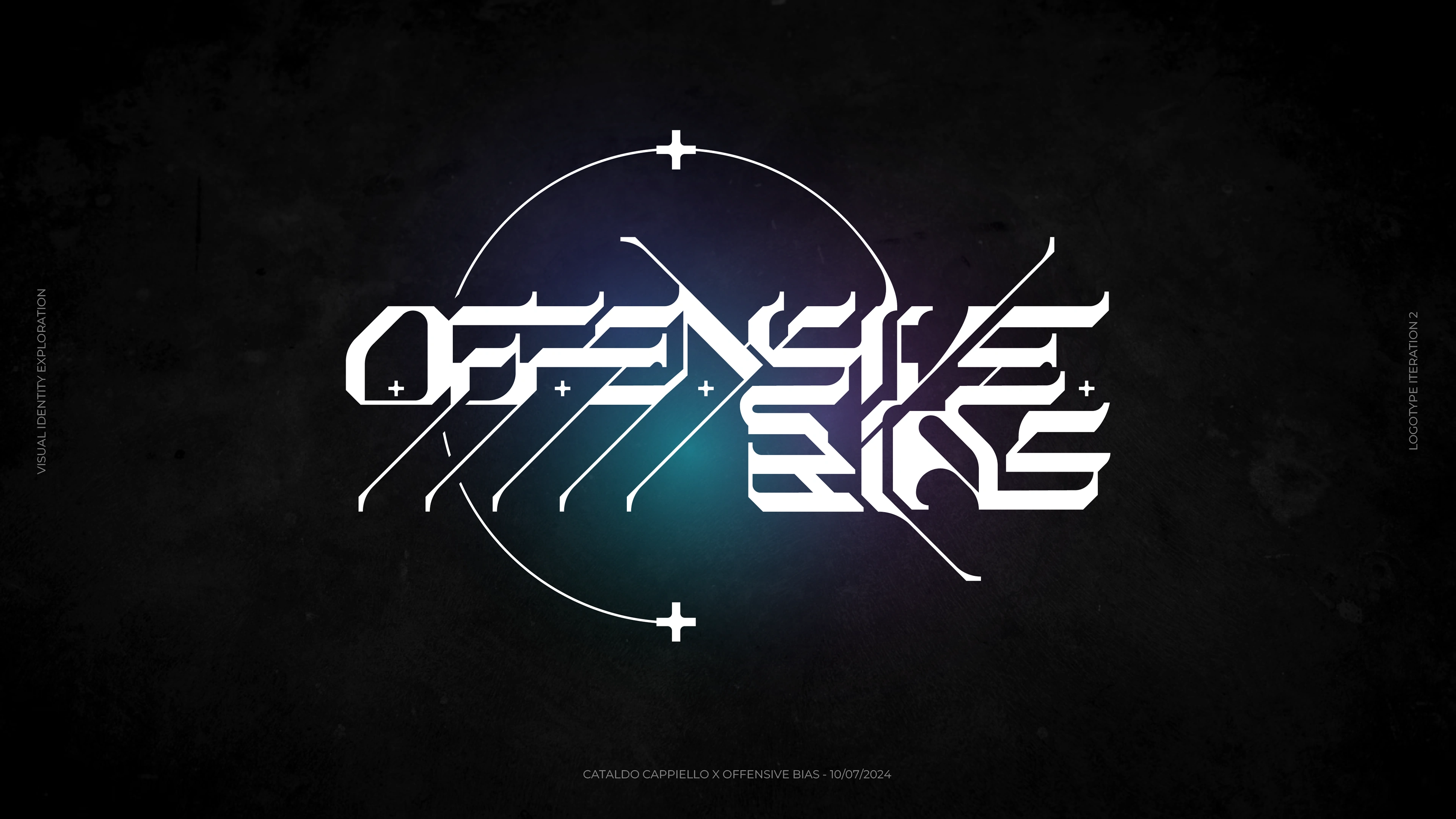
At this point, the client was quite satisfied, but felt that the logo was too symmetrical for their music. For an angular, unpredictable sound, an asymmetrical logo was in order. This kickstarted the second phase of the iteration process.
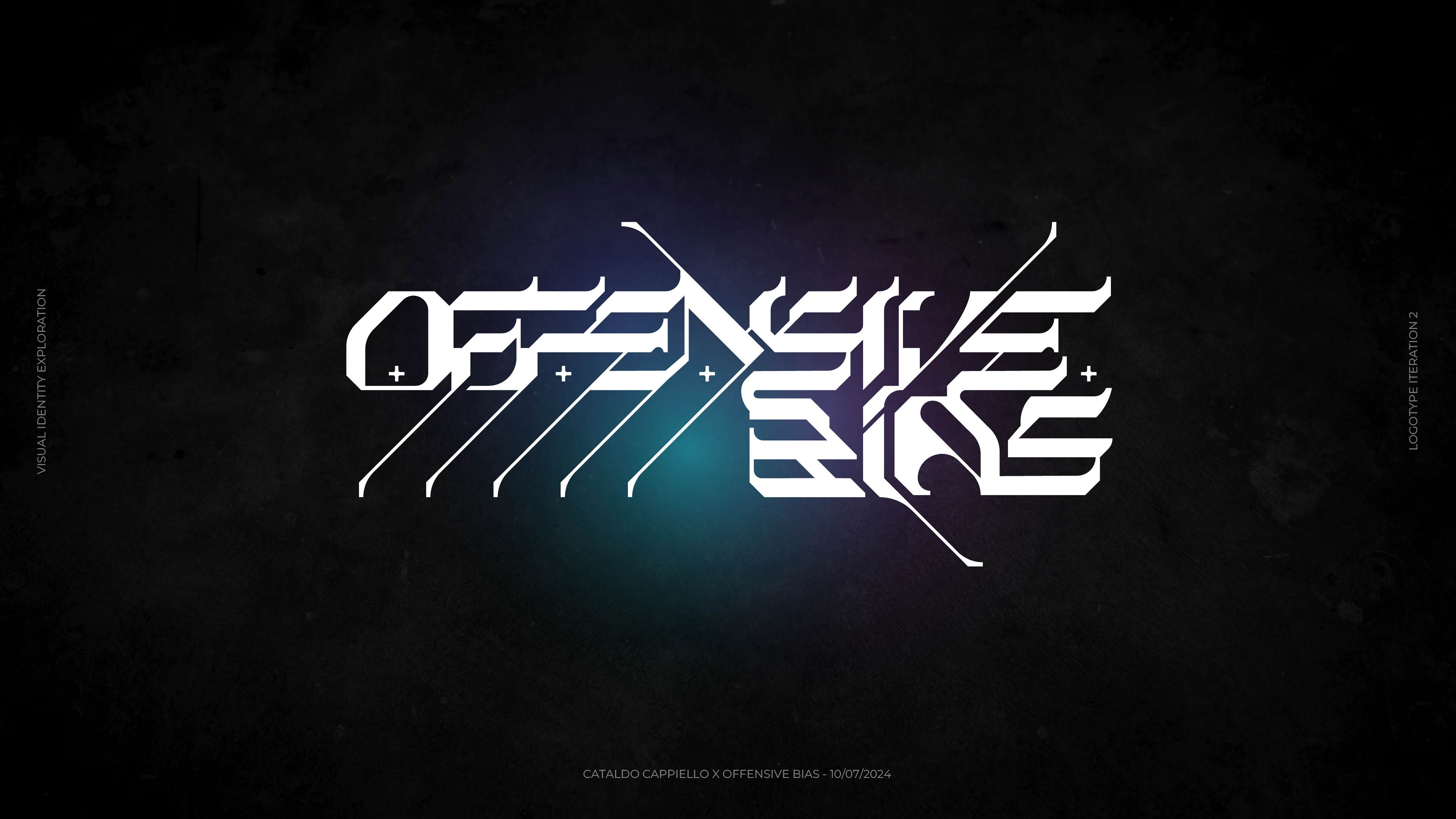
We eventually landed on a right-aligned solution, counterbalanced by diagonal elements. In addition to this, I've provided more options, which are displayed below.

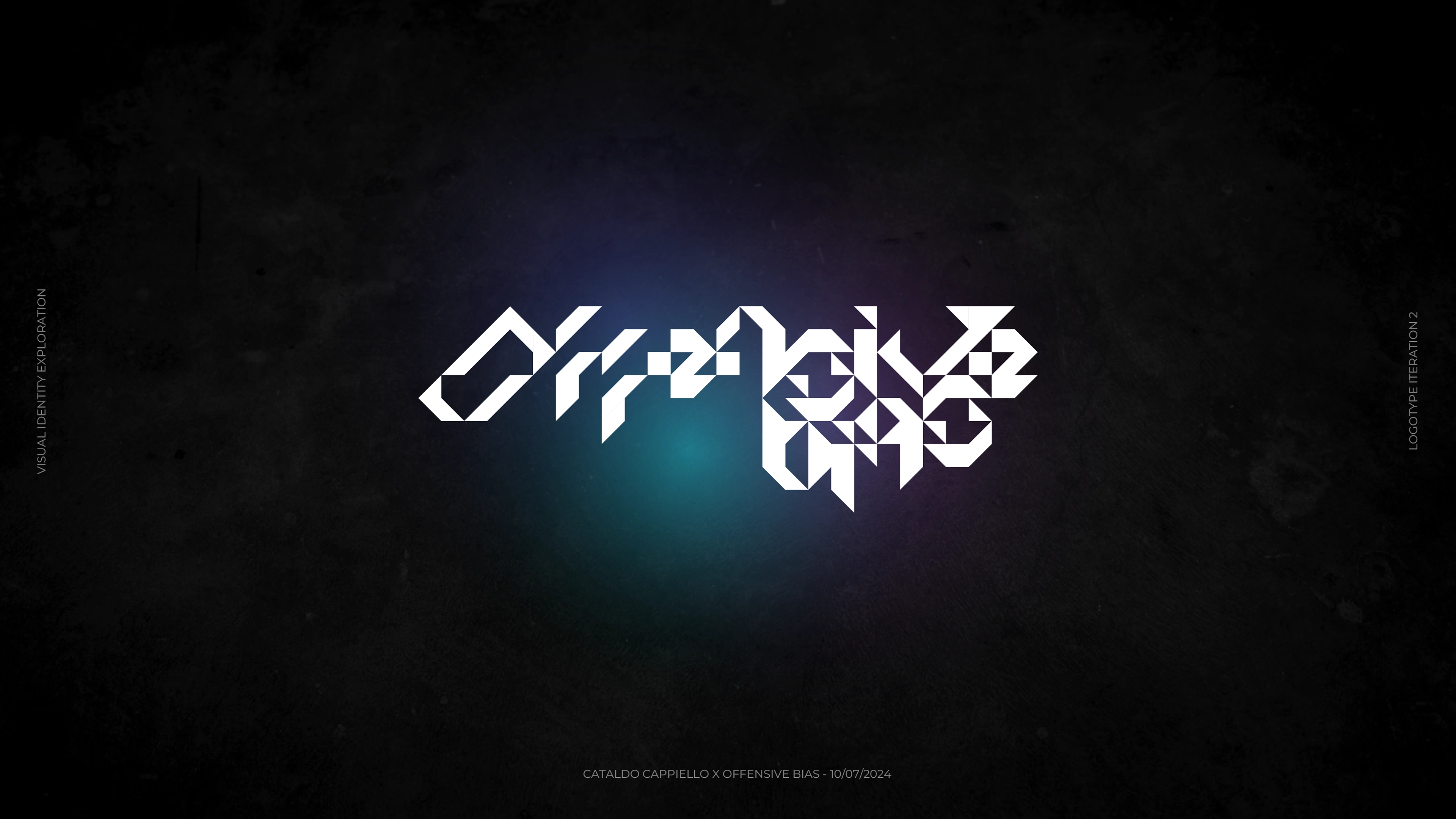
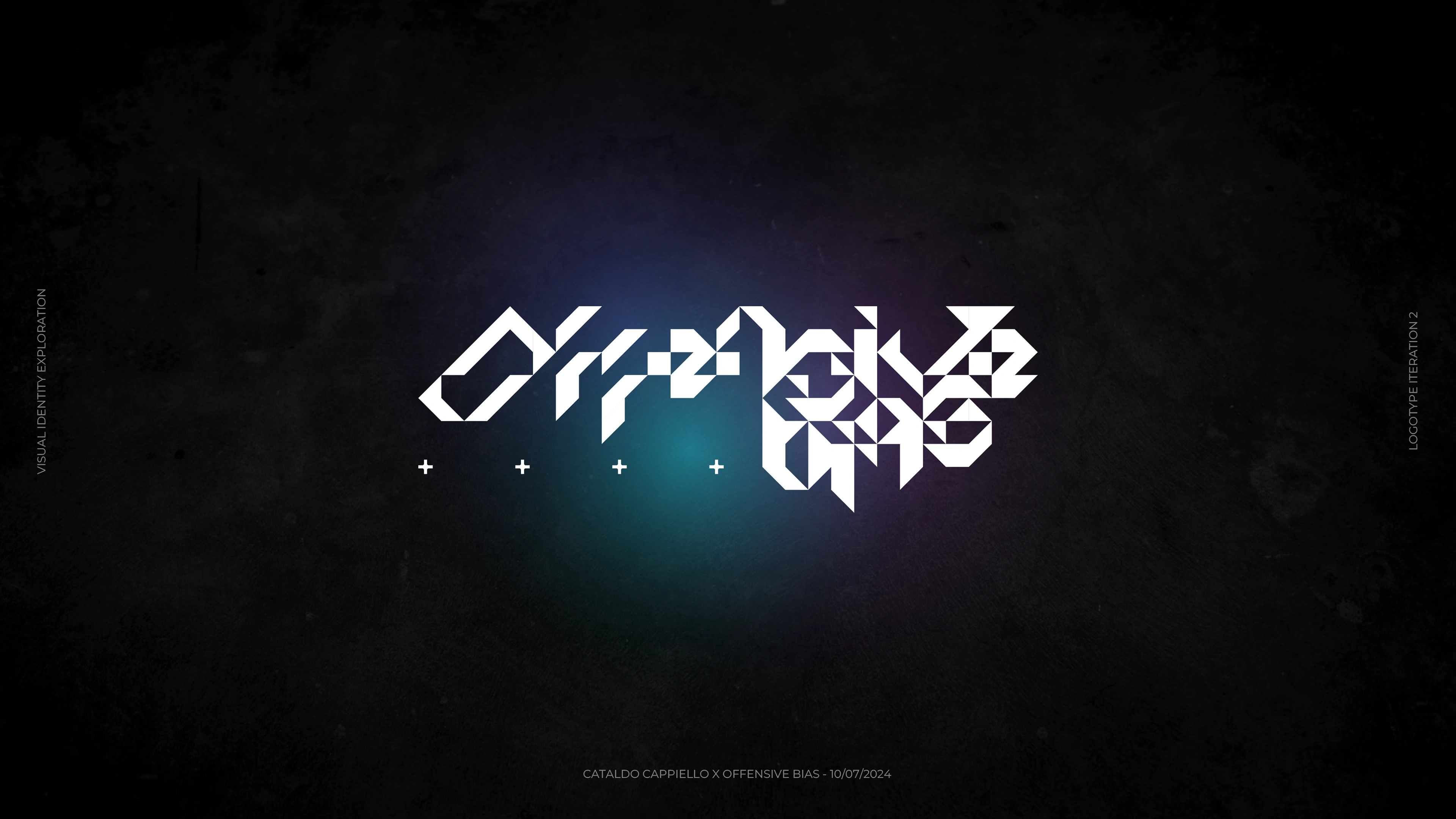
This is where we decided to explore a second route. Something cleaner, more geometric. The client was satisfied already, but we wanted to see if we could really go above and beyond.
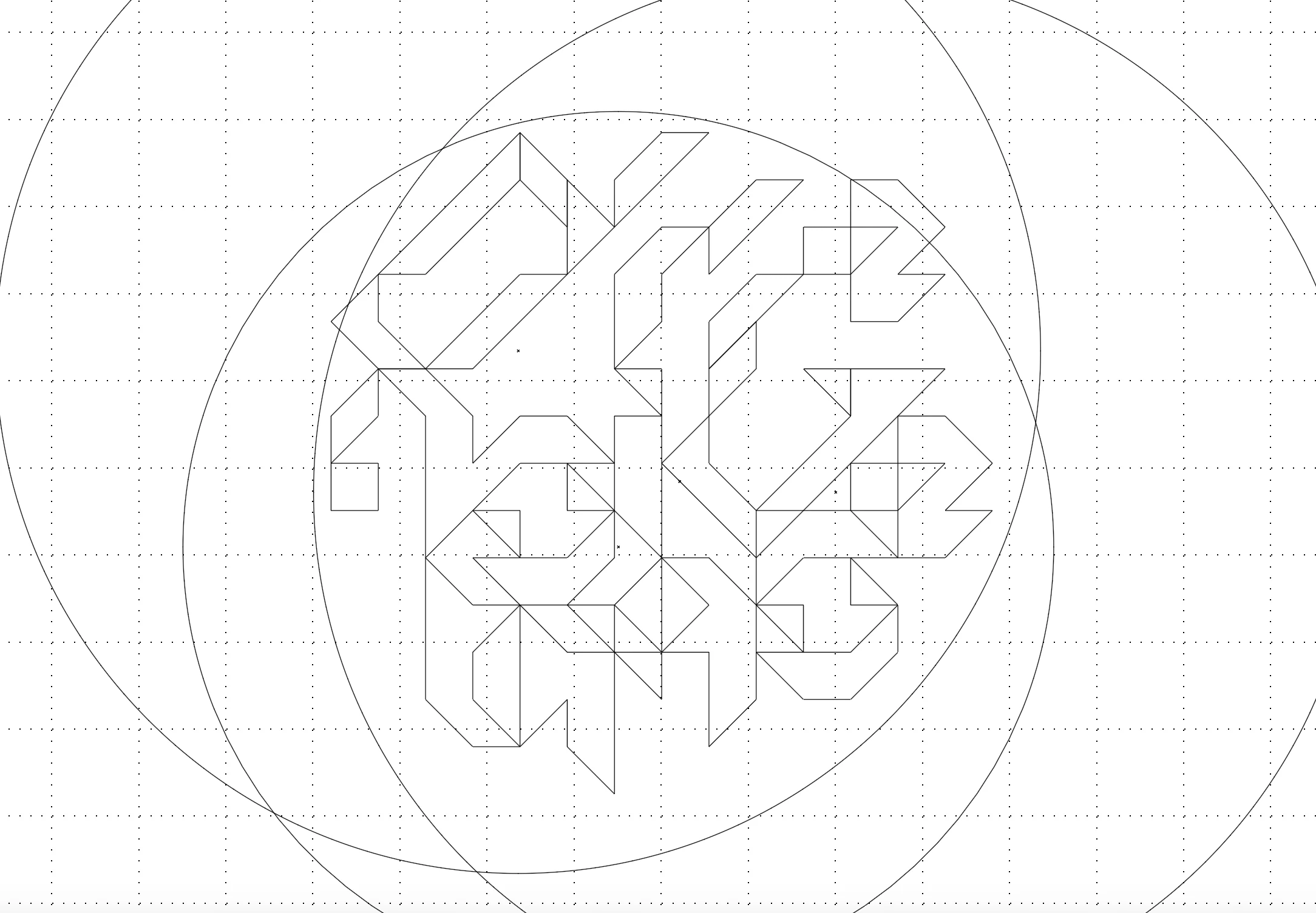
So I started playing with a very simple element: an isosceles triangle, equal to half the area of a square. I duplicated this triangle shape by following a strict grid system, which has lead to the first iteration in the second route.
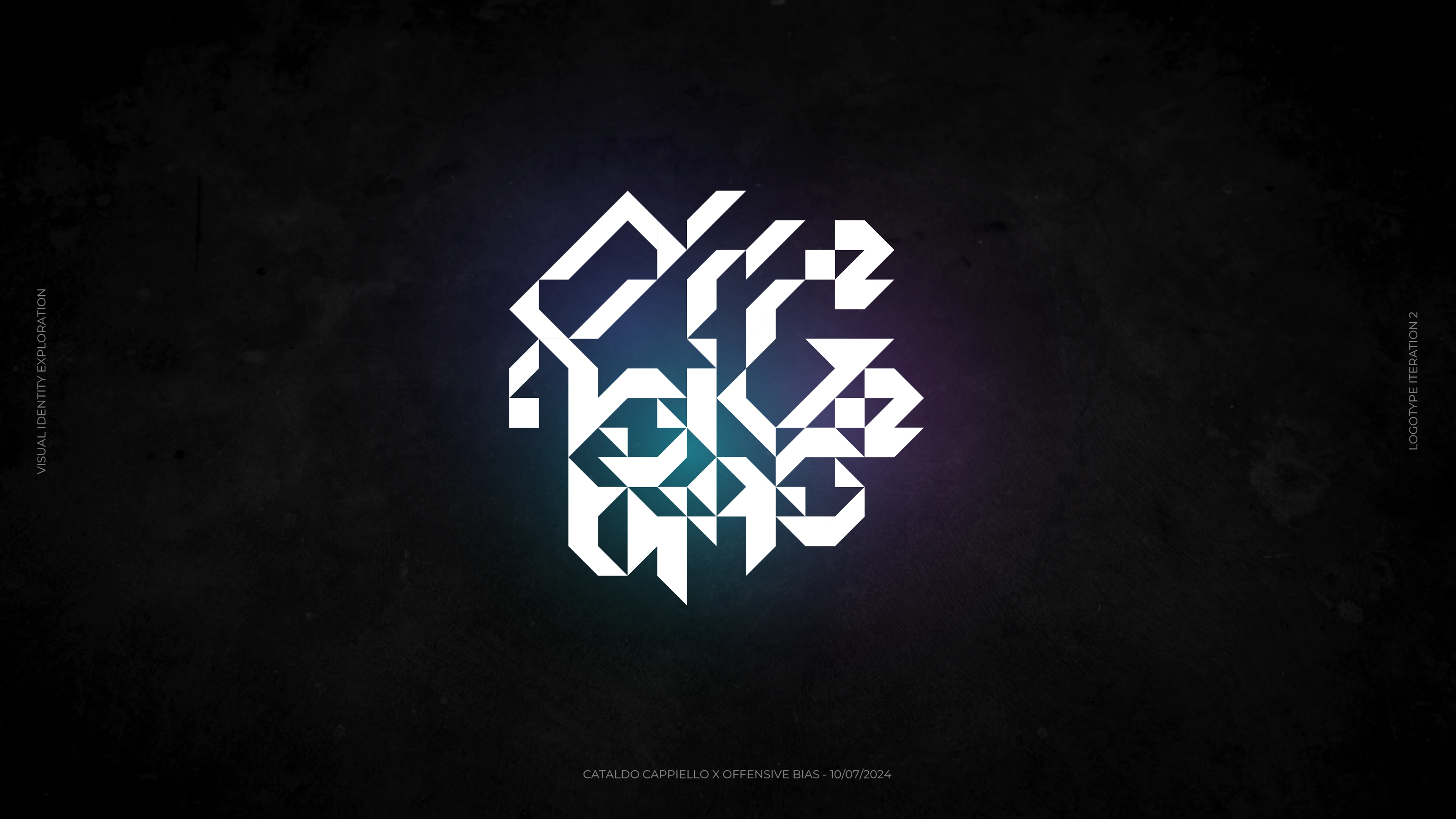
Since the client didn't prioritise readability in their brief, and also because their music is unpredictable and angular, I've worked on a condensed version of the previous logomark, this time focusing on a circle-like shape.
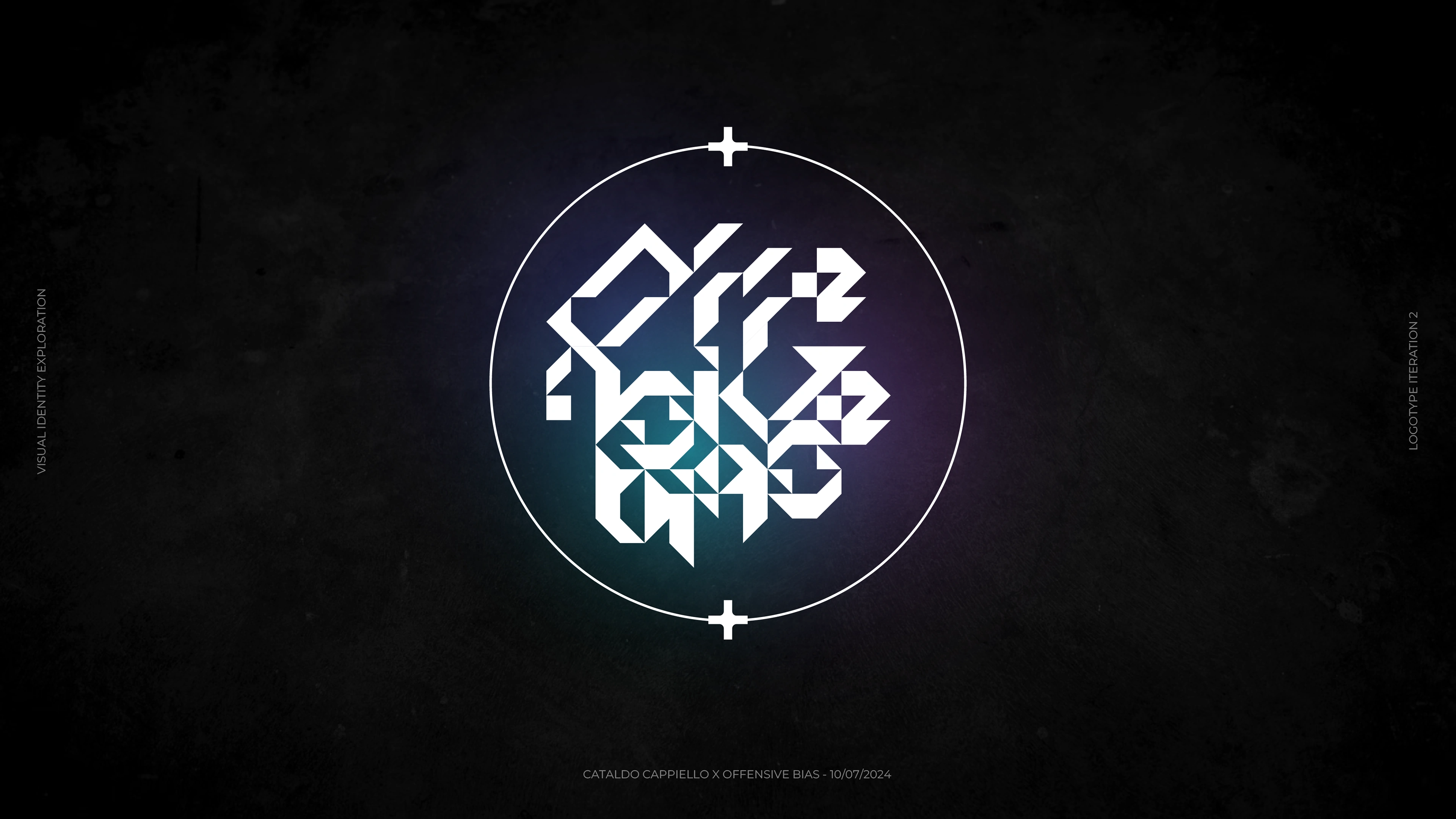
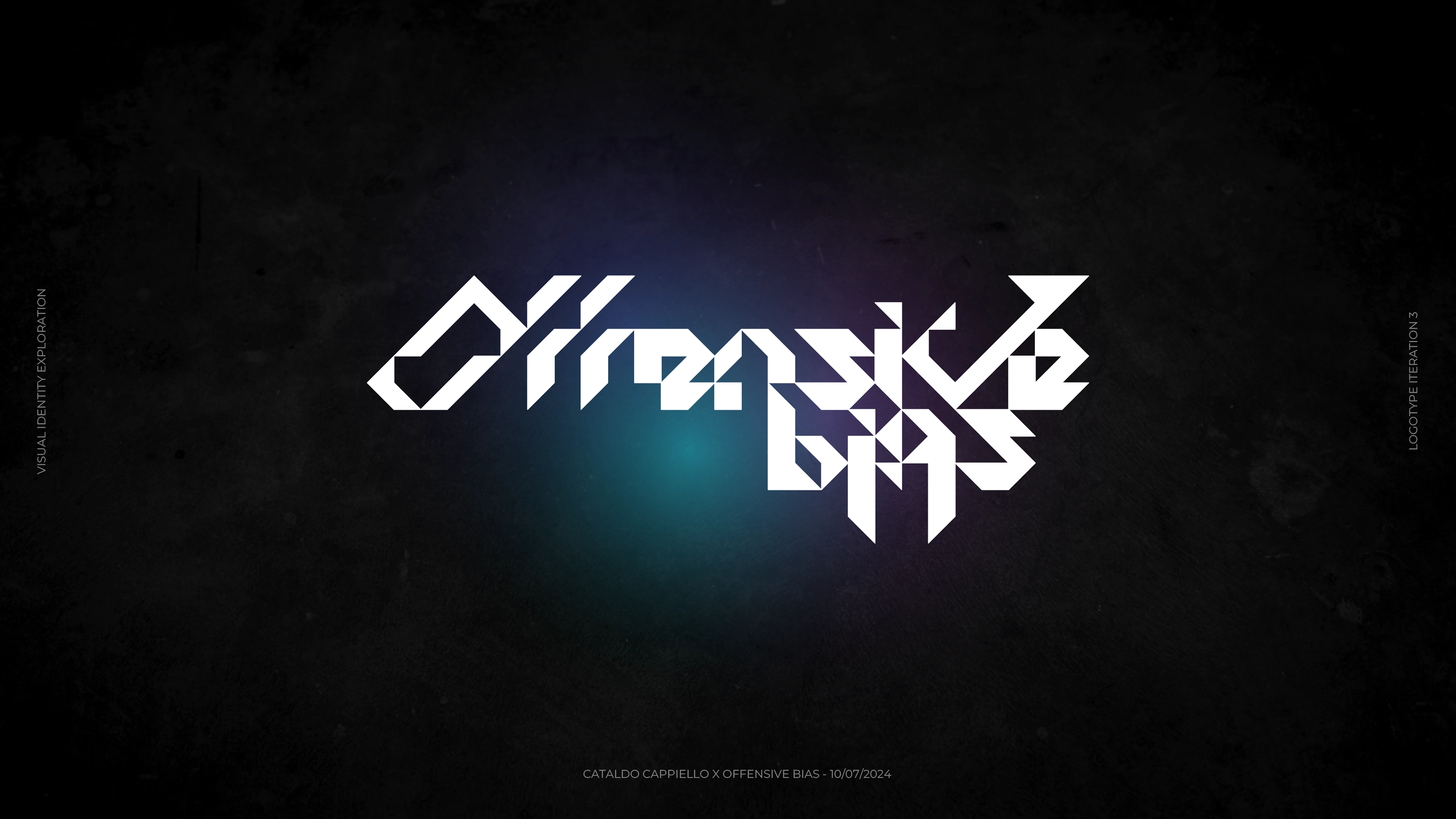
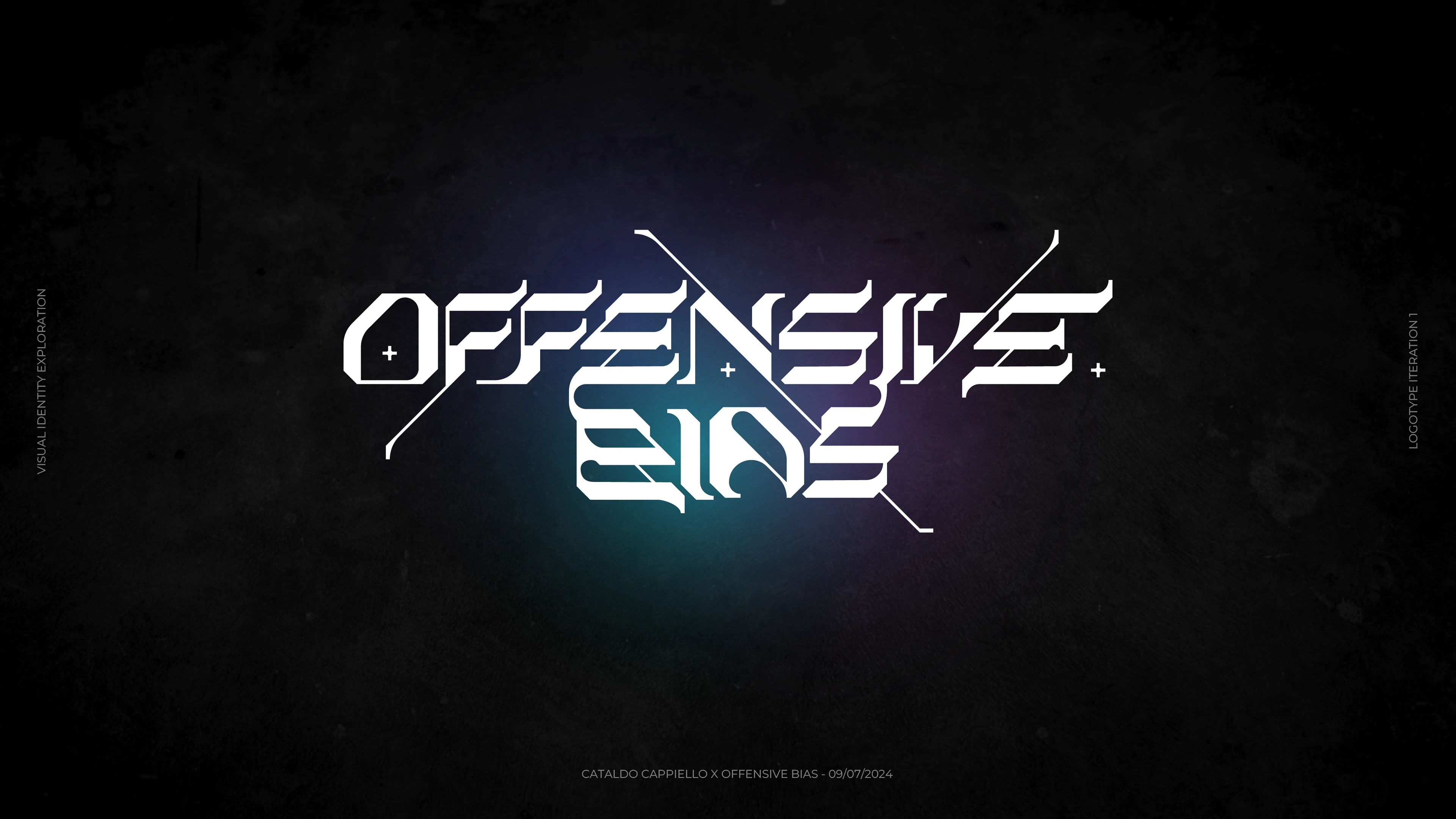
Once it became clear that the client had a preference for the non-condensed version of the logomark, I iterated some more in order to make it cleaner, more readable.
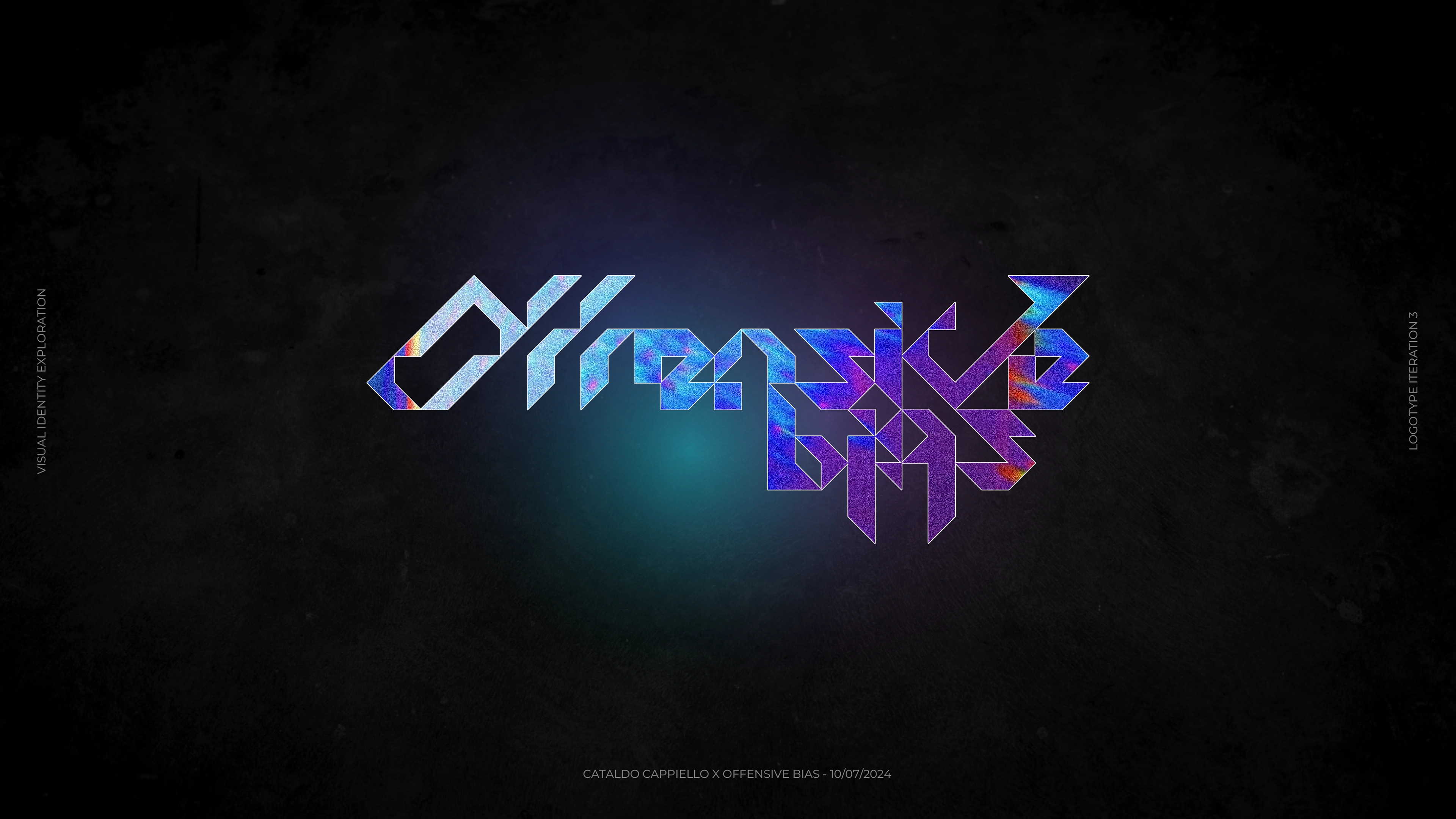
This eventually became the final step in our iteration process, and Offensive Bias' official logo.
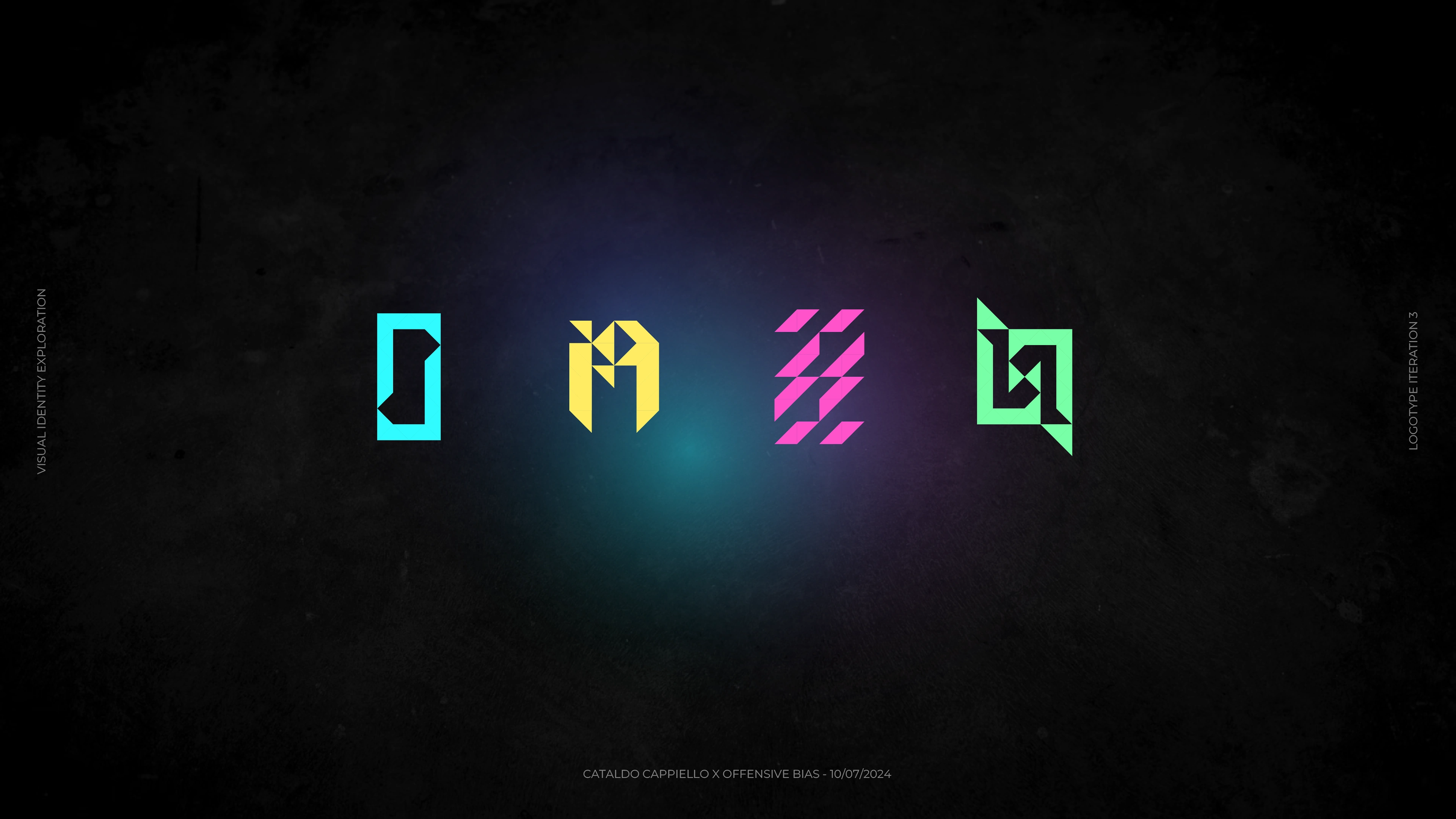
Starting from selected areas of the logo, I came up with four abstract shapes, that the client will be able to use as they please. For example, these can become icons for Instagram highlights, or even symbols for a physical release.
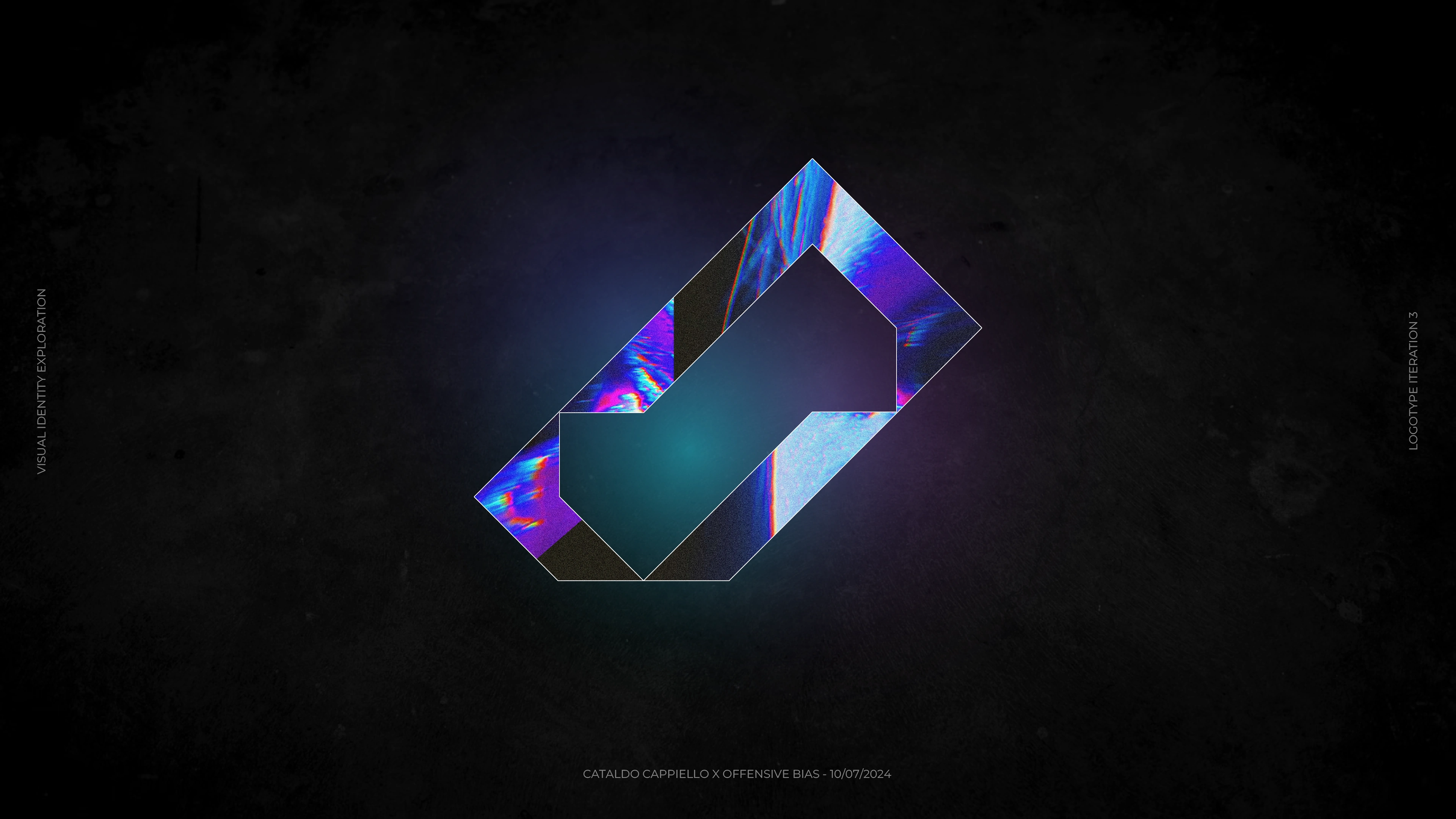
My next idea was to isolate the "O" from the logotype, and to turn it into a logomark.
I believe it's a very powerful and unique shape, which synthesises the spirit of Offensive Bias extremely well.
I've presented this idea through this mock-up, which shows that the logomark is versatile enough that a picture, a gif, or even a video can be placed on its inside.
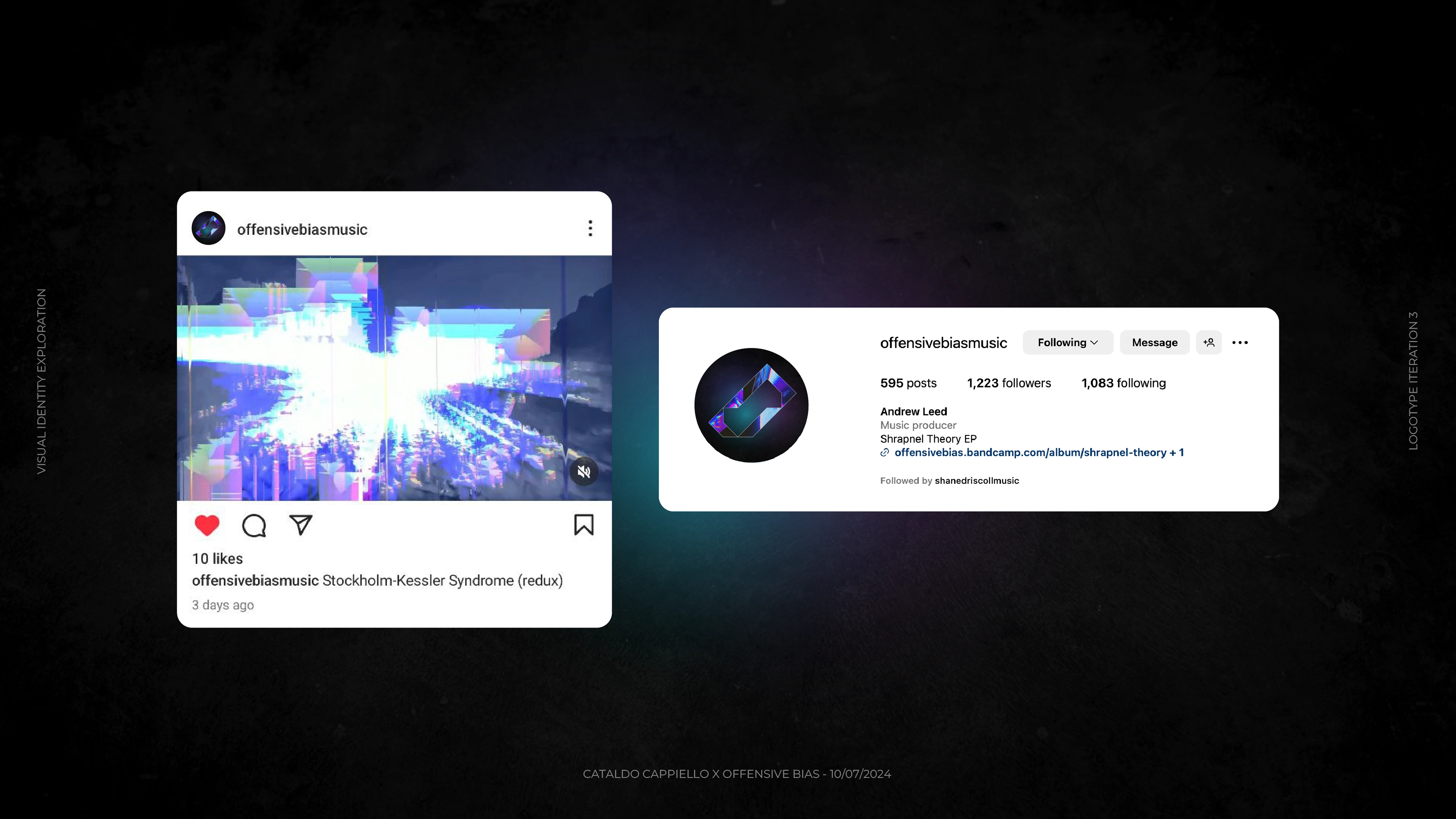
This can also become a social media profile picture.
Ultimately, the client was extremely satisfied with their new logo, and I sent them a final teaser picture demonstrating that the entire logomark can be used as a mask too.
Like this project
Posted Aug 1, 2024
Logo for Offensive Bias, a progressive metal / electronic / math project, taking inspiration from many eclectic artists in the contemporary music scene.