Built with Framer
Verifly - Landing Page
The Website Guys
Summary
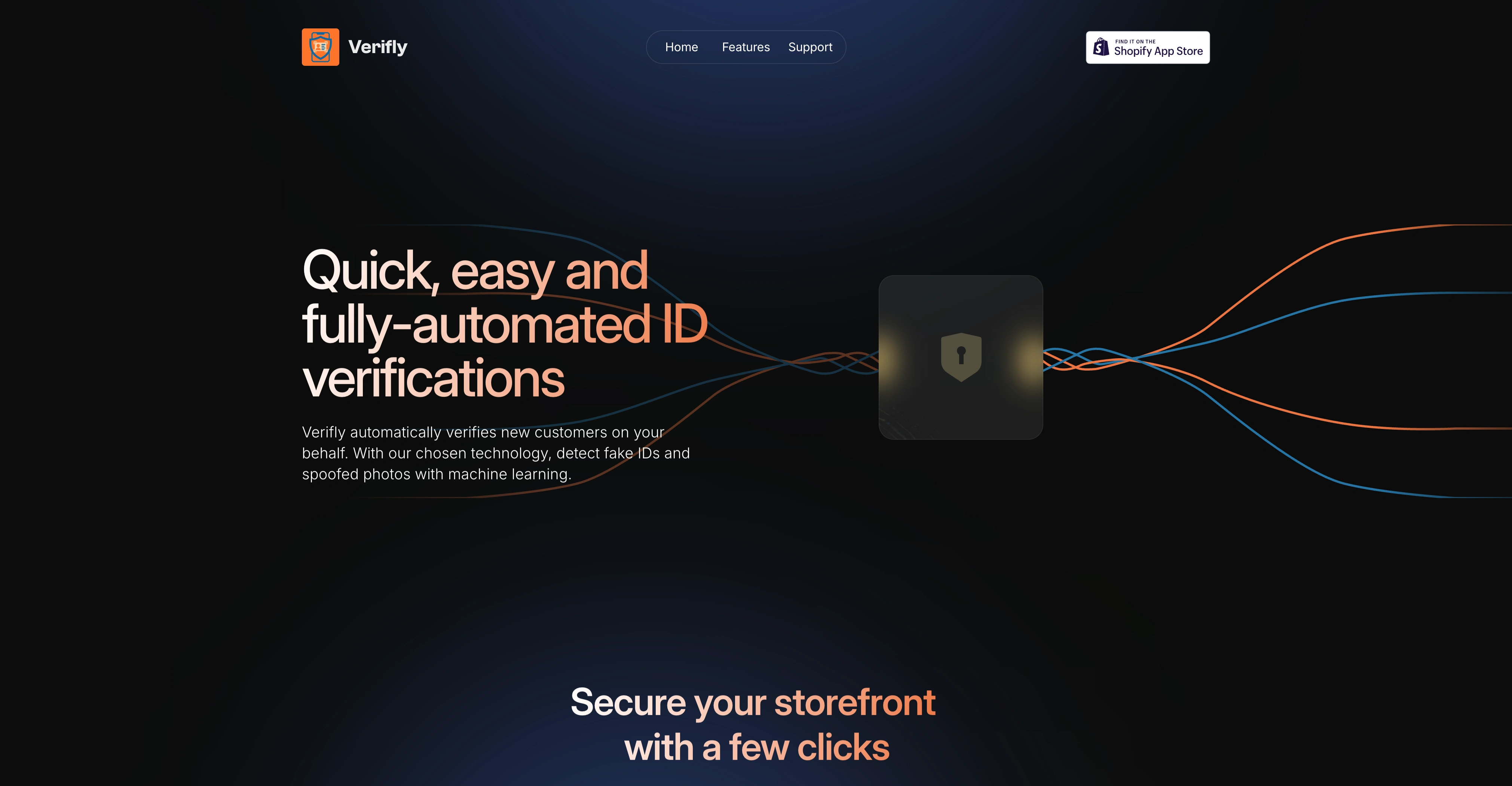
Redesigned the Verifly (formerly Extra Verification) Landing Page with an updated look and feel. The page is more concise and has an attractive, more modern appearance, while giving users a rundown of Verifly's features.
Process
Verifly had a barebones website with an outdated design. It explained the app's features and allowed users to install the app on their Shopify storefront. Unfortunately, the design was stuck in the 2010's.
It took me some time to find a template that felt like a website for a cybersecurity solution. The dark theme with gradient lighting and text and an illustration with a lock was perfect.
Framer also makes it easy to copy and paste elements or components from other projects. This allowed me to reuse a spinning globe component to highlight the fact that Verifly can support users in over 100 countries.
To polish things, I revisited one of my favorite websites, LottieFiles. I was able to find a few slick animations and leveraged Framer's LottieFiles integration to plug and play what I had found in LottieFiles' open library.
Preview

One of Verifly's key features
Like this project
Posted May 15, 2025
Redesigned Verifly's landing page with a more attractive appearance, improved features overview and slick animations.