AI-Powered Learning Management System Design
Micheal Great
The Brief
My client, an education entrepreneur, approached me with an ambitious vision: create a Learning Management System that didn't just replicate classroom experiences online, but transformed them. They wanted something modern, intuitive, and powered by AI—a platform where teachers could effortlessly create and monetize courses while students enjoyed interactive, personalized learning experiences.
The Goal: Design and build a complete LMS SaaS
The Challenge
The Problem Space
The online education market is saturated with legacy platforms that haven't evolved with user expectations. After initial discovery calls with the client, I identified three critical problems:
Authentication Friction
Payment Opacity Existing platforms hide pricing, confuse users with complex tiers, and make subscription management a nightmare.
Passive Learning Experience Most platforms are glorified video libraries:
Zero real-time interaction
No personalized assistance
Teachers overwhelmed with repetitive questions
Students feeling isolated and unmotivated
My Approach
I proposed a user-centered design process with these principles:
Research First - Understand users deeply before designing
Iterate Rapidly - Low-fidelity testing before high-fidelity polish
Build Progressively - Ship, learn, improve in cycles
Accessibility Always - Design inclusive experiences from day one
Data-Driven - Let metrics guide decisions.
Discovery & Research
Competitive Analysis (Week 1)
I conducted a thorough audit of 12 LMS platforms across three categories:
Enterprise Platforms
Canvas, Blackboard, Moodle
Insight: Feature-rich but overwhelmingly complex
Opportunity: Simplification without losing power
Creator Platforms
Teachable, Thinkific, Kajabi
Insight: Better UX but limited interactivity
Opportunity: Add real-time collaboration
Modern Alternatives
Skillshare, Udemy, Coursera
Insight: Great discoverability, poor creation tools
Opportunity: Balance both sides of marketplace
Key Findings:
The Gap: No platform combined ease-of-use with powerful real-time collaboration and AI assistance.
Phase 2: User Interviews (Weeks 1-2)
I conducted 23 in-depth interviews:
12 teachers (K-12, university, corporate trainers)
11 students (high school, college, adult learners)
Interview Structure:
Current learning/teaching practices
Pain points with existing tools
Ideal platform features
Willingness to pay
Task walkthroughs with competitors
The UX Design Journey
The Design Process
I followed a modified Double Diamond approach:
Discover (Weeks 1): Research
Define (Week 2): Synthesis & Strategy
Design(Weeks 3-4): Design & Build
Deliver (Weeks 5): Test & Launch
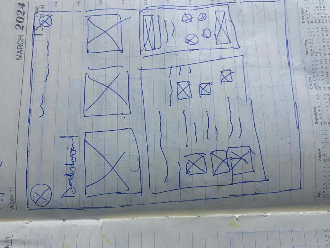
Low-Fidelity Wireframes
I moved to Figma and created grayscale wireframes for all key screens.
Wireframe Testing Round 1:
Showed wireframes to 8 users (4 teachers, 4 students) via Zoom.
Tasks:
Sign up for an account
Find the course creation page
Upload a lesson video
Enroll in a course
Ask the AI assistant a question

Key Features Component Shots
High-Fidelity Design
Time to make it beautiful.
isual Design Evolution
Brand Identity Workshop
I facilitated a brand workshop with the client to establish visual direction.
Brand Attributes:
Modern
Trustworthy
Energetic
Accessible
Professional (but not boring)
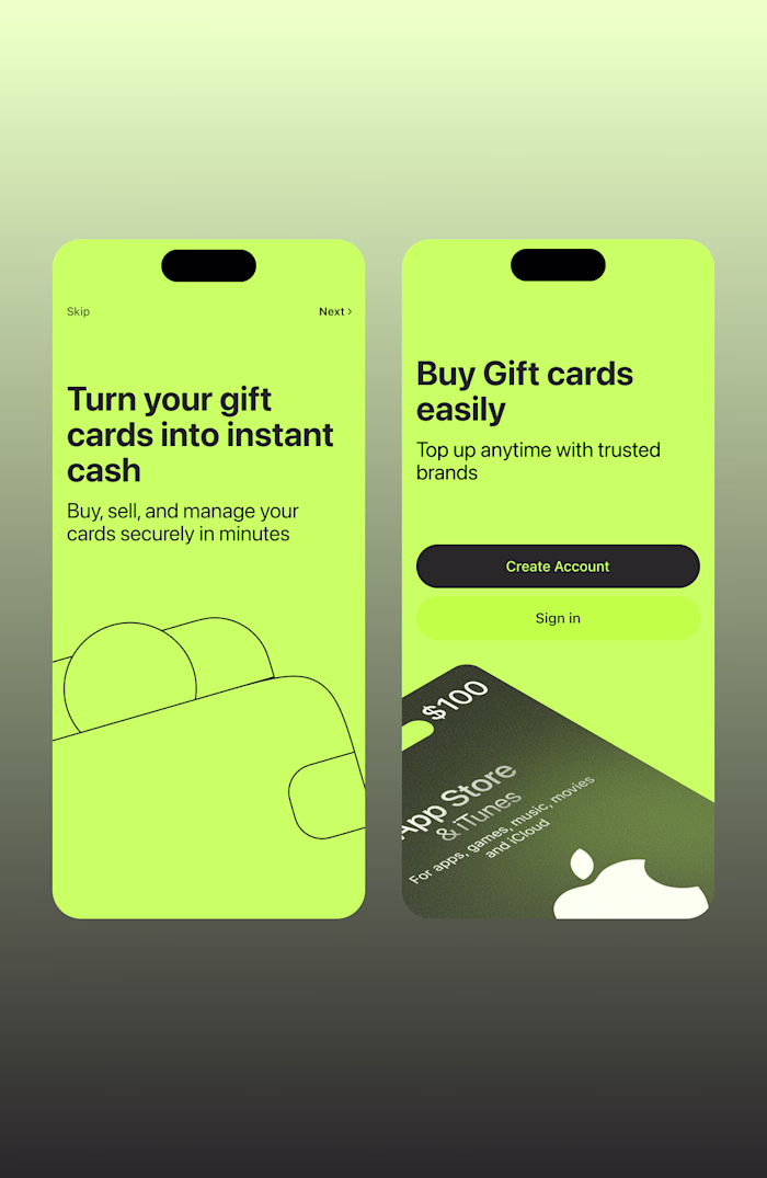
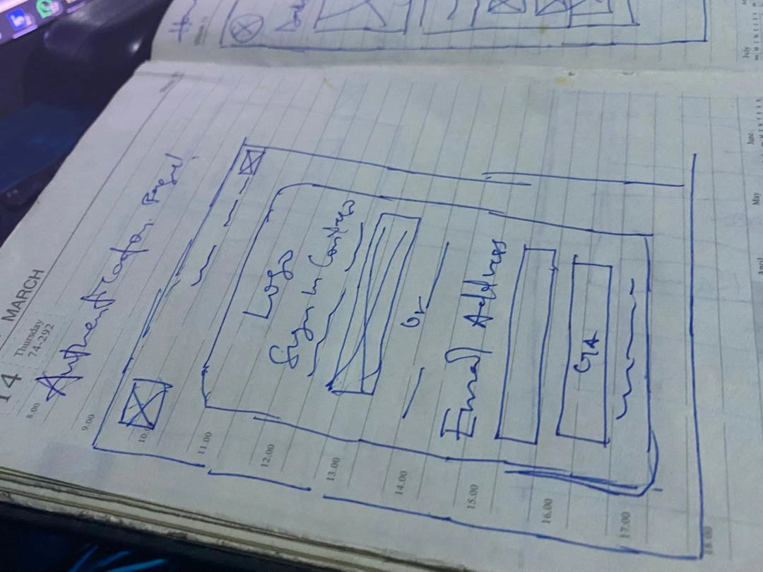
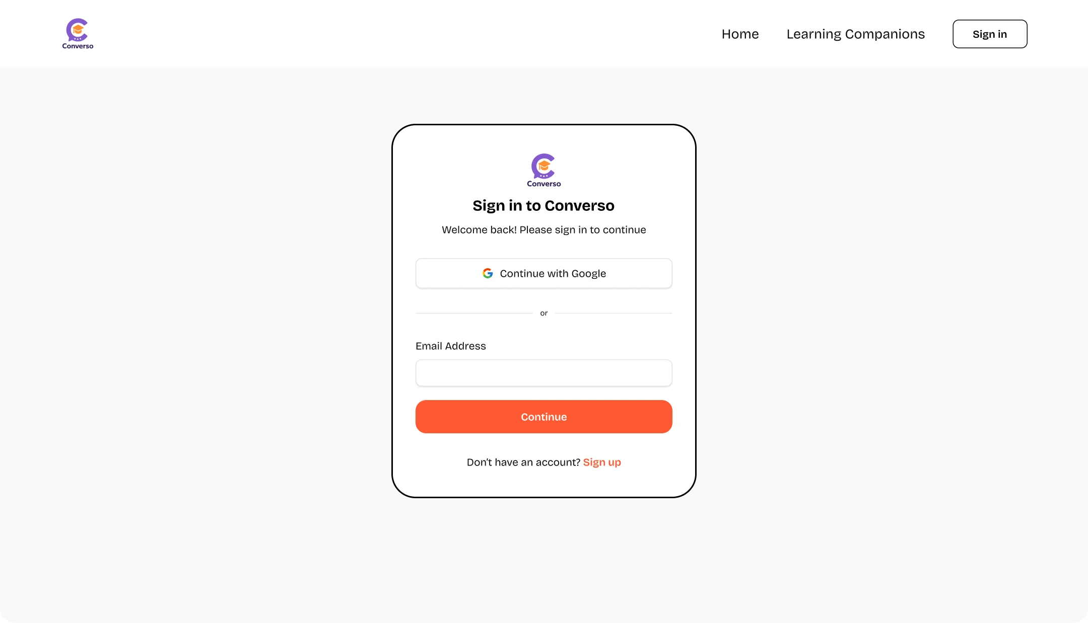
Feature 1: Magic Link Authentication
The UX Challenge: Make signing up feel effortless while maintaining security.
The Solution:
Step 1: Landing Page
Clear value proposition
Single CTA: "Get Started Free"
No overwhelming feature lists
Step 3: Check Email
Success animation
Clear next step: "Check your email for your magic link"
Resend option after 30 seconds
Backup: "Or continue with Google/GitHub"
Step 4: Click Link
Automatic redirect
Loading state: "Verifying your magic link..."
Instant access to platform
Micro-Interactions:
Button transforms to loading spinner
Check mark animation on success
Gentle shake if email invalid
Auto-focus on email field
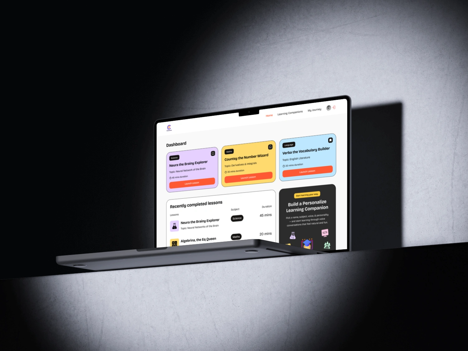
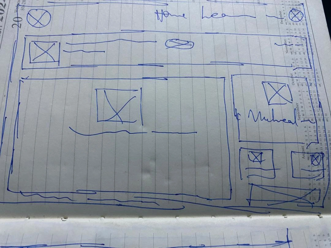
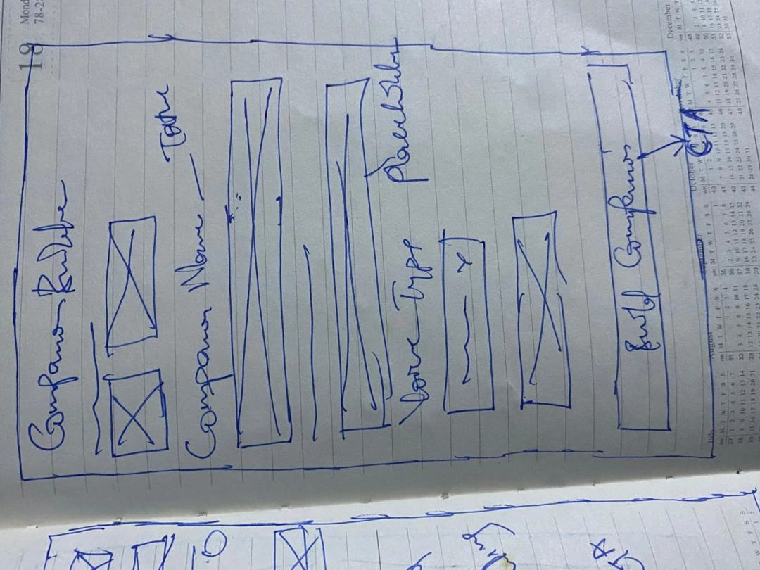
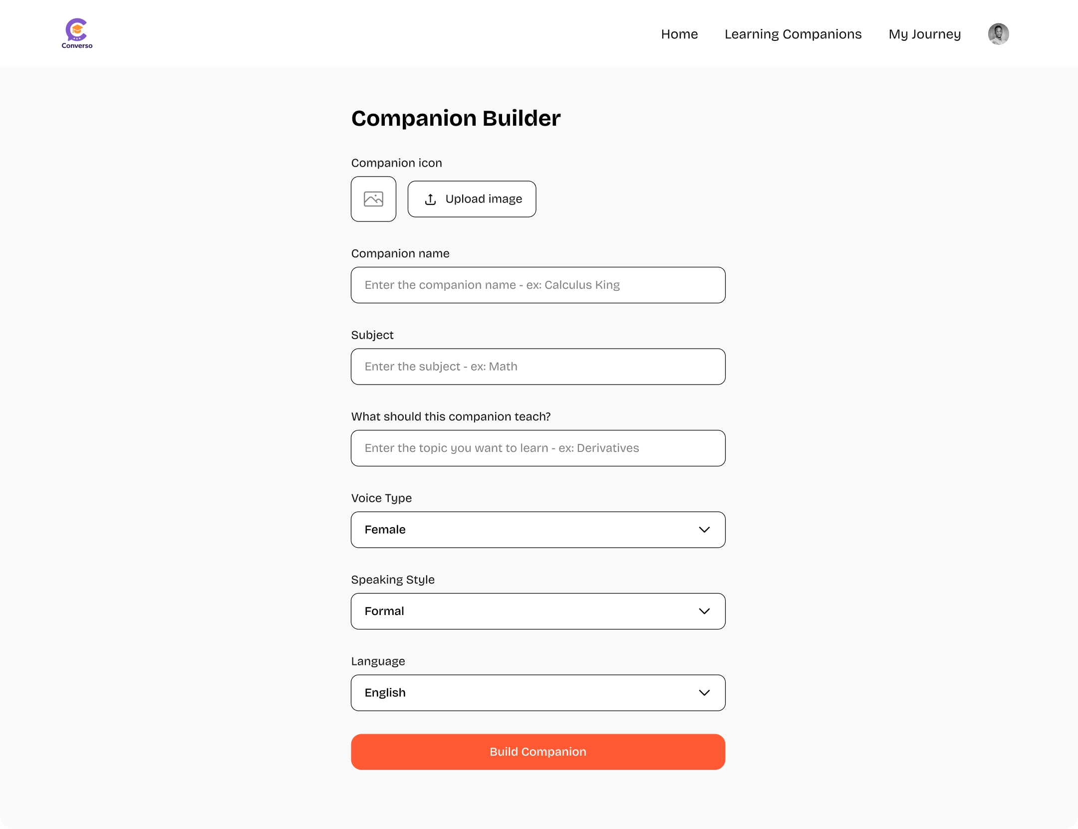
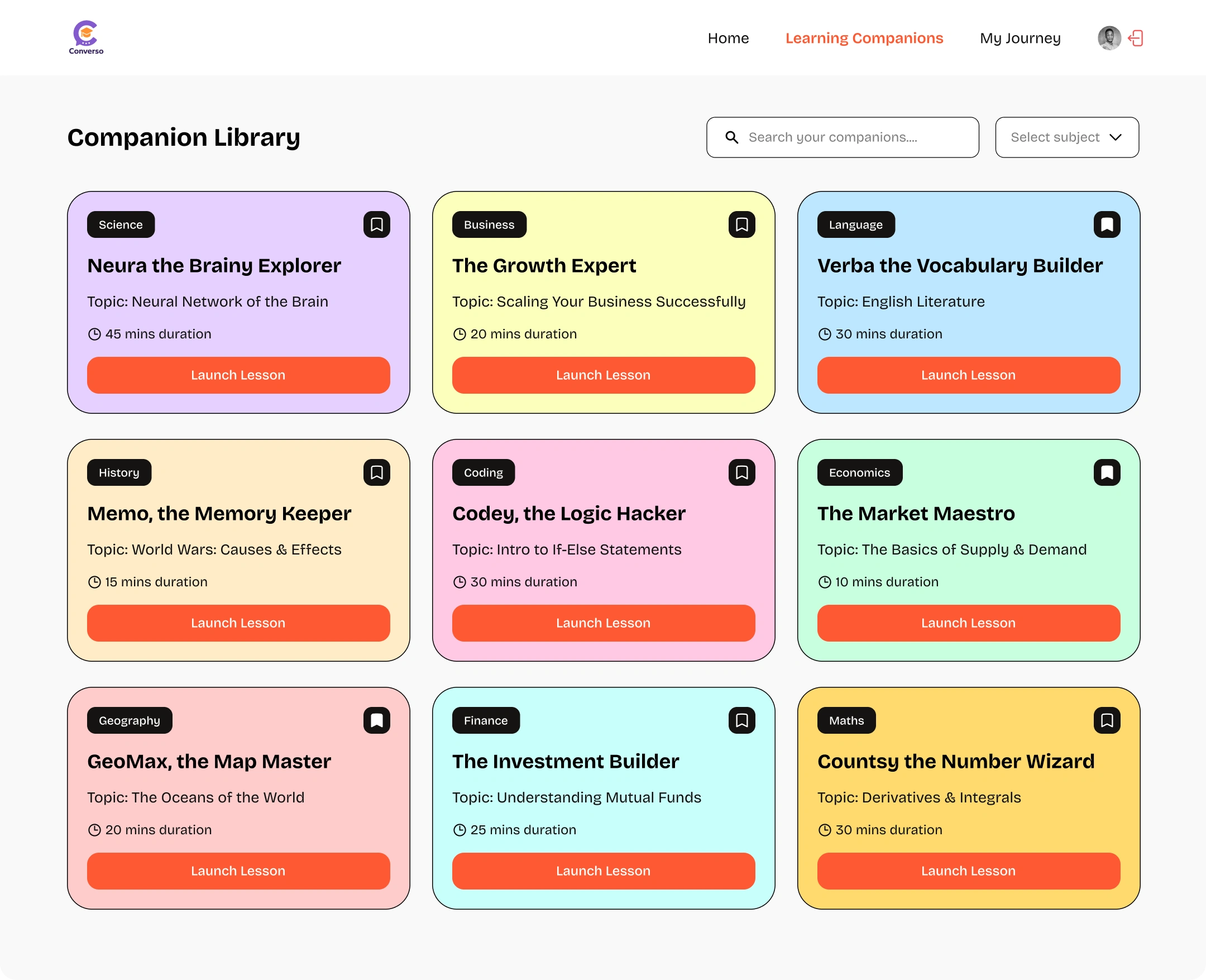
Feature 2: AI-Companion Builder
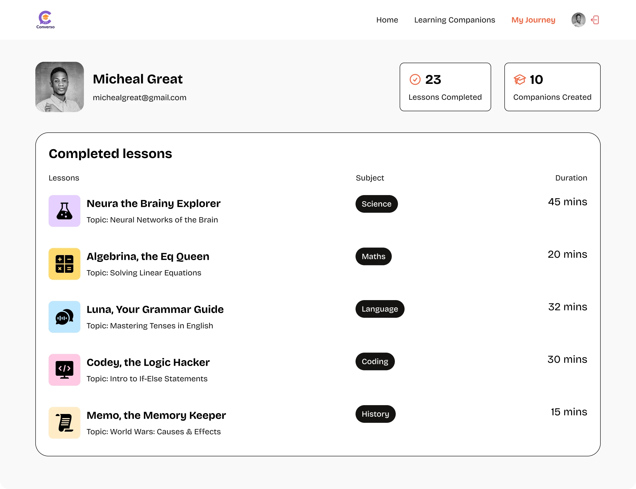
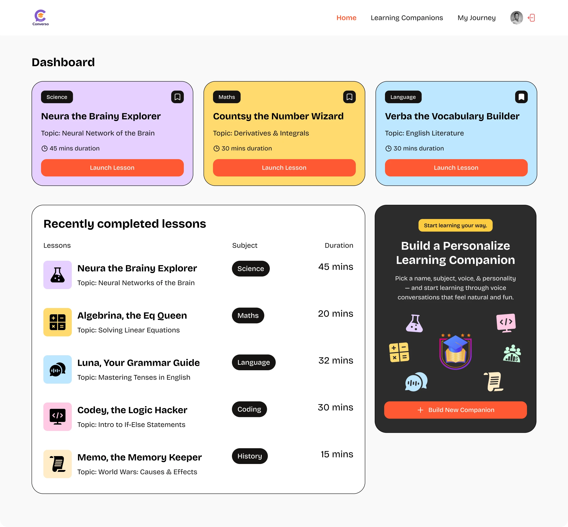
Course Pathway Dashboard
Companion Limit Reach

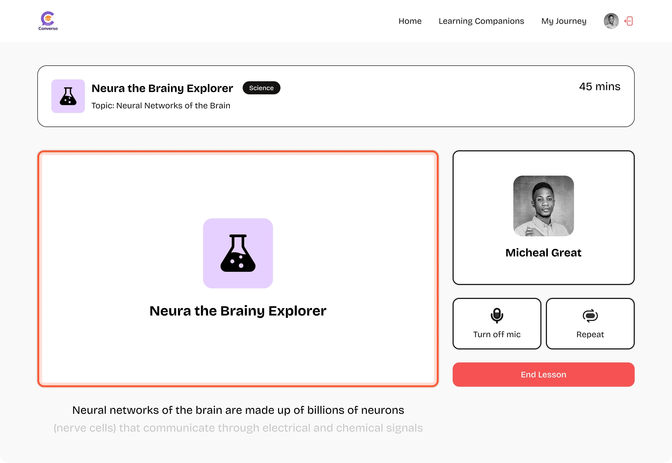
Real-Time Learning Interface
The UX Challenge: Balance content consumption with humanly-like interactive sessions without overwhelming students.
Solution: We wanted to build something that feels instantly familiar, like a space students already know how to navigate. No confusing buttons, no learning curves. Just a clean, welcoming interface where students can listen, talk, and interact with their teachers in real time, almost like they’re right there in the same room.
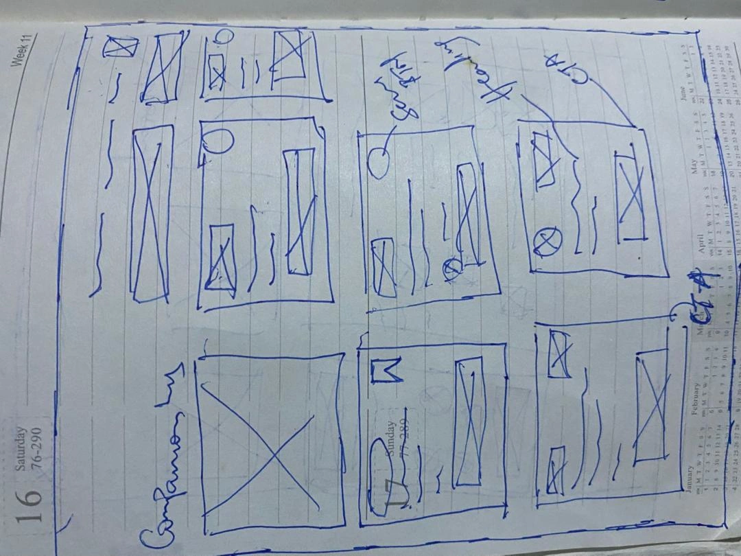
Discovery Page
Home Dashboard
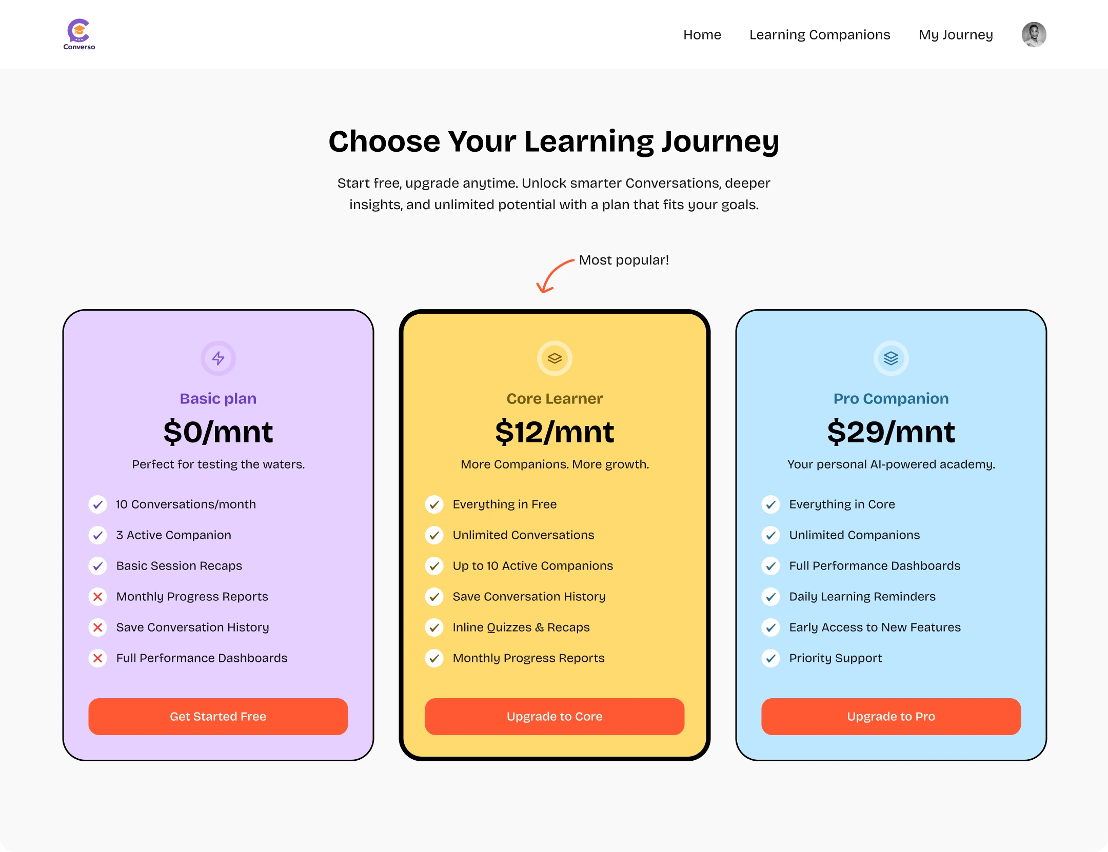
Subscription Page
Pricing & Publish
How will students access this course?
⚪ Free ⚪ One-time Payment: $____ ⚪ Subscription Required💡 Similar courses are priced at $47-97[🔒 Save as Draft] [🚀 Publish Course]Final Confirmation Modal
You're about to publish!
Quick checklist: ✅ Course has at least 3 lessons ✅ All videos have captions ✅ Pricing is set ⚠️ Missing: Course trailer (Optional but recommended)[Cancel] [Publish Anyway] [Add Trailer First]Success Metrics:
80%+ onboarding completion rate
60%+ free-to-paid conversion rate
4.5+ star user satisfaction rating
<3% monthly churn rate
What I Delivered
A fully functional, beautifully designed LMS platform featuring:
✅ Frictionless authentication (magic links + OAuth)
✅ Seamless payment & subscription system
✅ Real-time collaborative learning sessions
✅ AI voice assistant for interactive learning
✅ Intuitive course creation & management
✅ Just Web-responsive design system
✅ Accessible to WCAG 2.1 AA standards
THANKS FOR READING THIS CASE STUDY, YOU'RE THE BEST 😎
Like this project
Posted Nov 8, 2025
Designed and built an AI-powered LMS platform for interactive learning.