Passage Marketing Website Redesign
Overview
Passage is a platform designed to empower international students in their pursuit of studying abroad, focusing on providing tailored financial solutions such as education loans. The primary goal of Passage is to simplify the journey of securing financial aid while partnering with educational institutions to make quality education more accessible
check website here
Problem
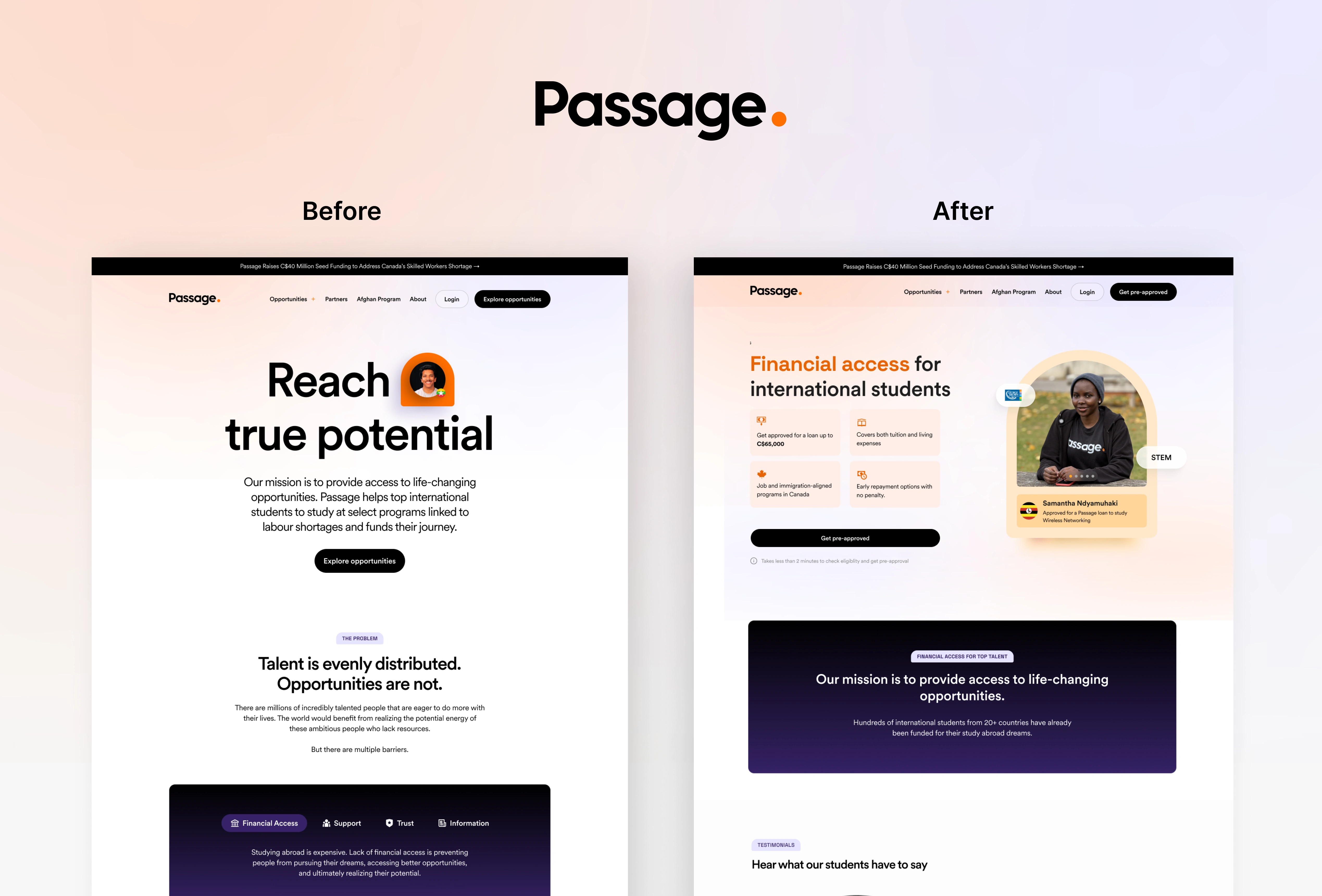
The original Passage website had a text-heavy design that made it challenging for users to quickly understand its offerings and mission. Potential users, especially international students seeking financial aid, could be overwhelmed by the amount of information, which hindered the platform's ability to communicate its value proposition clearly and effectively.
Key issues:
Lack of visual hierarchy, leading to confusion.
Limited use of visuals, which missed opportunities to connect emotionally with users.
The critical CTA ("Get pre-approved") was not prominent enough, reducing conversion potential.
Solution
The redesign focused on creating a more visual and engaging interface that prioritizes clarity and user-centric storytelling. The new design emphasizes:
Hero Section: A strong visual with a simple, impactful tagline, reinforcing the brand name "Passage" as a metaphor for a seamless journey.
Social Proof: Integrated loan statistics and testimonials from real students, building trust and credibility.
Prominent CTA: A redesigned "Get pre-approved" button that stands out and encourages immediate action.
Reduced Text: Information is presented in digestible formats like cards and visually engaging layouts, making it easier for users to understand the benefits at a glance.
Emotional Connection: Photos of students who benefited from the platform, giving a face to the success stories.
These changes ensure that users can quickly grasp Passage's offerings and are encouraged to take immediate steps toward their goals
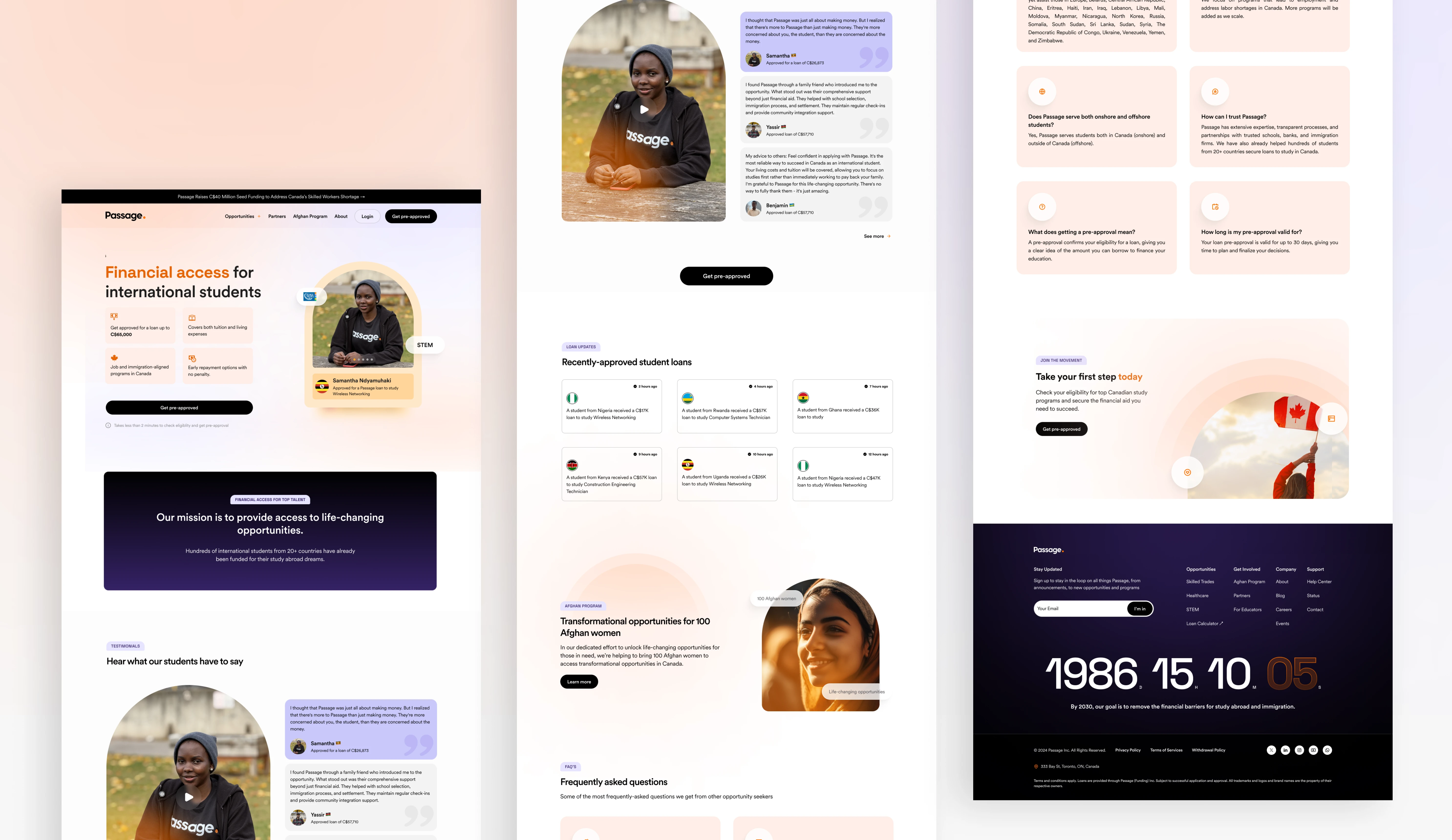
Homepage
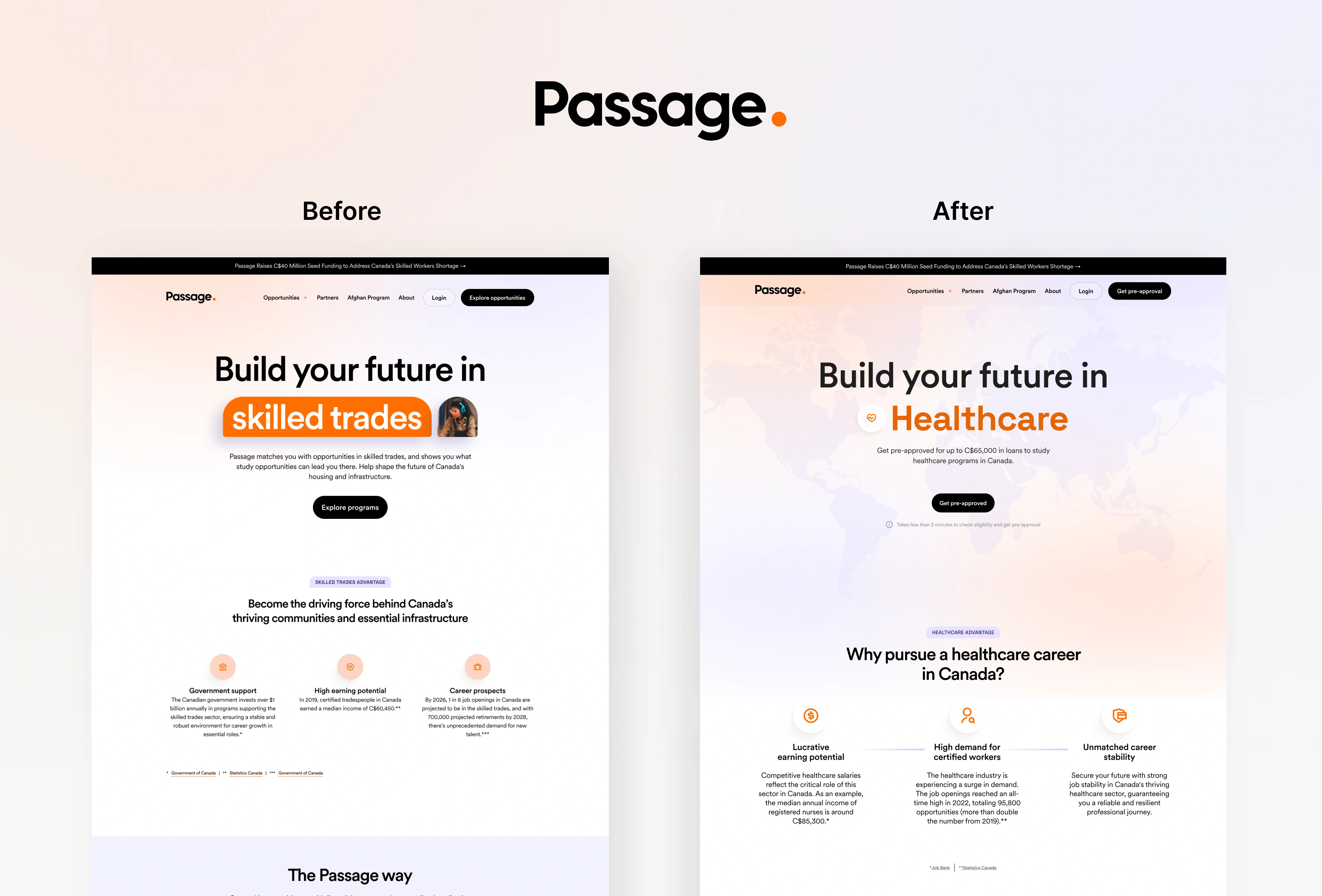
Opportunities Page before and after
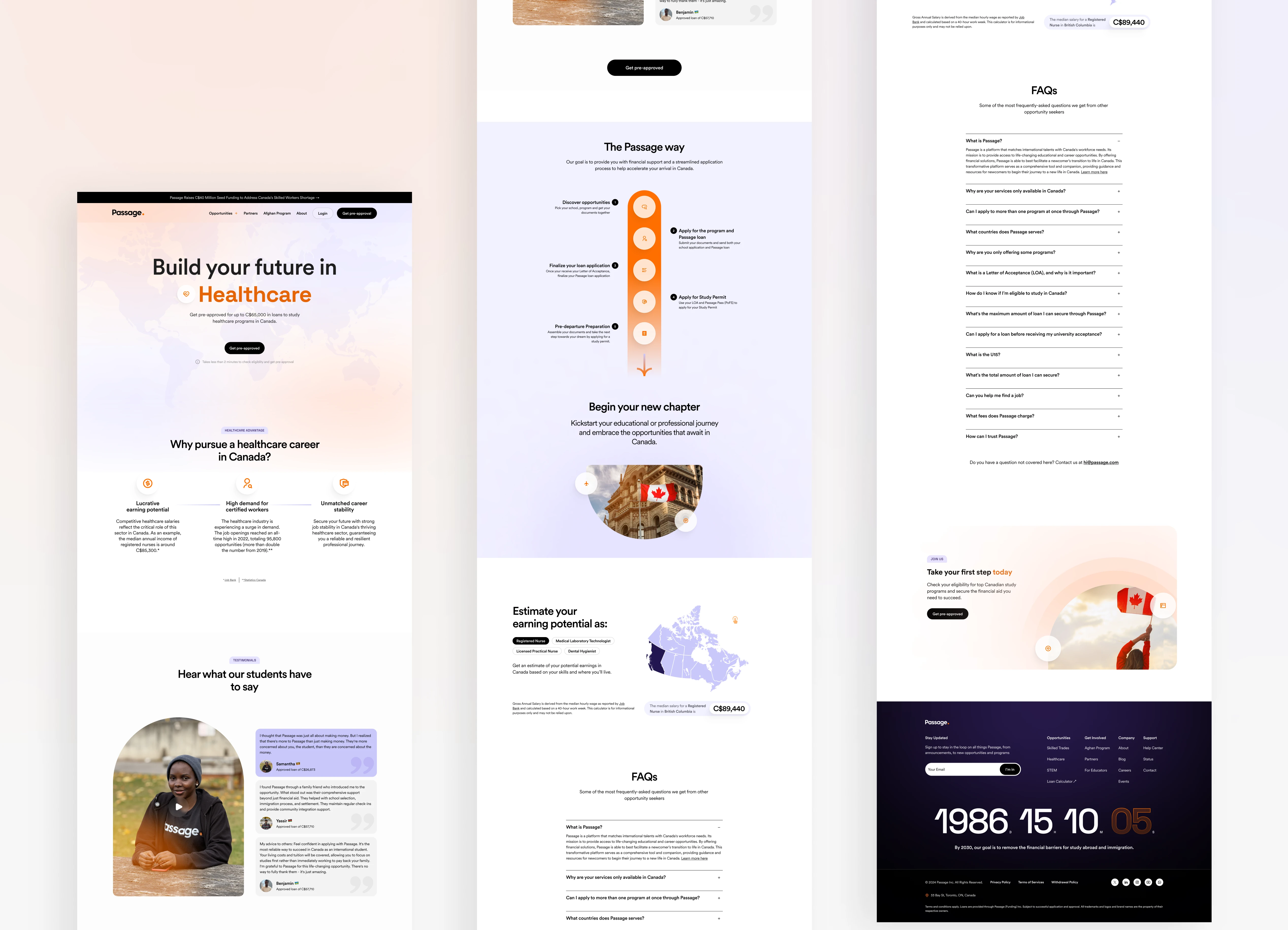
Opportunities page full preview
Check live website here
Like this project
Posted Dec 5, 2024
The redesigned Passage website prioritizes clarity and user engagement by transitioning from a text-heavy layout to a visually driven design.
Likes
28
Views
799
Timeline
Nov 22, 2024 - Nov 28, 2024
Clients
Passage


