Zirkon - Logo And Brand Identity Design
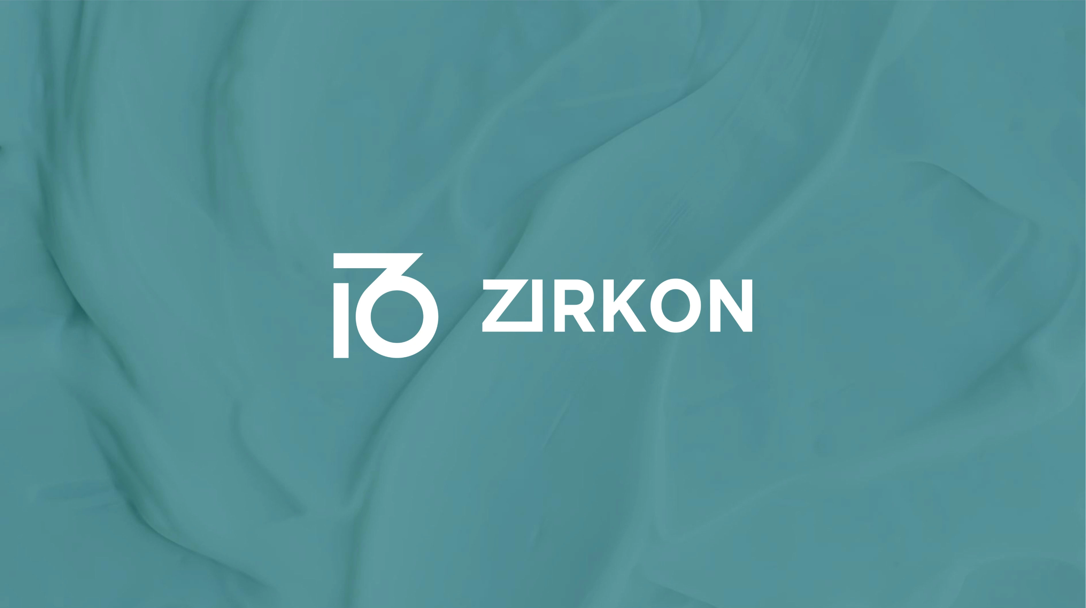
Zirkon Pharmaceuticals, a frontrunner in the pharmaceutical industry, entrusted our team with crafting a logo and brand identity that would embody their unwavering commitment to innovation and ethical practices. Recognizing the importance of empowering patients and healthcare providers alike, our objective was to develop a cohesive visual language that would set them apart in the highly competitive market.
Through meticulous planning and design, we created a logo that serves as a visual representation of Zirkon's dedication to pharmaceutical excellence. The centerpiece is the letter "Z," which not only stands for their company name but also signifies their unique identity within the industry. A line integrated seamlessly into the "Z" symbolizes the constant progress they strive to achieve in healthcare. Enclosing this within a circle underscores their holistic approach to innovation, ensuring that all aspects of healthcare improvement are considered.
For the color palette, we opted for deep teal tones. This strategic choice conveys a sense of trust and reliability, assuring patients and medical professionals that Zirkon prioritizes quality and consistency. The deep teal also subtly hints at growth, reflecting the company's forward-thinking nature and unwavering pursuit of advancements in the field. To further solidify their position of leadership and confidence, we incorporated bold typography throughout the branding. This design element not only creates a visually compelling brand identity but also positions Zirkon as a true innovator within the healthcare industry.

To еxplorе thе possibilities of collaborating with Thе DA Dеsigns on your upcoming design projects, plеasе do not hеsitatе to contact us at,
Email ID : thеdadеsignsagеncy@gmail.com
Whatsapp (click to chat) : https://wa.link/76ald0
Contact : +91 8866701761 / +91 9664629899
Wе would bе dеlightеd to arrange a meeting at your convеniеncе to discuss your dеsign requirements in dеtail and chart a path towards achiеving your brand's visual aspirations.
Thank you for considеring Thе DA Dеsigns as your dеsign partnеr. Wе look forward to thе opportunity of working togеthеr to еlеvatе your brand's visual idеntity and lеavе a lasting impact on your audiеncе.
Warm rеgards,
Thе DA Dеsigns
Like this project
Posted Mar 20, 2024
Zirkon Pharmaceuticals, a leader in the pharmaceutical industry, approached us to craft logo and brand identity reflecting their commitment towards innovation.

