Rancer – Cash-Flow Marketing Site

Dayyan Mustafa


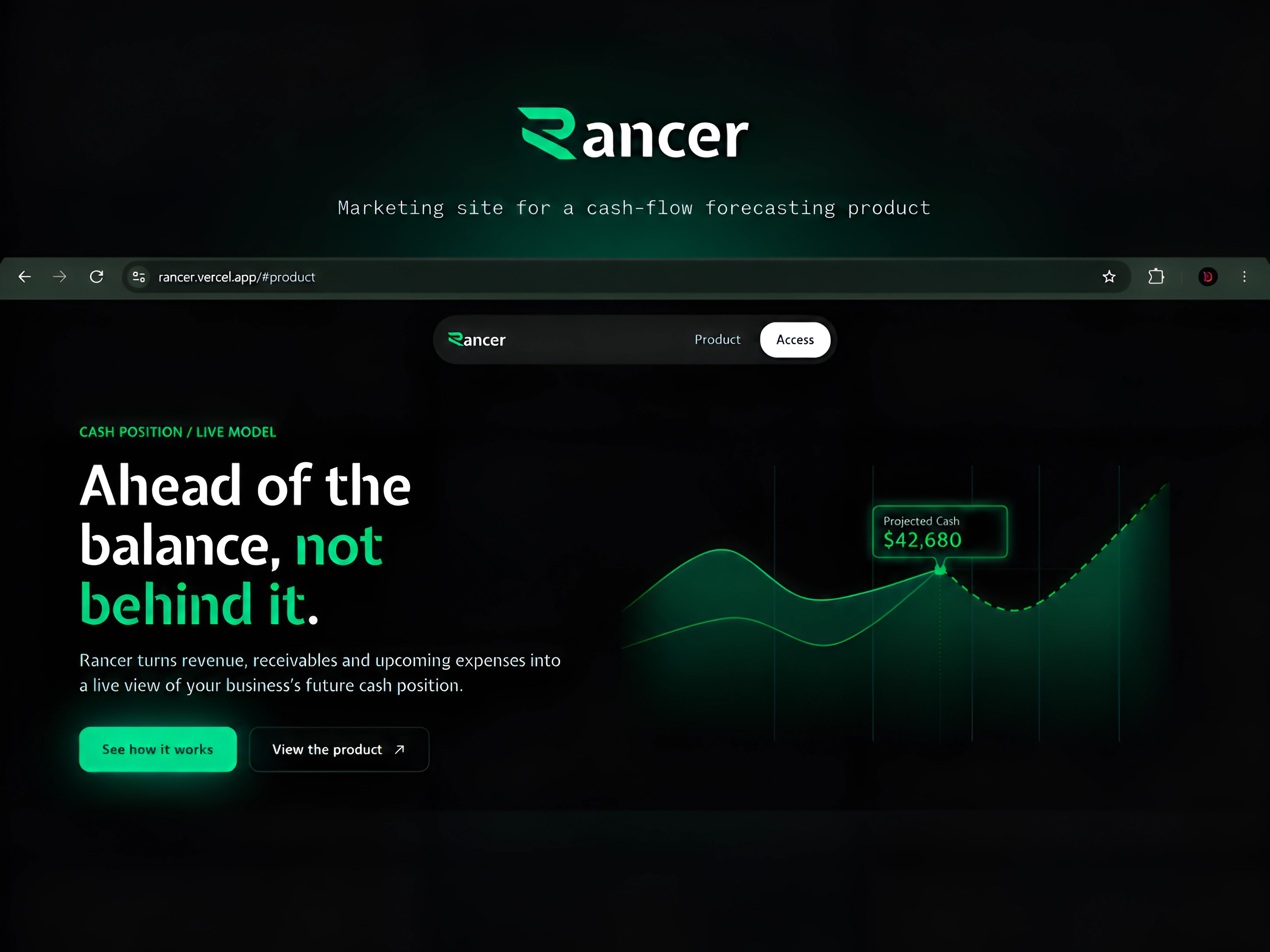
A walkthrough of the Rancer marketing site
Rancer is a cash-flow timing tool for service businesses – agencies, consultancies, and studios that invoice clients on delay. The product's premise is that profitability and liquidity aren't the same problem: a business can be profitable on paper and still run short of cash if income and obligations don't land on the same schedule. This is the marketing site built to introduce that idea before the product itself.
The brief was self-directed: design a landing page that demonstrates the product's actual mechanics rather than describing them in the usual feature-list format. Instead of a generic hero-cards-testimonials structure, each section on the page mirrors a real step in how Rancer reasons about a business's cash position – a live-moving forecast curve in the hero, a timing-risk breakdown showing why profit and cash diverge, an interactive forecast section, a receivables-risk view, and a decision-simulation section that mirrors the product's own scenario engine.
Design direction: dark-mode, single-accent-color system (green, used only for meaningful state – inflows, healthy runway, active elements – never as decoration), monospace typography for all financial figures to reinforce a financial-instrument register rather than a typical SaaS aesthetic. Built in Framer, then converted to code for full control over animation timing and layout precision across desktop and mobile.
This site is the front door to the full product – clicking through from it leads into Rancer's actual application, covered in a separate case study.
Like this project
Posted Sep 17, 2026
A dark, motion-driven marketing site for a cash-flow forecasting product – built to demonstrate the tool's mechanics through interaction, not just description.
Likes
0
Views
2
Timeline
Sep 14, 2026 - Sep 16, 2026