HORI Brand Identity Redesign
Like this project
Posted Jan 12, 2026
Designed a modern visual identity for HORI, a fresh consulting agency.
HORI
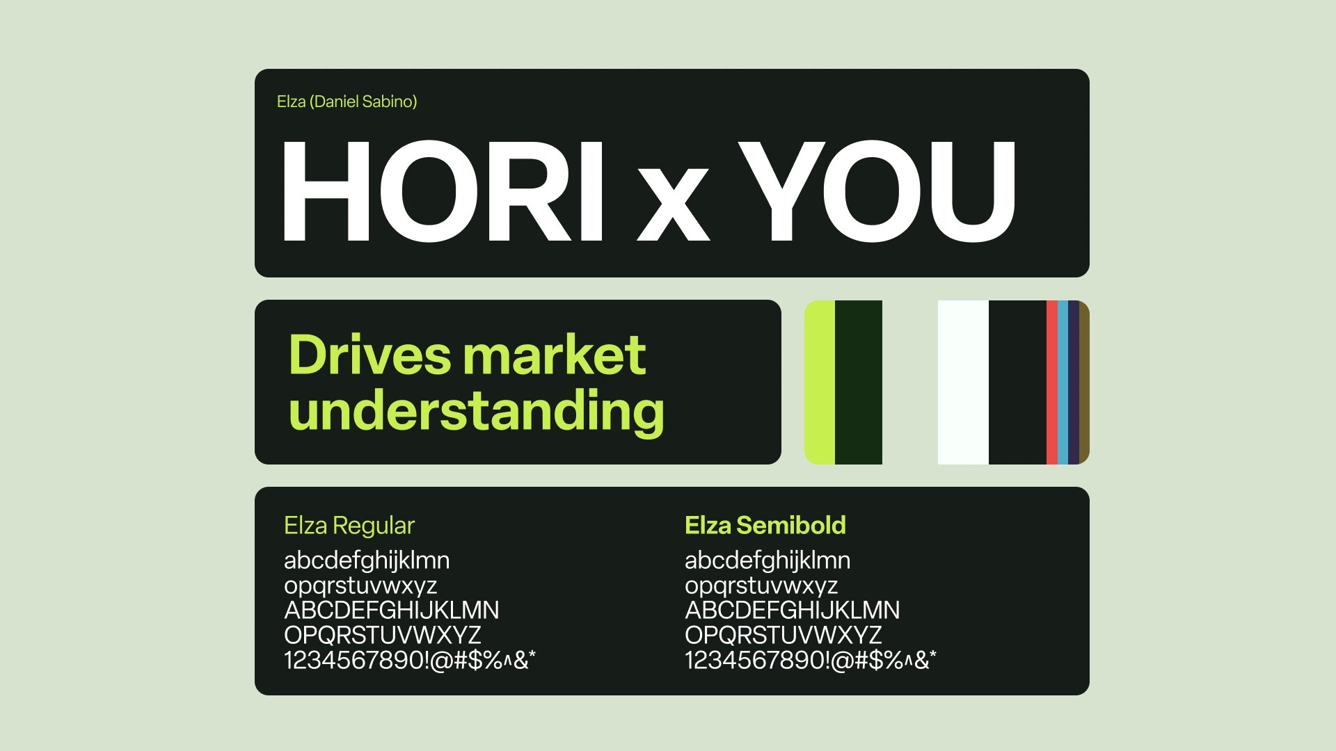
HORI is a consulting agency. They wanted to modernise its image without betraying its heritage. The challenge was to create a younger, more recognisable identity that could unify its products under a single symbol.

We designed a visual identity structured around four organic shapes forming the word HORI. The whole conveys a balance between stability and renewal, tradition and innovation.


Results :
A stronger identity, a clearer message, concrete results. In just a few months, HORI has gained visibility, confidence and business traction. The brand image has become a lever for growth, not just a simple logo.


