City Pups
A design sprint focused on improving the onboarding experience of the CityPups mobile app.
The Problems Identified
-City Pups experienced a decrease in user matches in comparison to data from their initial launch
-A task completion rate of 34% within their onboarding process
The Solution
Iterate the current City Pups application to provide consistency within their interface and clarity of pet adoption tasks
The Outcome
-Users expressed that the onboarding process now boosted their confidence in matching with the perfect pet for their lifestyle
-The user task completion rate increased to 72%
Project Details
Roles: UX Research, UX Design
Duration: 1 Week
Project Type: Individual Project
Tools Used: Figma, Zoom
CityPups is a mobile app that helps people living in cities find the perfect dog to adopt.
During this sprint I was asked to analyze and ideate the onboarding & matchmaking process for CityPups' users.
Visitation was high and consistent but conversion was not and my goal was to determine why this was and what solution could improve this issue.
Usability Observation
A successful onboarding flow is essential to convincing users that your product will be useful for them and directing them on a path towards product usage.
With this in mind I began with observing users as they made their way through the onboarding process of the current CityPups app.
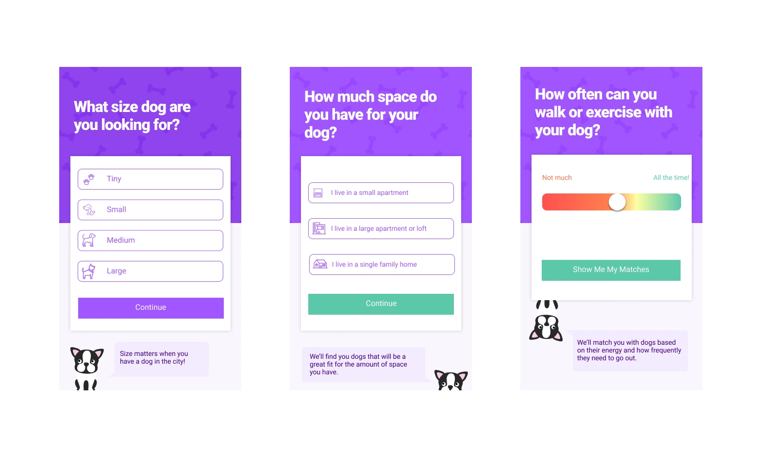
CityPups interface prior to this design sprint
My goal was to:
-Observe CityPups current onboarding process & how users interacted with it
-Identify pain points for users within the current flow
-Determine what deterred users from completing the onboarding process
Users were asked:
-Tell me about yourself and your interest in adopting a dog
-What research have you done so far on adopting a dog?
-When using the CityPups app what do you expect this experience to be like?
-Take some time to utilize the CityPups application presented to match yourself with a dog while walking through your thought process out loud.
Findings
-Users expected to be matched with a dog that best fit their lifestyle by the end of their experience with the app
-80% of users wanted size options to be further specified
Users felt that the space options provided did not cover all space options that may be available to those living in the city.
Current options exclude parks, yards, and trails.
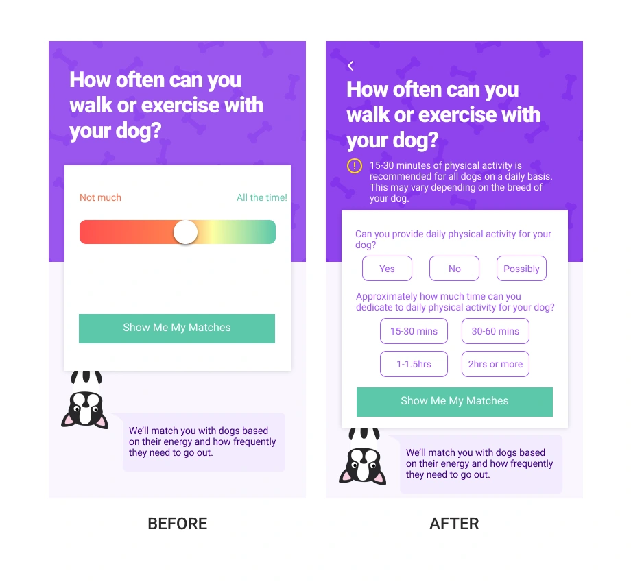
Users found the 'walk' question to be confusing. How would a new dog owner know how much exercise is required for a dog?
Are different levels and durations of exercise recommended for different sized dogs?
Design Decisions
My goals were to address the issues described by users while remaining within the time and budget constraints set by the business.
Simple additions of clarifying elements were deemed as the most feasible option at the time.
Mid Fidelity Wireframes
Following the decision to focus on clarifying specific elements of the current design of the CityPups app, I decided to move on to mid-fidelity wireframes instead of low-fidelity.
Considering that this was a design sprint and time was limited, I utilized icons that were currently apart of the brand guide and made slight adjustments based on my design decisions.
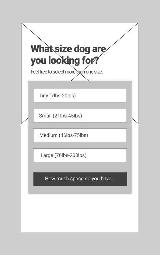
Size Clarity
I added weight ranges to each size option to help users distinguish and visualize the sizes that each category was referring to.
I adjusted the call to actions on the buttons to infer which screen may be next as it may hint at what was going to be asked of users next.
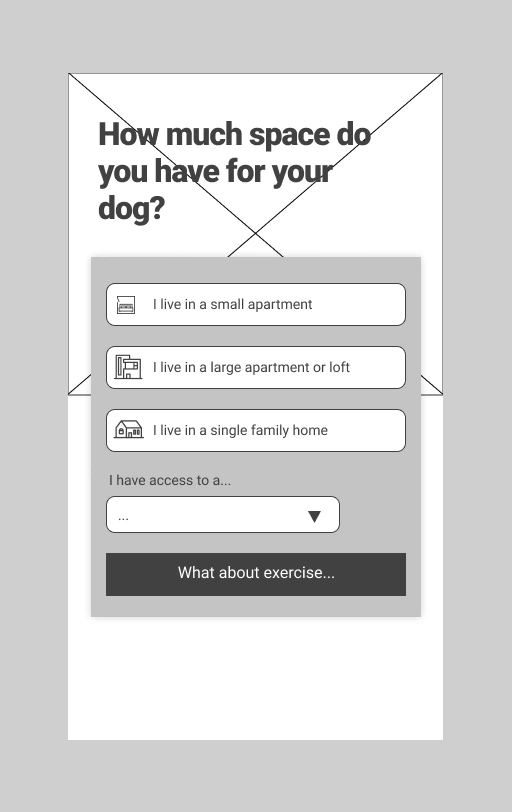
Additional Space Options
I designed and added space options for users that were separate from living quarters in the form of a dropdown menu.
In the initial usability testing users expressed frustration regarding feeling limited to the space options that were being considered so this was added as a solution for that.
Educational Elements & Specification
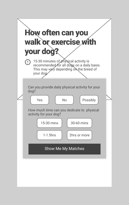
I removed the slider feature following user feedback that it lacked clarity. Users were unable to determine what 'not much' and 'all the time' meant in detail. They felt that the slider was not able to provide them the opportunity to accurately state how often they could walk their dog.
I also provided an educational disclaimer regarding how much time is recommended for dogs to inform new dog owners as users also expressed not knowing how much exercise is recommended seeing as many of them were first time dog owners.
Wireframe Testing
Users were now asked to complete the same tasks that were completed in the first round of usability testing with my iterated wireframes to assess the quality of the solutions I drafted.
User Feedback
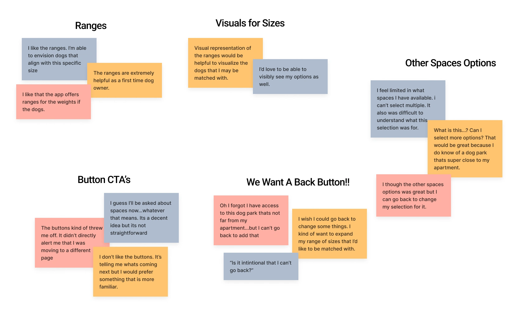
I organized common praises/concerns into an affinity map to assess the feedback provided by the users and identify similar and related feedback.
Mockups
Based on the feedback provided I decided to make numerous changes to each screen.
Color Consistency, Size Clarity, & Visual Representation
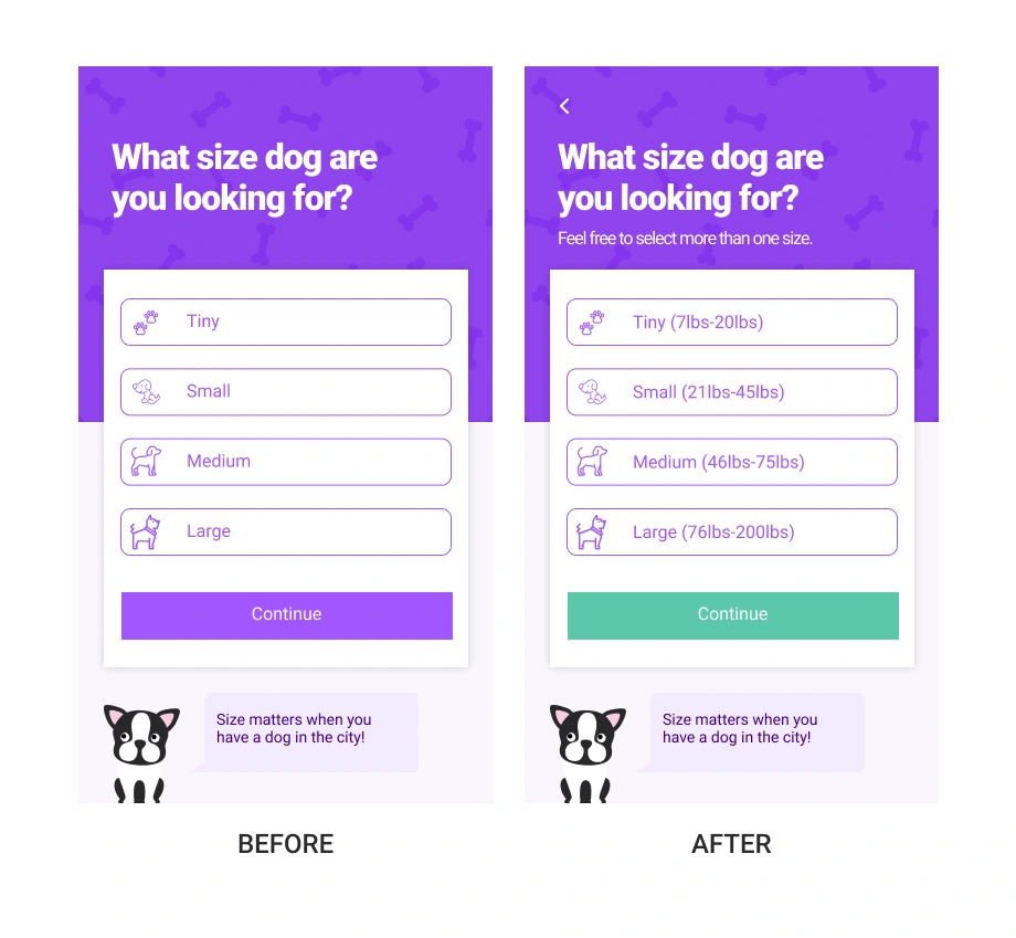
I added the icons back into the interface of the buttons to provide visual representation of each size range based on users' feedback.
I changed the call to action back to 'continue'. The idea of the CTA aligning with the next topic was a nice idea but seemed to confuse the users.
I also changed the color of the 'continue' button to establish consistency for users.
Adjusting Space Options
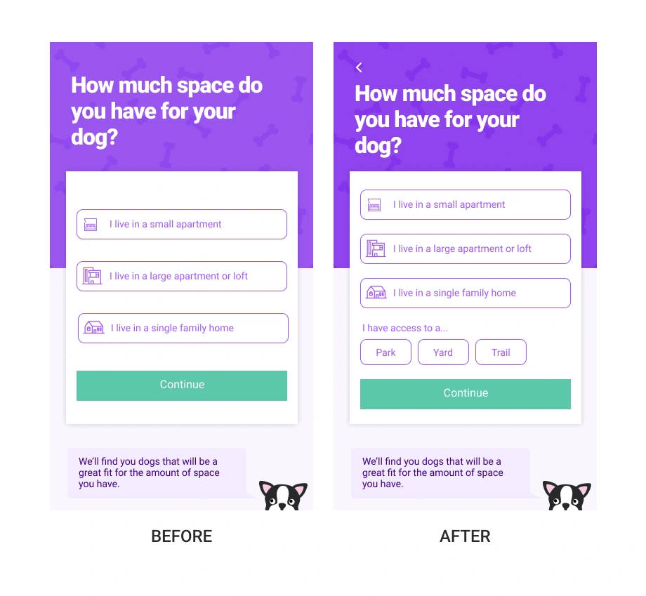
I adjusted the additional options for spaces and added buttons instead of a drop down feature as it seemed confusing for users.
One user scanned over it, other users expressed interest in it but felt limited to what they could select due to the display of the feature.
Educational Elements & Specification
I made sure to keep the educational disclaimer apart of the design because all of the users expressed their appreciation for the information and found it useful.
Future Opportunities
If time allowed I would conduct further usability testing using low-fidelity wireframes and mockups.
I also considered the effect of adding photos to discern the size ranges for dogs and would love to explore that idea further with A/B testing.
Like this project
Posted Sep 13, 2023
A design sprint focused on improving the onboarding experience of the CityPups mobile app.
Likes
0
Views
6

