Loom
Overview
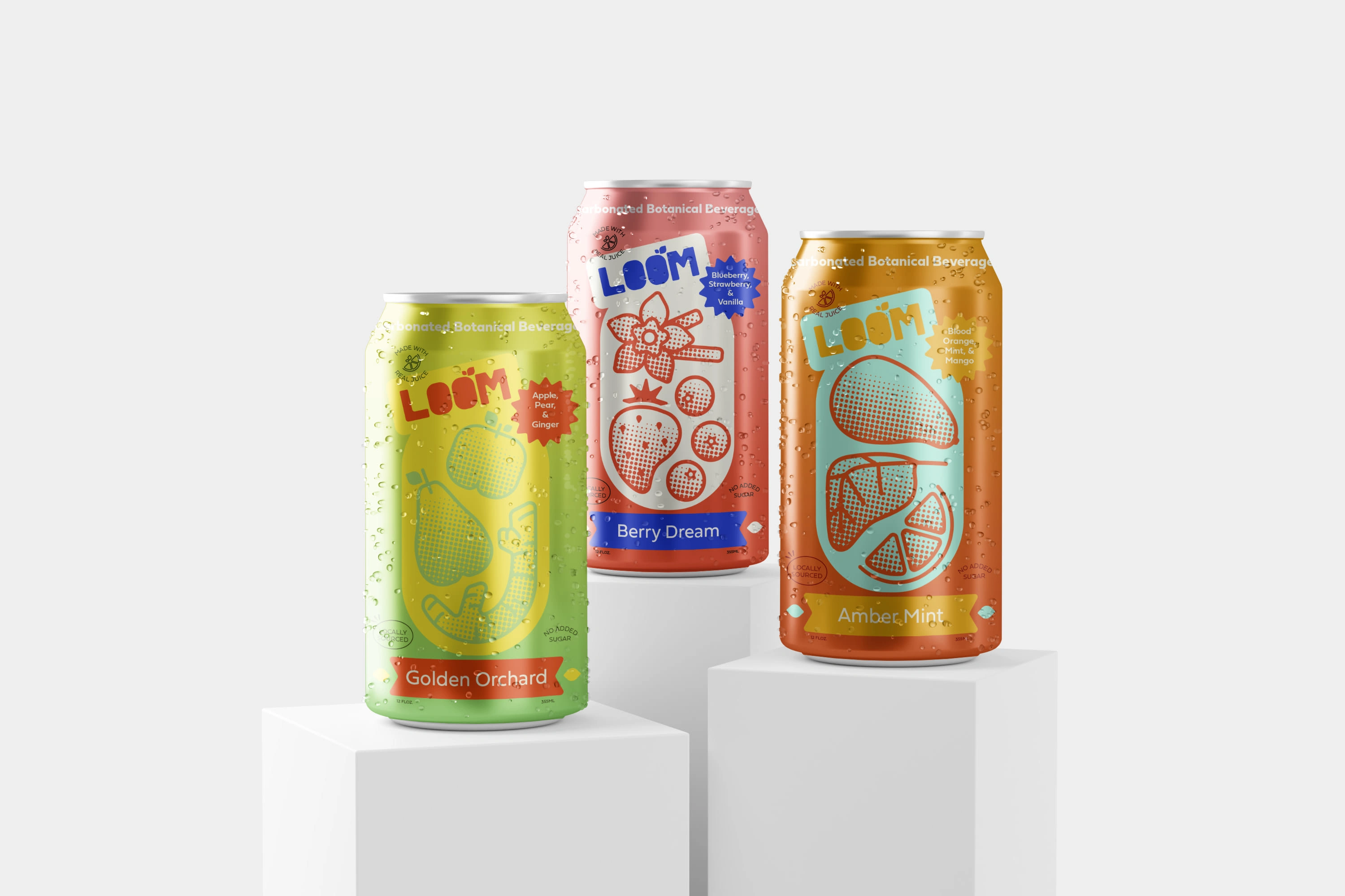
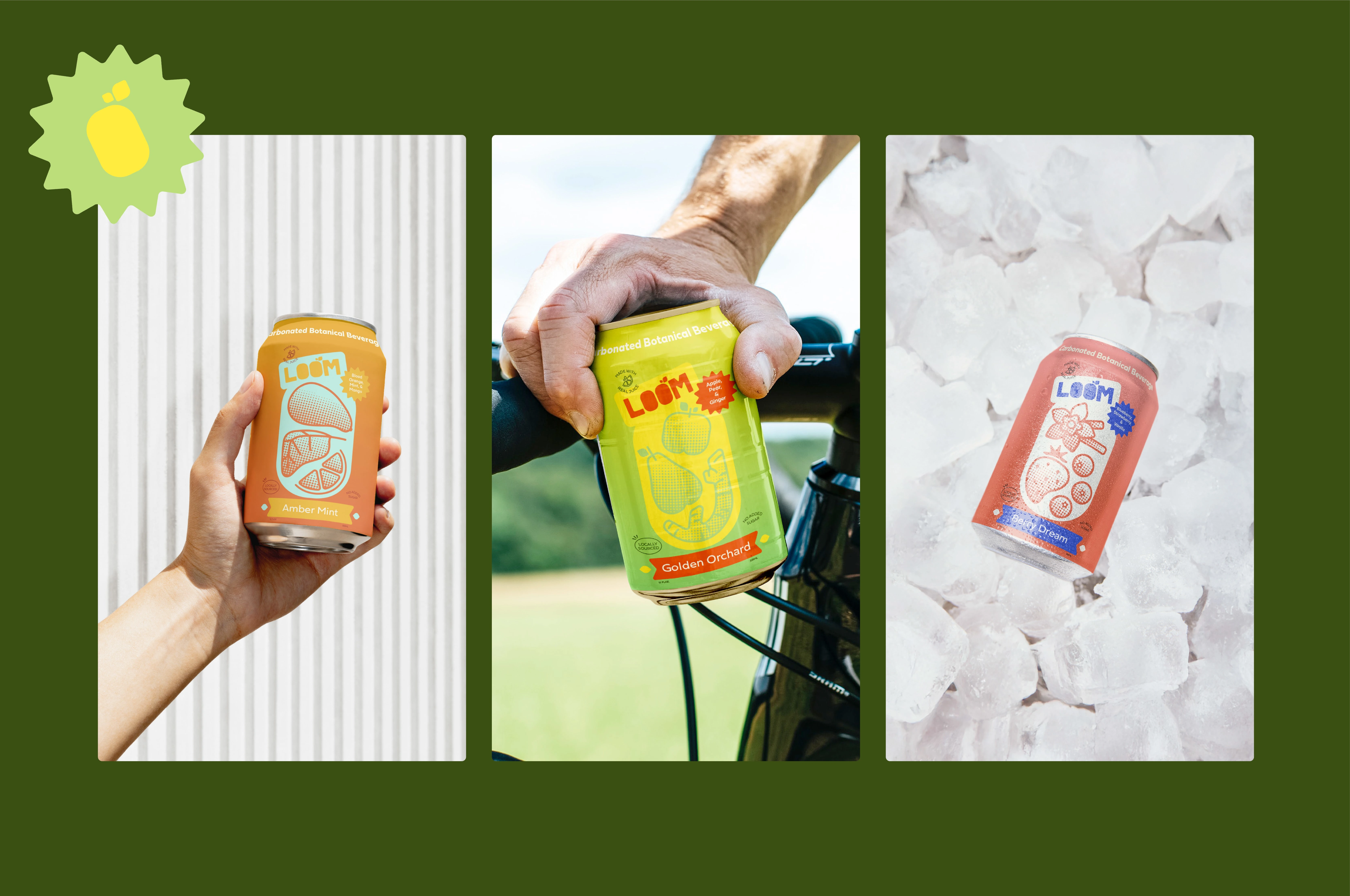
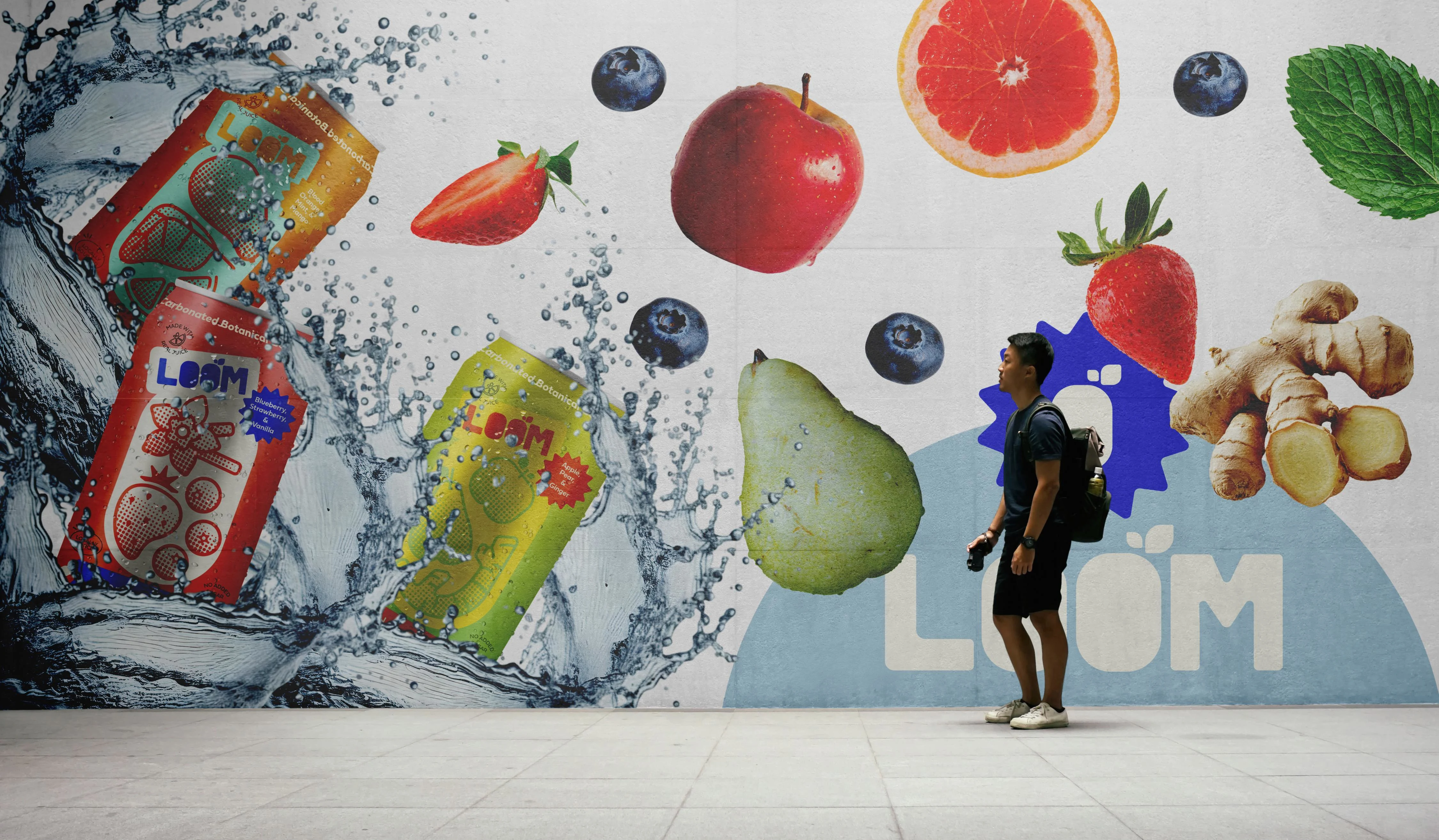
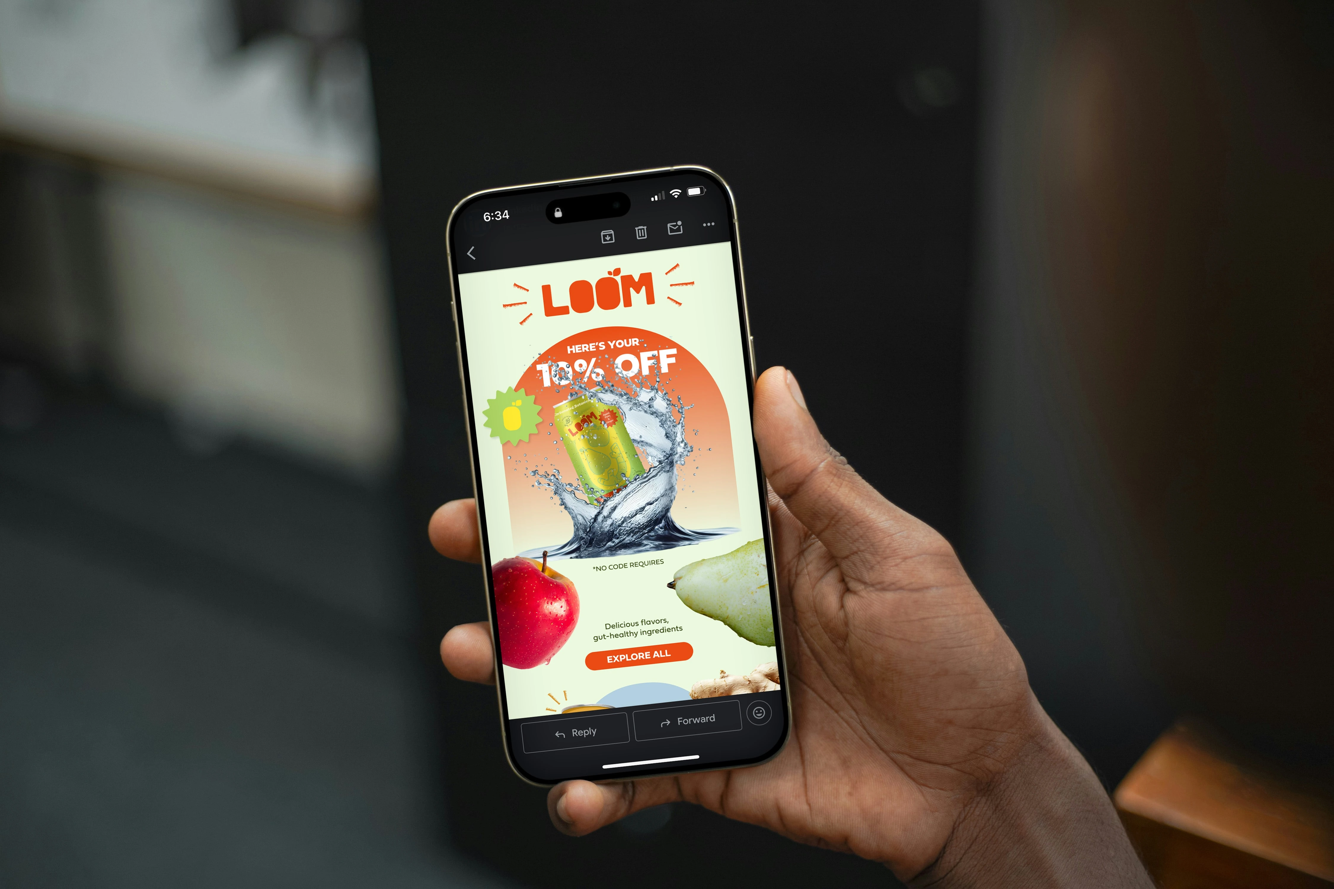
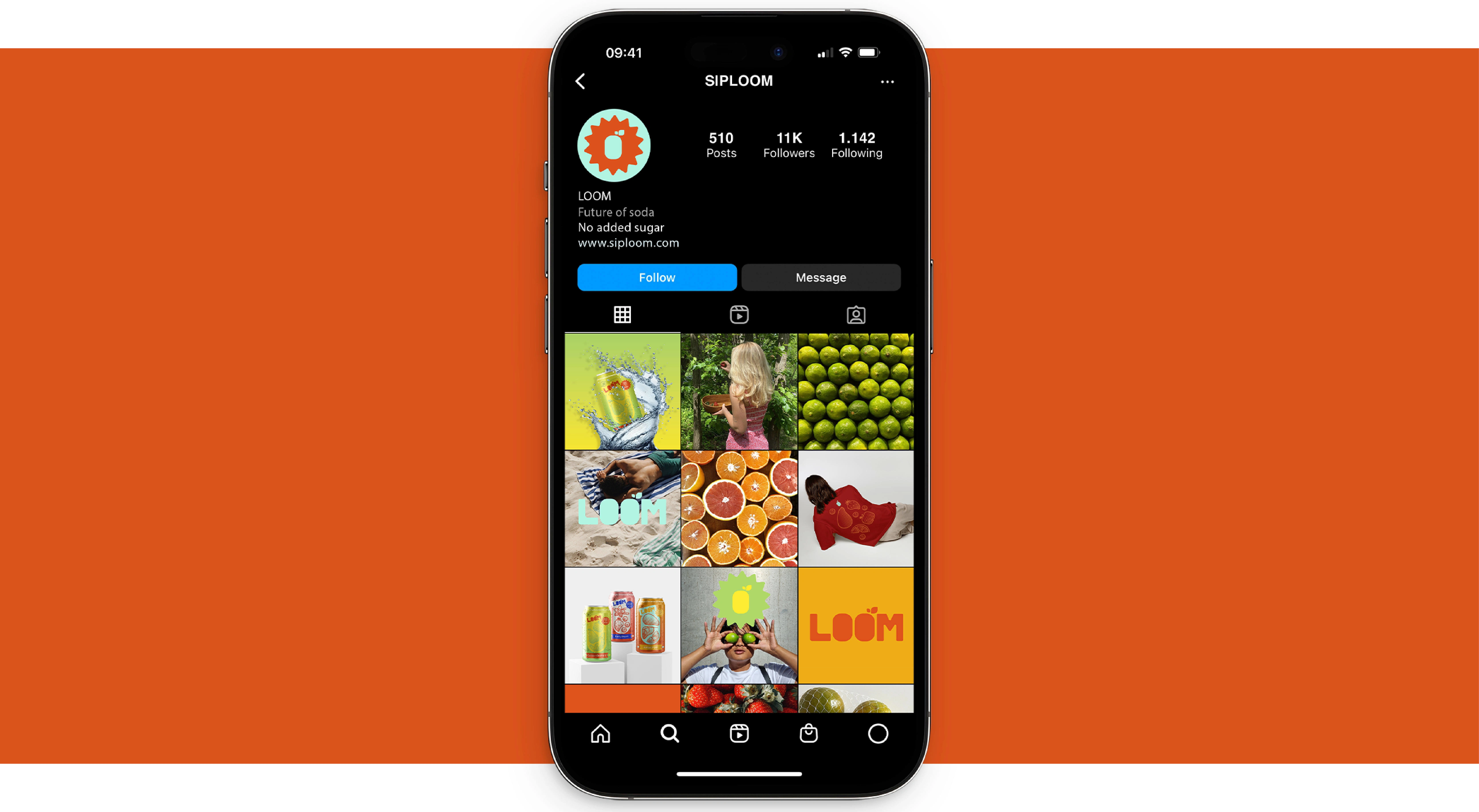
Loom is a botanical soda designed to support gut health and overall wellness, while still delivering a bubbly soda product. The vibrant color palette and playful illustrations were created to spark curiosity, capture attention, and resonate with a younger audience. I leaned into the urge to create a brand identity that is bold and expressive, the kind of design that makes people do a double-take. Products shouldn’t just serve a function; they should tell stories, spark connections, and create experiences.
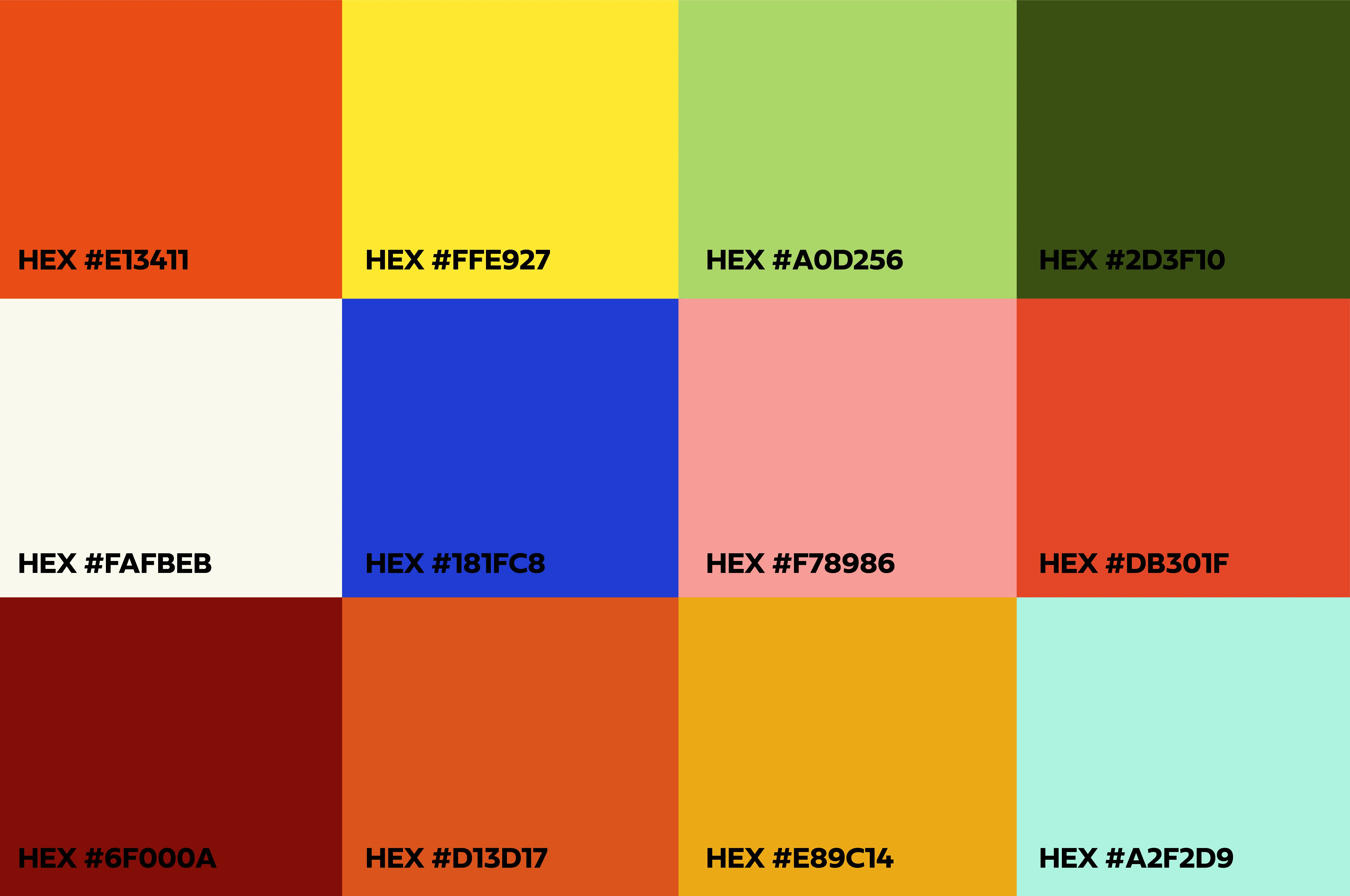
Color Palette
I chose a very bright and vibrant color palette that takes inspiration from the fruits within the drinks. The colors grab consumers' attention, feel playful, and create a sense of energy and fun that matches the brand’s personality. This approach makes the product not only recognizable but also memorable, helping it stand out.
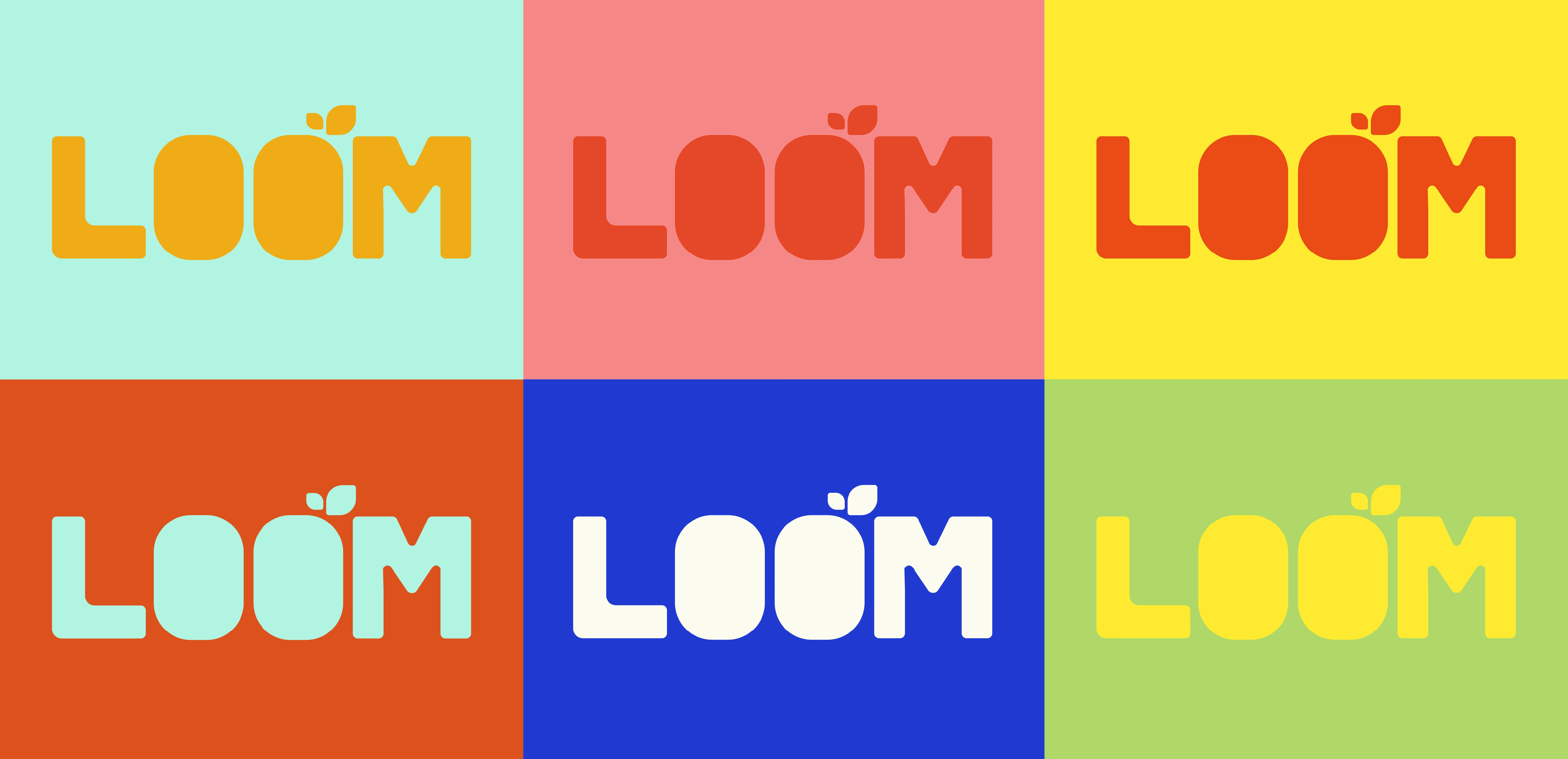
Logo
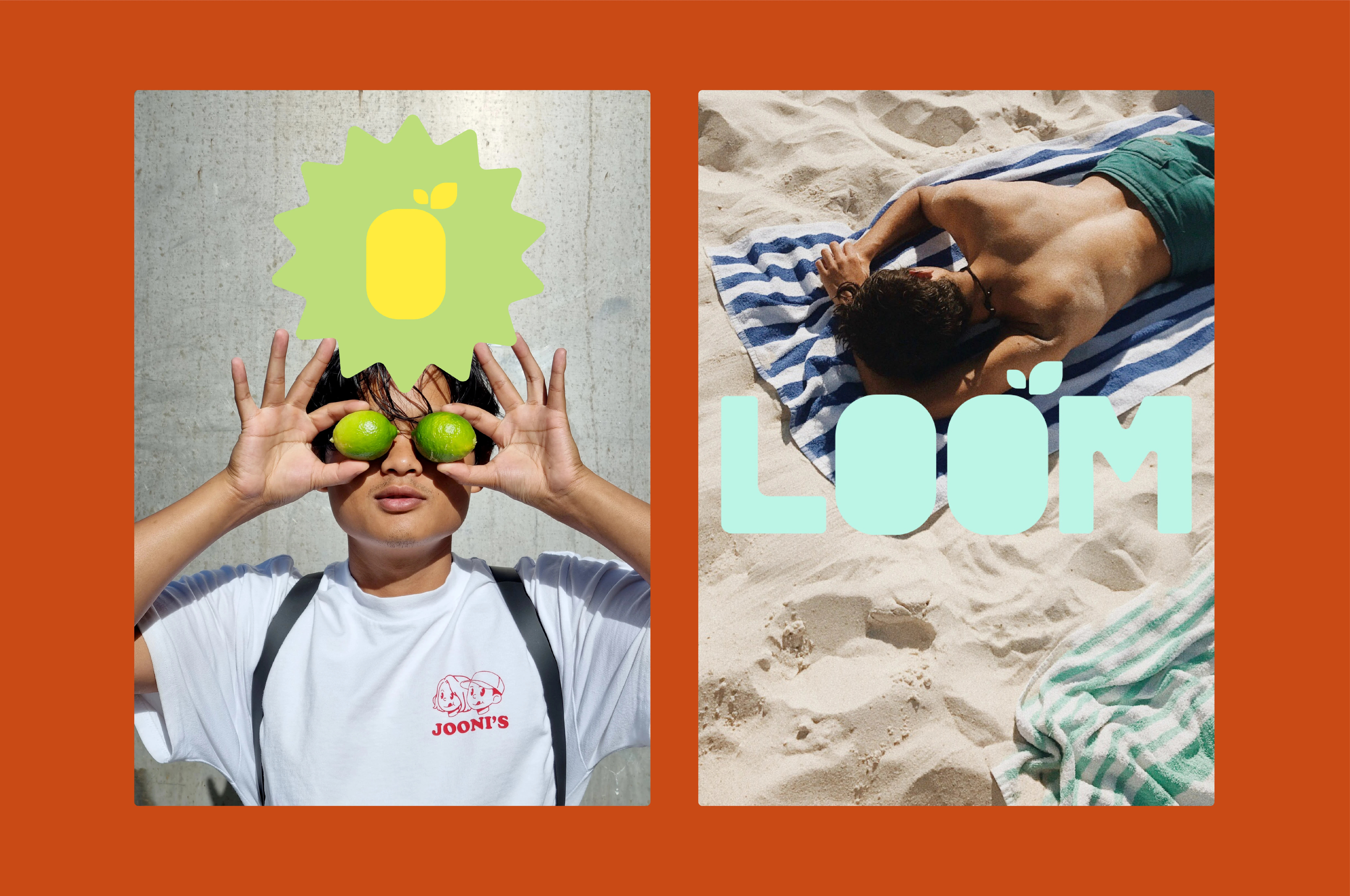
The Loom logo was designed to be simple and memorable. The O's within the logo are designed to reference both a soda cans and the natural, botanical ingredients at the heart of the product. This playful detail helps connect the brand to wellness while still feeling fun and approachable. To ensure versatility, I also created a brandmark. This secondary mark provides a simplified version of the logo for smaller applications, maintaining recognition and consistency without losing the brand’s character. Together, the marks balance clarity, adaptability, and storytelling, creating a strong visual foundation for the brand.

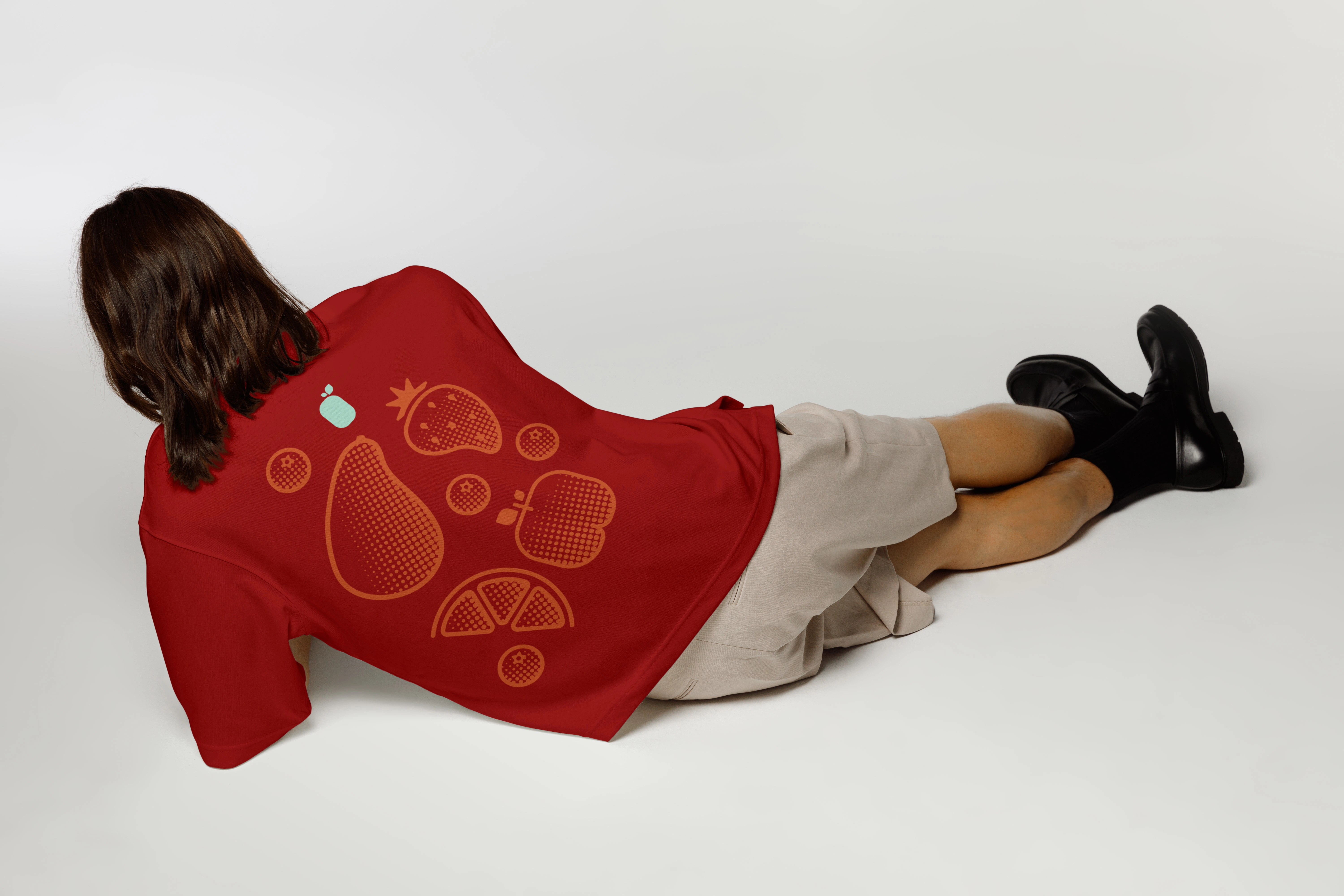
Patterns

Let's Connect!
Got a design project in mind? From branding and motion to illustrations and logos, I’m here to help bring your ideas to life, so let’s chat!
Feel free to DM me on here or you can reach out to me through my email: dahliaconleydesign@gmail.com
Like this project
Posted Oct 28, 2025
Loom is a bold, botanical soda brand that mixes gut health with fun. Vibrant colors and playful design make it eye-catching, expressive, and unforgettable.

